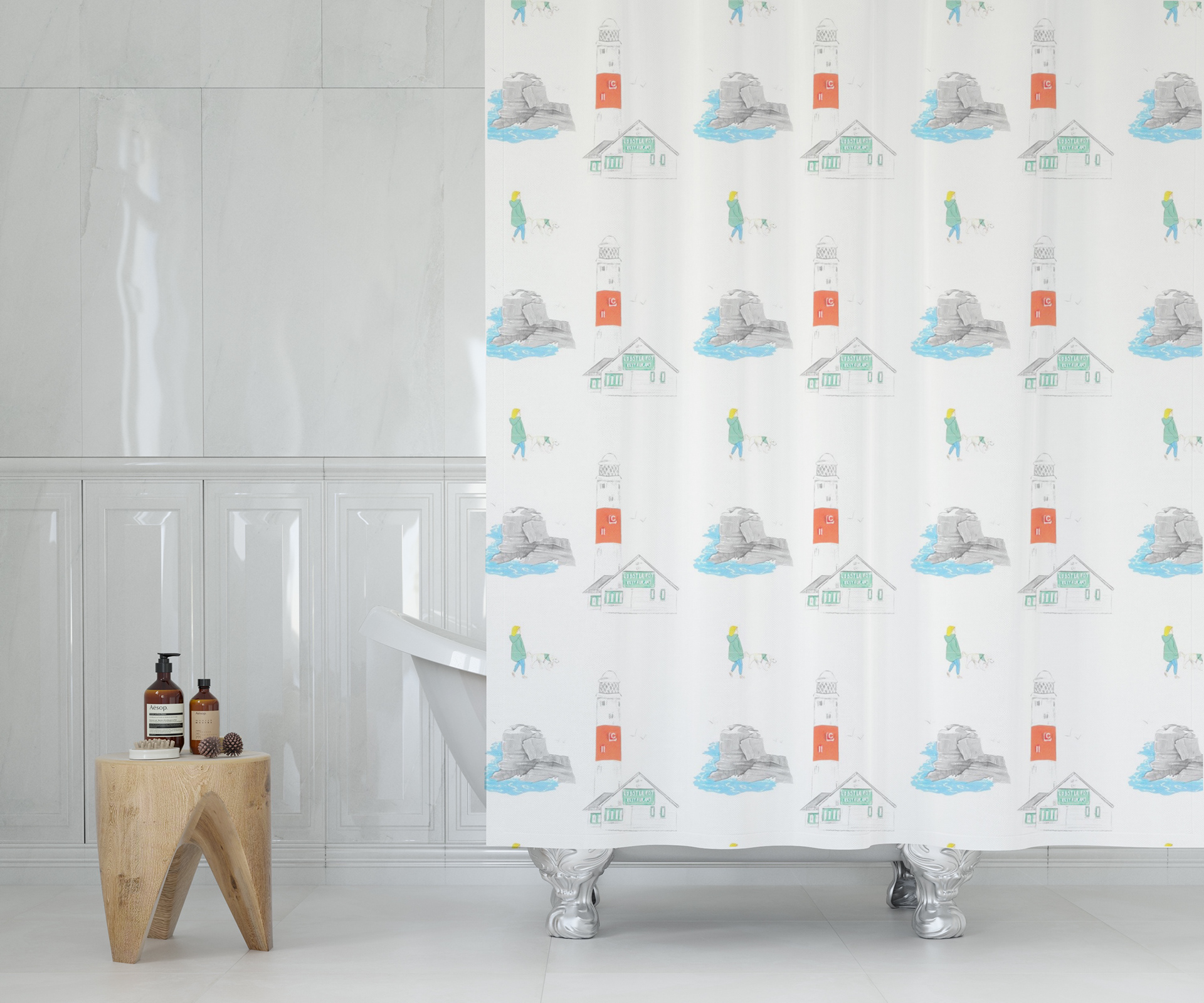
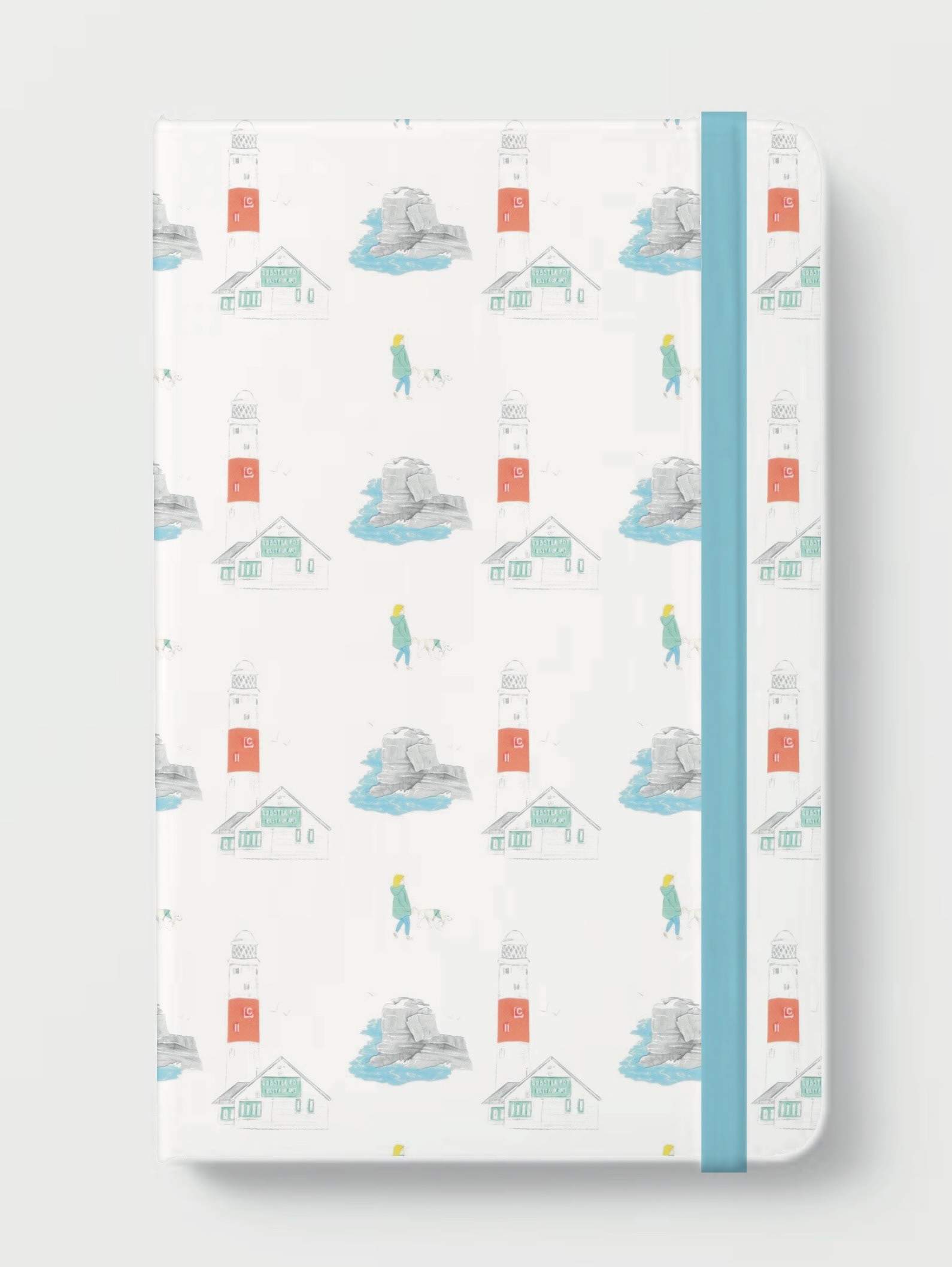
The feedback I was given during my interim crit was really insightful and helpful. It was obvious that the clients were most excited about the ideas surrounding the coffee shop aesthetic and we discussed in just how many ways the pattern could be used such as on coffee cups, napkins and even notebooks. They said that the colour schemes were subtle and soft, something their company is known for and that they were excited to see how I was going to move forward with my desired material of watercolour.
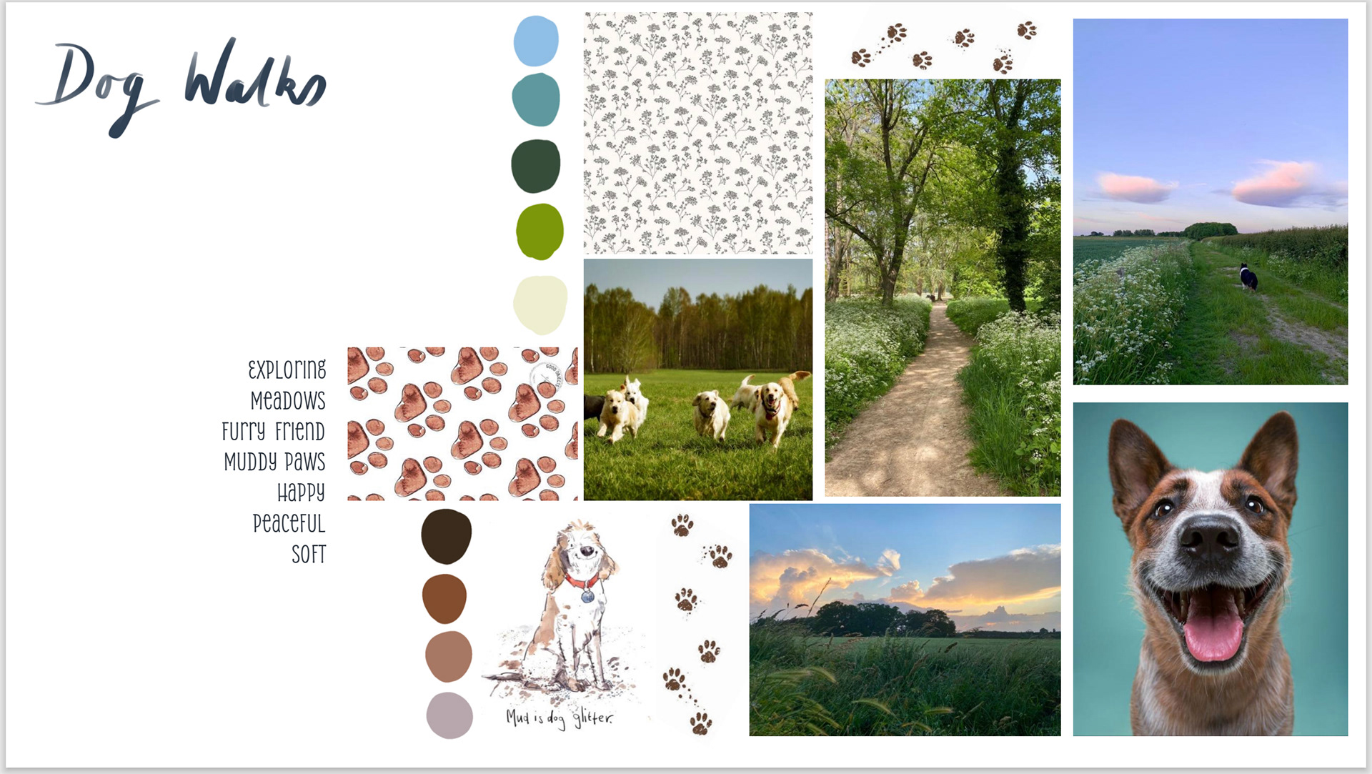
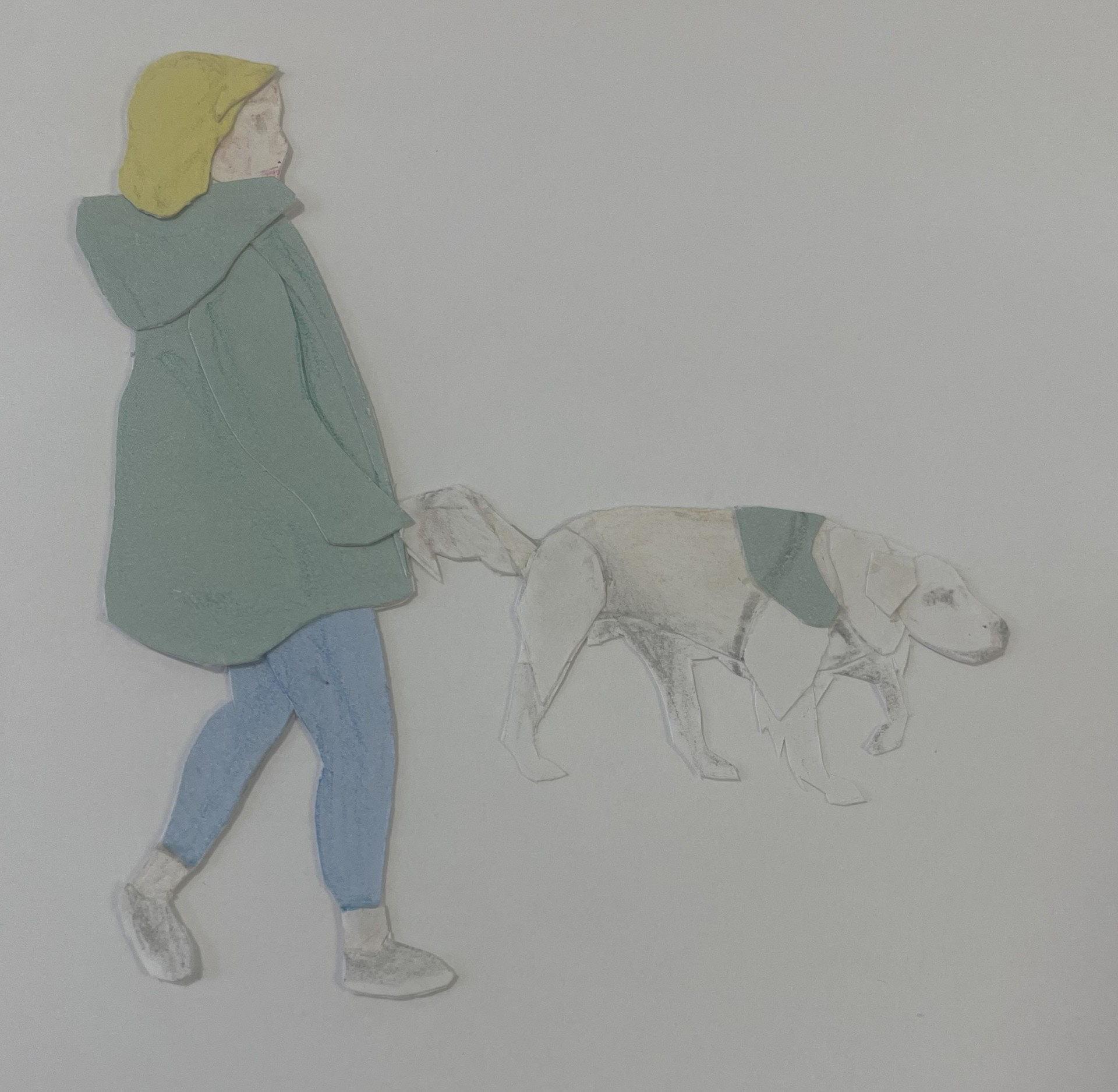
It was also said how certain aspects of the dog walking moodboard could be linked with the coffee shop ideas. I hadn’t previously thought of this but quite enjoyed the idea and so I will carry this forward within my experimentation.
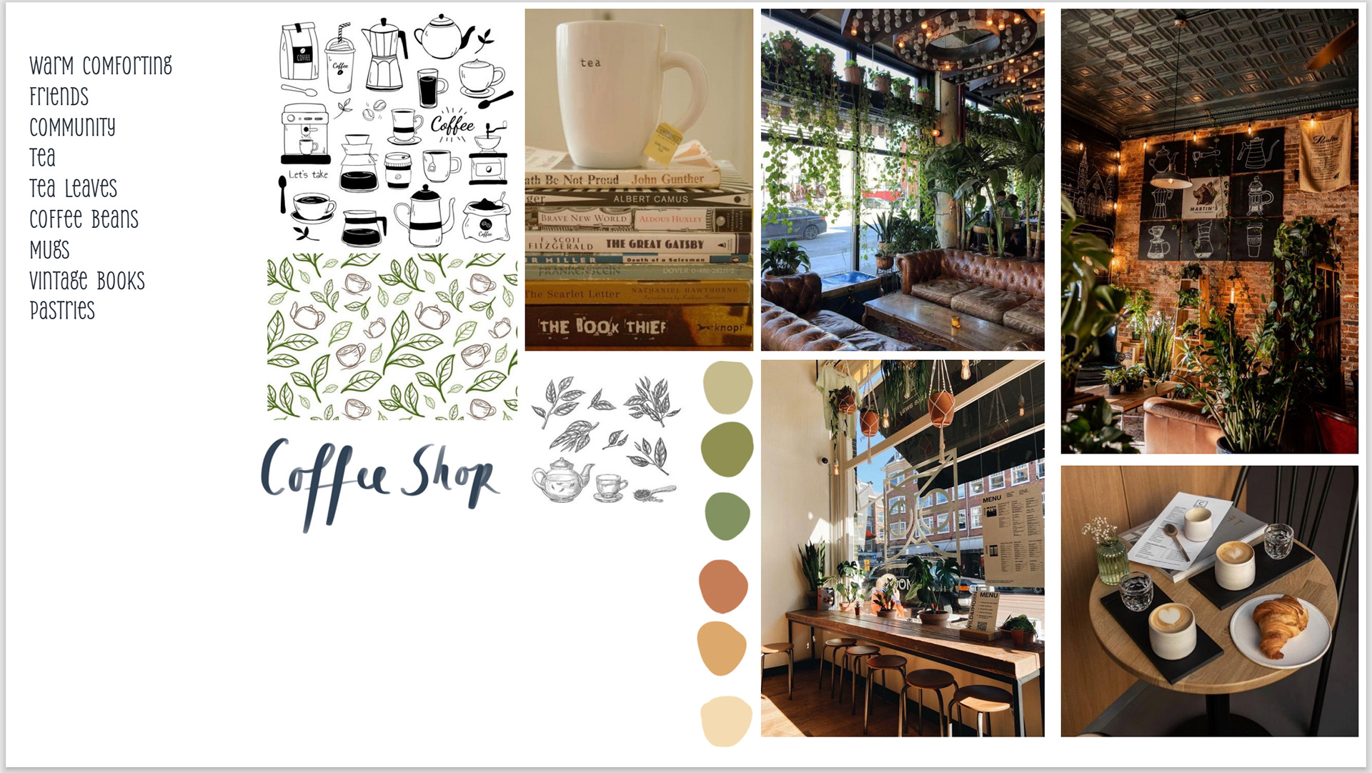
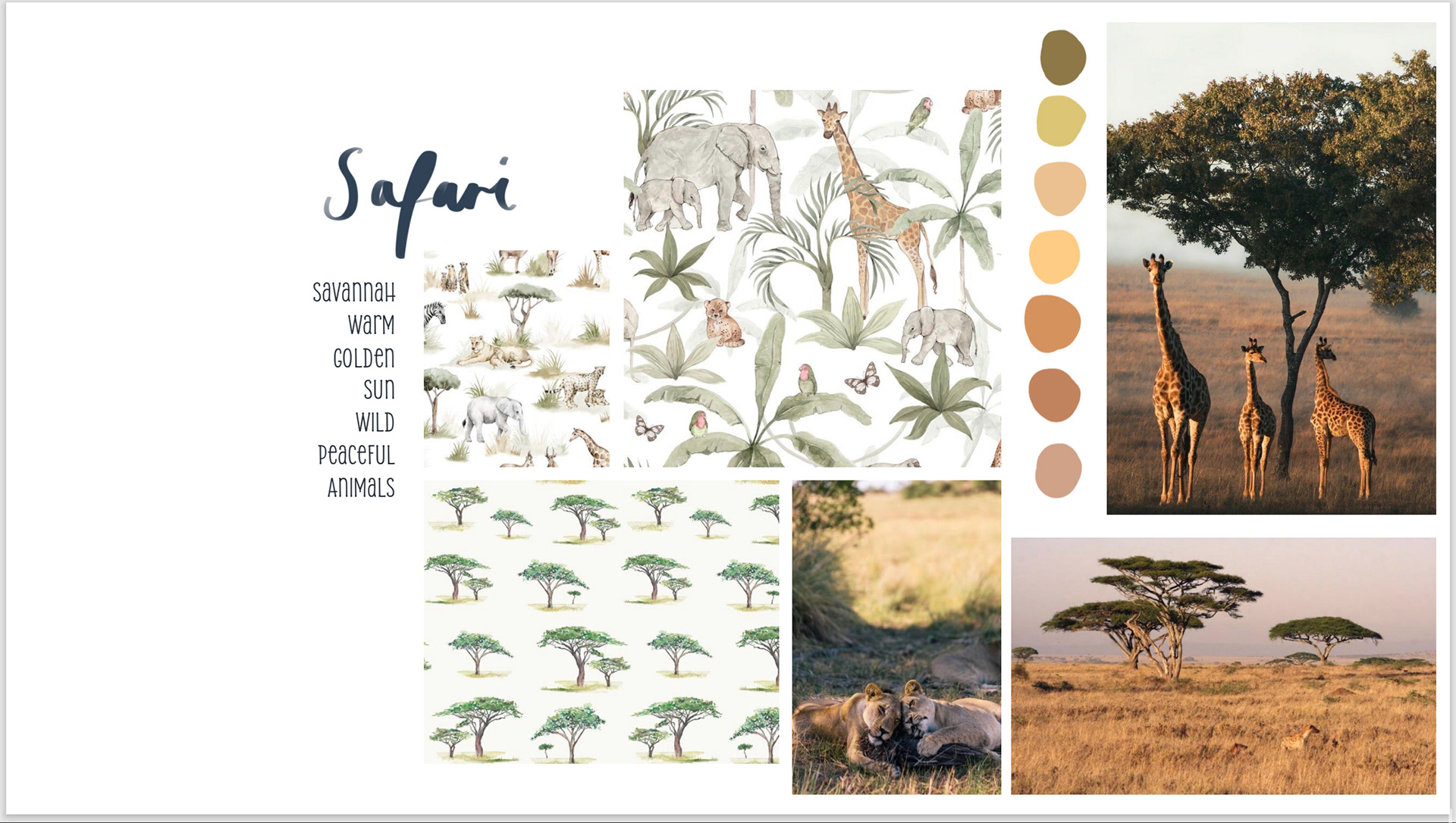
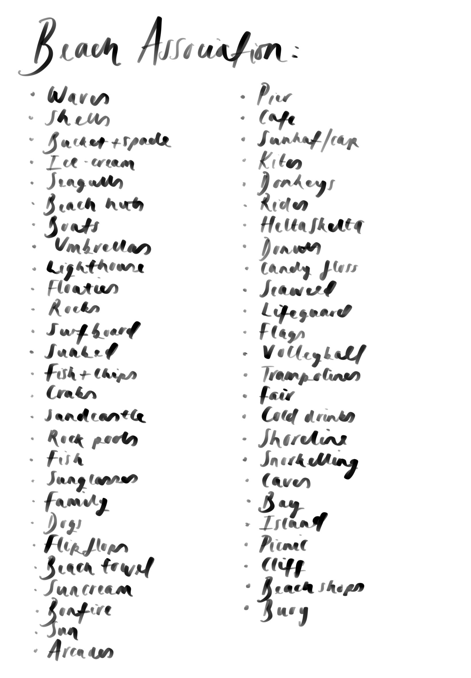
For this project the idea is to have a narrative to fuel the patterns you create, I found this really difficult to think of for the ‘coffee shop’ theme as everything was just too vague. I think that there is already a lot of generic coffee patterns out there and if I had no special experience to bring to the table it wouldn’t really add up to much. Because of this I decided to look more into my other themes, even combining them in some ways.
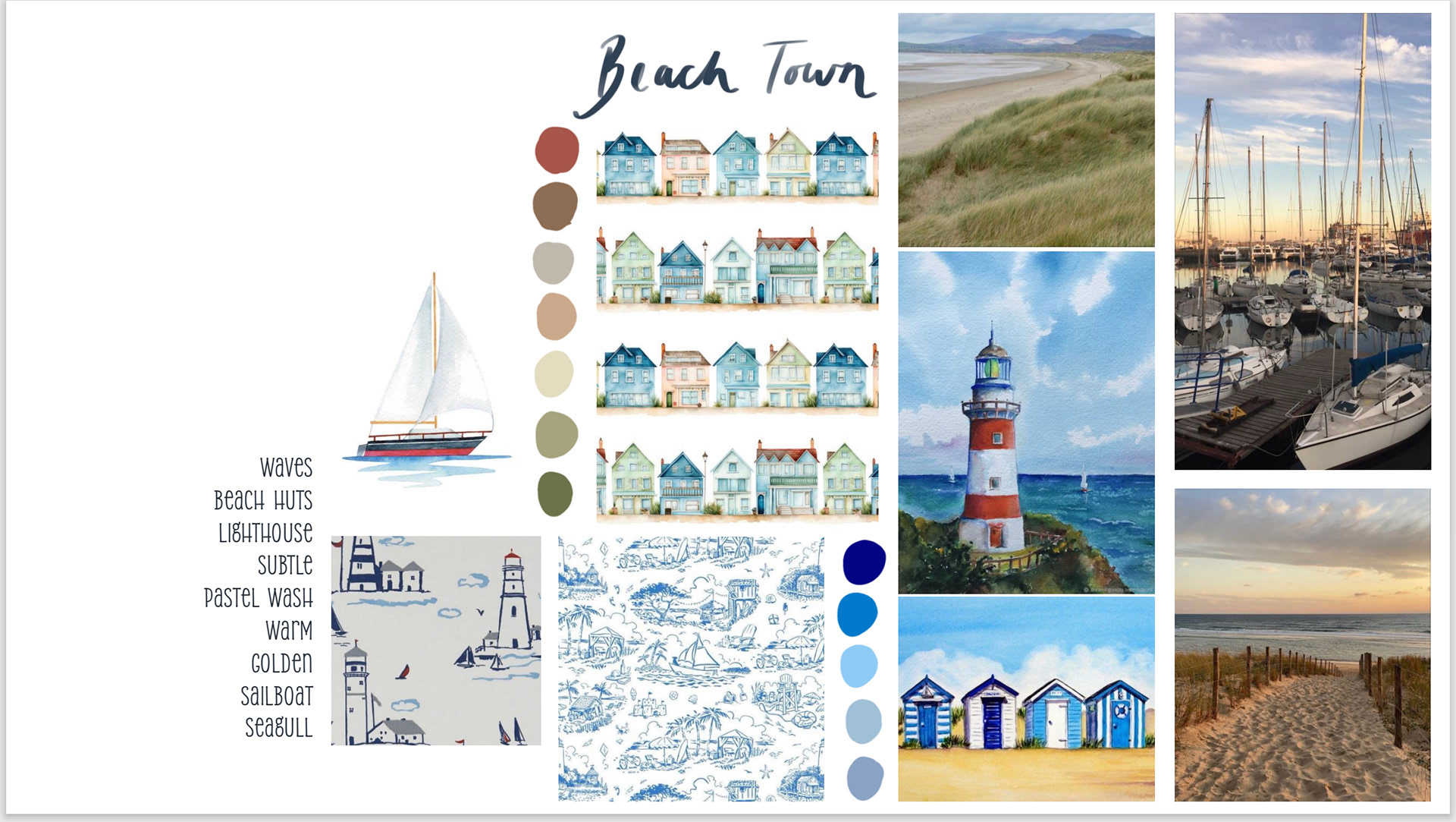
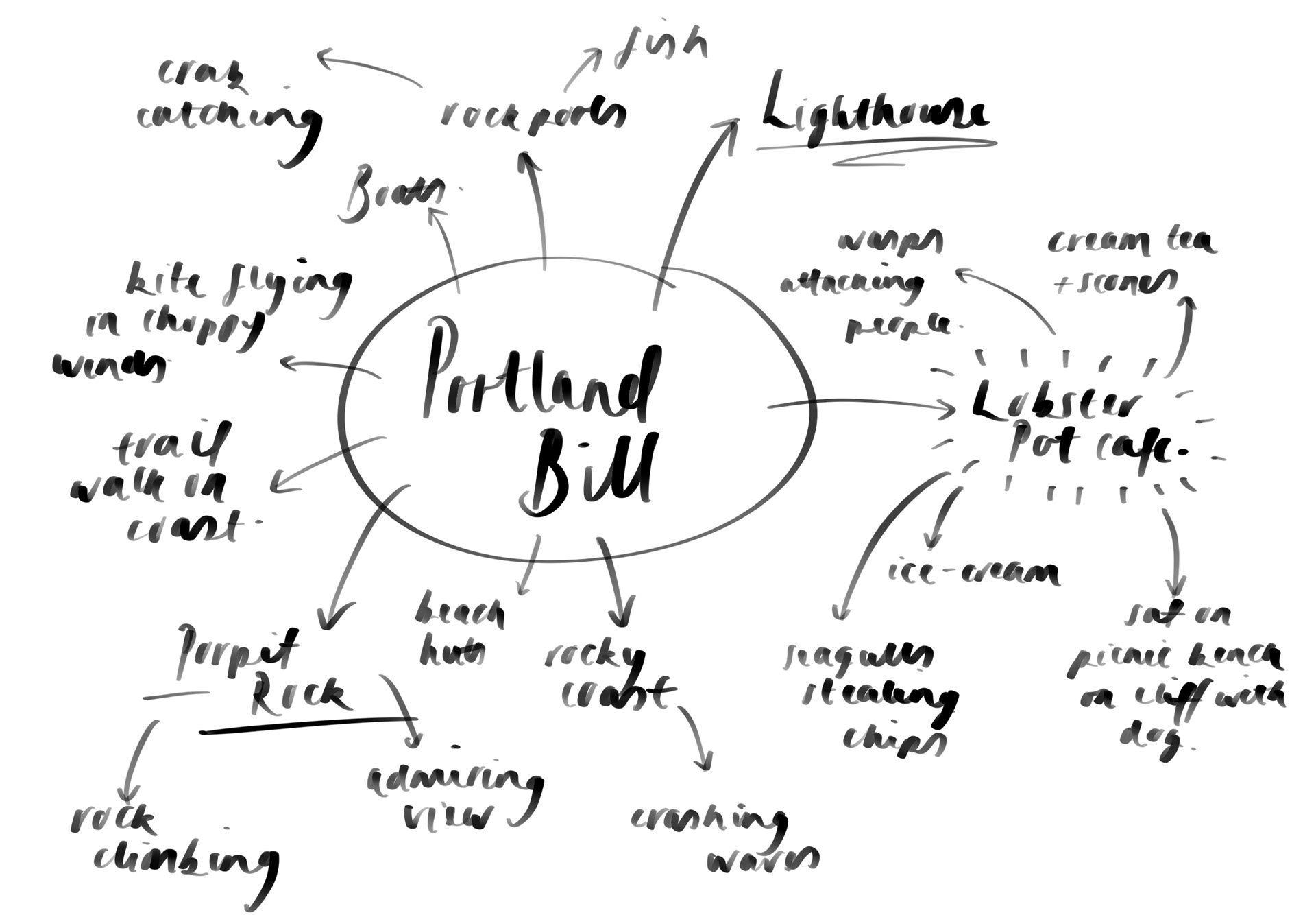
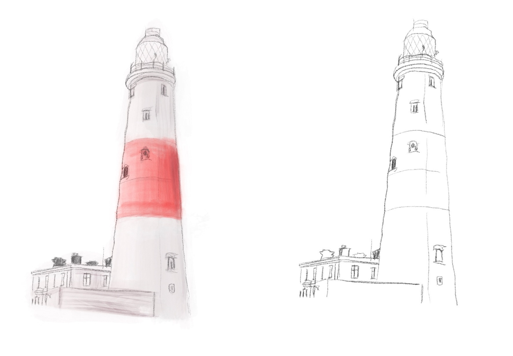
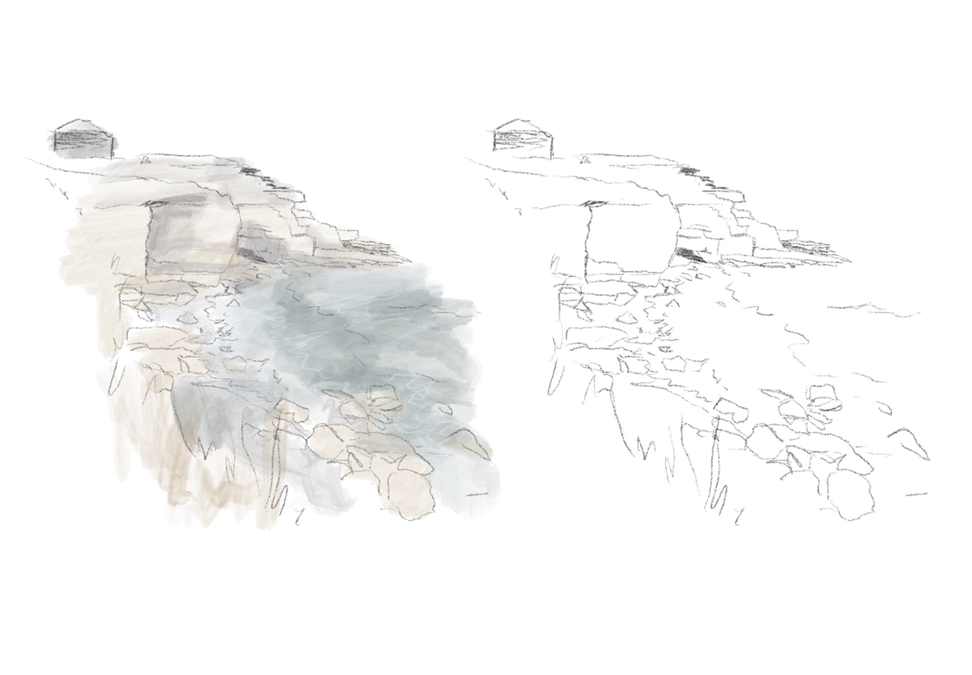
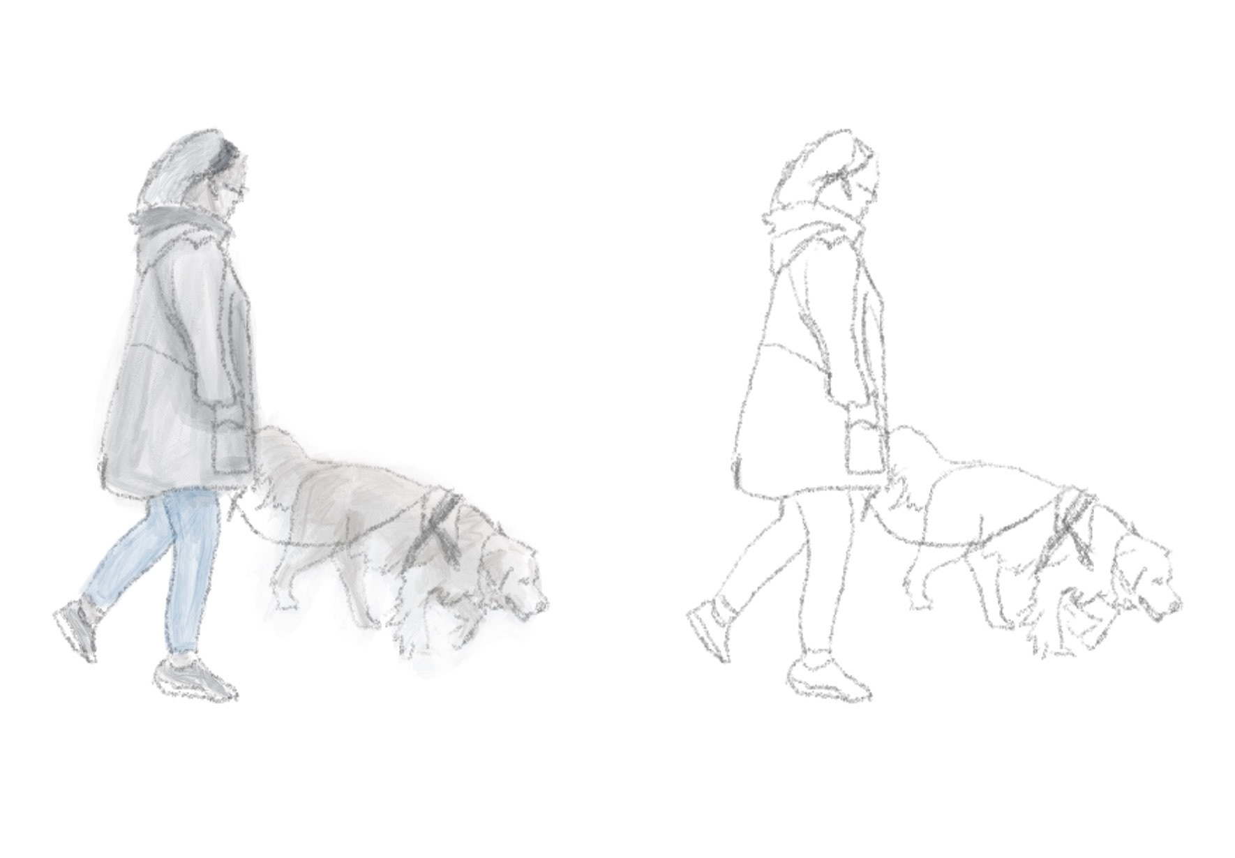
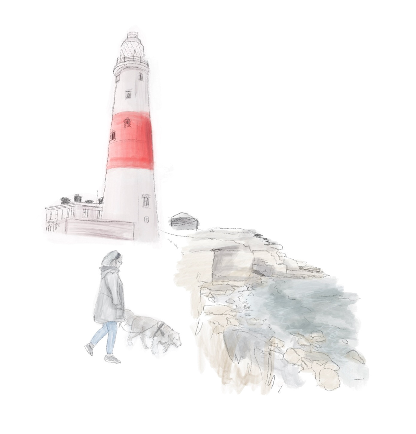
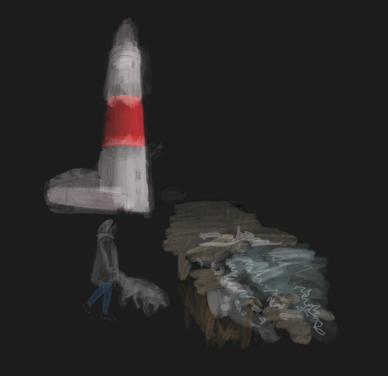
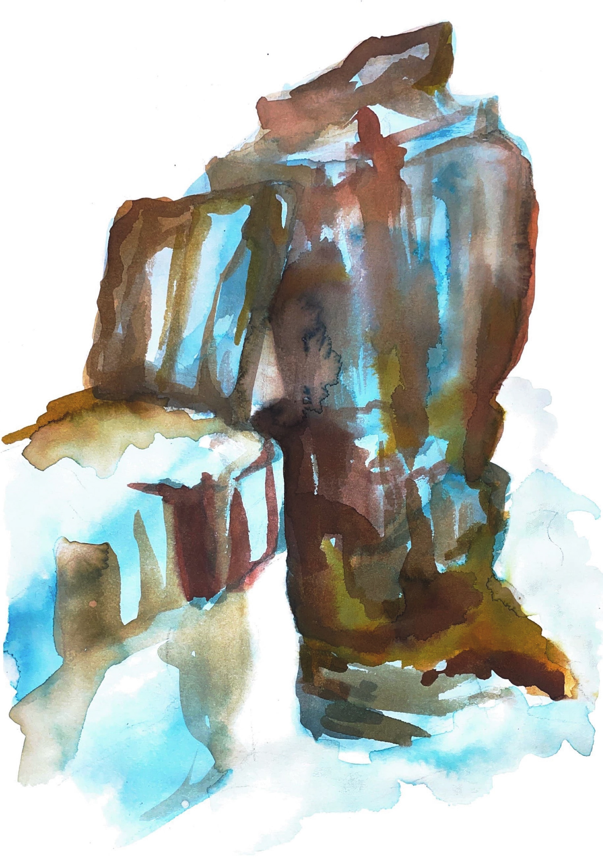
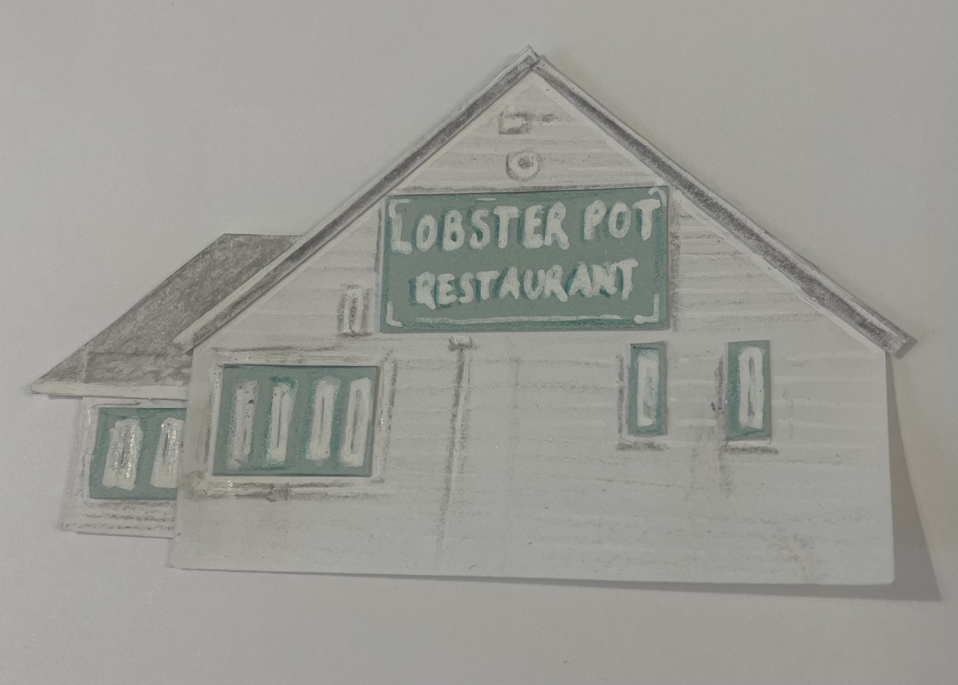
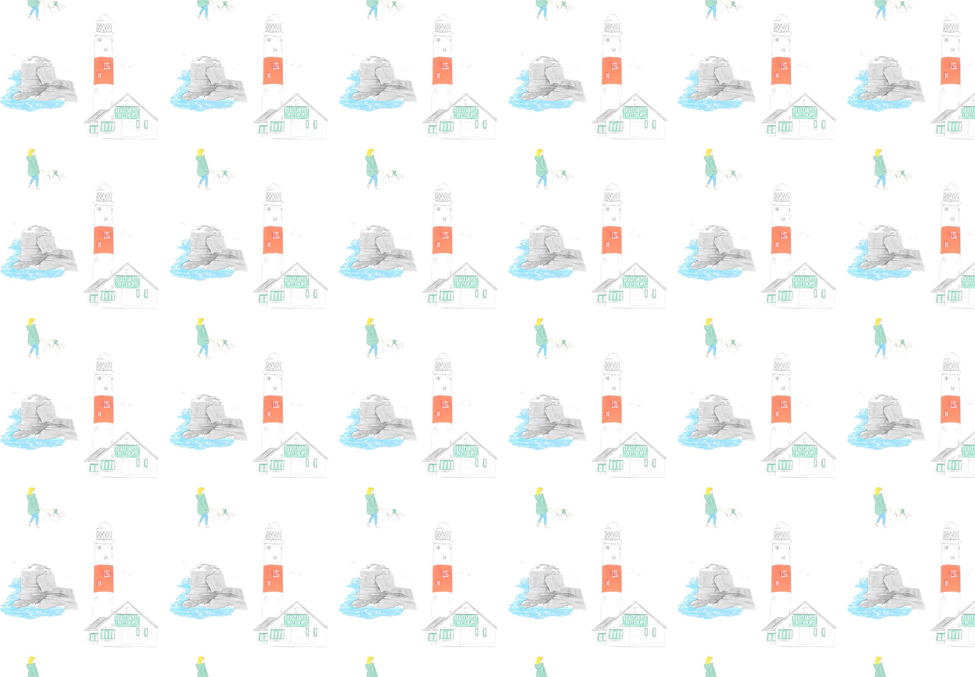
Portland has always been a big place for my family, my great grandad Jack being known as the oldest man on the island and it being the place my grandad grew up. Ever since I was little we would have frequent travels there to go visit Papa and so it became such a special place. Long walks around the coast to visit Portland Bill, rock climbing around the lighthouse and starring out at the crashing waves, always ending up with a cream tea at the Lobster Pot. A large open field where we’d always attempt to fly a kite but then almost end up flying away! We would always have our dog there with us, old memories with little Kc and now also with Shelby.
These are such core memories to me that incorporate factors from 3 of the themes I previously selected that I feel more drawn to this as my subject.
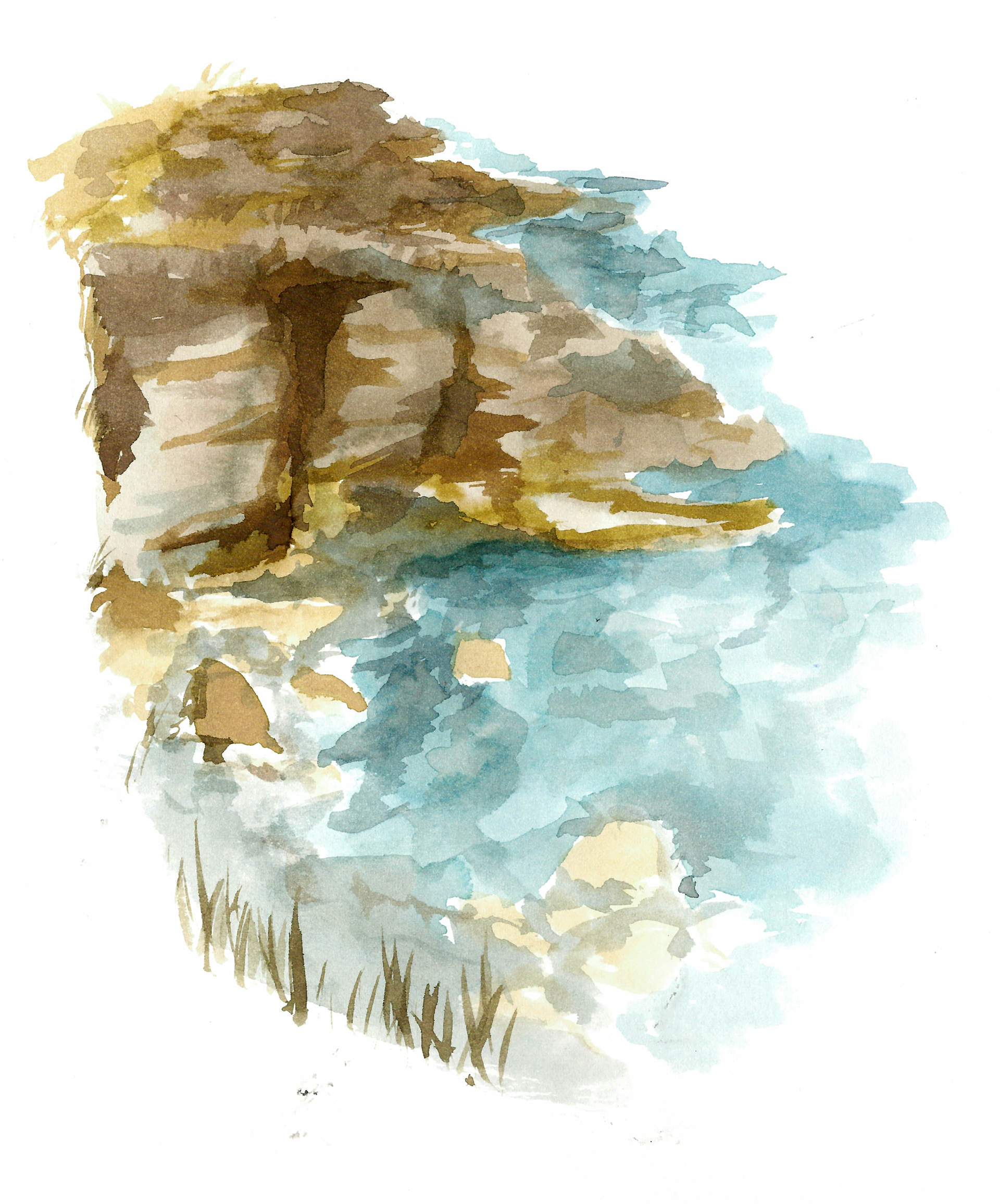
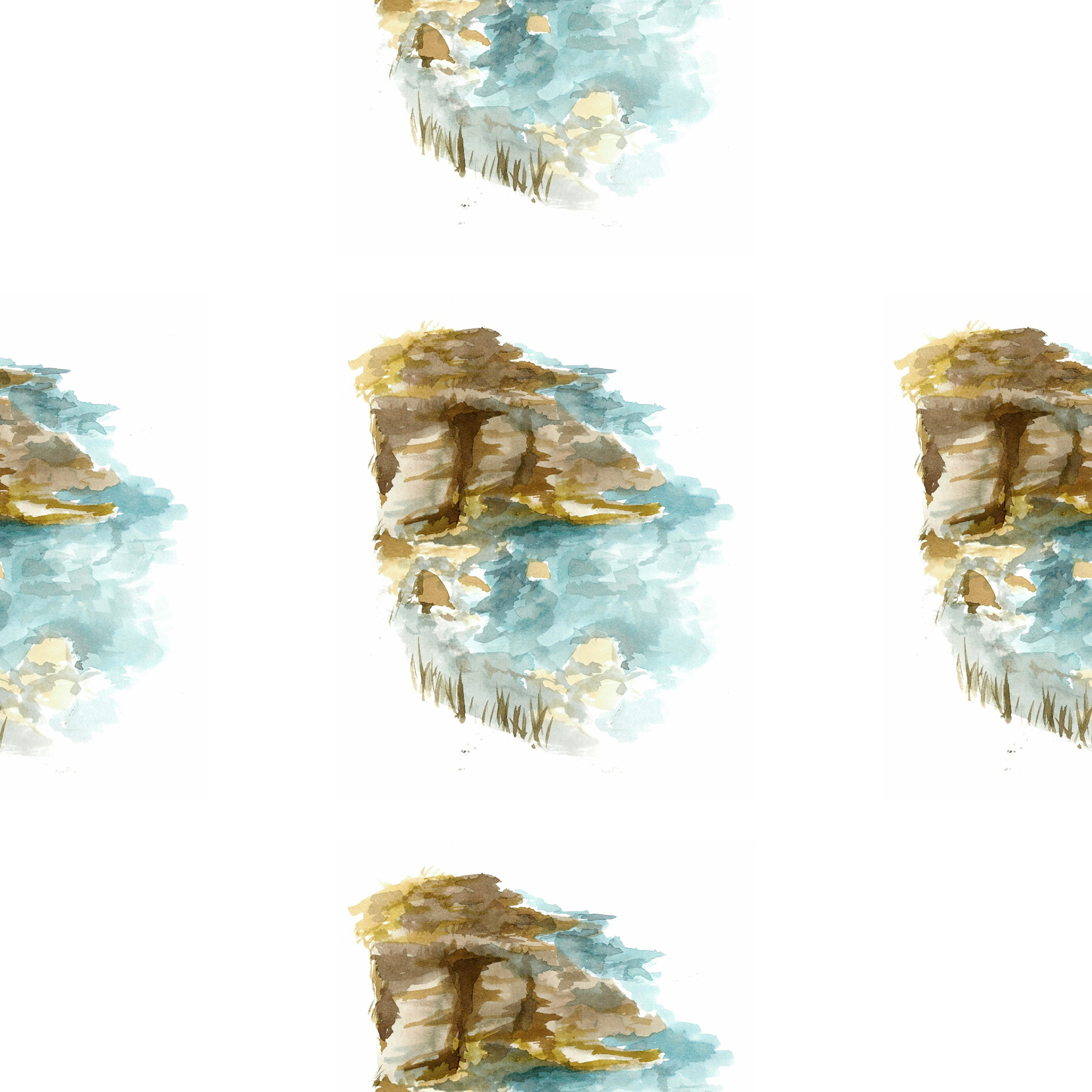
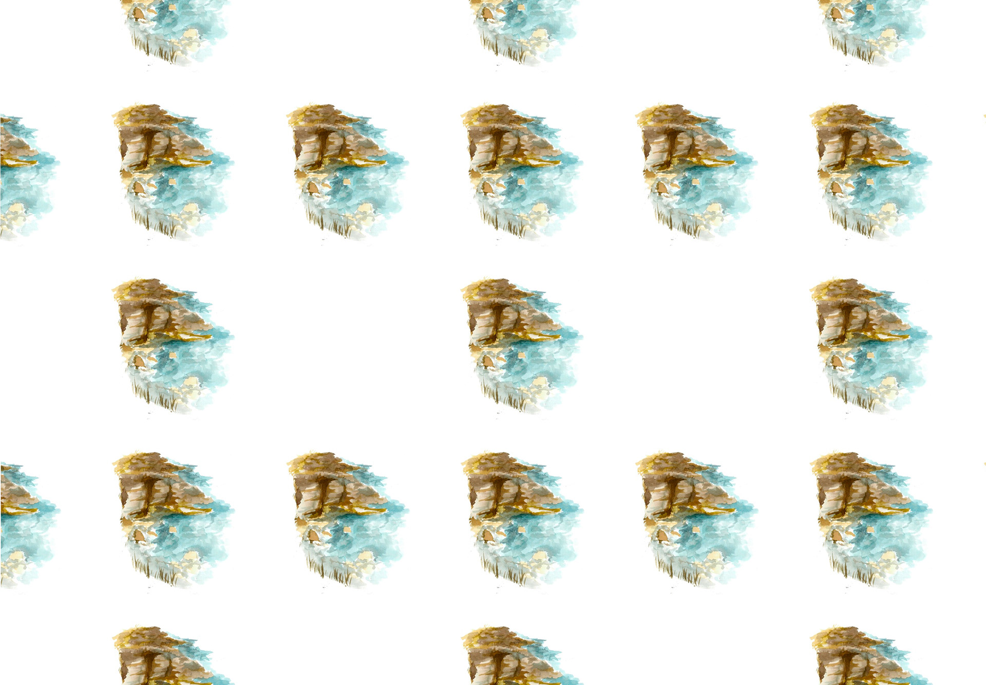
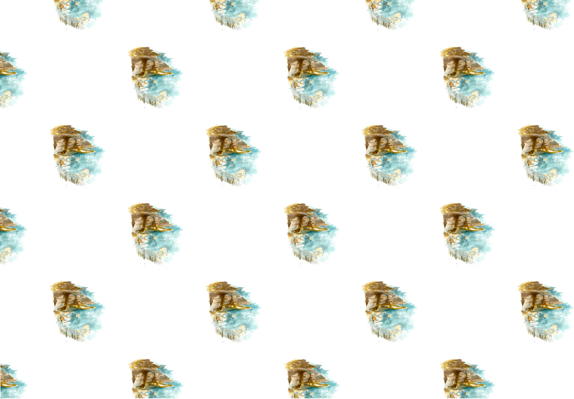
I put this shoreline watercolour into a repeat pattern using Procreate, seeing my work actually form something made me feel really accomplished but I can’t say I am the biggest fan of how it looks. Because I added the image in the centre it has led on to leave an ignorable square of negative space that draws the eyes more than the image does. To move forward I will take out the middle image in order to create a more even sequence and aLeo add in some additional factors to fill out the gap.
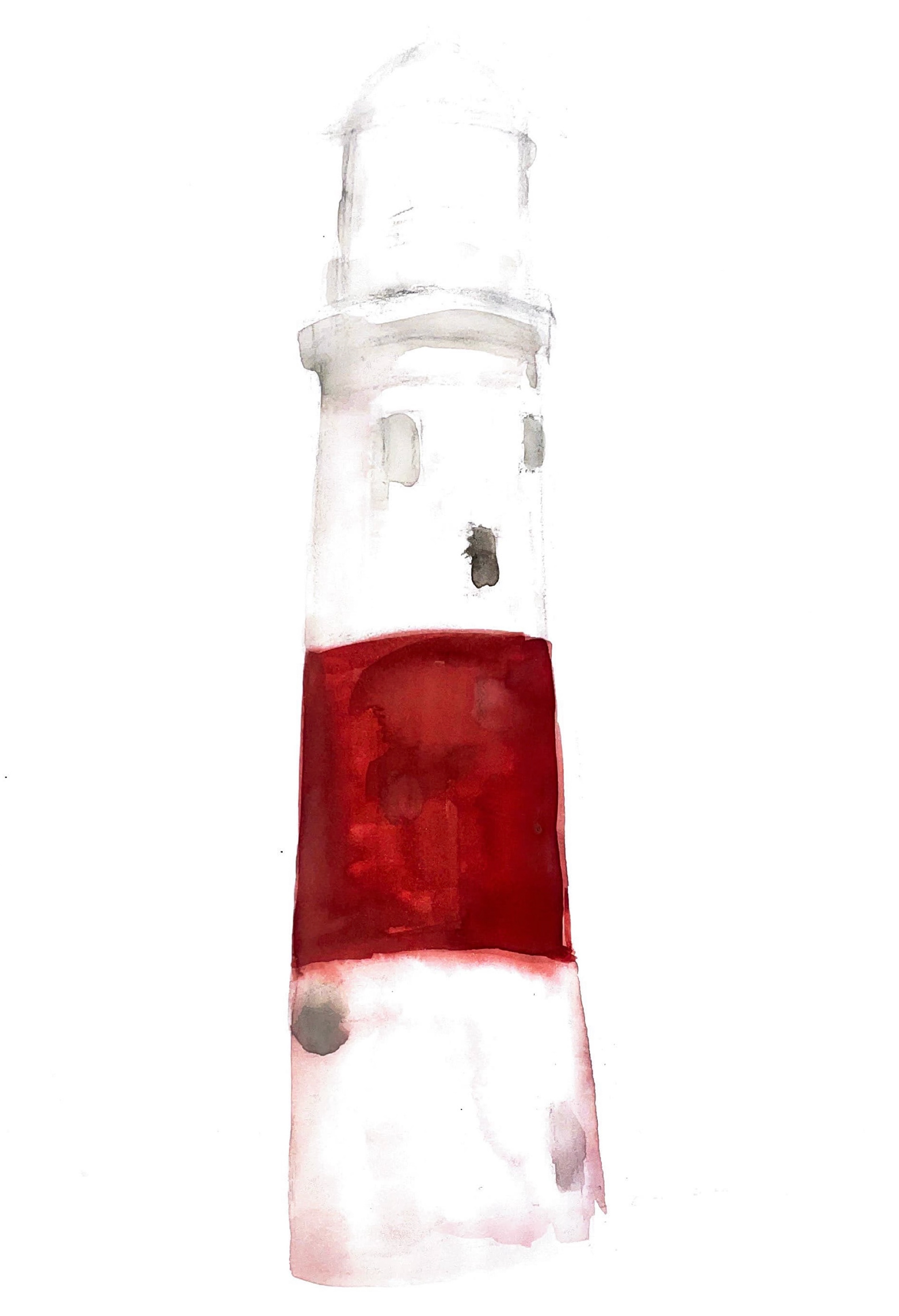
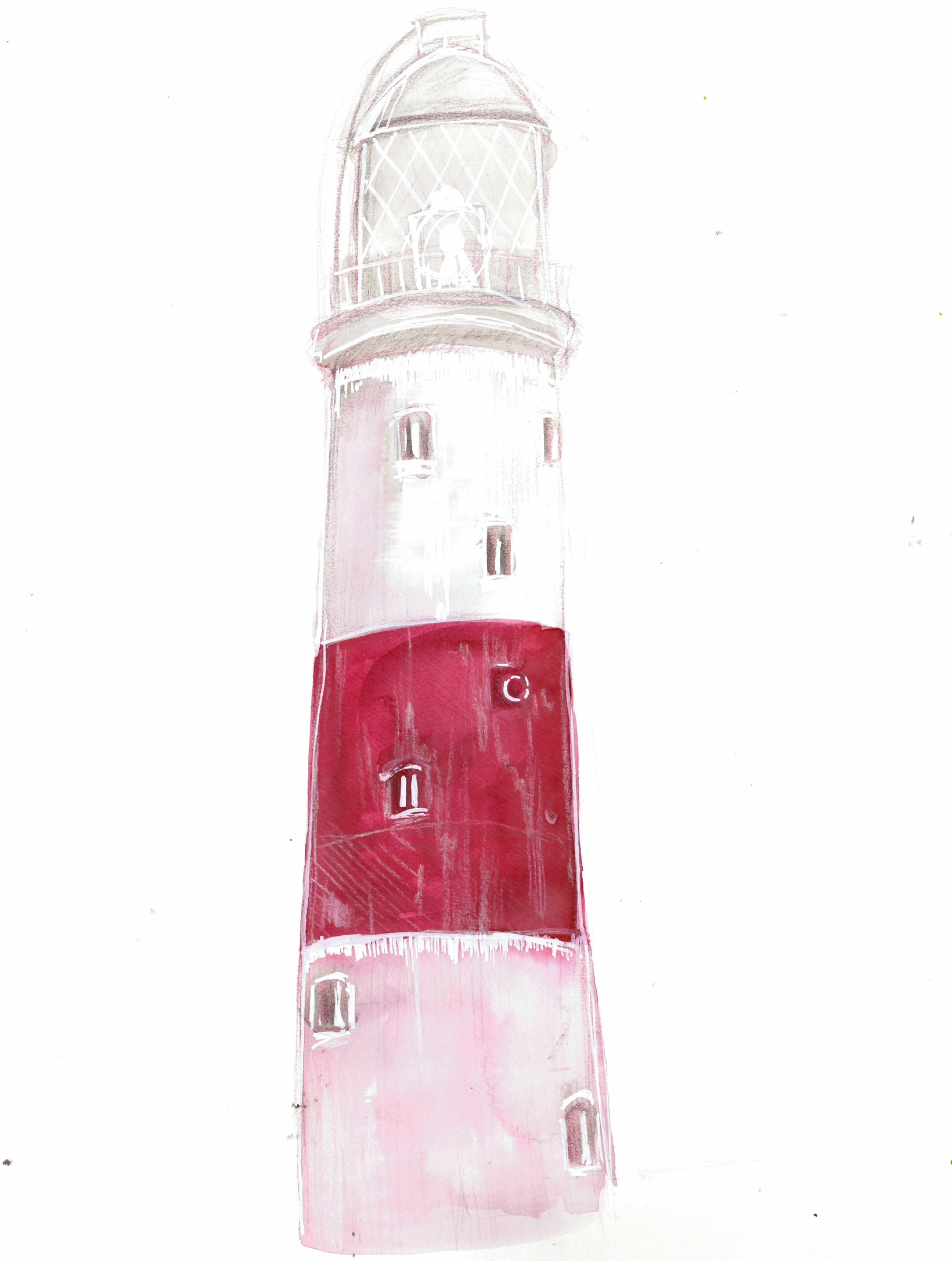
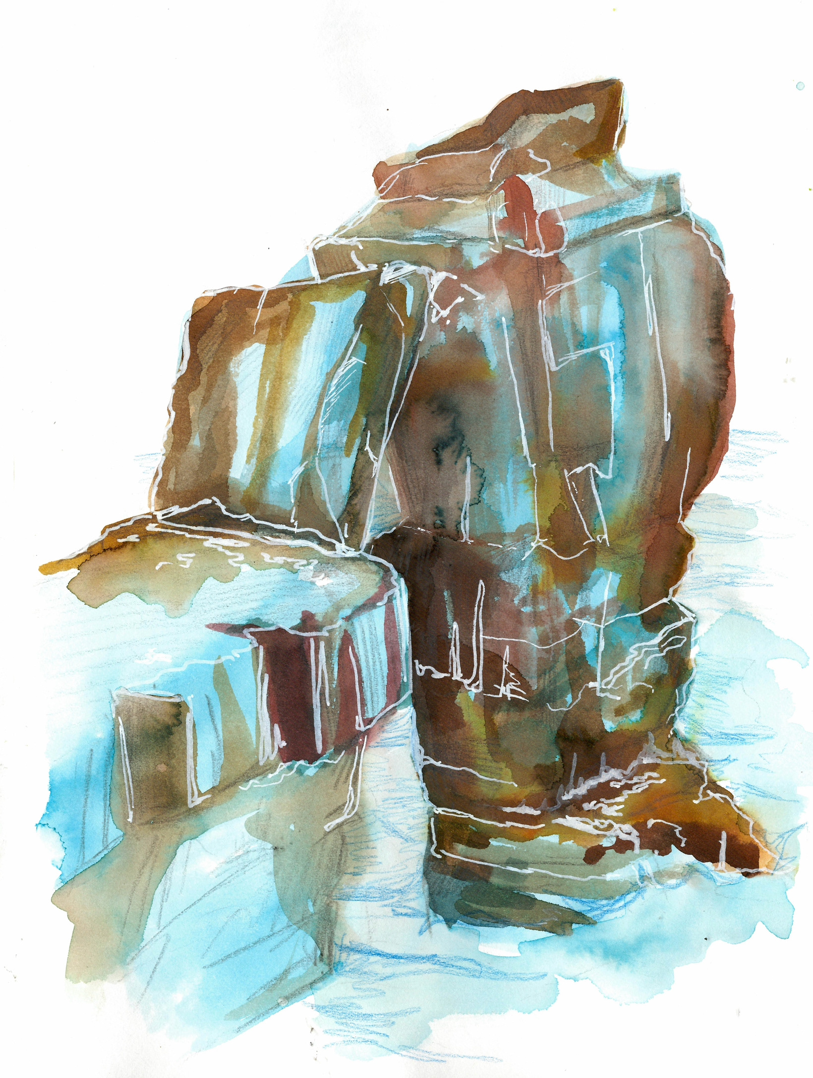
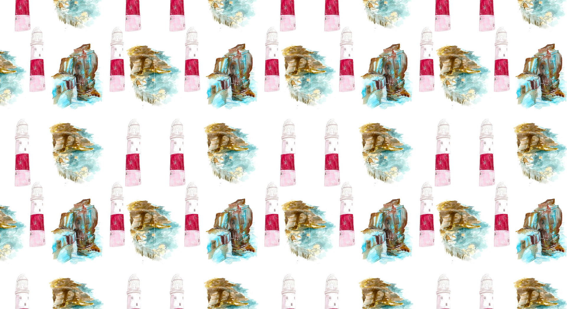
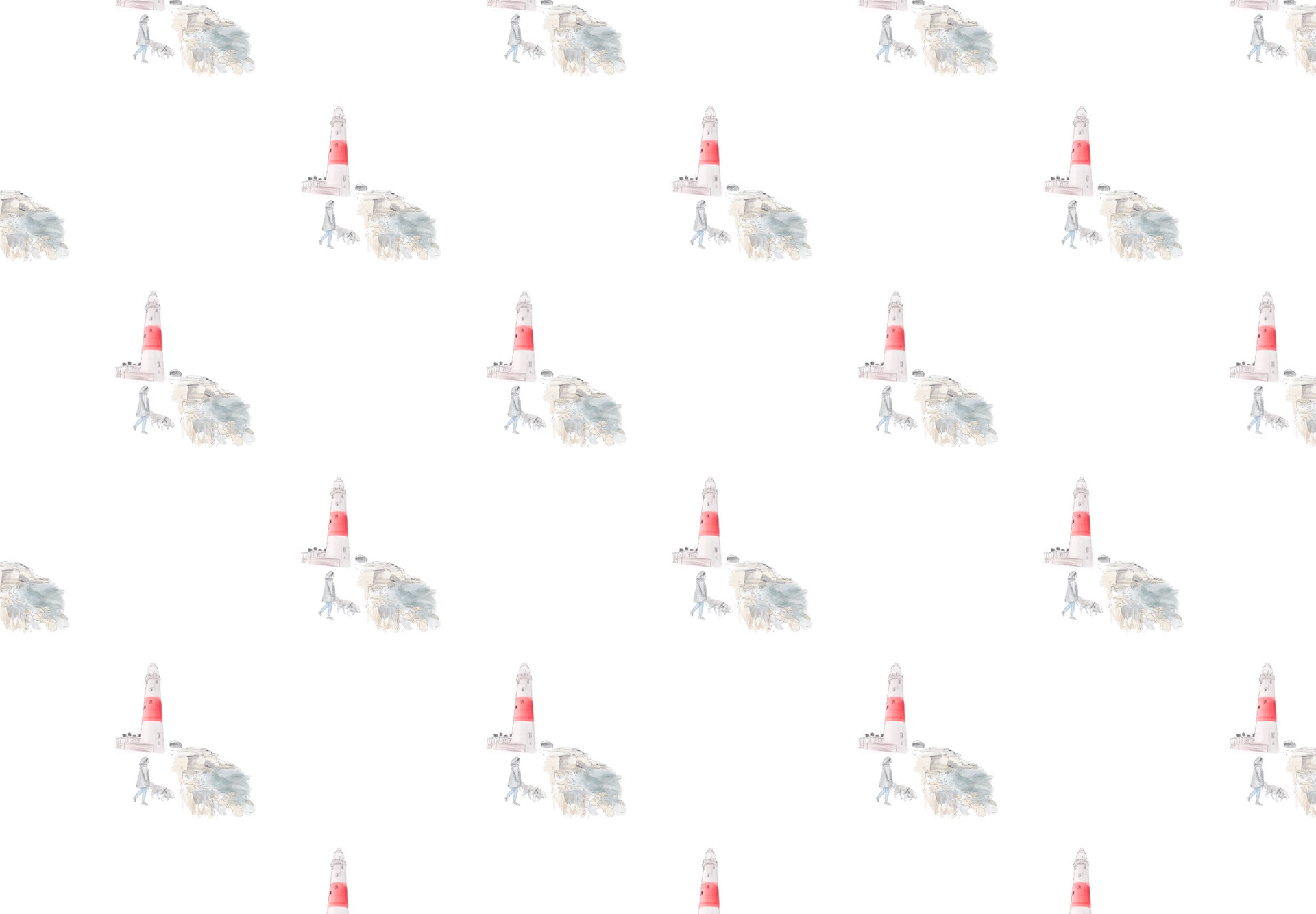
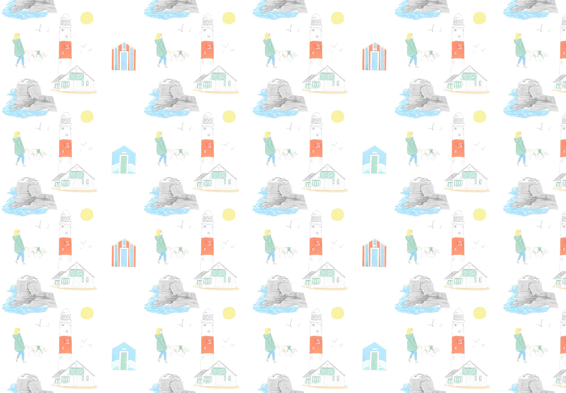
For this pattern I combined both the Pulpit rock watercolour and the lighthouse with the coastal watercolour from previously in the project. My aim was to fill the gaps while incorporating more key elements of Portland Bill. I feel that this may have been slightly more successful had I only added 1 lighthouse to the tile and used another image for the other gap. The pattern now looks too busy and there is too many varying colours going on. Moving forward, I need to take out one of the lighthouses, and maybe alter the brightness of the images. Having both a vibrant blue and red going on at the same time is very overwhelming and so I feel altering the saturation/brightness of each or redoing them with a lighter wash would work out a lot better.
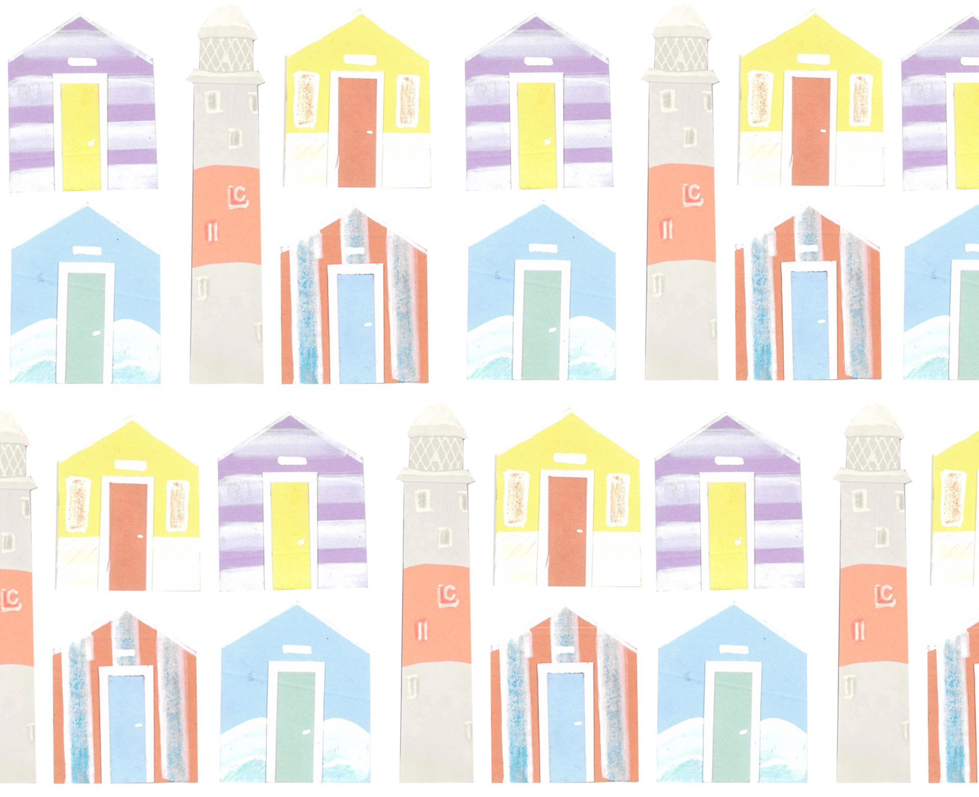
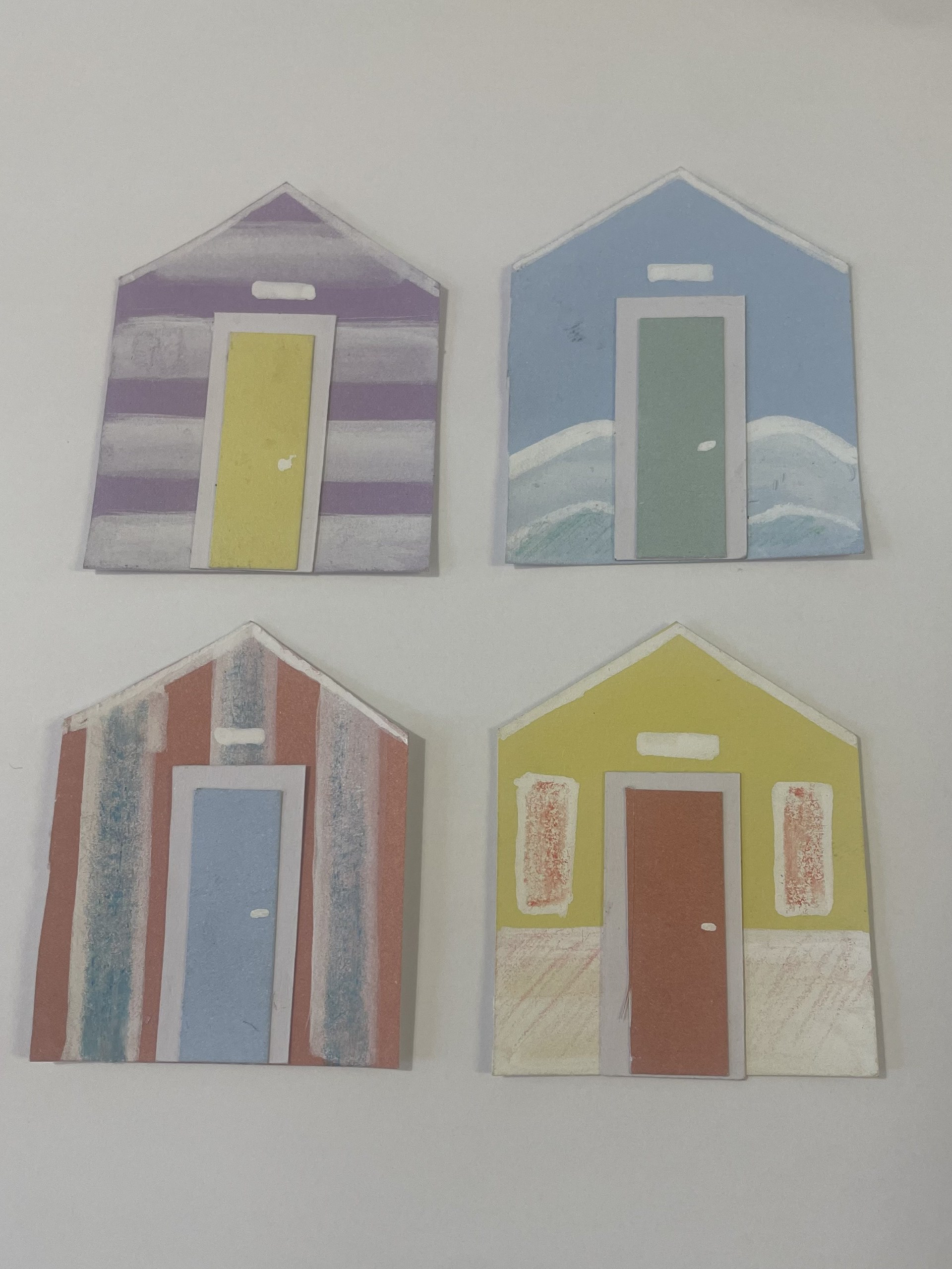
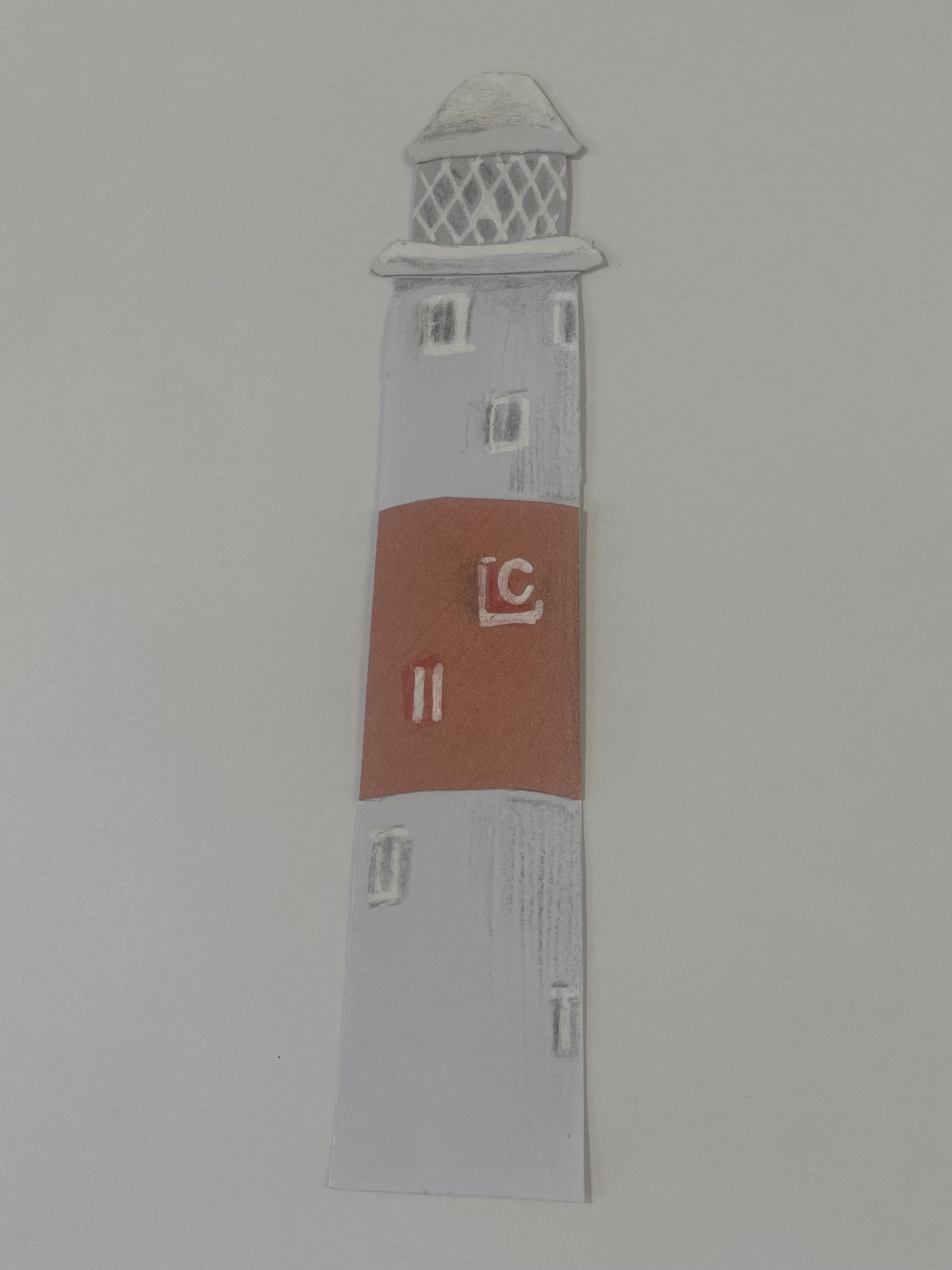
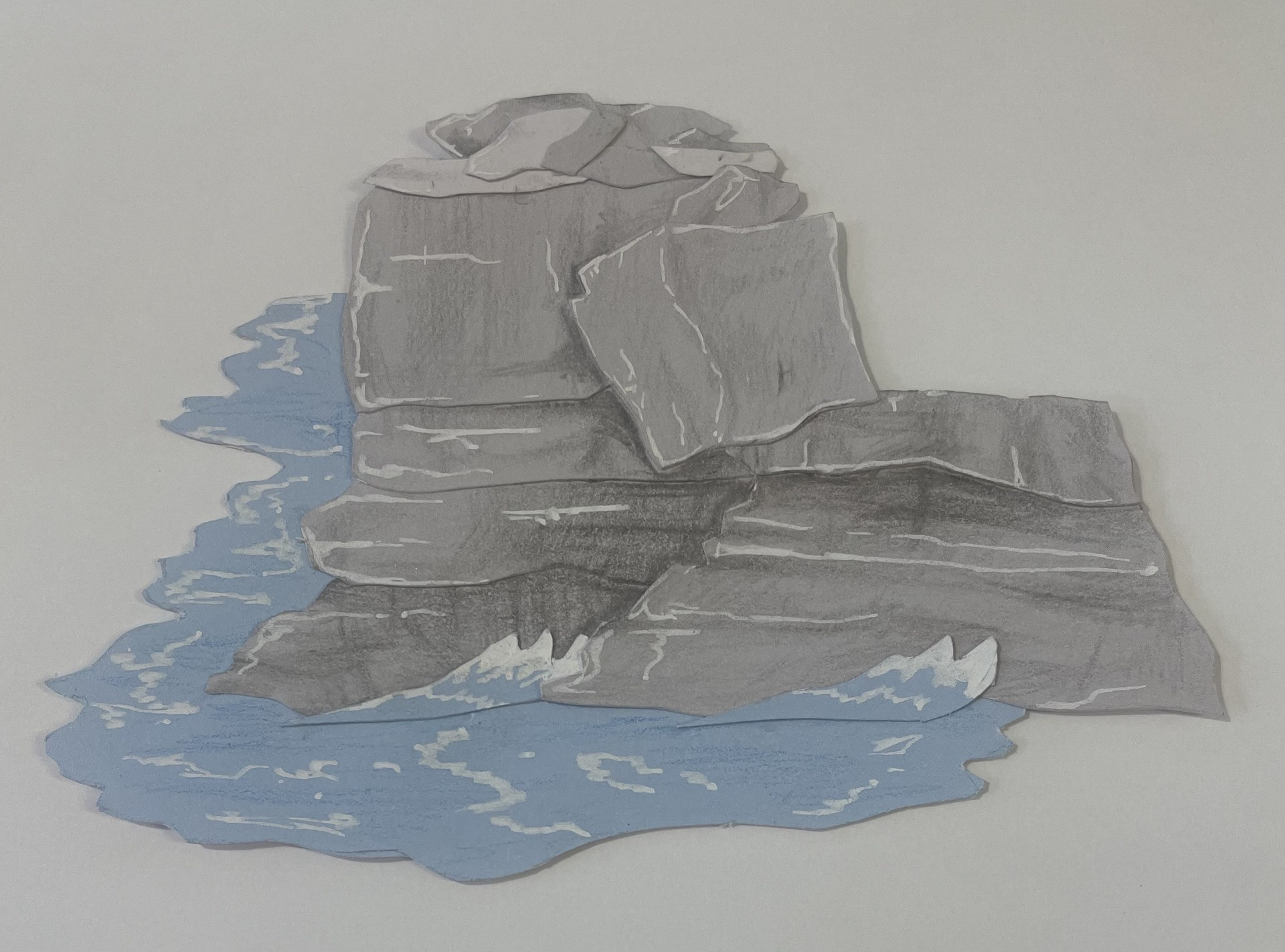
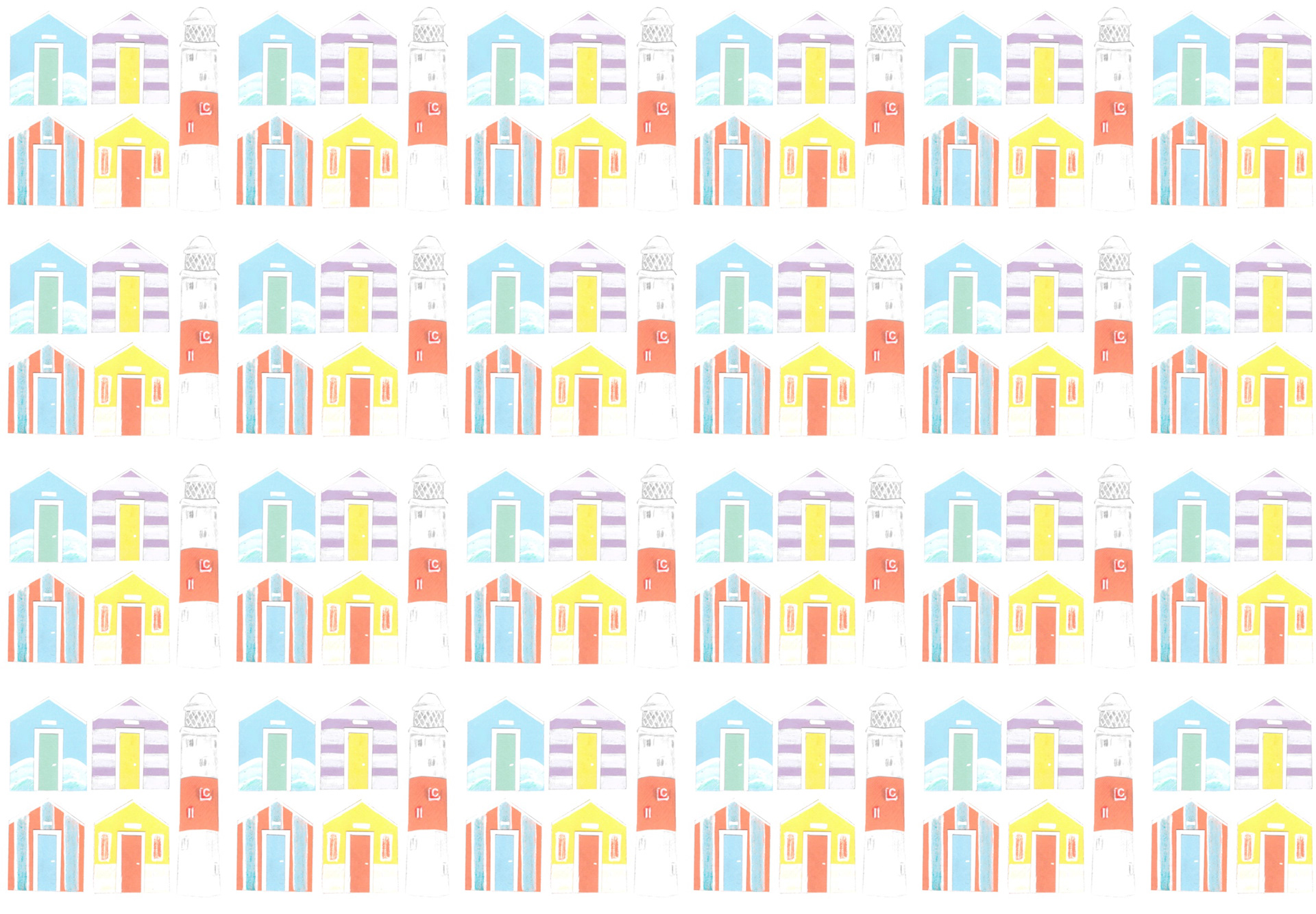
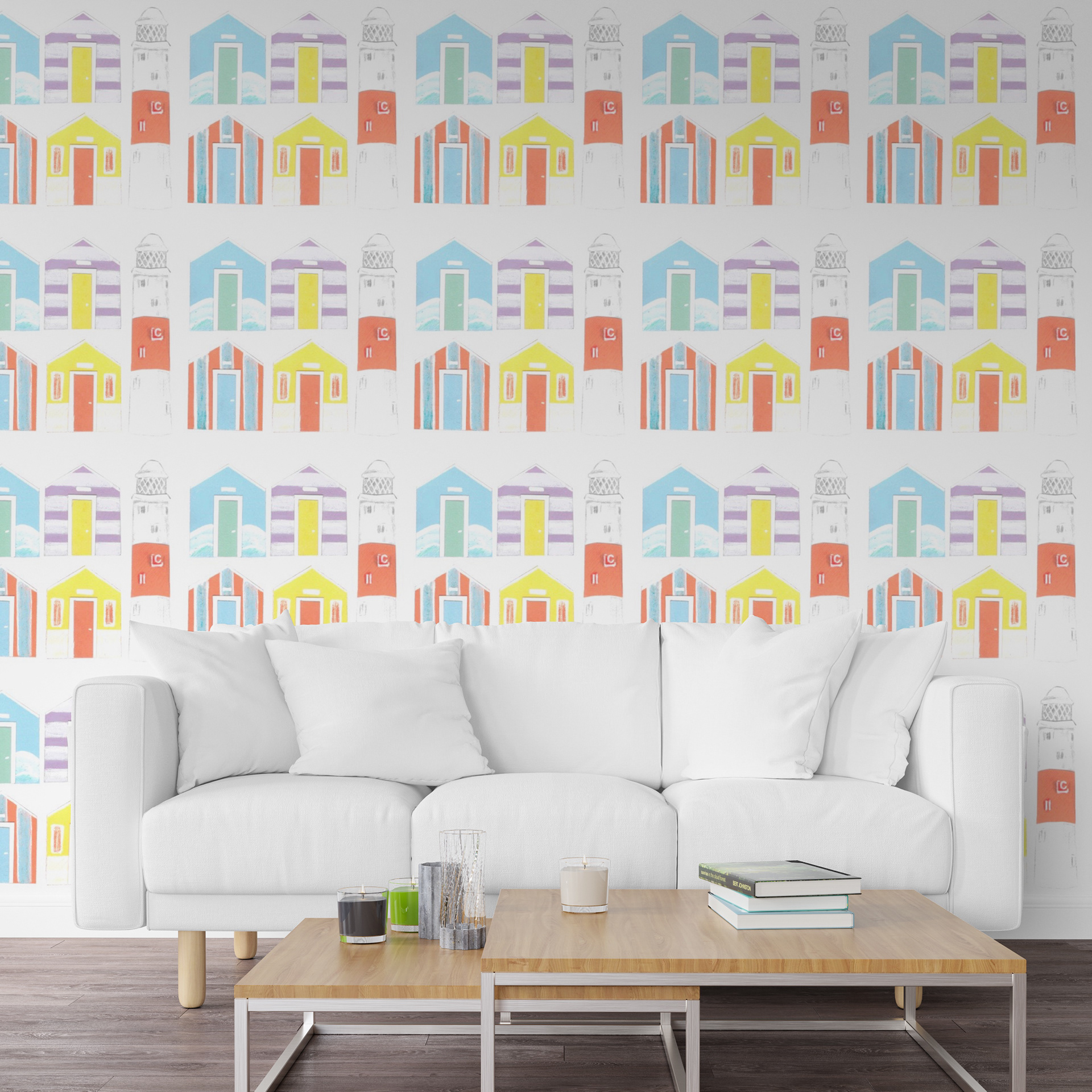
For this pattern I thought I would try using paper cut. At the start I didn’t actually think I would like this method as it seemed a lot more technical than what I’m usually drawn to. Each beach hut took around half an hour and then the lighthouse about an hour. I found it really difficult letting go of specific measurements, because of this I ended up drawing on the details of each piece to quicken the process. I feel that this actually improved the designs as it added another layer of texture. I arranged them into a typology kind of pattern and actually really love how this turned out. I kept to a specific set of pastel papers and feel that the combination of the minimal colours and even arrangement is really pleasing to the eyes.
I think I will continue to explore this method because of how successful it turned out. To move forward I might create some more variations of beach huts and possibly incorporating some other coastal elements too.
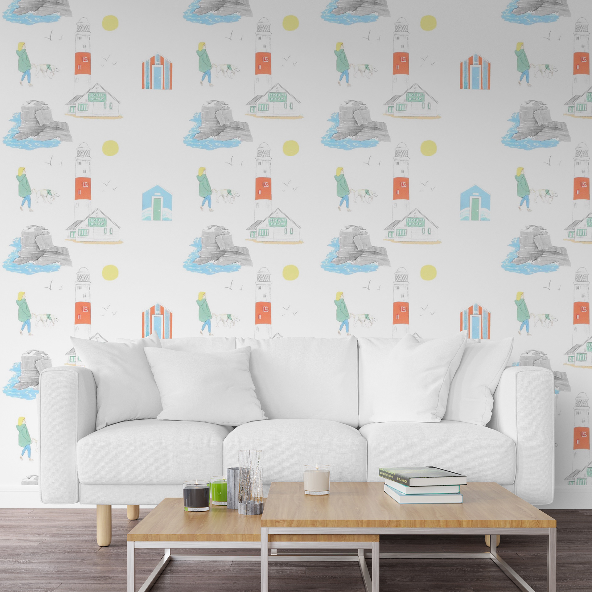
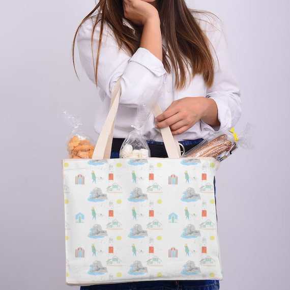
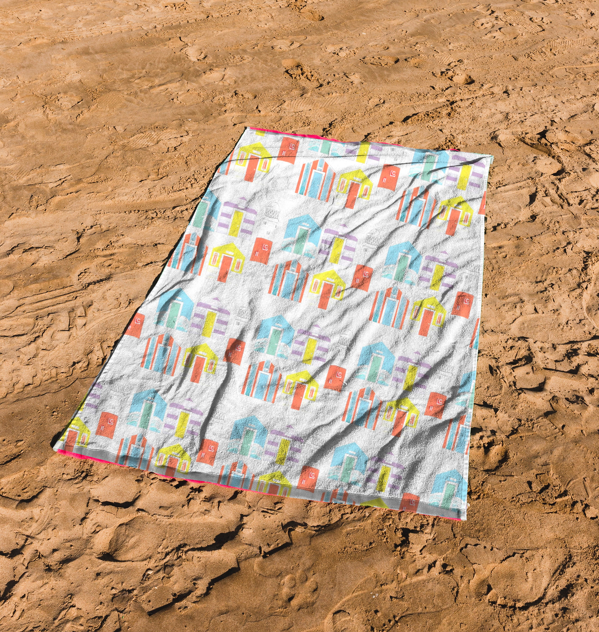
Caroline and Hollie gave positive feedback to my final presentation, they seemed to really enjoy the personal approach to the theme. They said that each of the prints work well together and that the colour scheme was very complimentary and worked well for the topic. They also really loved that I brought in the physical paper cuts for them to see and further expressed how important and admired this is by clients in the professional world. One thing they did say is that it’s a shame how much the appearance of the paper cuts is lost in the pattern. Caroline said how without the understanding that they were paper cuts, it may have been assumed that they were made digitally. I agree with what she was saying and so moving forward I feel that if a slight shadows was placed between the layers this would be more successful.
Another thing they expressed was how nice it is to arrange the patterns in person, physically moving around the components by hand and photographing them at each stage. I think this is a really good idea and would allow me to properly play around with placement.