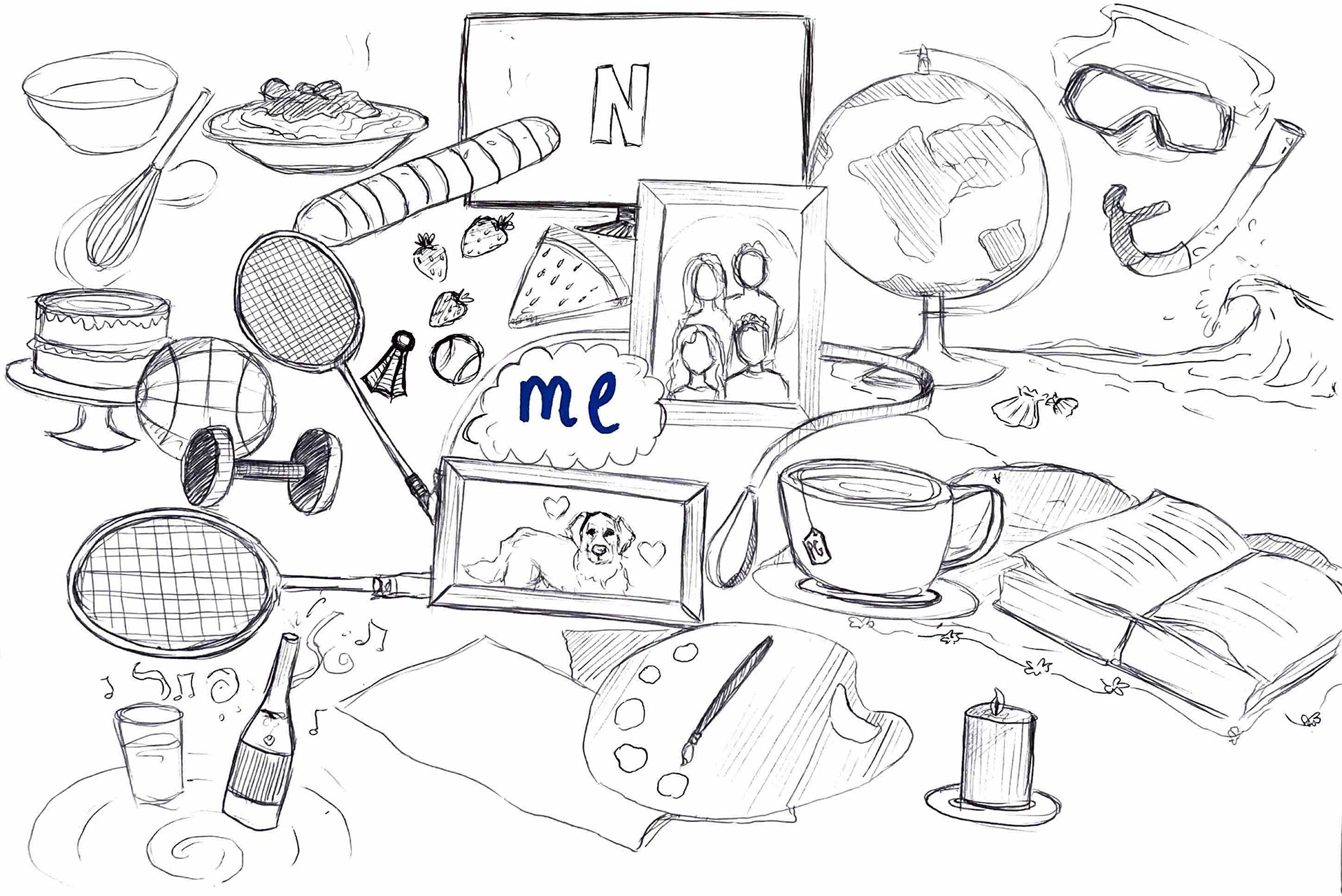
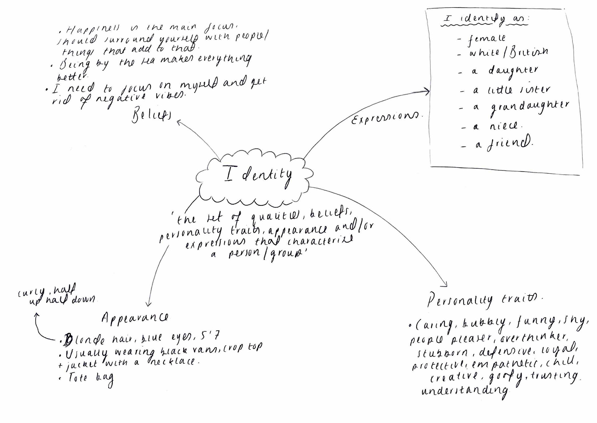
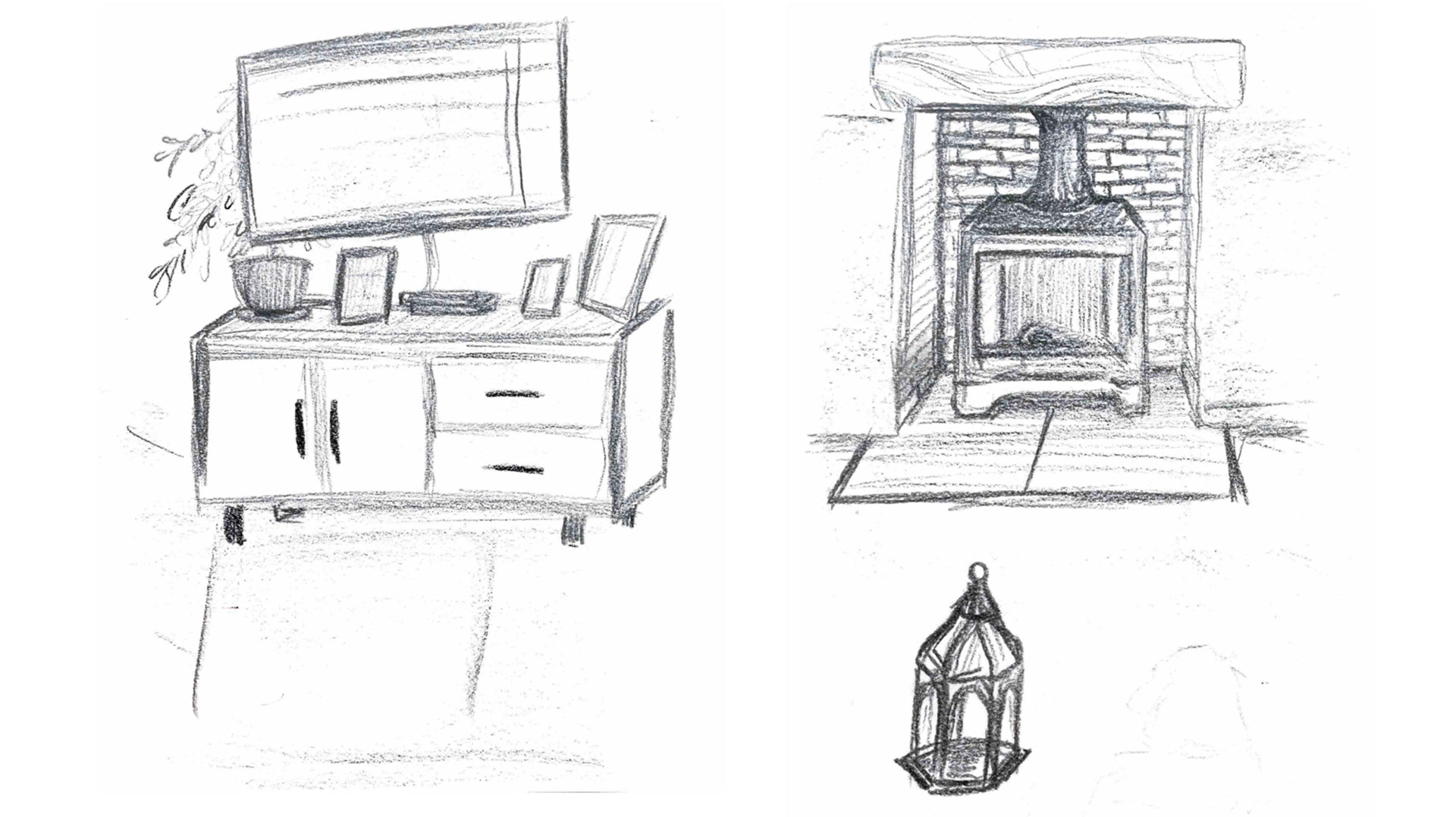
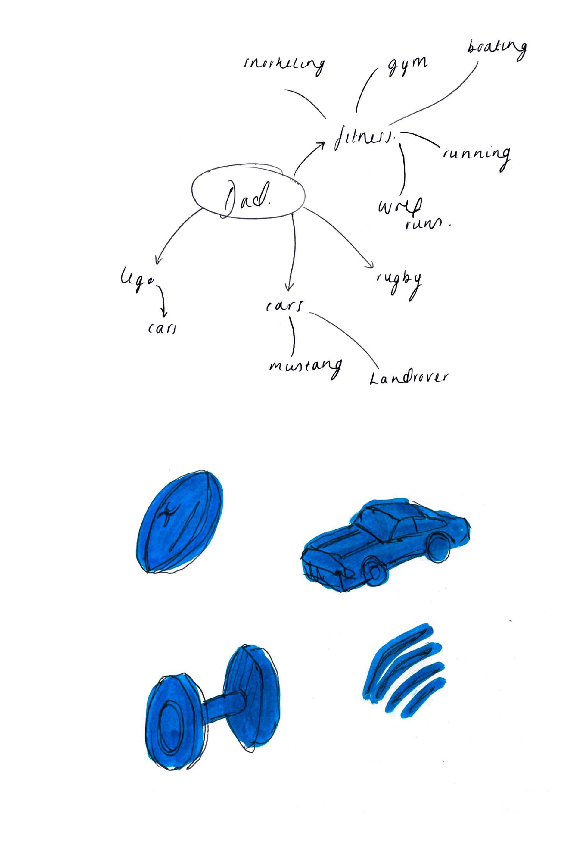
When this brief was first introduced to us I began thinking more about the things that build me as a person; my personality, my values, my physical attributes and my hobbies & interests. I put these things into a visual mind map so that I could clearly lay out the things that are most important to me. This was actually very insightful and I enjoyed delving deep into what I enjoyed doing. Moving forward this can help me find a focus.
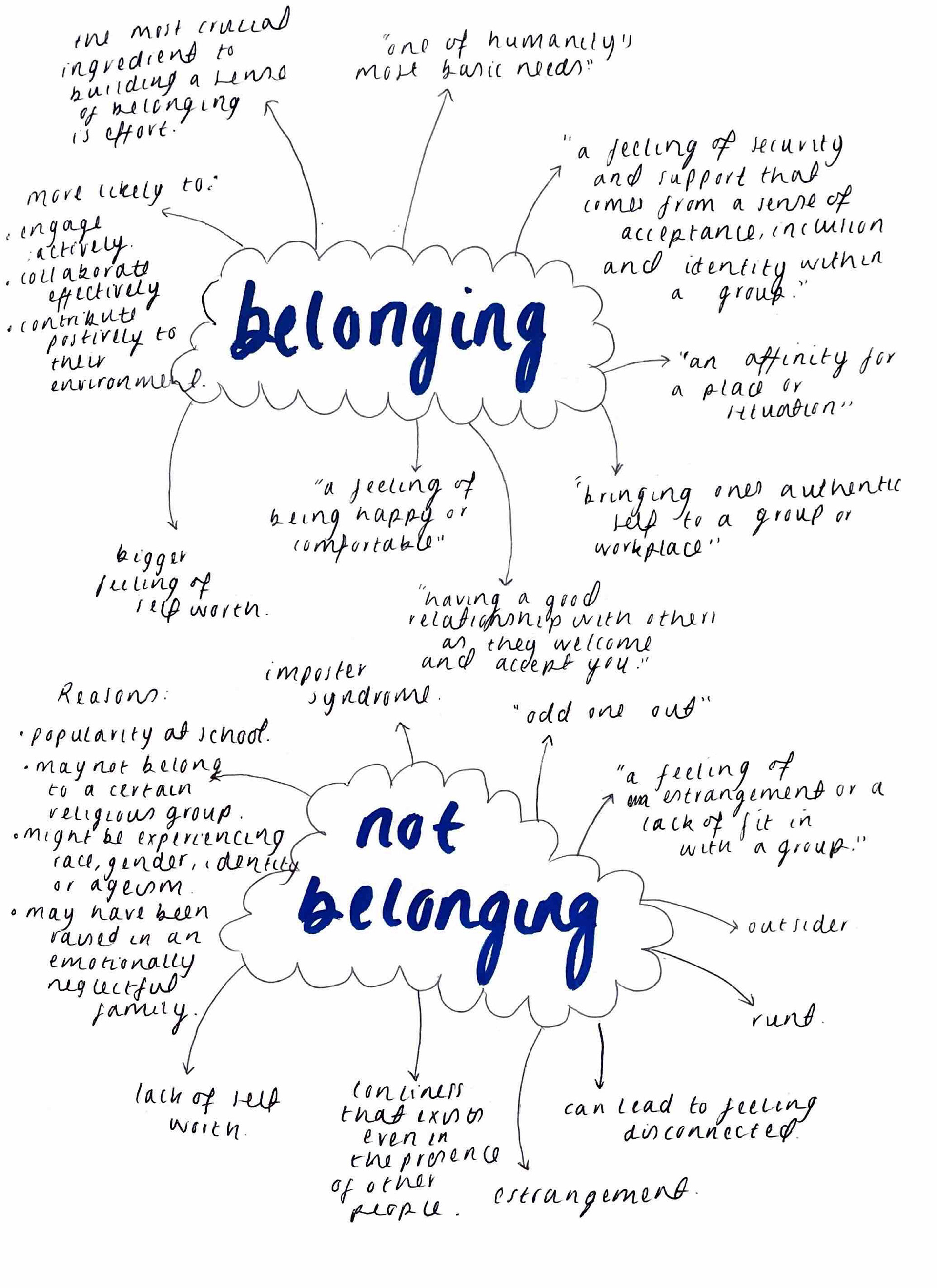
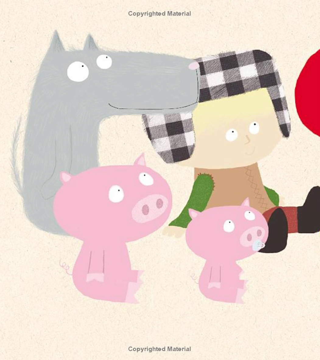
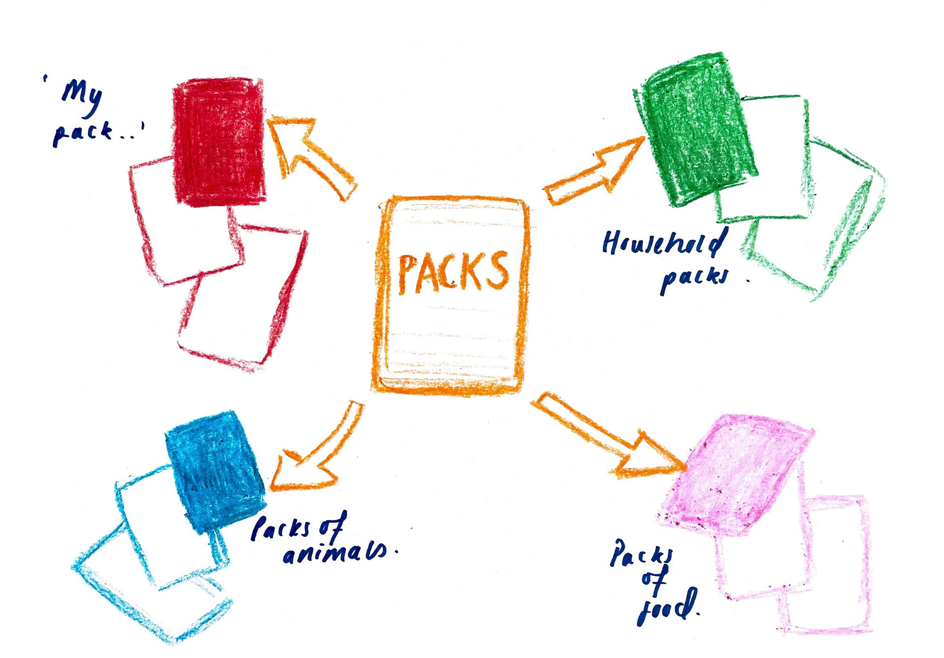
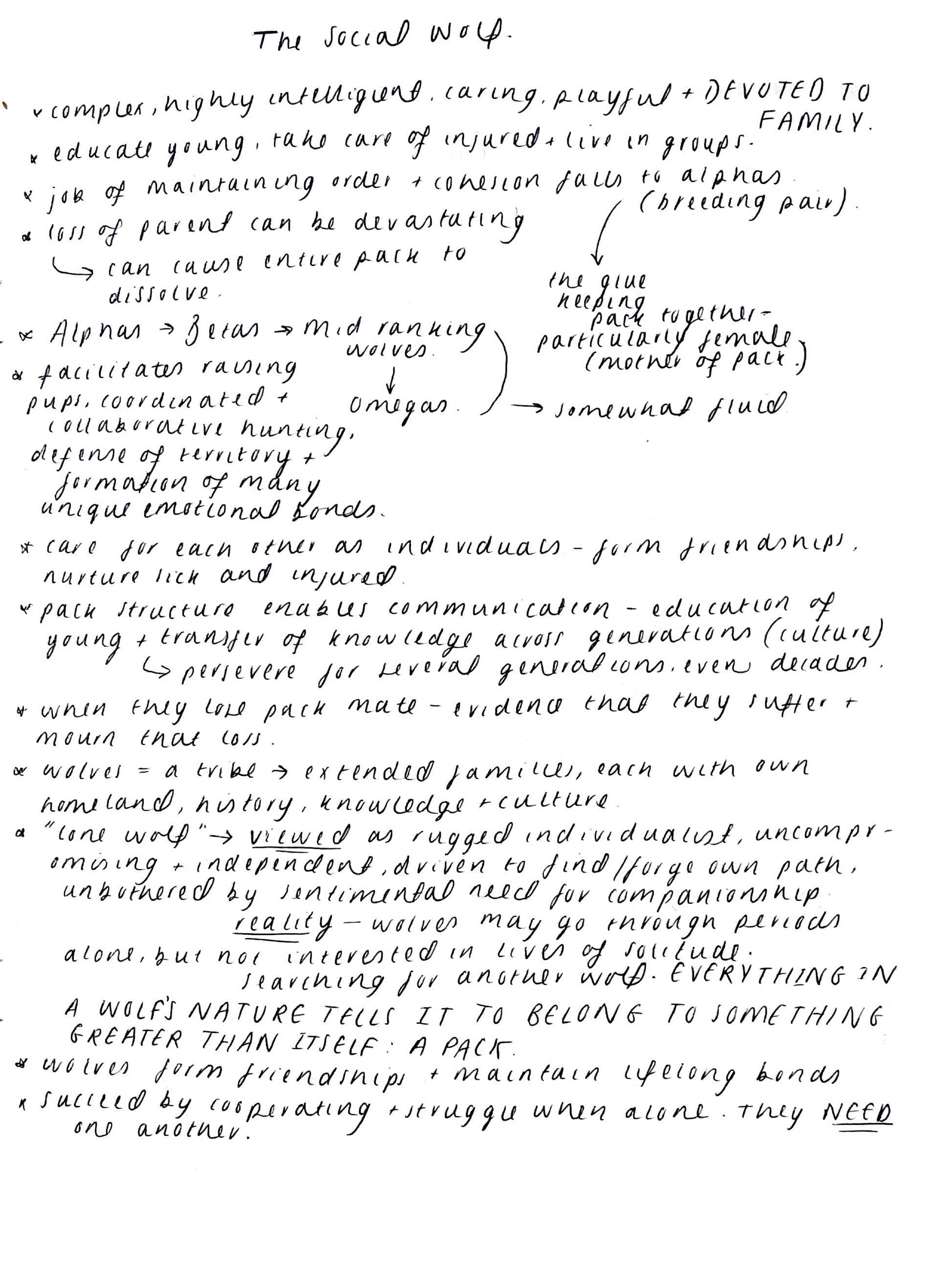
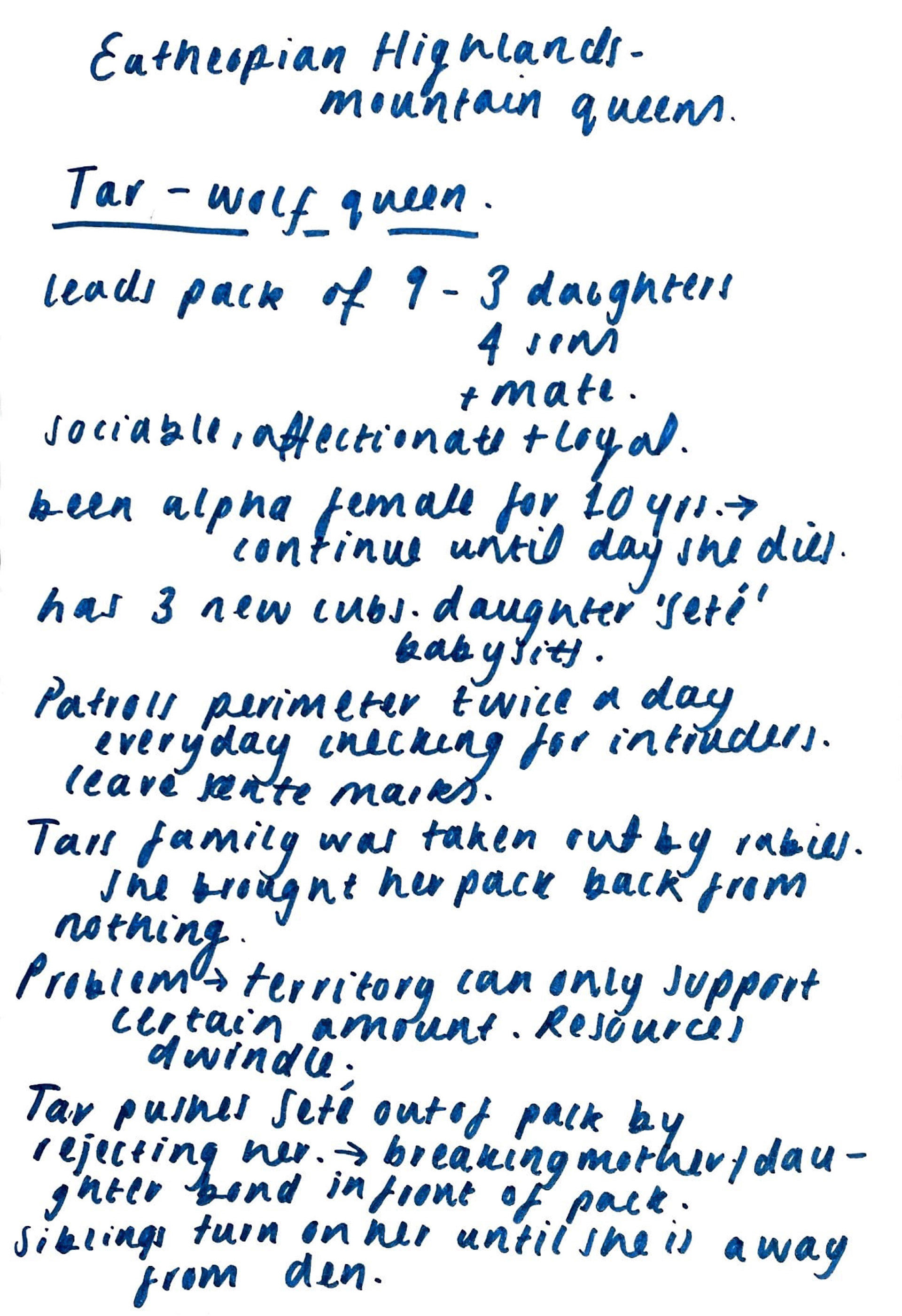
I instantly connected with the belonging and not belonging brief. I feel that it really resonated with me due to family being such a core value in my life. I instantly knew where I most belonged-with them, and knew it would be rewarding to involve them in my work in some way. The word 'pack' also jumped out to me, the idea of looking at different family units and how they belong. And of course, allowing me to think of some form of animal imagery.
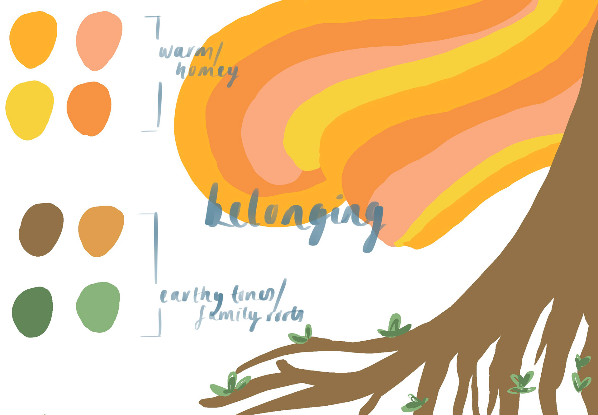
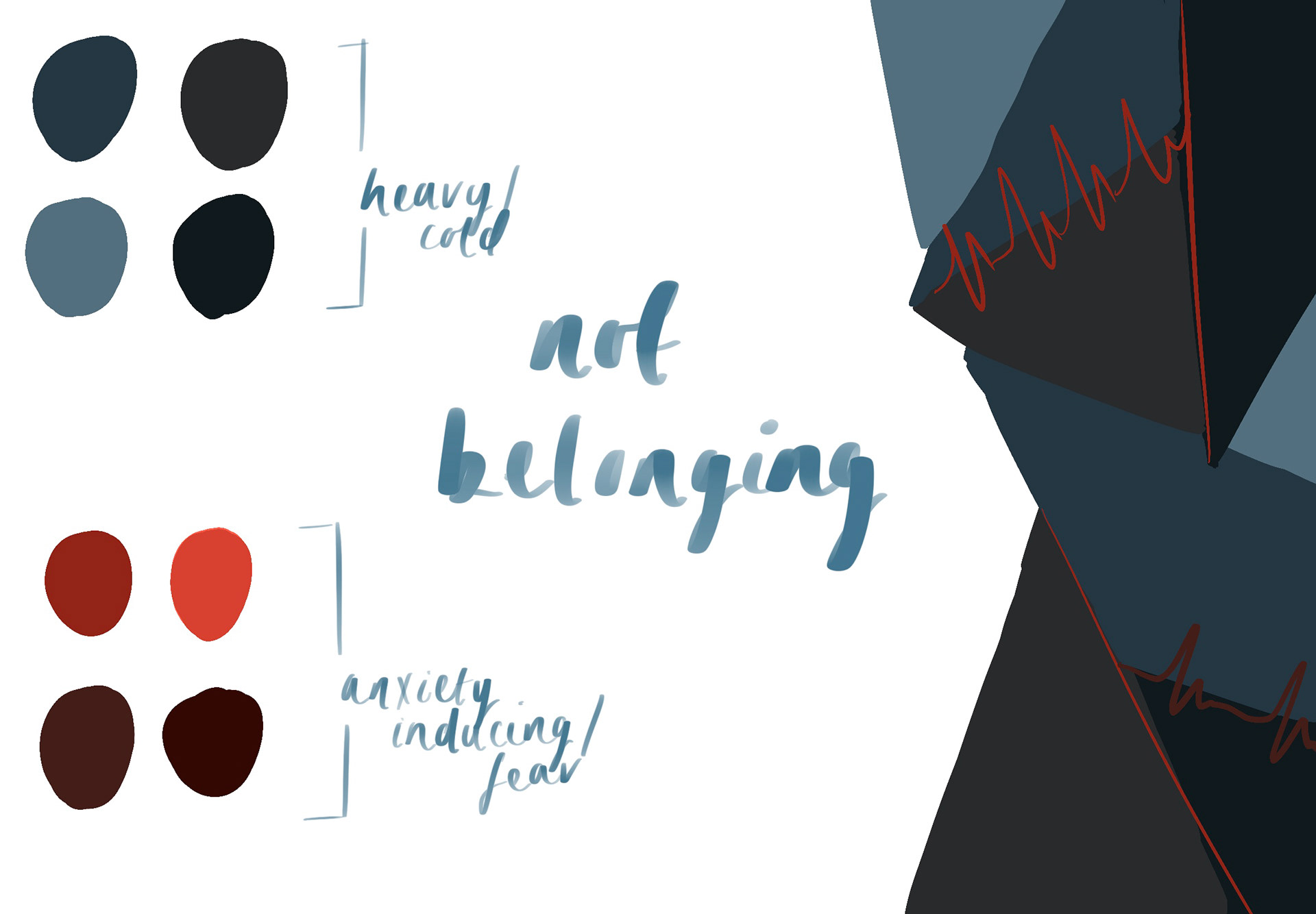
Moving forward I visualised belonging and not belonging and noted down colours and shapes that resonated with each. Belonging being very warm and flowing, against not belonging being dark and uncomfortable.
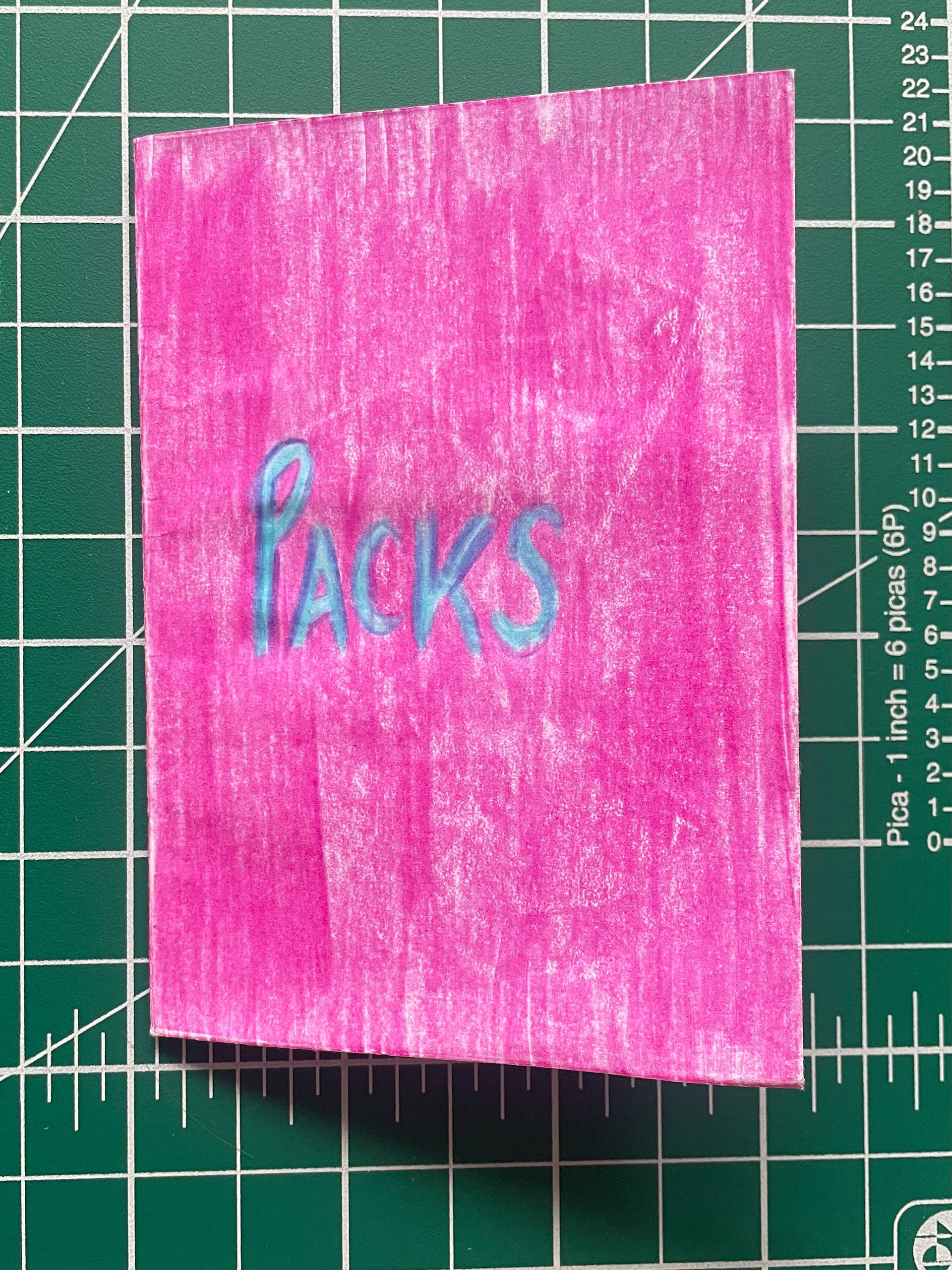
My pack
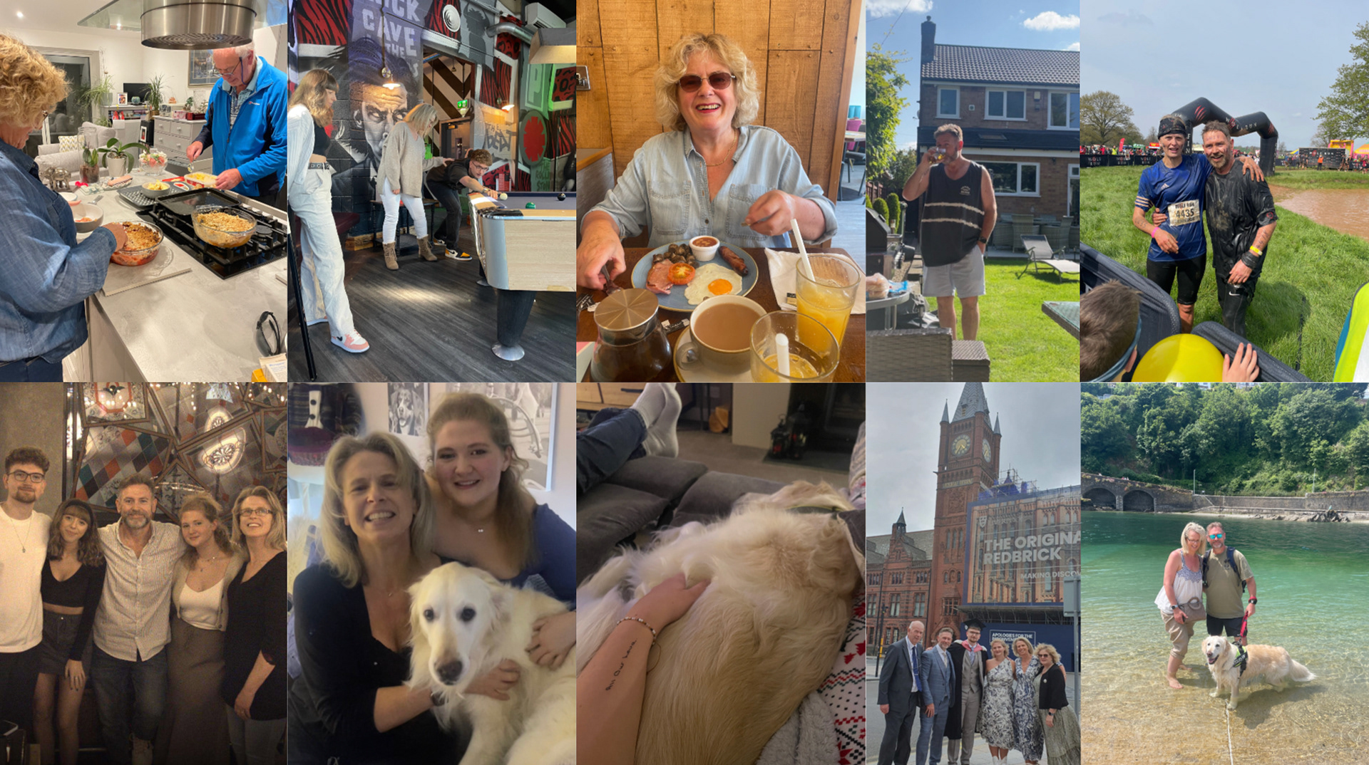
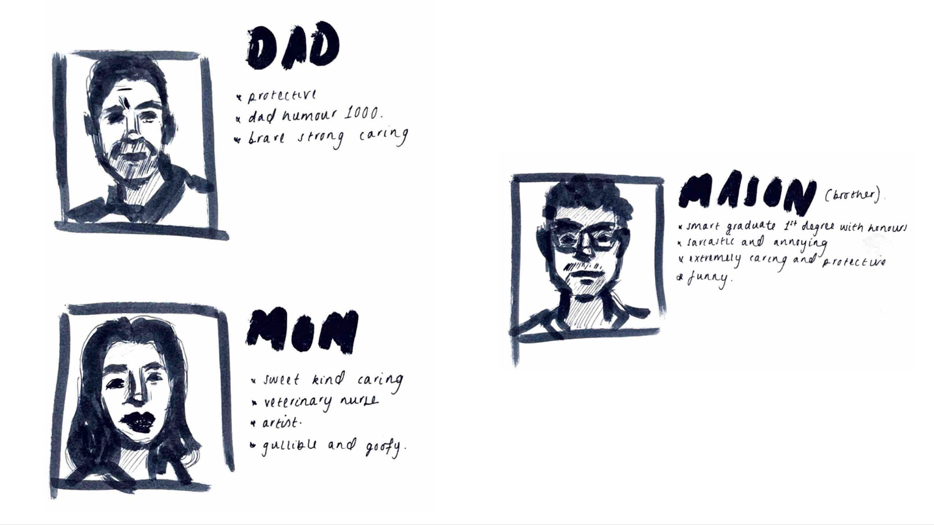
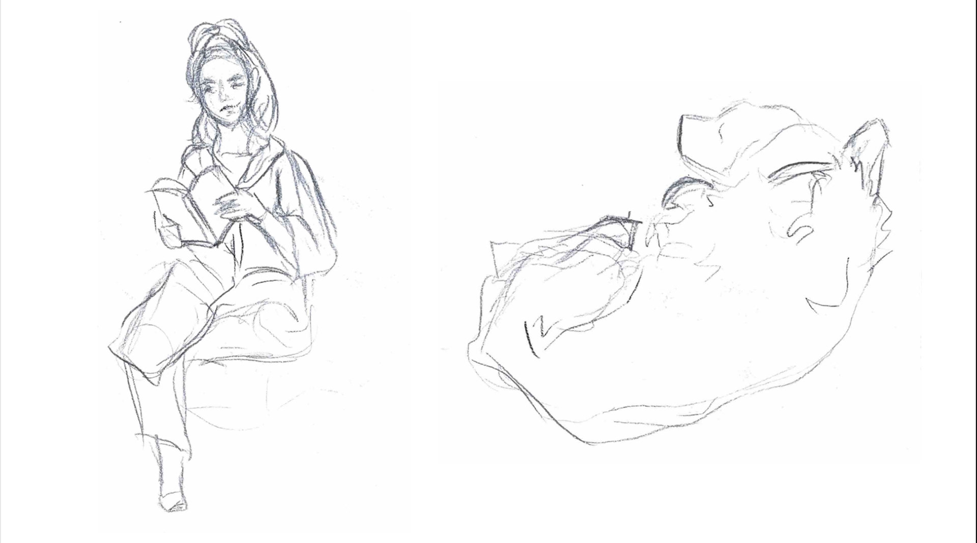
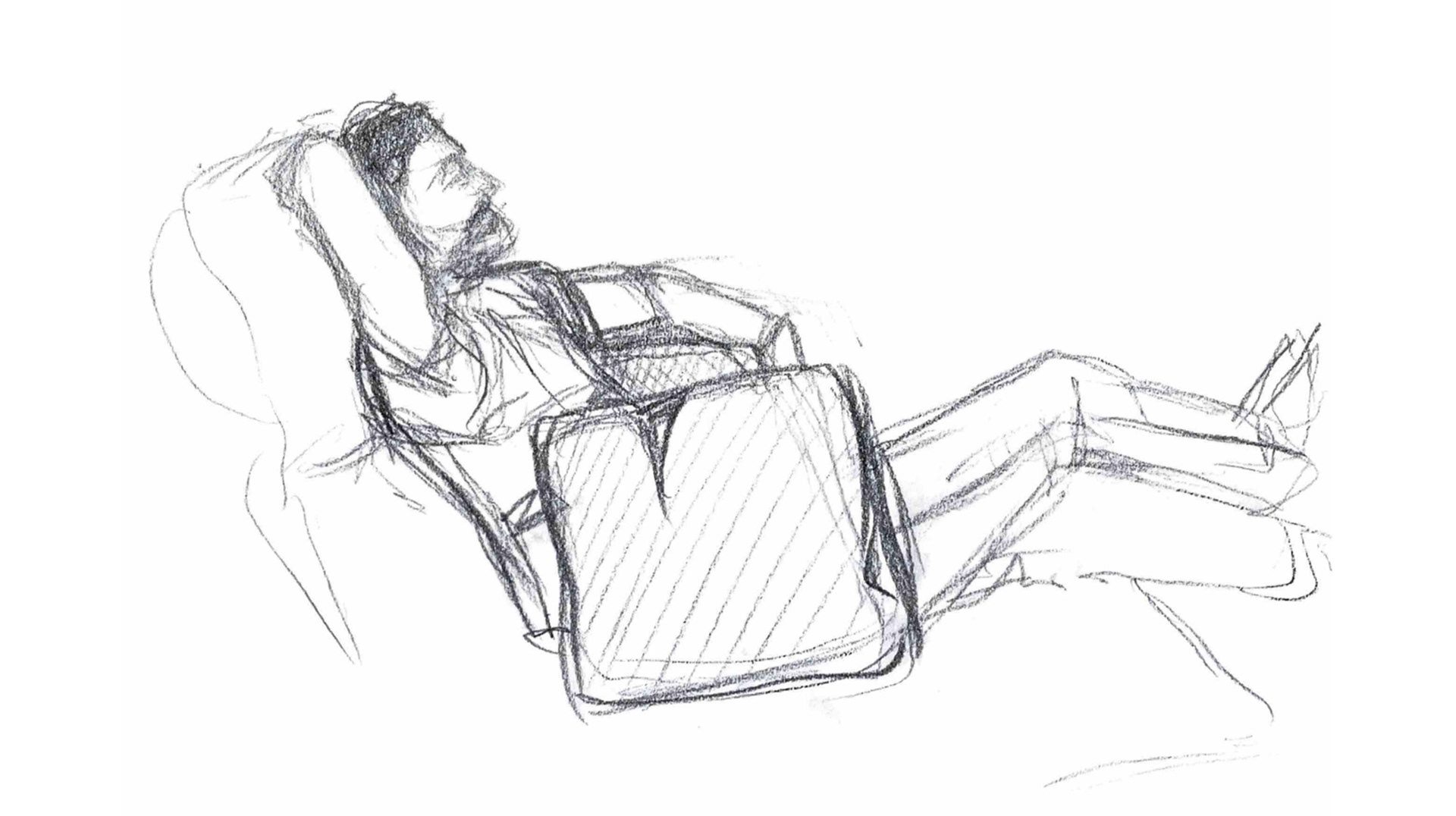
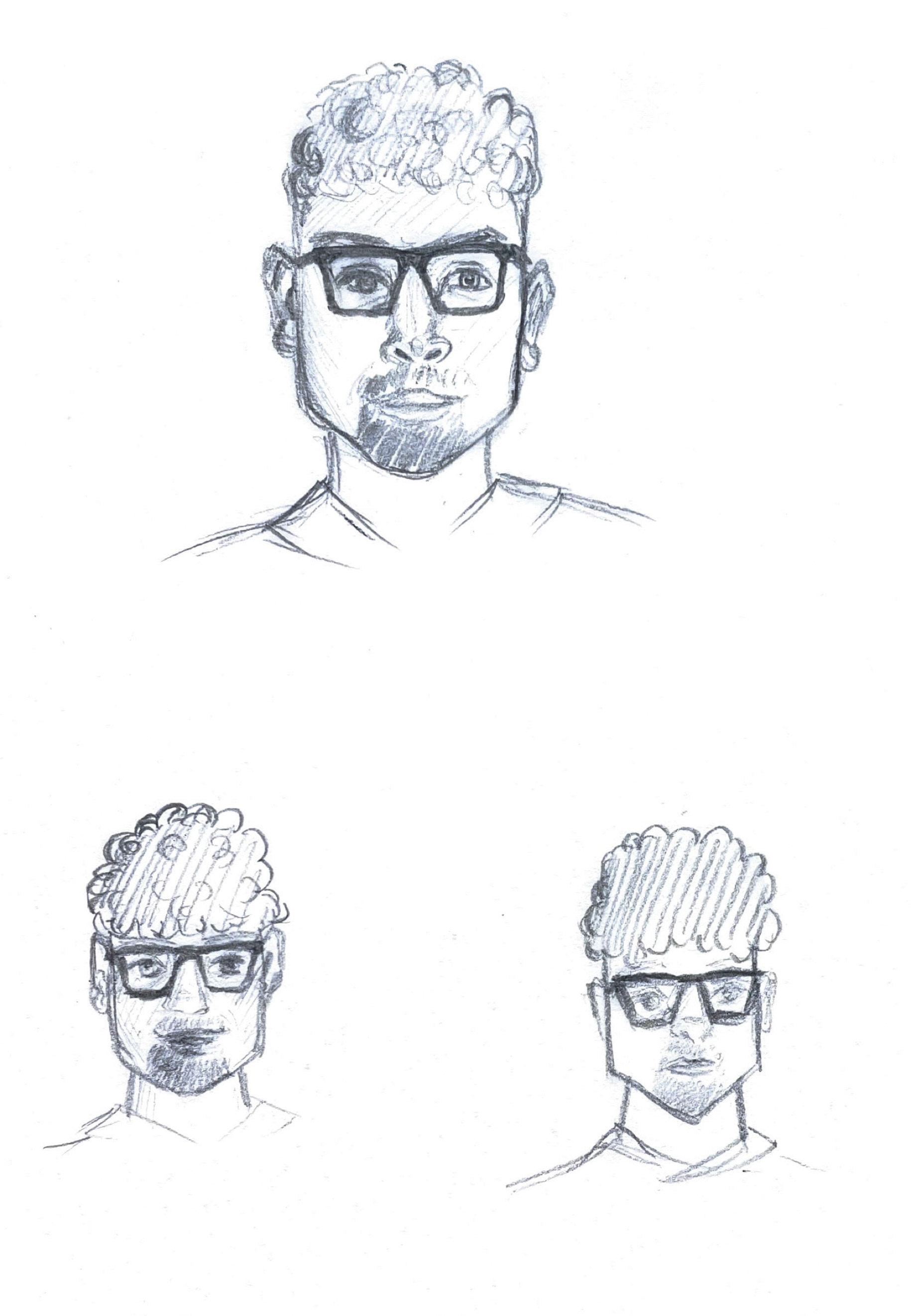
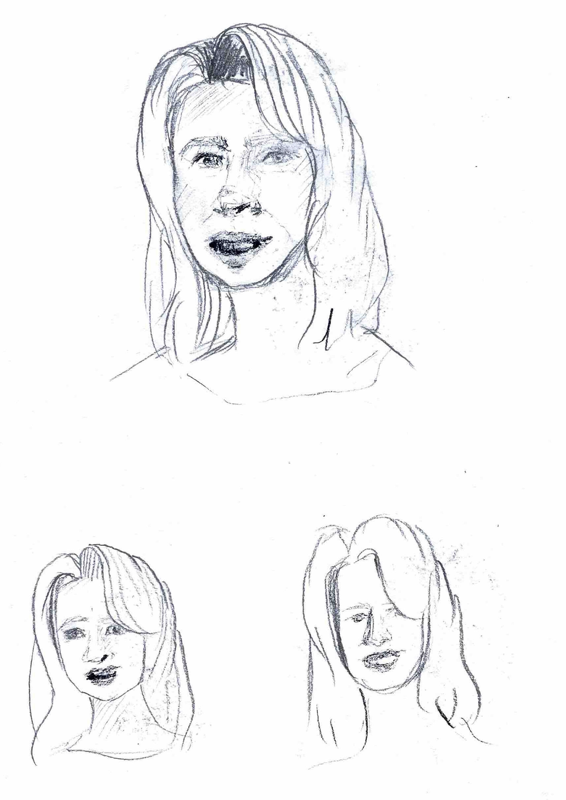
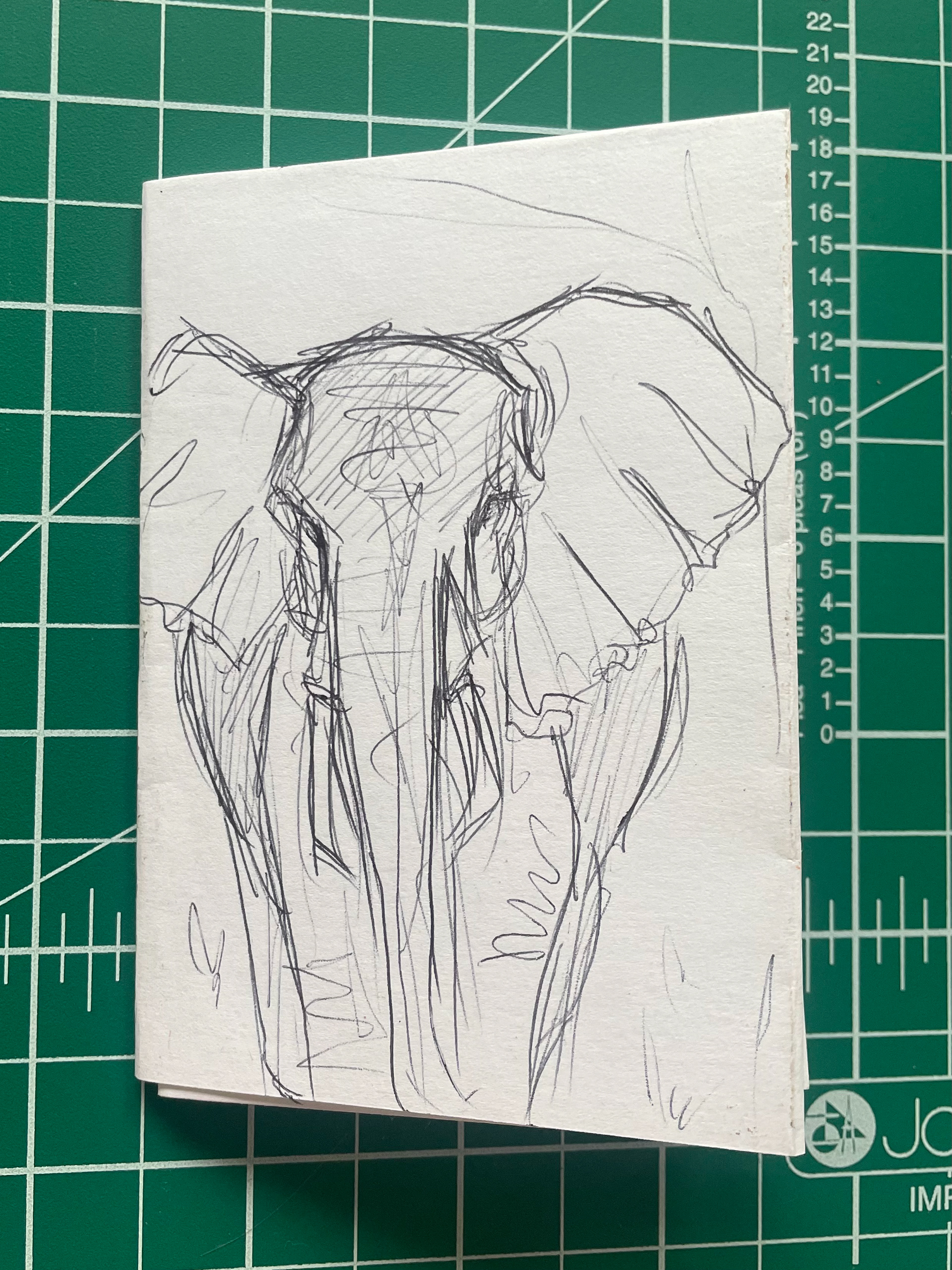
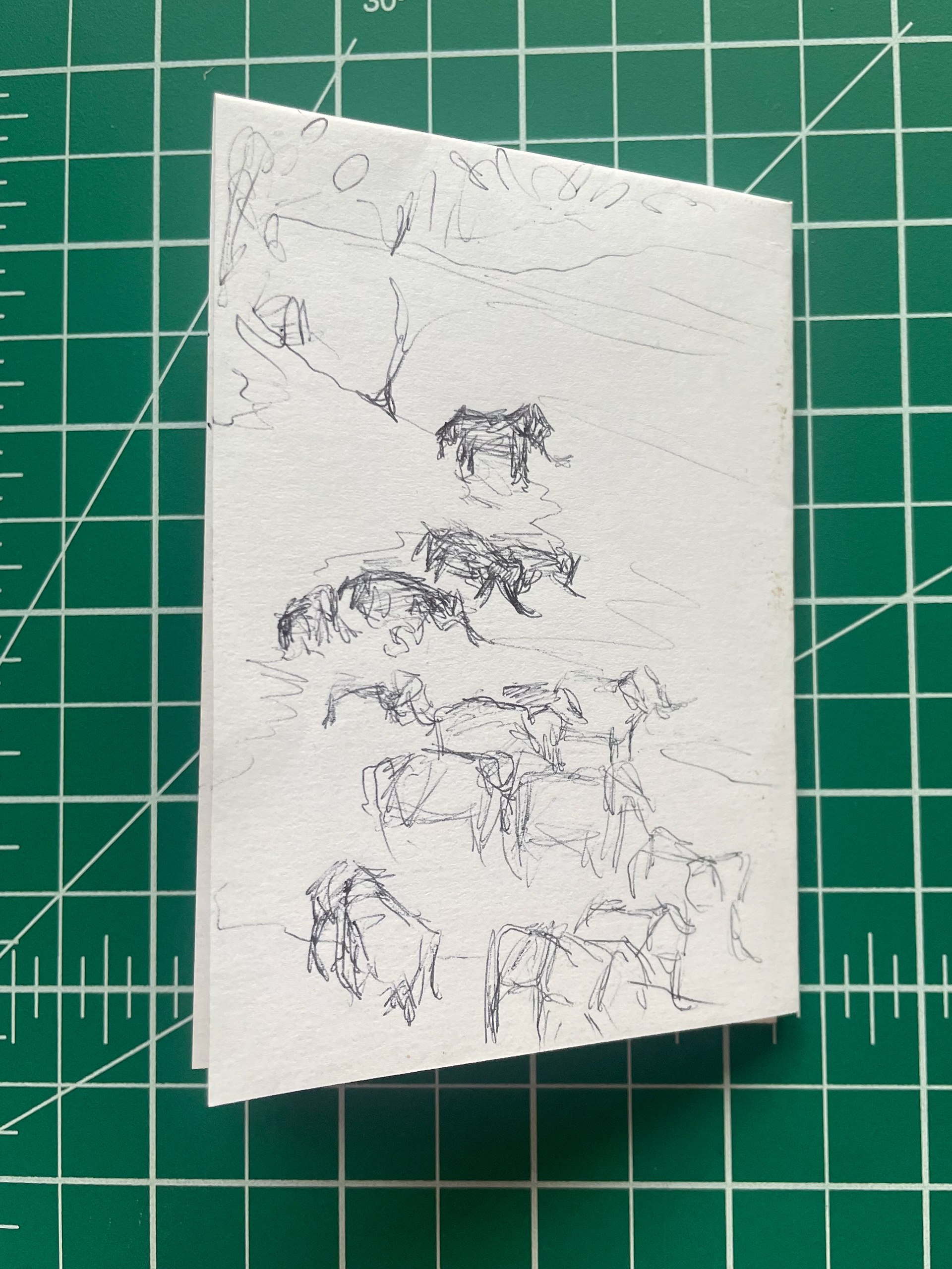
It was really nice being able to illustrate my family, they deserve to be valued in my work. I tried out a couple different methods of drawing them, along with noting down their key attributes and then carried out some life drawings while I was visiting home. Doing these drawings actually further pushed that thought of belonging, their presence always making me feel at home.
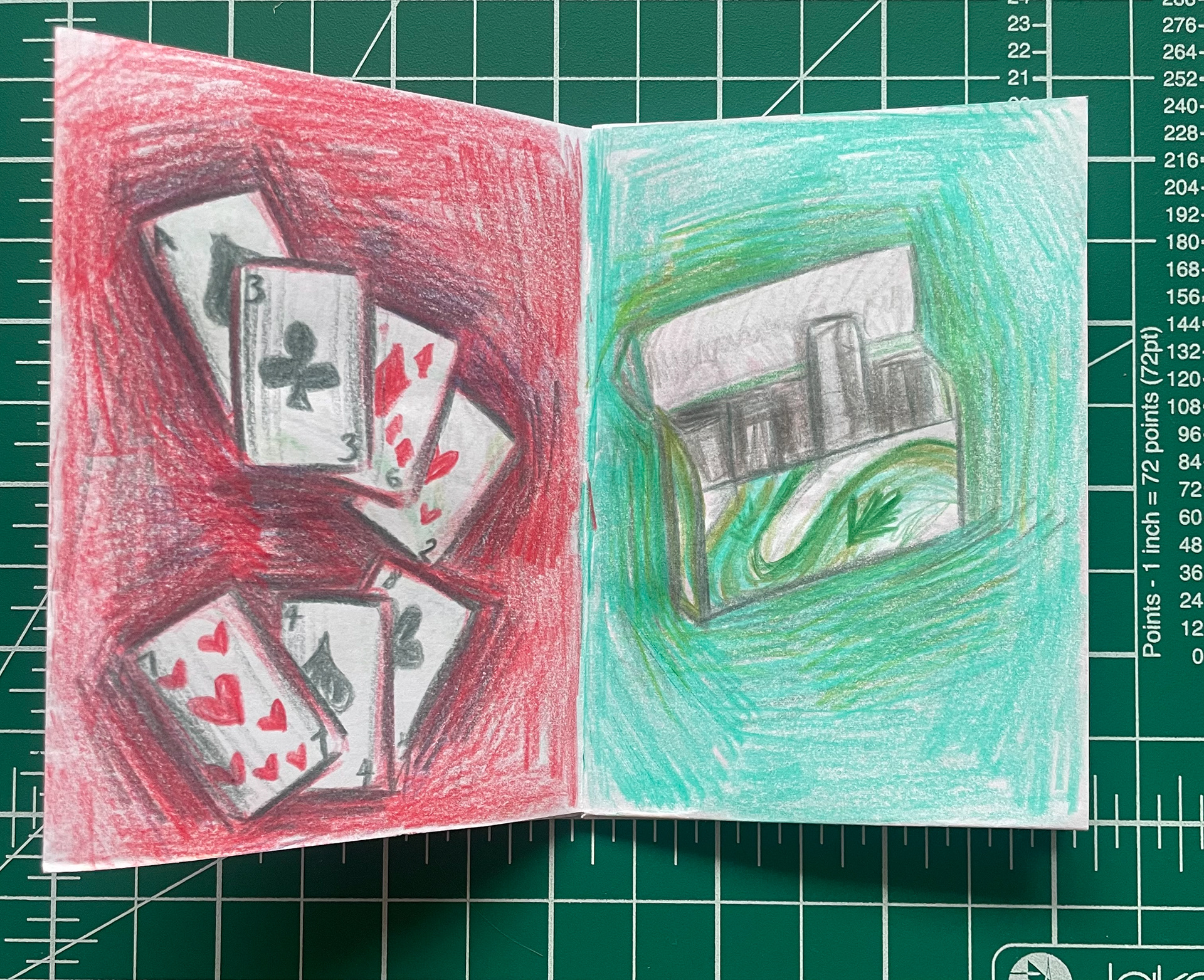
happy families card game
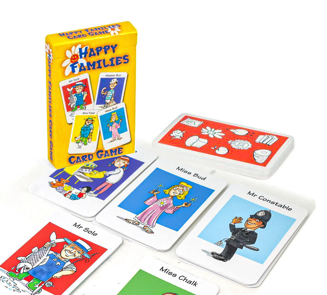
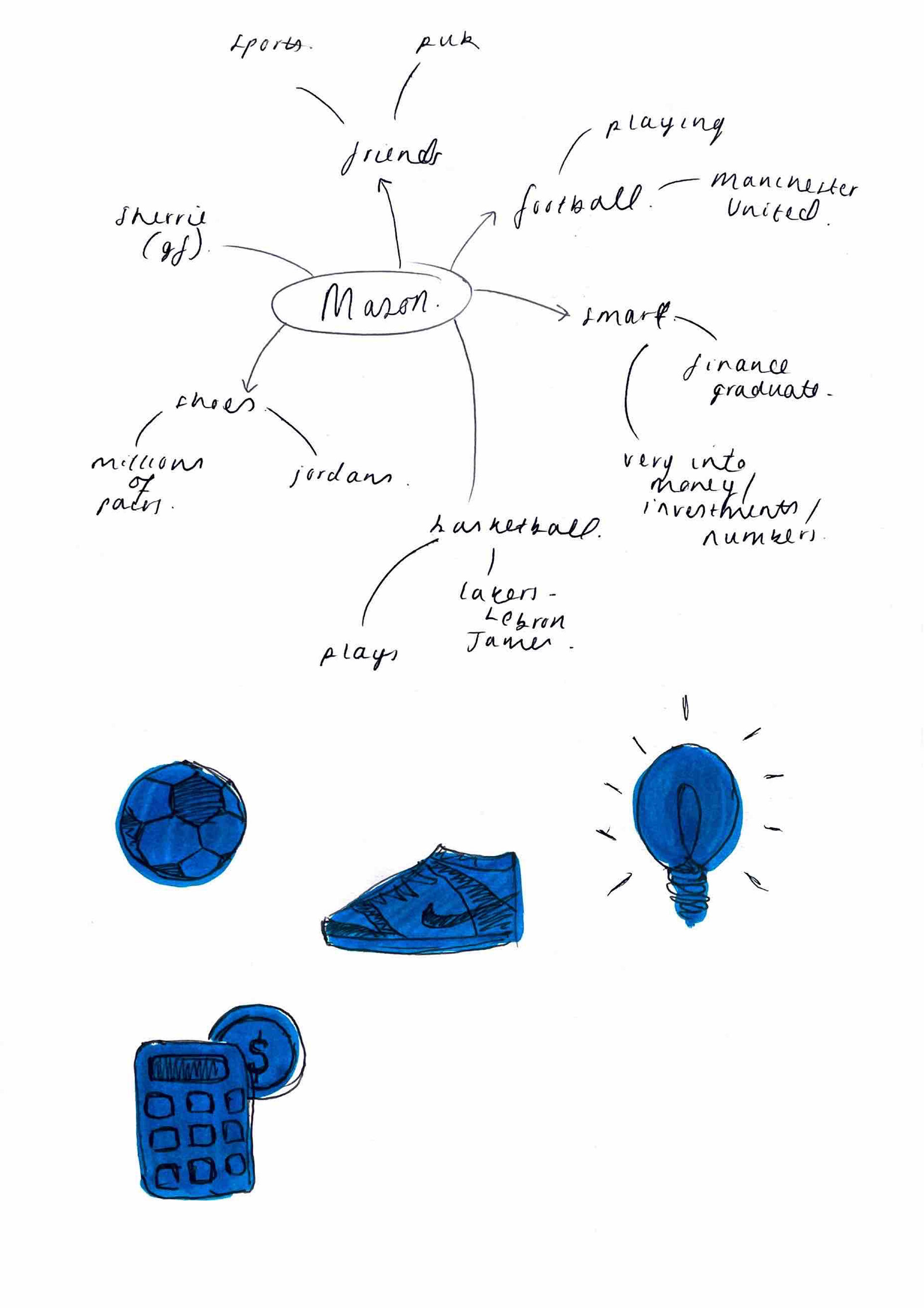
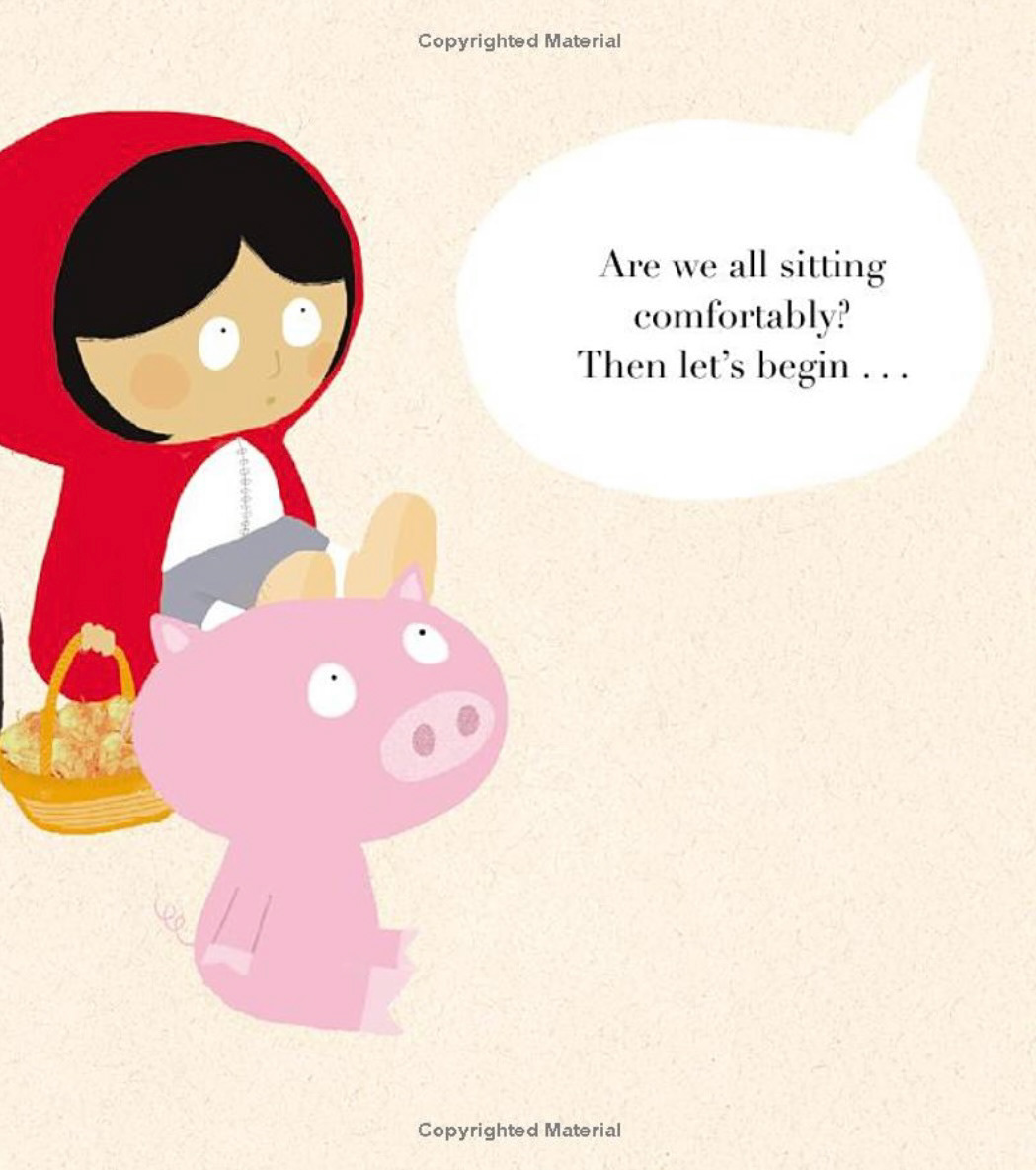
The happy families card game is one that’s very close to my heart- a frequently played game when visiting my grandparents as a child. The aim of this game is to attain the most complete sets of families by requesting cards from other players. Each family consists of 4 characters: a Mr, Mrs, Miss and Master. Each set of cards contains key elements of the families personality or profession. My idea is to try creating sets of cards surrounding my family and their interests.
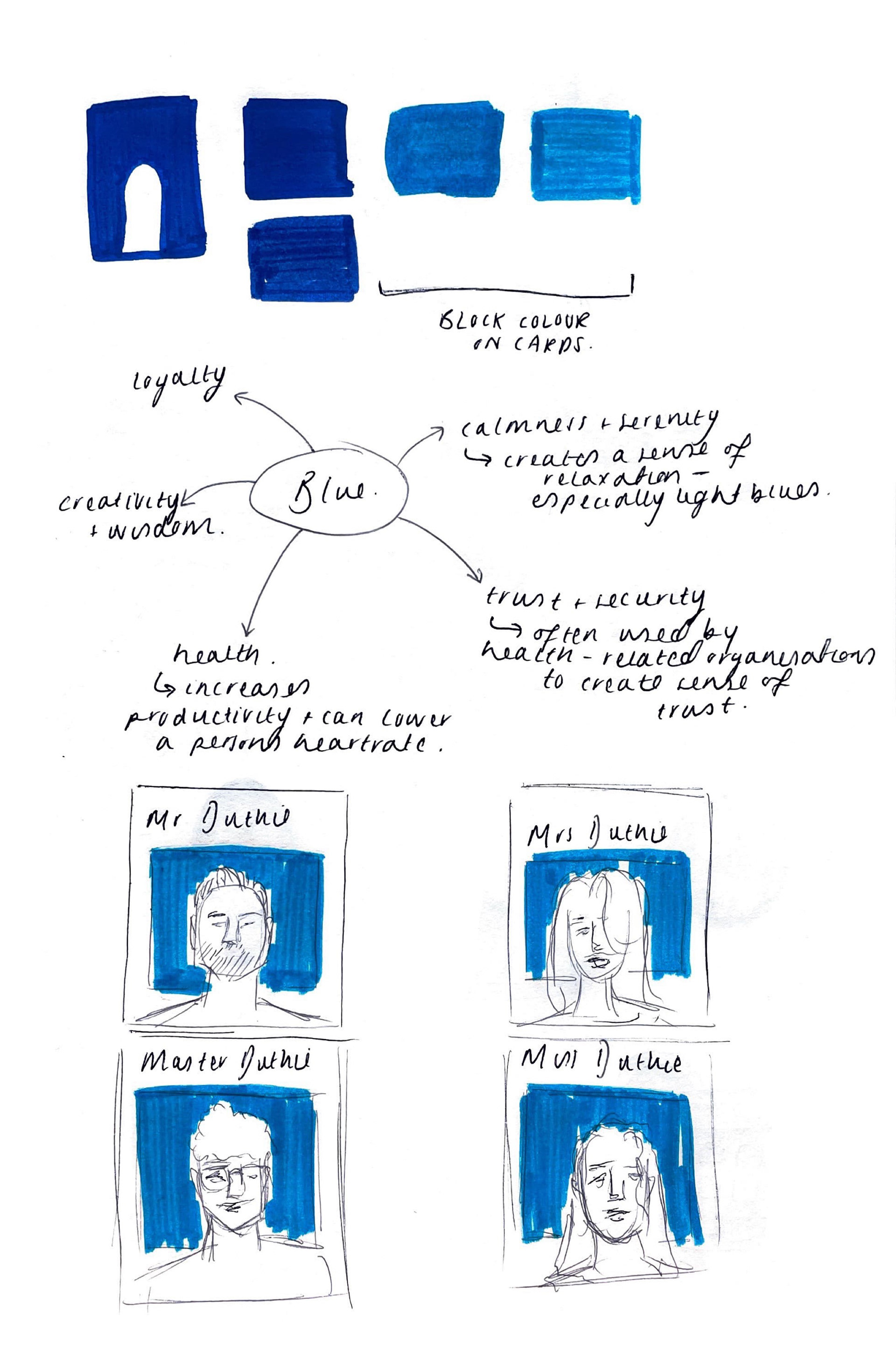
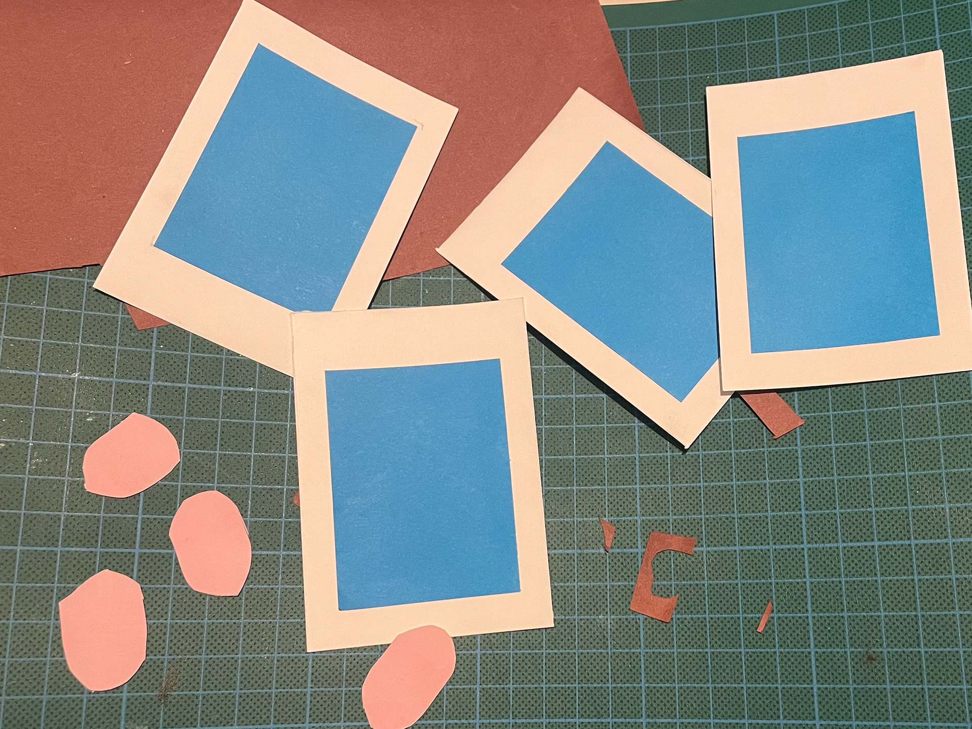
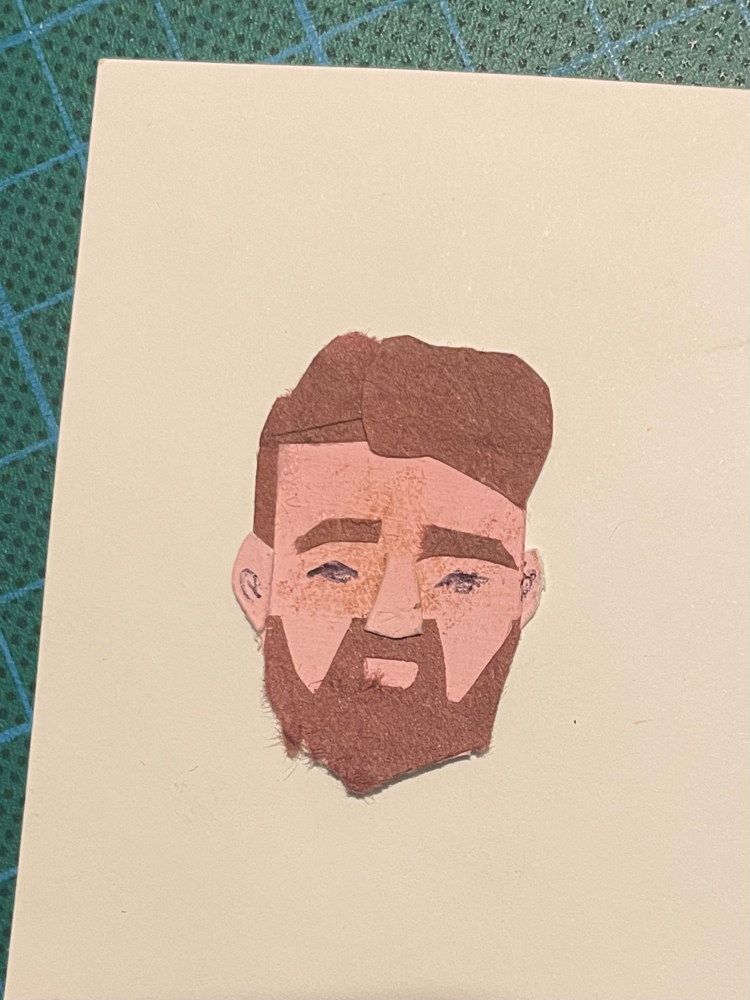
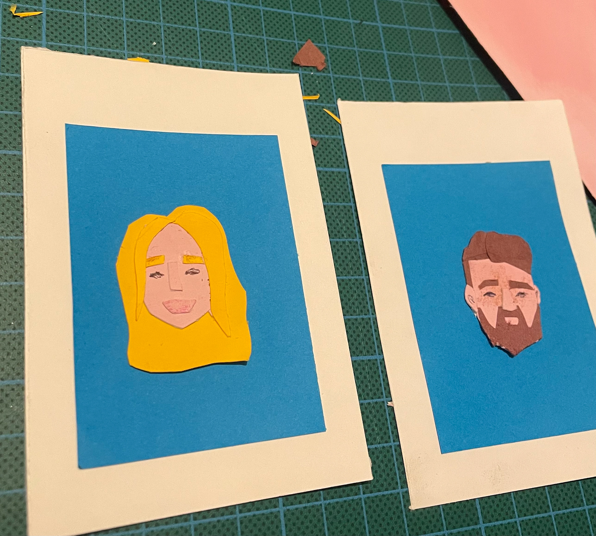
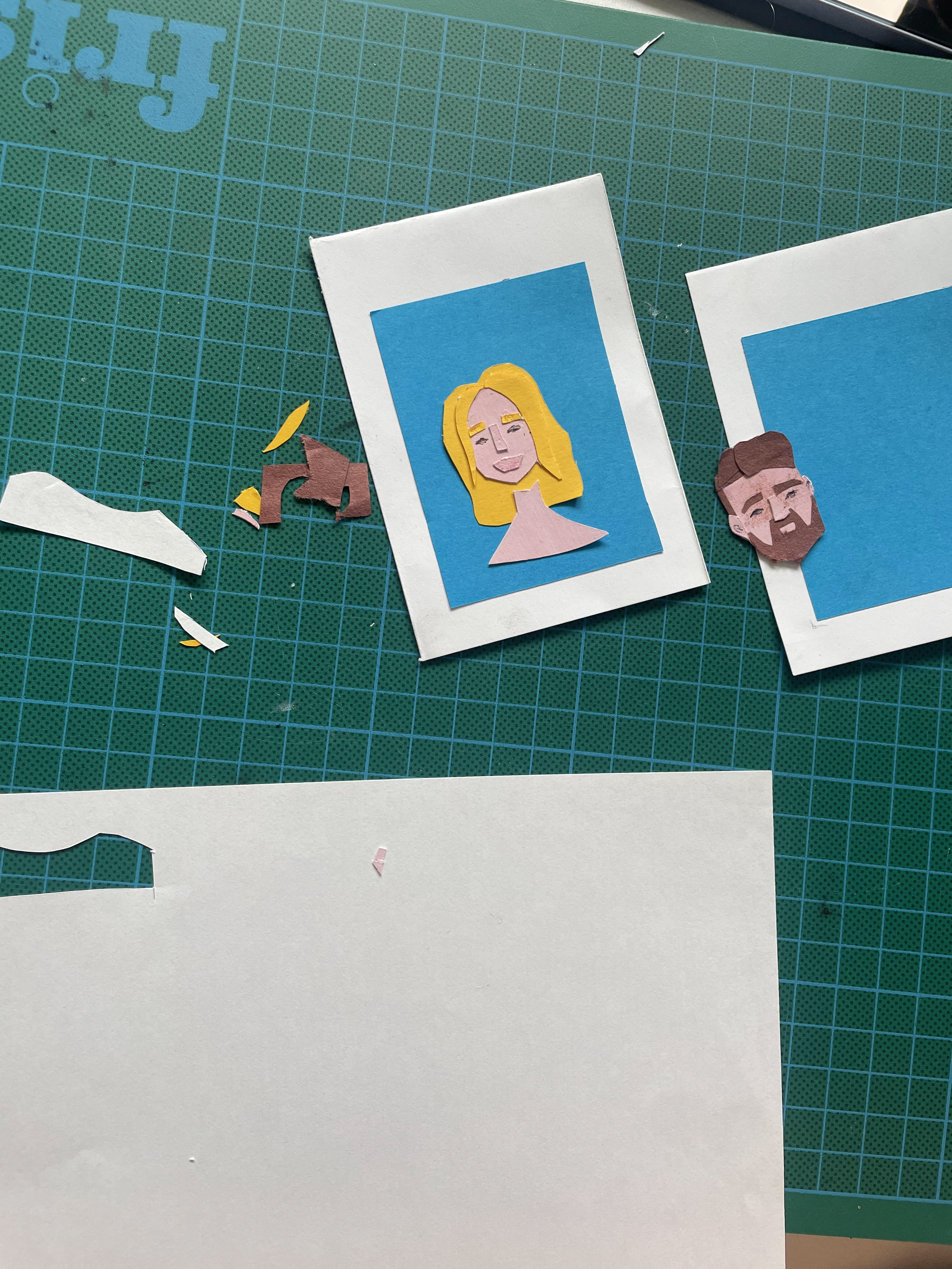
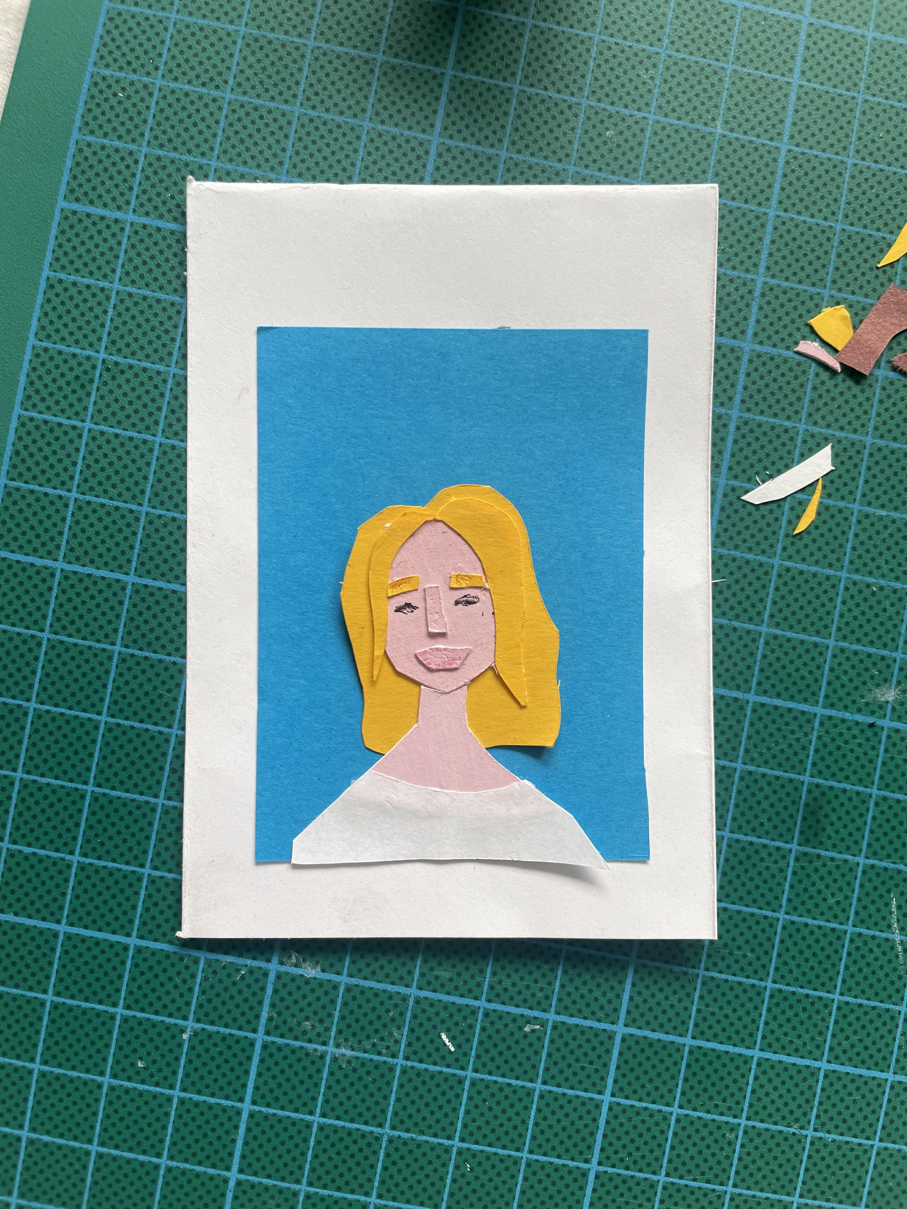
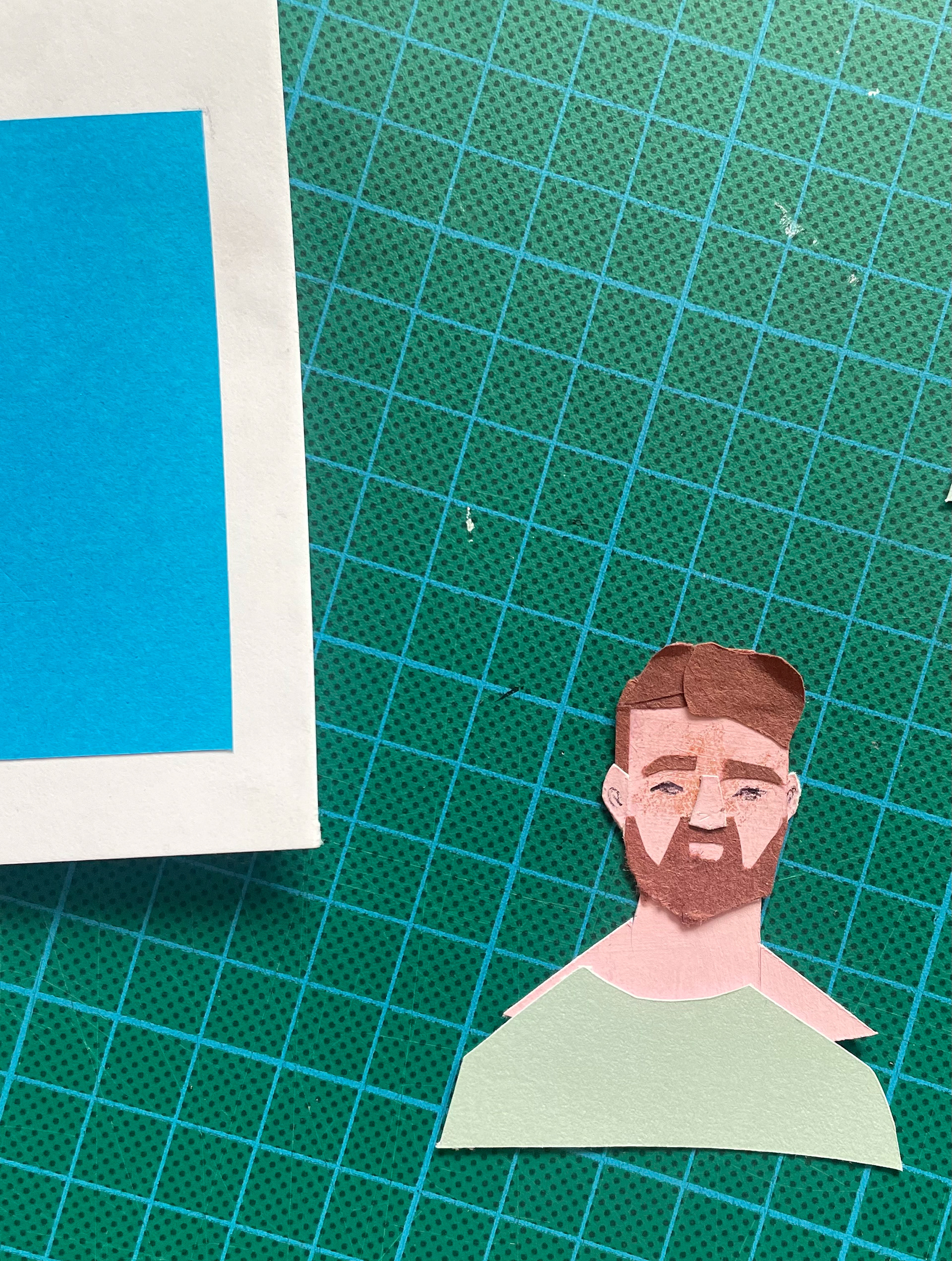
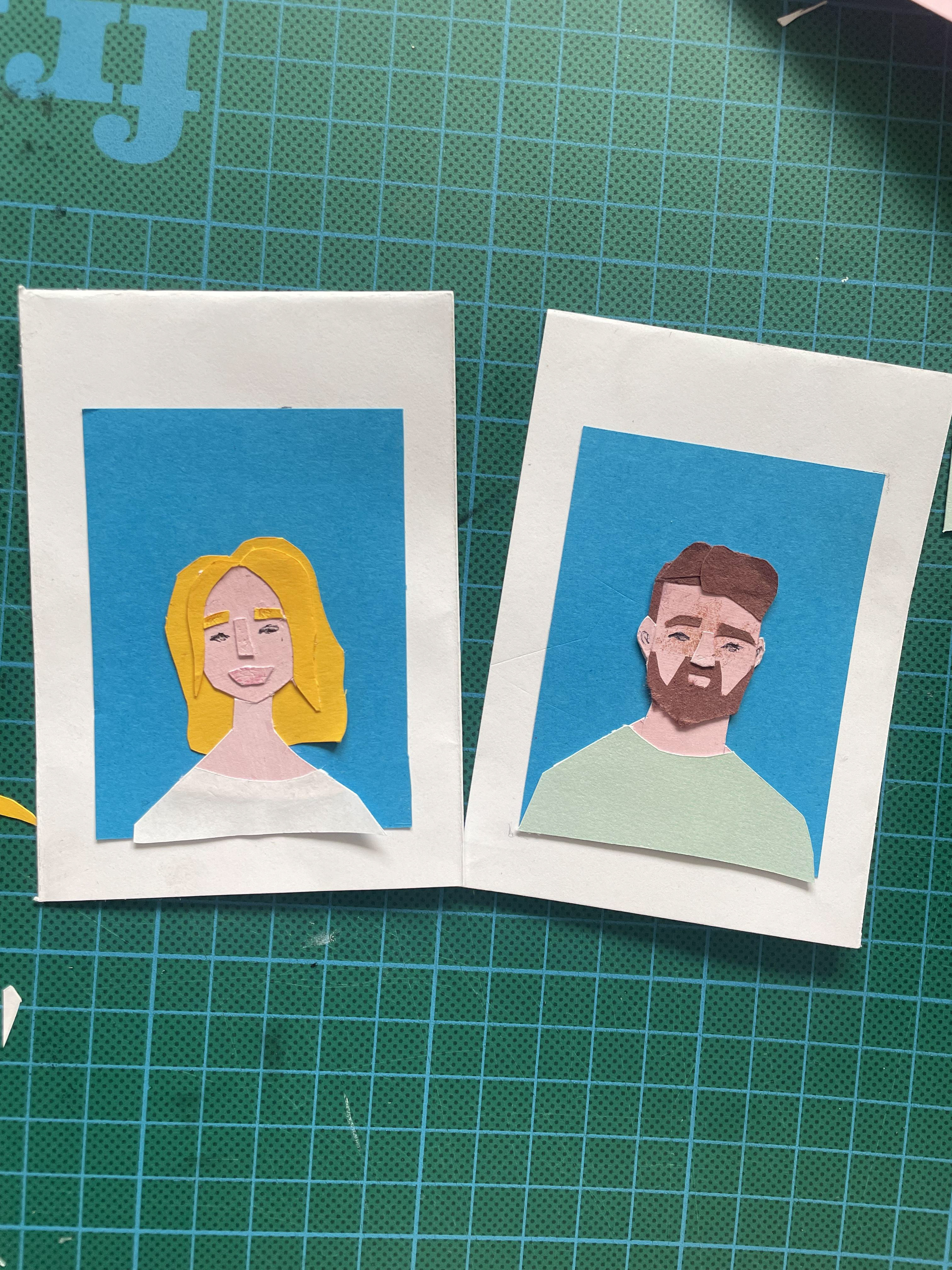
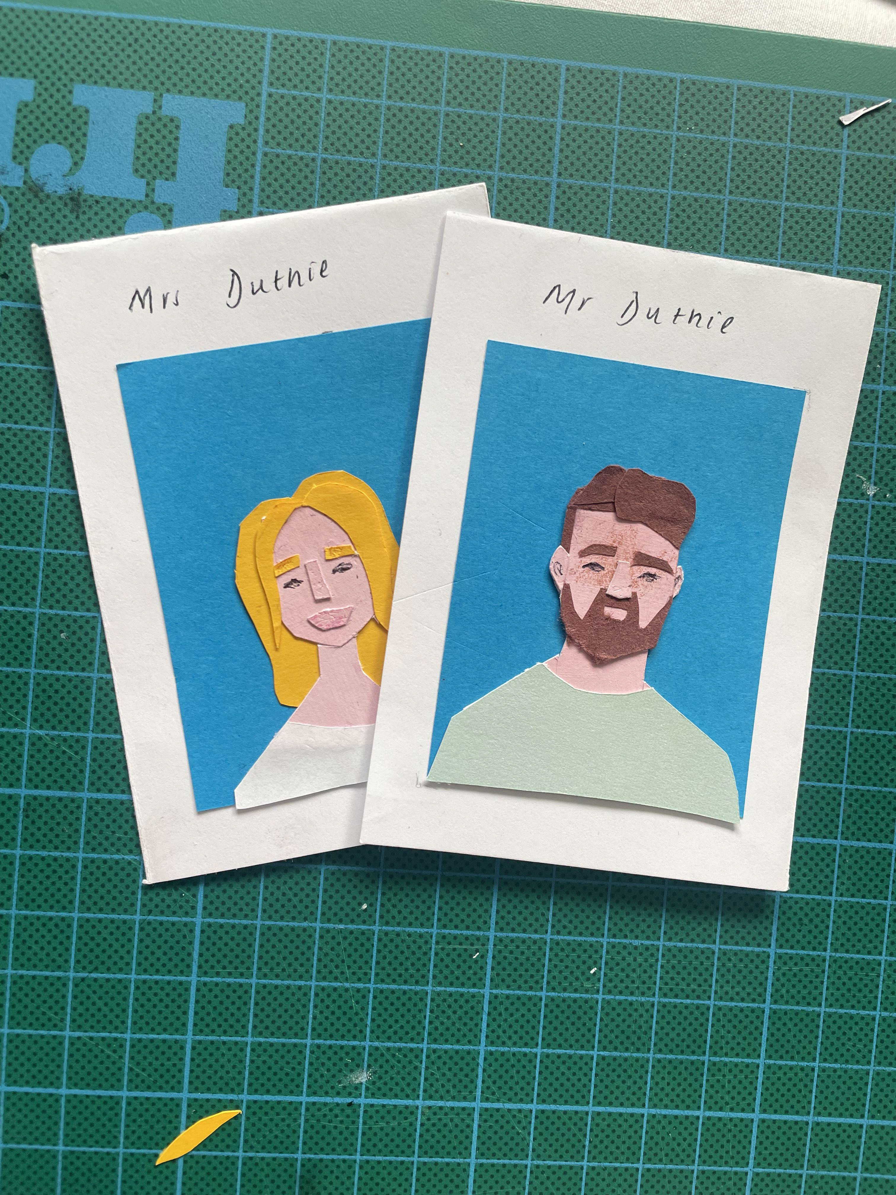
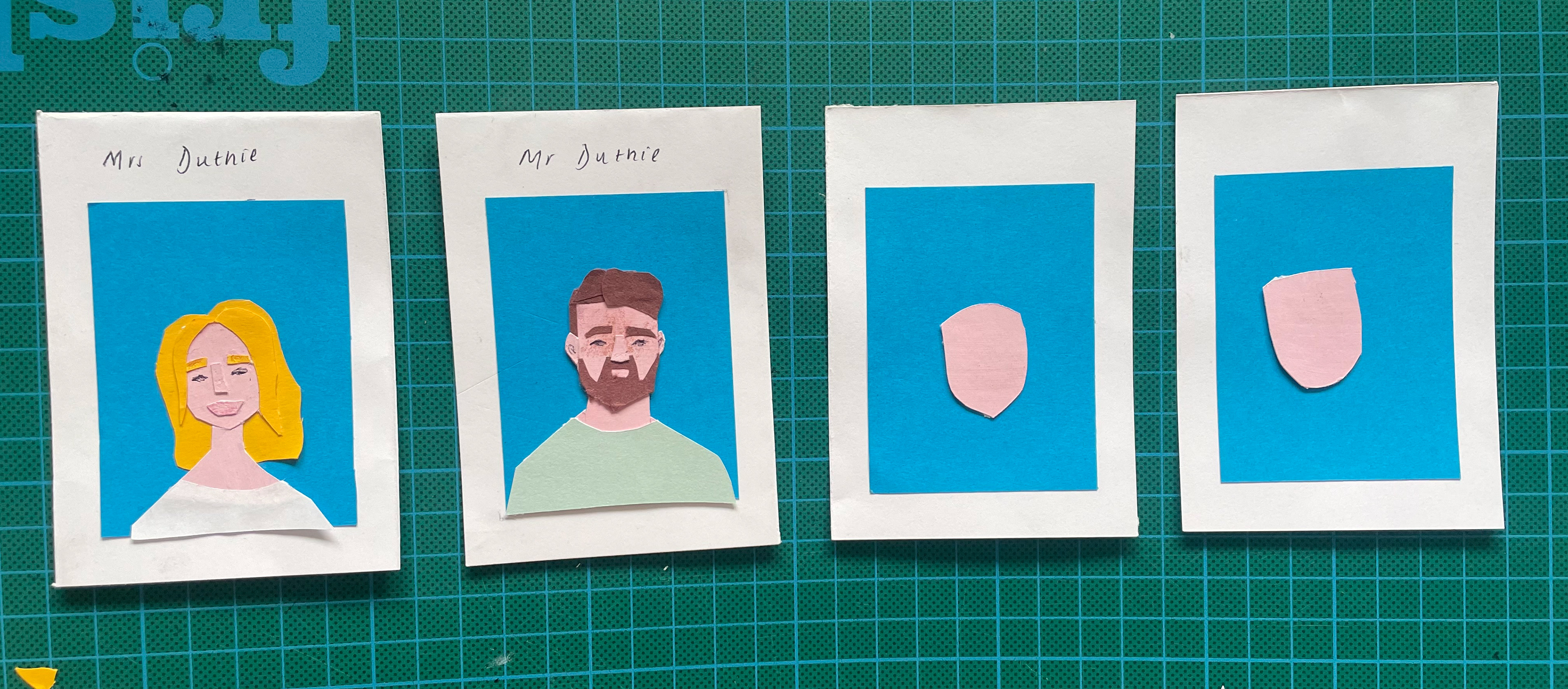
This was my first time really using paper cut and I quite enjoy how they came out. I had to draw on the eyes and add a slight bit of colour with pencils in order to further the details. However, although I enjoyed this, there was many issues. First of all, the scale of the cards was too small. This meant that cutting features for the face proved near impossible due to just how tiny they were. Because of this, the finish turned out unprofessional and moving forward I would have to change this. The handwritten text was also unprofessional. It also occurred to me that there are 11 sets of cards in this game, and so my 1 set would be useless. Adding over areas of my family didn’t work due to altering numbers and the same family name. If I was to move forward with this idea I would’ve responded to these things. However, I also noticed that I had just lost passion for it.
I have never enjoyed illustrating people and so I was really struggling with how to make things interesting. I kept finding myself going back to wanting to draw animals and so I made the decision to cut this idea. I can’t regret where this project started because it allowed me to include my family and show how much I value them. But I want to be able to enjoy what I’m making and so I decided to move forward looking at animal packs rather than my own.
REFLECTION OF WEEK 1
I feel that my first week was really successful in exploring the idea of belonging. I took time to investigate my identity and form a clearer insight of myself as a person and the things that are most important to me. I have displayed a range of both primary and secondary research including observational drawings and have began making links of where I can take this forward including the idea of a 'pack' and how this is associated with animals.
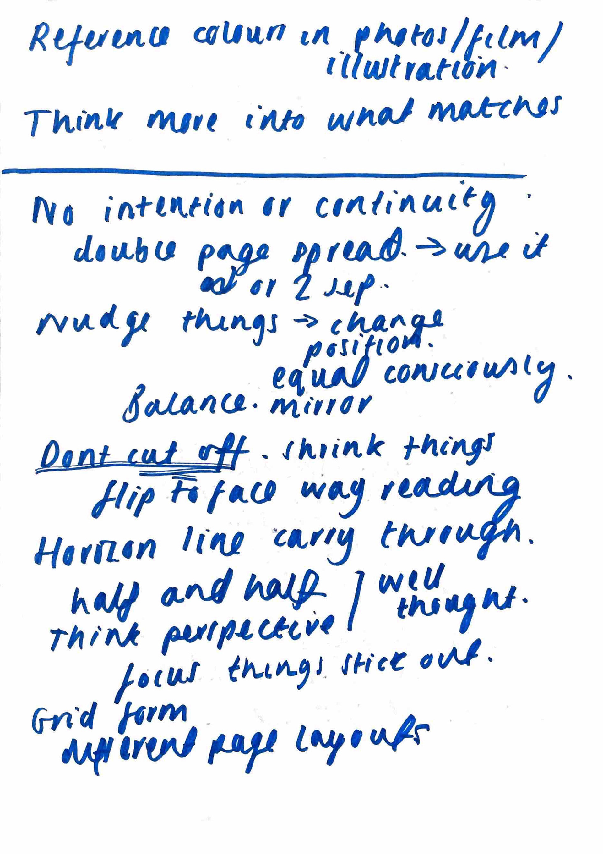
Moving forward I need to explore the different routes I can go down and start experimenting with materials and methods exploring more into colour as well. May be helpful to start looking more into other illustrators work for inspiration for my project.
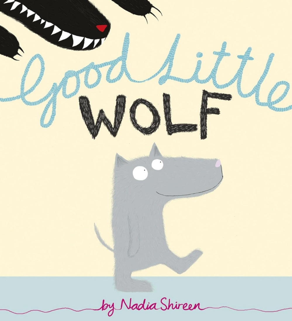
Simple but expressive illustrations using pastels. She exaggerates certain aspects of her subjects, such as giving her main character a large snout. This may be to show his youth, that maybe he hasn’t grown into his body yet, or to emphasise how big his teeth are.
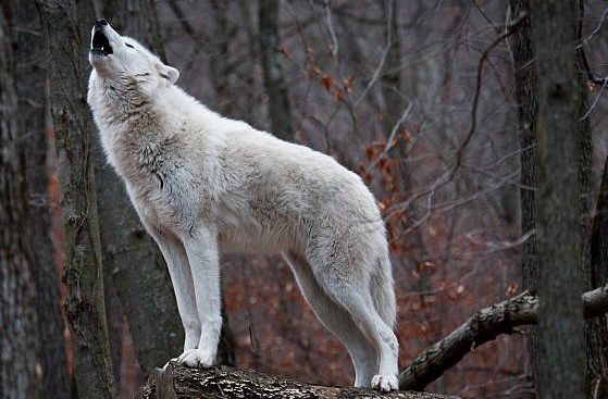
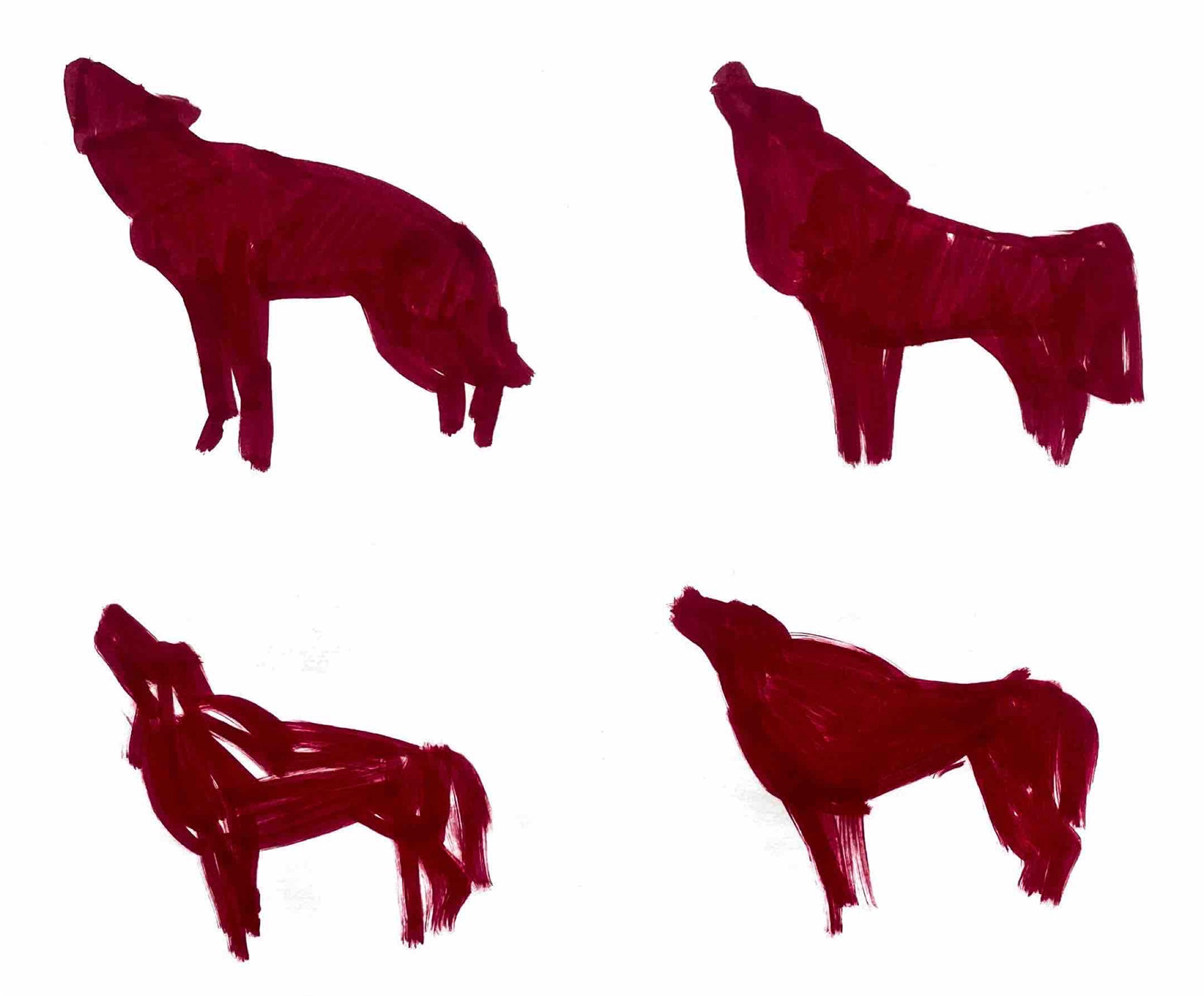
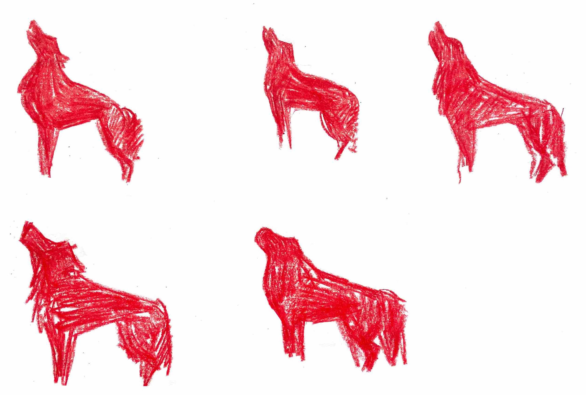
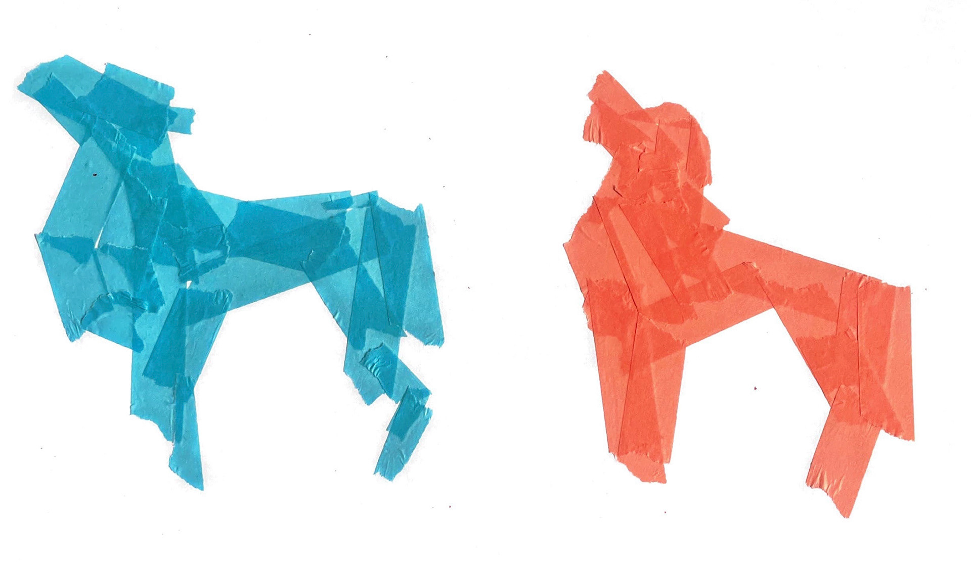
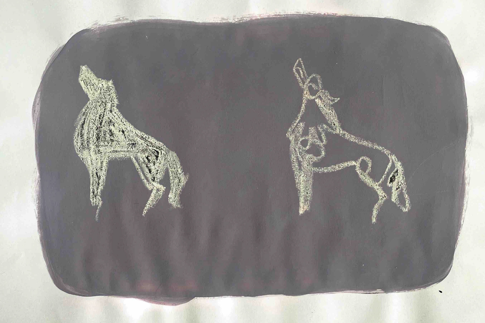
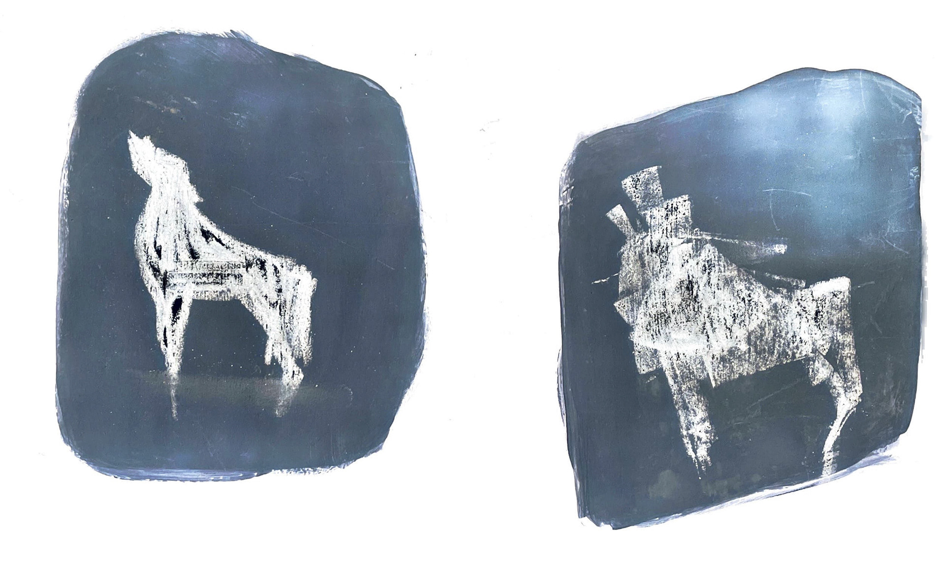
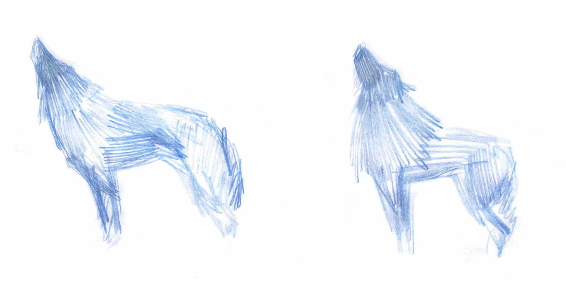
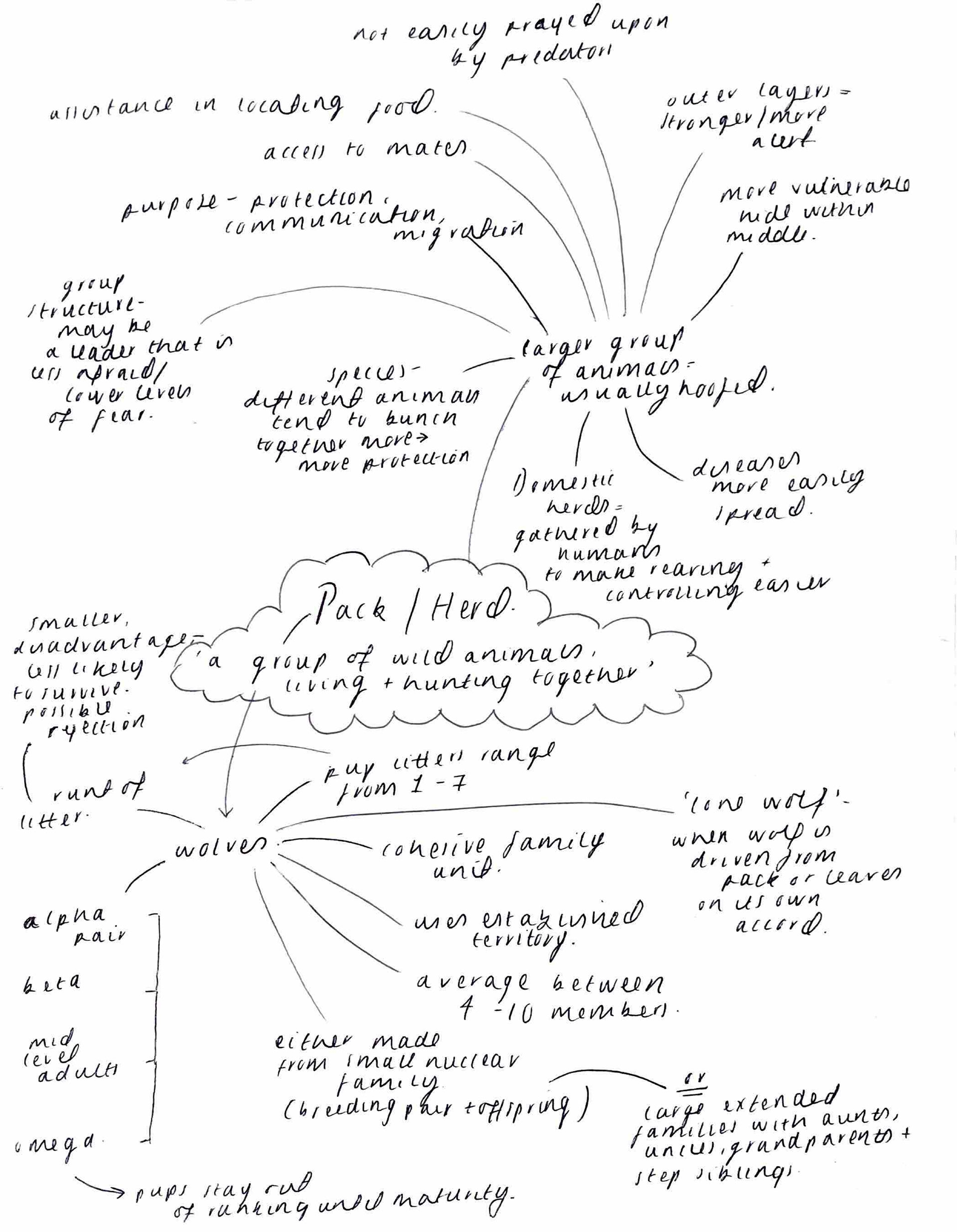
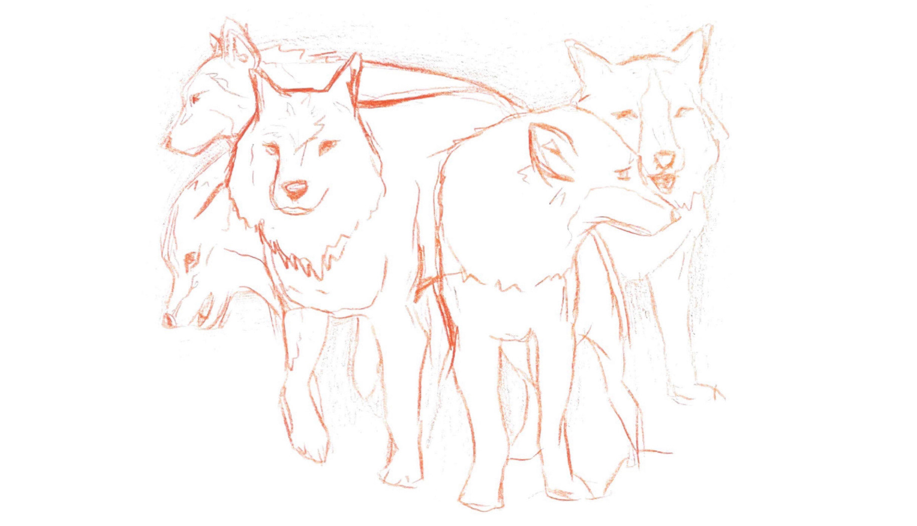
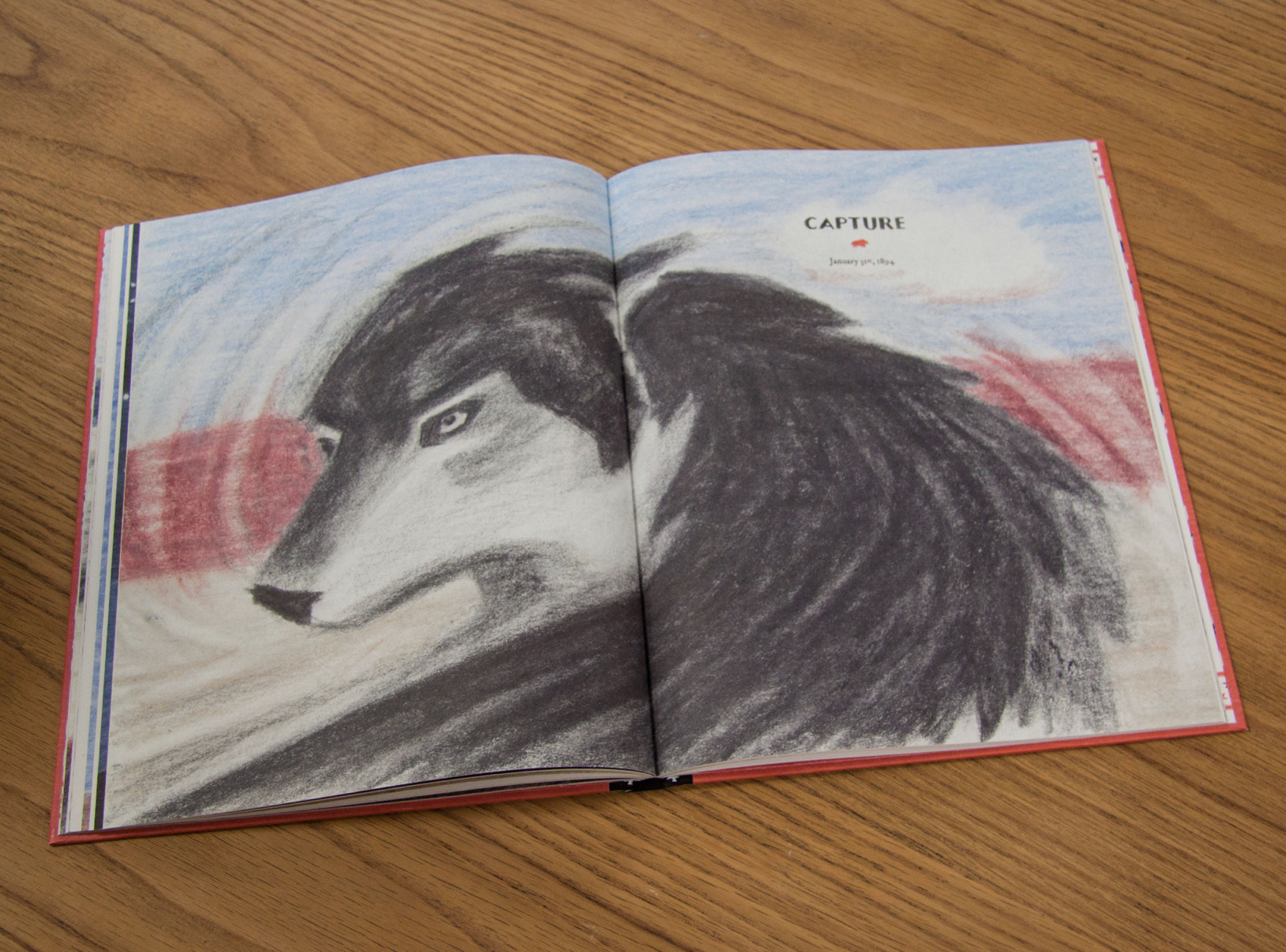
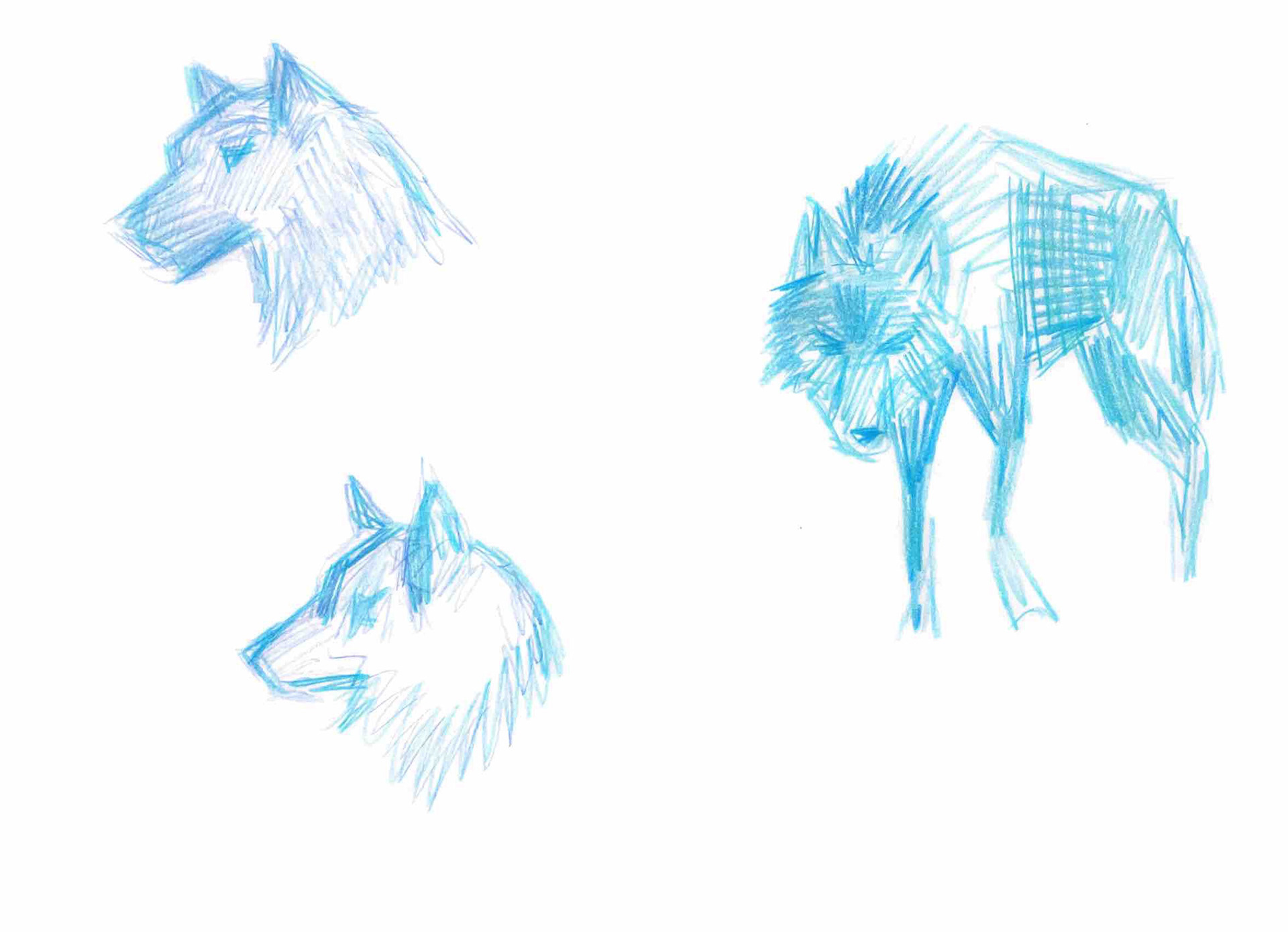
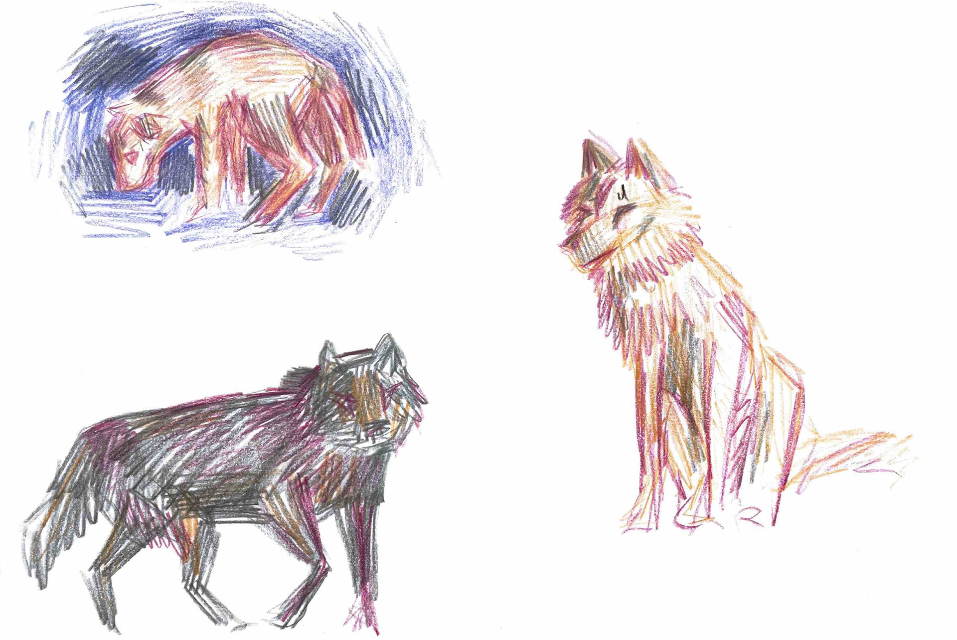
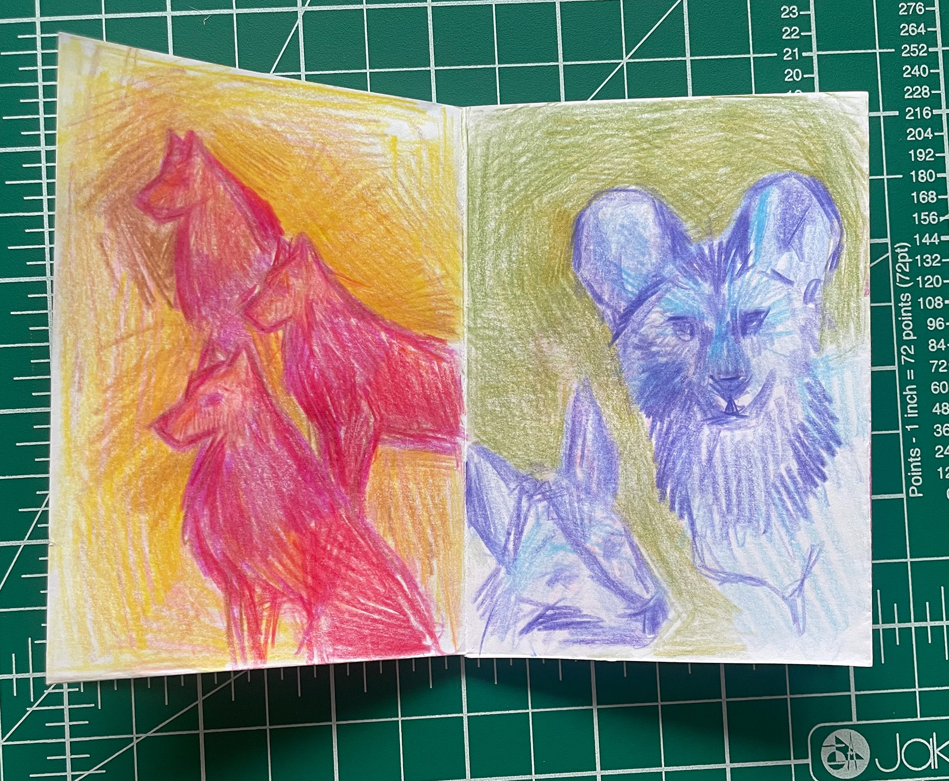
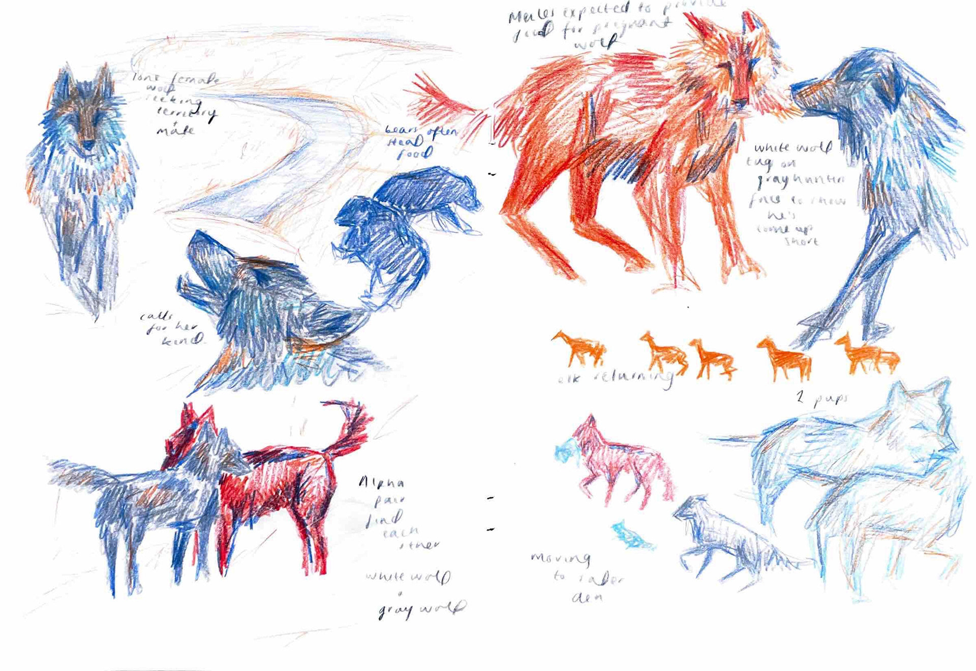
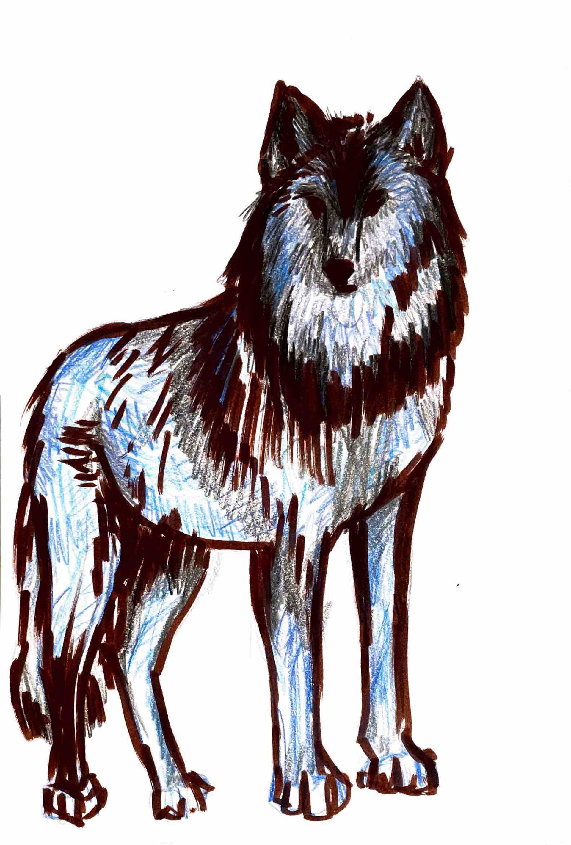
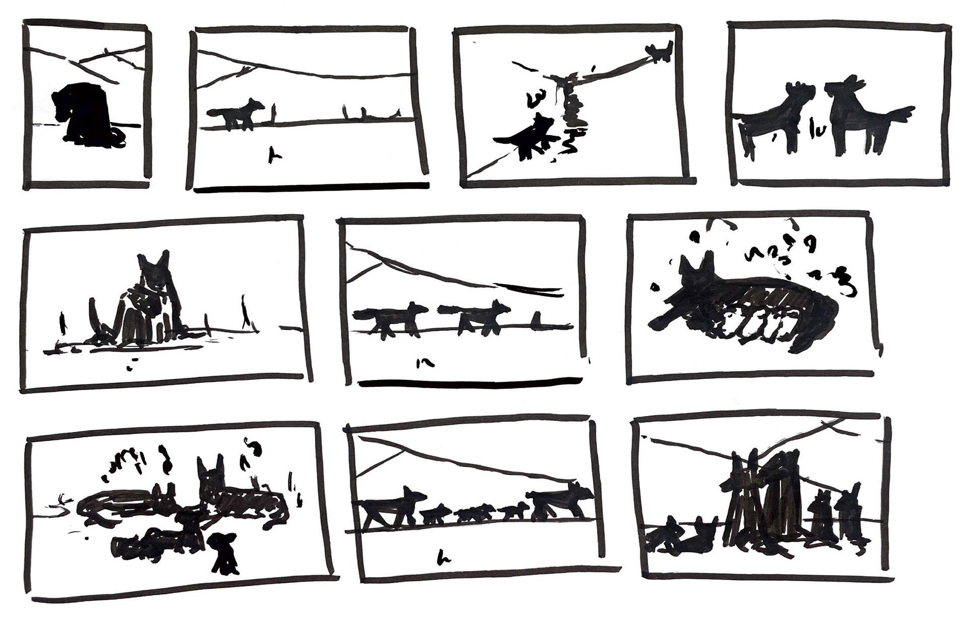
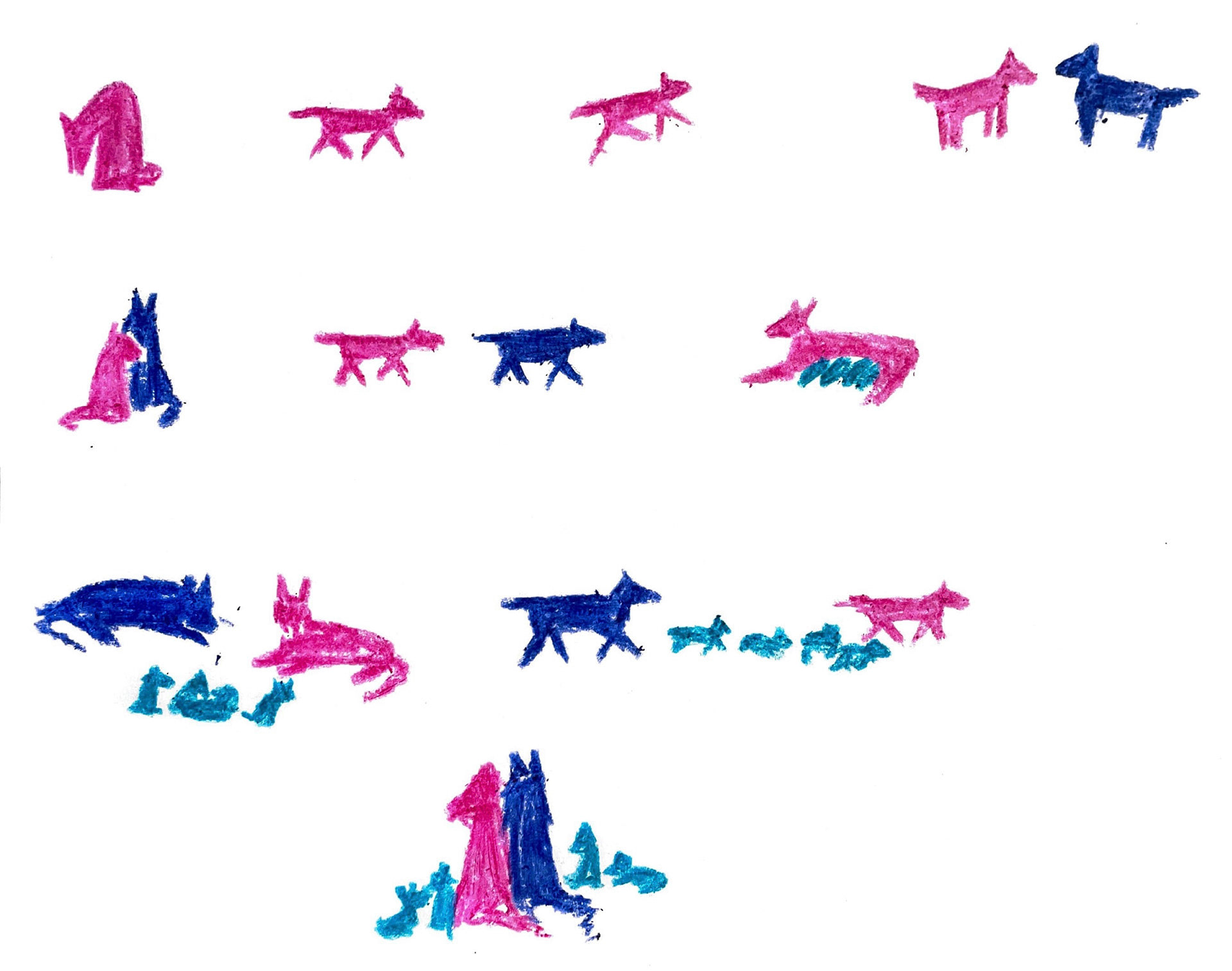
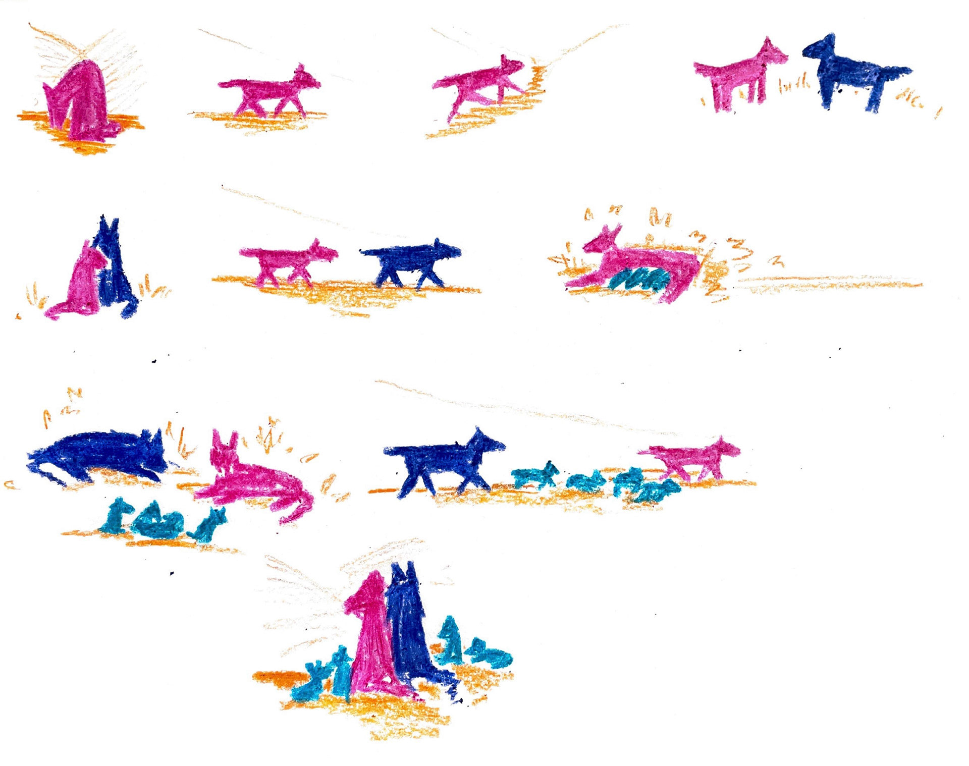
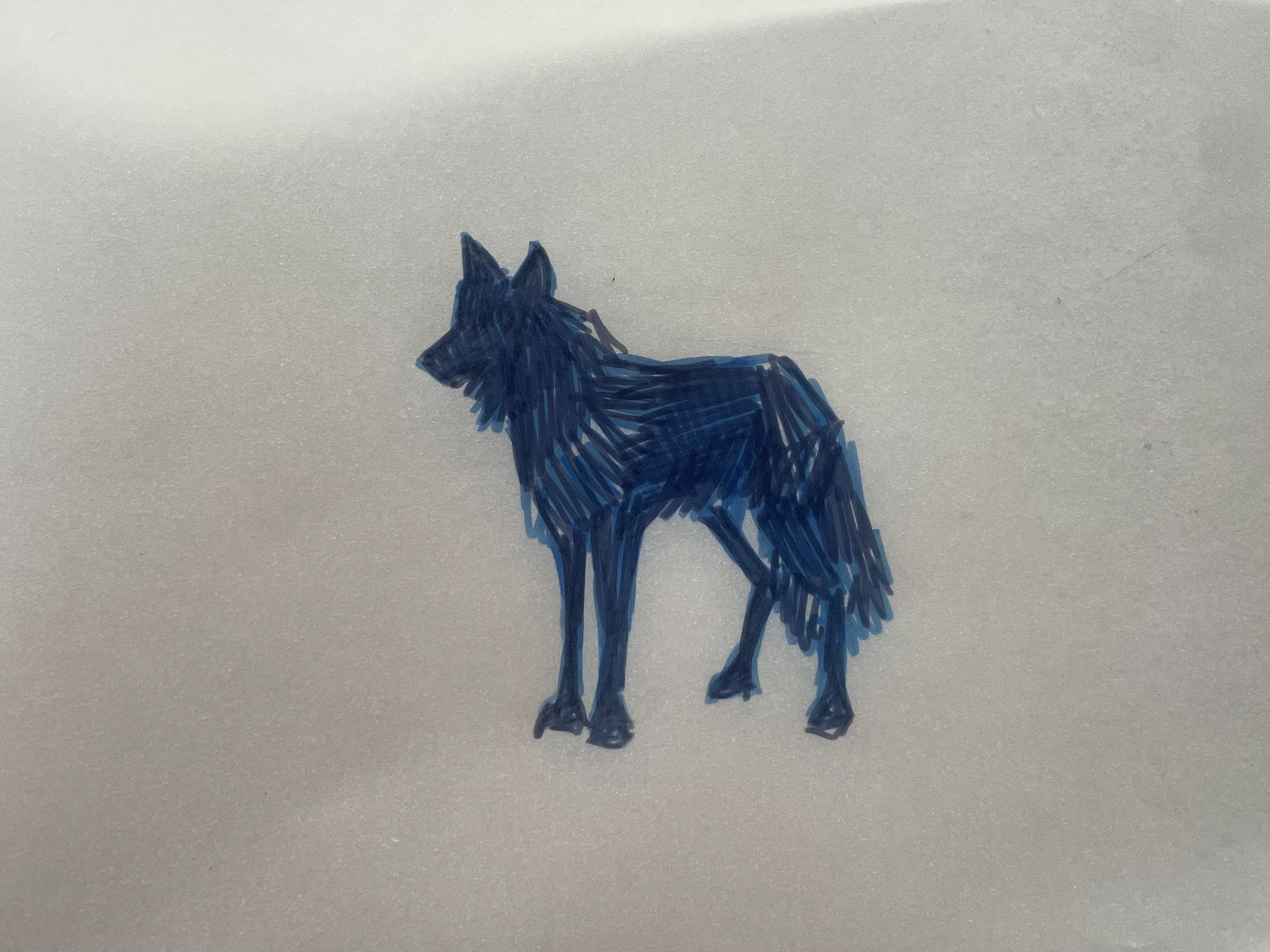
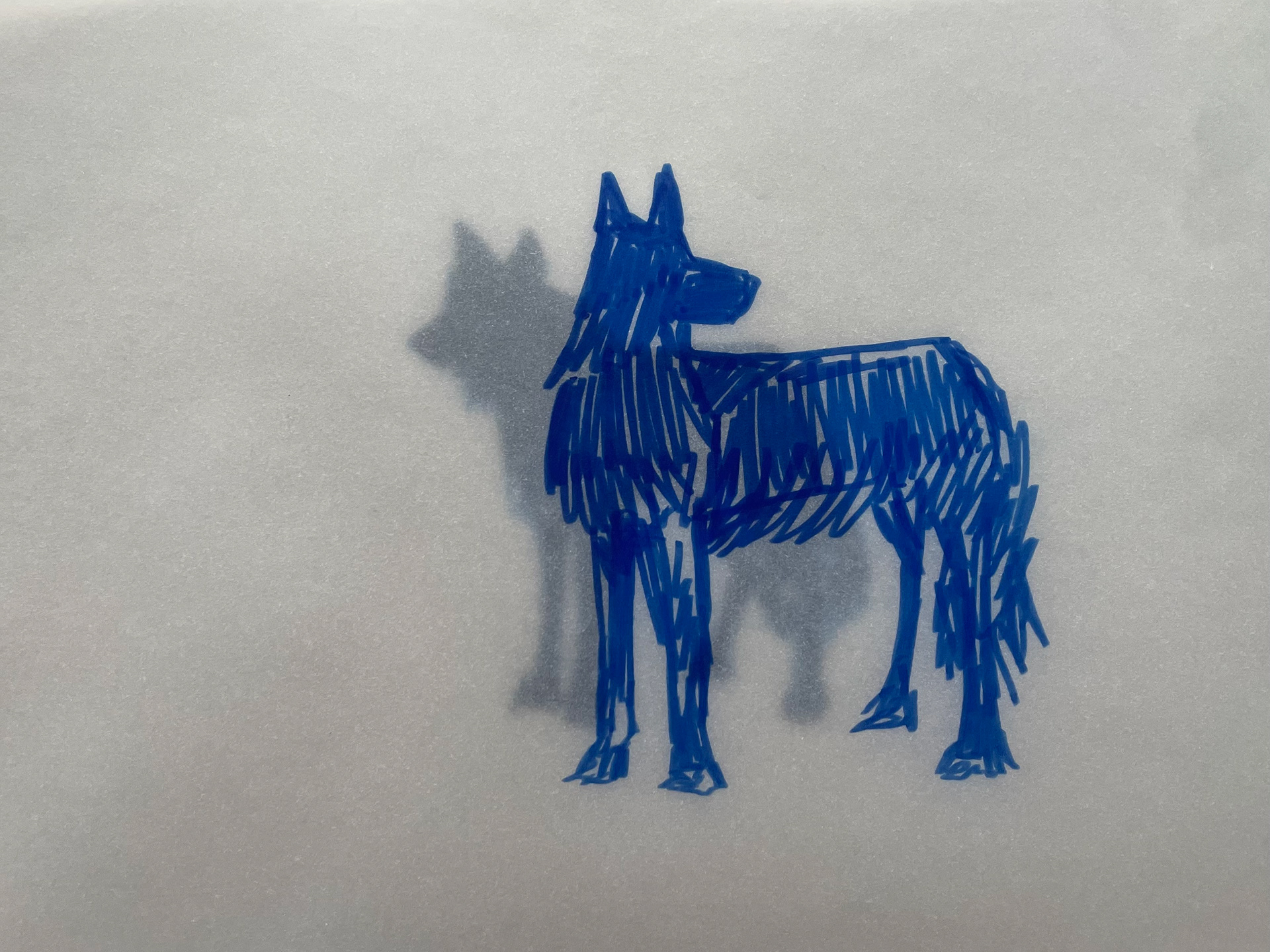
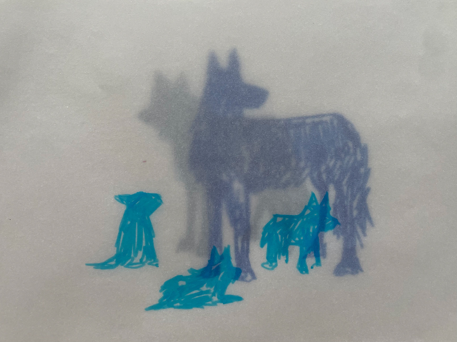
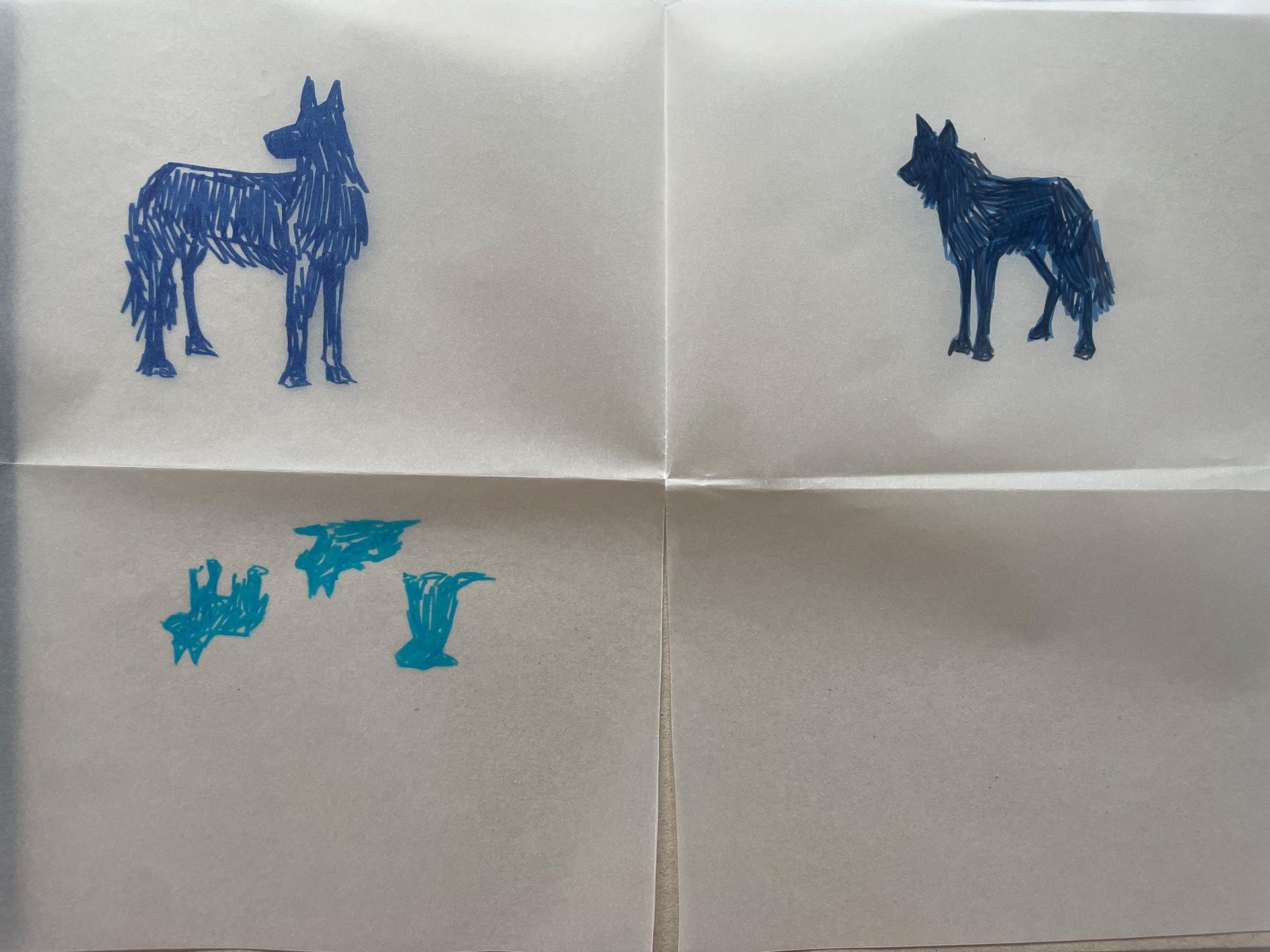
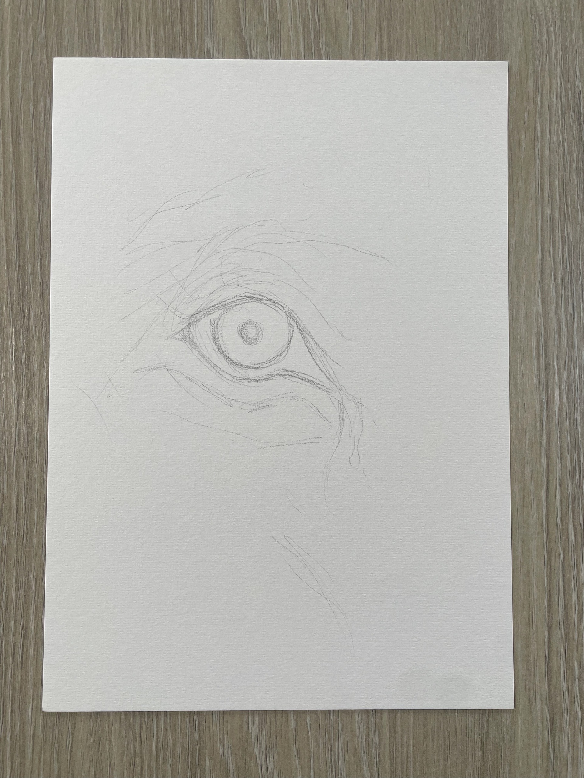
For this task I forced myself to look at the same reference and see how many ways I could illustrate it. This pushed me to use materials I wouldn’t usually use such as tape and using chalk onto emulsion. I tried altering certain aspects of the wolf in each such as the chest or snout, exploring ways I can alter the wolfs identity- thinking maybe if the chest is larger then they are prouder/more respected.
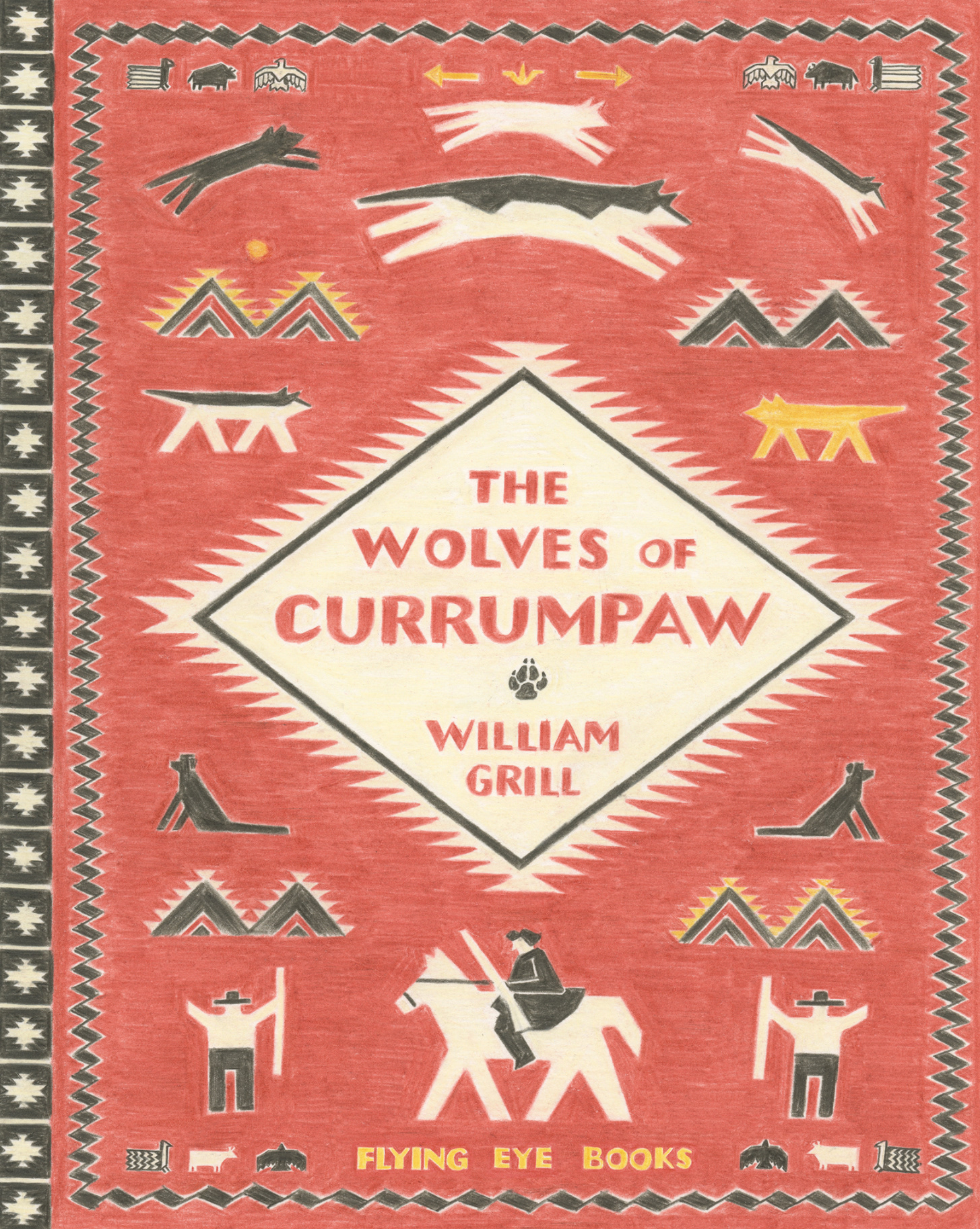
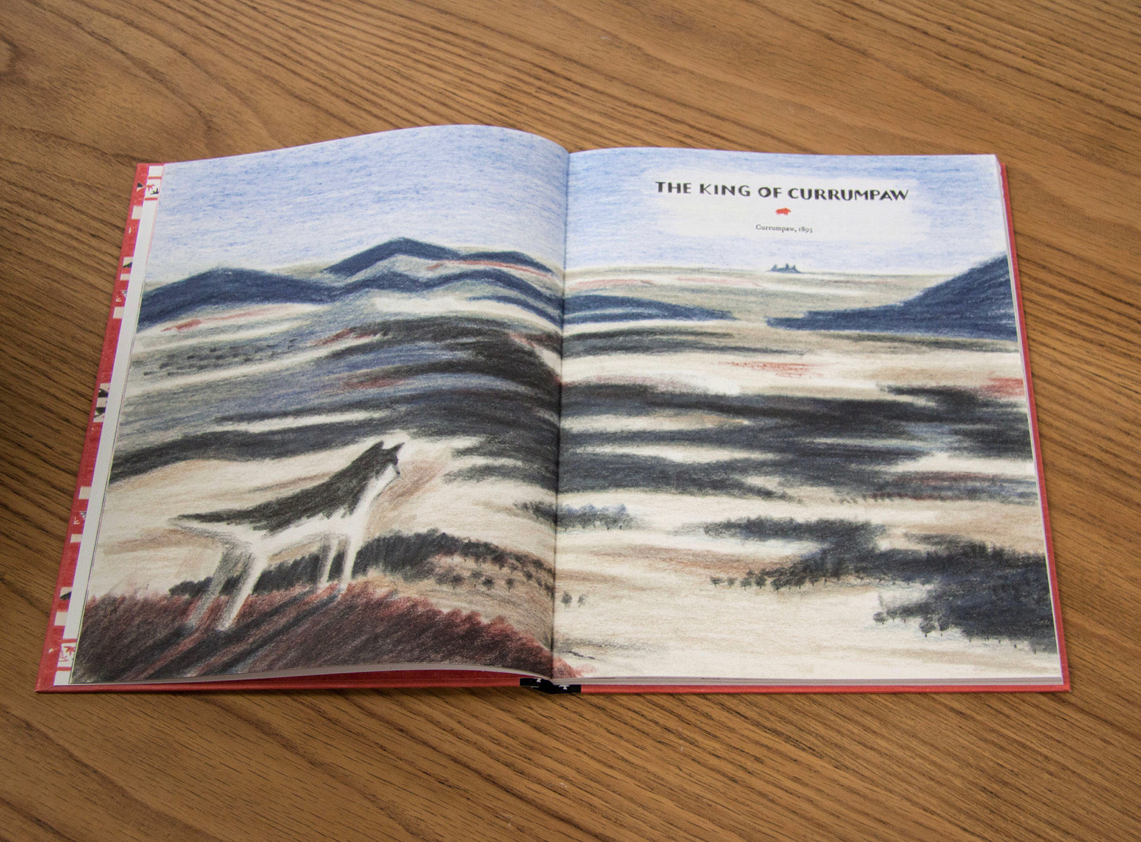
William illustrates in coloured pencils on loose sheets of paper. I really admire the freedom of each of his strokes and I feel that it really enhances the passion he has for his topic.
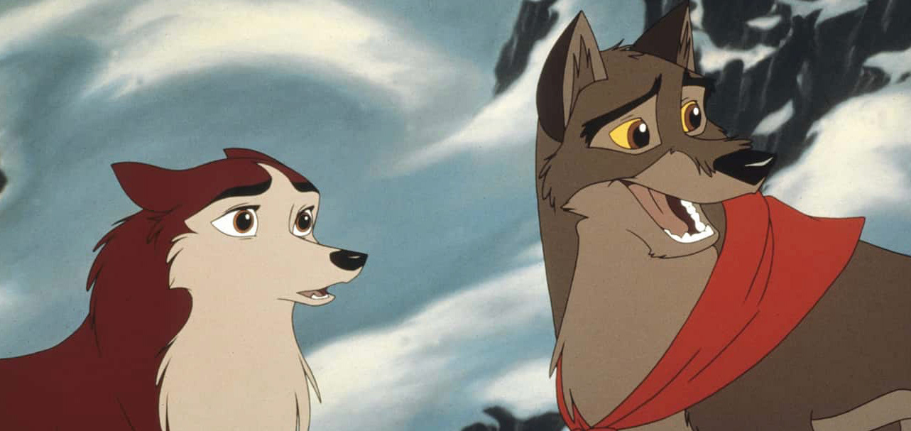
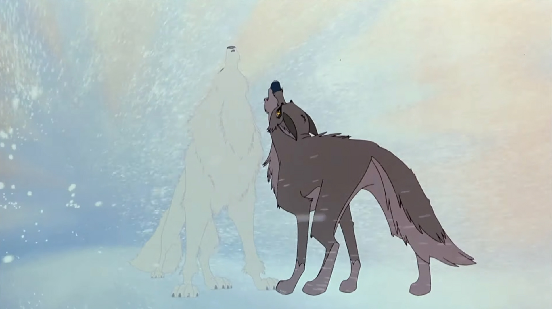
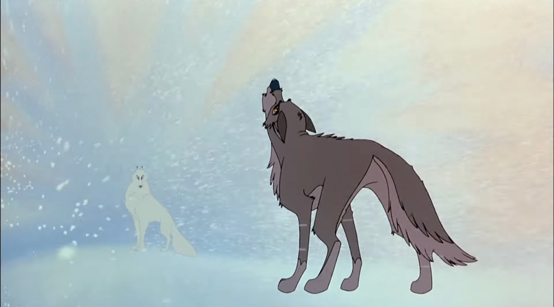
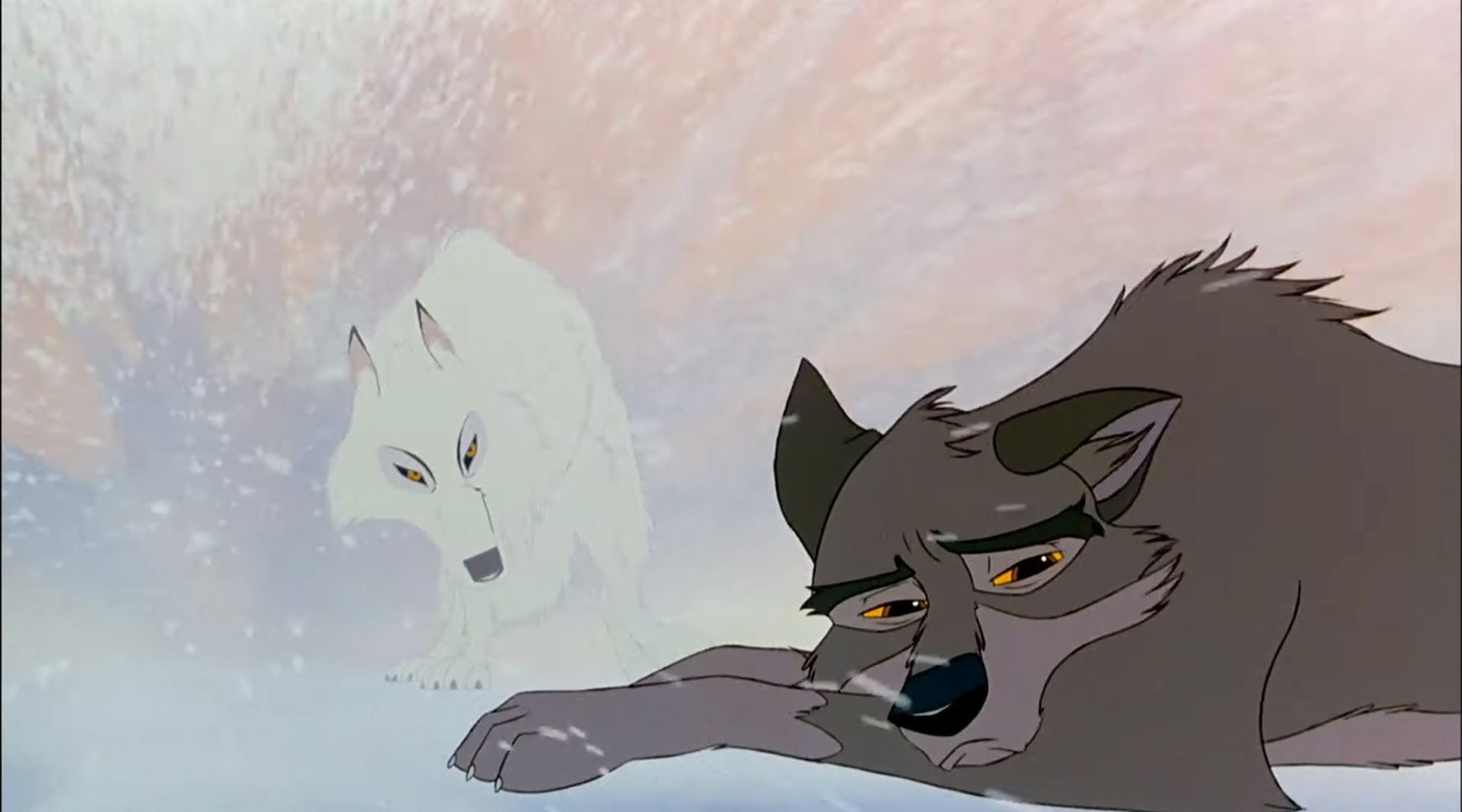
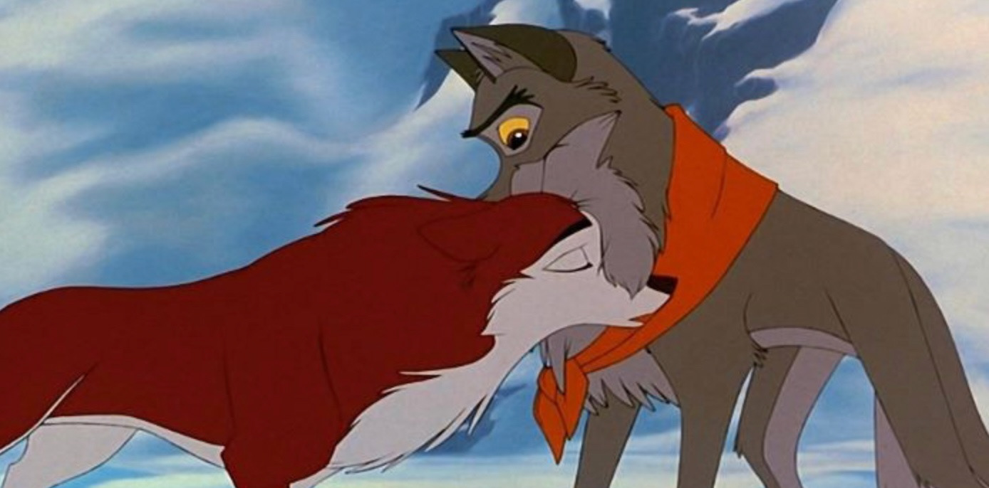
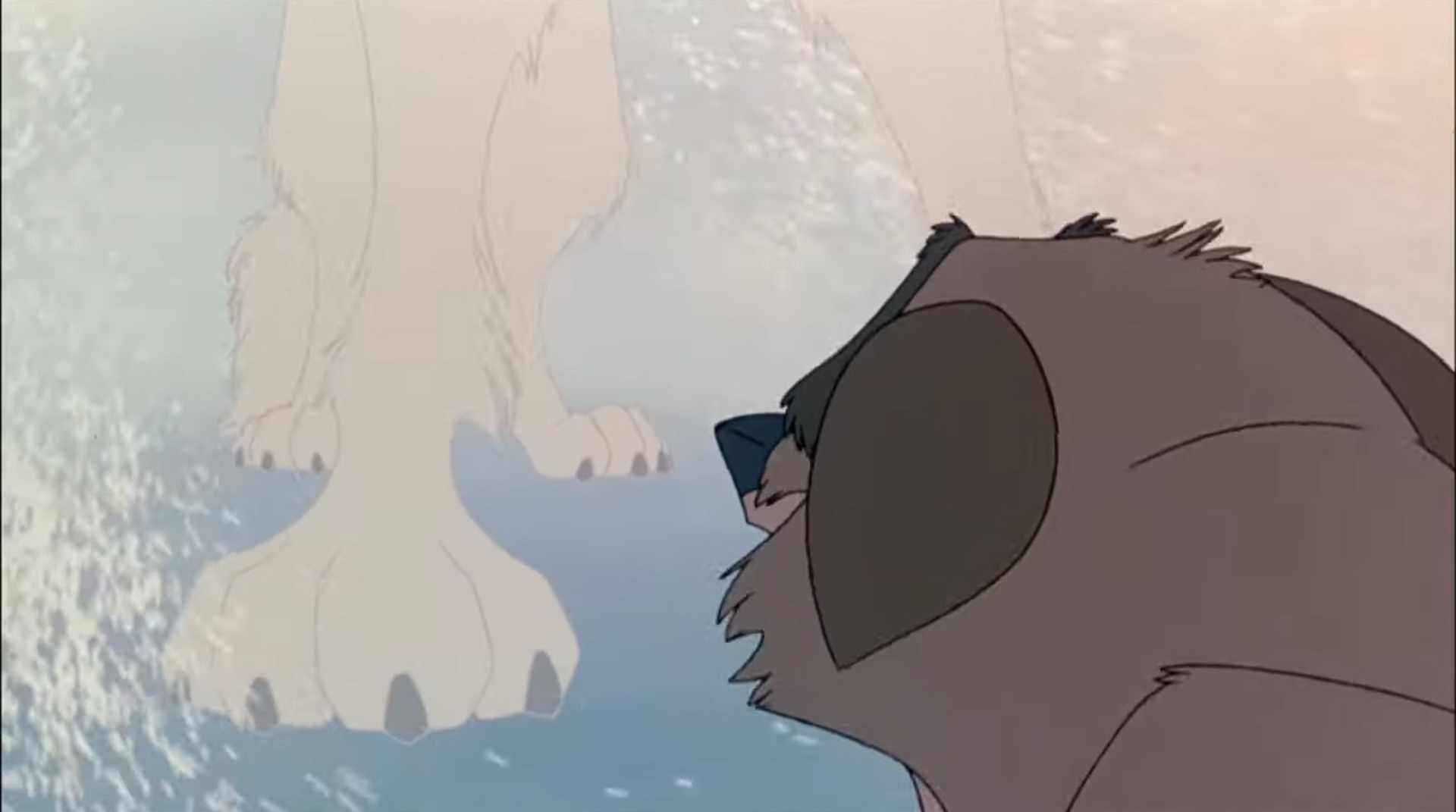
Balto is a film I grew up watching that I think fits perfectly into my topic. Balto is a half wolf half husky who is rejected from the dogs within the village. You follow his journey from being the outsider, ashamed of the Wolf side of him and ignoring those instincts. All until he proves himself by bringing home cures to a deadly illness. Within this film you can see subtle differences used to extinguish between a dog and a wolf such as the size of both the body, paws and snout and the eyes. They also tend to be scruffier looking too.

Entering the third and fourth week of this project I found myself getting gradually more and more overwhelmed. It felt as though I had a million ideas and directions in my mind but for some reason I couldn’t get any of it down on paper. I put so much pressure on myself to create a high volume of work that I think I stopped valuing what I was actually creating. Because of this I really lost my motivation and pace with my project. I decided to take a few days off to recollect myself by spending some down time with my friends and getting myself out on walks and to the gym to clear my mind. Doing this changed my perspective completely when regarding my identity project. Although I have loved exploring my personal link to the feeling of belonging and being able to study my family more I have decided to change my path to focusing back onto animals. The pull I felt to the word ‘pack’ in the belonging brief made it clear that I want my subject to be animals.
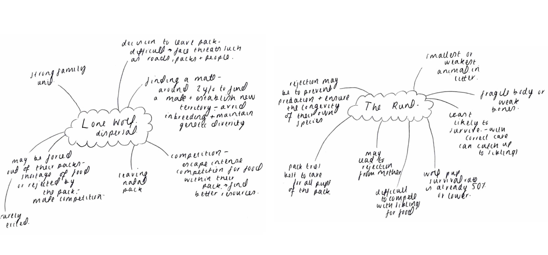
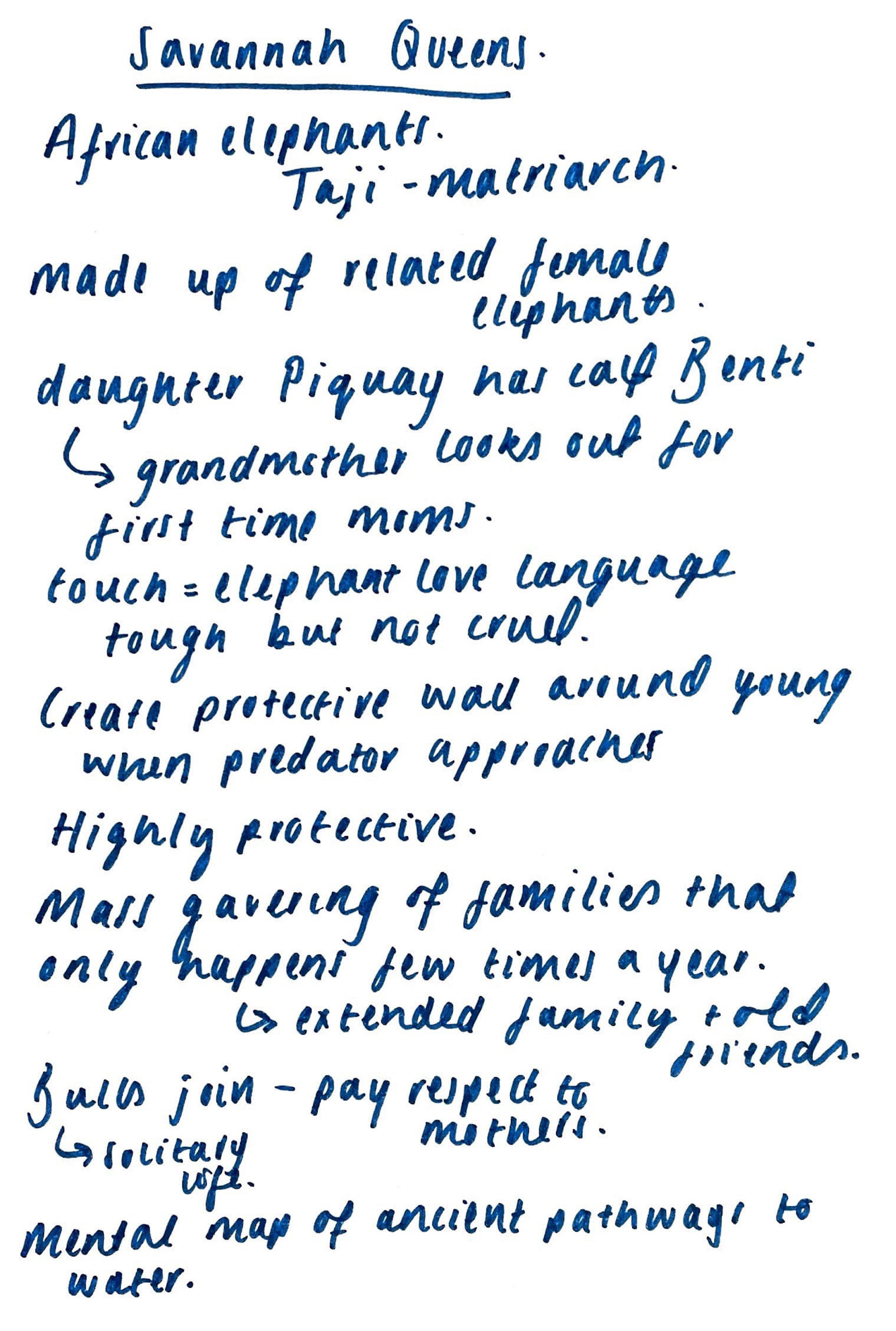
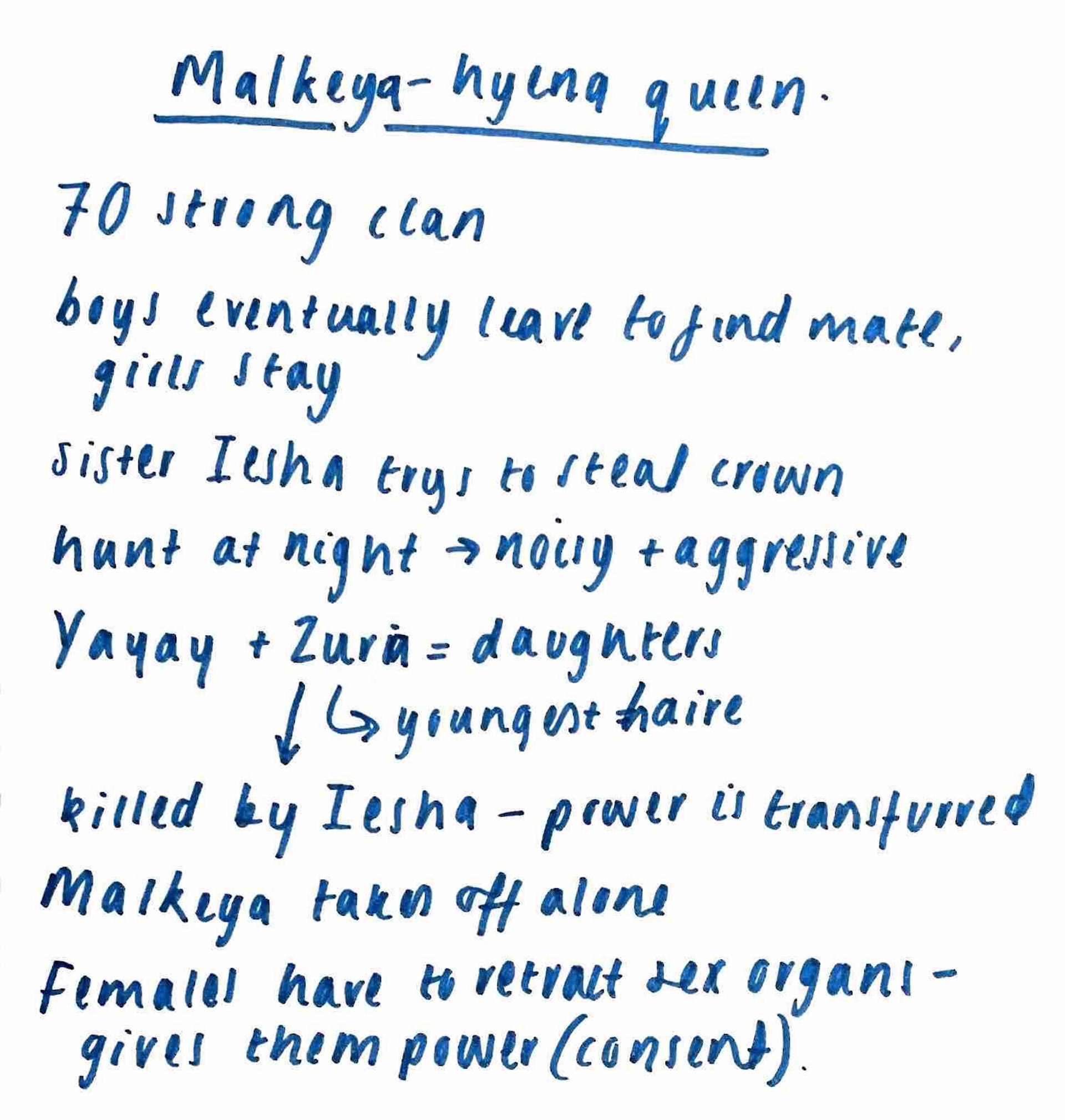
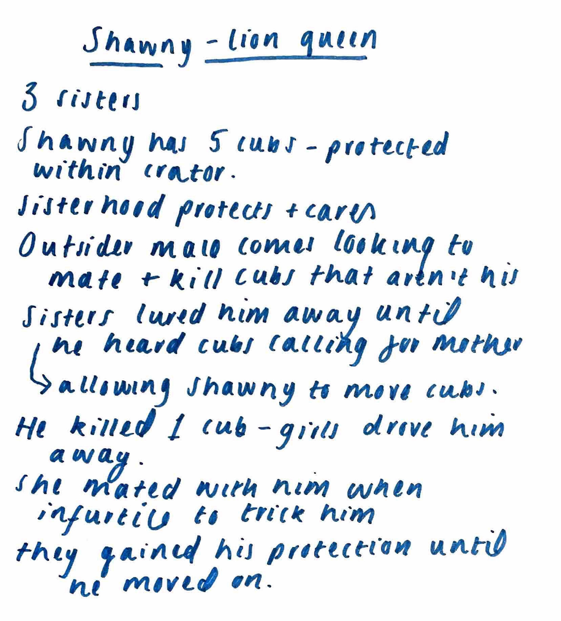
Moving forward I want to search more into the different groups of animals and the dynamics they share. Packs, herds, prides- all family units that rely on a certain way of living in order to best survive. It’s not always easy to realise that the love and belonging experienced by humans is also experienced by most species. Maybe evidencing this in my work could lead to some increase of empathy and respect for animals.
looking at packs as a whole
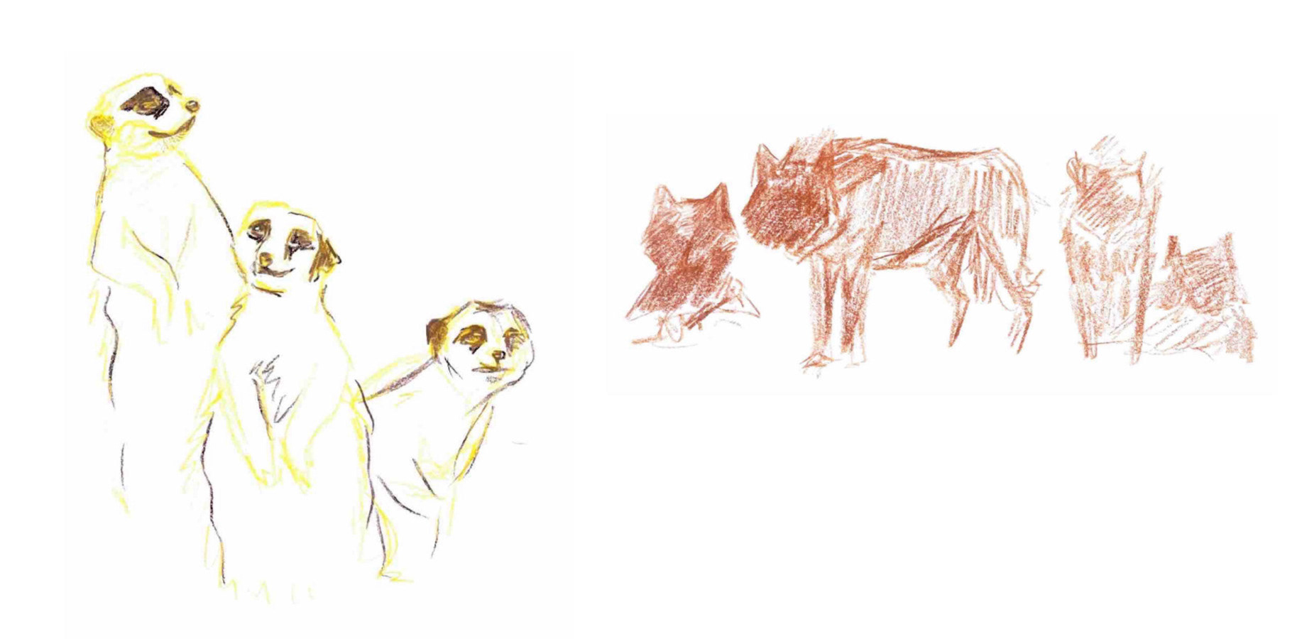
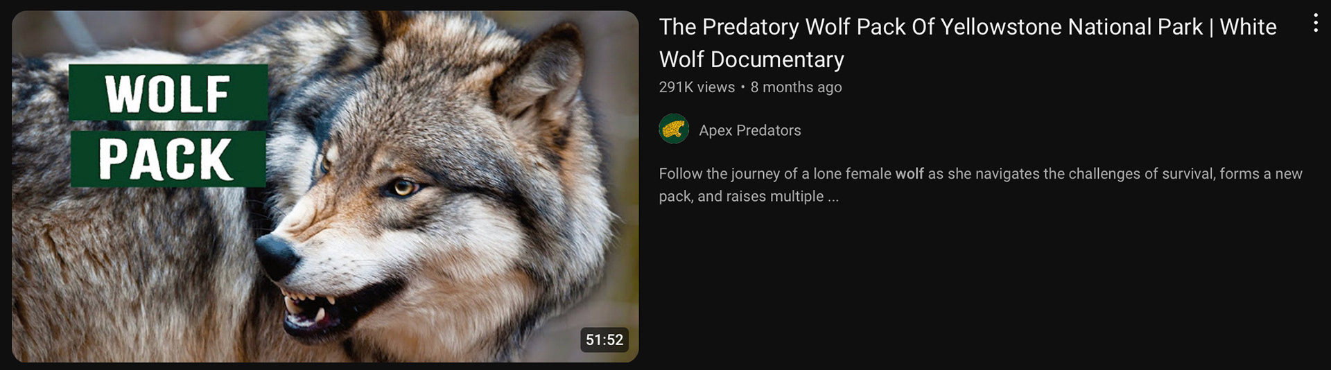
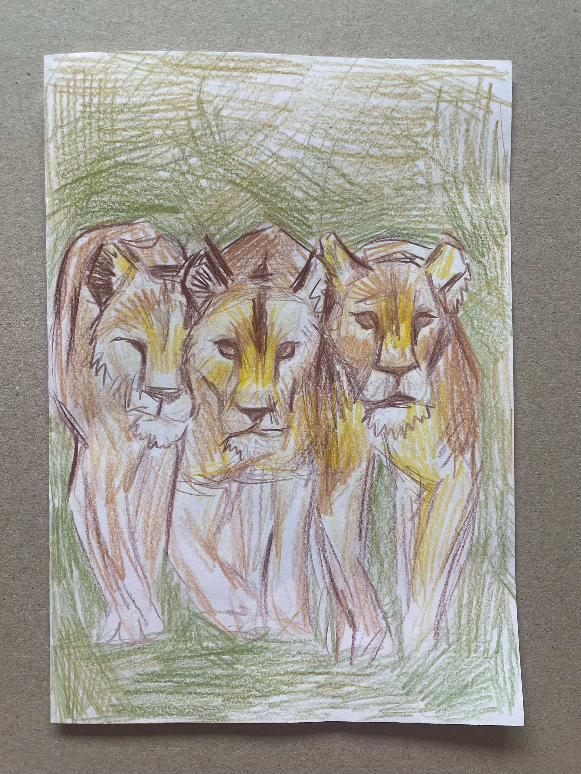
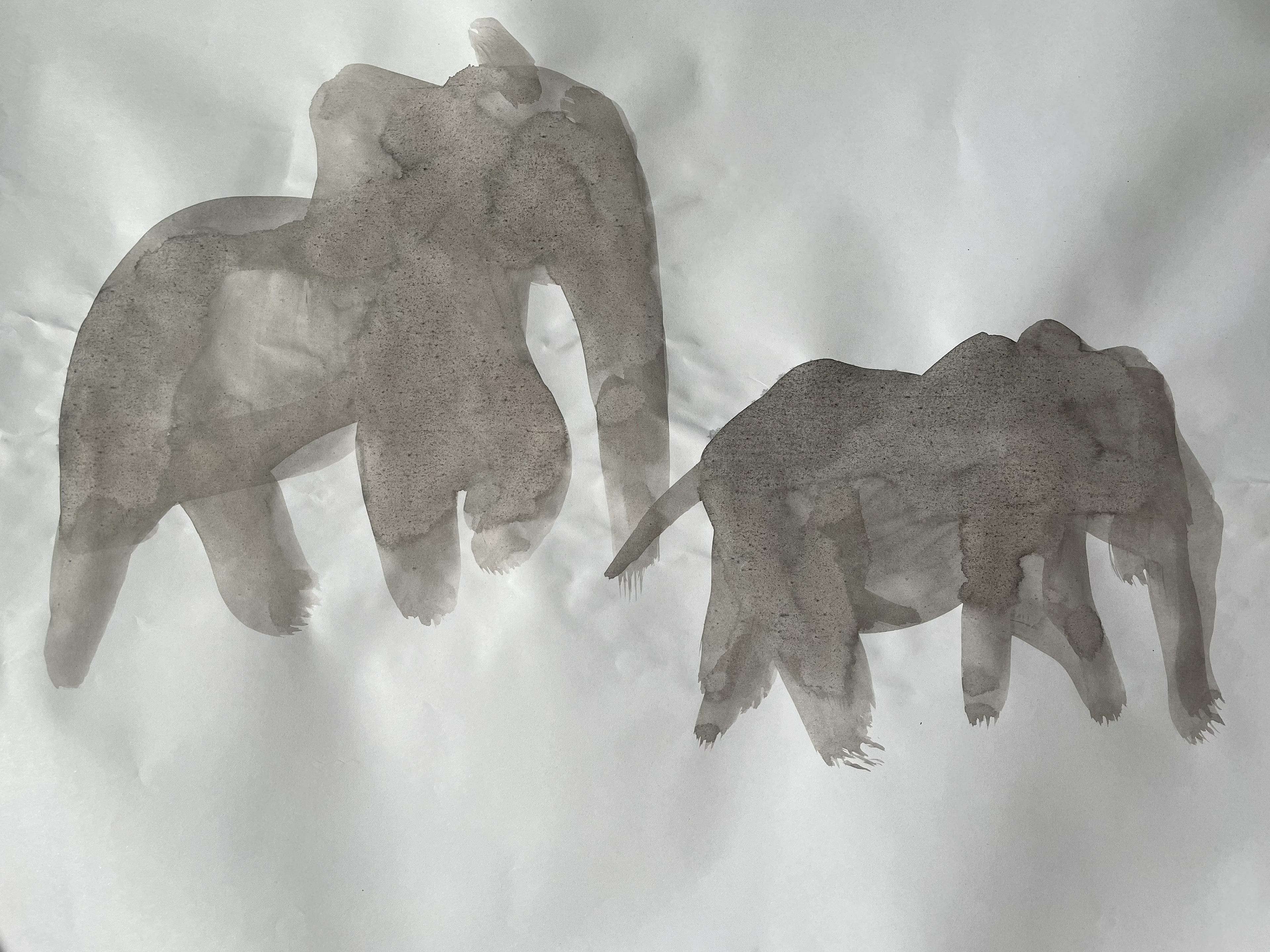
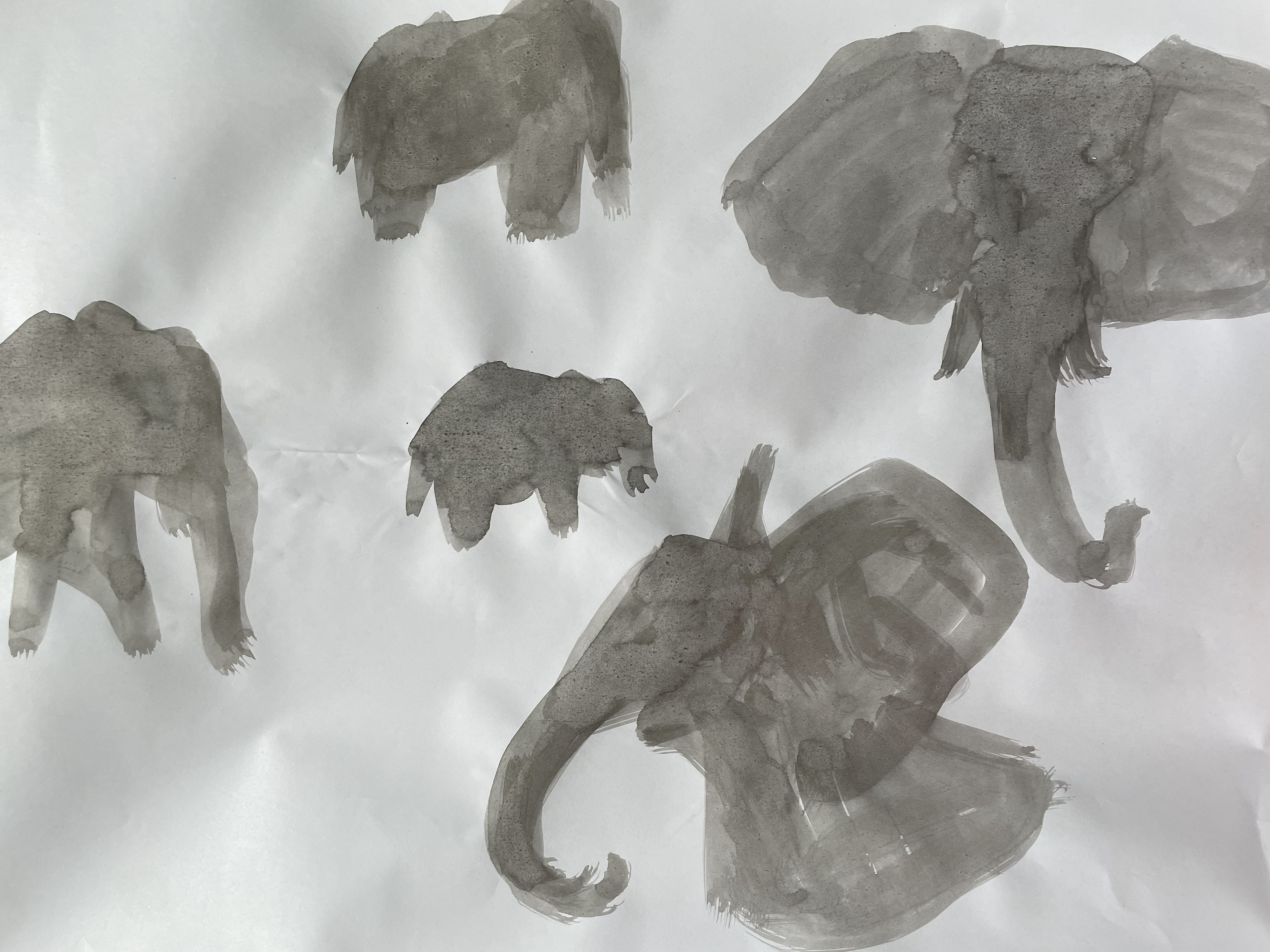
animal Research
childrens book research
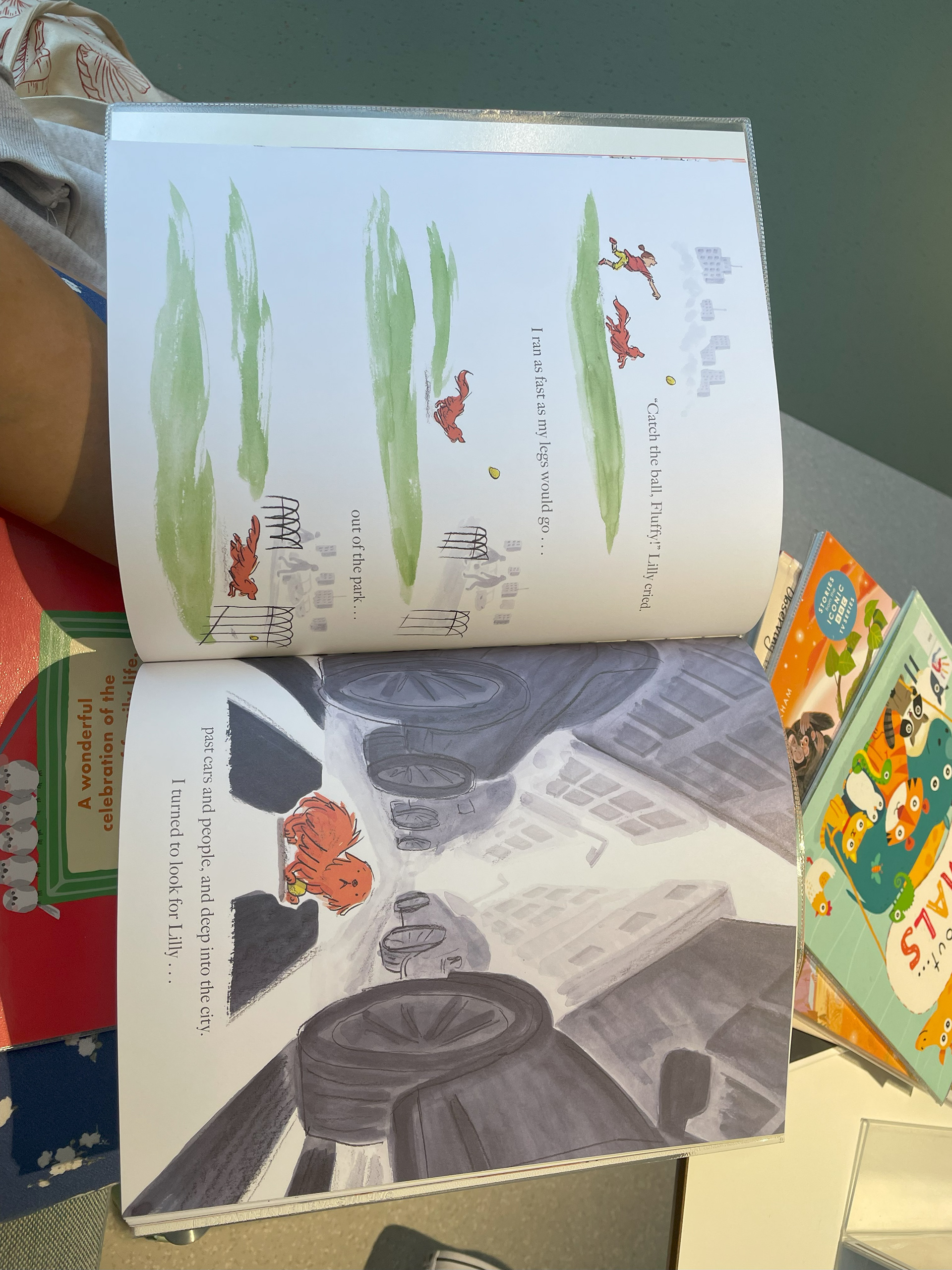
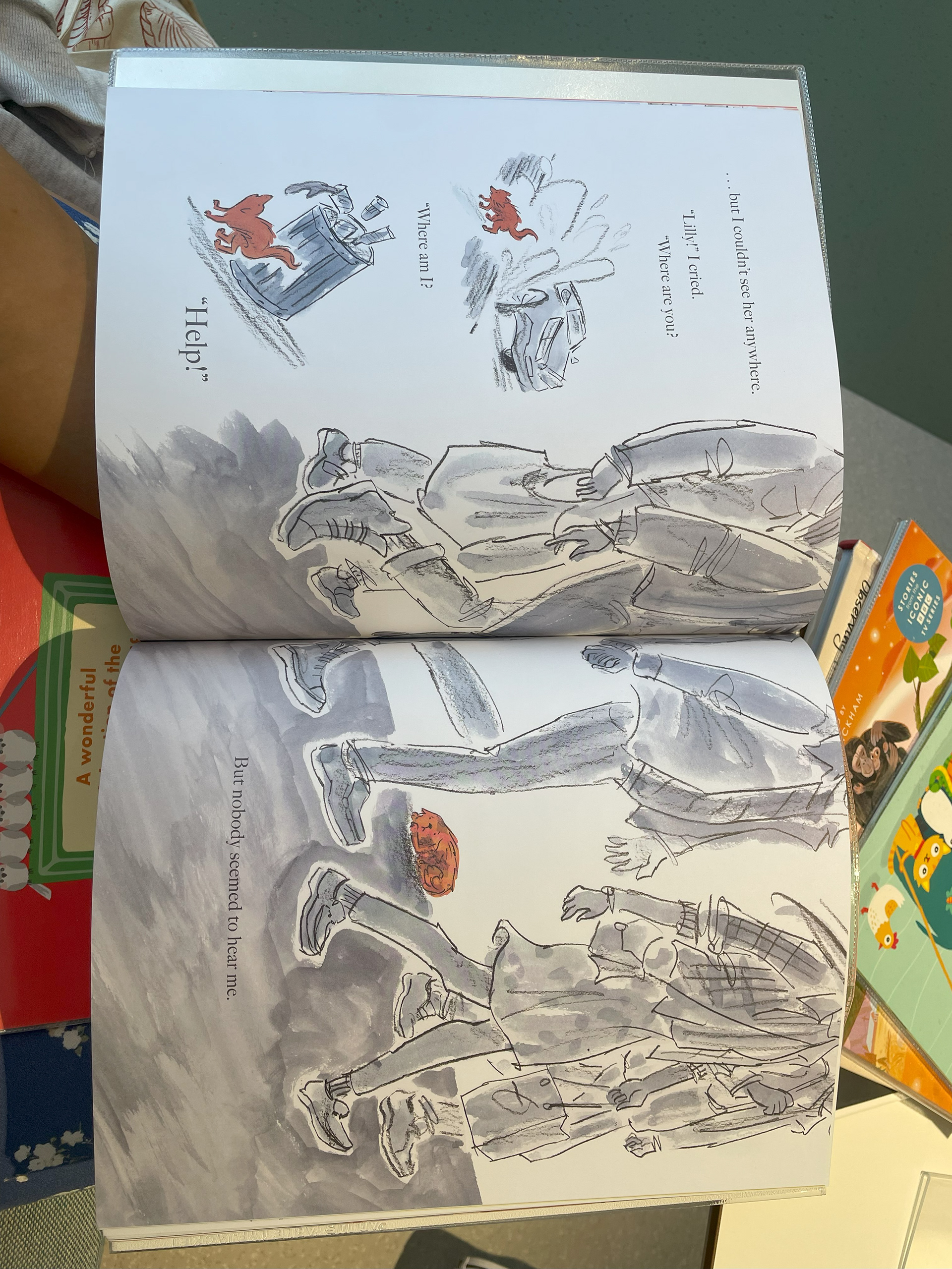
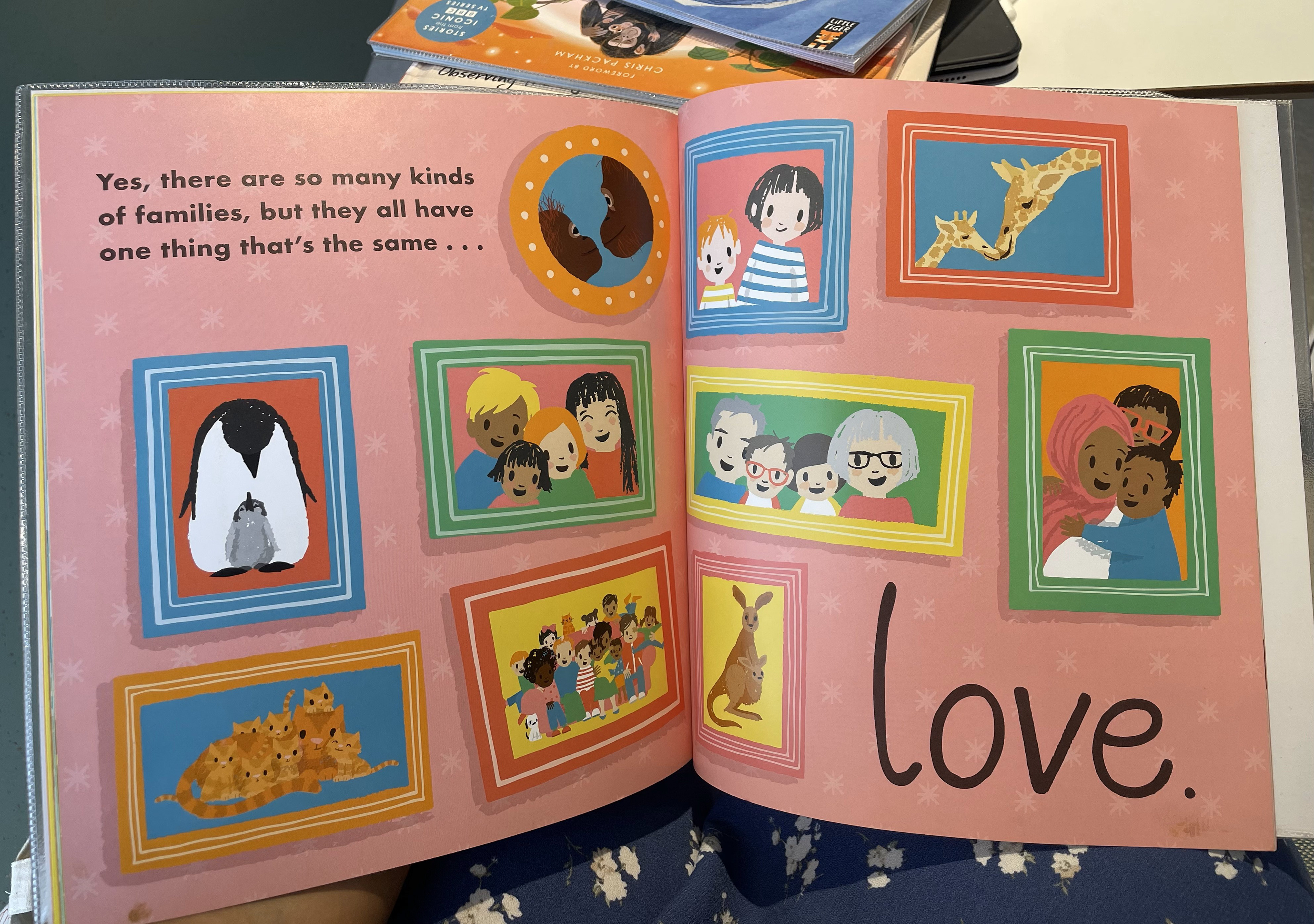
I went to Nottingham library and took out some childrens book's regarding animals. Majority of the books for the youngest ages were more animated looking with exaggerated expressions.

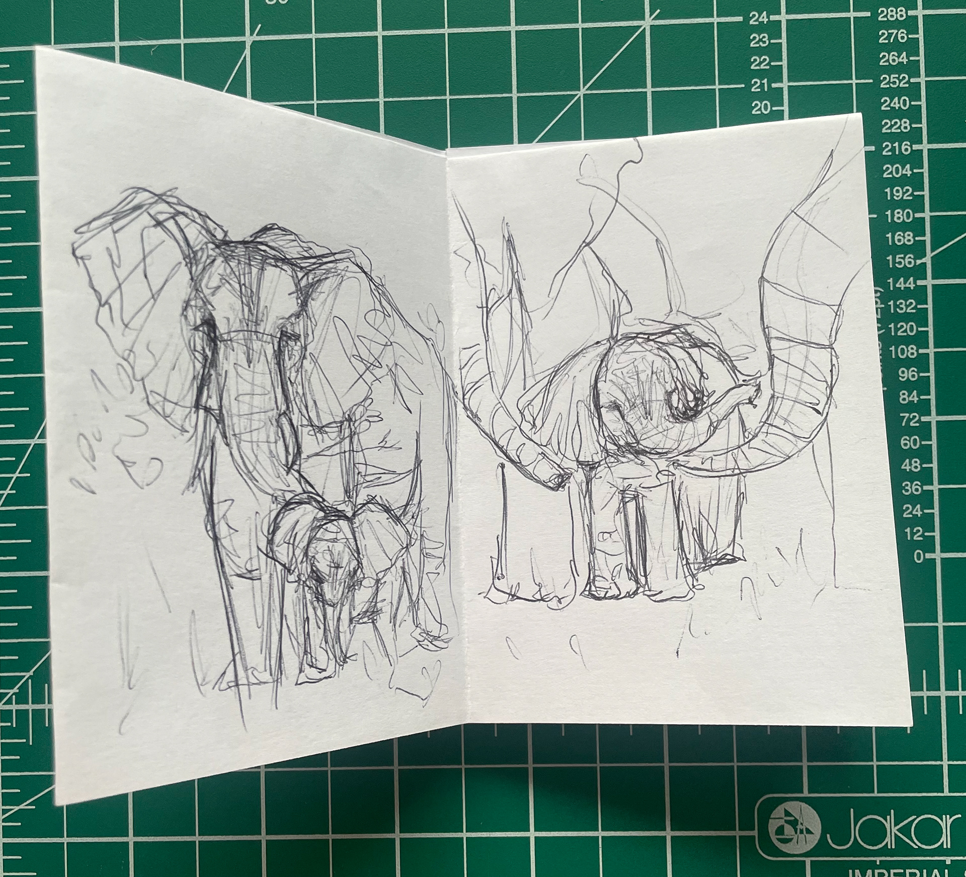
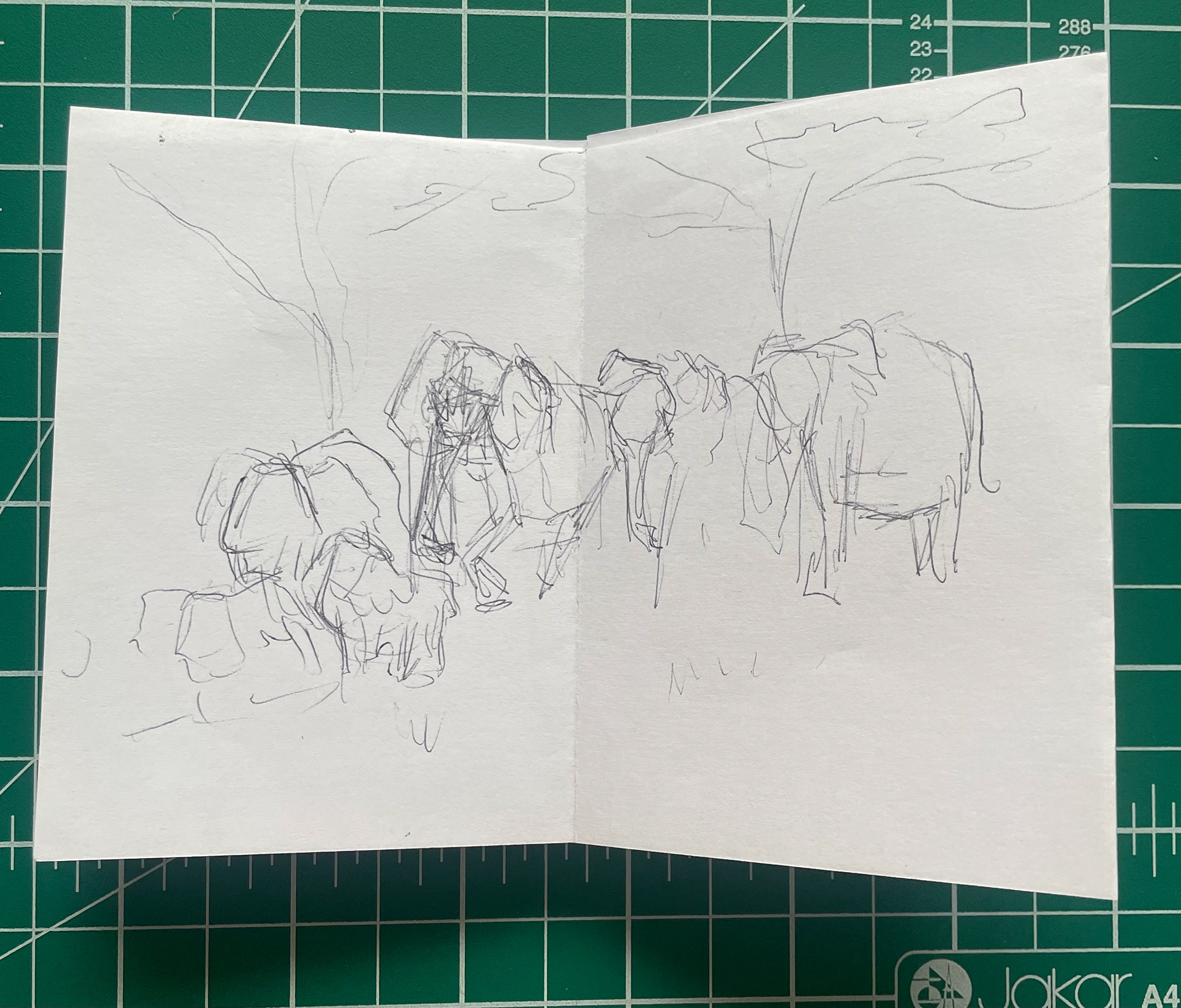
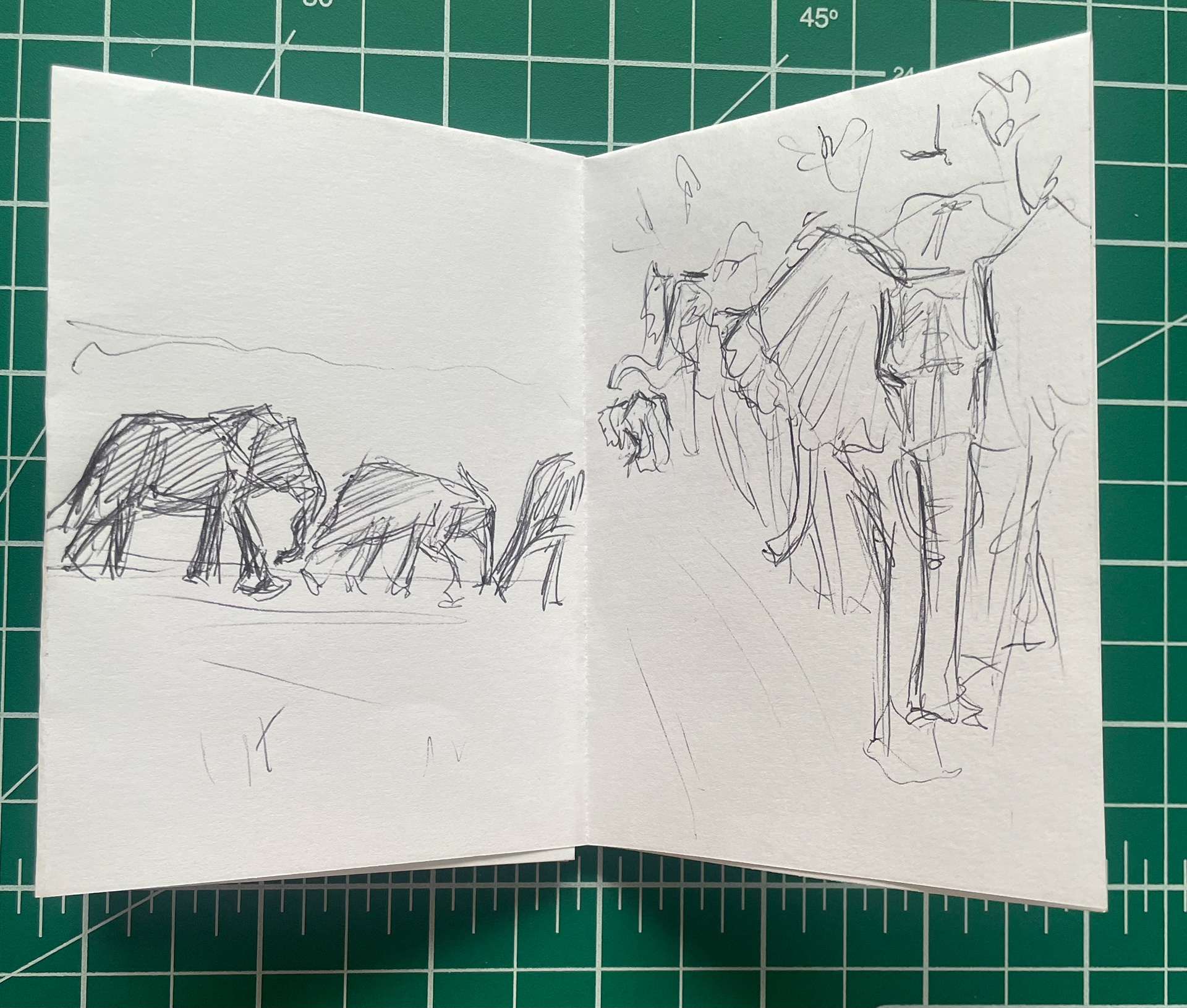
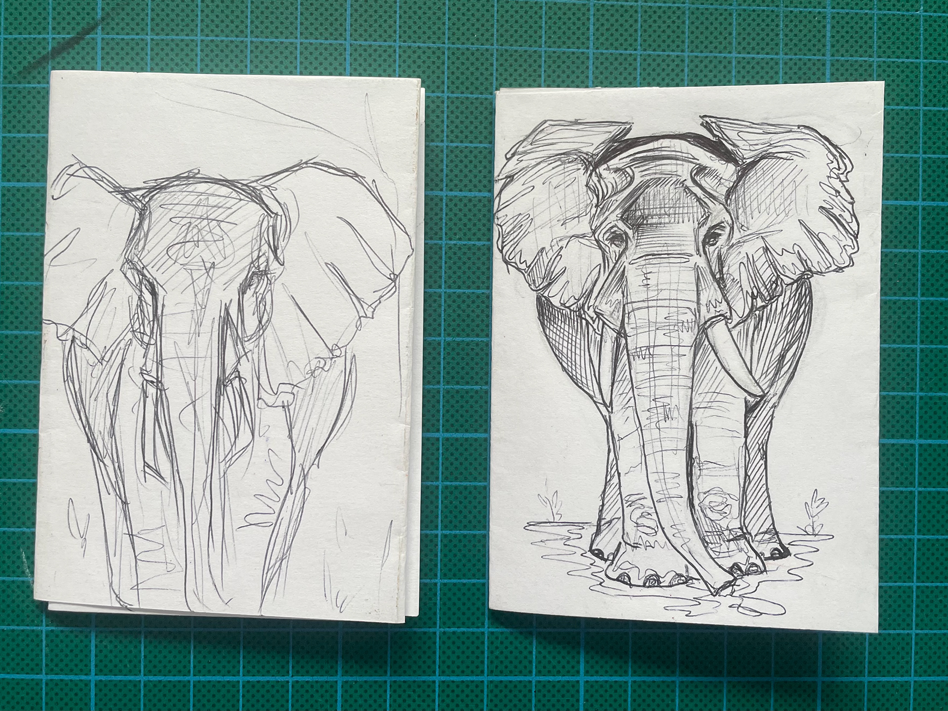
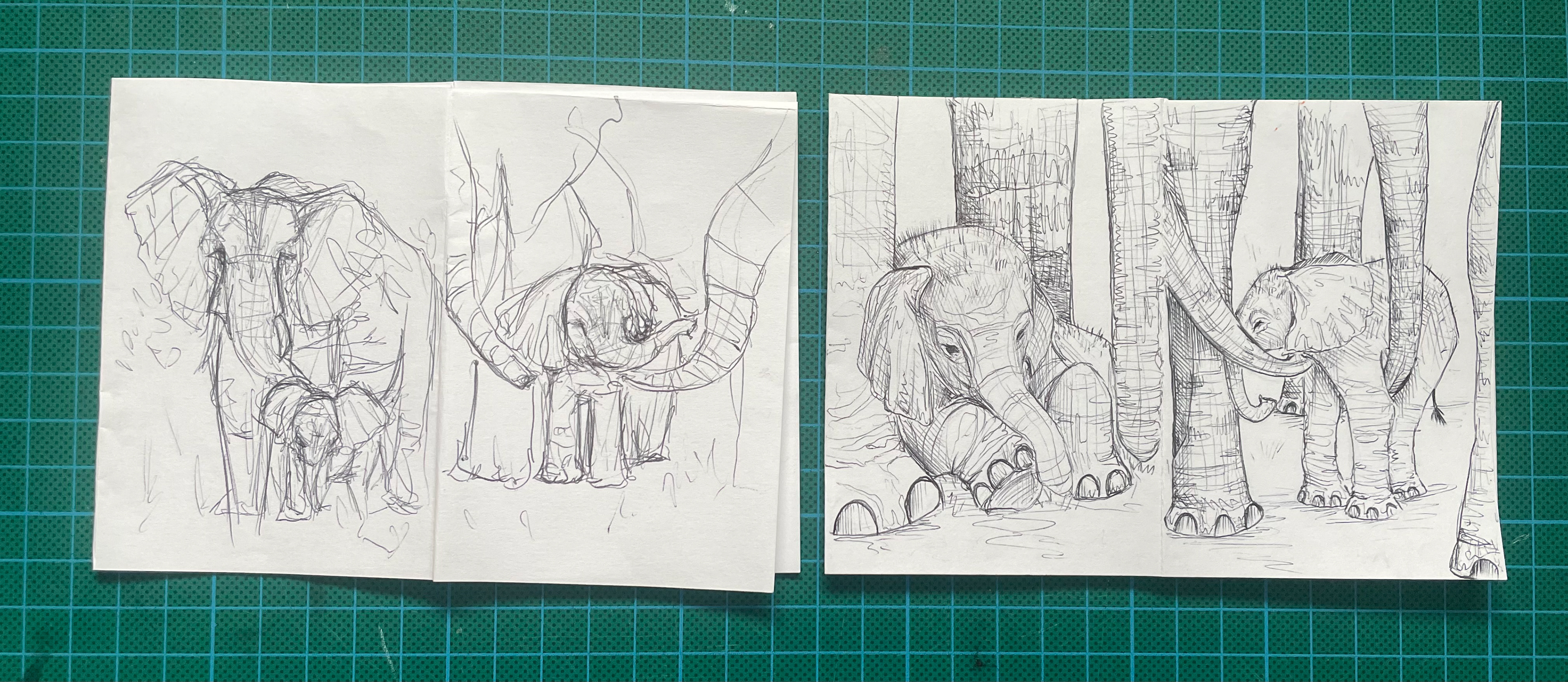
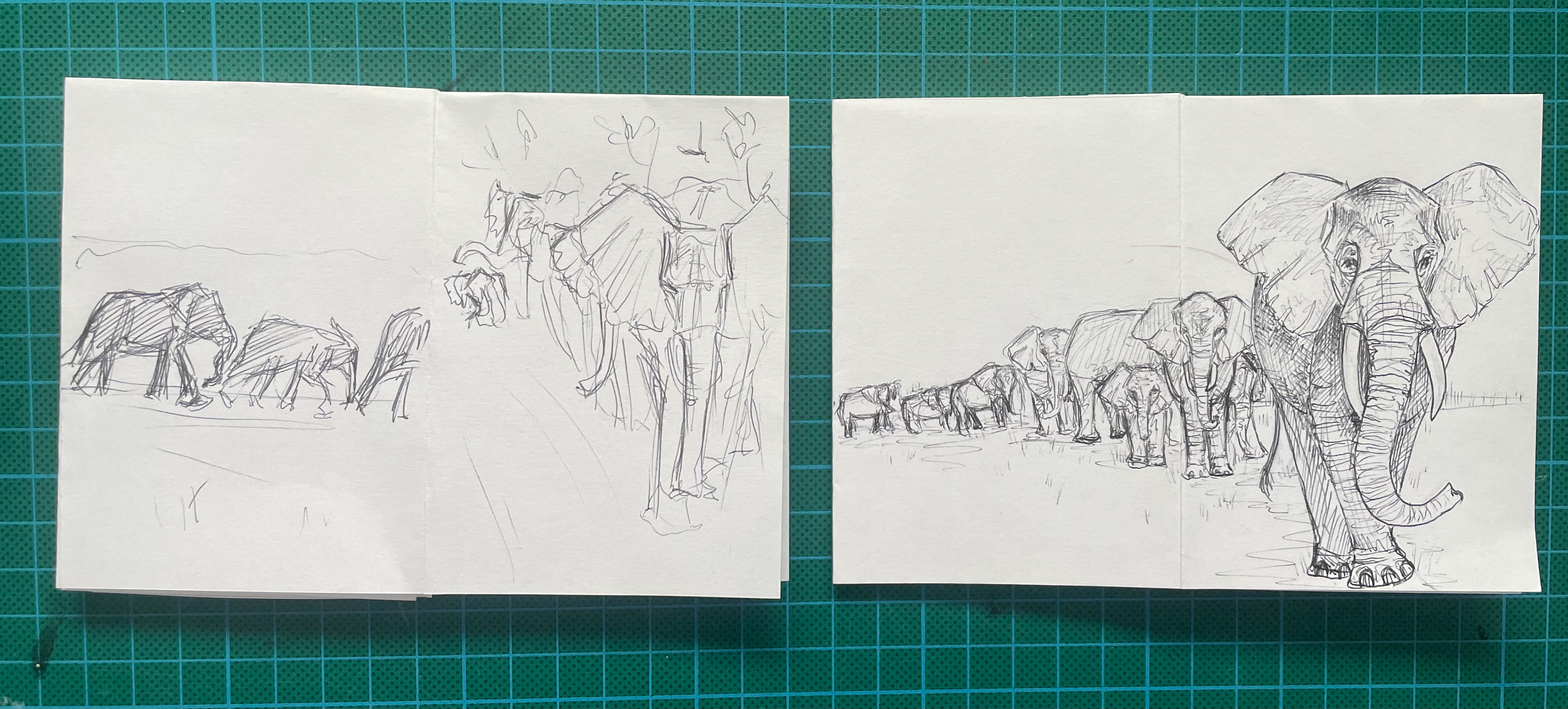
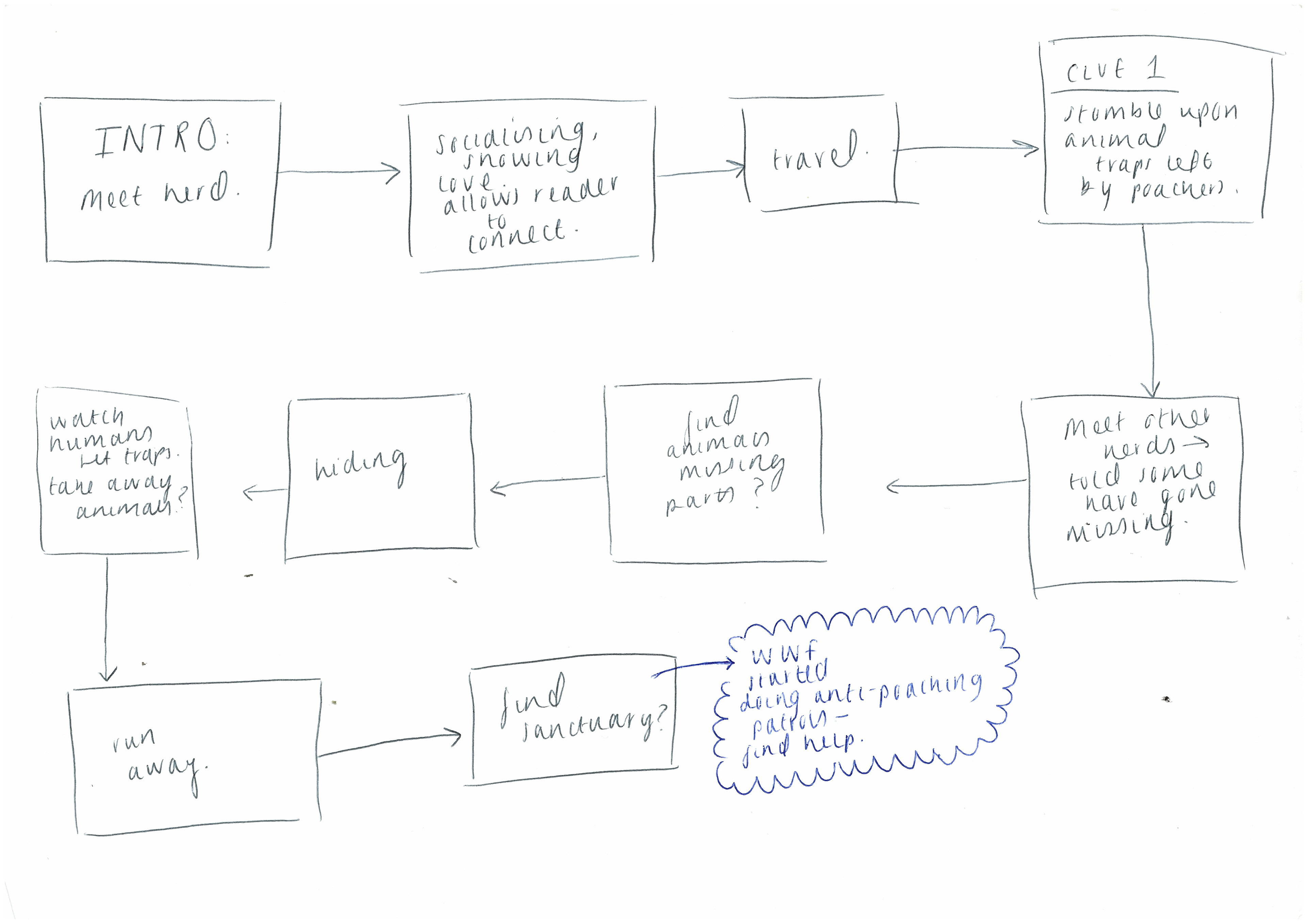
For now I feel as though I have settled on the idea of creating a zine. The subject will either focus on one specific ‘pack’ or may include stories from multiple. In my tutorial we discussed how to improve on my techniques when creating a zine- focusing on layout, colour palette and structure. Something I hadn’t noticed before is how even doing something as simple as flipping the way the animal is walking can encourage the reader to turn the page to find out where they’re headed. Using this I went back and started developing my elephant zine and I am a lot happier with how this turned out.
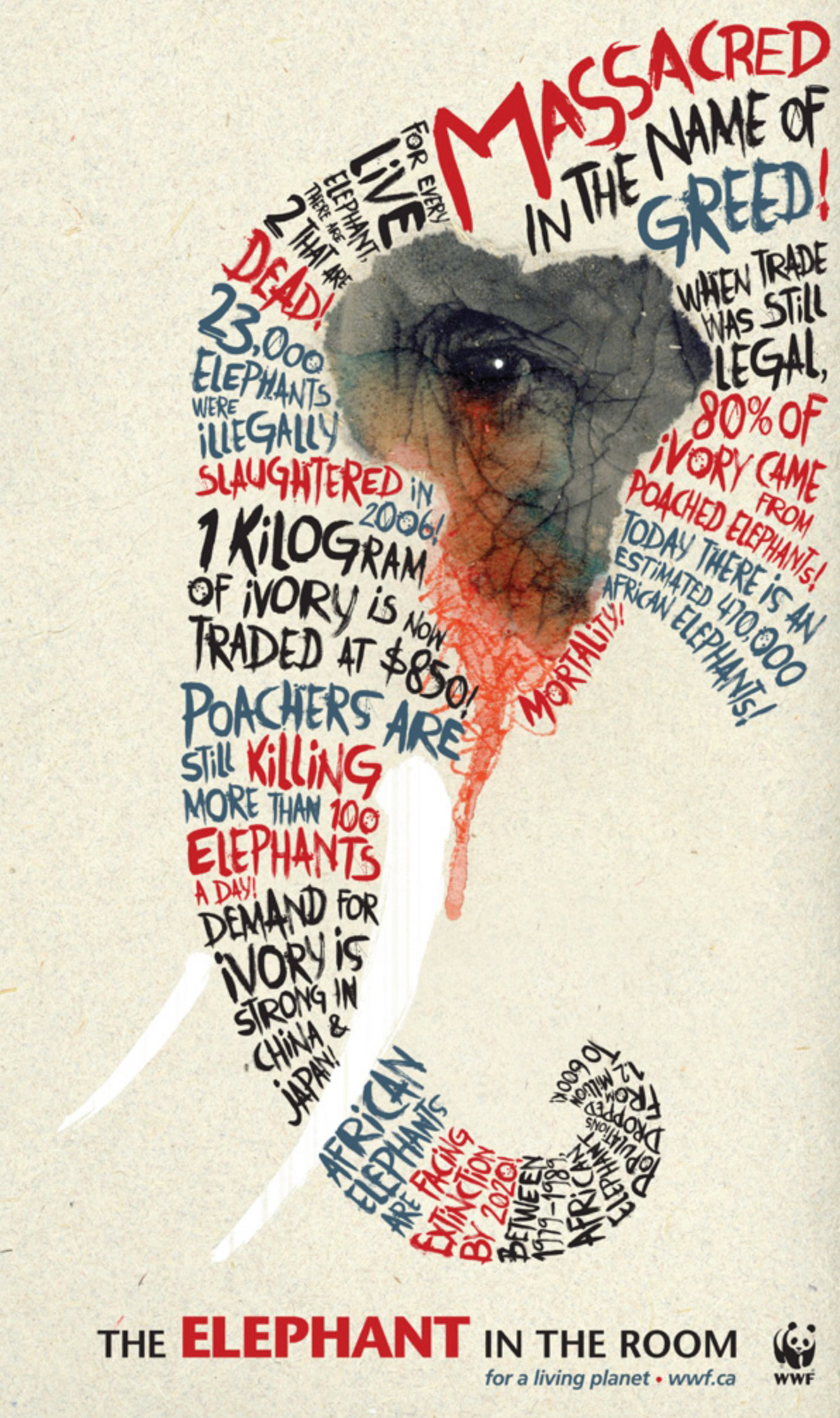
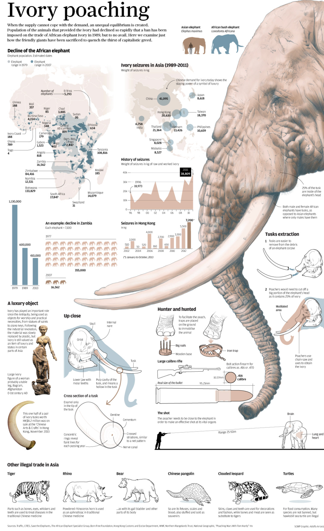
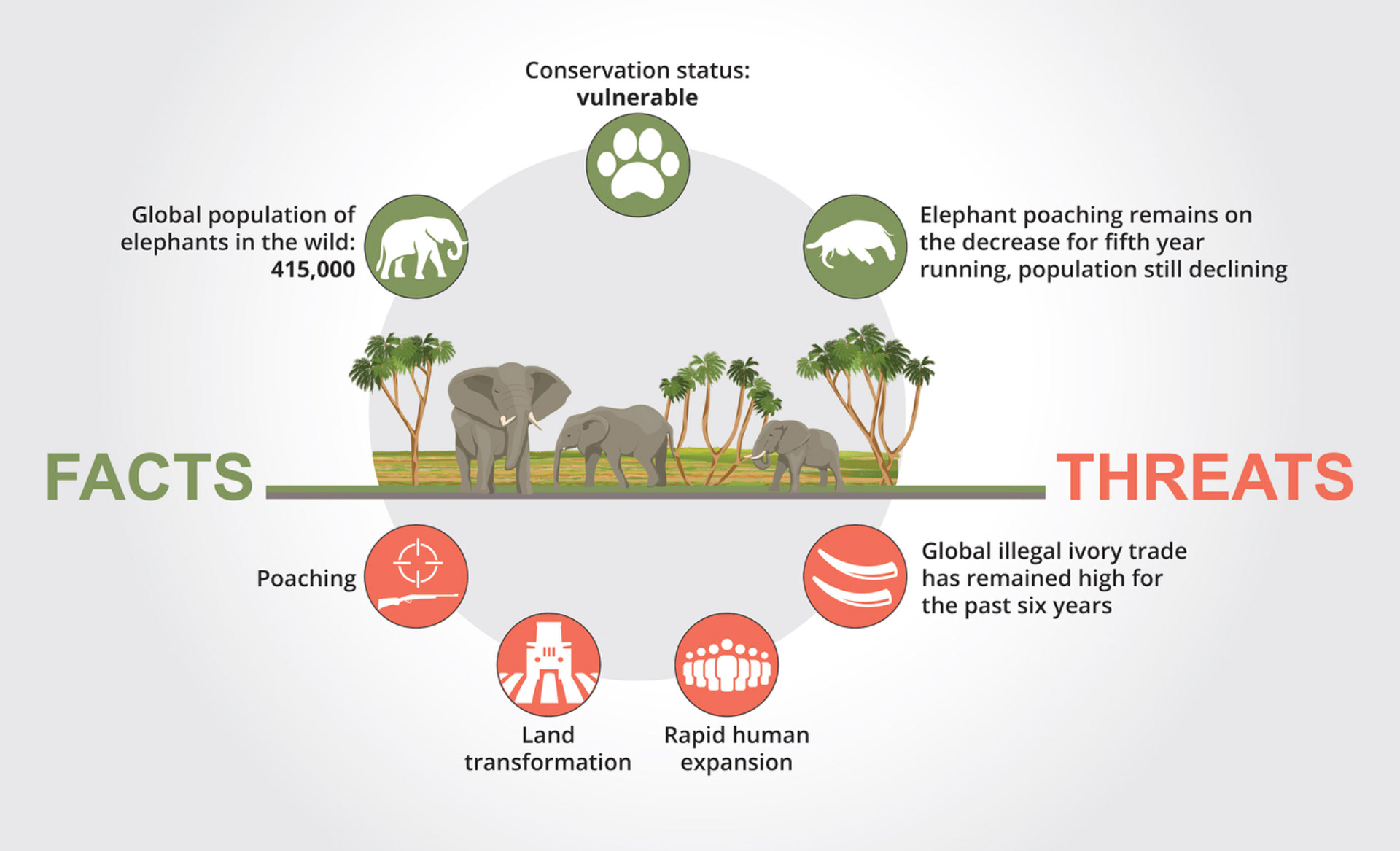
I’m finding it really difficult to create a storyline that I connect with as well as making sure it’s suitable for younger readers. Having these boundaries has made it extremely difficult to breach the serious topic of poaching- imagery showing this being too traumatic or deep for a child to see. I tried finding ways around this, more so hinting at the idea rather than blatantly showing the act but then the worry of ‘will my message still come across?’ comes into play. Researching into the factors that should be considered when illustrating a children’s book also brought up another issue for me. I’ve been encouraged to make my animals more human-like, exaggerating features to enhance characters feelings or personalities and to consider a more alluring colour pallet so that a child is more drawn to it. Although this all makes complete sense it feels wrong to make light of such a serious message and change from what I’m used to. My whole aim of making people connect with these animals shouldn’t be because they’re acting like humans, I want them to see exactly how they are- a truthful representation that isn’t shown enough.
When I think about what work I most enjoy seeing, my amplify book is always what comes to mind. I spent time looking back through it, noting down the things that I liked.
Target audience research
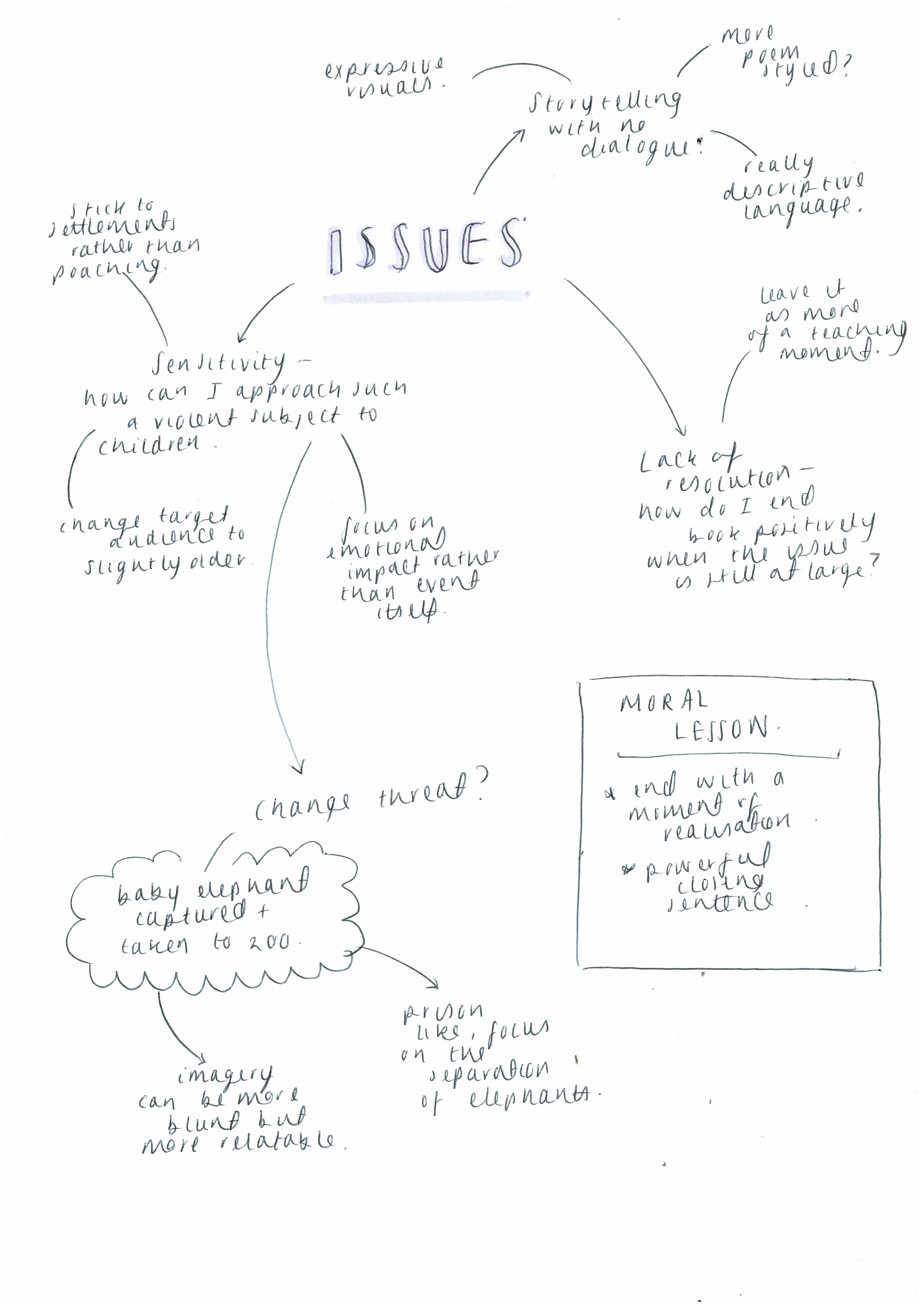
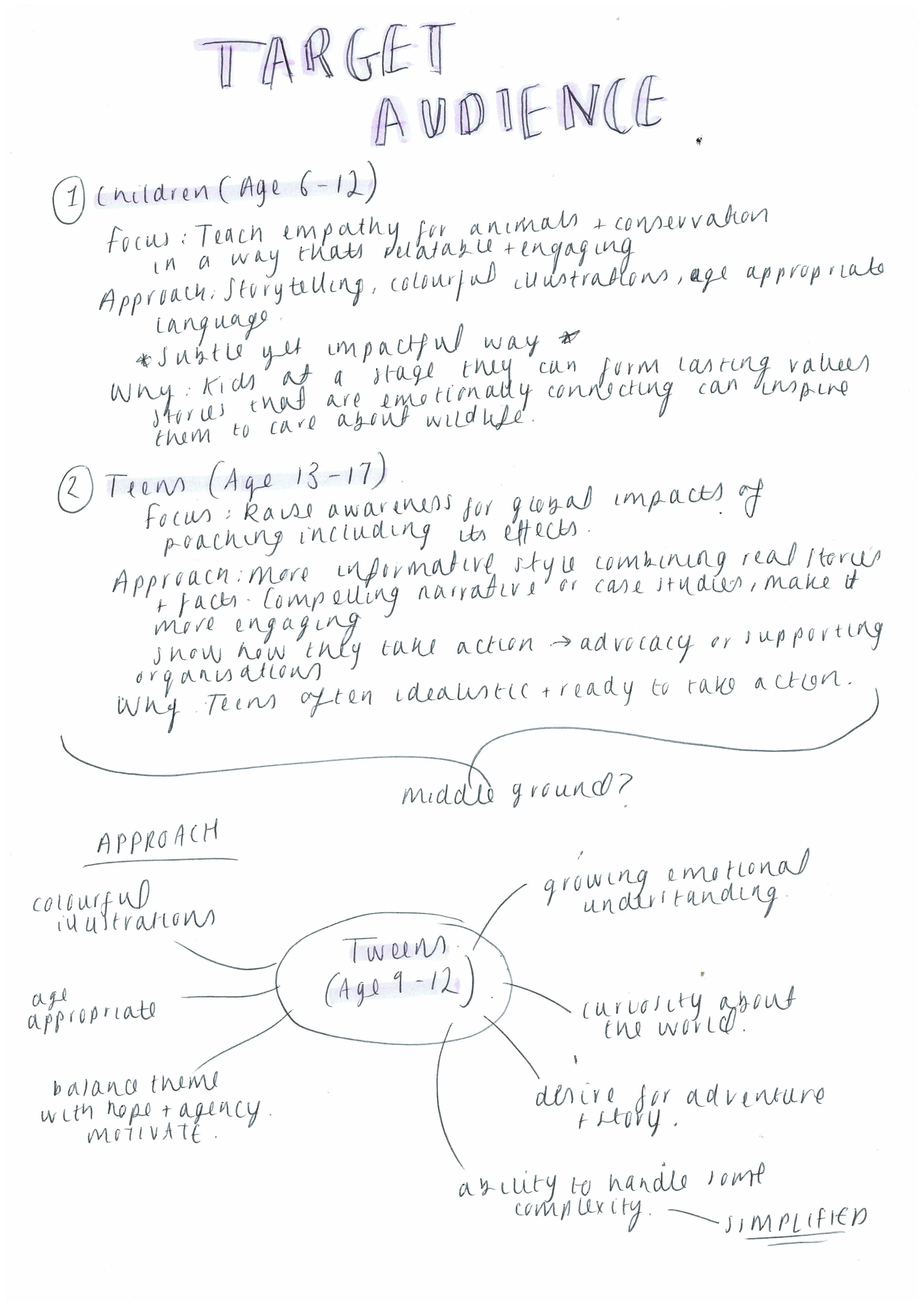
Moving my focus more towards children flagged up some issues. The first being that they are more likely to engage with books that I didn't want to illustrate- such as more humanised animals that wear accessories to prompt their role/personality. I was set on creating something with a serious meaning and so it felt wrong to make them unnatural to who they are. My purpose in this project was all about educating on their lives and so it felt insensitive to stray from exactly who they are. The second problem was that the issues I wanted to make apparent could be classed as too sensitive for certain age groups. Because of this I did some research into what age is appropriate to start showing these kinds of topics to along with thinking of ways to dull down the imagery of these issues.
I found that it was more acceptable to start hinting at issues between the ages of 6 and 12. Subtle imagery that they can choose to read into. With teenagers (13-17) you don't need to be as mindful because these are the ages they start being taught about more serious subjects, but their morals are already in development by then. This was a problem because the whole point of my raising empathy in children was to show them in the ages they're developing their beliefs they later live by. This is to create a longer lasting sense of empathy, so I decided to go for tweens (9-12). This is because even though I still need to be a little cautious, they are less sensitive and so I can make a little more of a hint while they're still in the ages of development.
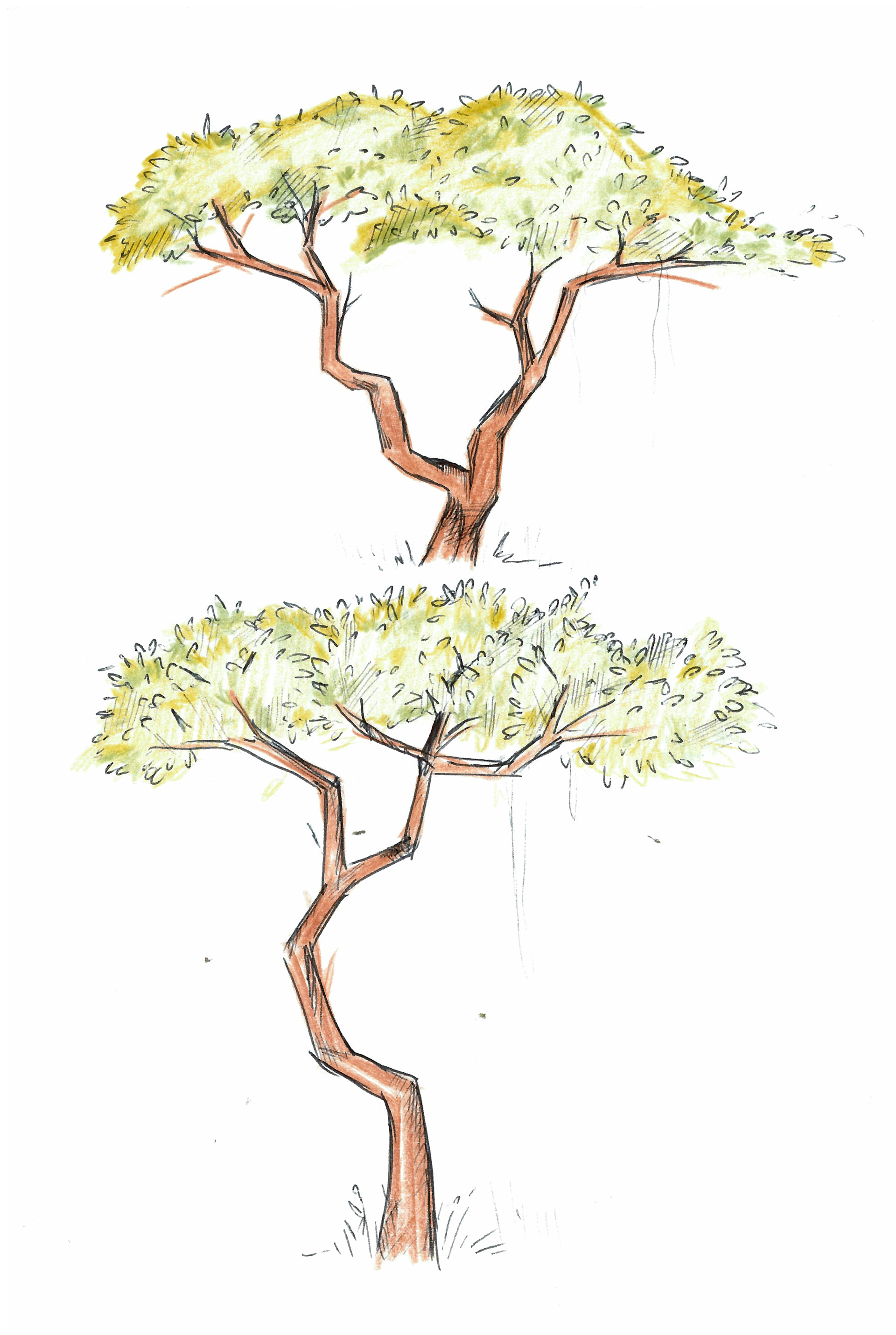
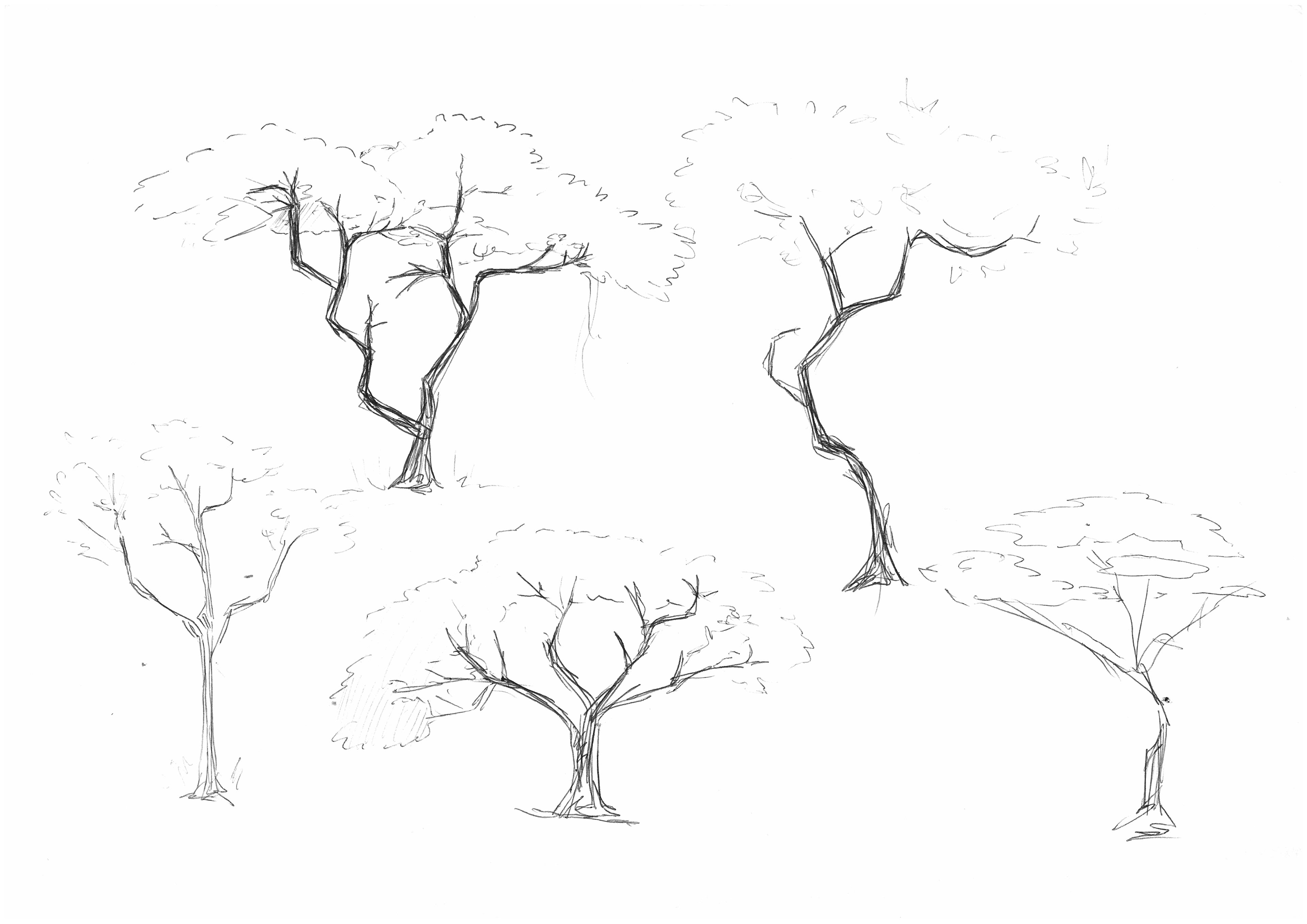
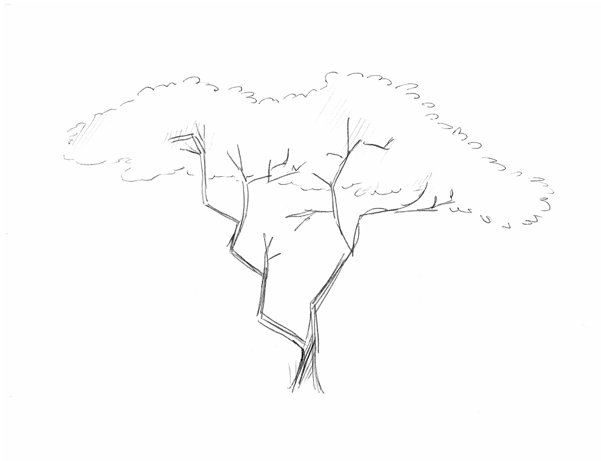
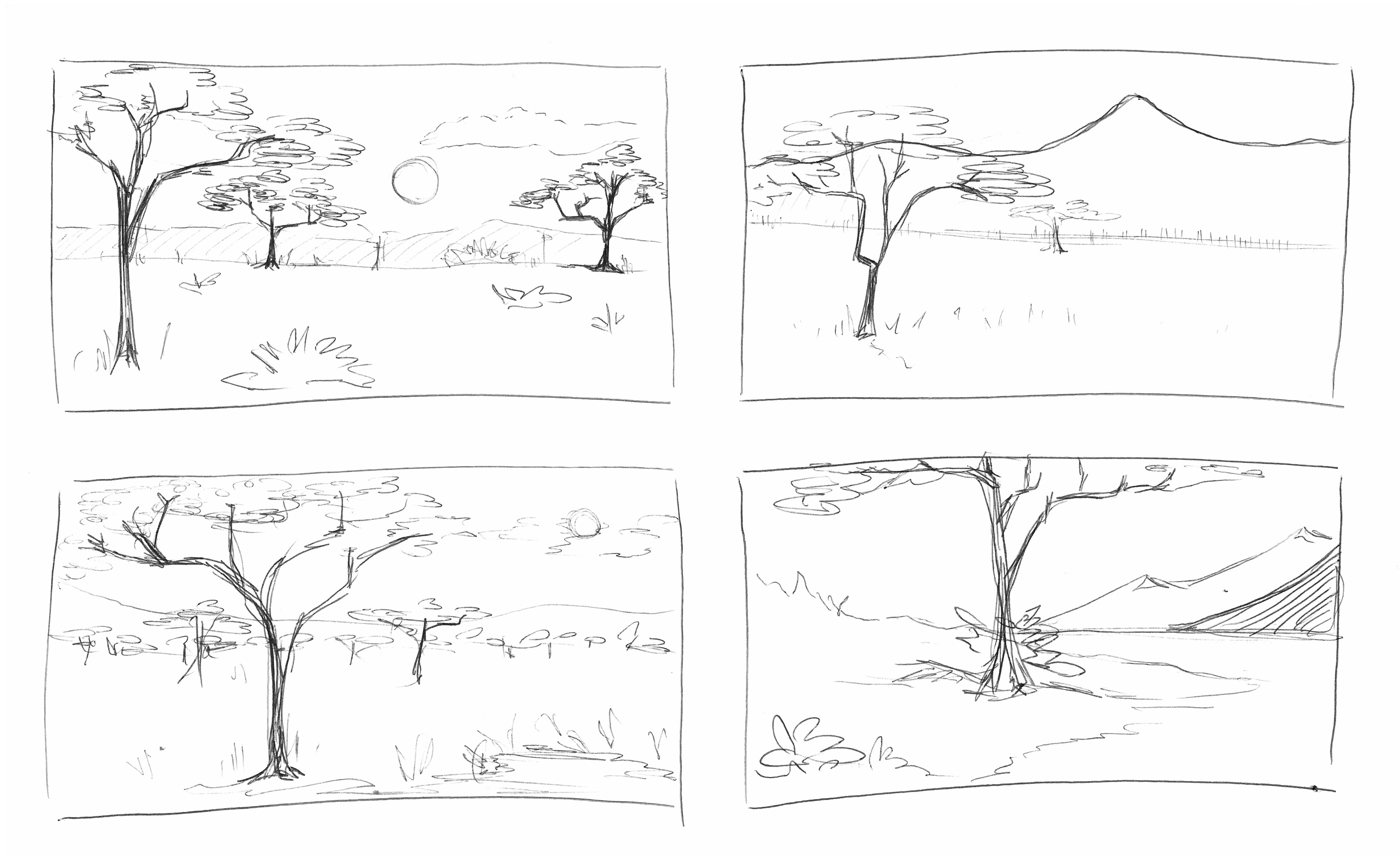
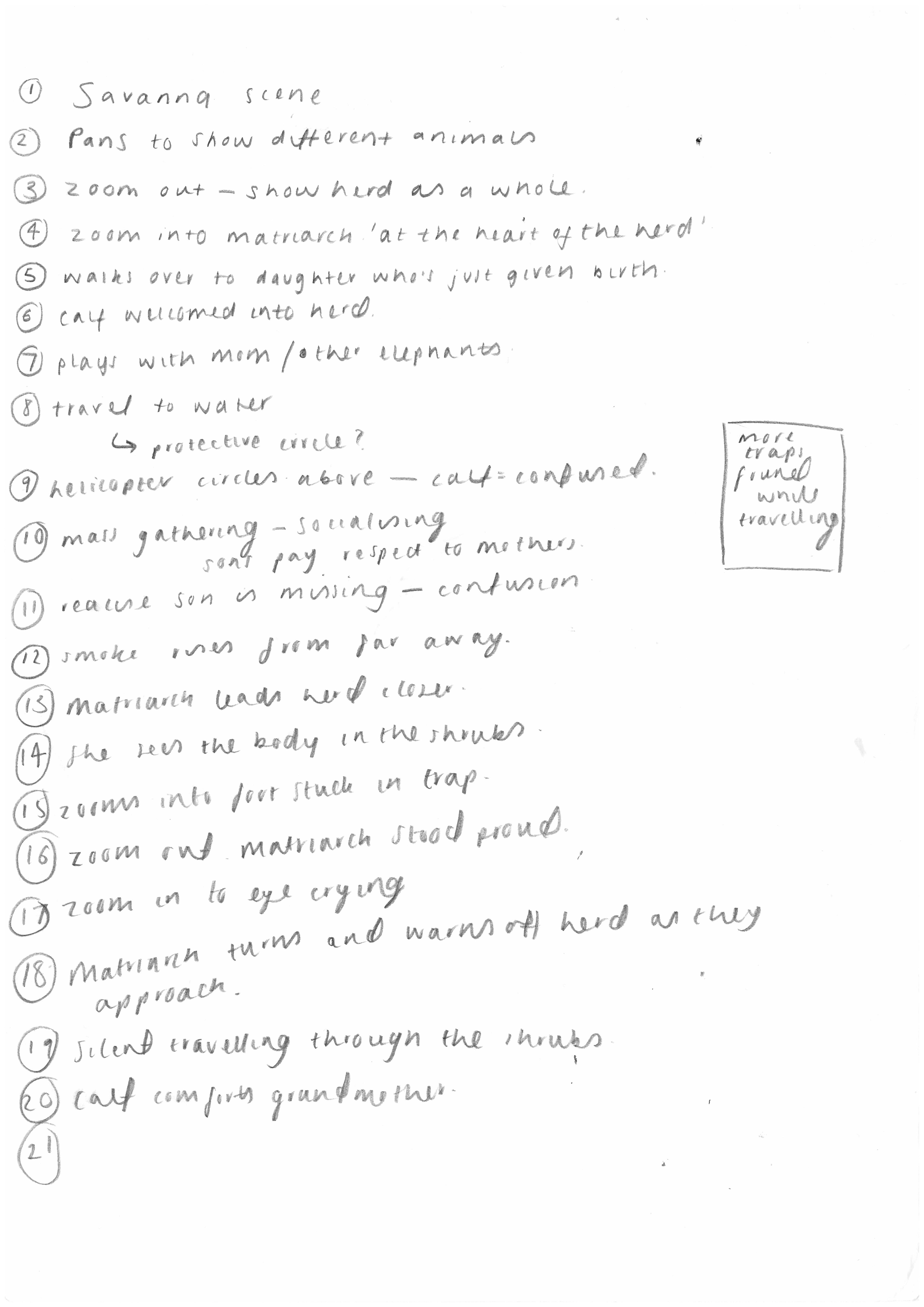
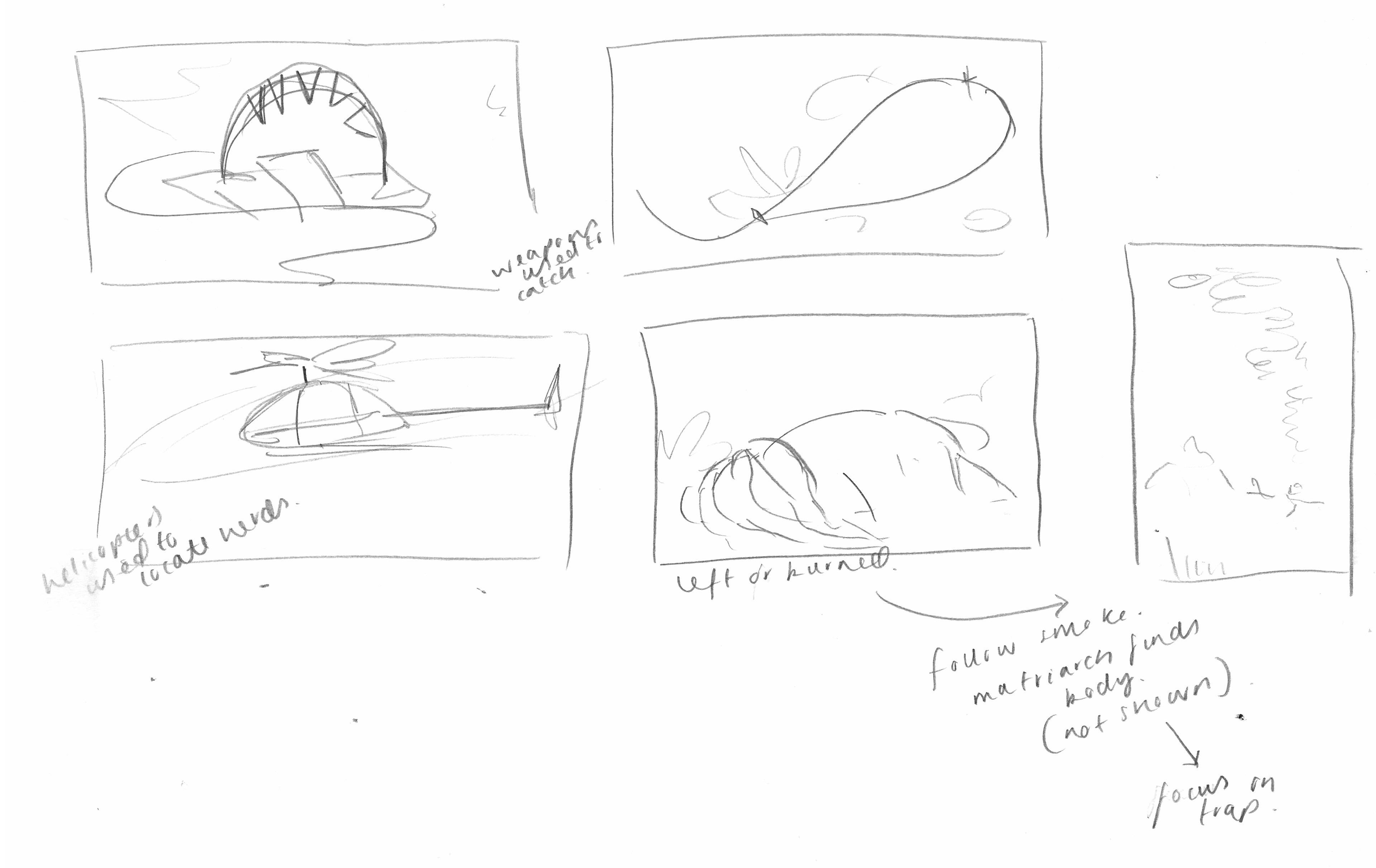
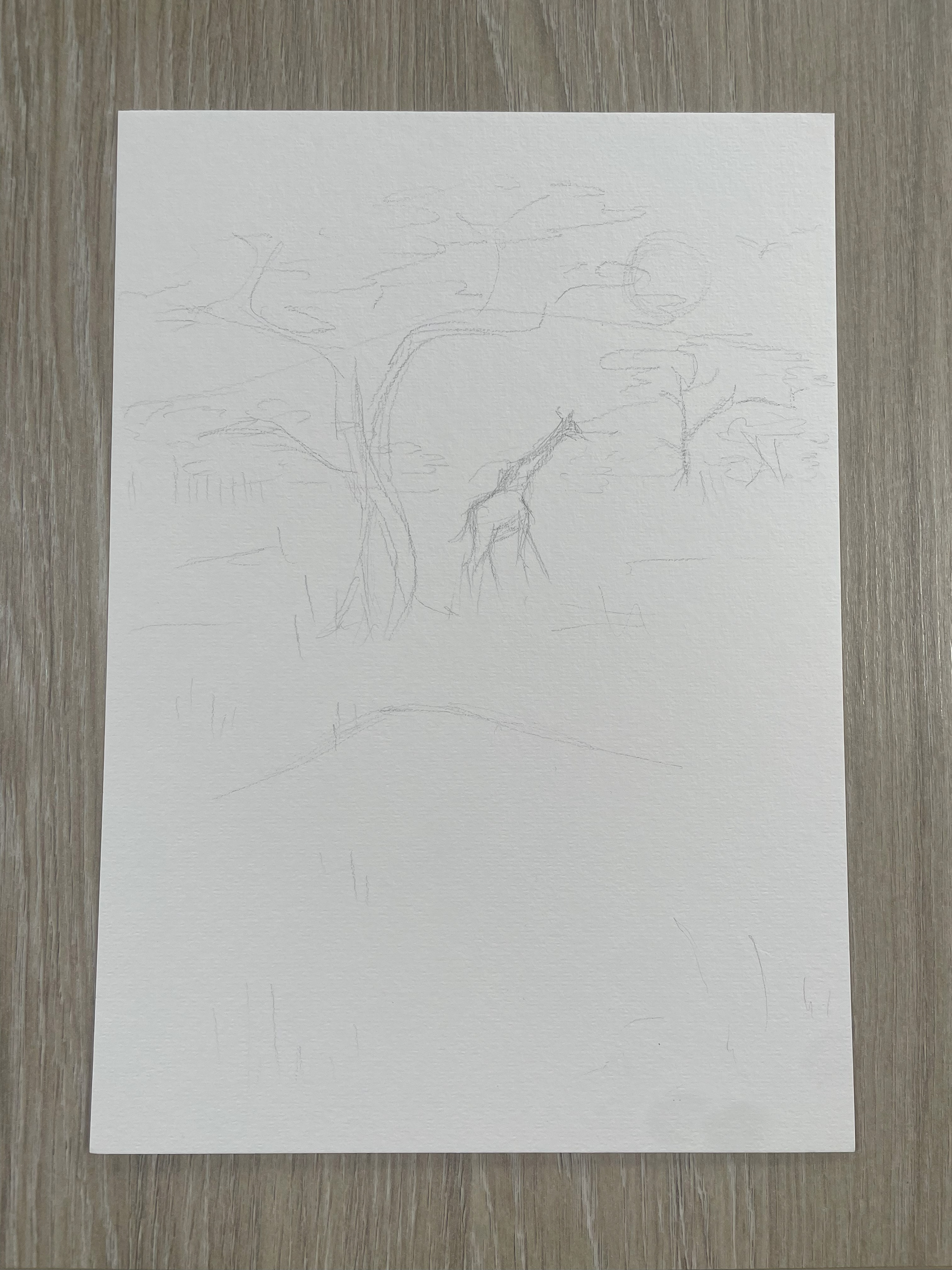
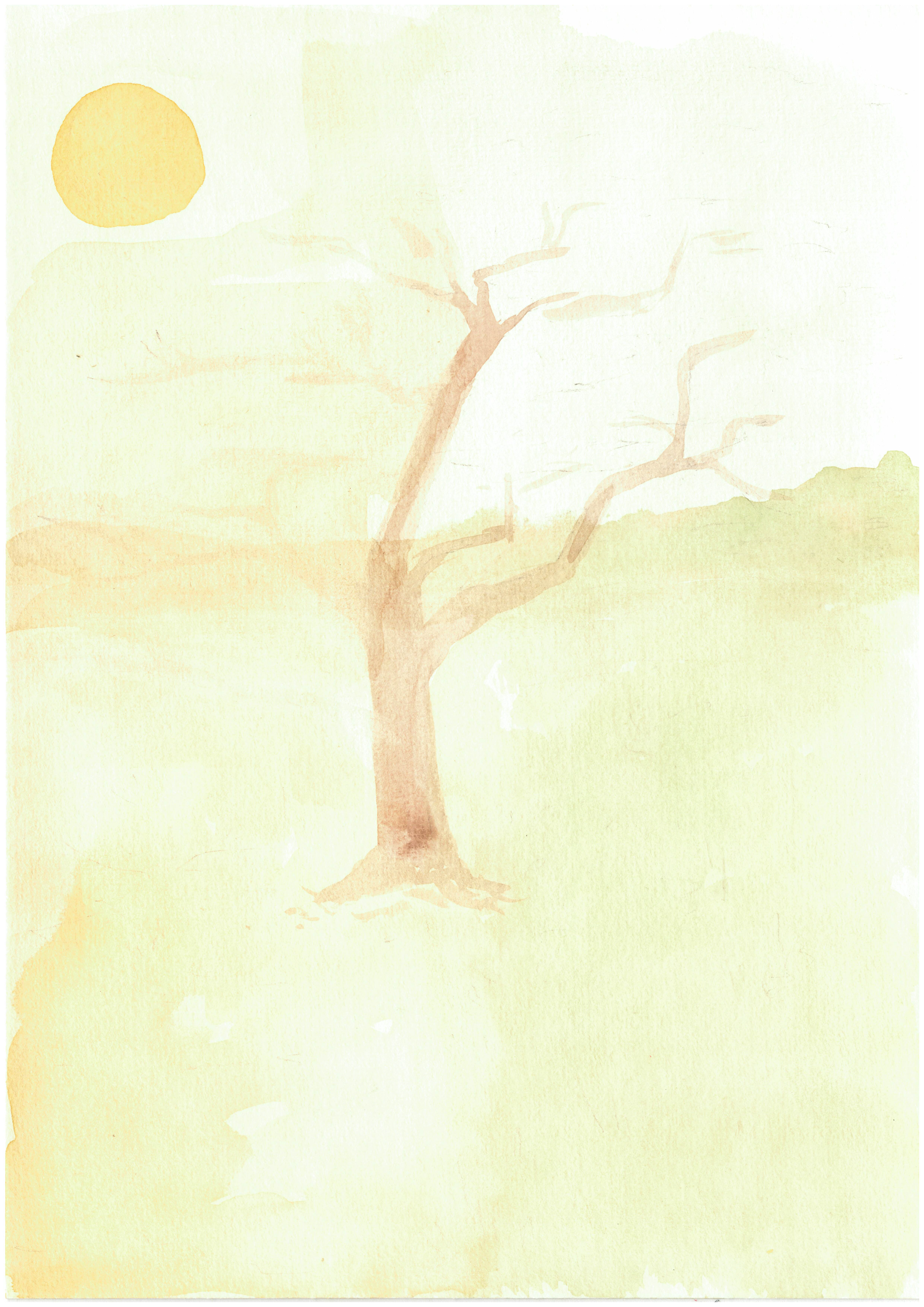
This was me noting down plot points that I wanted to include, trying to find less obvious ways to talk about death and poaching. I did this by zooming into a foot being caught in a trap, focusing on a tear and more of a silhouette of a body. I also did some little experiments of savannah trees to help me better capture the environment.
big brush watercolour experiments
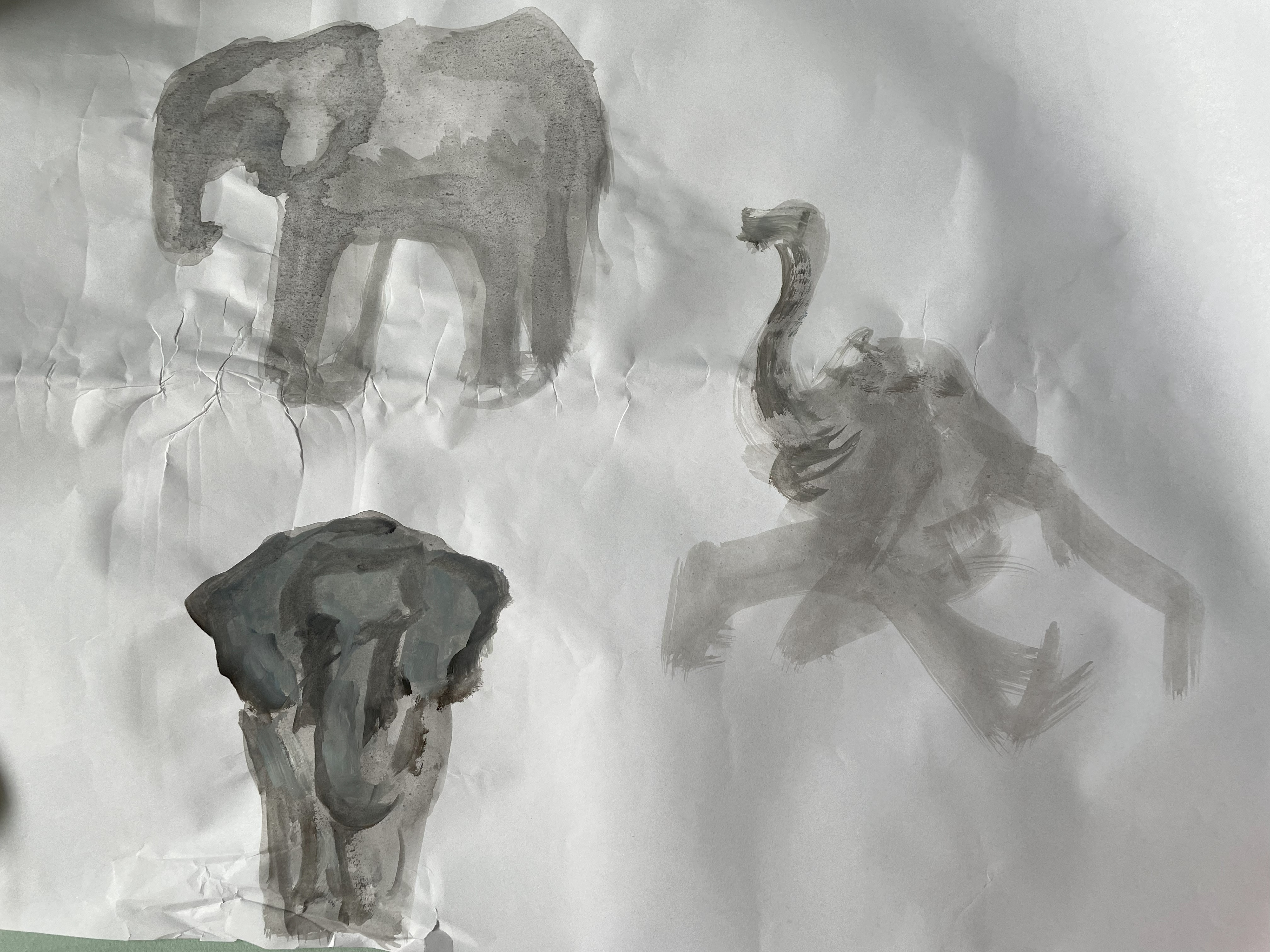
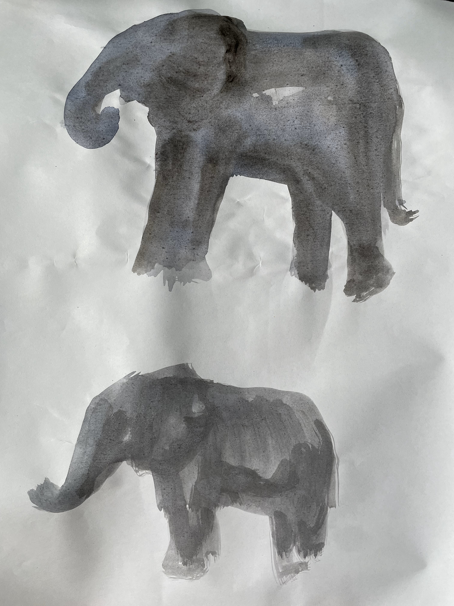
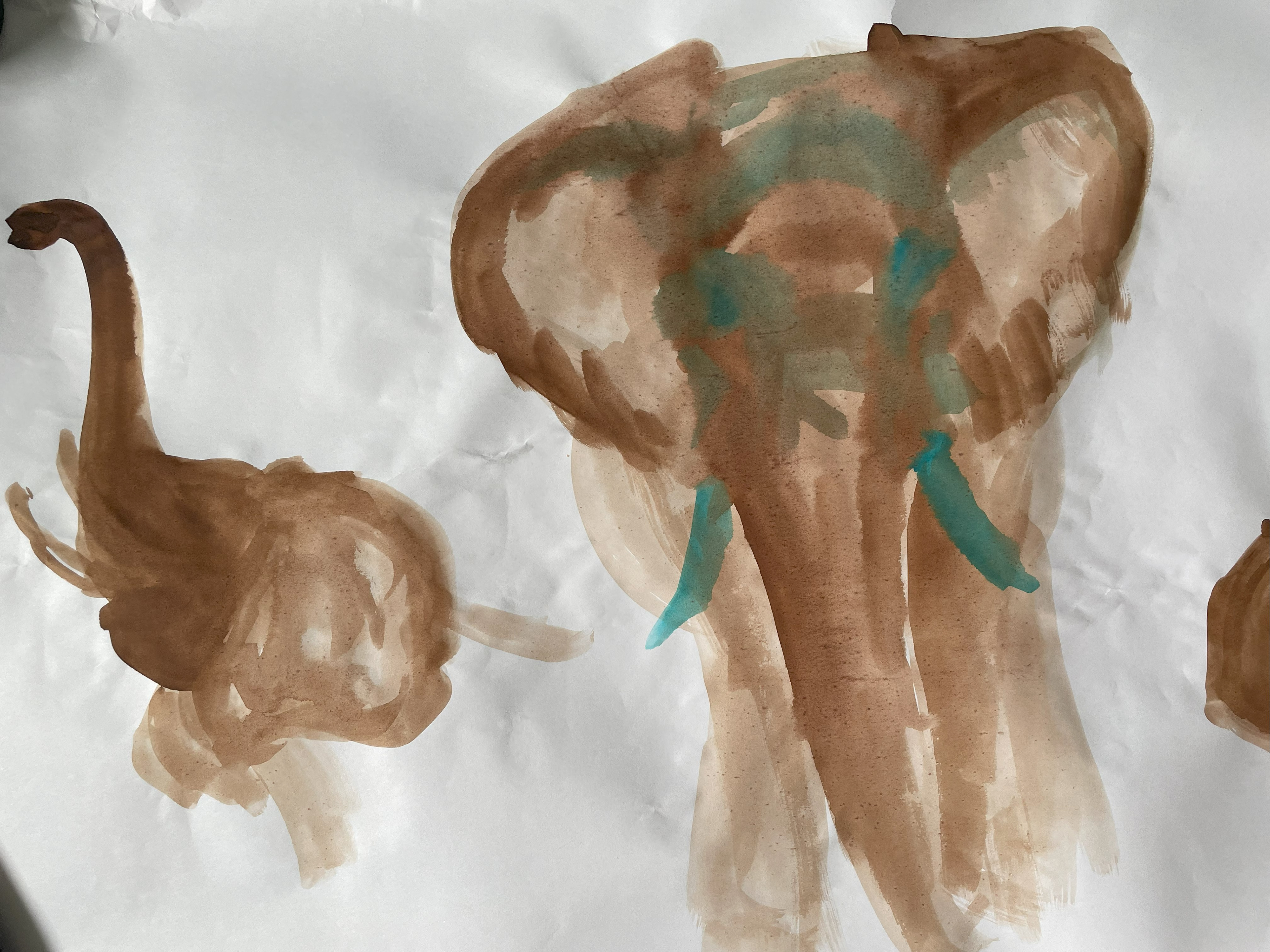
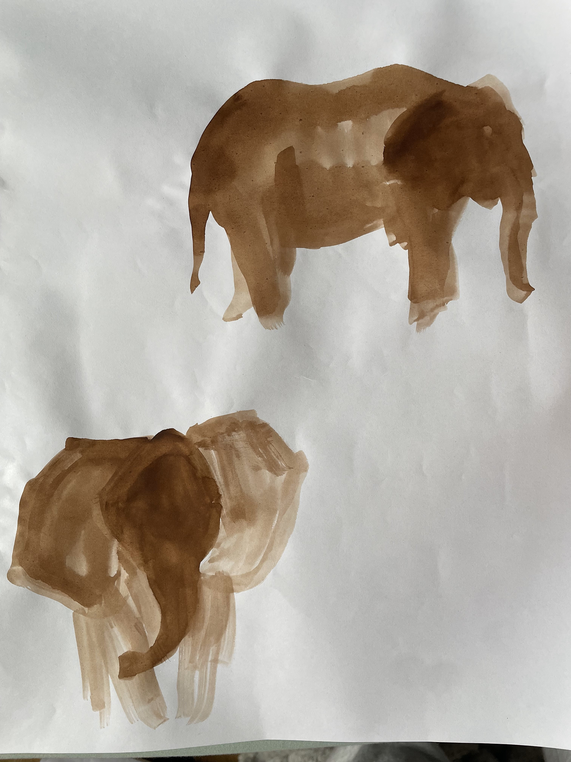
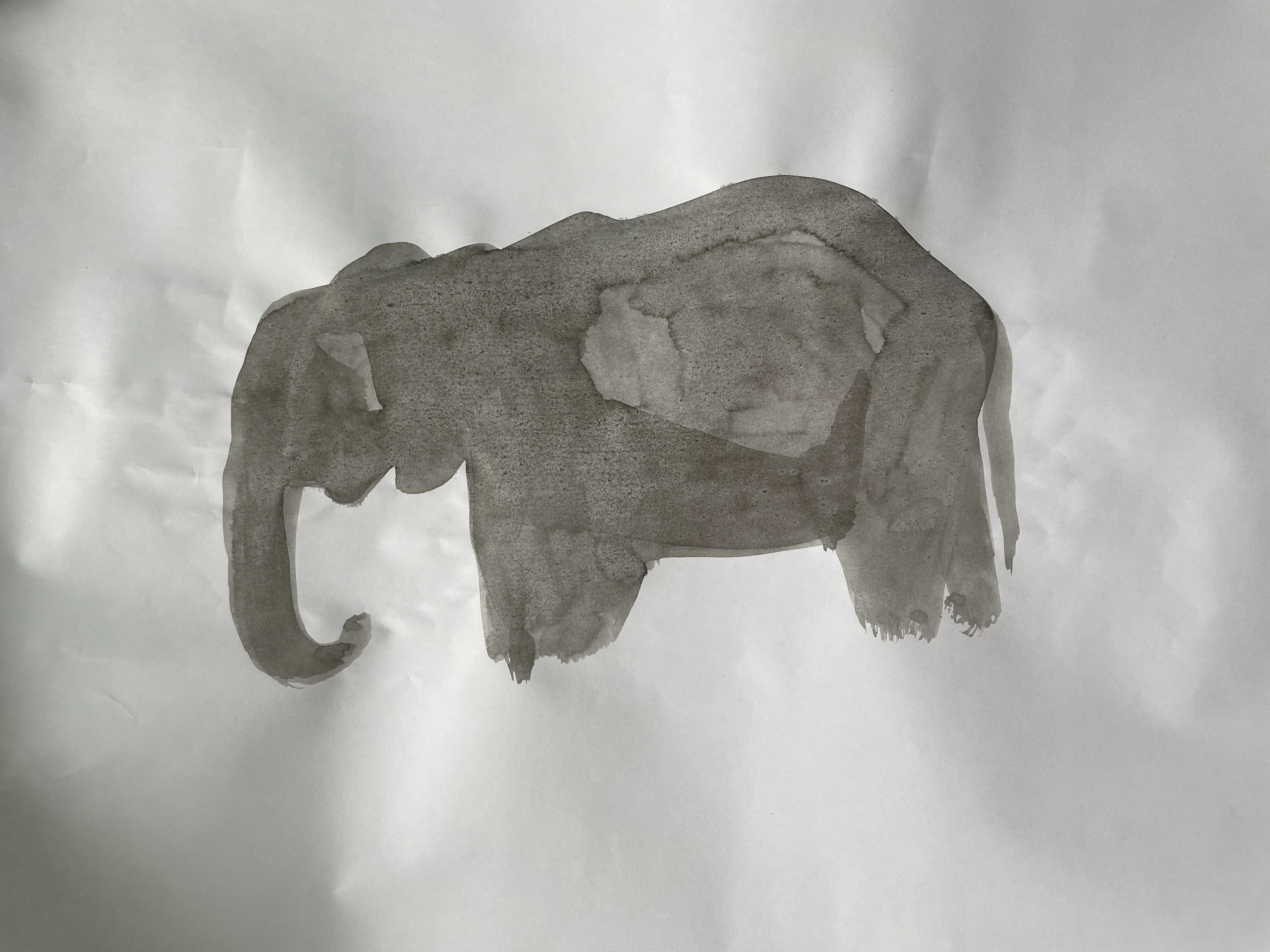
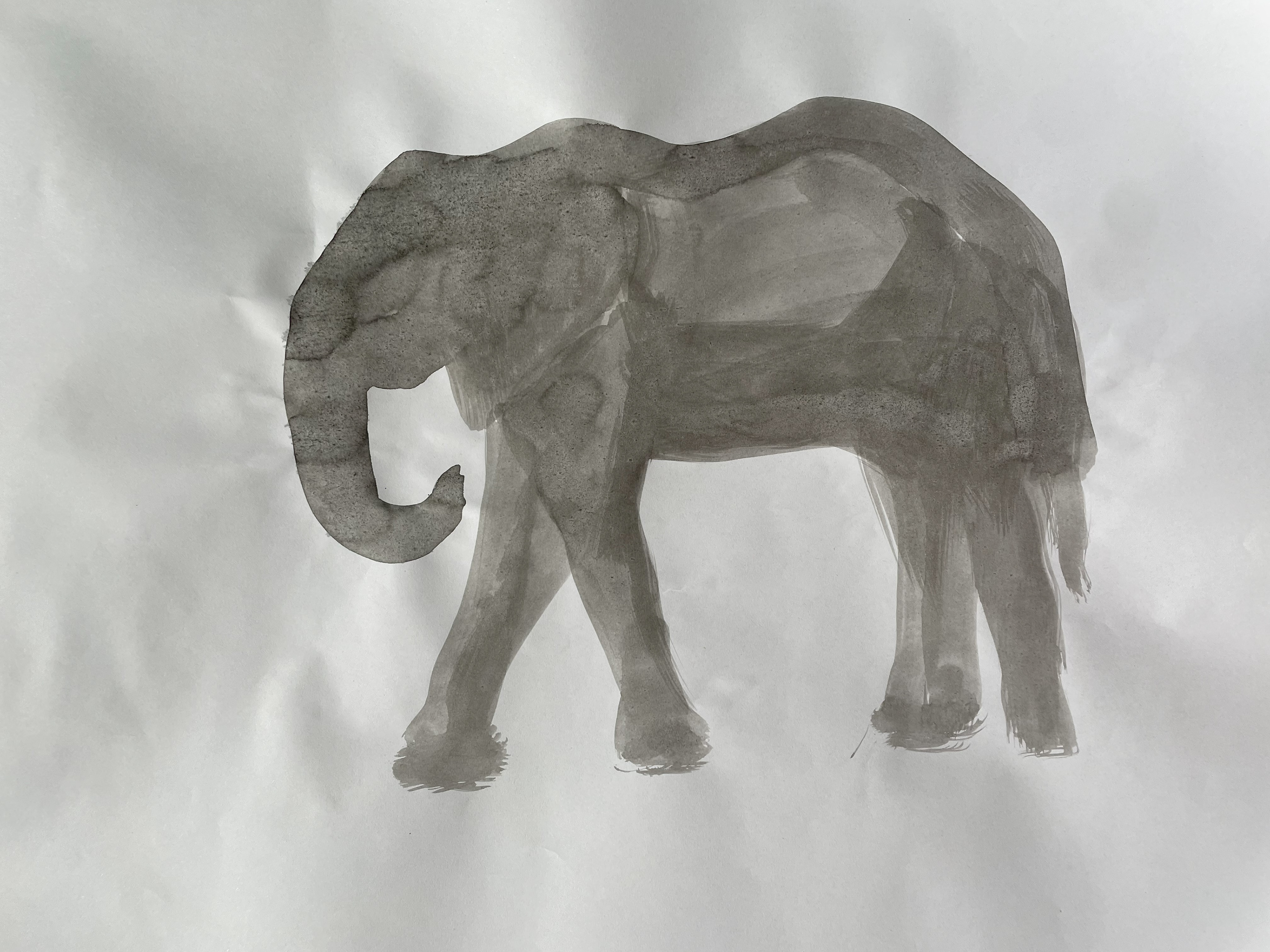
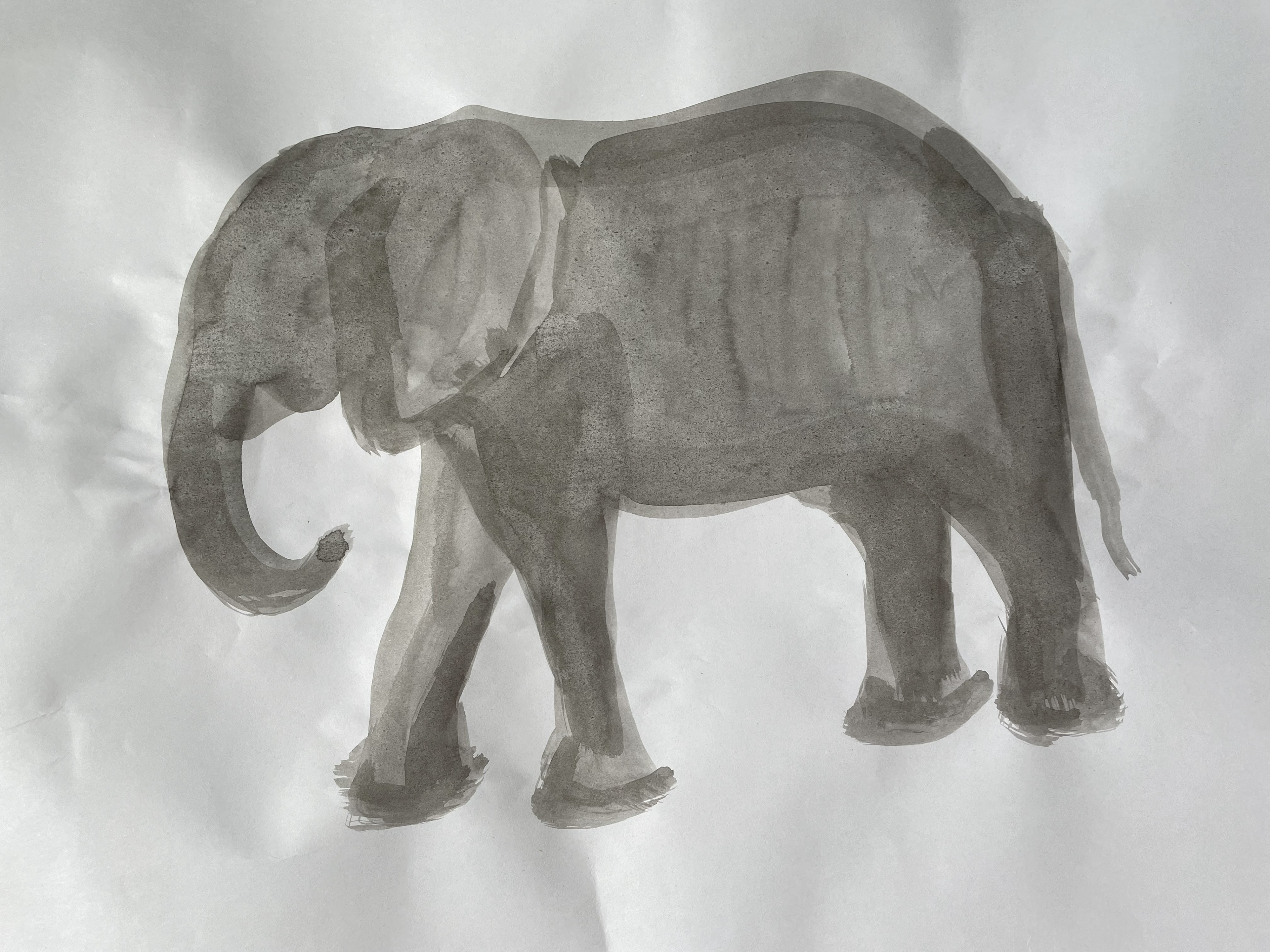
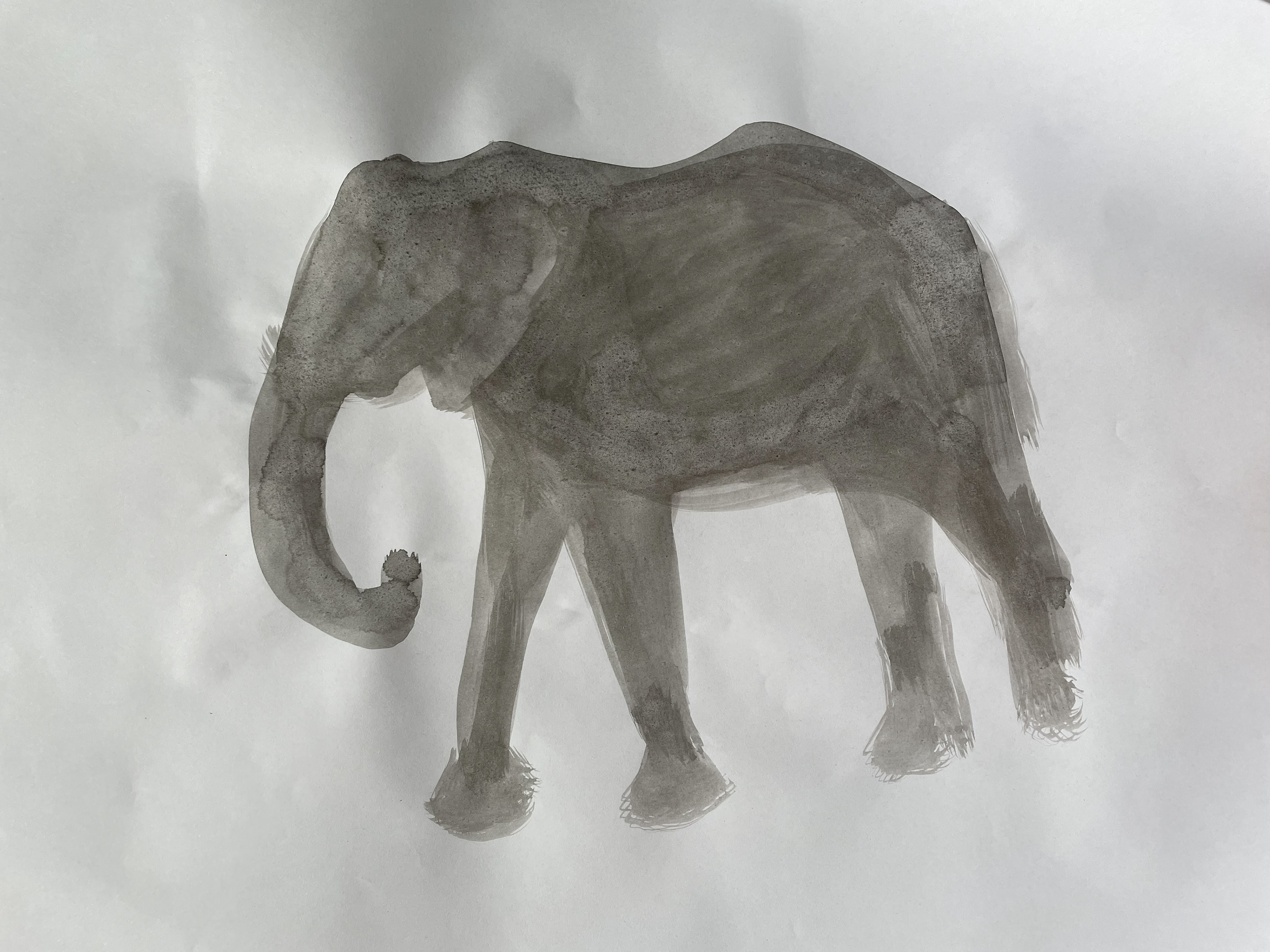
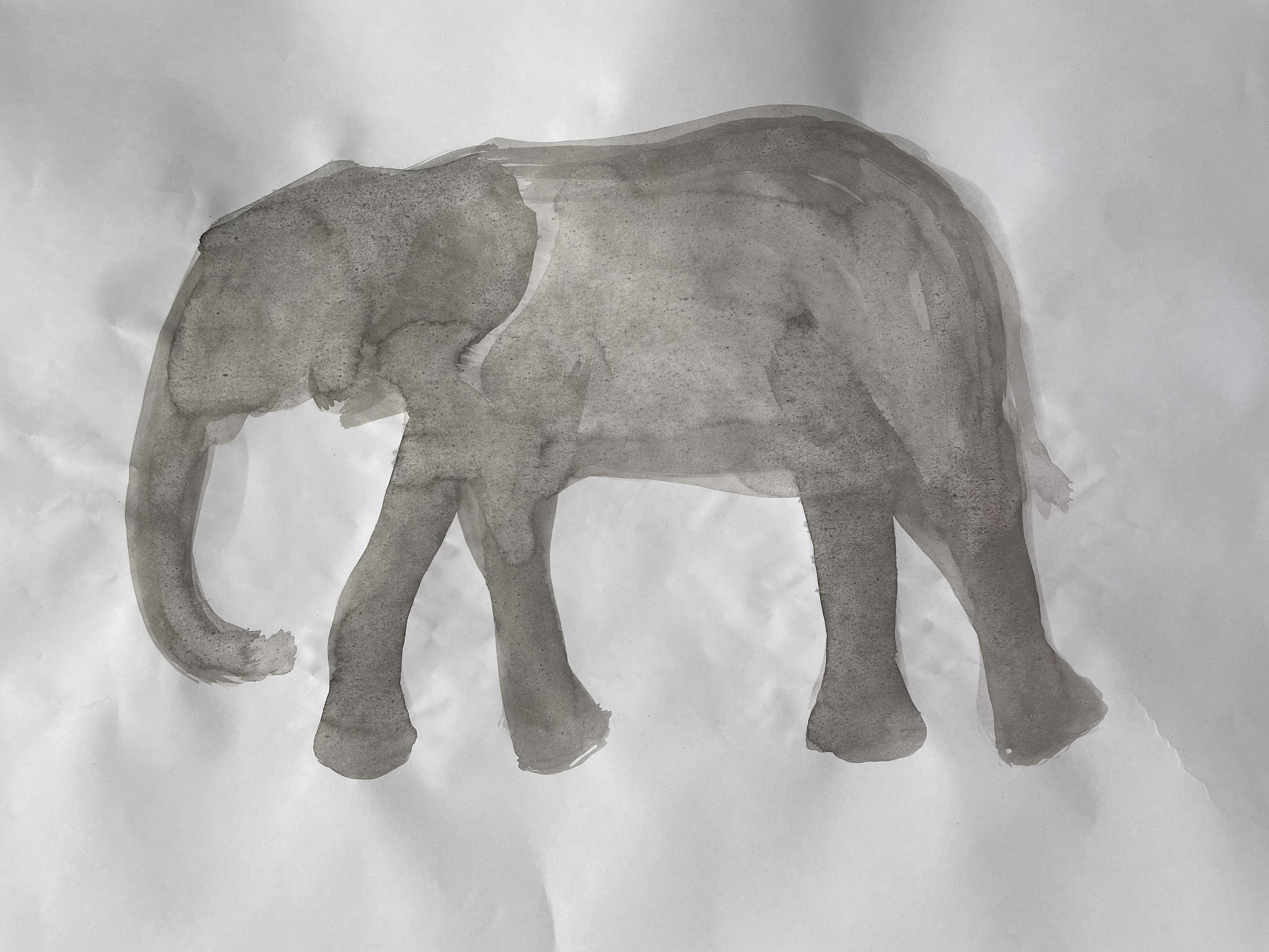
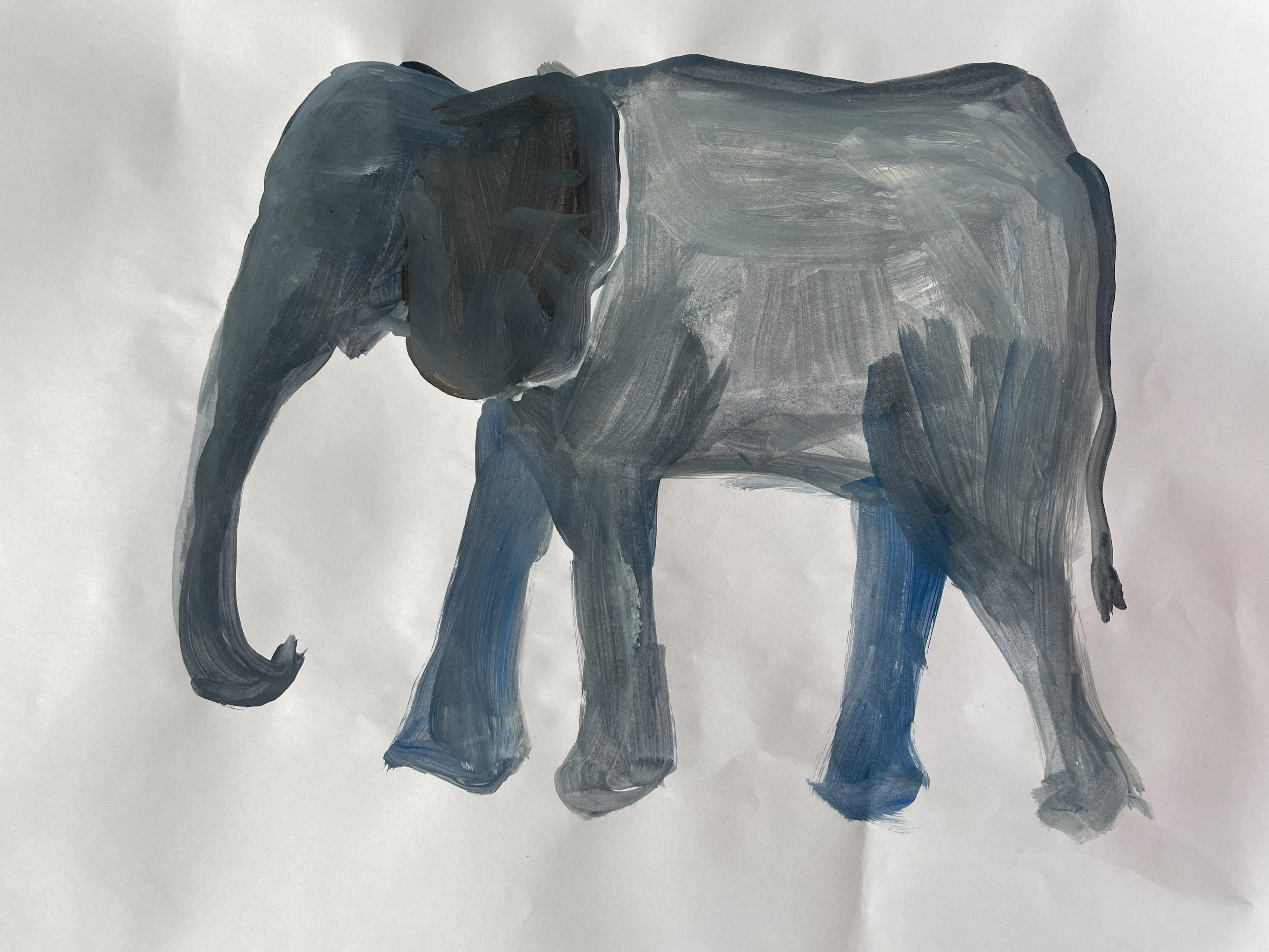
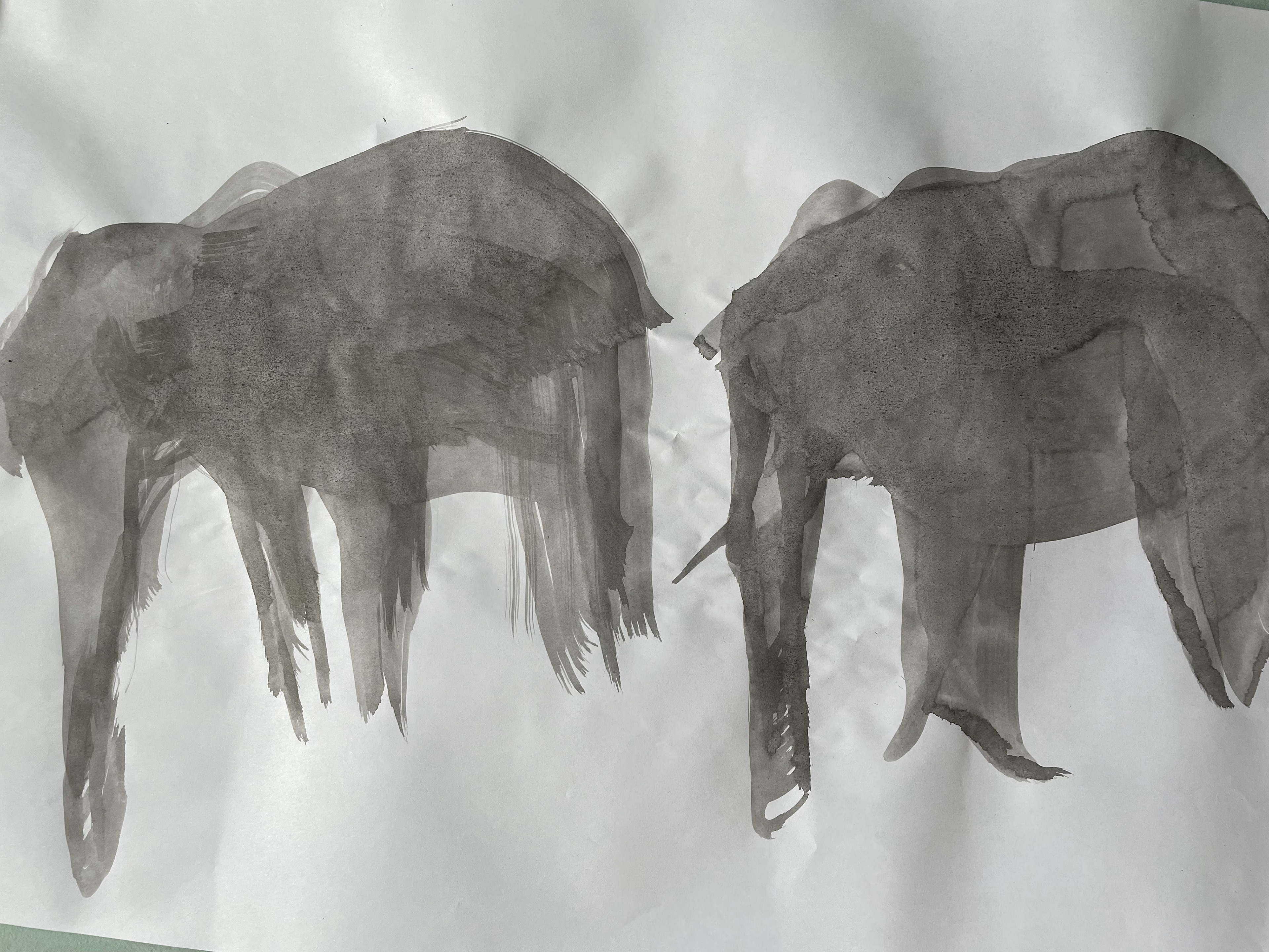
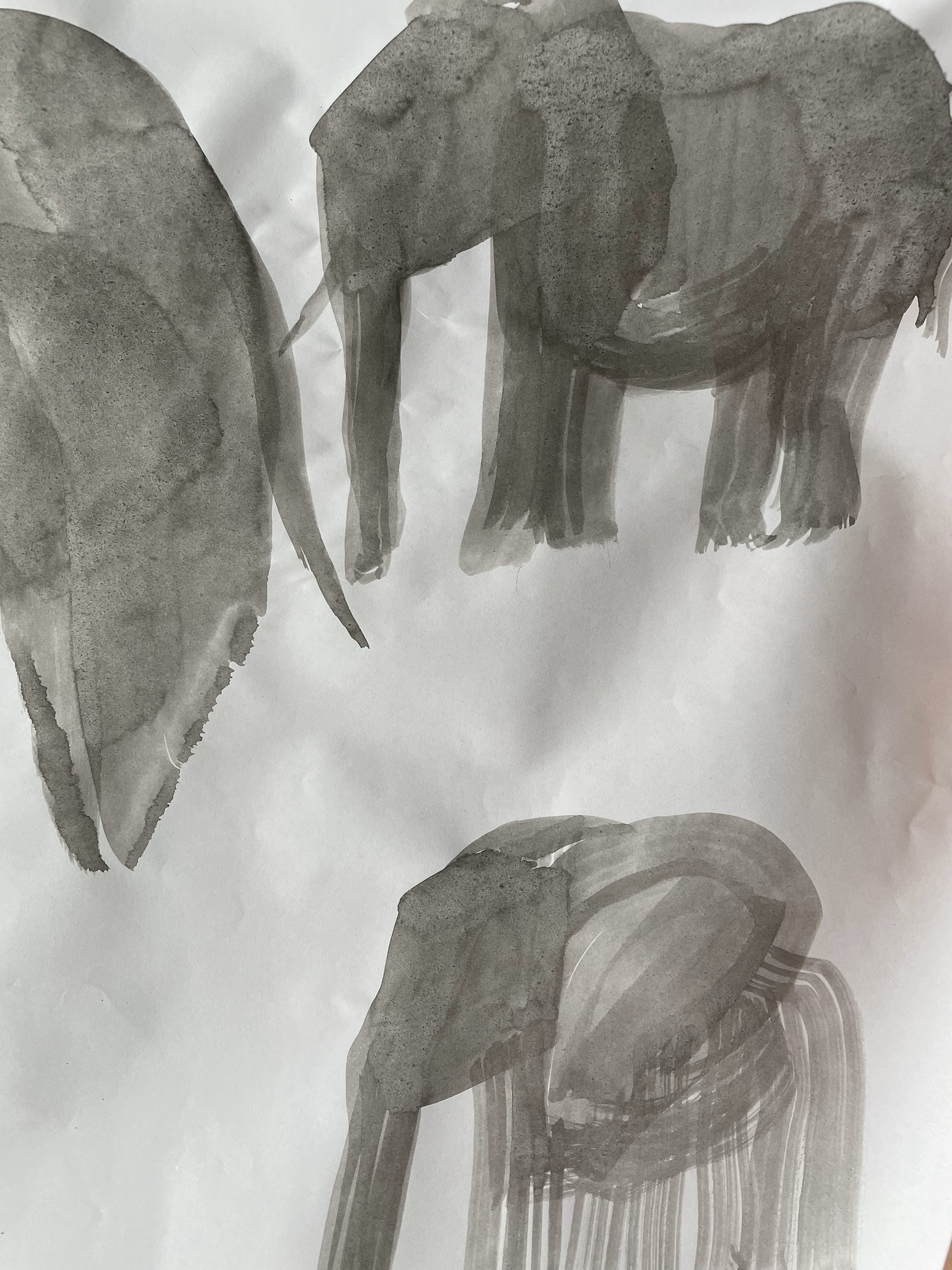
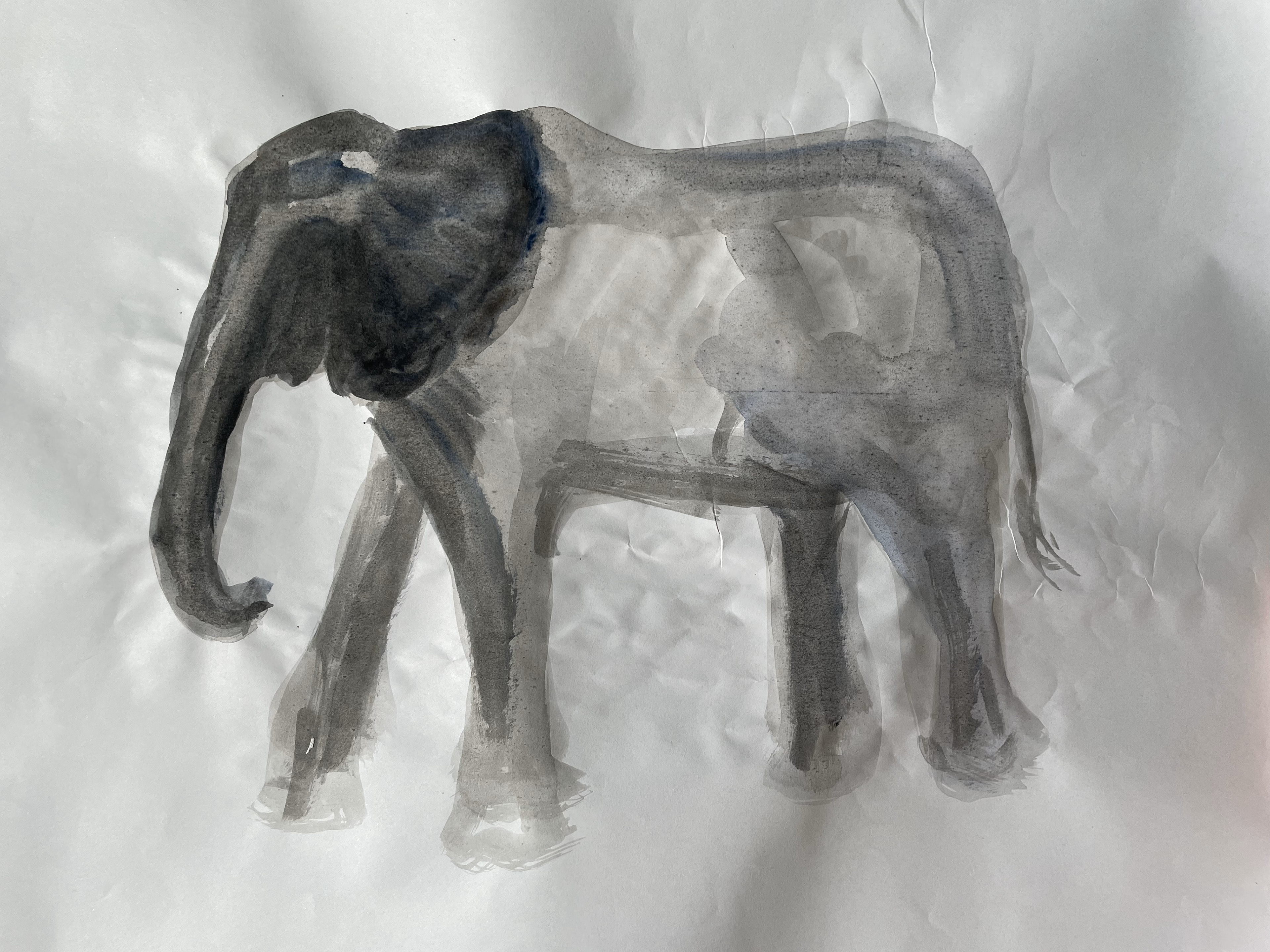
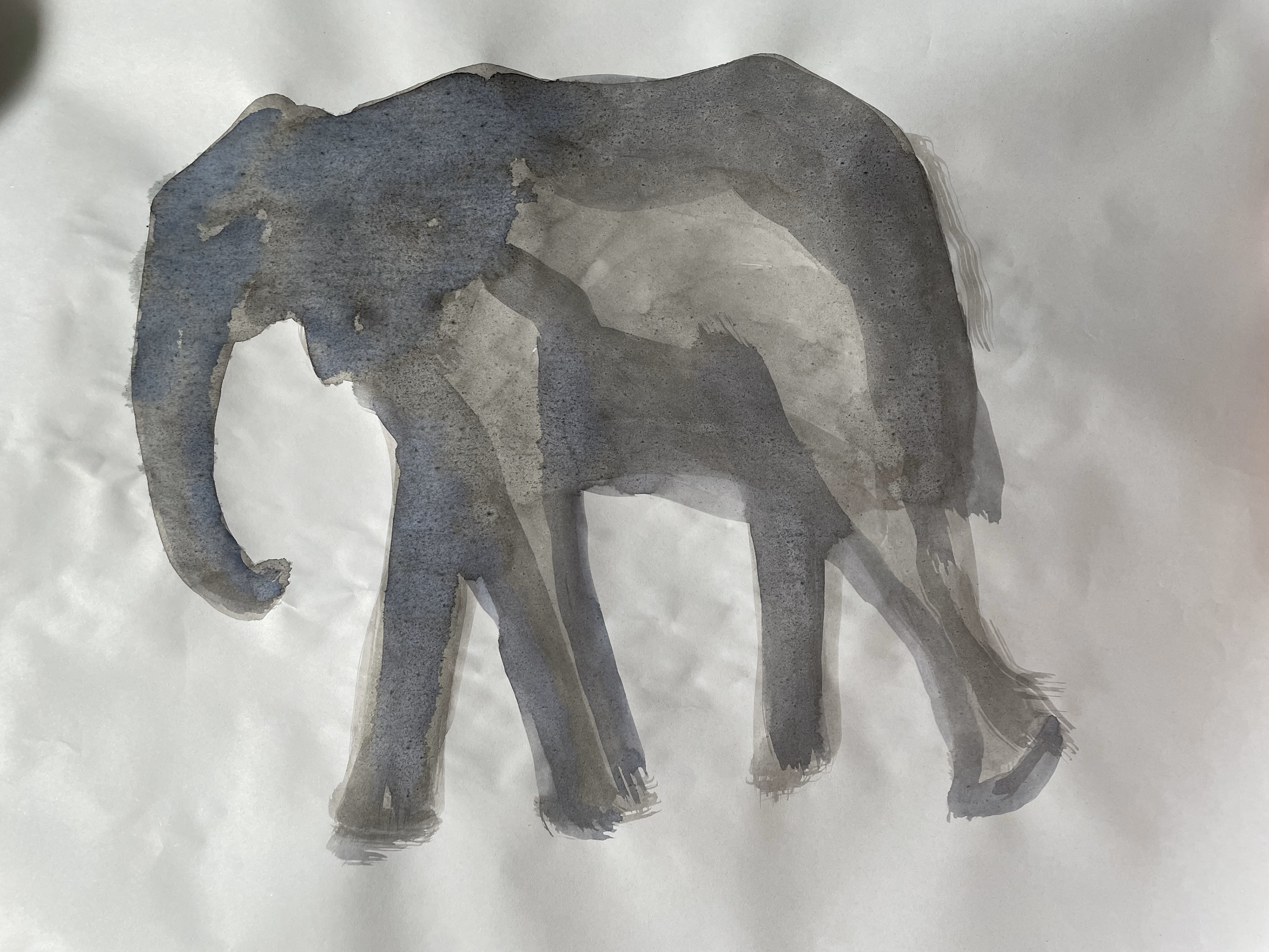
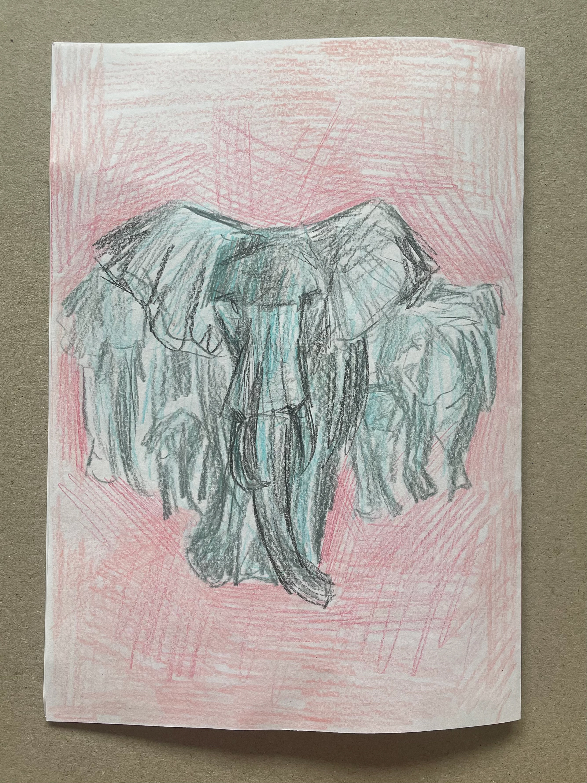
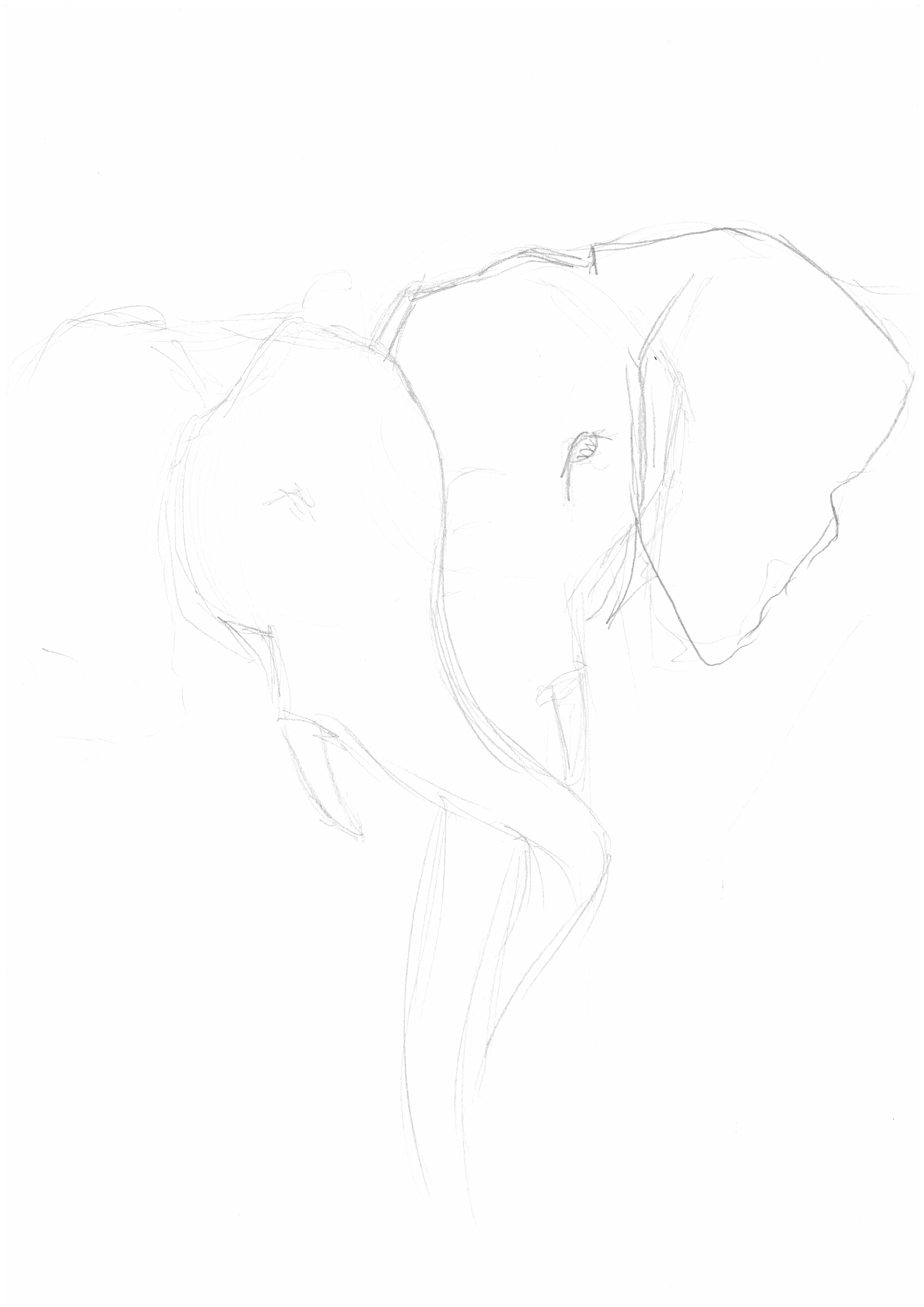
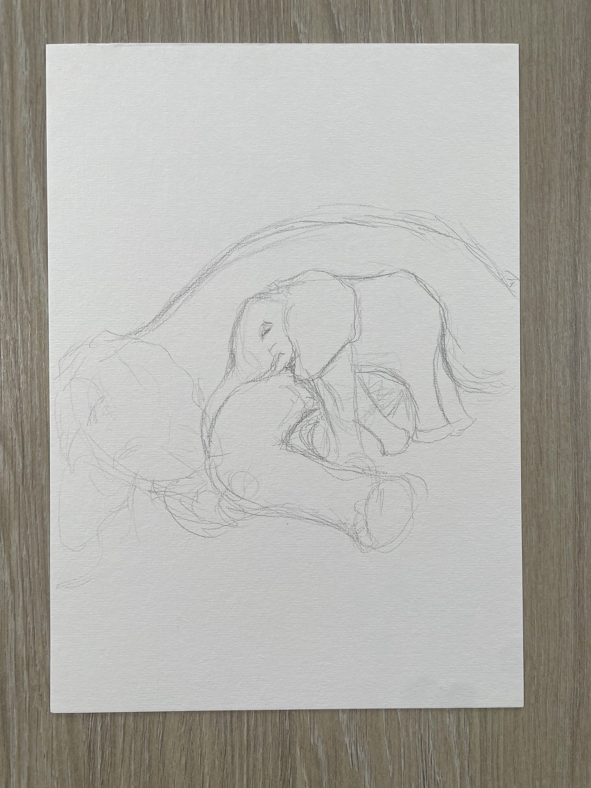
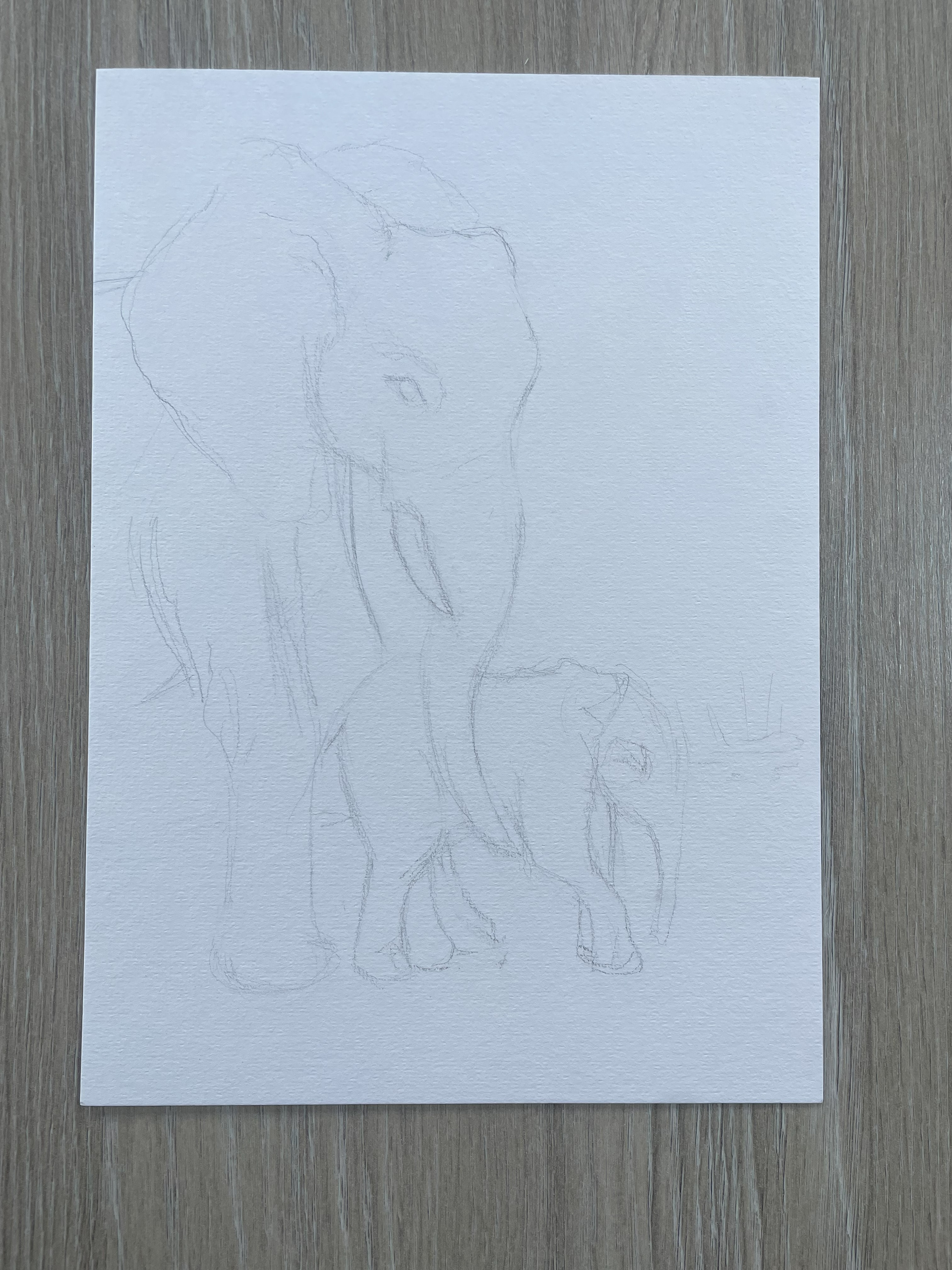
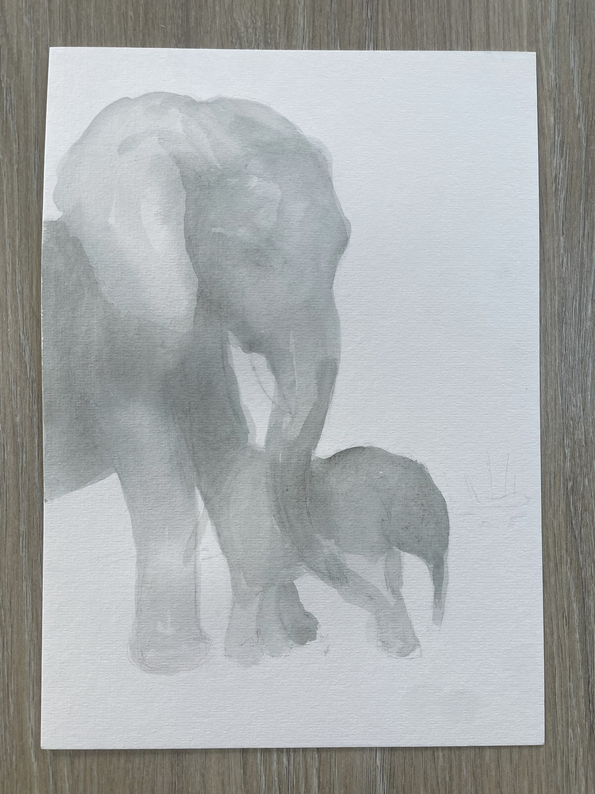
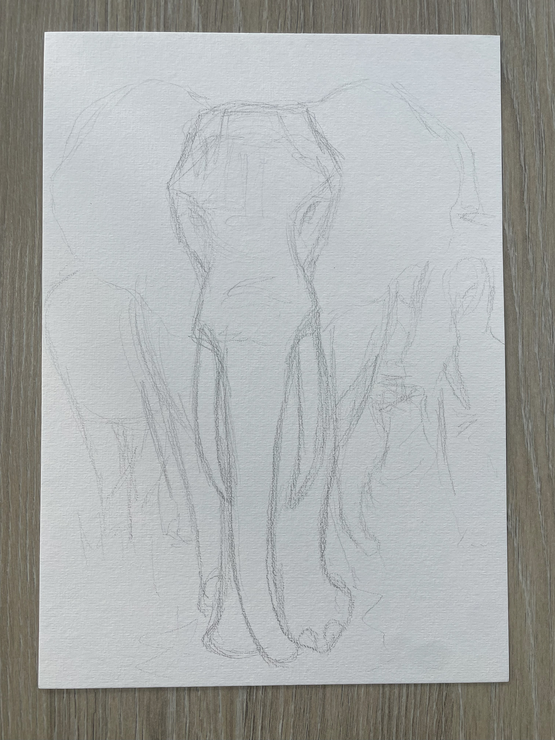
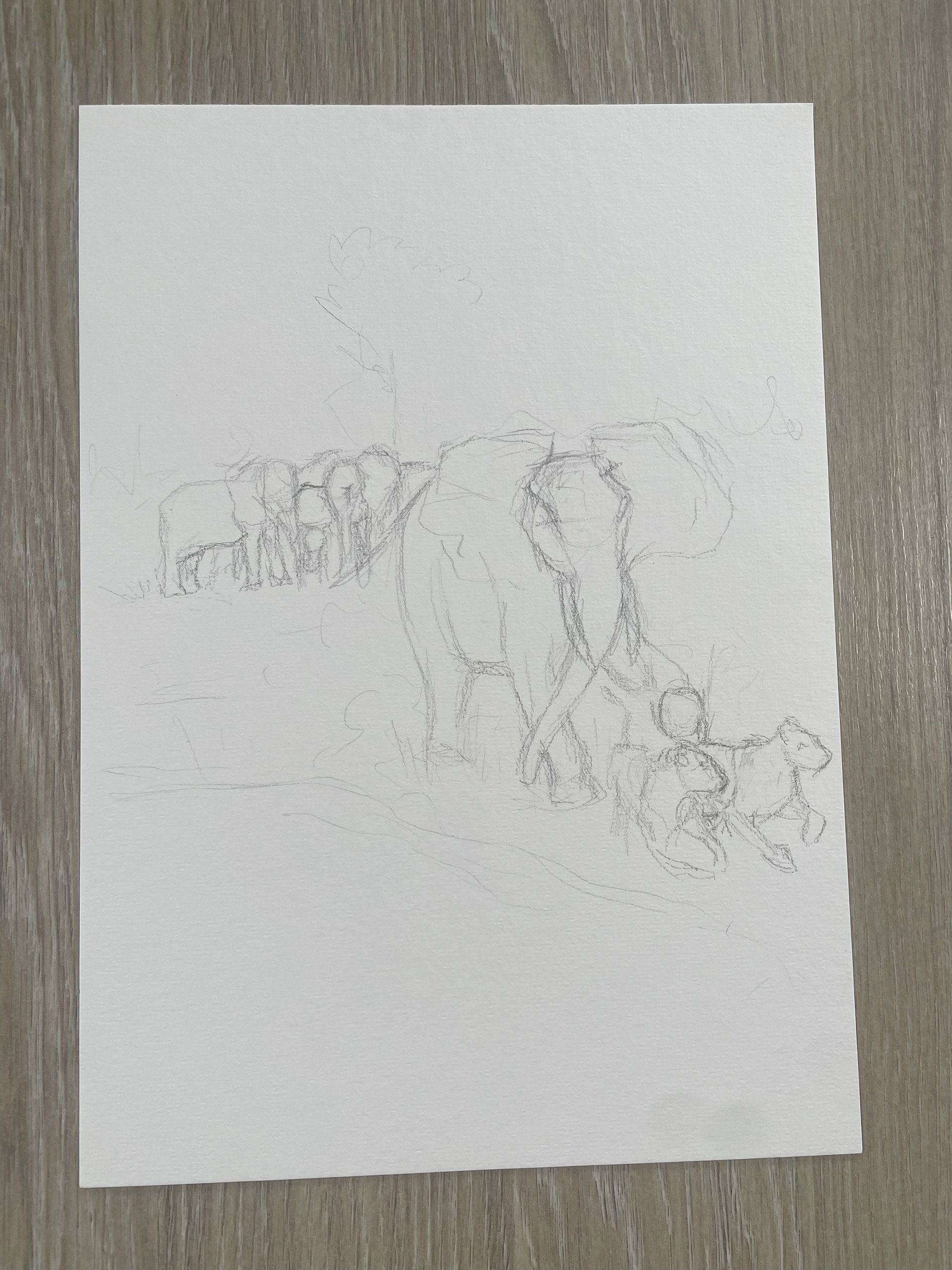
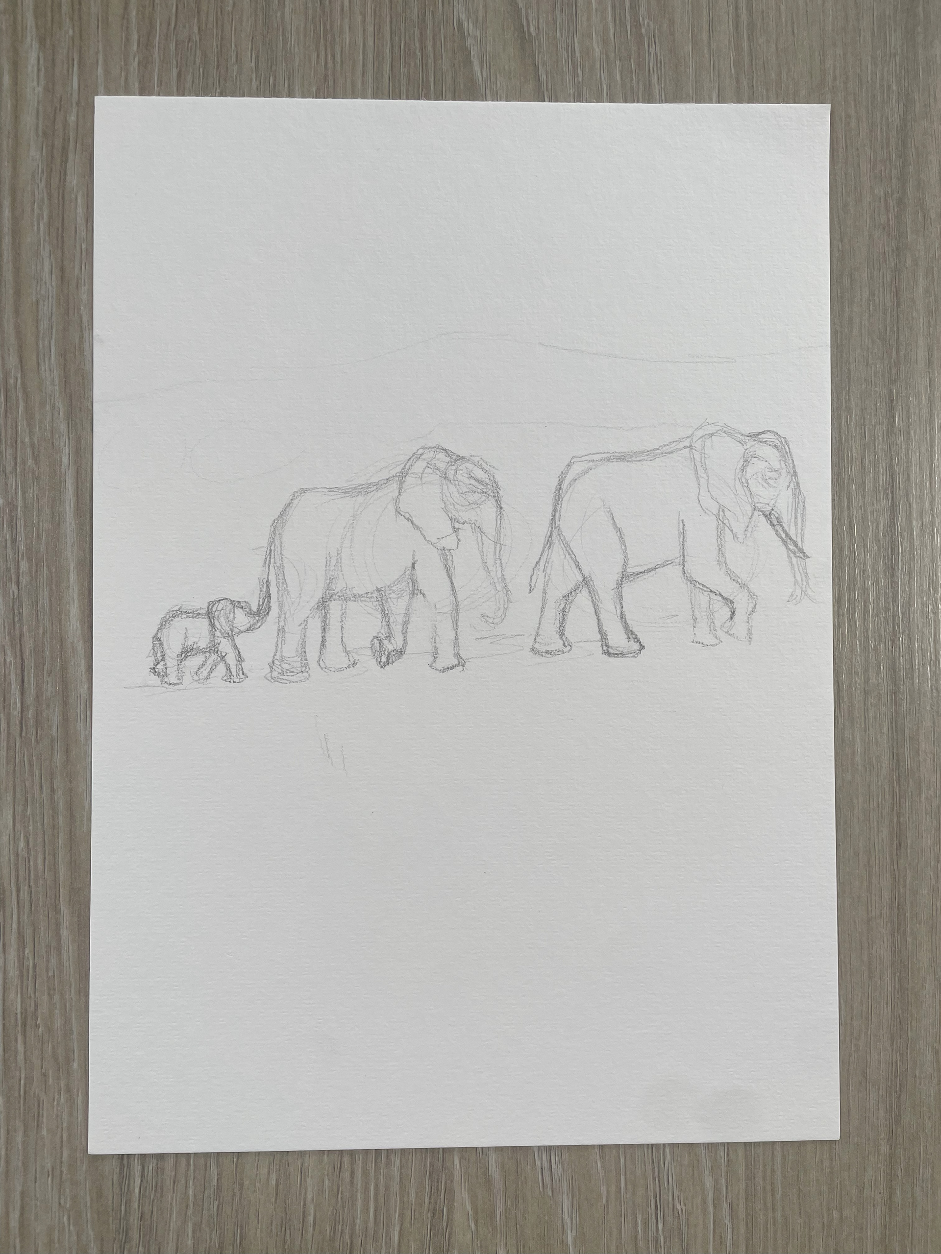
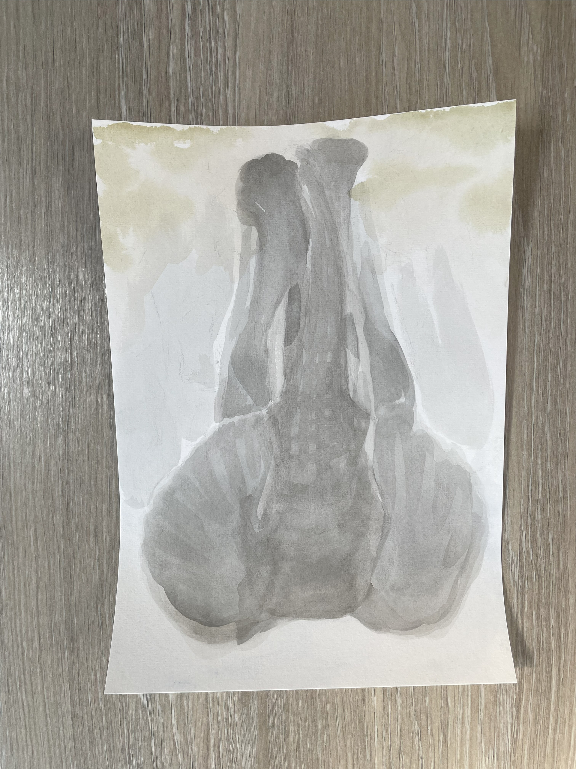
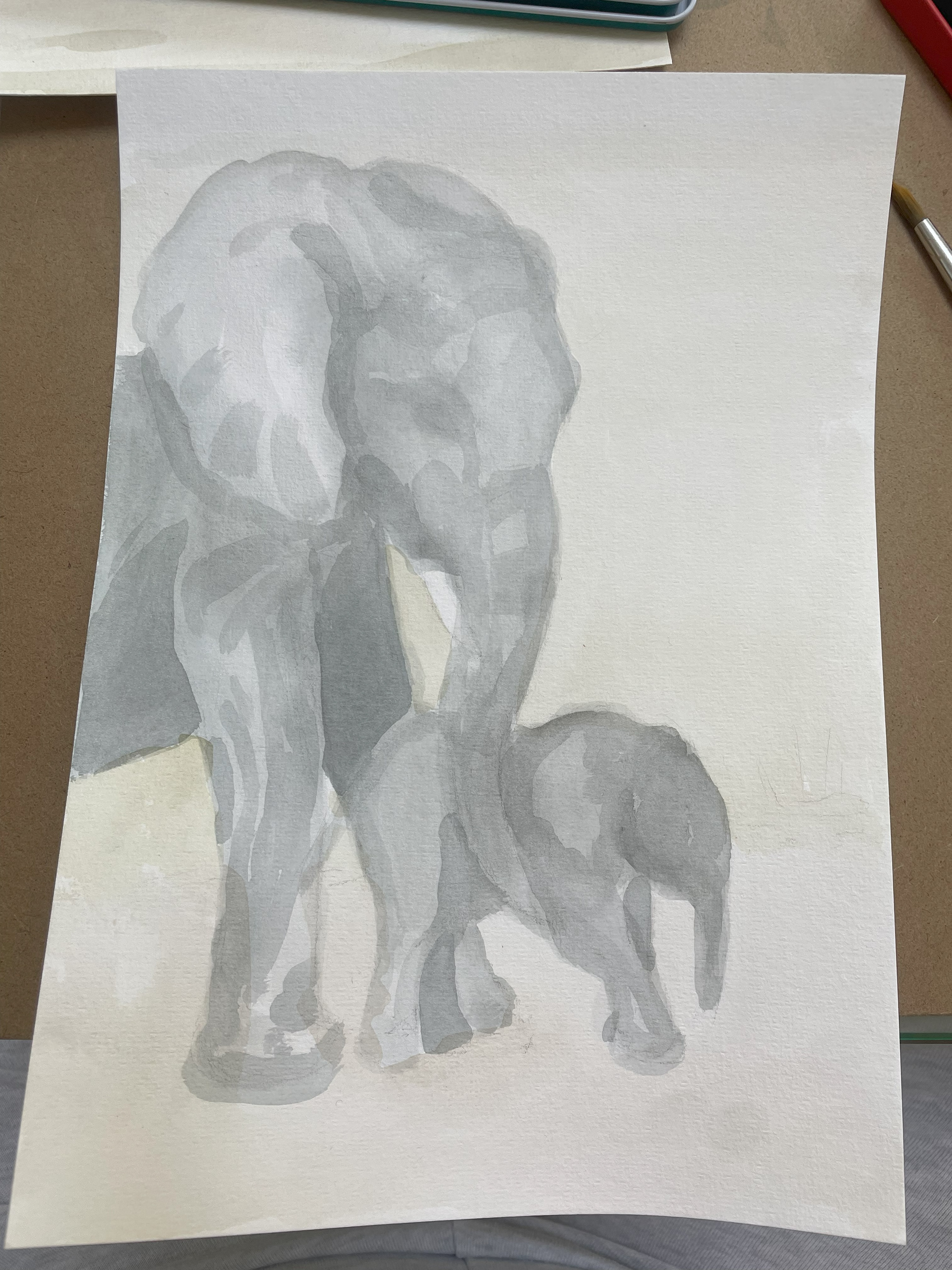
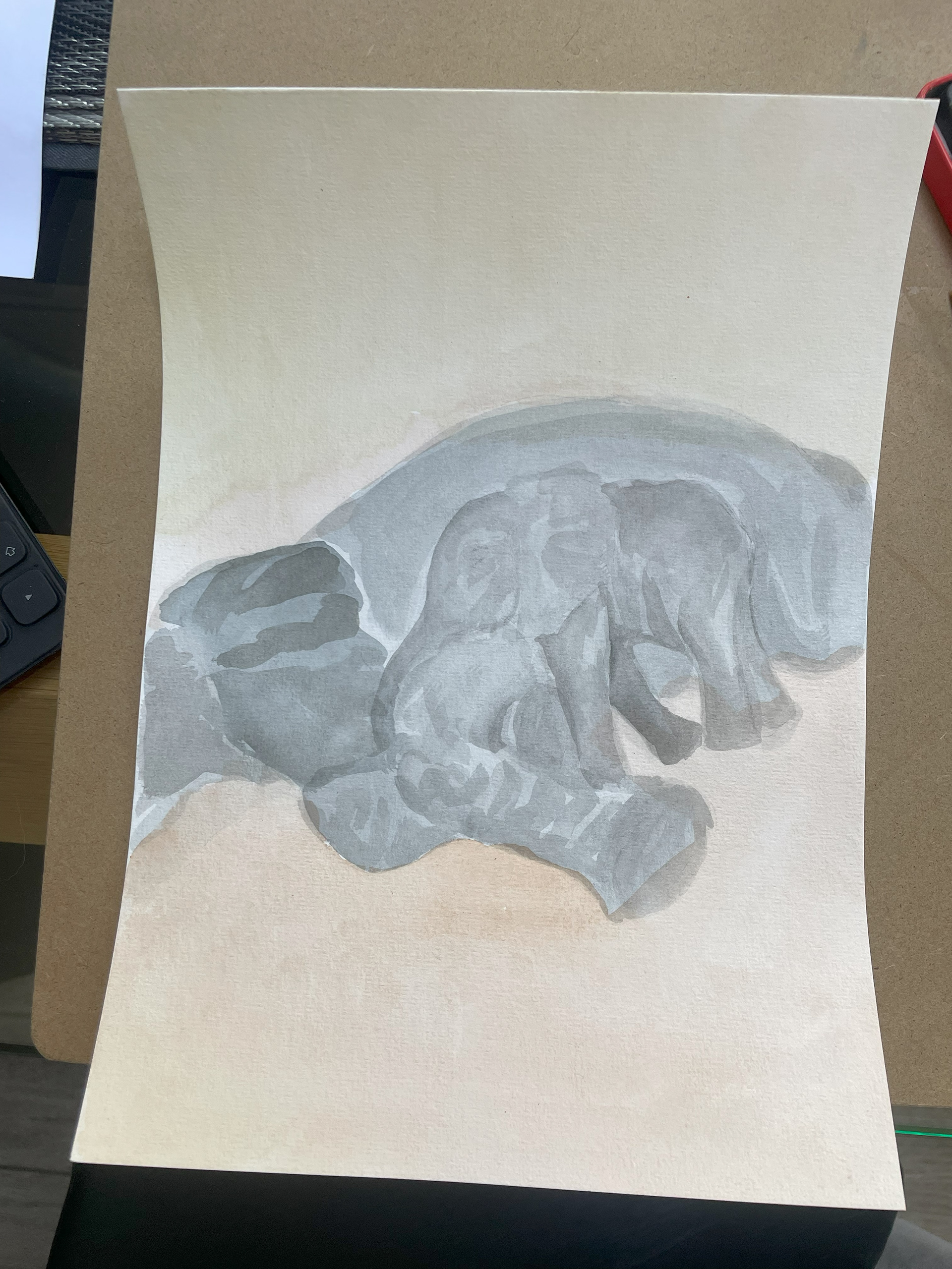
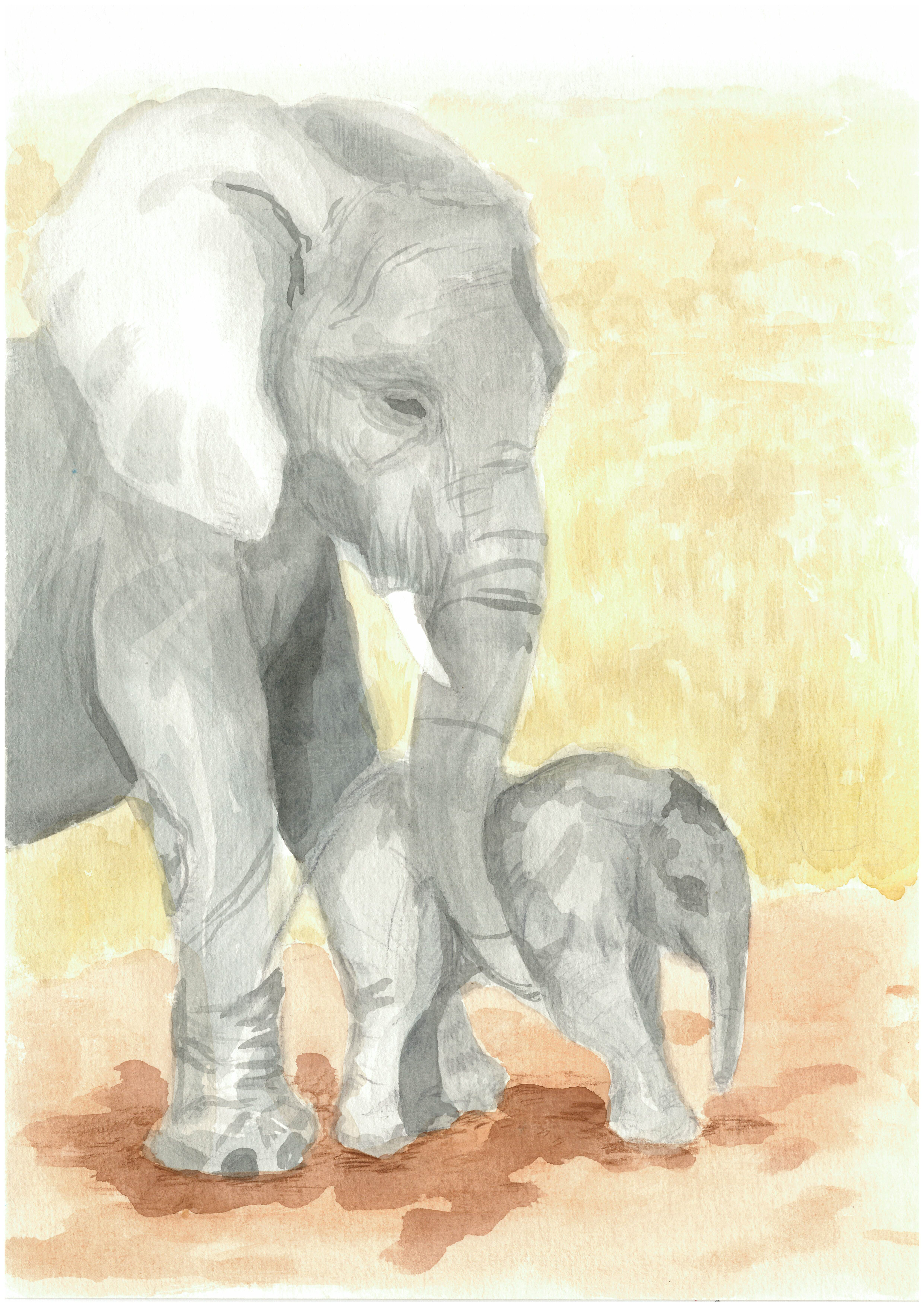
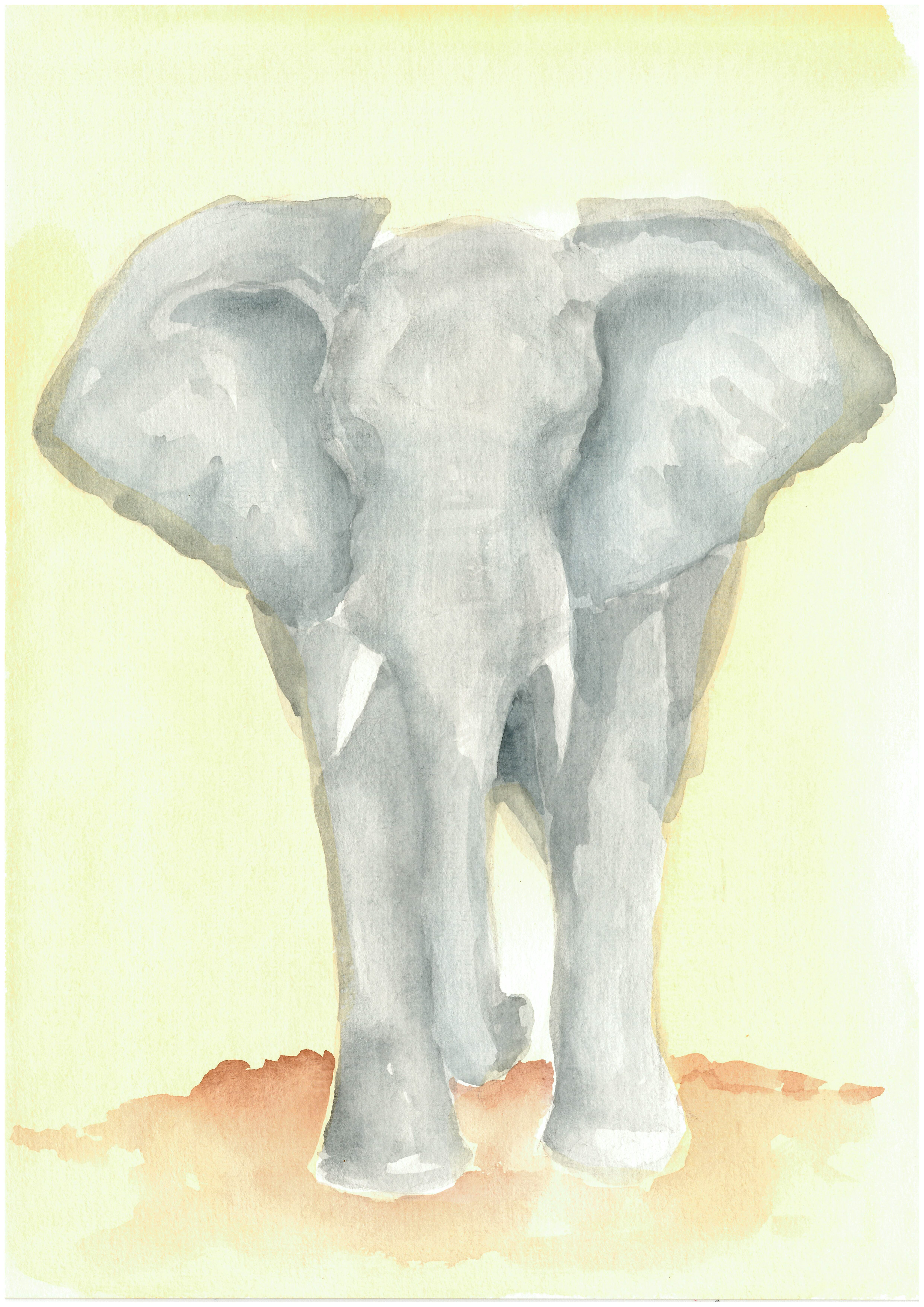
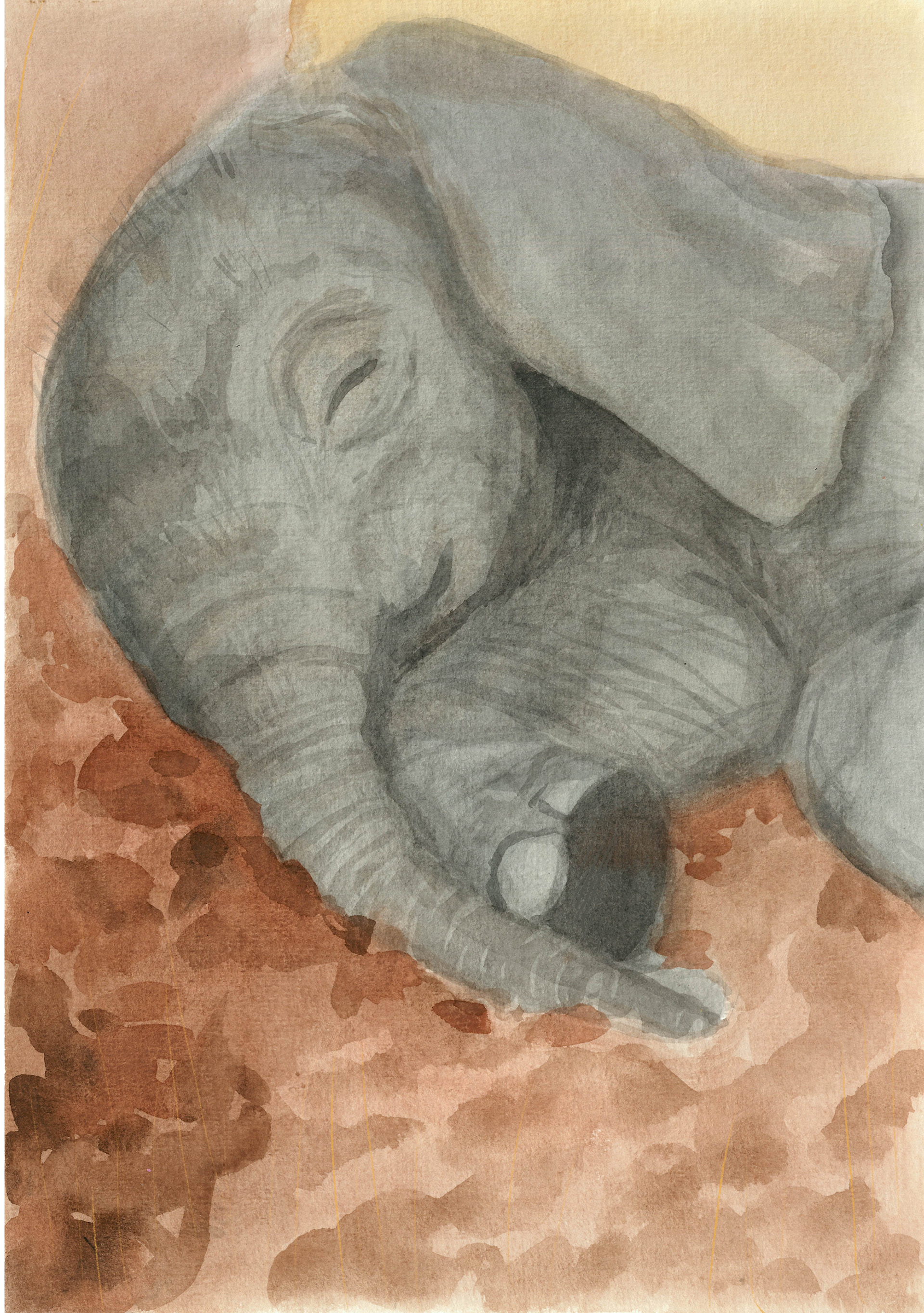
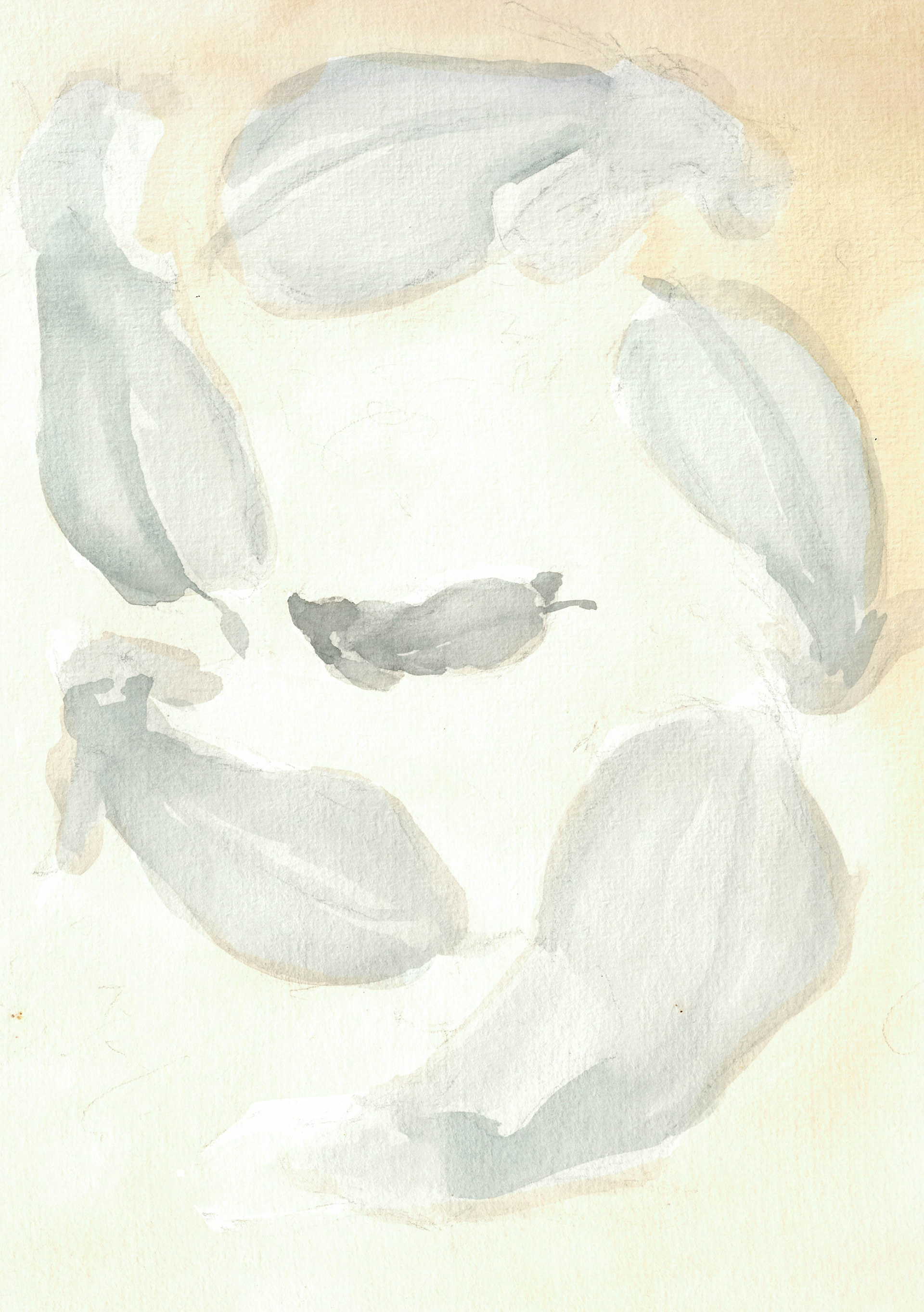
I knew that I was more than likely going to make my final outcome out of watercolour so I tried loosening up by grabbing a massive role of paper and a big brush and just continuously painting elephants for a day. In some cases I tried out different poses or angles, others I incorporated different colours and in a few I tried out watered down acrylics. I love the shape these all created, the smoothness of the curve of their backs is very pleasant to the eye. Moving forward I want to hold onto that idea of soft shape, but by layering up some detail to show a bit more of the features.
educational approach
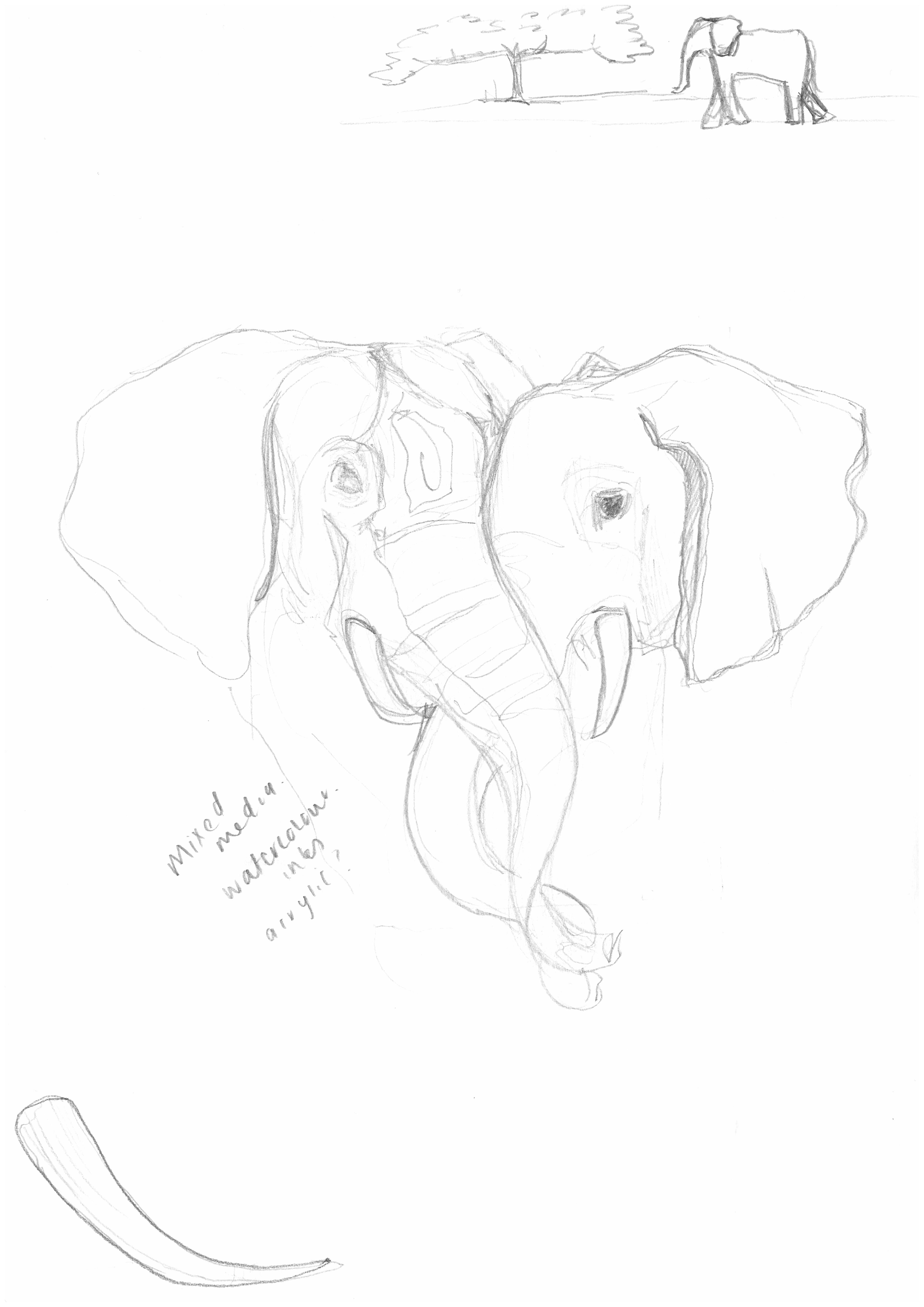
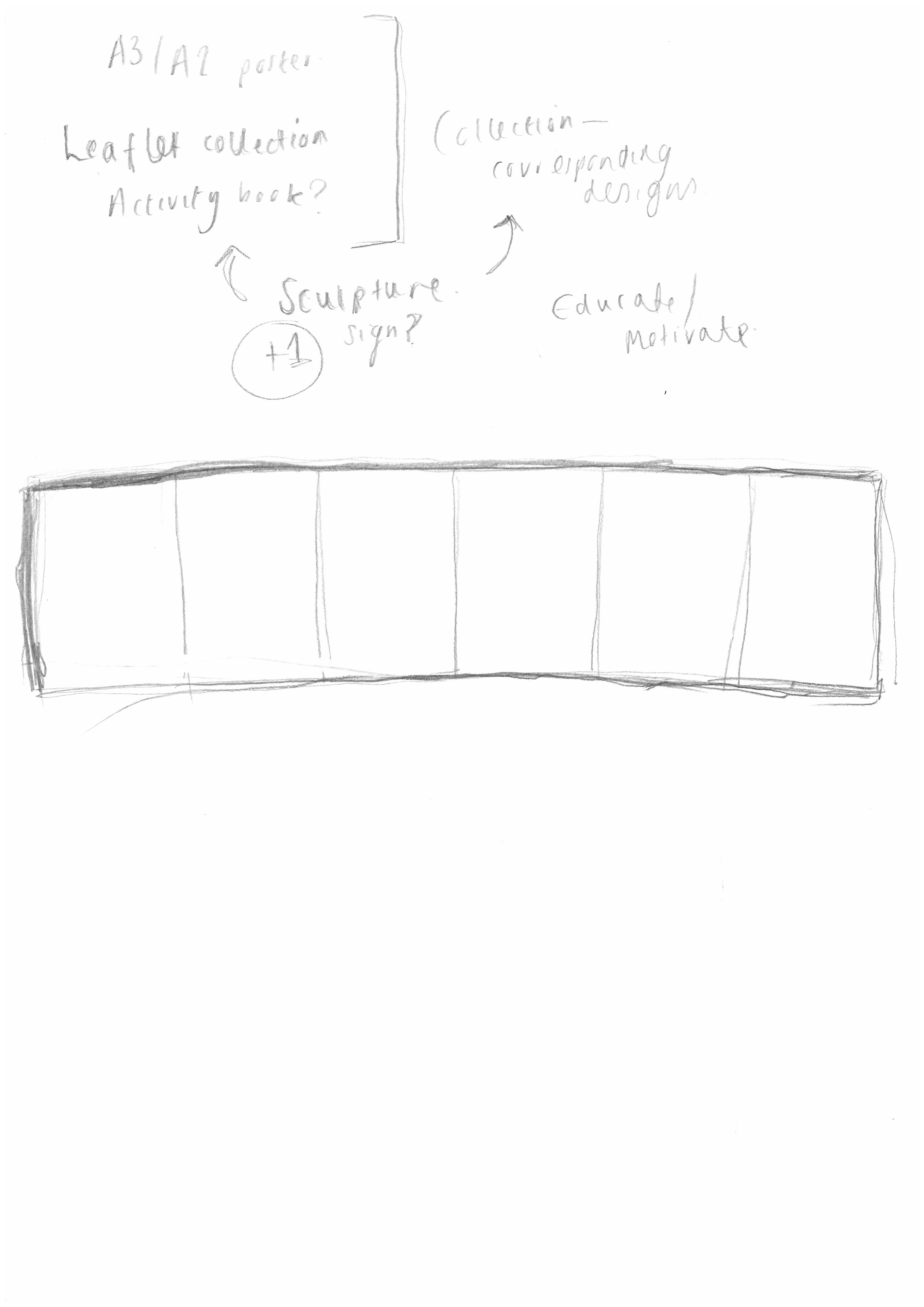
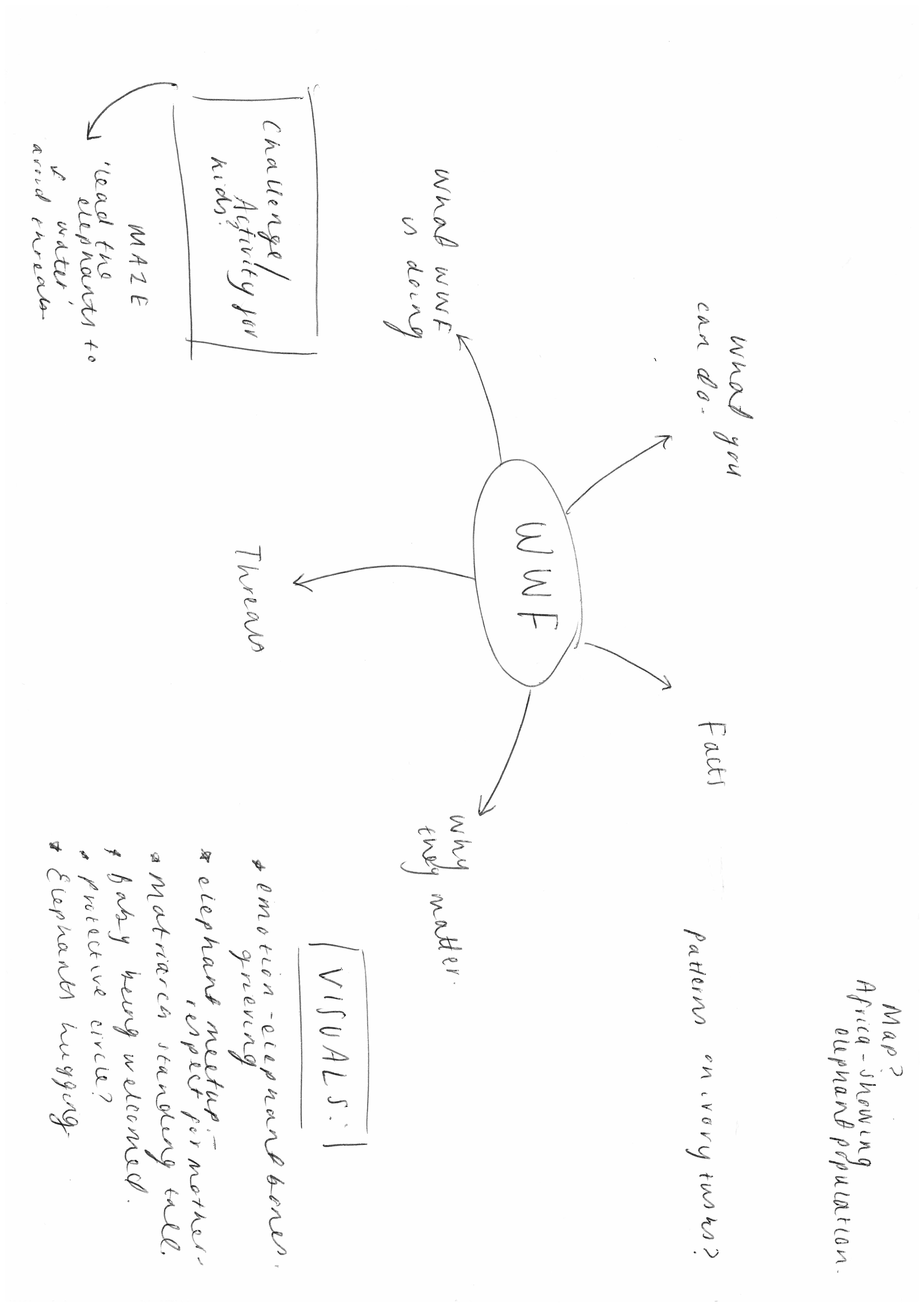
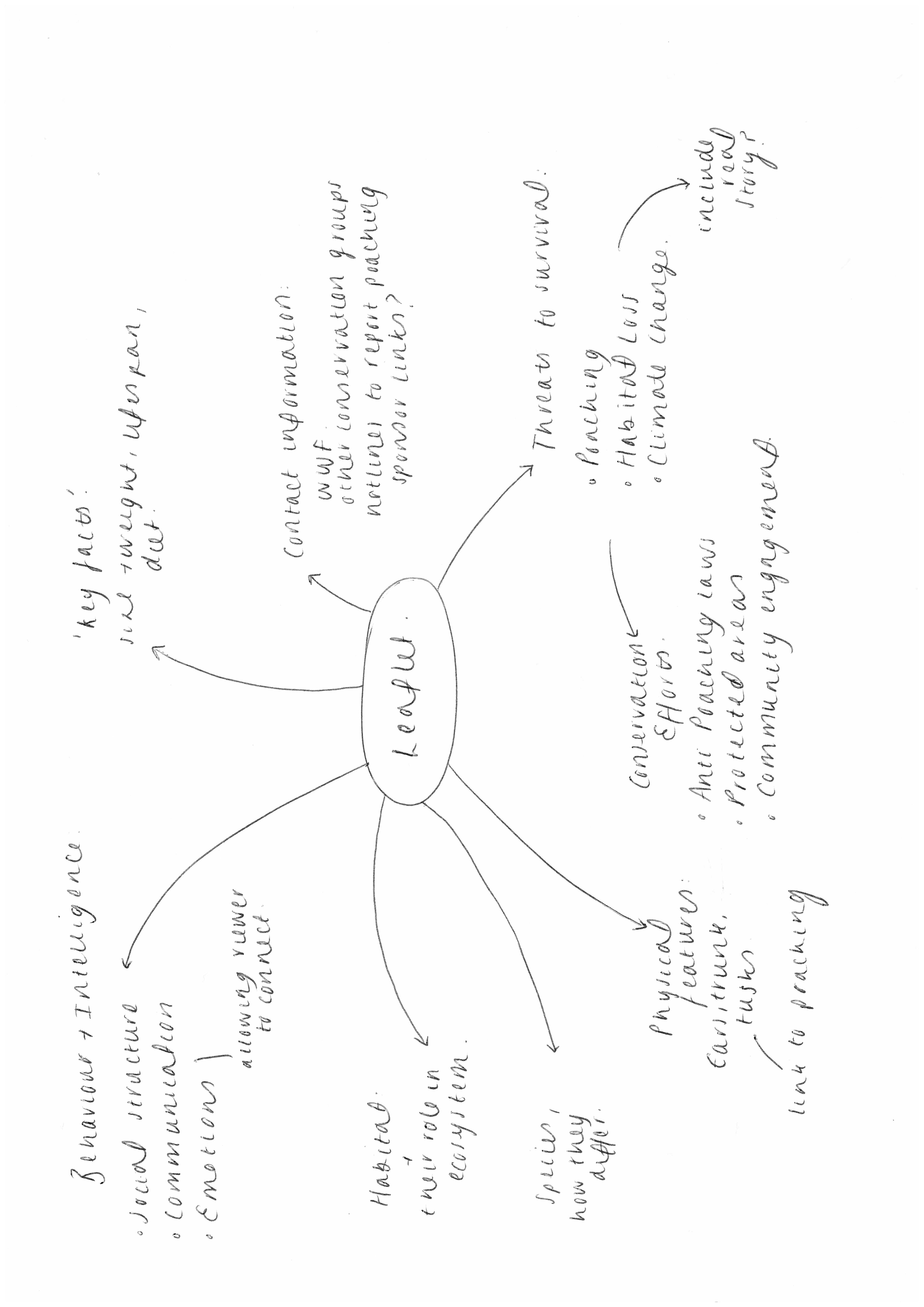
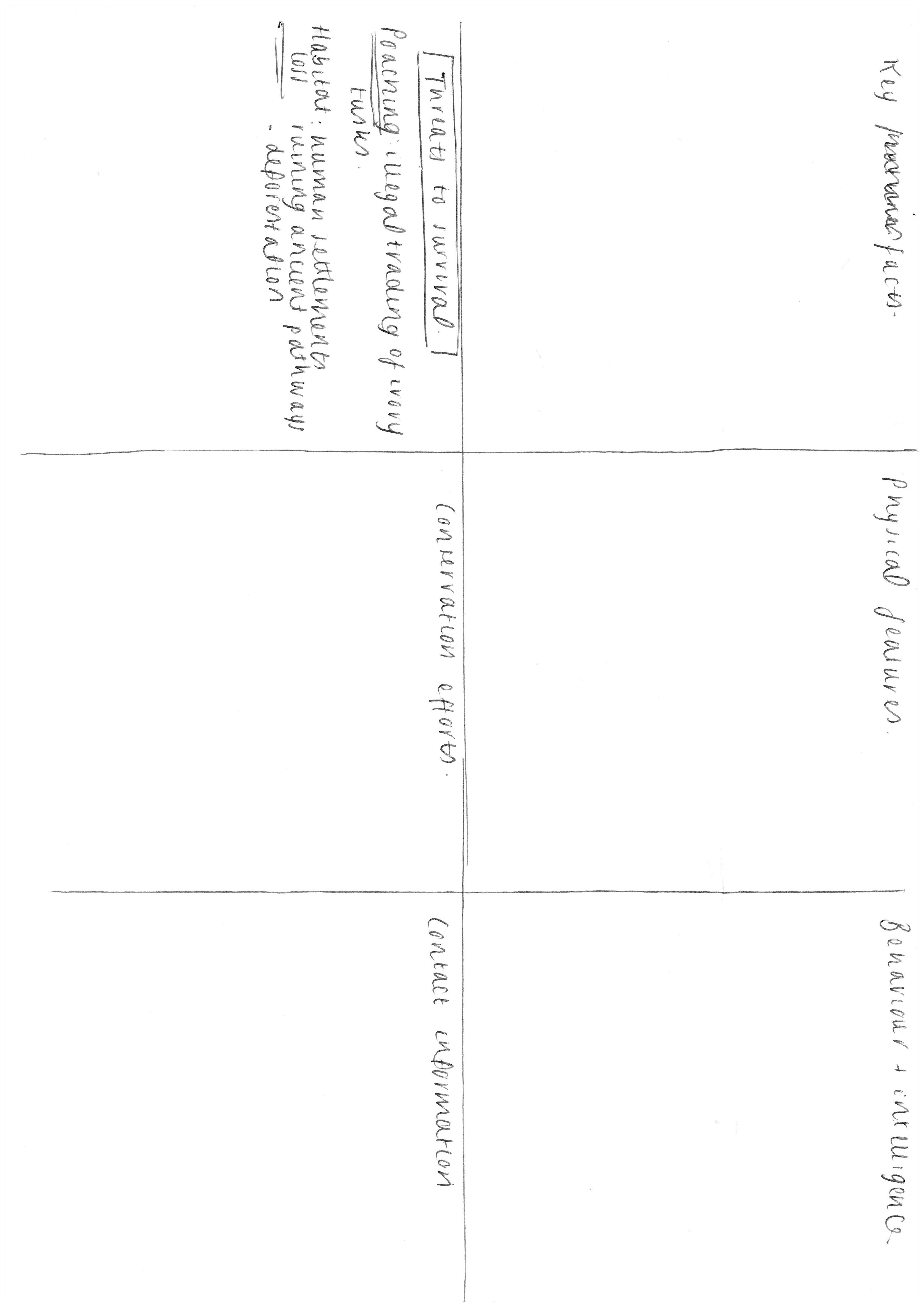
For a little while I was tempted to move more towards the educational portrayal of animals. With the introduction of the +1 sculpture, I thought I could create some form of educational sign that would be put up in a zoo or museum. I did some visual and informational research into this, gathering ideas for a leaflet to go with it. I sectioned this out into different categories of information and tried doing some little sketches as to how it would look.
Although I did really like this idea, I found it quite taxing trying to find good pieces of information and wording them appropriately. I also started getting confused as to how to arrange everything onto one page and it became too busy and distant from my original ideas.
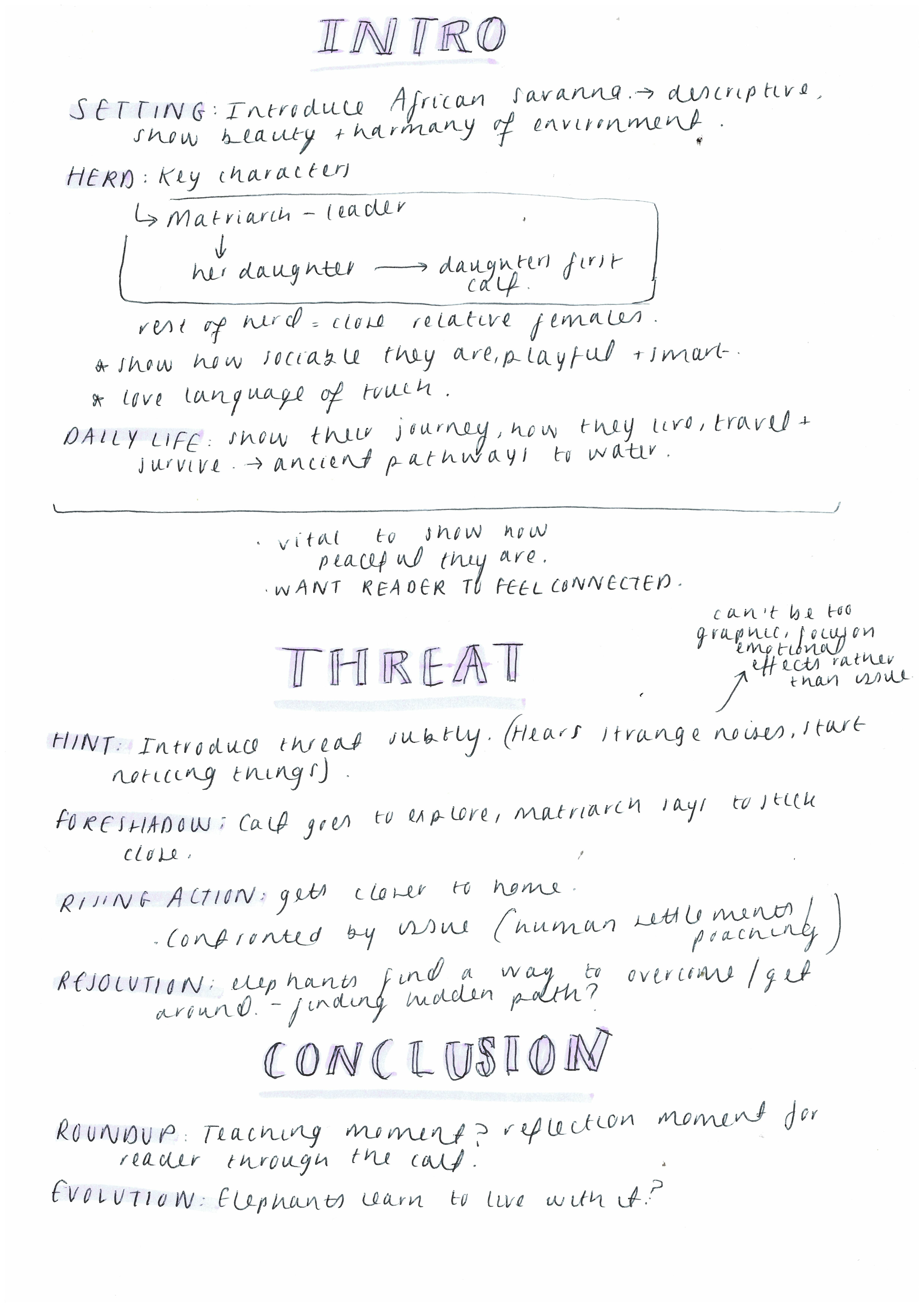
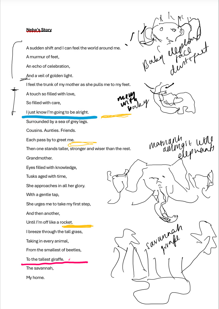
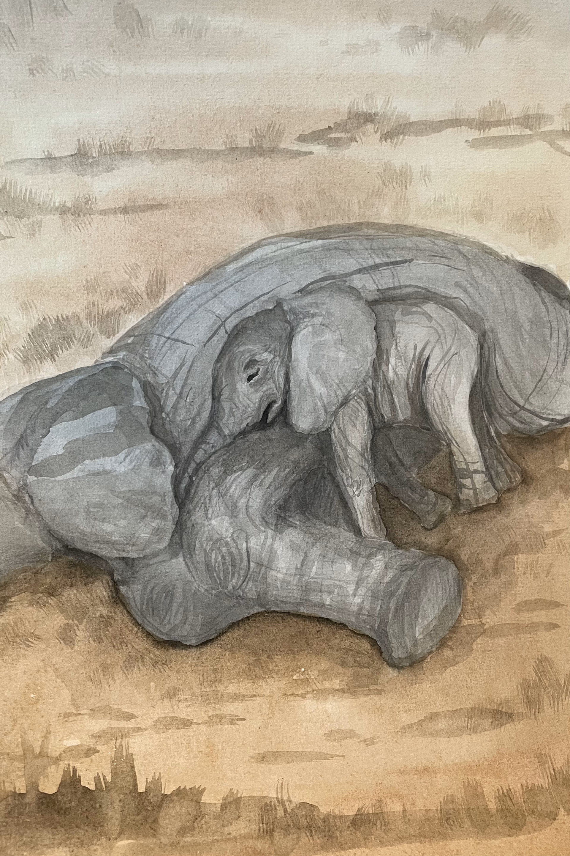
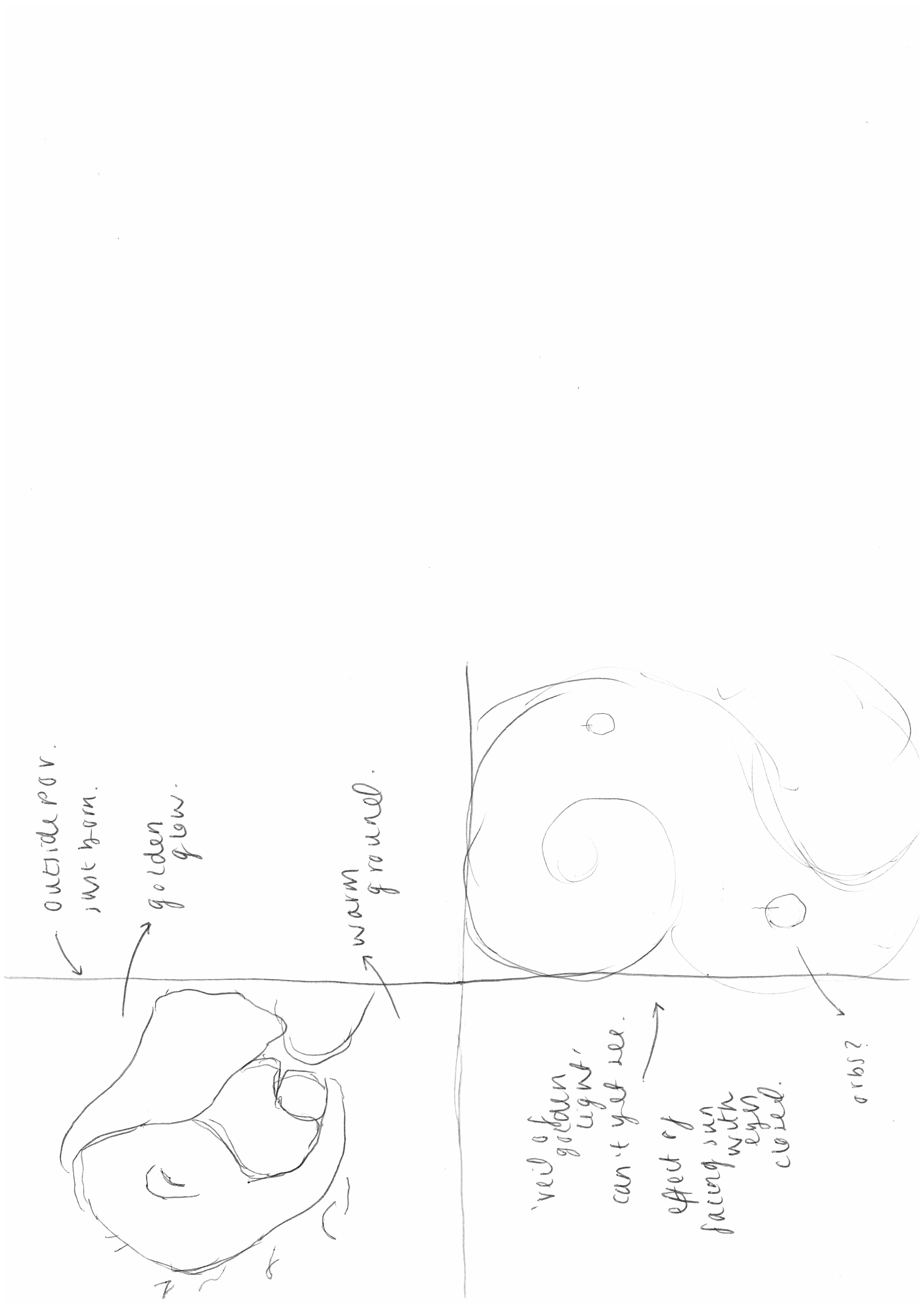
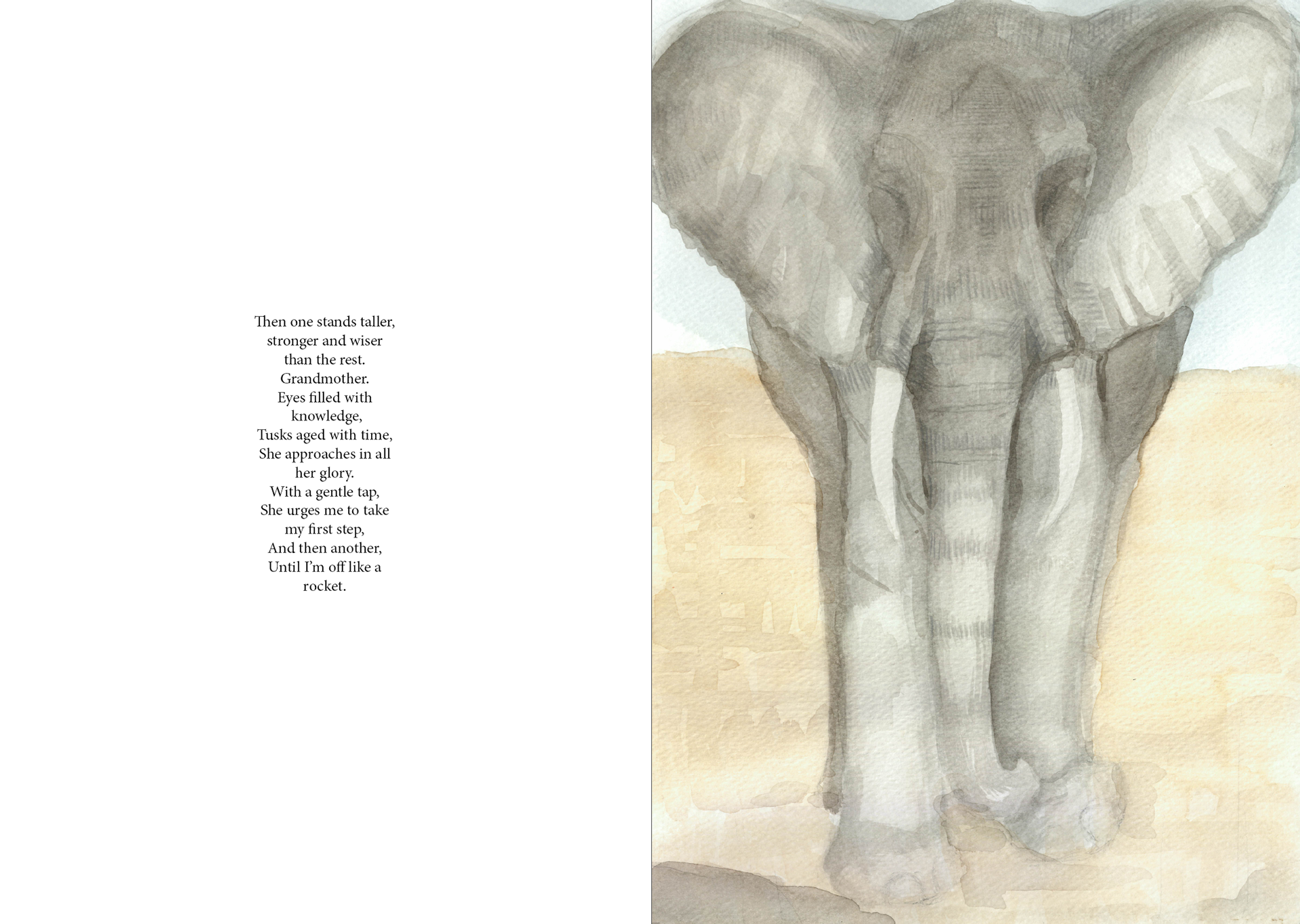
At this stage I was getting increasingly stressed because I was so desperate to actually fulfil the purpose of this project. I just struggled so much to actually get it into a context and role with it. While at home my dad actually helped me rest on my final idea. To have a story from a baby elephants point of view, following her as she grows. This was perfect and I instantly connected with it. The idea of telling the story from the perspective of the baby allows the reader to put themselves into her shoes, facing the challenges she does from a first person perspective. So this is where baby Neba was thought up.
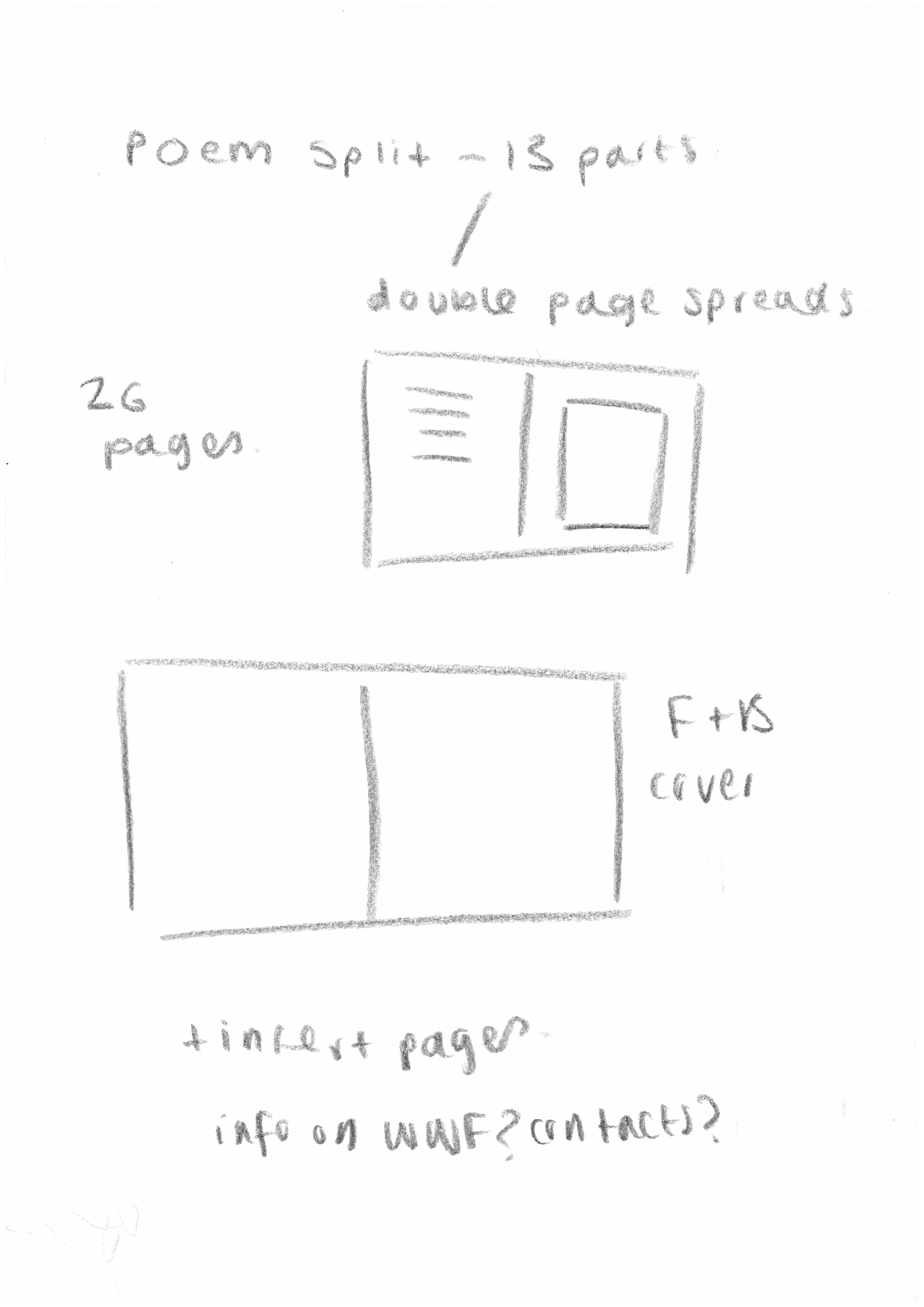
poem planning
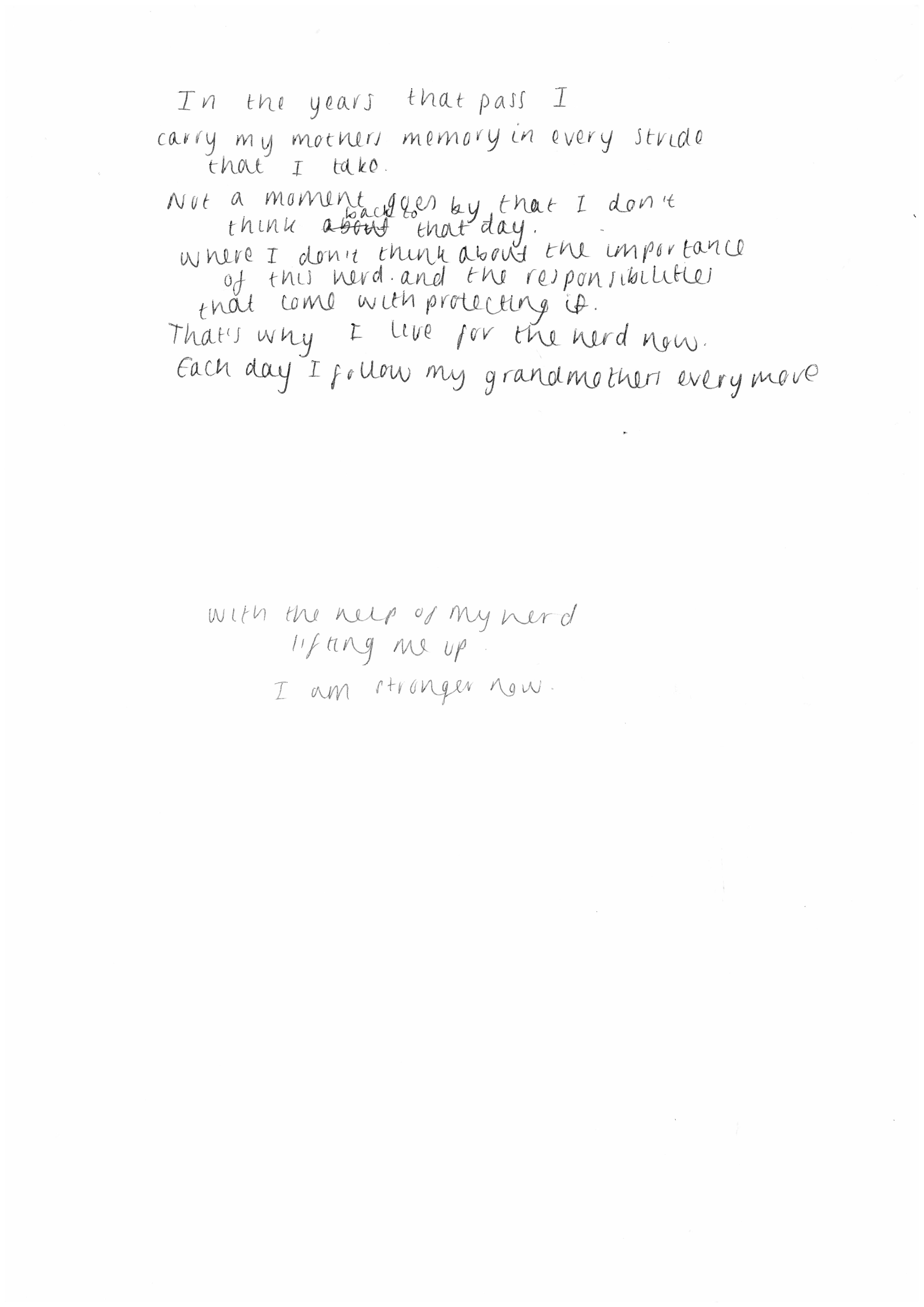
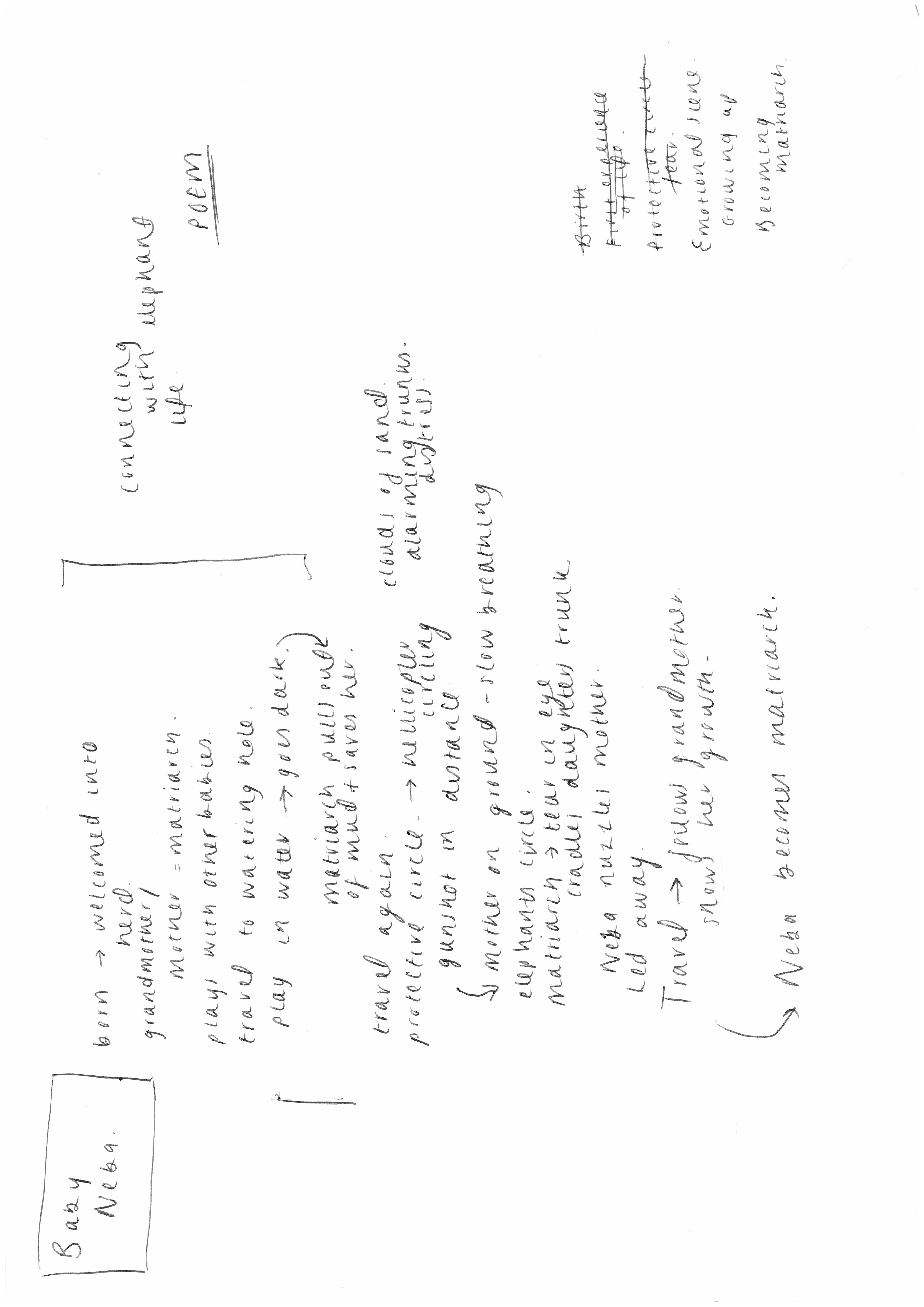
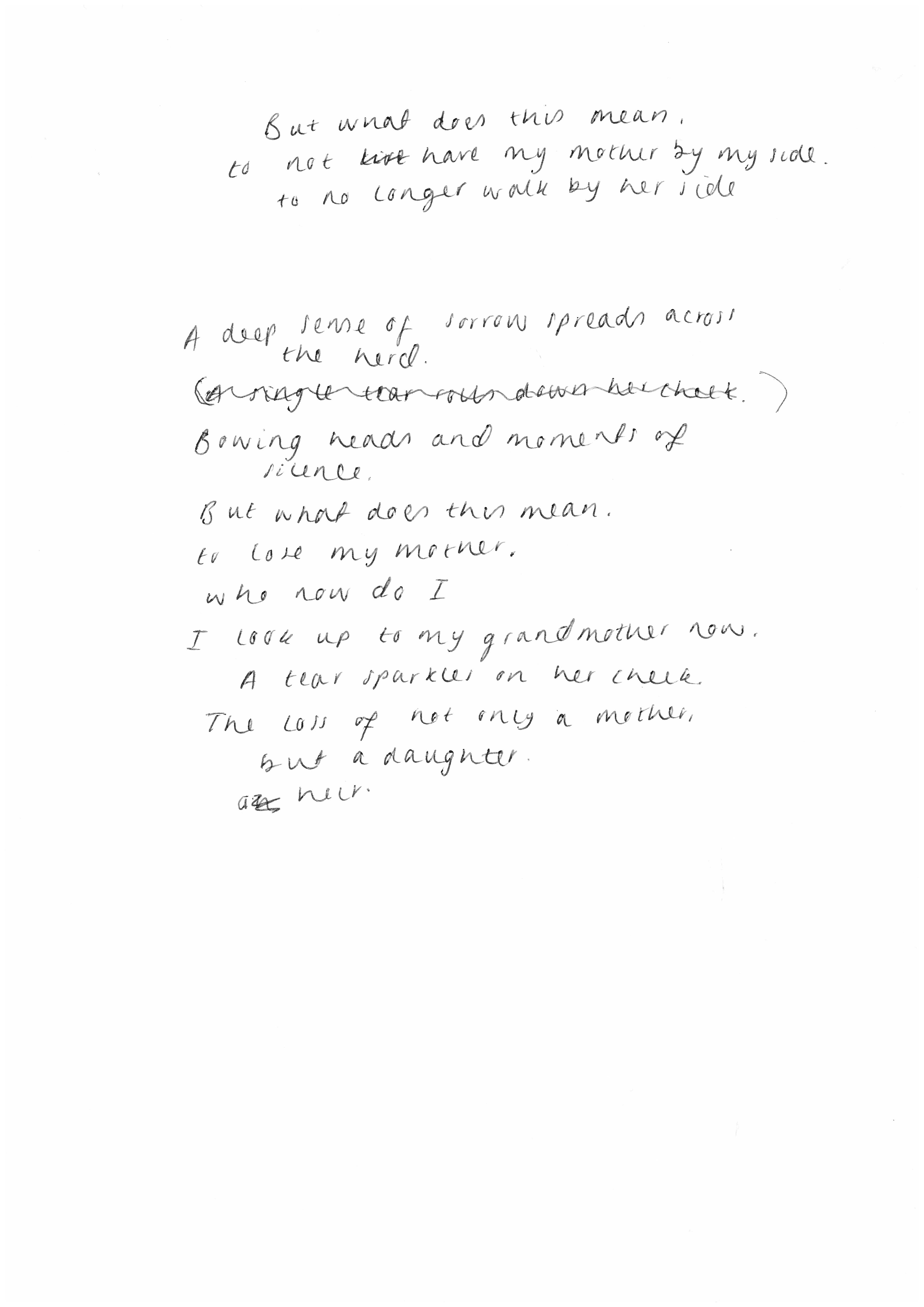
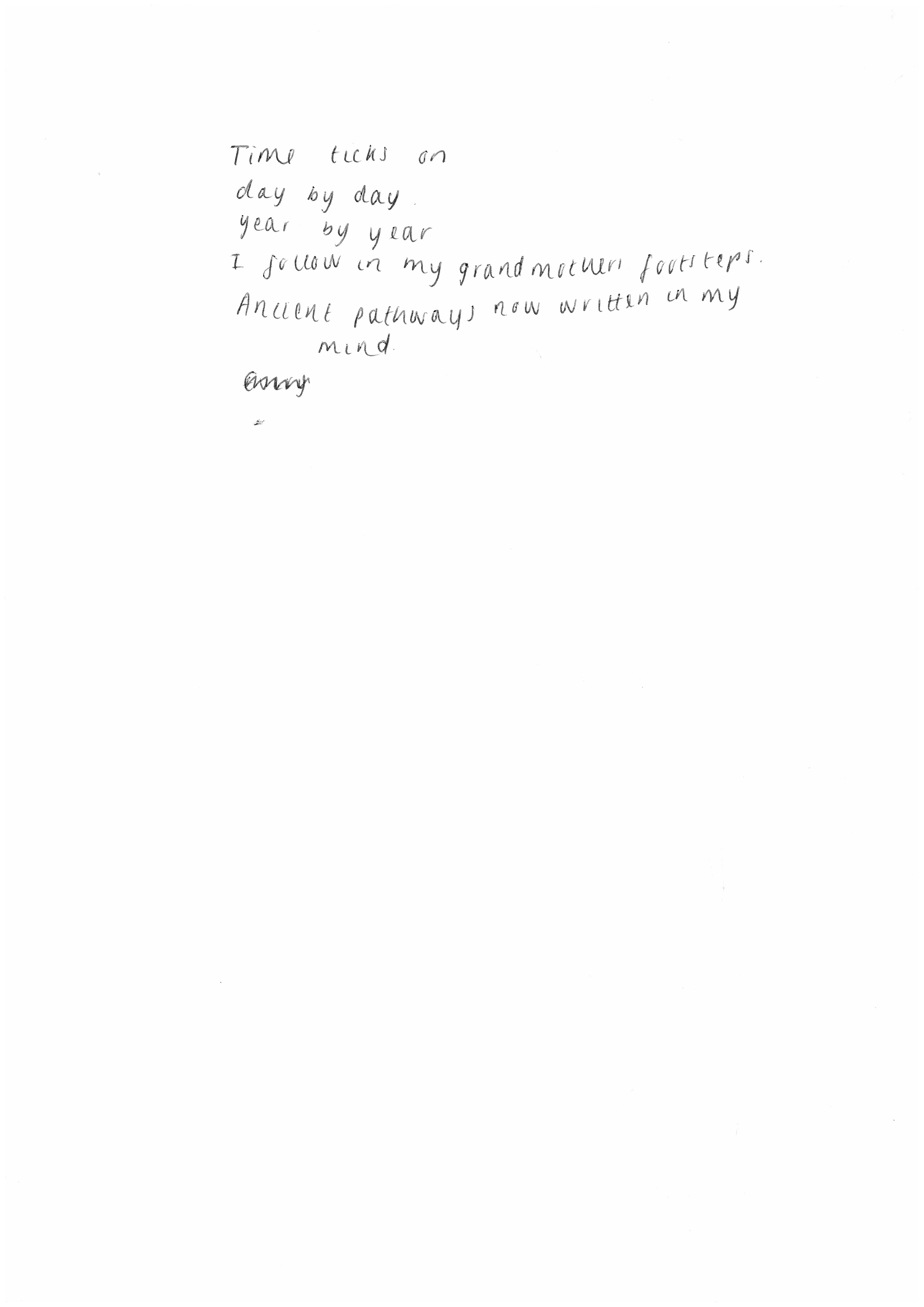
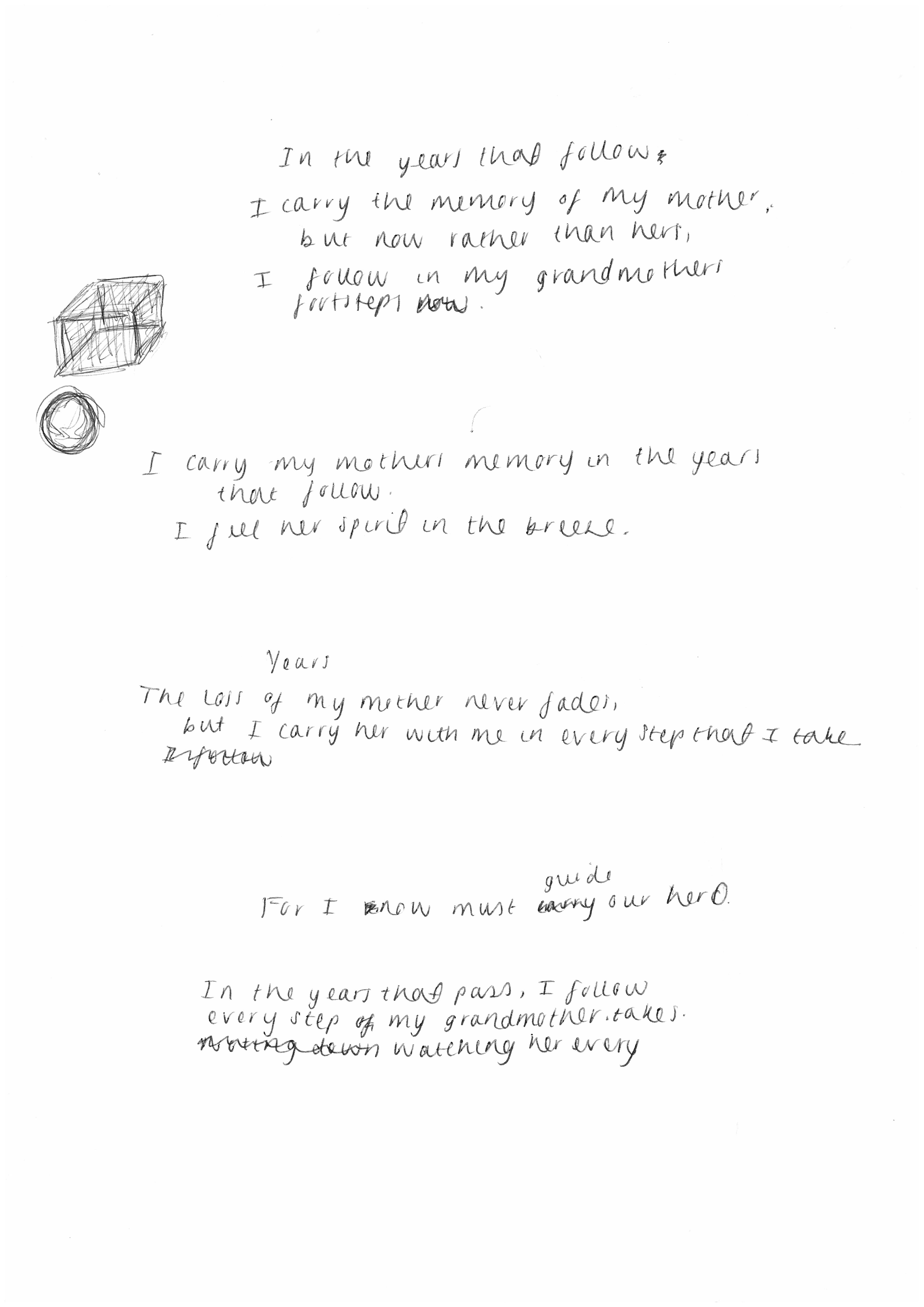
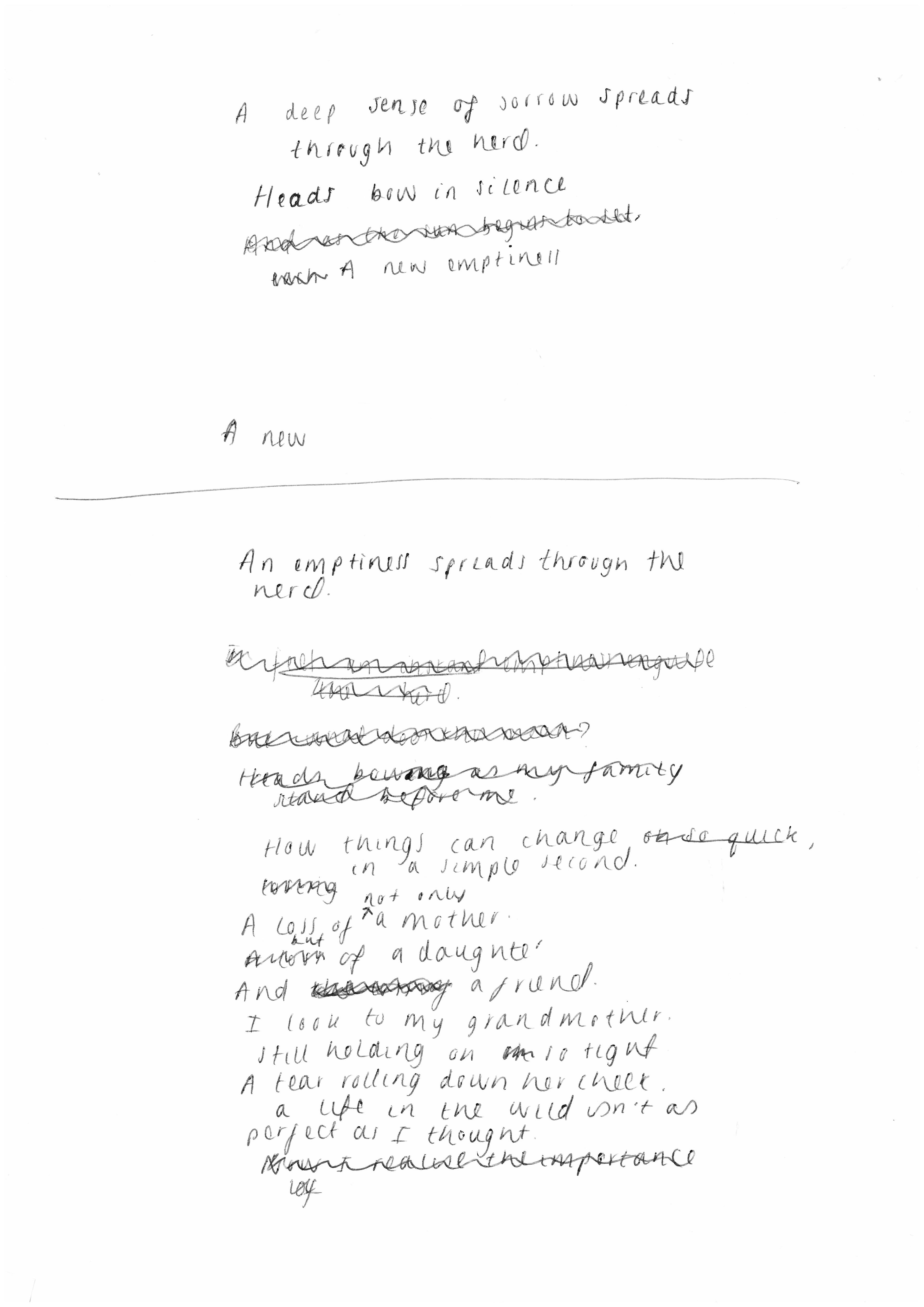
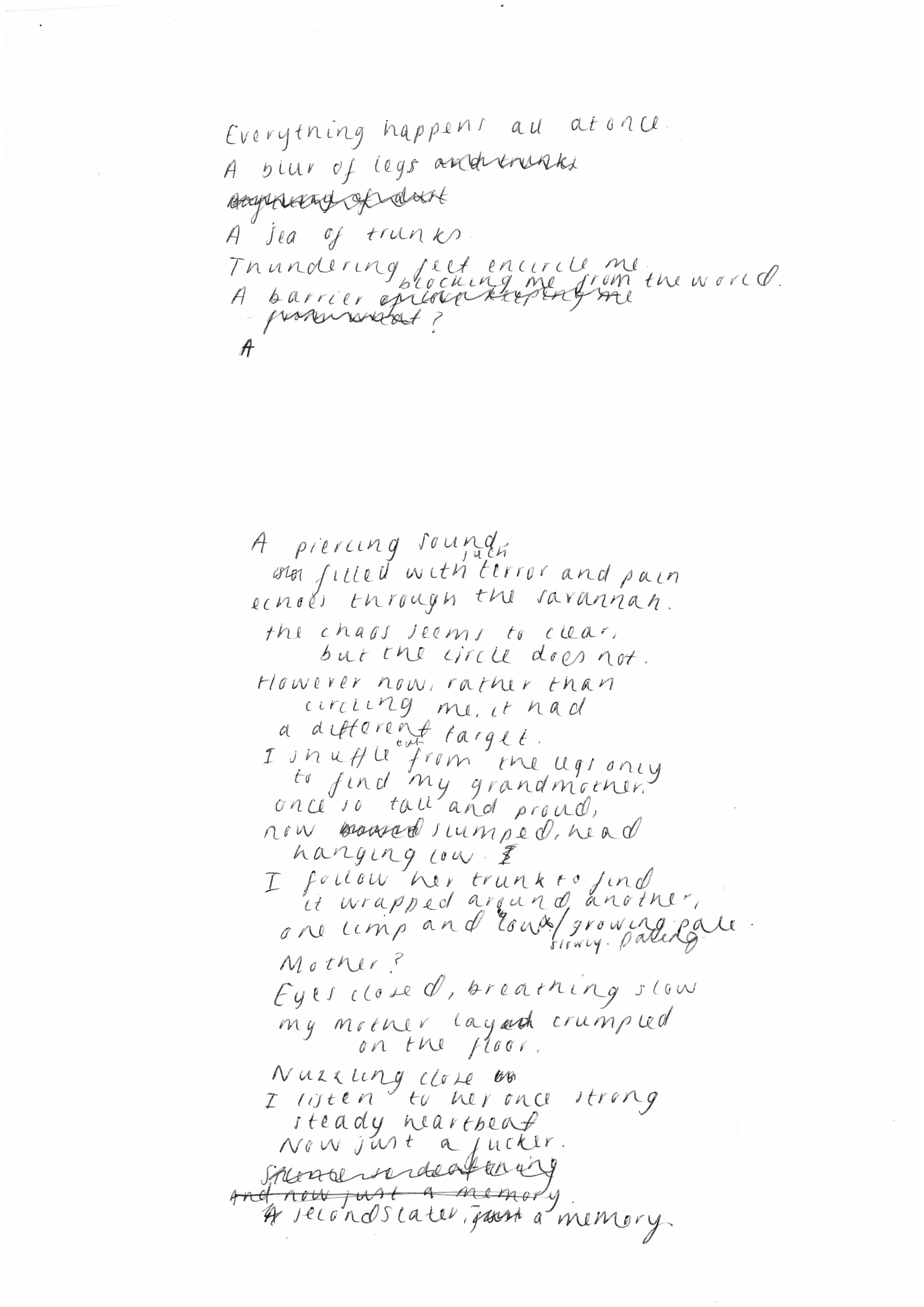
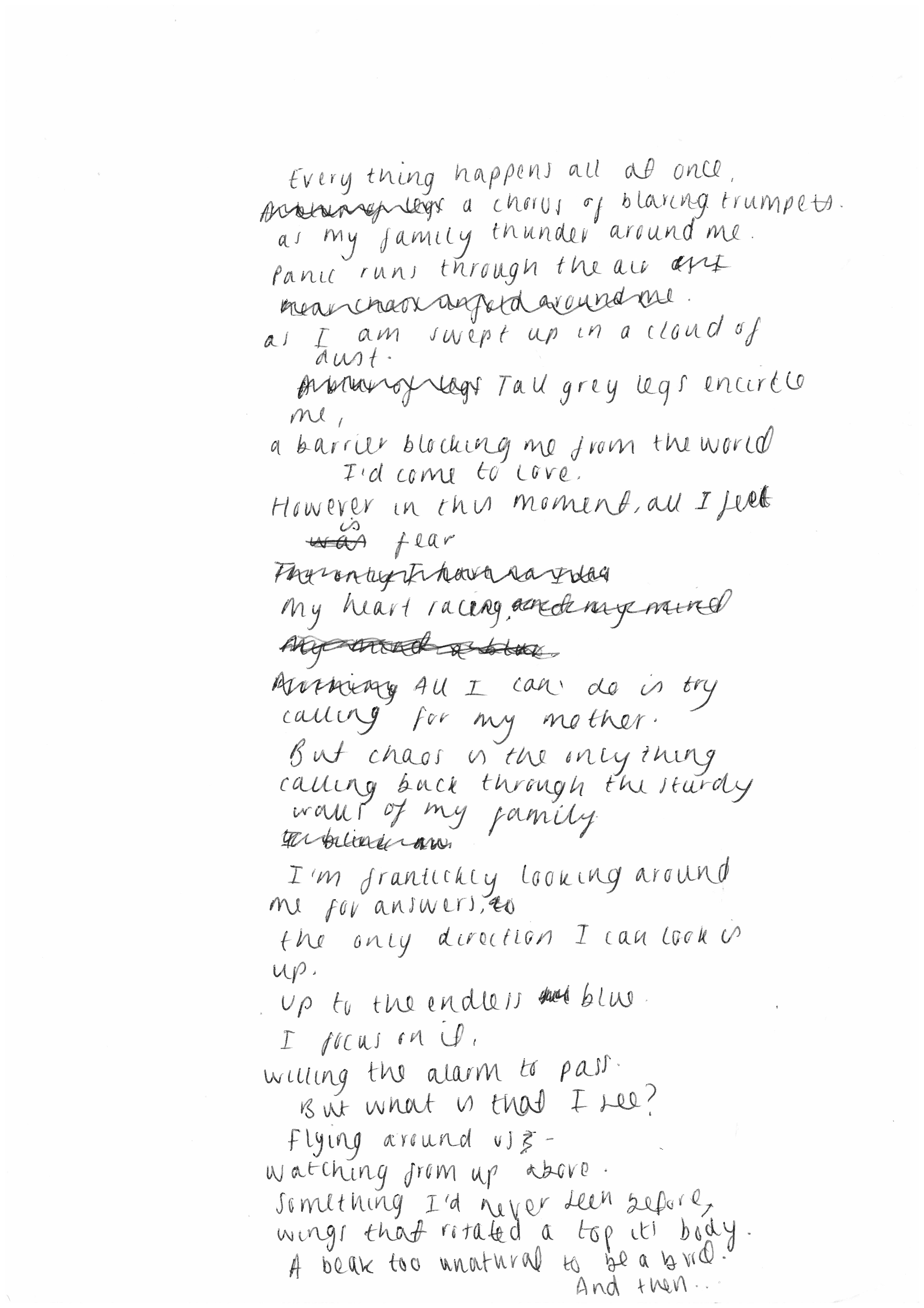
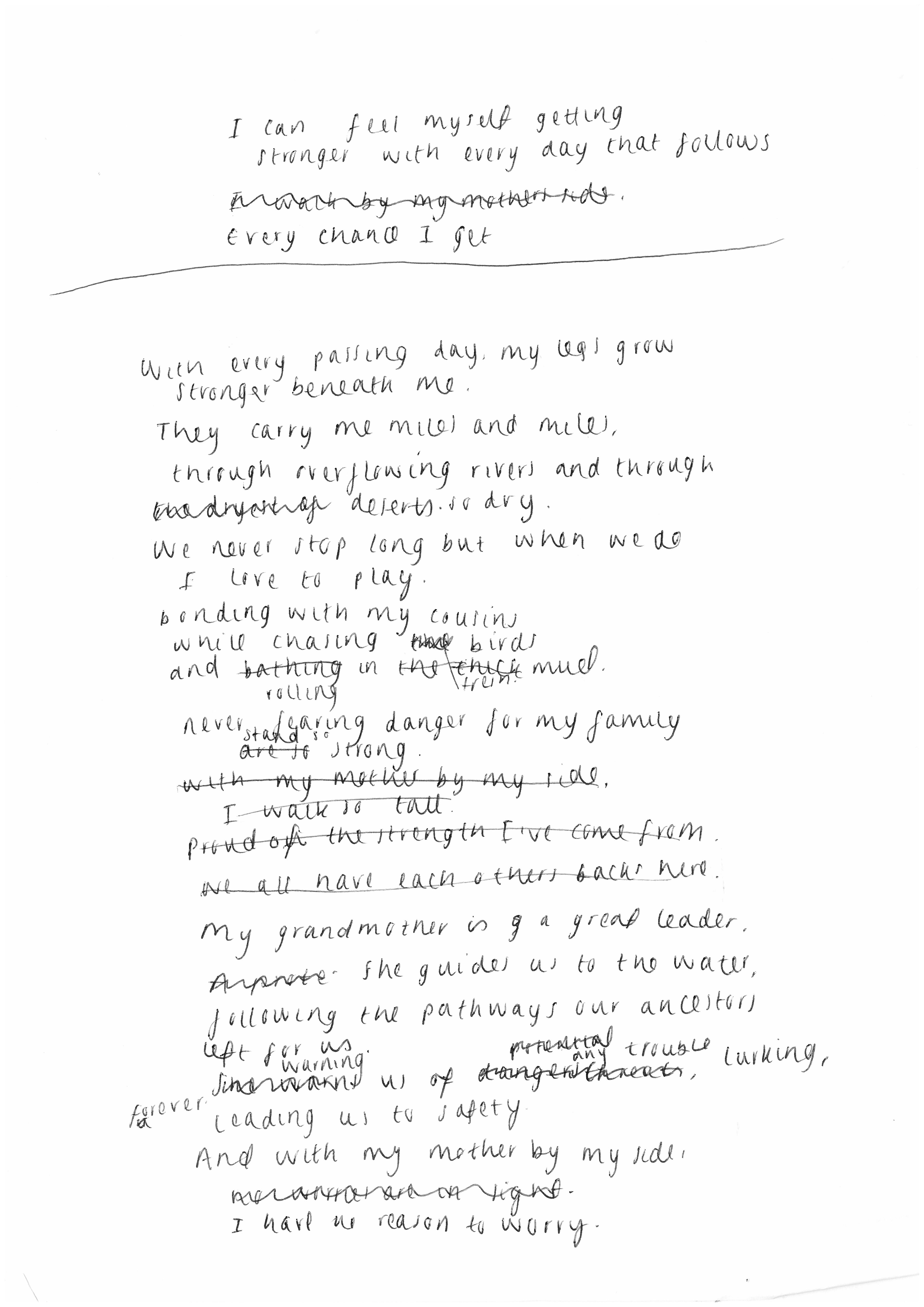
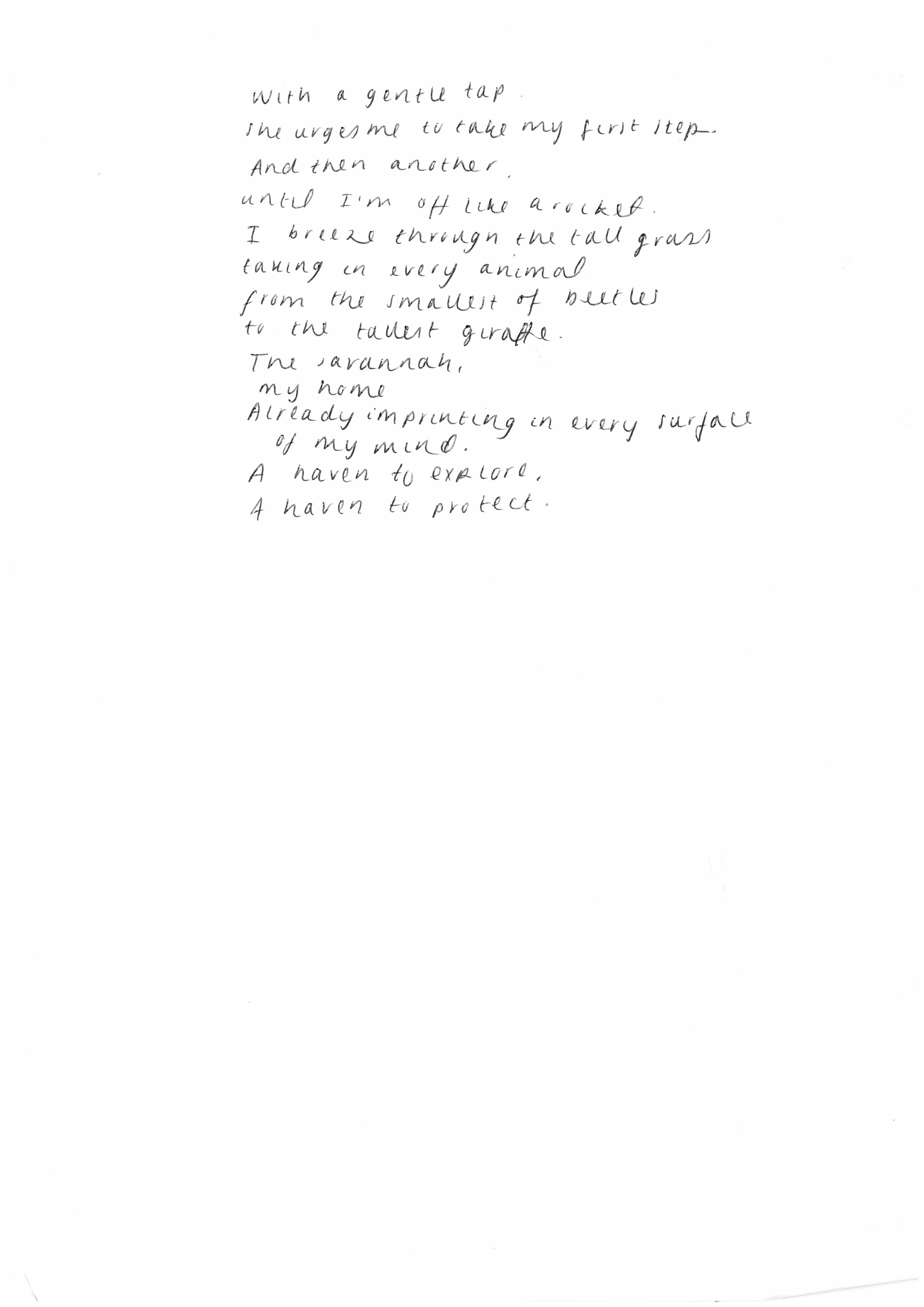
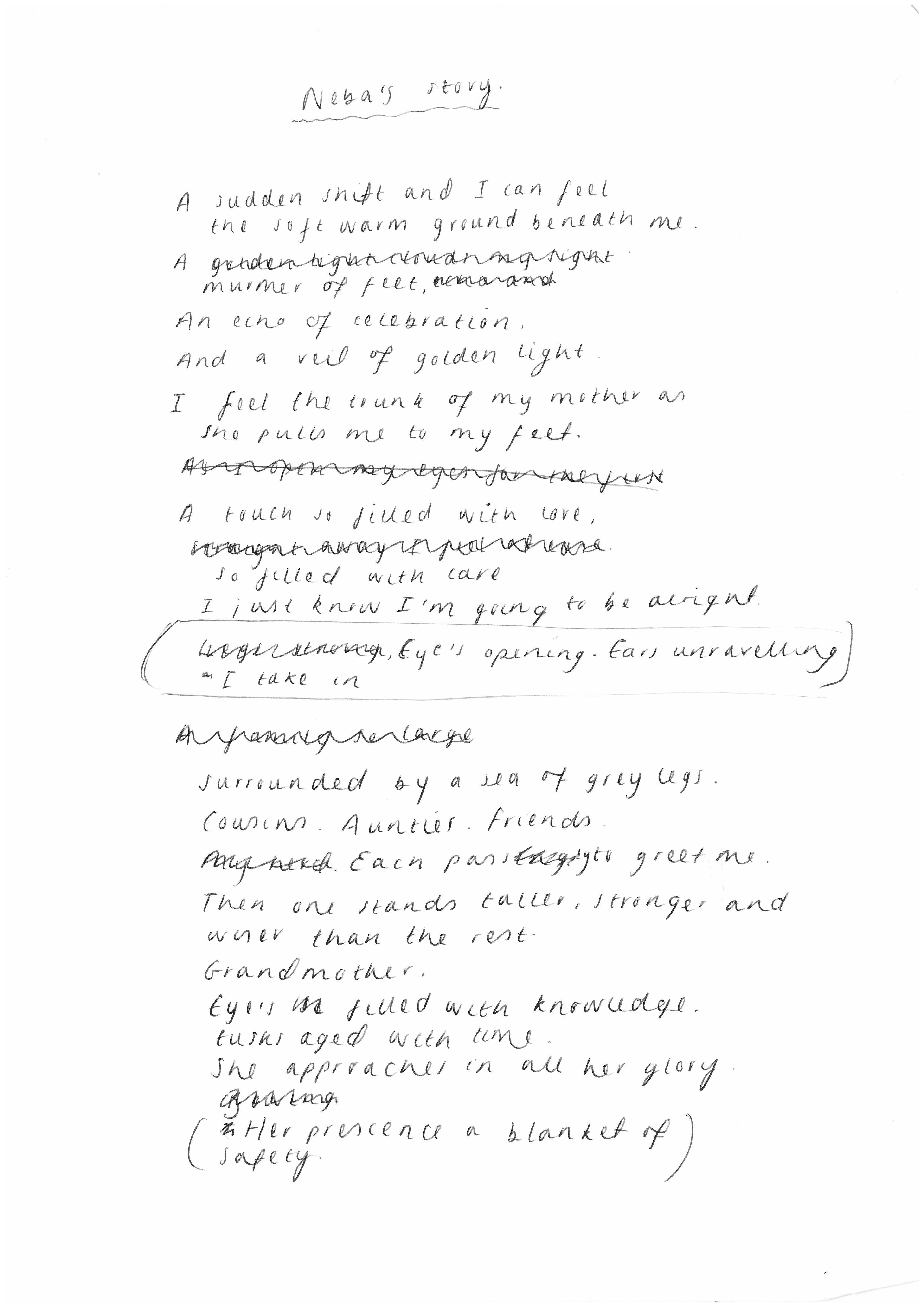
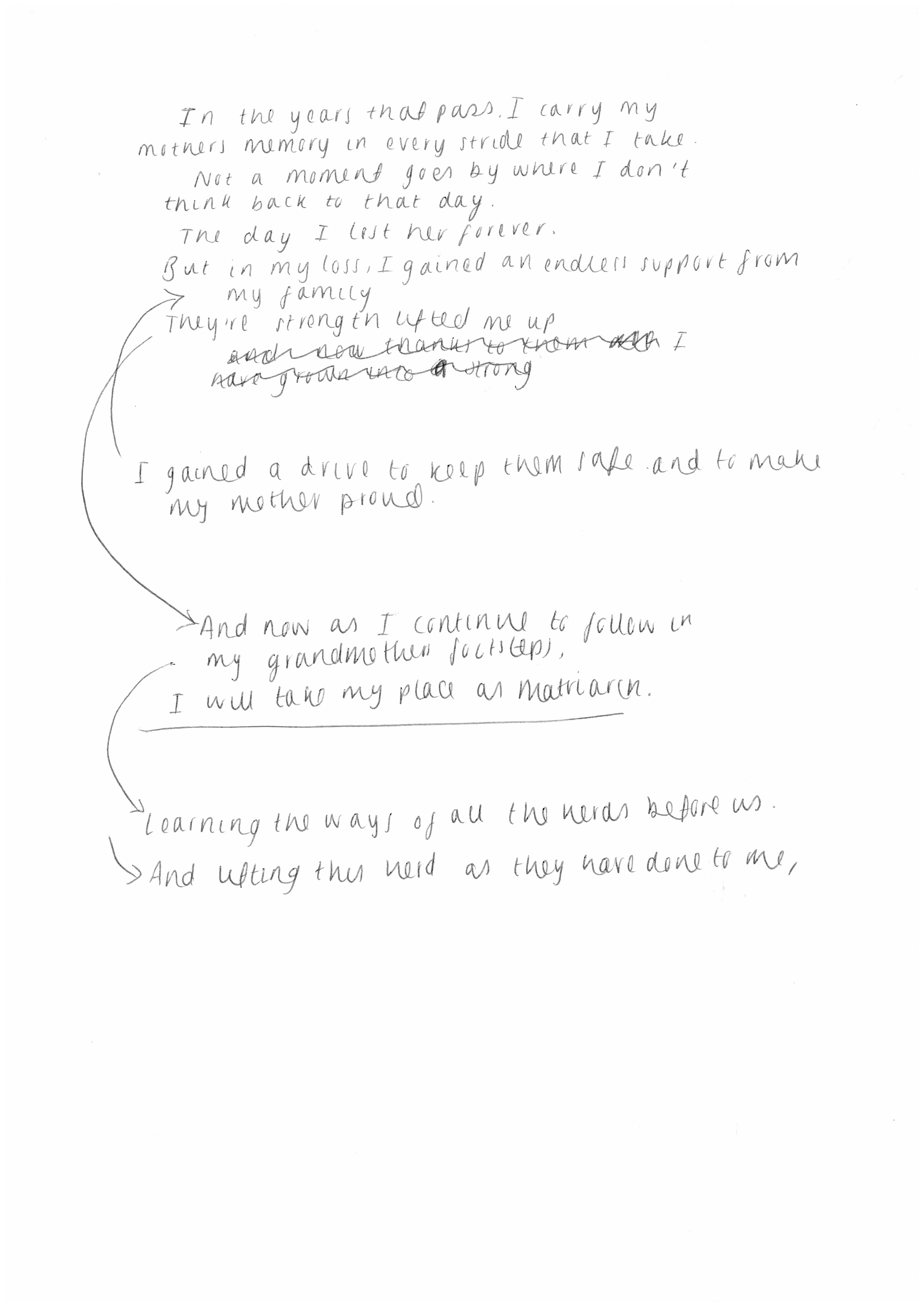
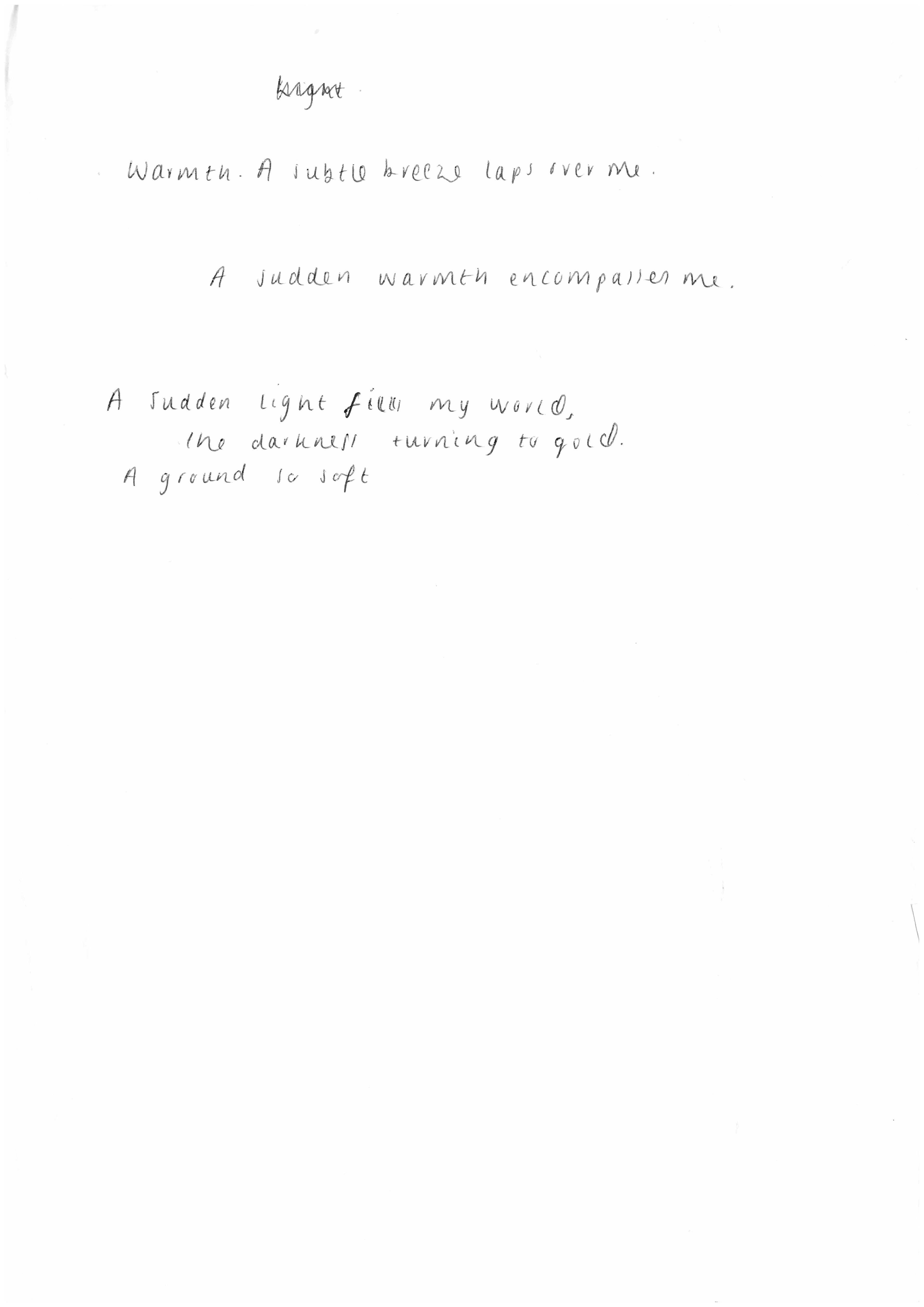
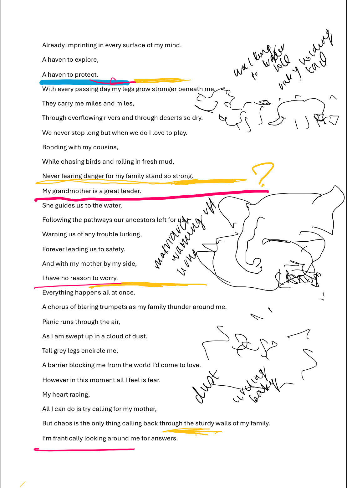
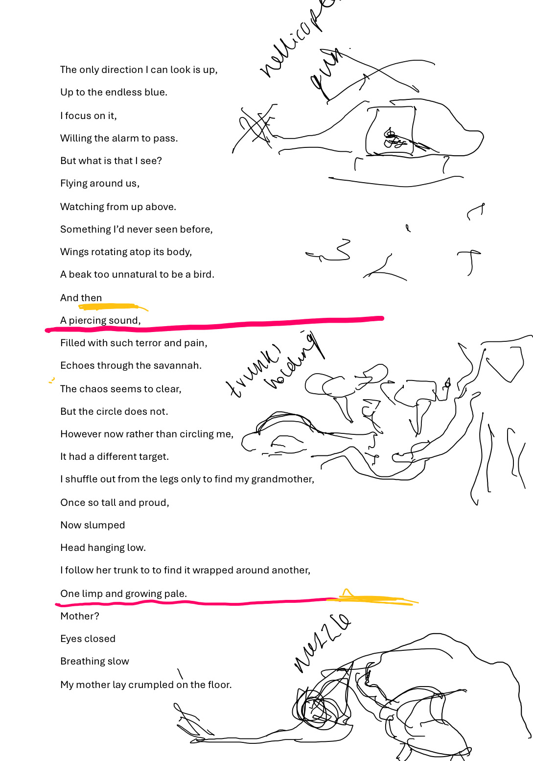
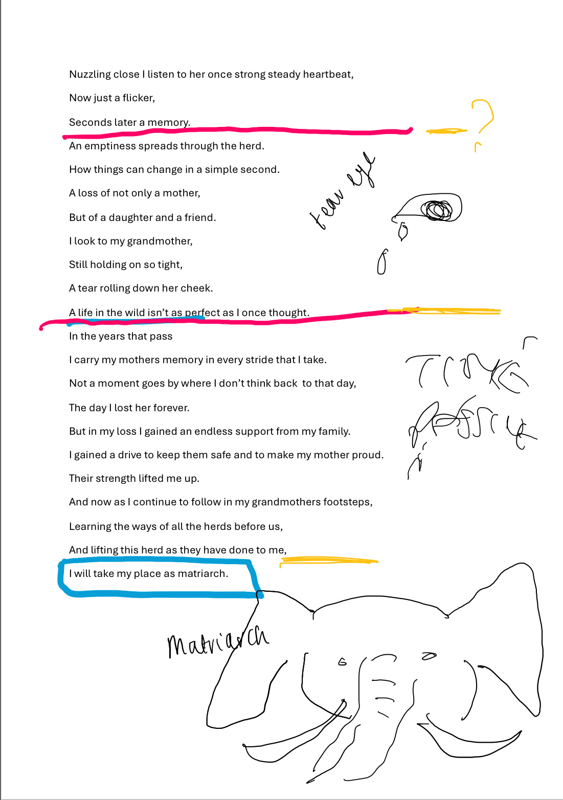
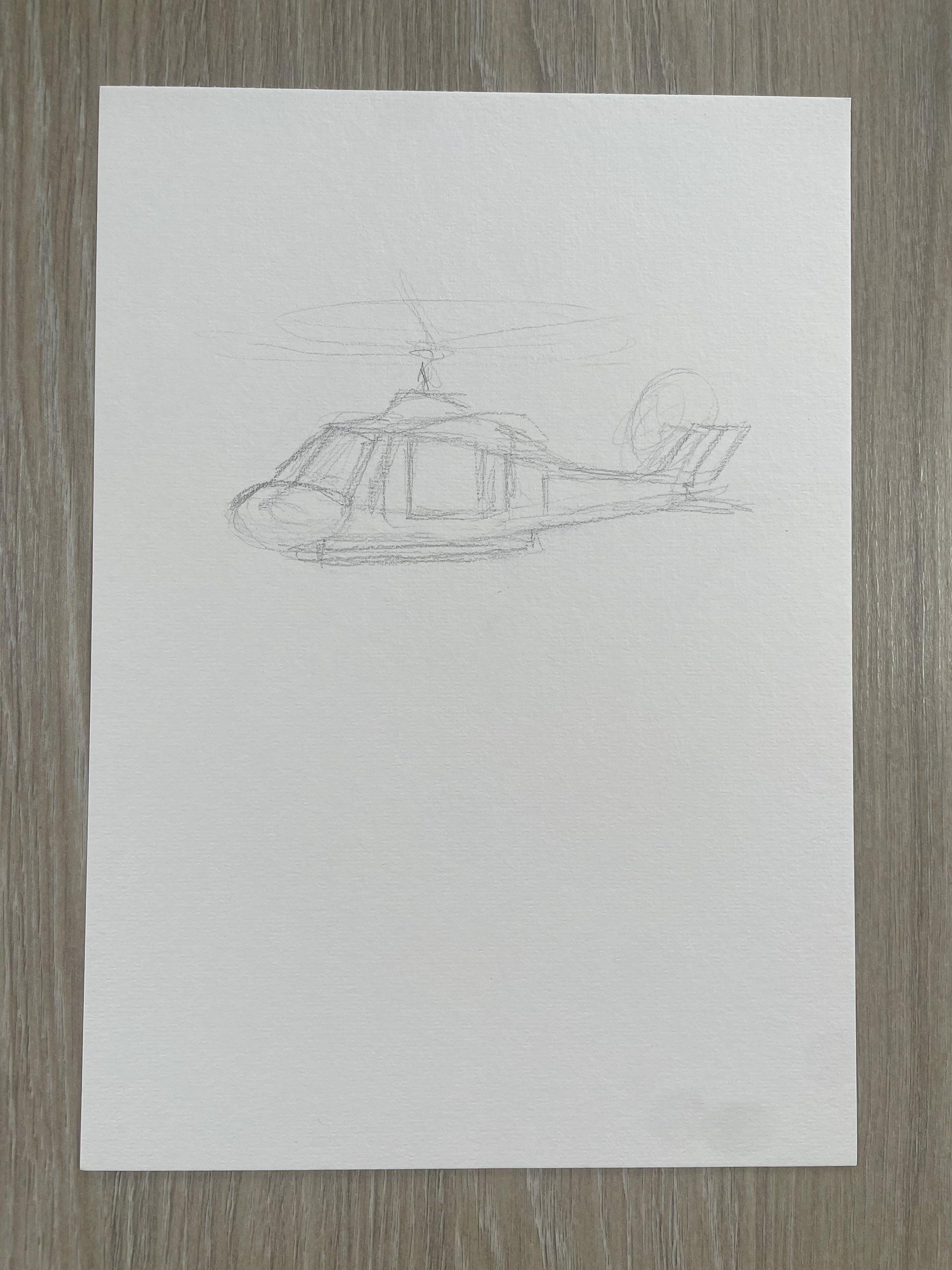
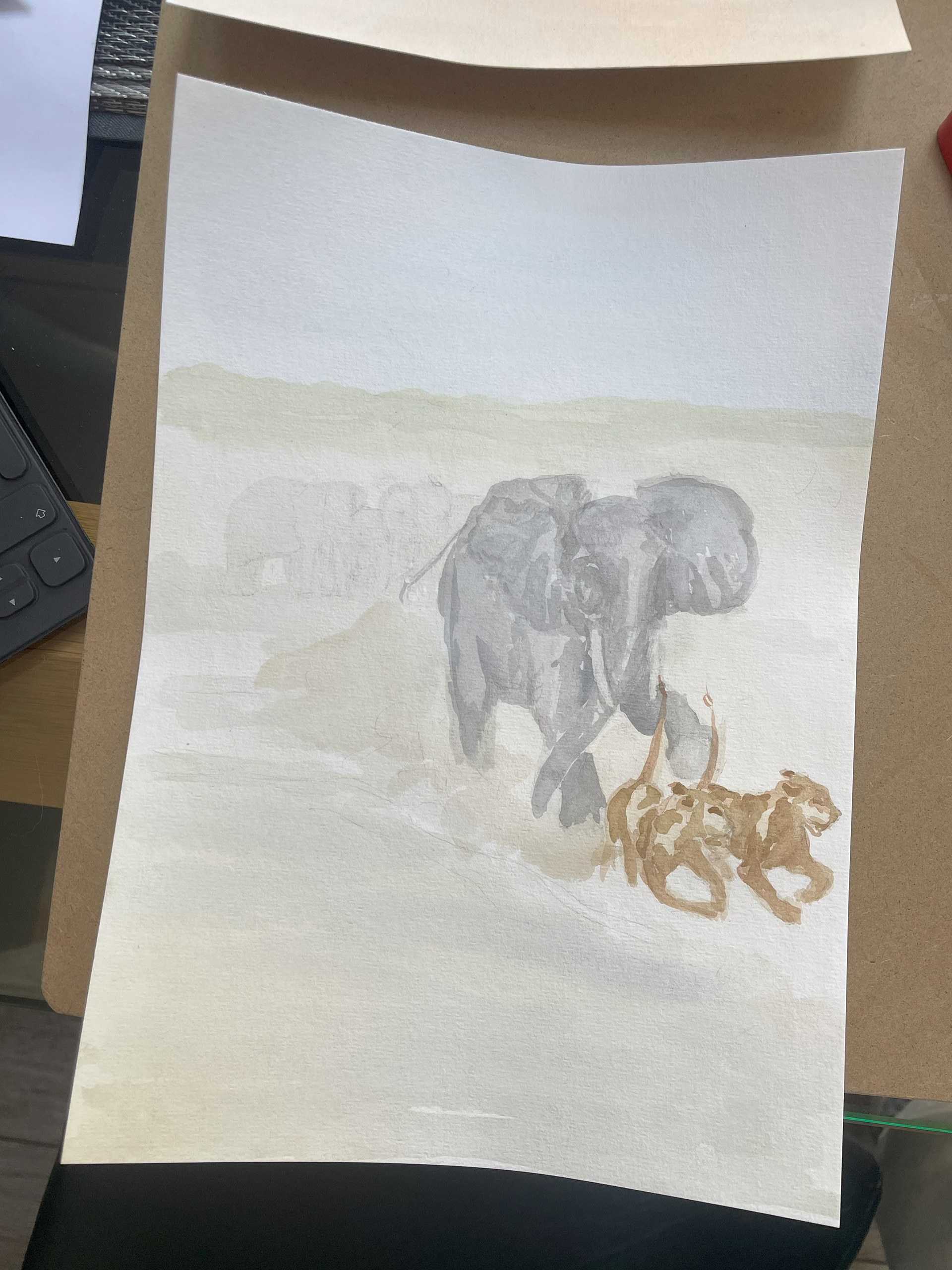
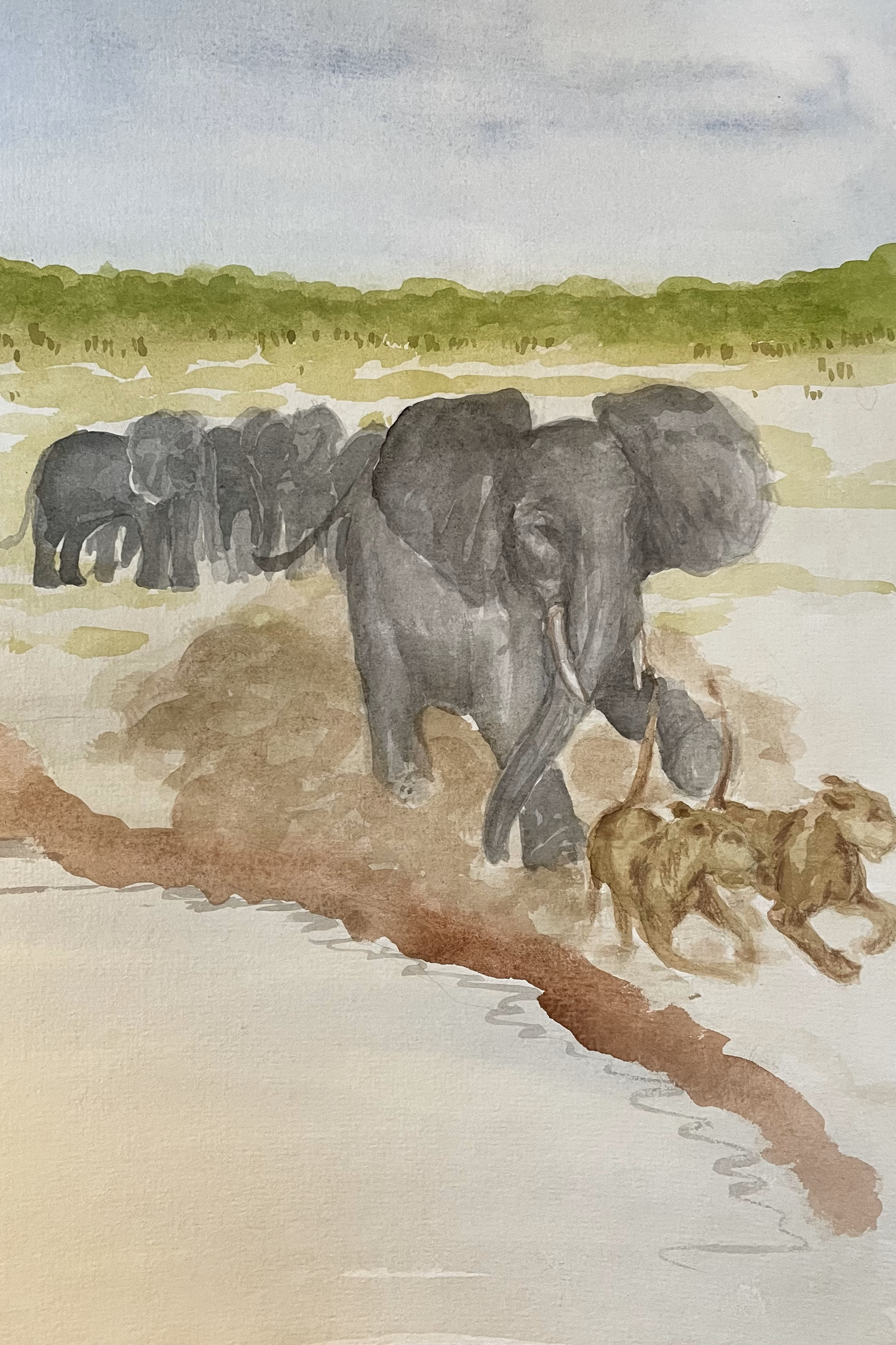
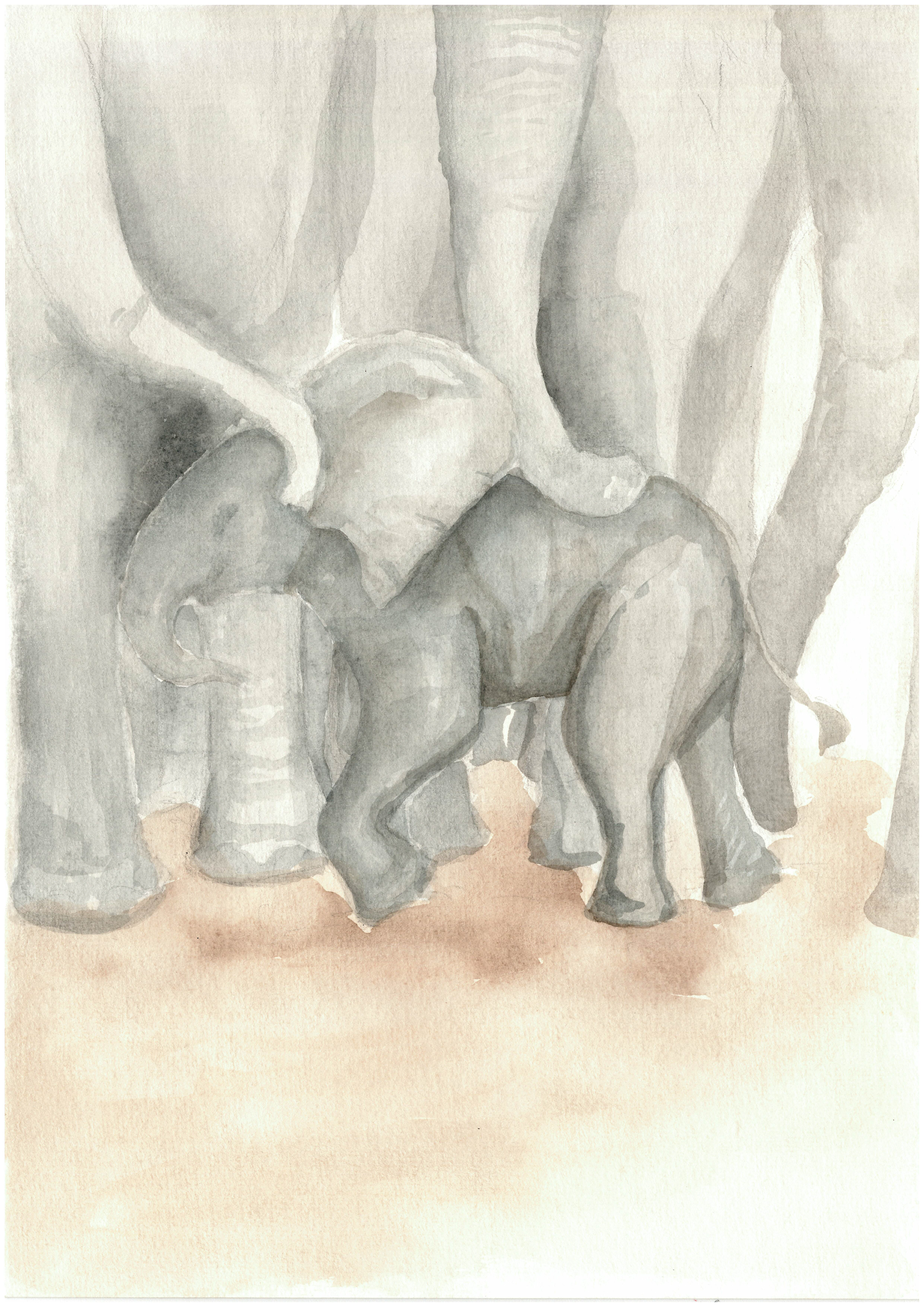
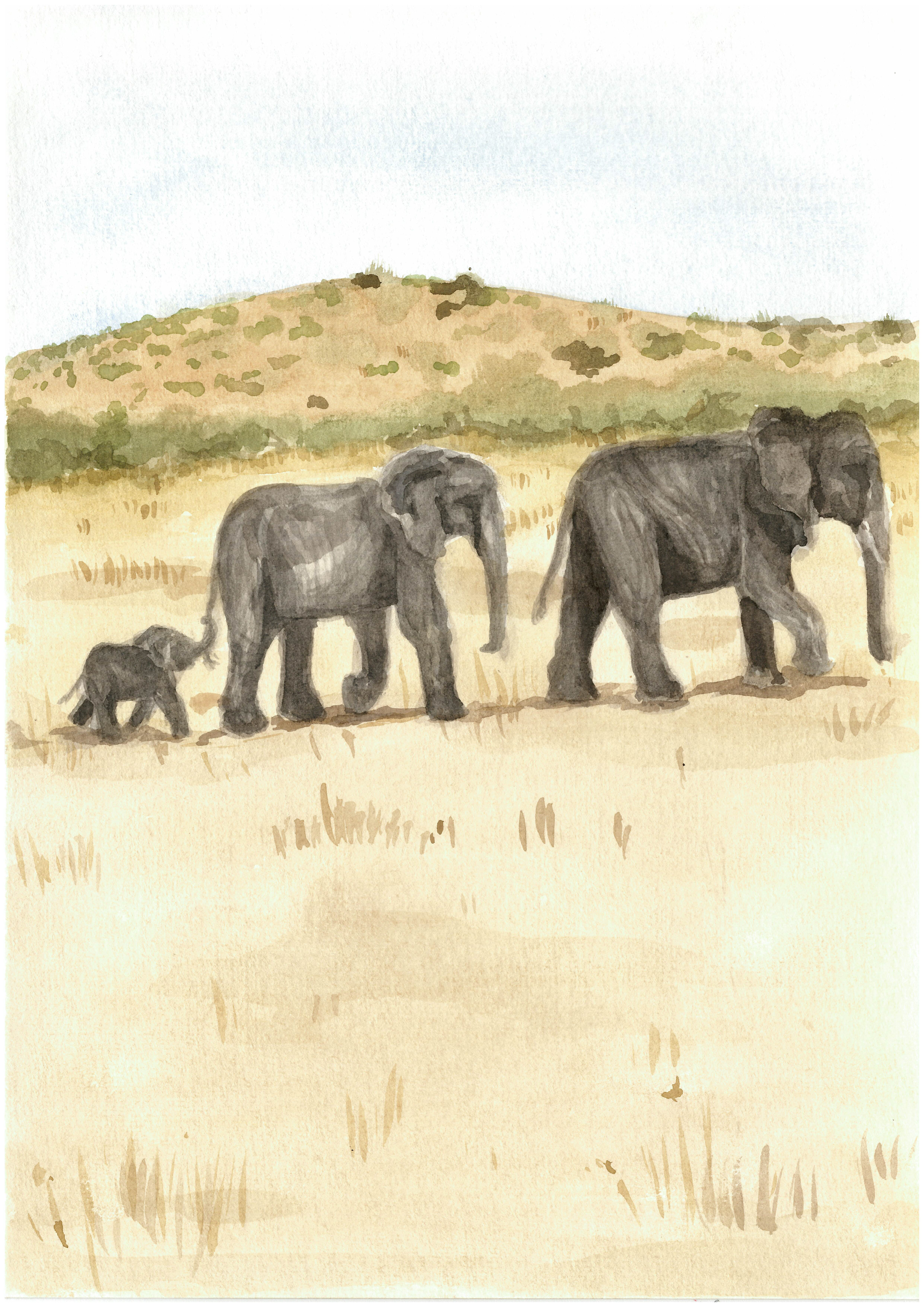
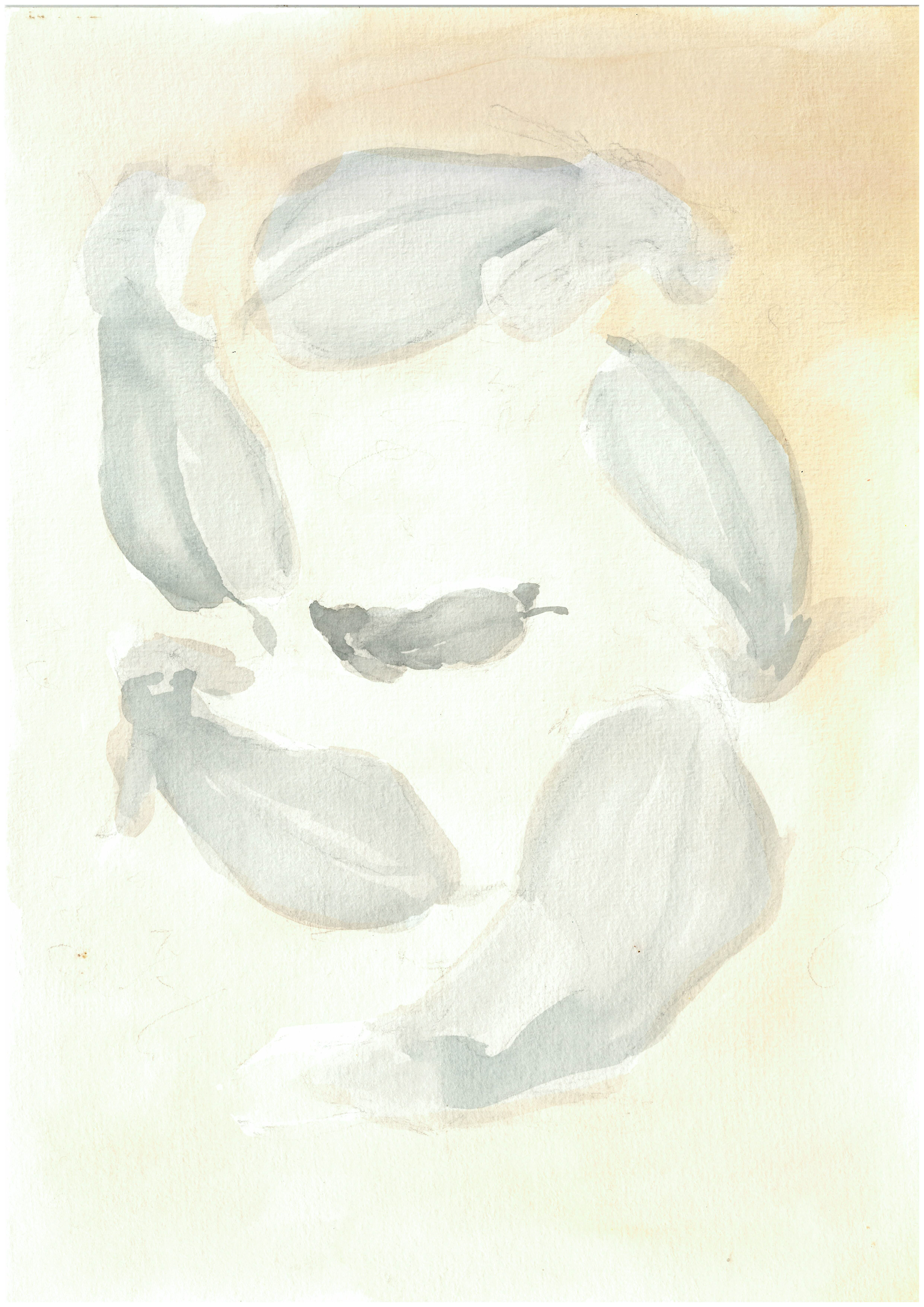
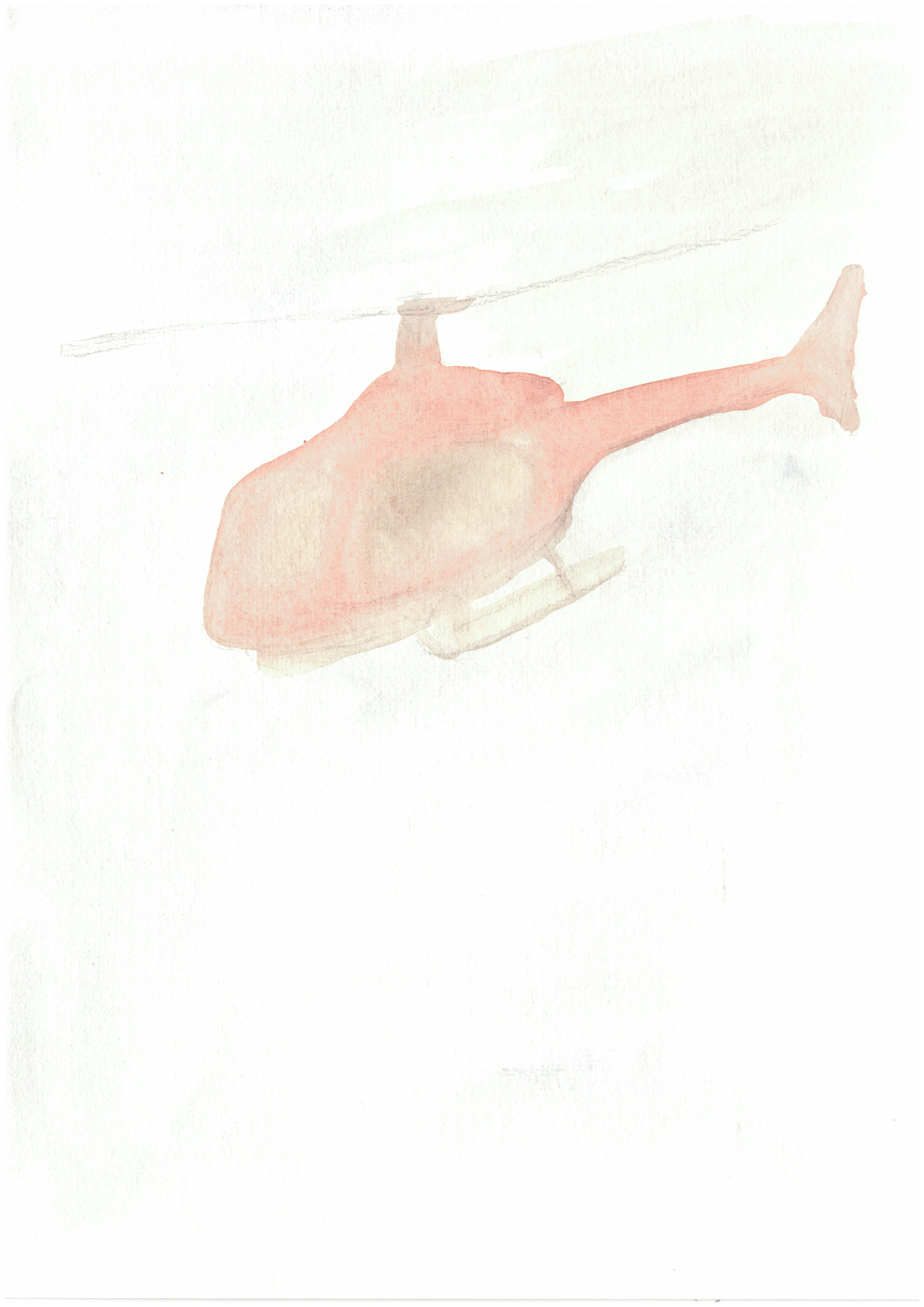
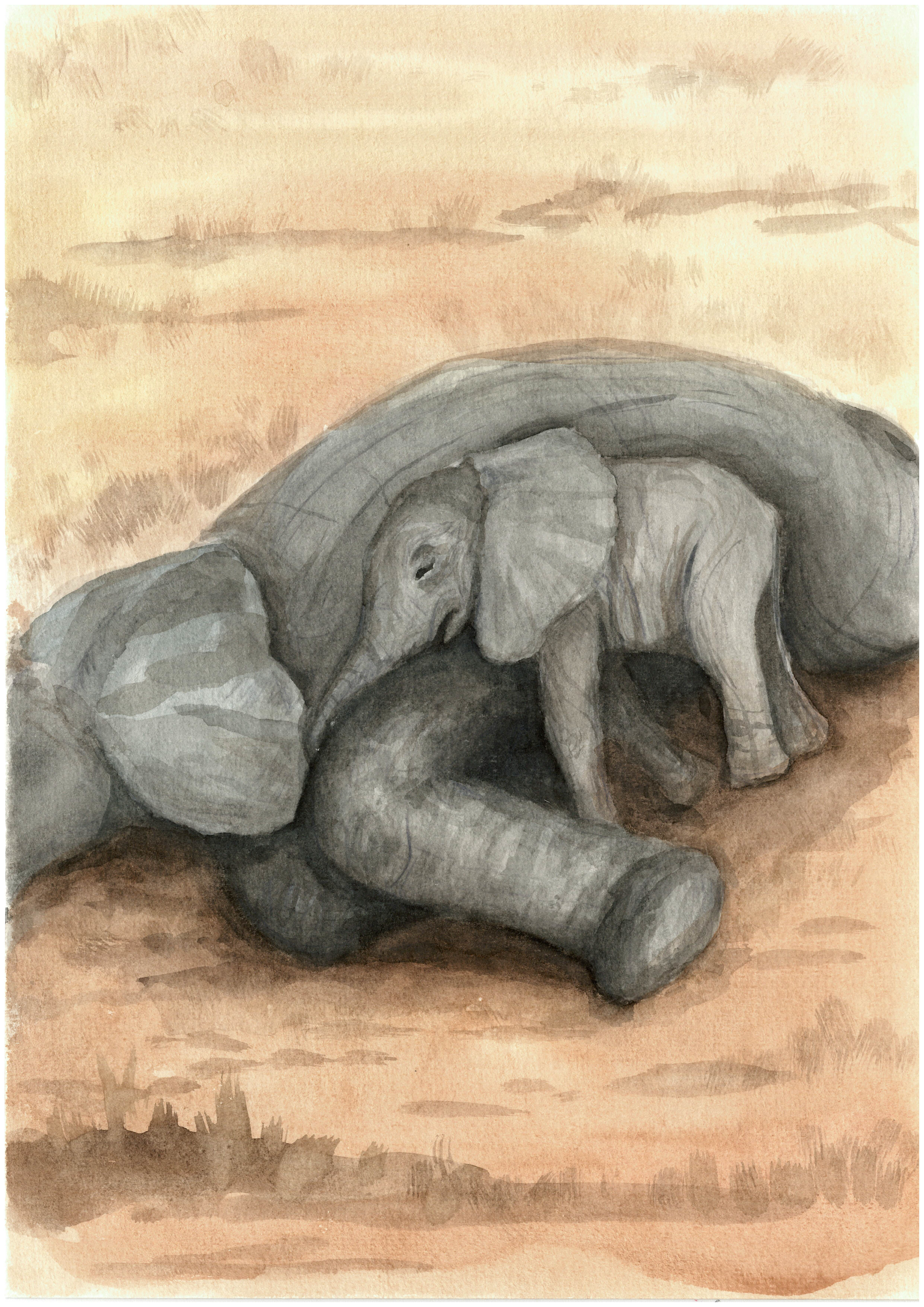
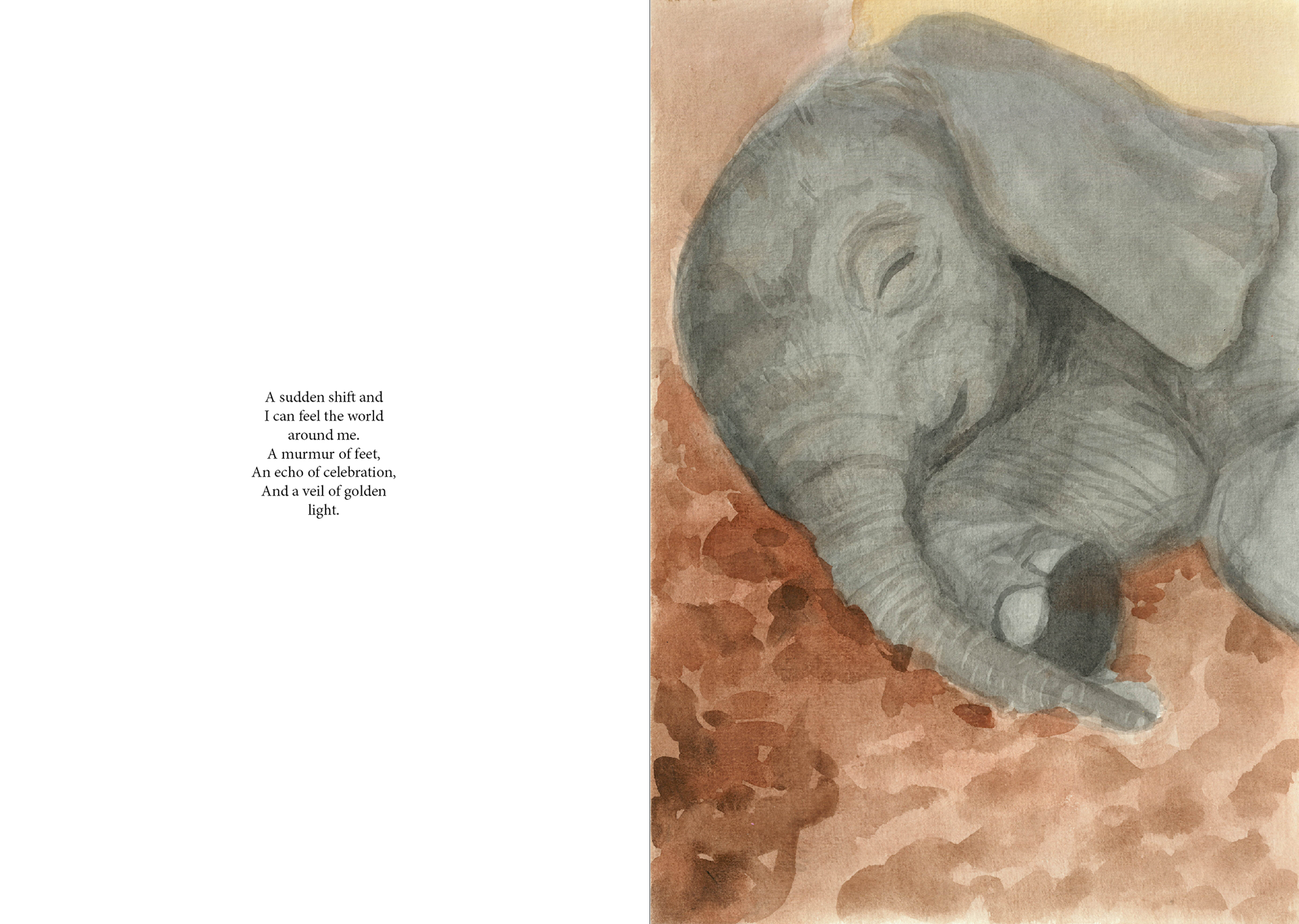
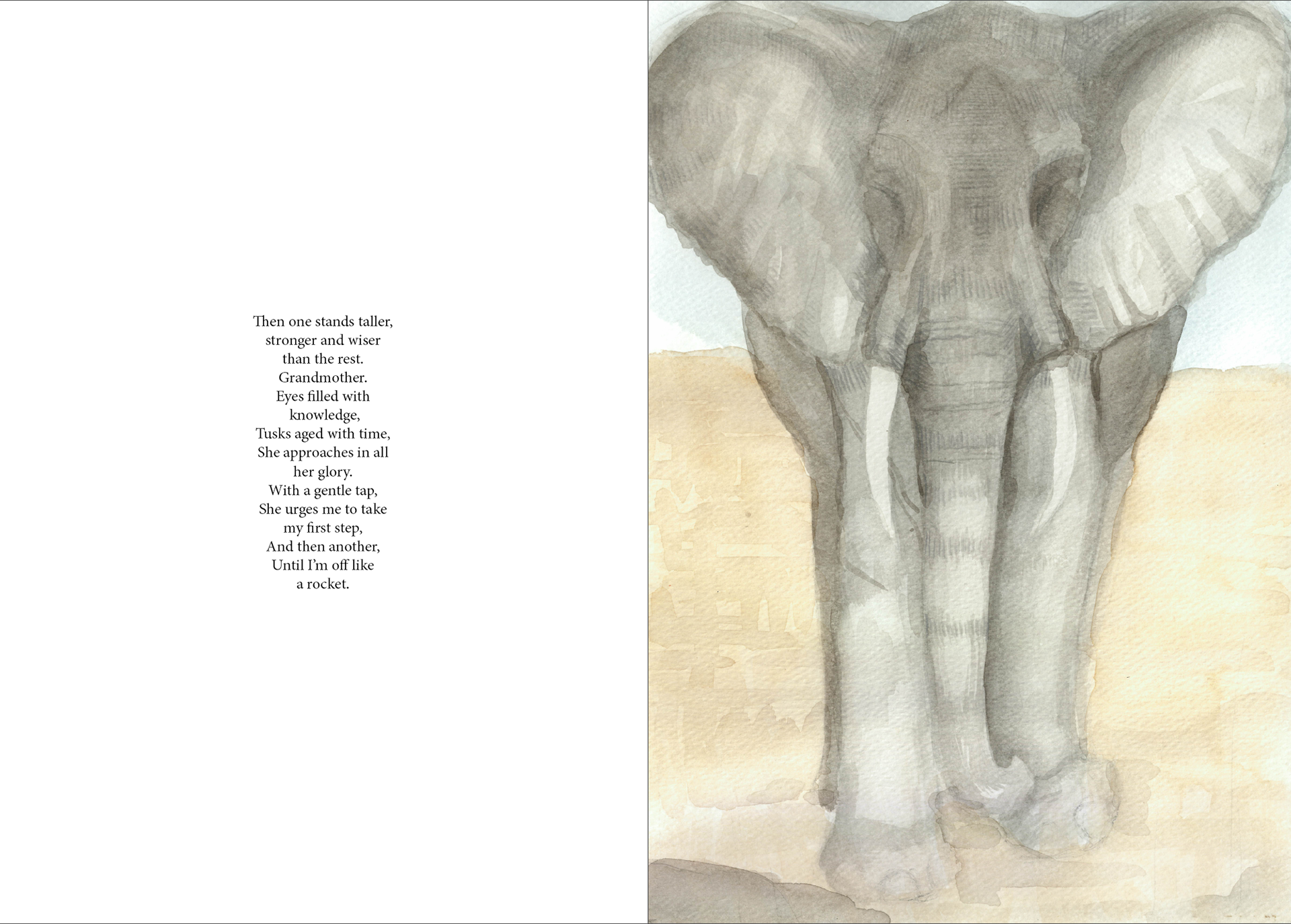
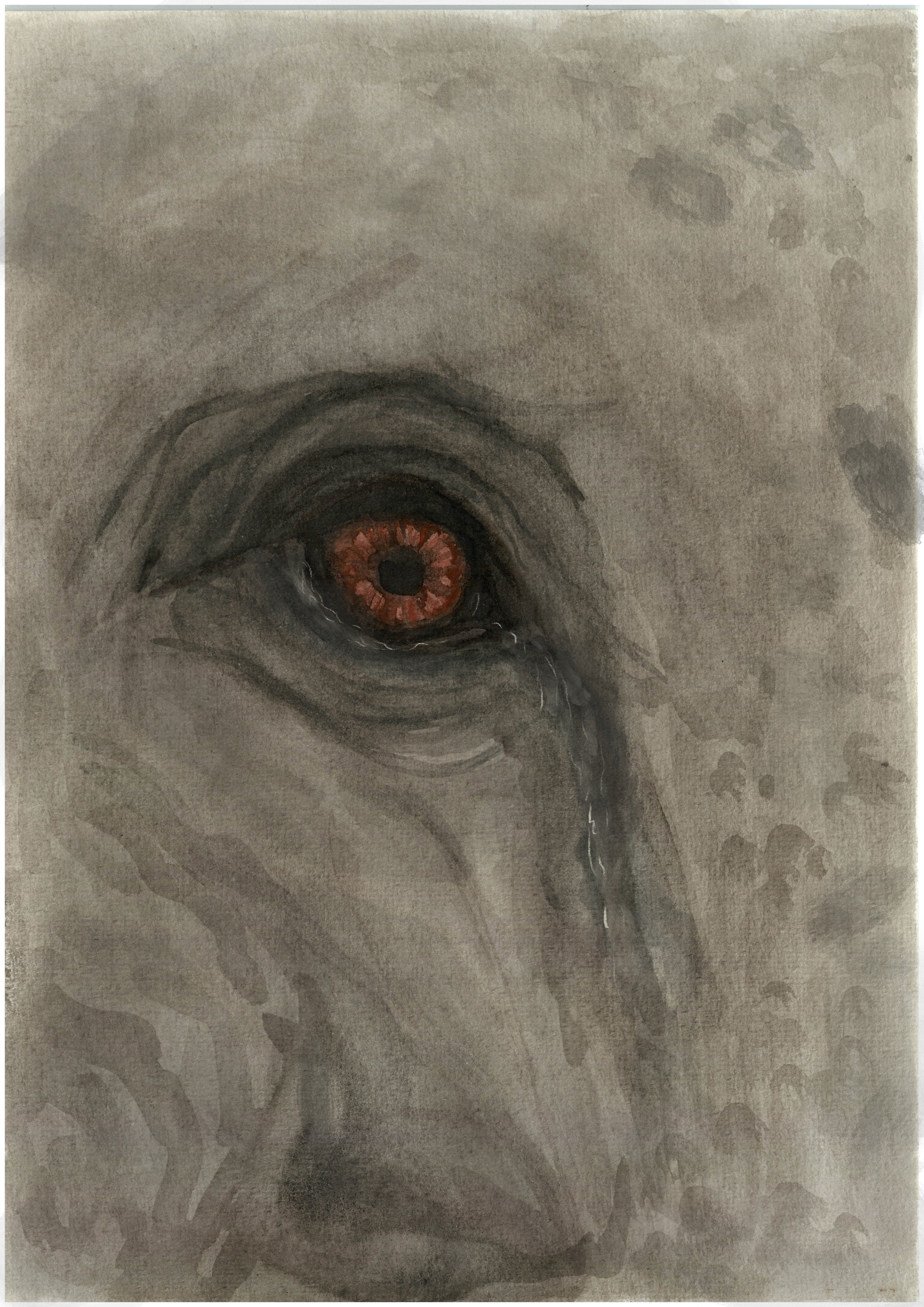
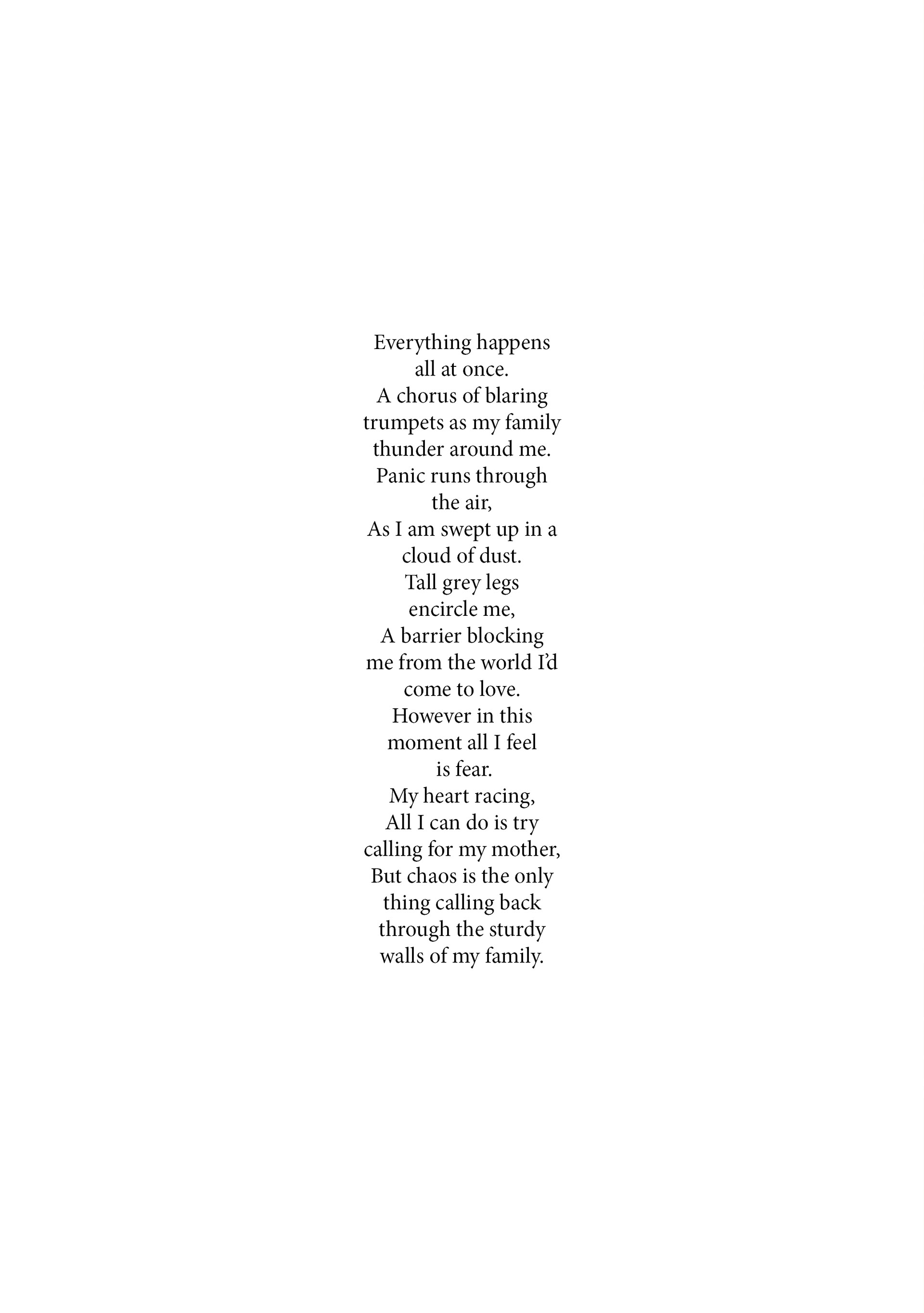
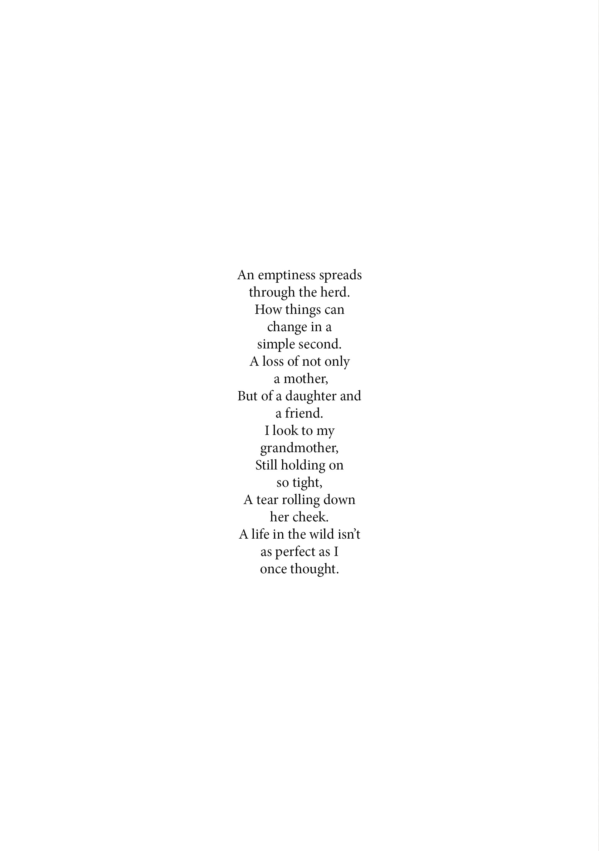
I decided to format the text as a poem because it's easier to read for a child. I thrive when it comes to description based writing and so this was a perfect opportunity to focus on a poem. I knew from the start that I didn't want text included, animals don't talk and so I wanted their voices to be heard in a different way rather than just through a simple conversation. I divided the poem into multiple sections and sat writing this over the course of a week. I wanted the reader to be able to form a connection with Neba and her family at the beginning, learning about how they live and the beauty of their home. But then I wanted this threat to be just as confusing and out of nowhere to them that it is for the elephants. And so I hinted at a threat, educating the reader on the protective circle formation the herd does for the young. This provided me an excuse not to focus on the act of what's happening because Neba herself has been shut away from the chaos. I wanted the reader to be able to share that intense change of emotion in order to understand Neba's panic. The poem hints at a helicopter in the sky (a method poachers use to track and hunt) and then continues to the description of a bullet sound. I tried writing it in the sense that we don't fully know what it is but everything is implied. I chose for the poachers to target Neba's mother to further push that emotion, feeling that deep sense of loss as if it were their own. This was vital in making the connection that a family bond is just as strong for all species and so why should they be treated any different. But then after this emotional scene, I wanted it to become empowering. Showing Neba to be taken in by the herd and follow in her grandmothers footsteps. The final page was meant to be the most powerful, a stand alone line where Neba gets her moment. I am really proud of the poem I have made and feel that it portrays the emotion and hopefully purpose that I intended.
final poem
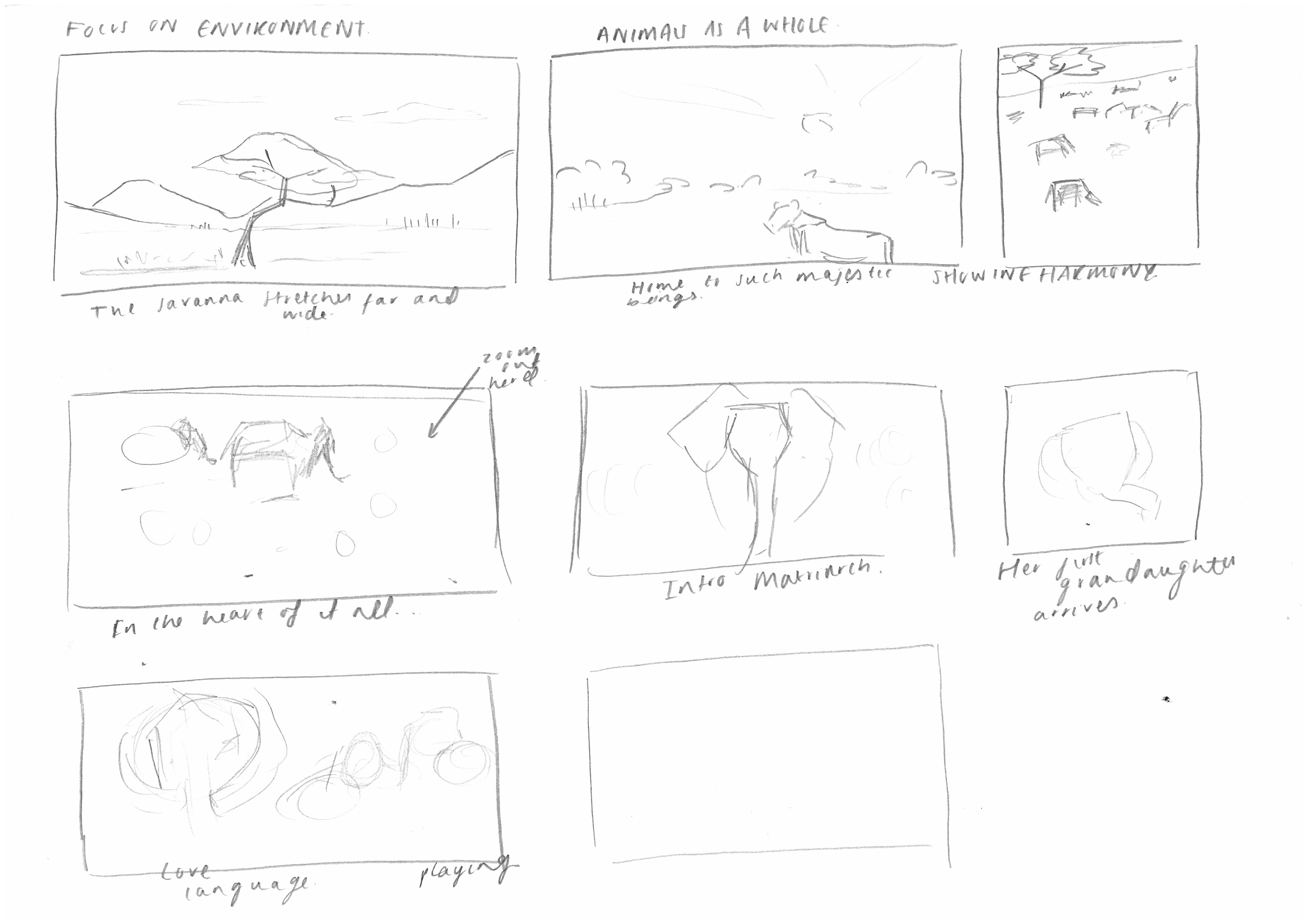
I wrote the whole poem into a word document and went through and roughly sketched out imagery that I envisioned for each part.
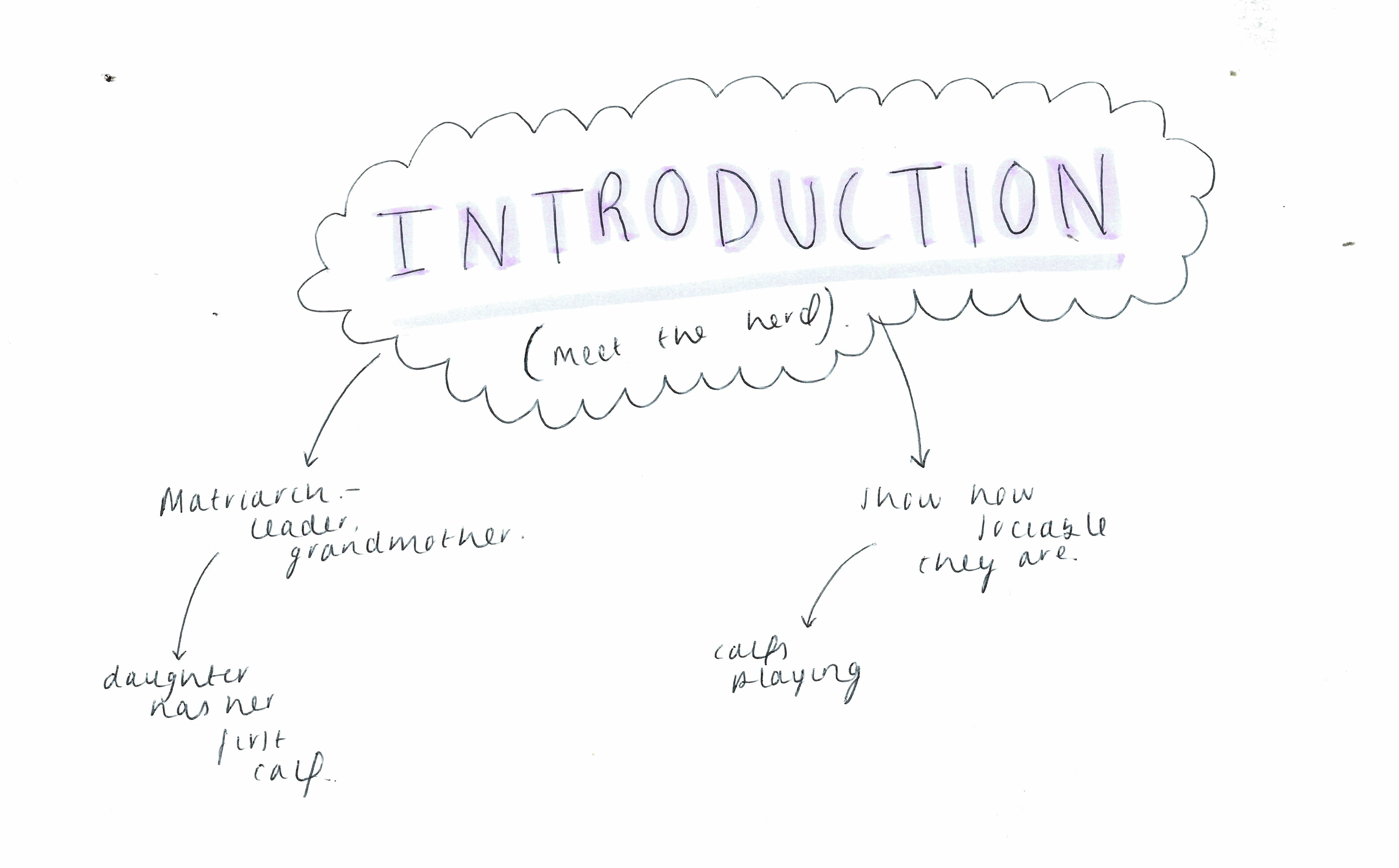
The process begins
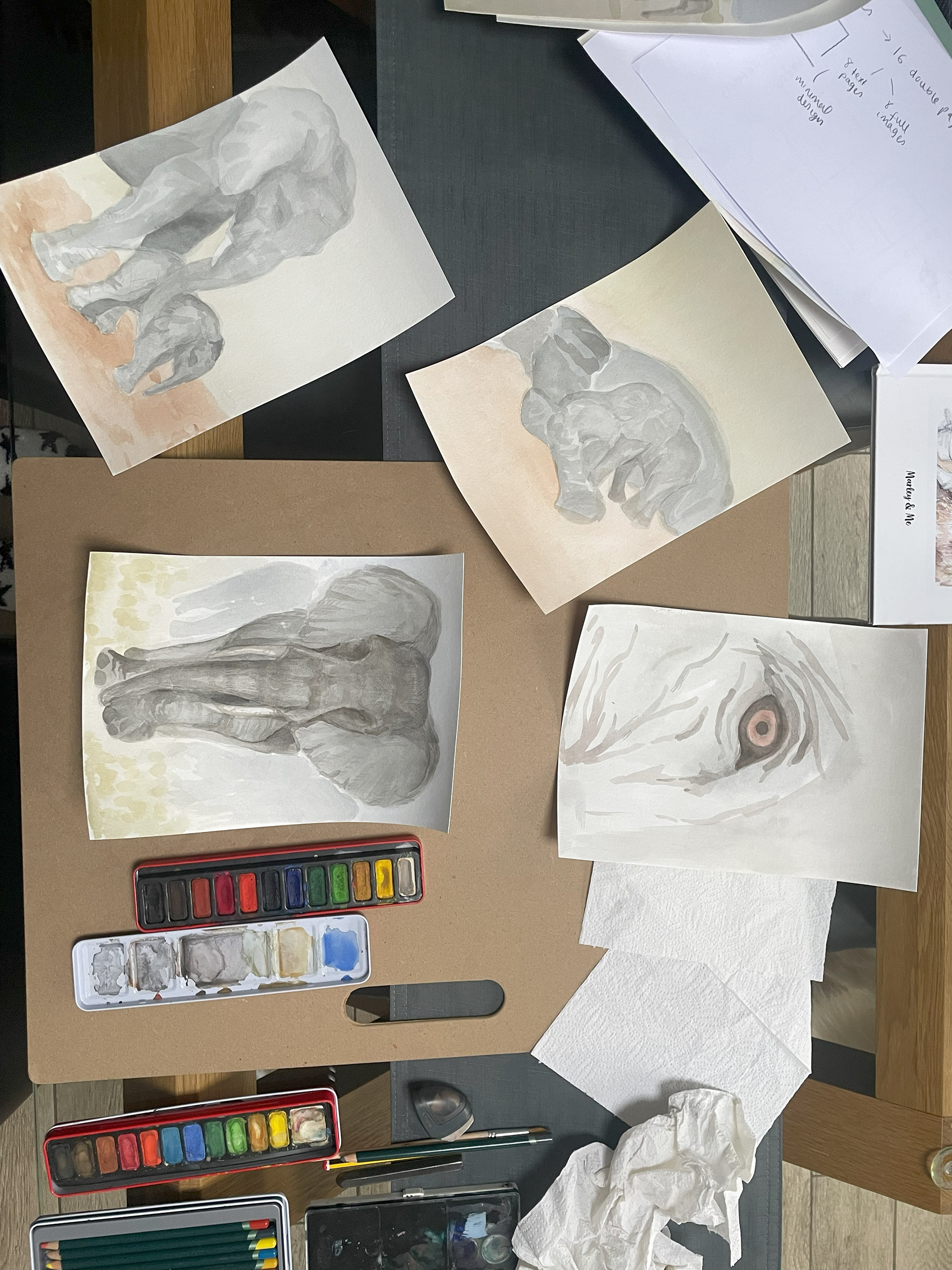
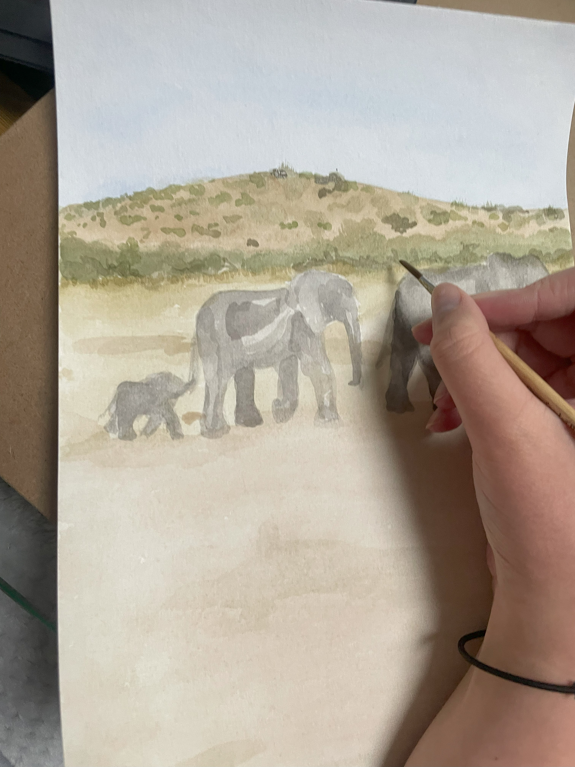
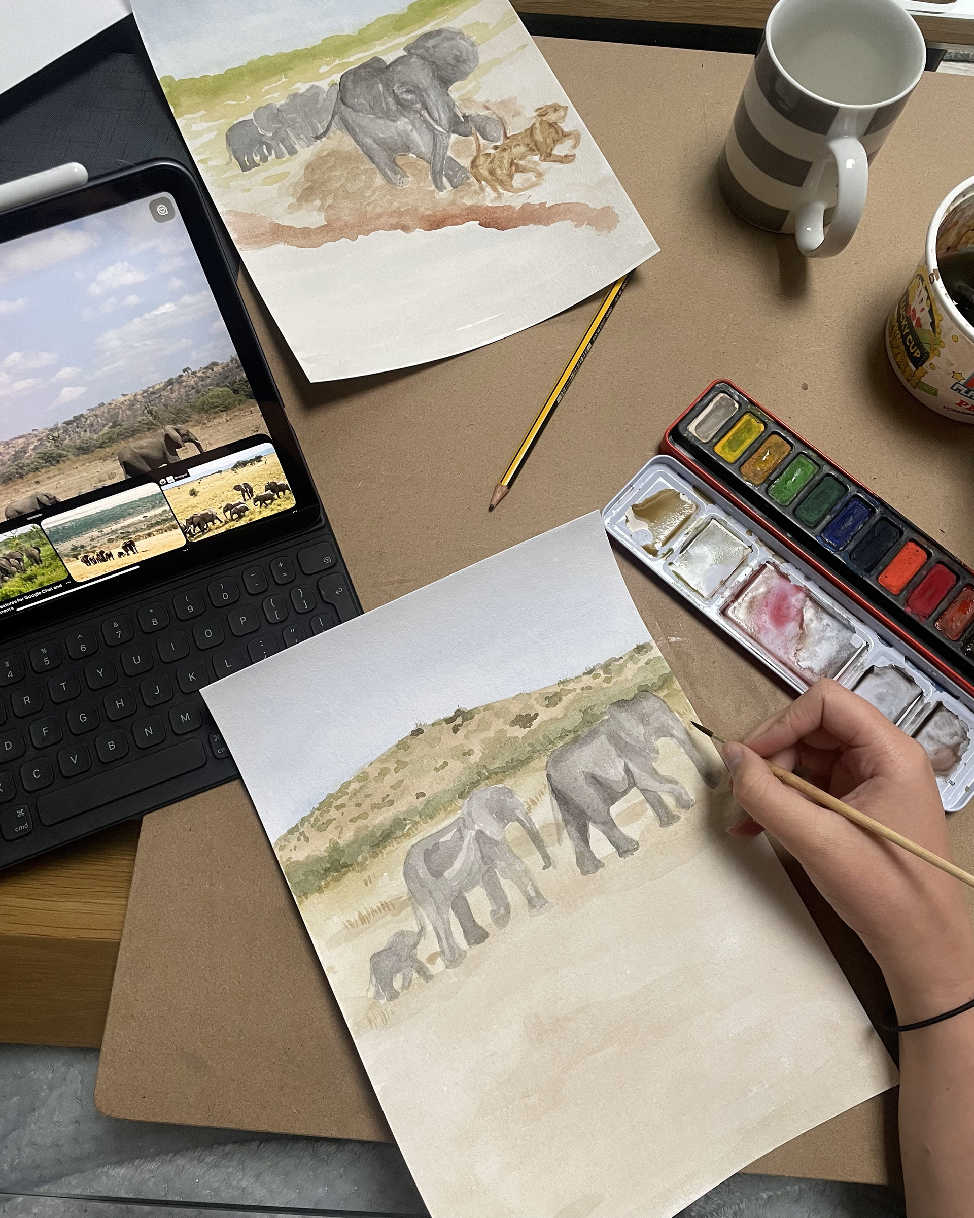
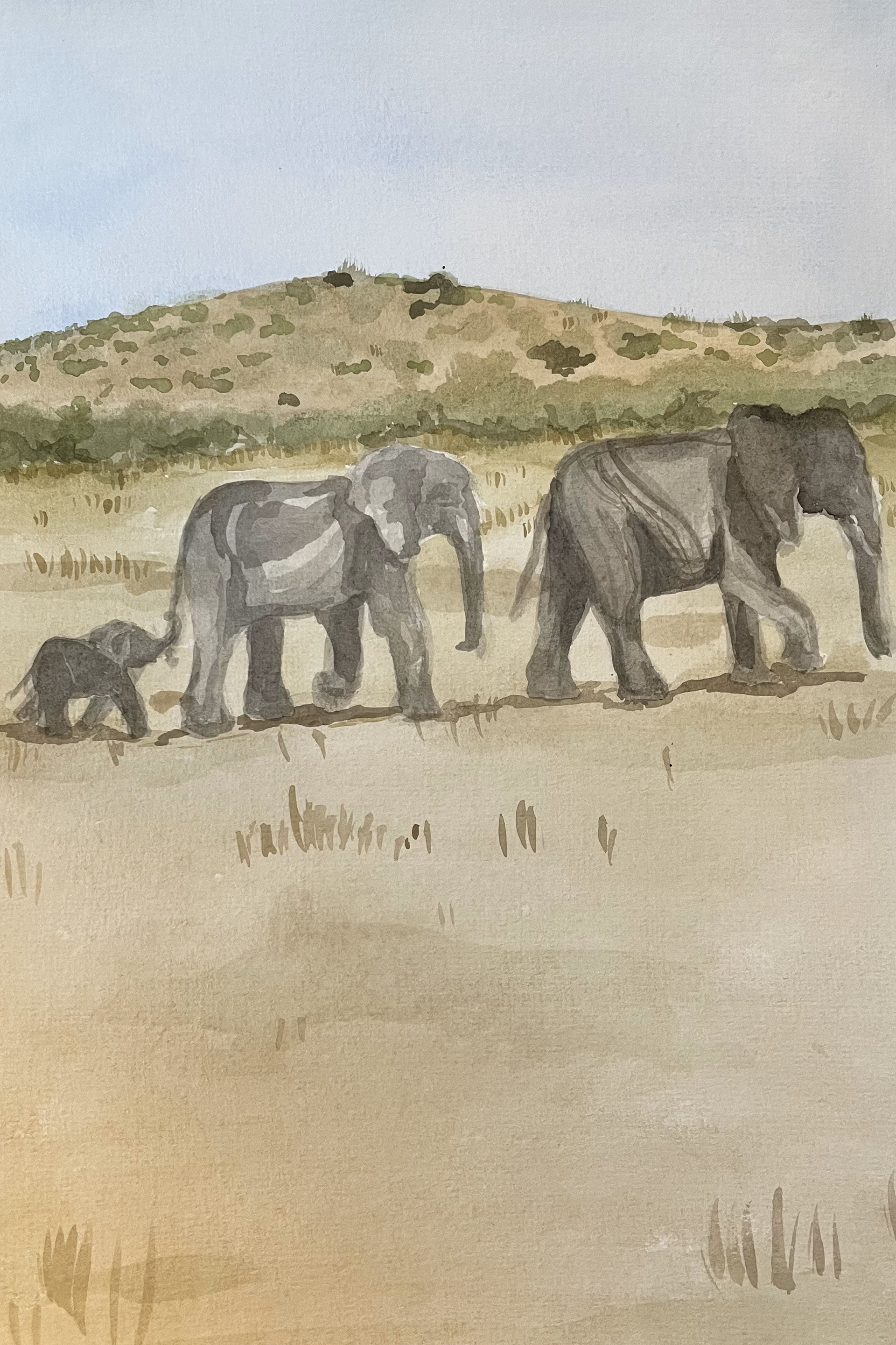
I worked into these with multiple washes of watercolour and pencil, trying to keep that loose outline but then going in to more detail within the piece. I was really enjoying where this was going.

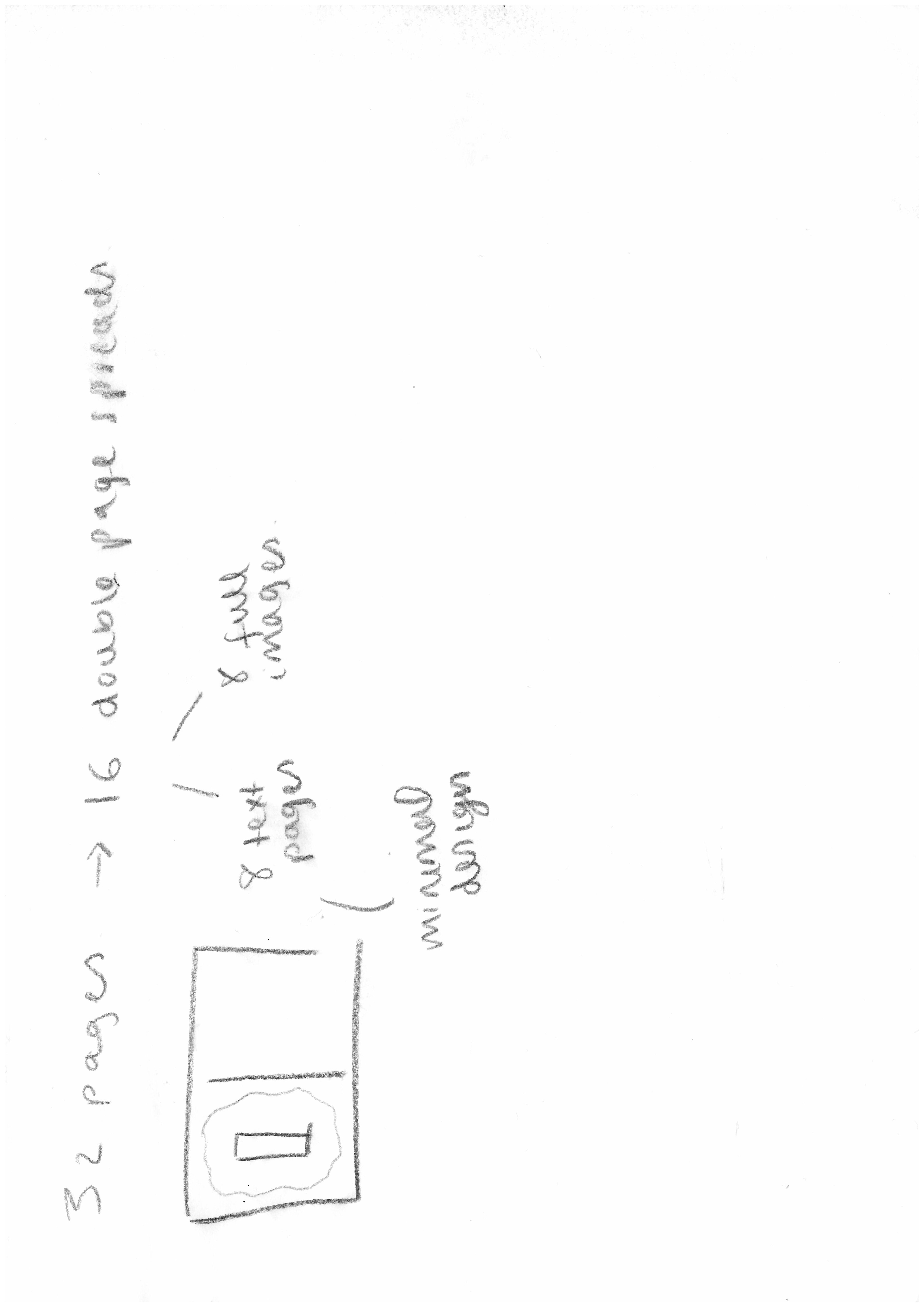
At this point, I was trying to rush through and finish all 14 pages of my book to bind for the submission. However, when I saw my tutors they made me realise that I didn't need to have this done. This project means a lot to me and although I was enjoying where it was going, I had rushed passed the points of trying out thumbnails for each piece. They told me about how no illustrator goes to a publisher with a finished book and so to focus on four high contrast images and see how I could push them.
This was disheartening to know I wasn't going to have a finished book for submission but I have now grown to appreciate and accept that now I can work to make it better.
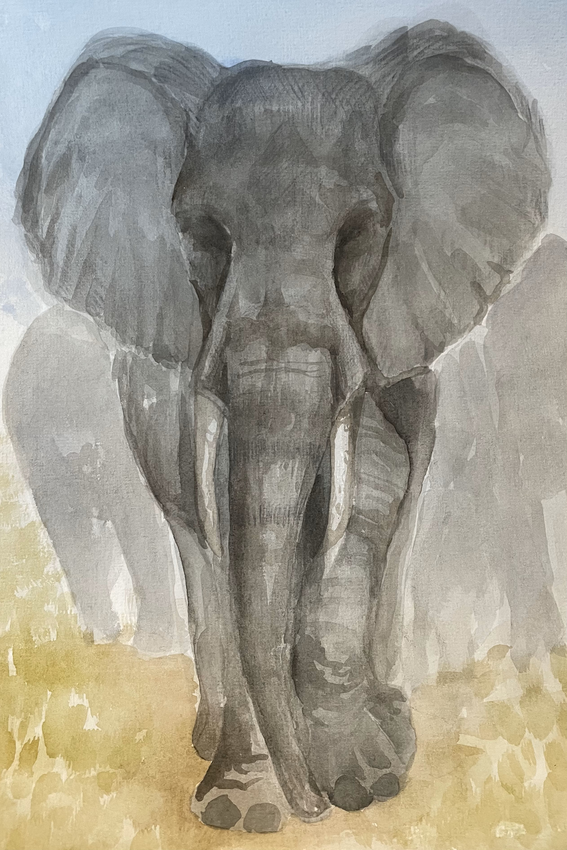
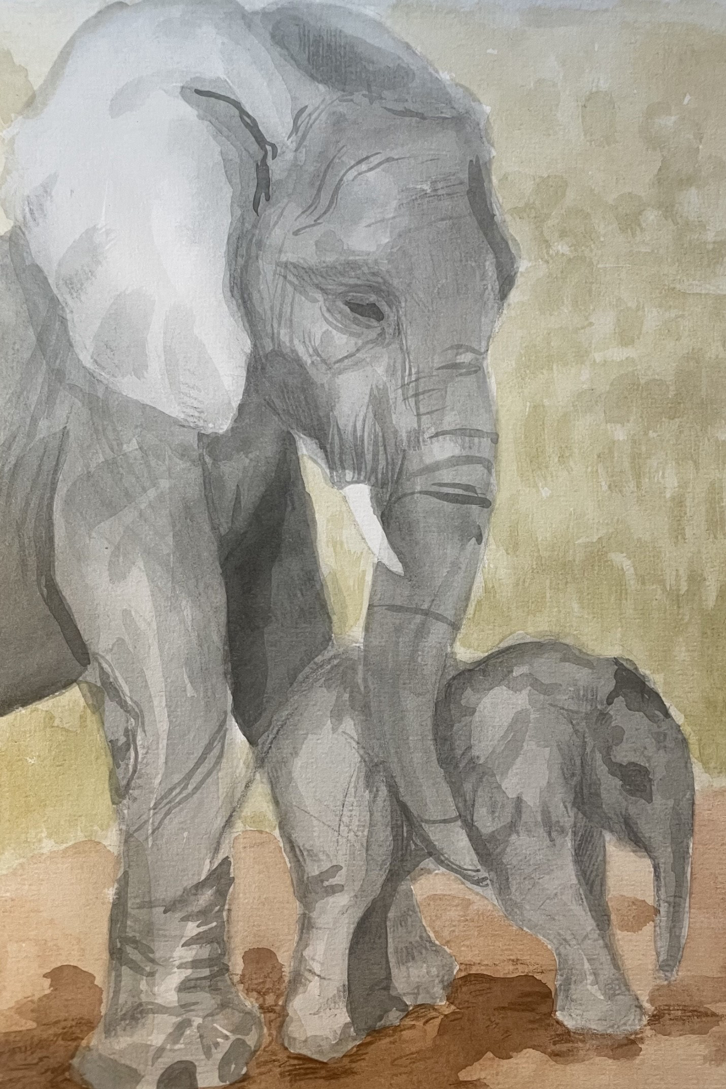
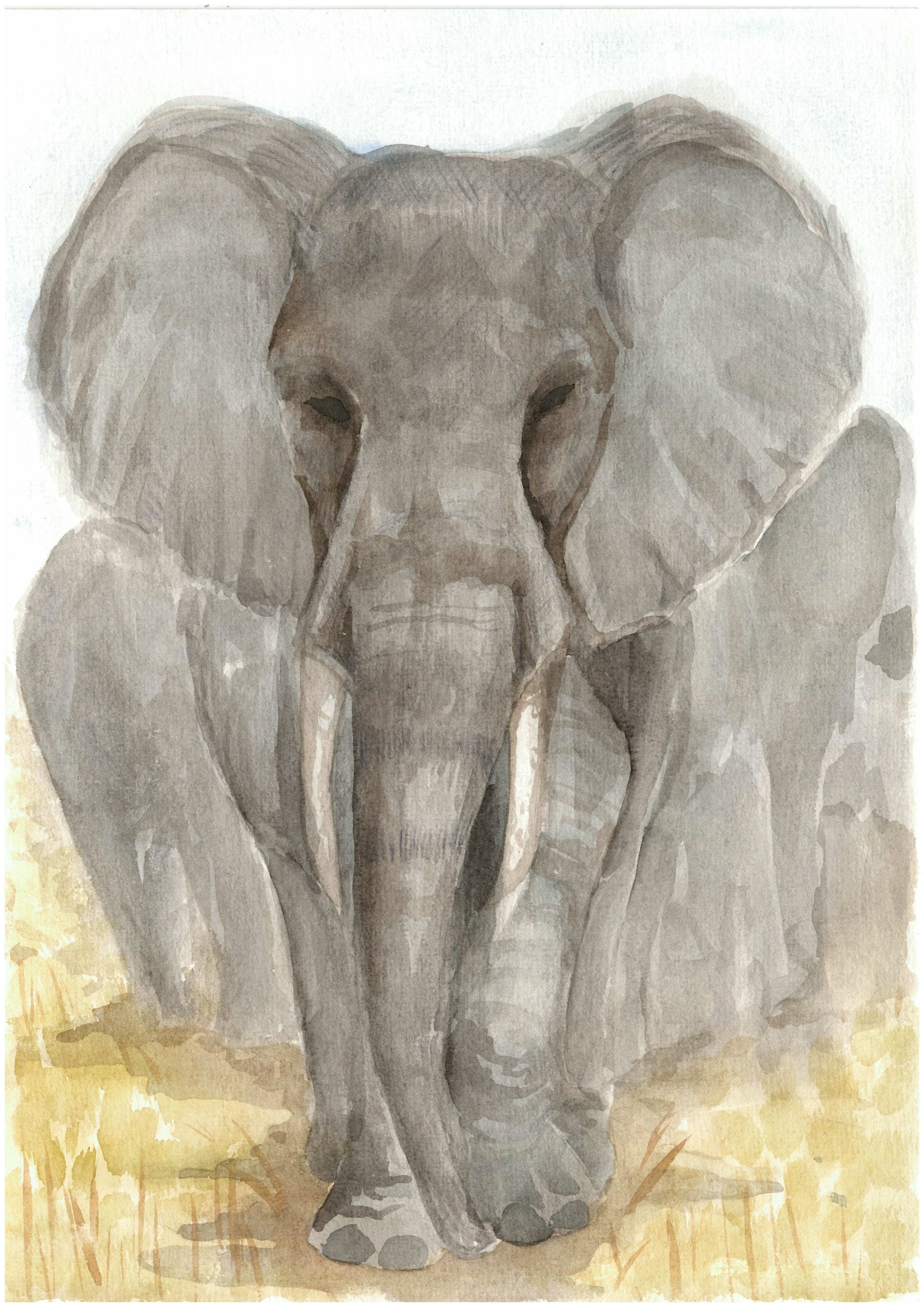
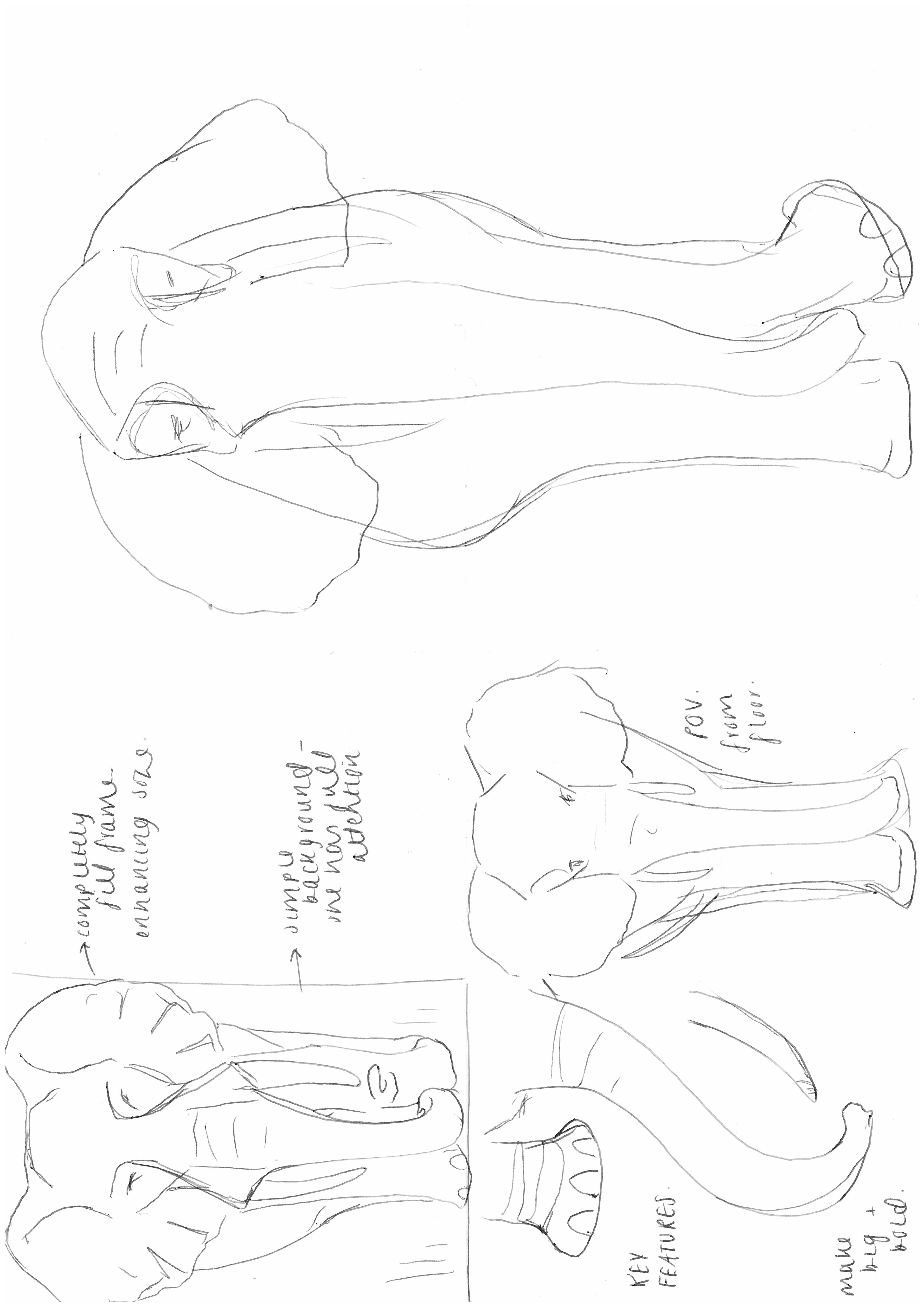
I made changes such as making the matriarch stand alone and completely fill the page, emphasising her height. I also went in and tried lengthening her legs and the grass in front of her to try and change the point of view to a more floor level perspective so you're looking up at her. Adding the text, I chose a font which was more known for a poem book, and went in and changed the formation if there were any orphan words.
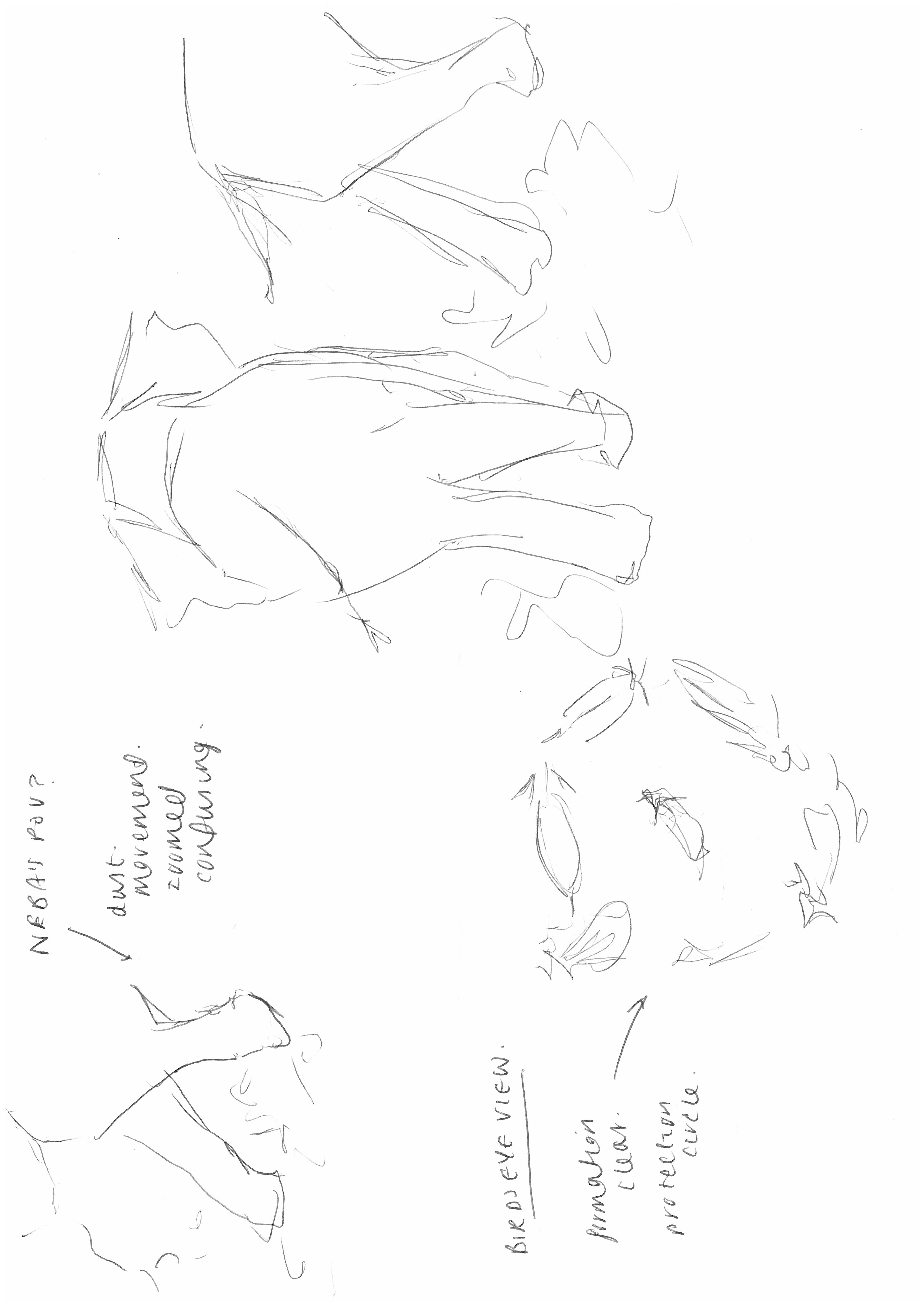
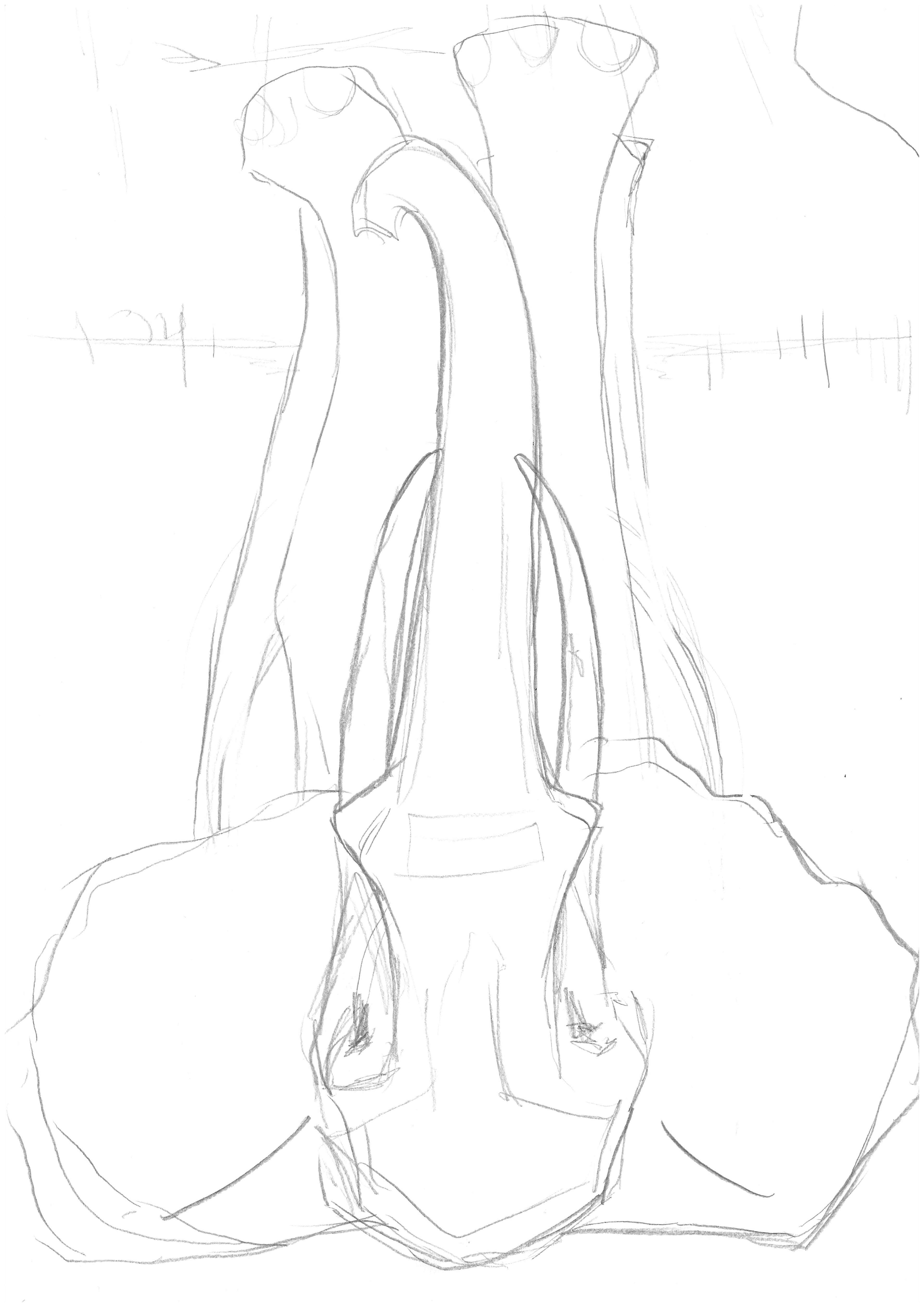

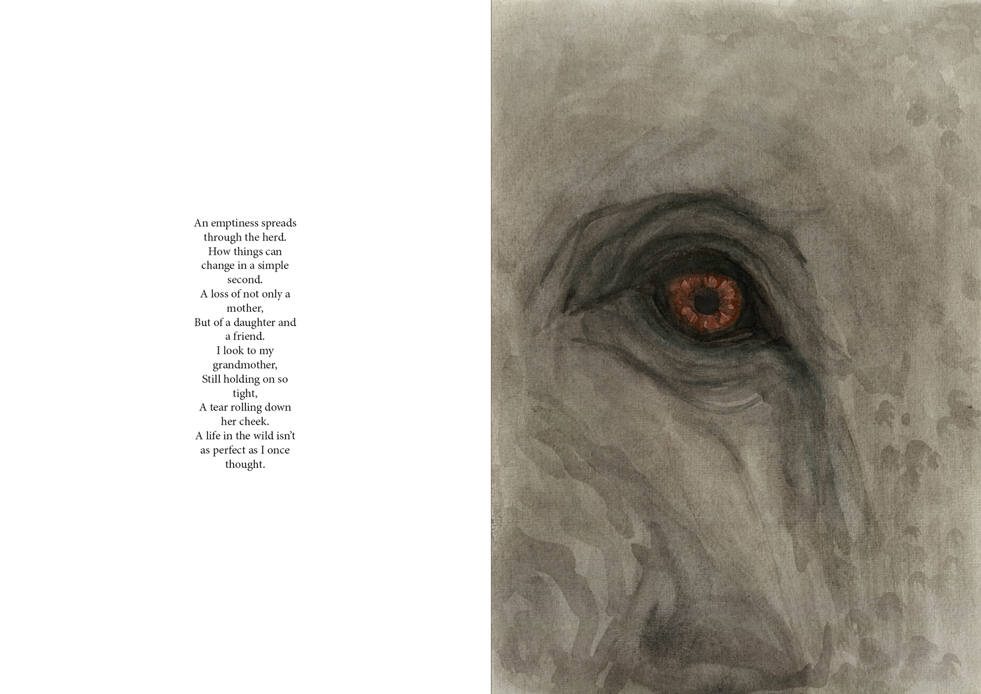
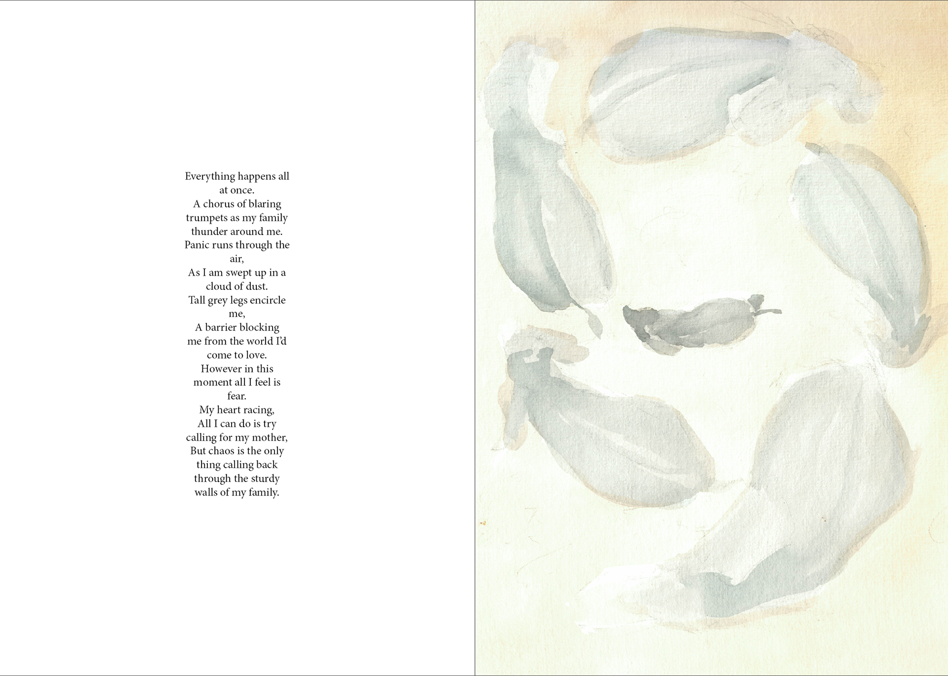
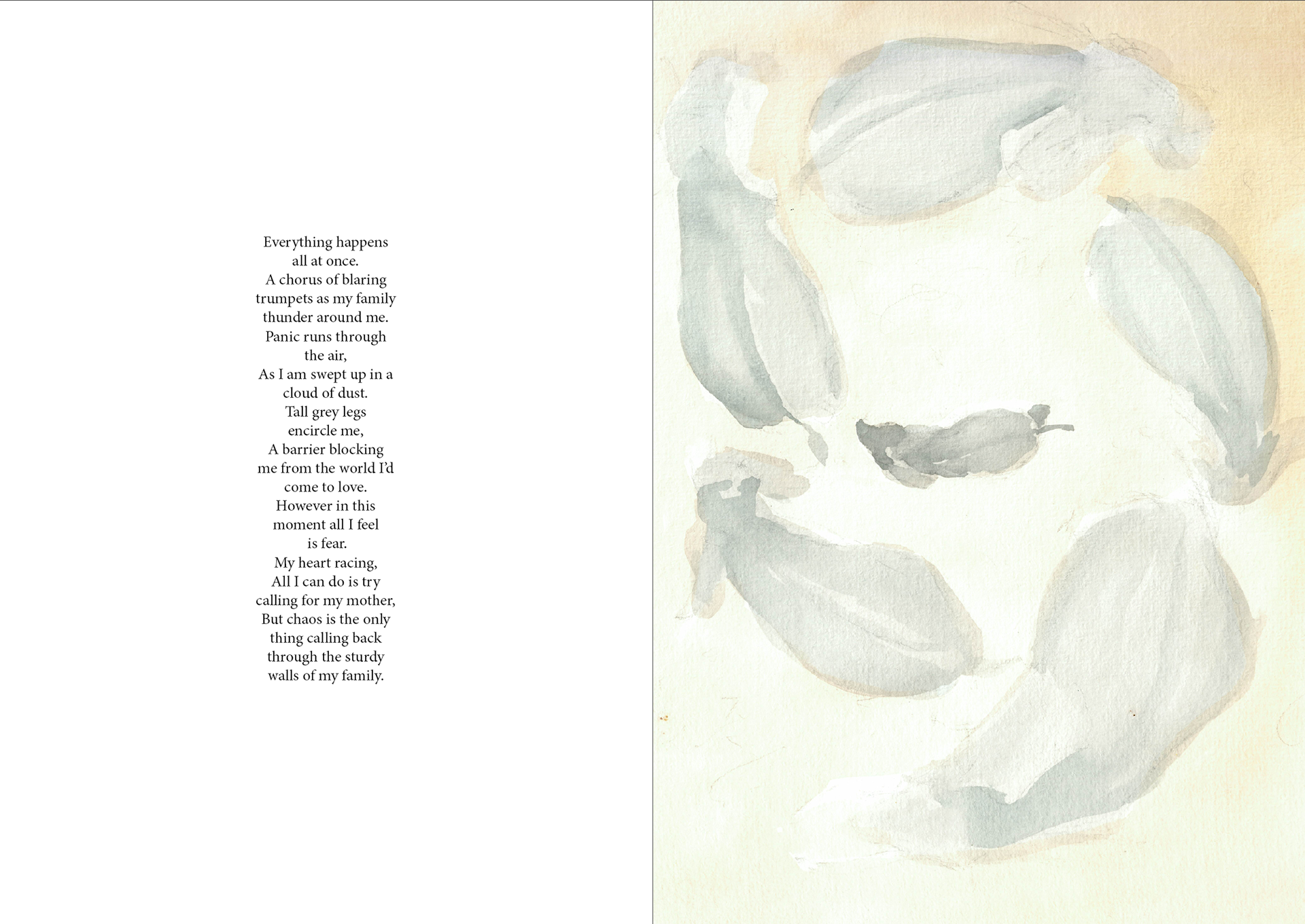
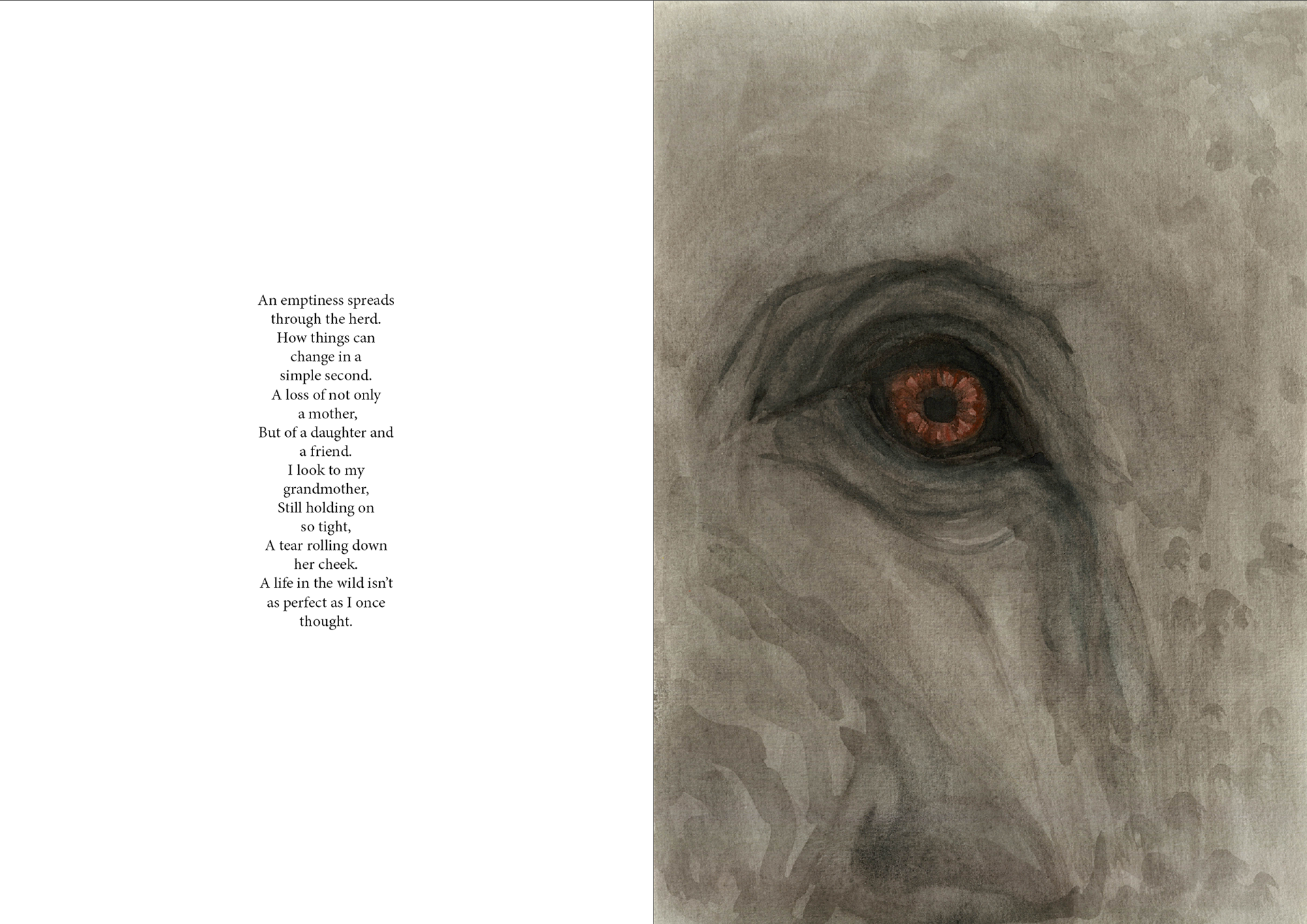
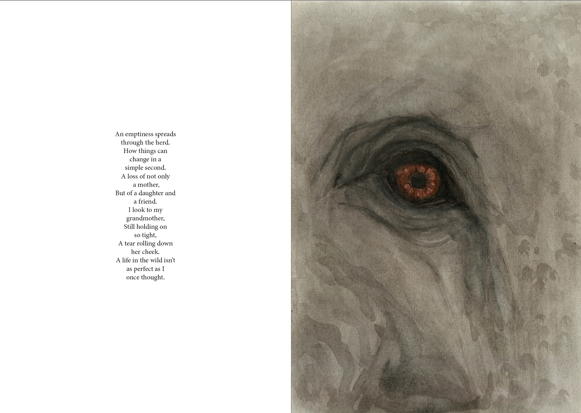
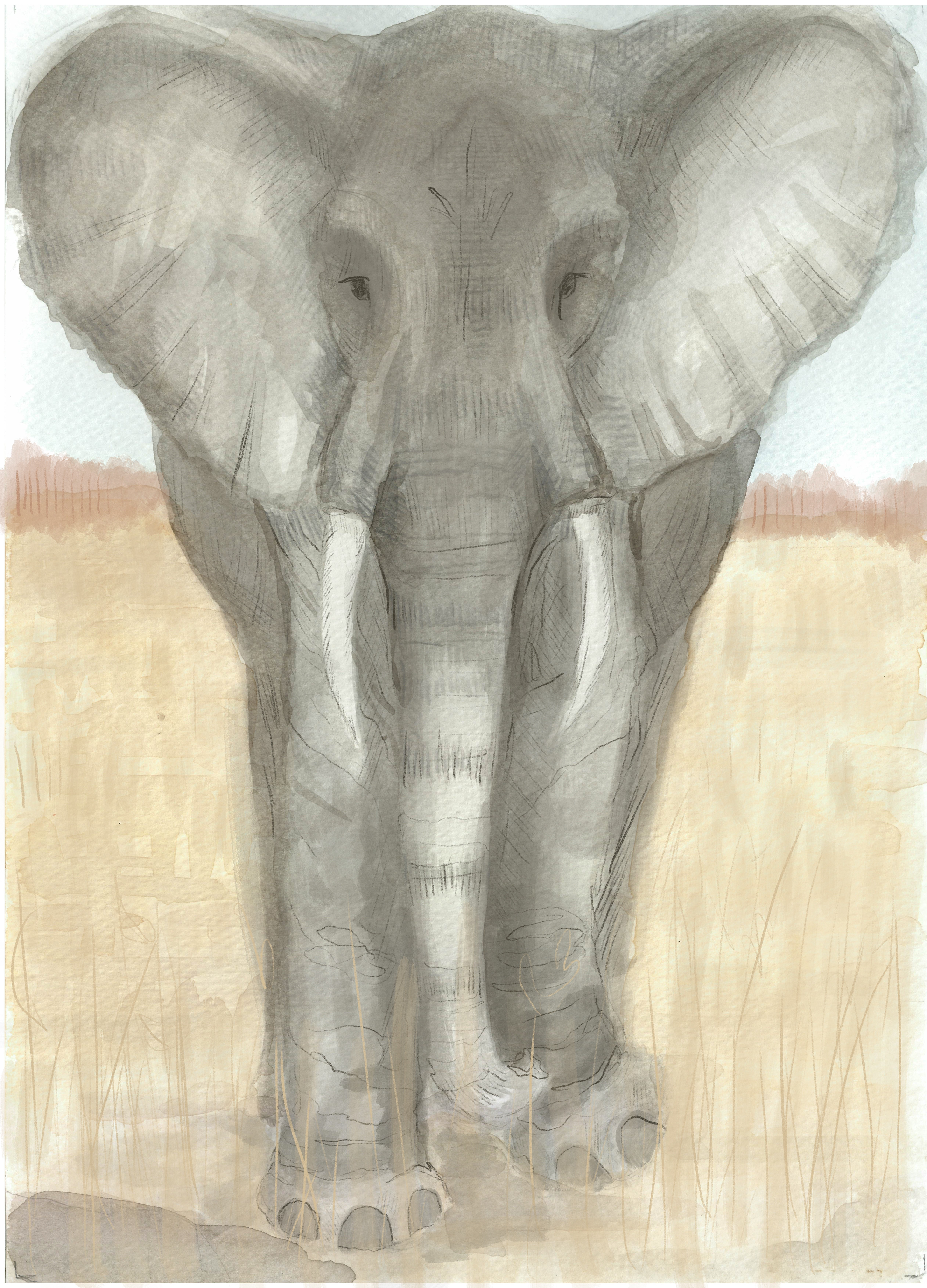
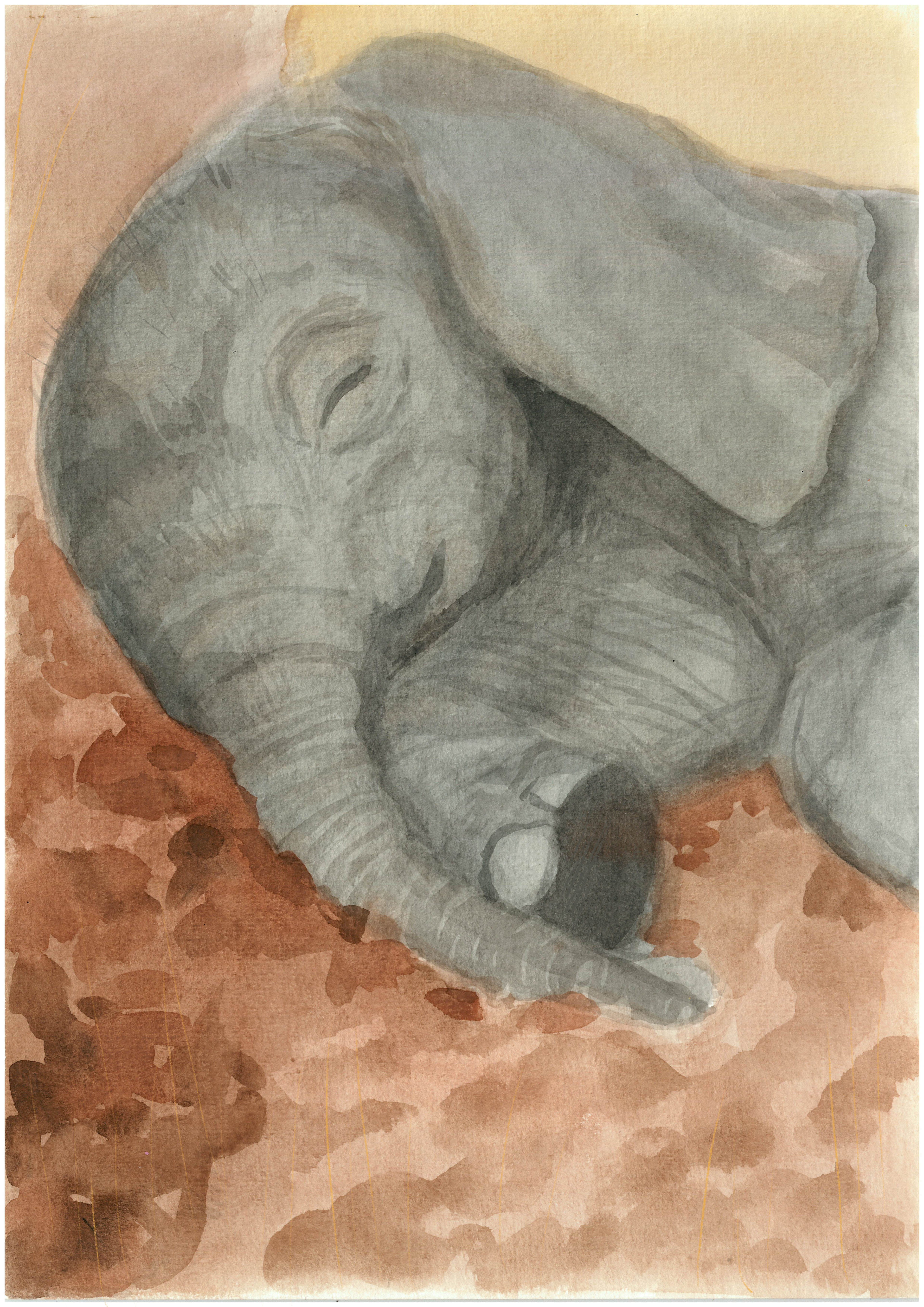
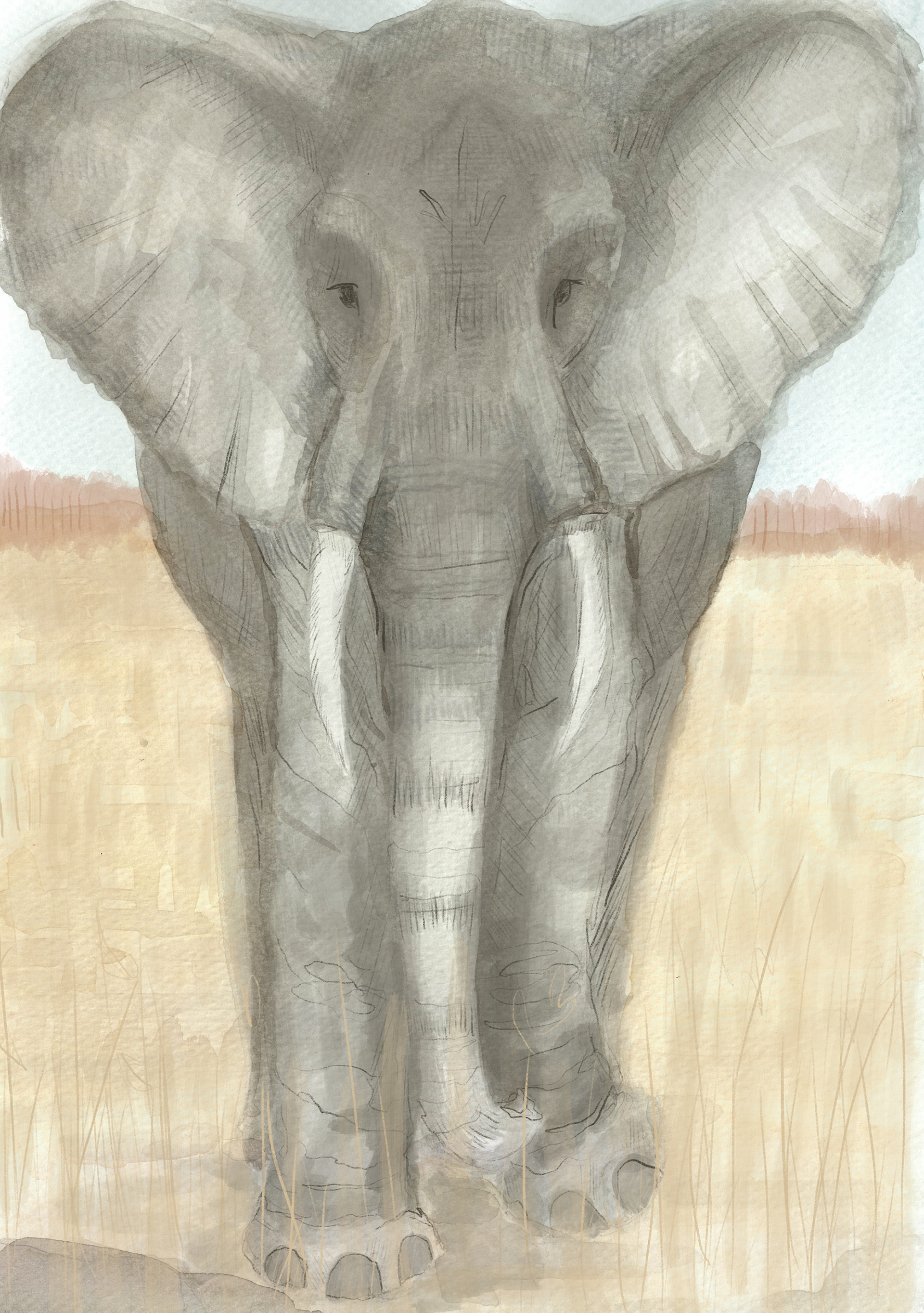
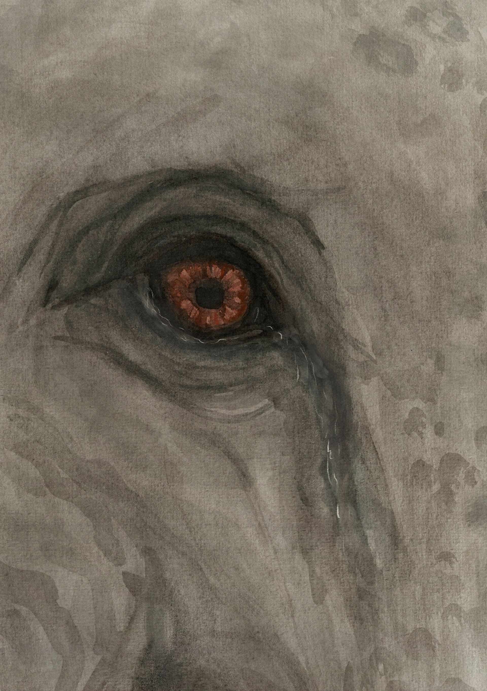
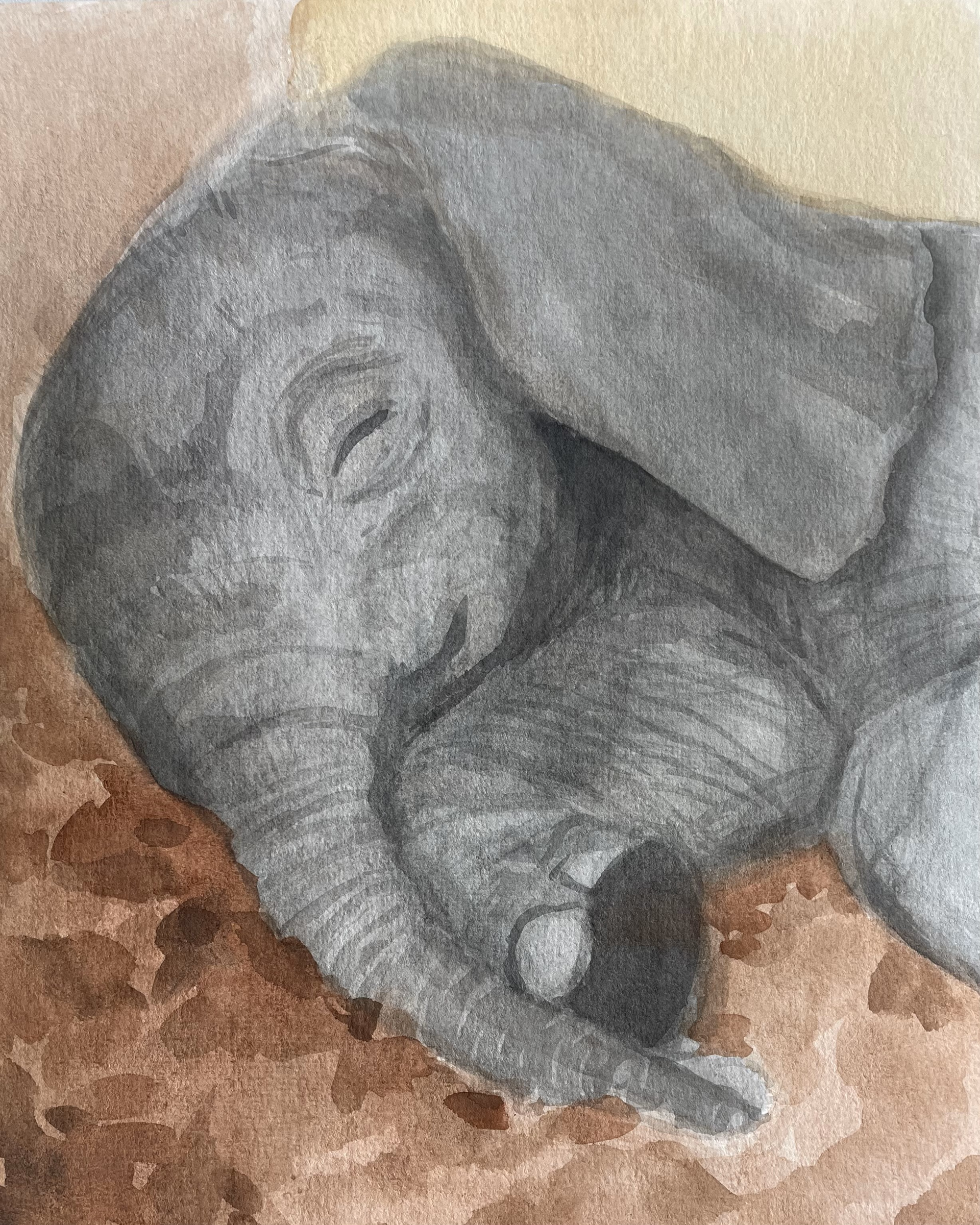
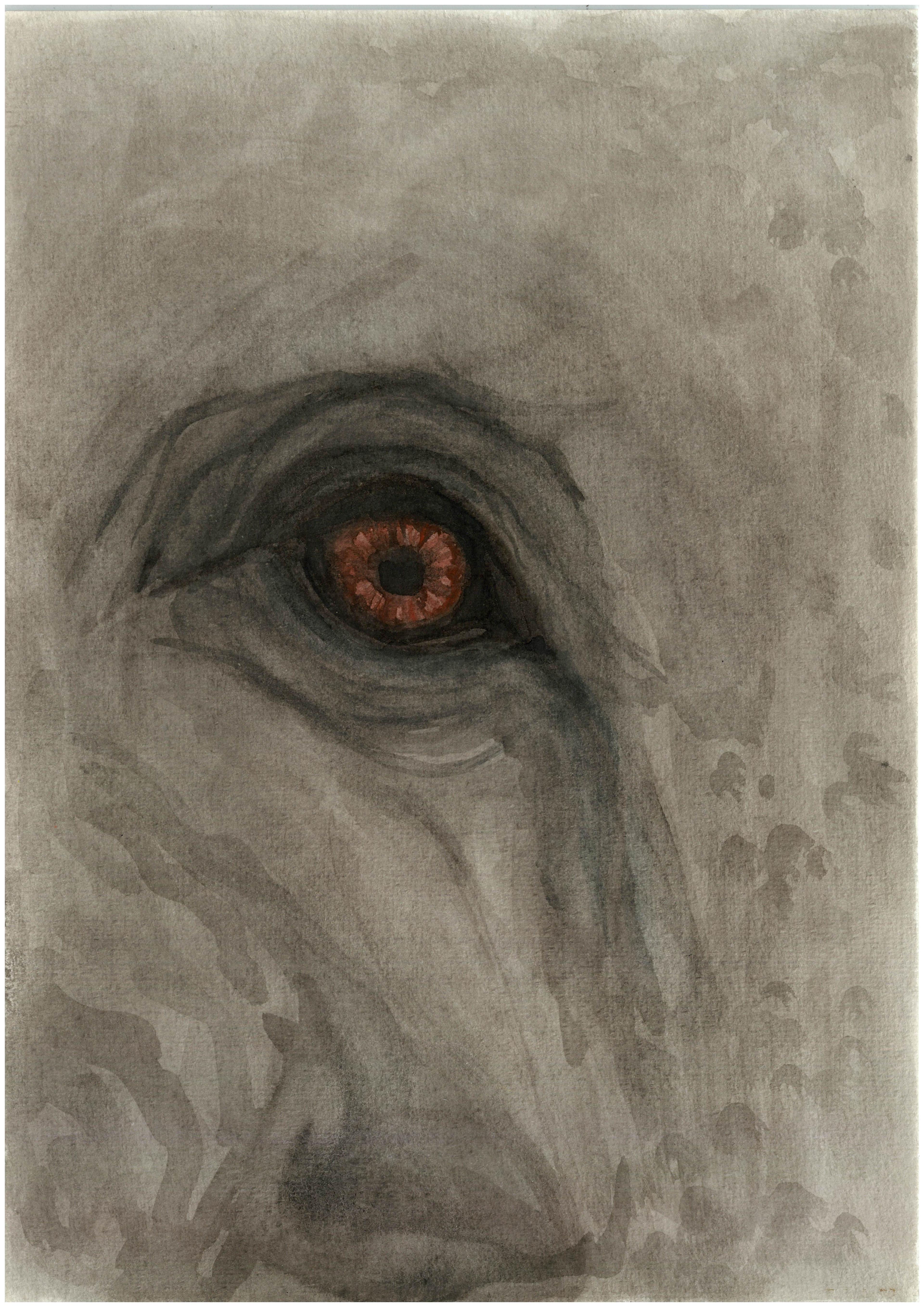
Seeing these images in this layout, looking really professional, made me feel really proud. The first and last, displayed just above, I am extremely impressed with. I feel that they sum up the words perfectly and I am so happy with the level of detail they possess. I think if I was being really picky, I may go back in and add a little more texture. The other 2 pieces, I can appreciate them but I feel I can further develop them to be more successful. With the protective circle I need to go into photoshop and try layering it in order to keep more of that contrast, but unfortunately I ran out of time.
It's upsetting I didn't get chance to finish this for the deadline but I am so excited to continue working into this for myself and see where it goes. I have now learnt never to jump straight into a design, although they came out successful, there can always be little ways to make it that much better.
reflection of project
This project has taken many turns, some drastic and others very minor. Initially it was all about where I felt I most belonged- with my family. I enjoyed being able to include them, even if it was for a little while. I don't regret where my project started as it allowed me to realise not only how much family means to me, but how much I value it in my work. Moving on I was able to focus back into my passion of animals, educating myself on their behaviour and how they interact in their packs.
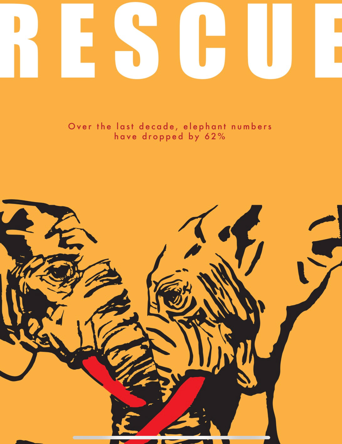
Watching how much they depend on their families just as much as we do was incredible to see, and I instantly knew I wanted to evidence that. My focal point dramatically changed and it was back in the zone of raising empathy for animals through expressing the similarities in our family dynamics. I wanted to show people how similar we actually are in hopes of a better understanding and so a better treatment. Raising awareness and empathy for animals has always been a frequently seen thing in my work and so it was no surprise when I started going towards a more defensive approach. When I had selected elephants as my topic, I knew that I wanted to make it more of an activist approach to raise awareness about the problems they face because of humans. I wanted to do this by making the viewer become attached to the animals, watching how strong their bond is and how much they depend on each other. Having them attached would create more of an emotional reaction when the problem becomes apparent.
I fell in love with this project and it became really close to my heart. Creating Neba and her story meant a lot to me. I took weeks planning and writing out the poem, building the perfect foundations. And I cannot wait for the day I get to make it into a book. I am a little disheartened that I didn't get the chance to finish the illustrations, but am thankful for the journey in took me on. It's clear to me now that the subject I want to focus on after uni is all about raising awareness and empathy for animals. As well as this, the importance of not pressuring yourself to get a whole book done by a certain date. My tutors helped me see that no illustrator ever brings a final book to a publisher, just a select few finals and a bunch of mock-ups. This project really has been a learning curve for me, and I have established my passion.
I went down so many different paths in this project that when I finally fell in love with an idea, I didn't have enough time to execute it. I really hope to continue this project after submission and get a book finished and bound by the time I leave Nottingham.