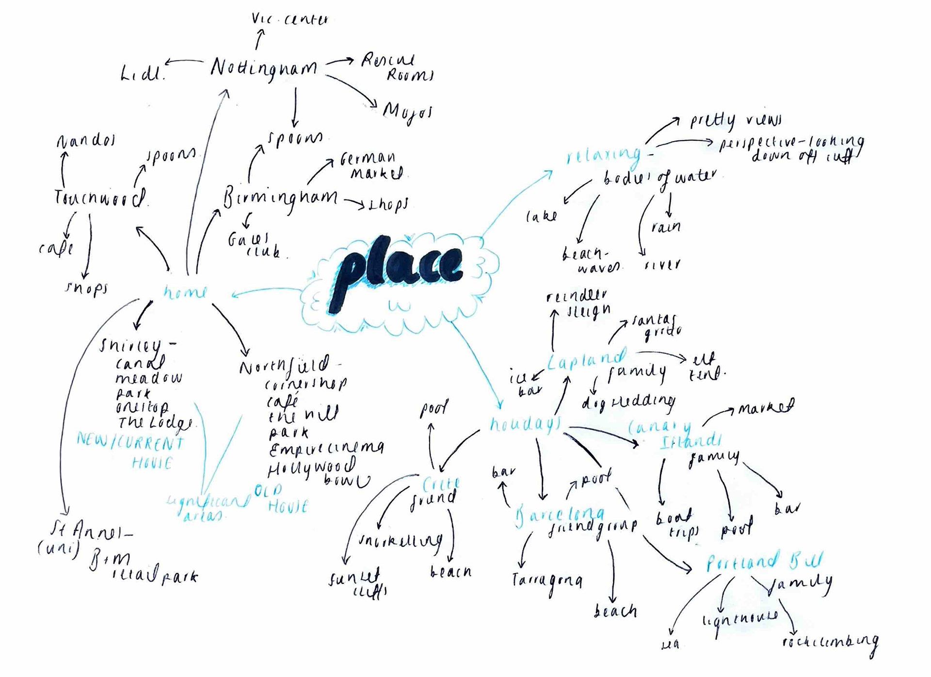
I started this project by thinking about the literal places of importance in my life. From this I drew off areas in particular that I associated with them allowing me to conclude what my favourite places tend to have in common. A lot of my fondest memories are by the sea, the place I feel my calmest self, and for as long as I can remember I've felt a pull towards it. Wondering whether to focus my project around a holiday destination in particular or to keep it more vague is one of my current challenges.
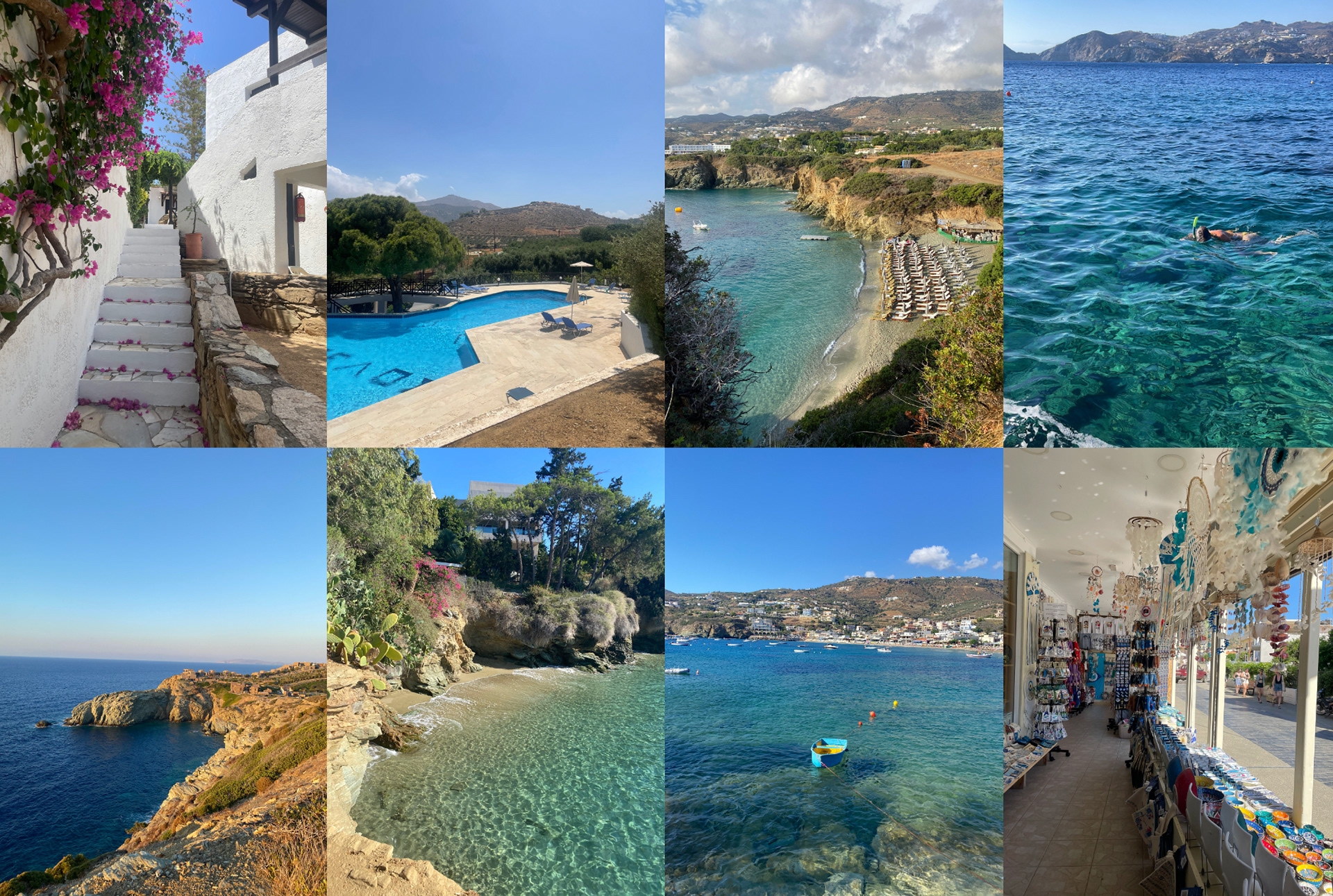
The place that currently sticks out the most to me is Crete. I travelled there June 2024 with one of my best friends and it was the trip that significantly changed me. This was the first year I had gone away without the support and guidance of my family so it was a real chance to test my independence. It was so incredibly rewarding, using each day to our fullest to explore such breath-taking views and places and unlocking a new found passion for all things travel. The world suddenly felt so much bigger and the need to see it grew with it.
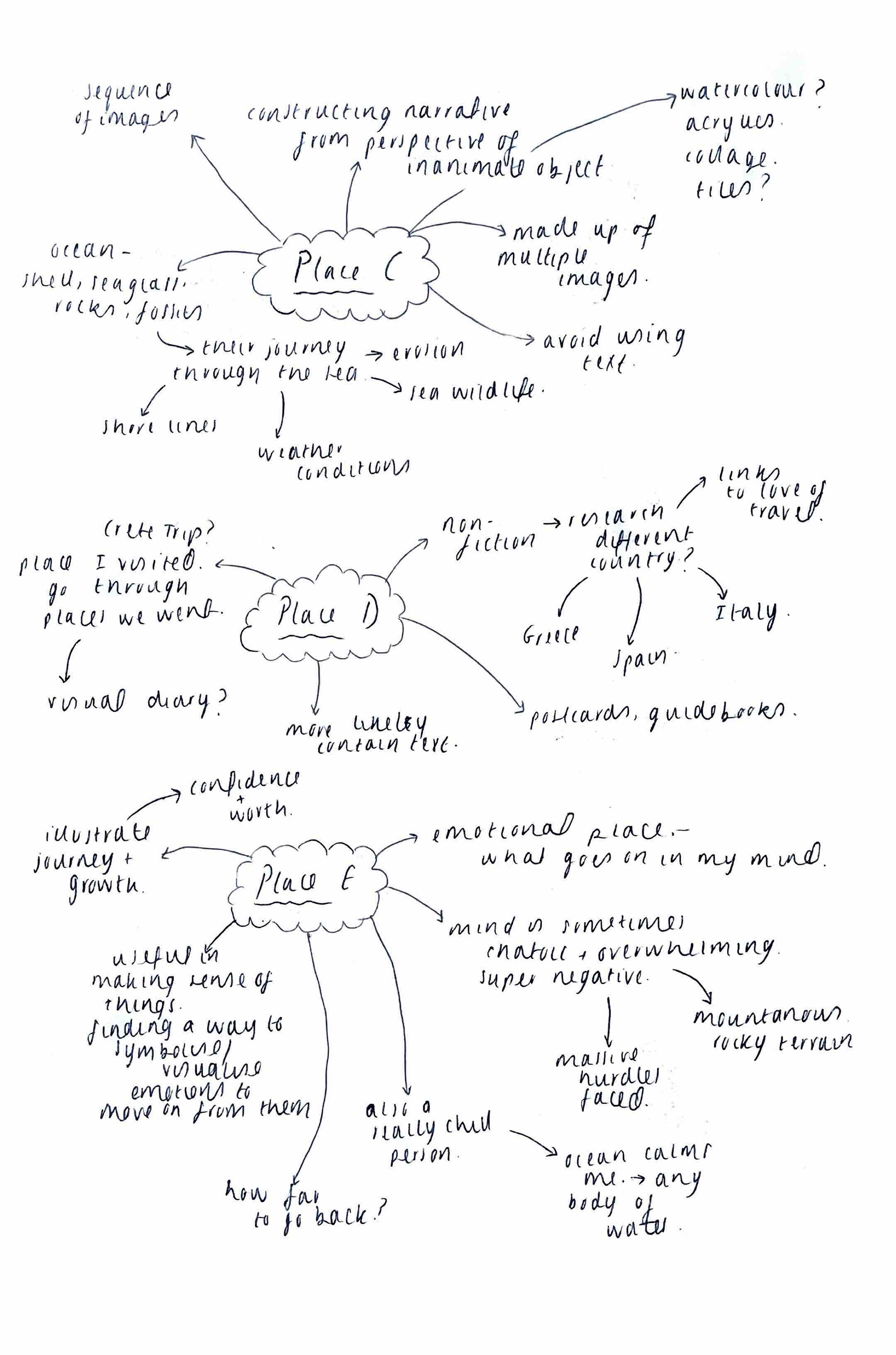
Looking at the briefs, I managed to narrow it down to three that I may be interested in. I will stay mindful of these moving forward and make a final link further into my project according to what direction my work goes.
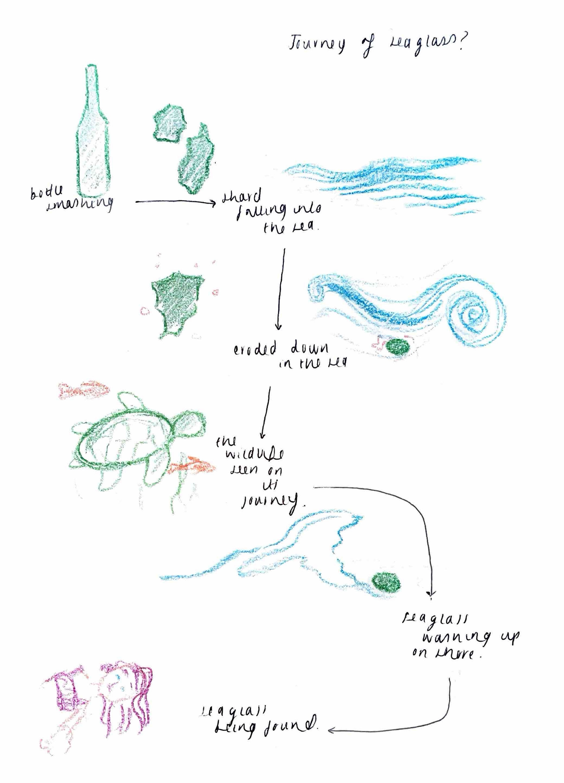
Due to an obsession with collecting sea glass while in Crete, I thought looking into the journey of this material would be really effective for brief C. Creating a storyline from a piece of glass' POV up until the point it was found by someone would allow me to capture both sea life and that from the shore. Part of me was thinking about creating some kind of book but the other wanted to be more experimental. The idea of illustrating onto more exciting materials in different methods was then spoken about. This included both painting and engraving.
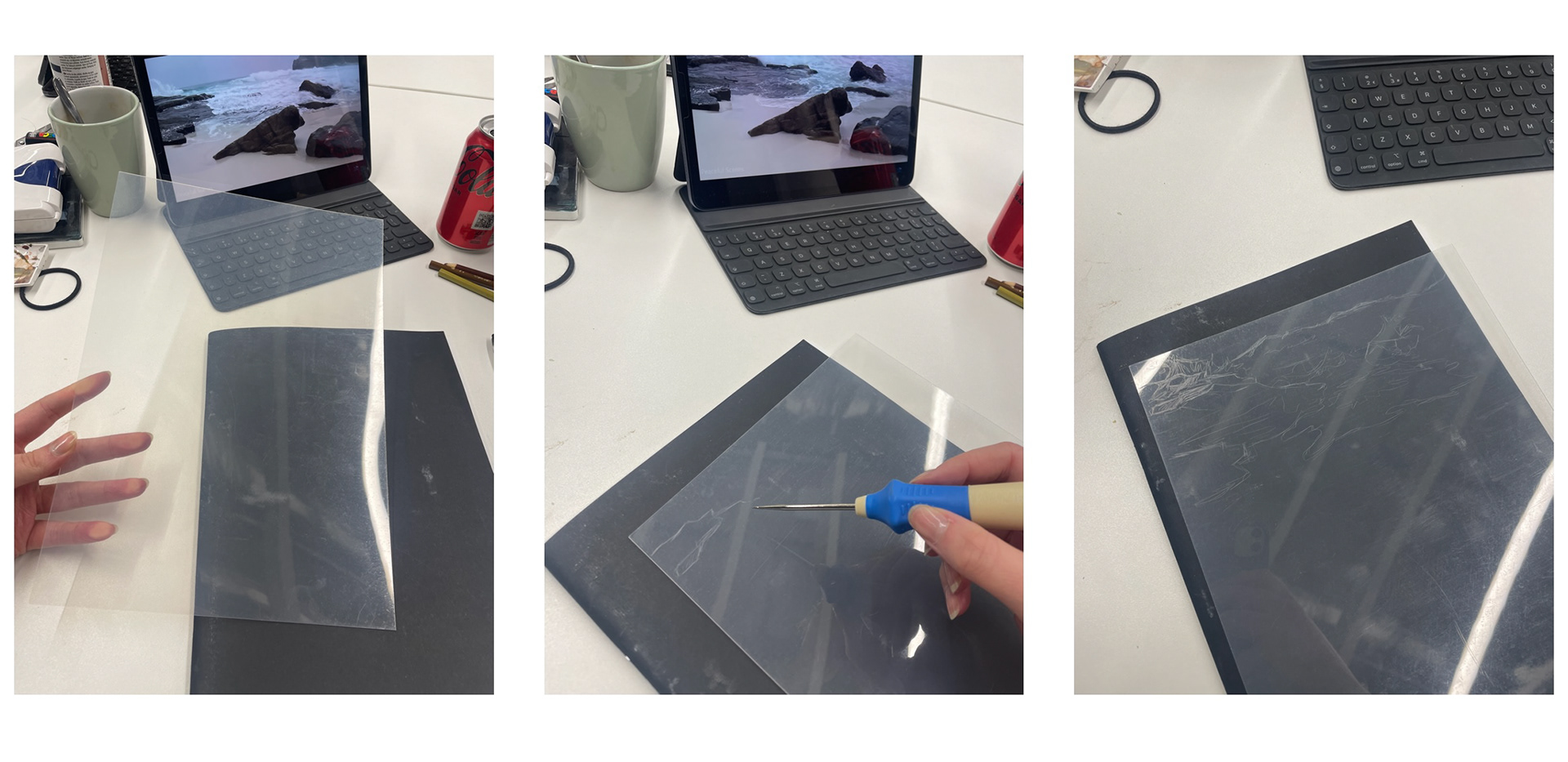
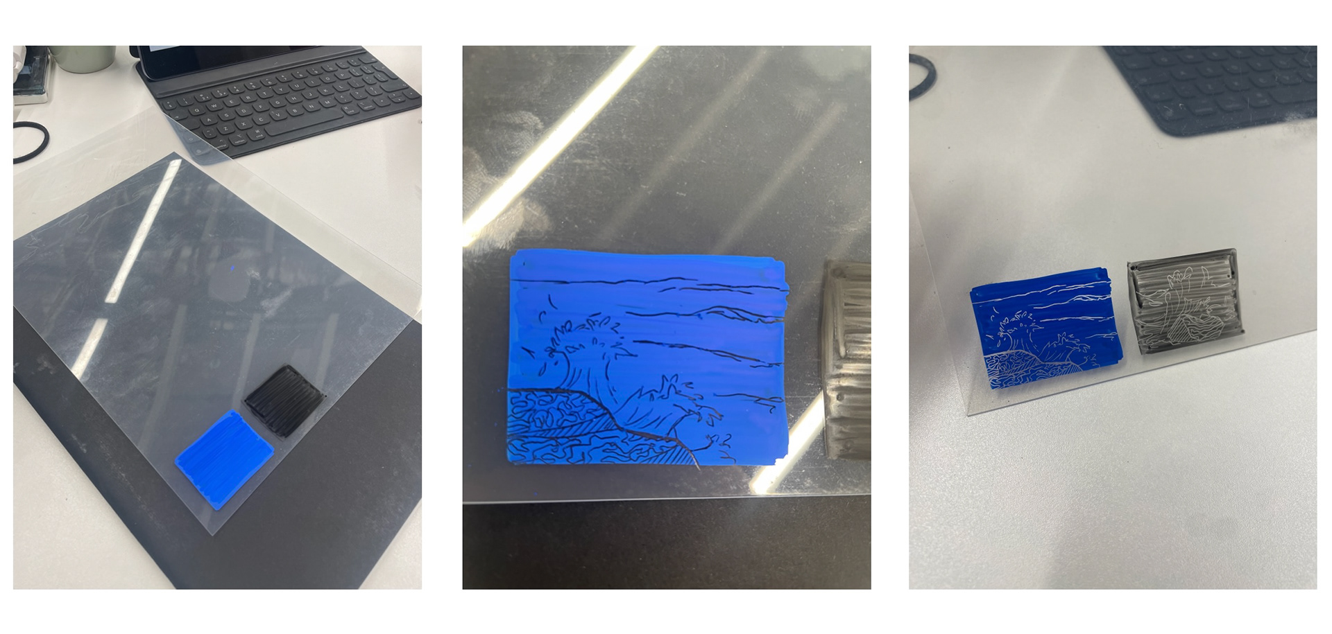
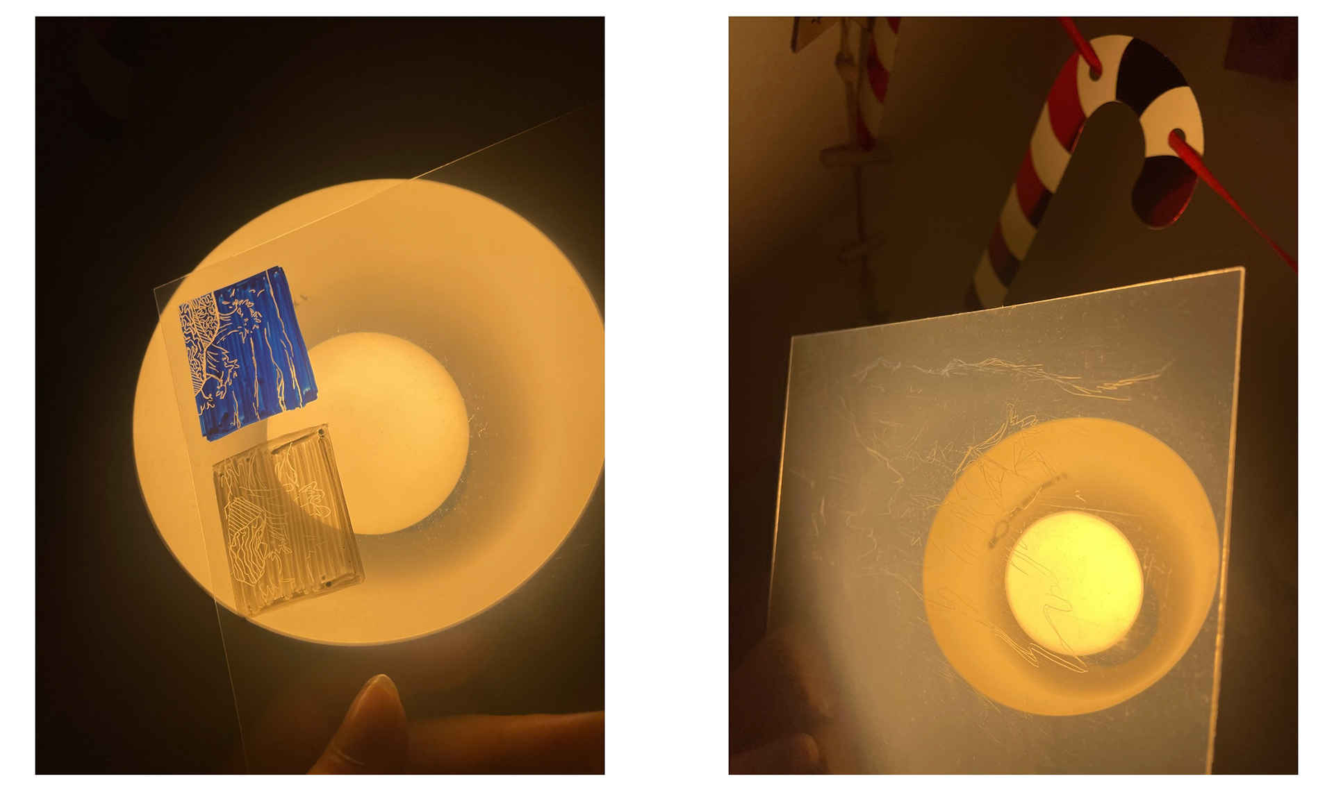
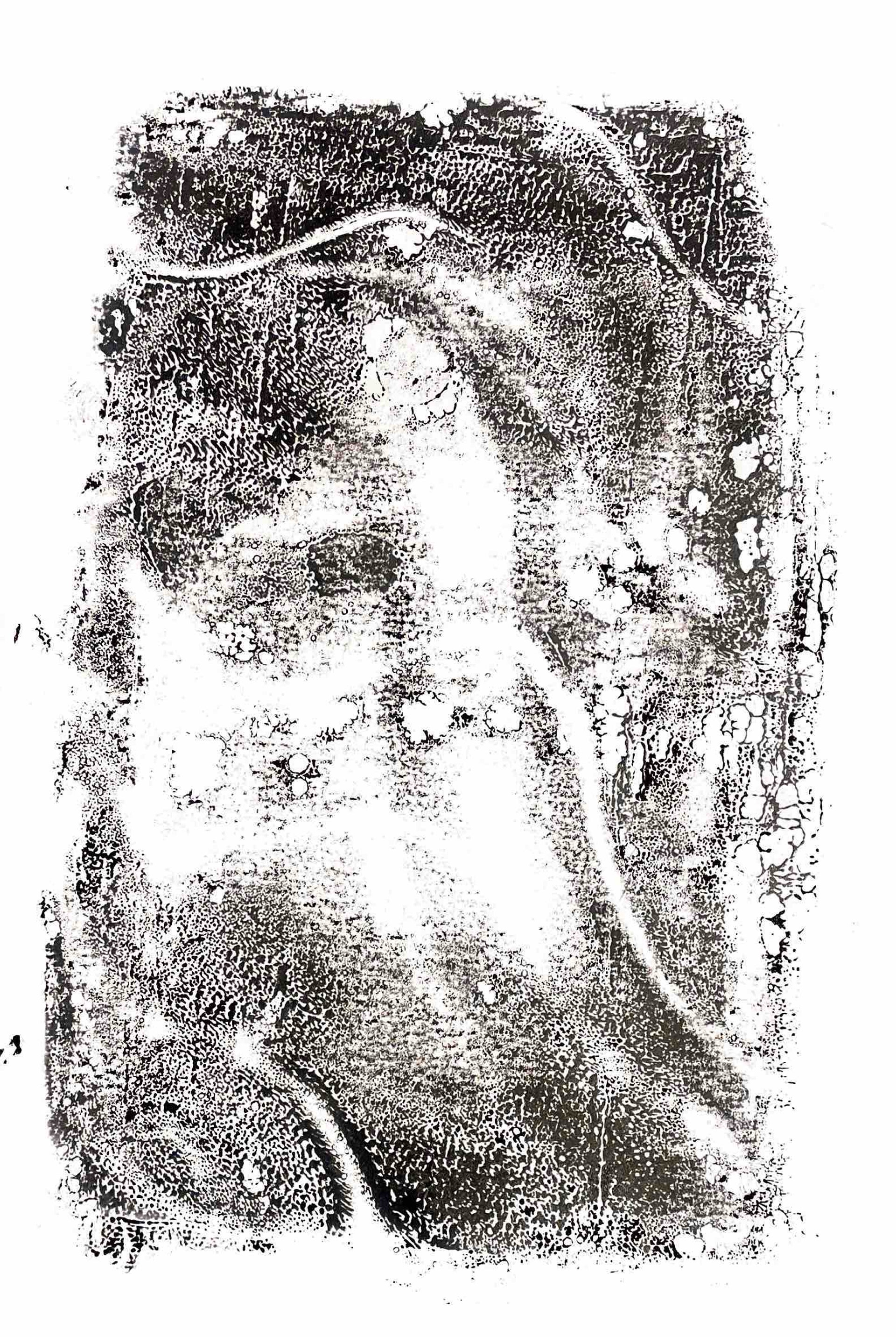
The glass that I collected was too small to scratch into and so I bought a variety of materials that somewhat resembled glass (transparent). This included acetate and different types of plastic. I used a book binding tool to scratch into the plastic and then tried it with paint. When scratching into paint it made the design a lot more noticeable however it was also more difficult to build up any textures using mark making.
Scratching experimentation
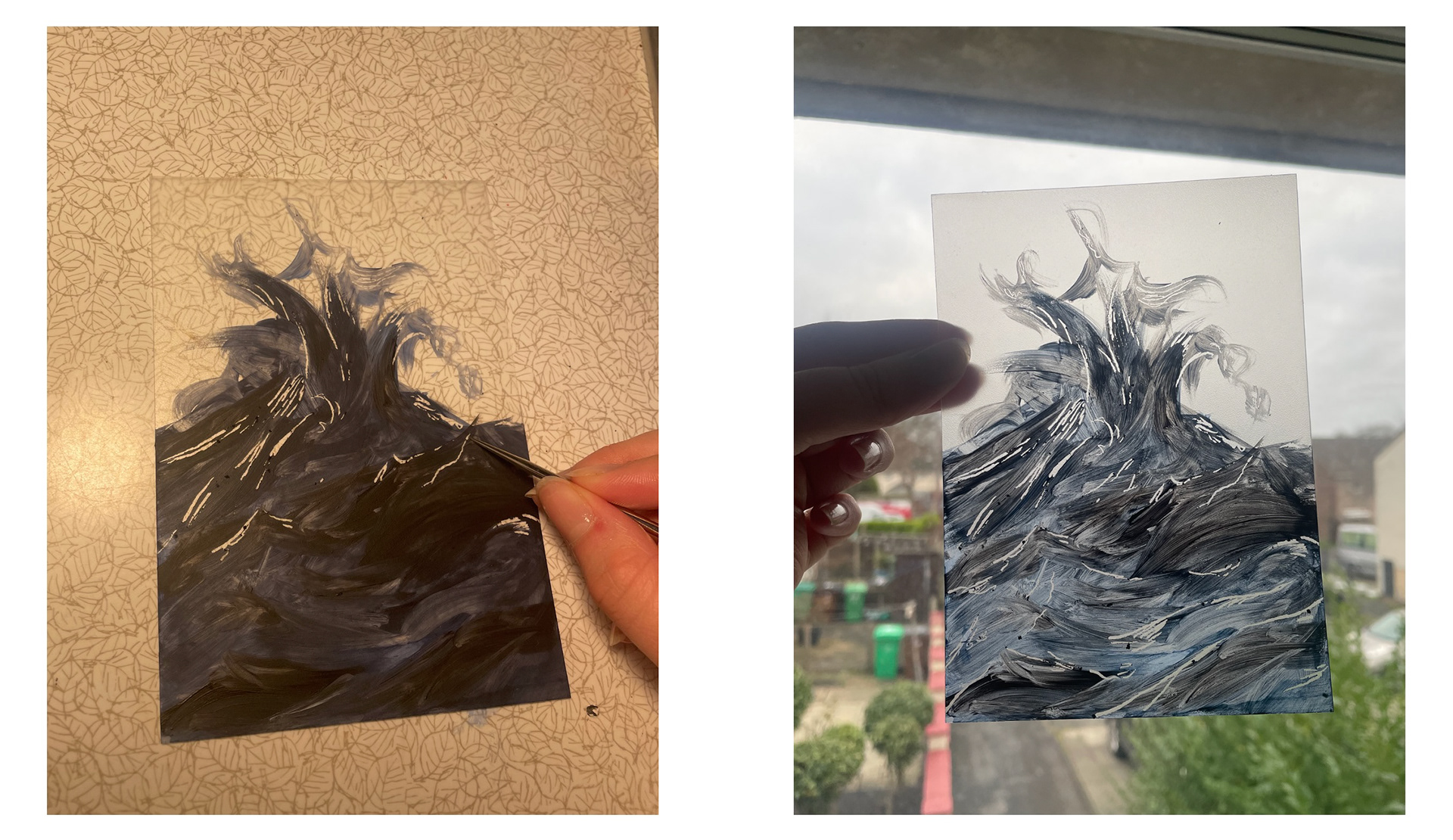
I also wanted to see how these designs would work with the light to link with how the sun hits the water and how that's seen from beneath the water. I really like how these illuminated but it didn't create the wanted effect as the light was not focused enough to project the image.
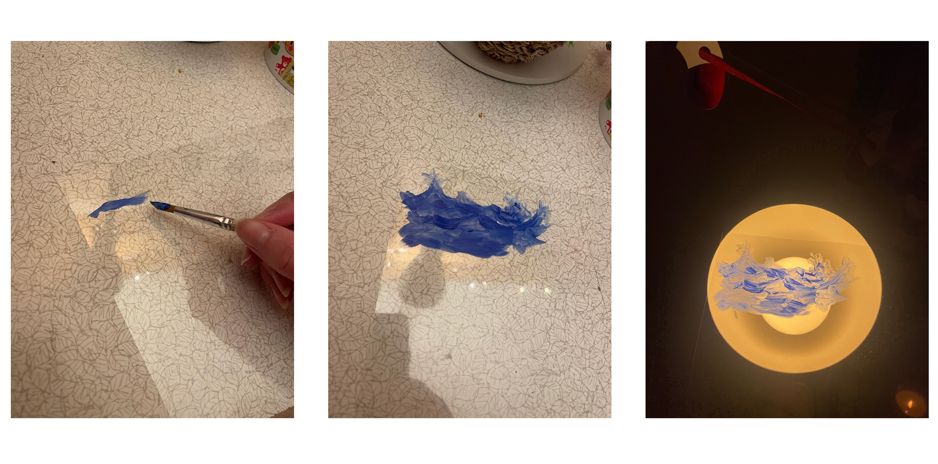
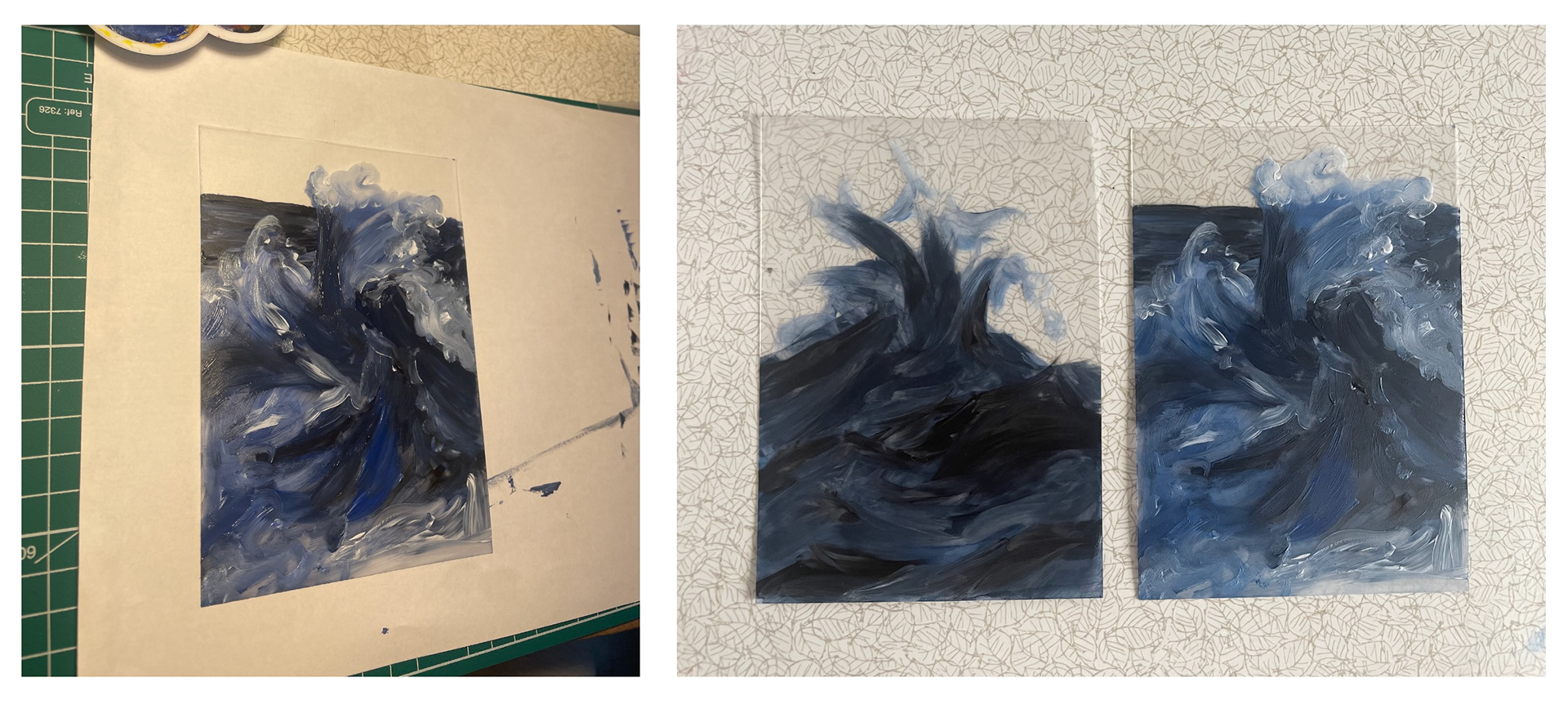
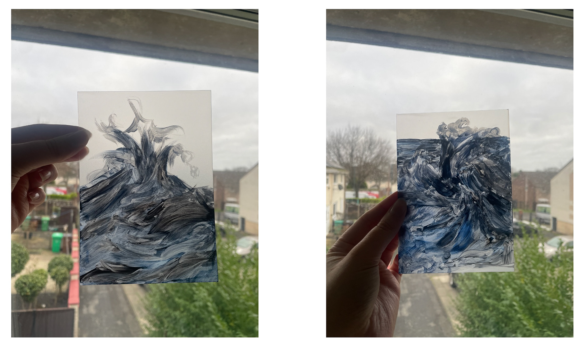
I then decided to use a thicker layer of acrylic paint to allow me to build up a slightly more detailed image of waves. I held this up against the window to see how the light effected the brushstrokes. When doing this it made the foamy areas of the piece less noticeable so I scratched a few more details into the paint to allow the light to emphasise the flow of the water more.
During my tutorial we discussed the idea of dry-point printing using the plastic that I scratch into, this way I would have a perfect print of what I have engraved. It would also allow me to nicely combine the painting element into my piece- whether that be painting on the paper I would be printing onto, or painting over the finished print.
I am still waiting to get an induction for this, but as an alternative I did some mono-printing using the tools I had at home. These were simple and fast designs that I then worked into with biro, acrylics and crayons.
Mono printing experimentation
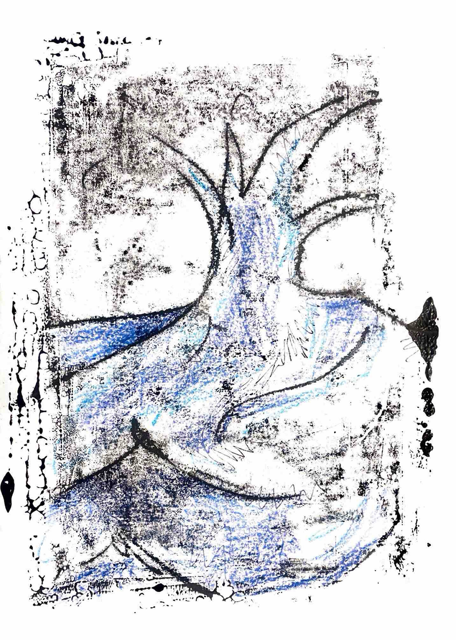
The ink I had for this ended up being water-based and so each time I rolled it onto the tray the ink would start to split. Usually this would be seen as a disadvantage but I think it left a nice effect in the wave- almost looking like the foamy bits before it crashes. When adding acrylics over the prints, the ink would bleed into the paint and so you lose a lot of that pigment. All in all I feel this was a successful experiment and I wouldn't be opposed to trying this again in the future. However, saying this I would like to find a method that better portrays the feelings created from being around the water- emphasising how absorbed you get into the sound.
Focusing on feeling
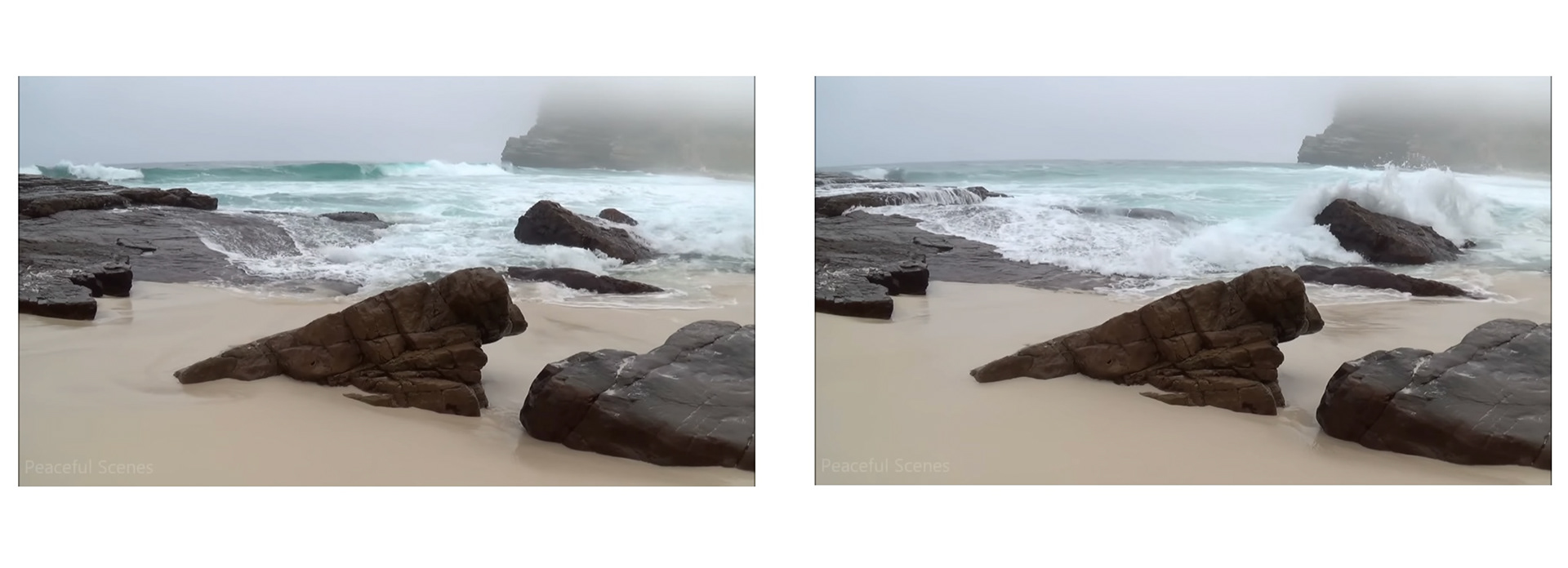
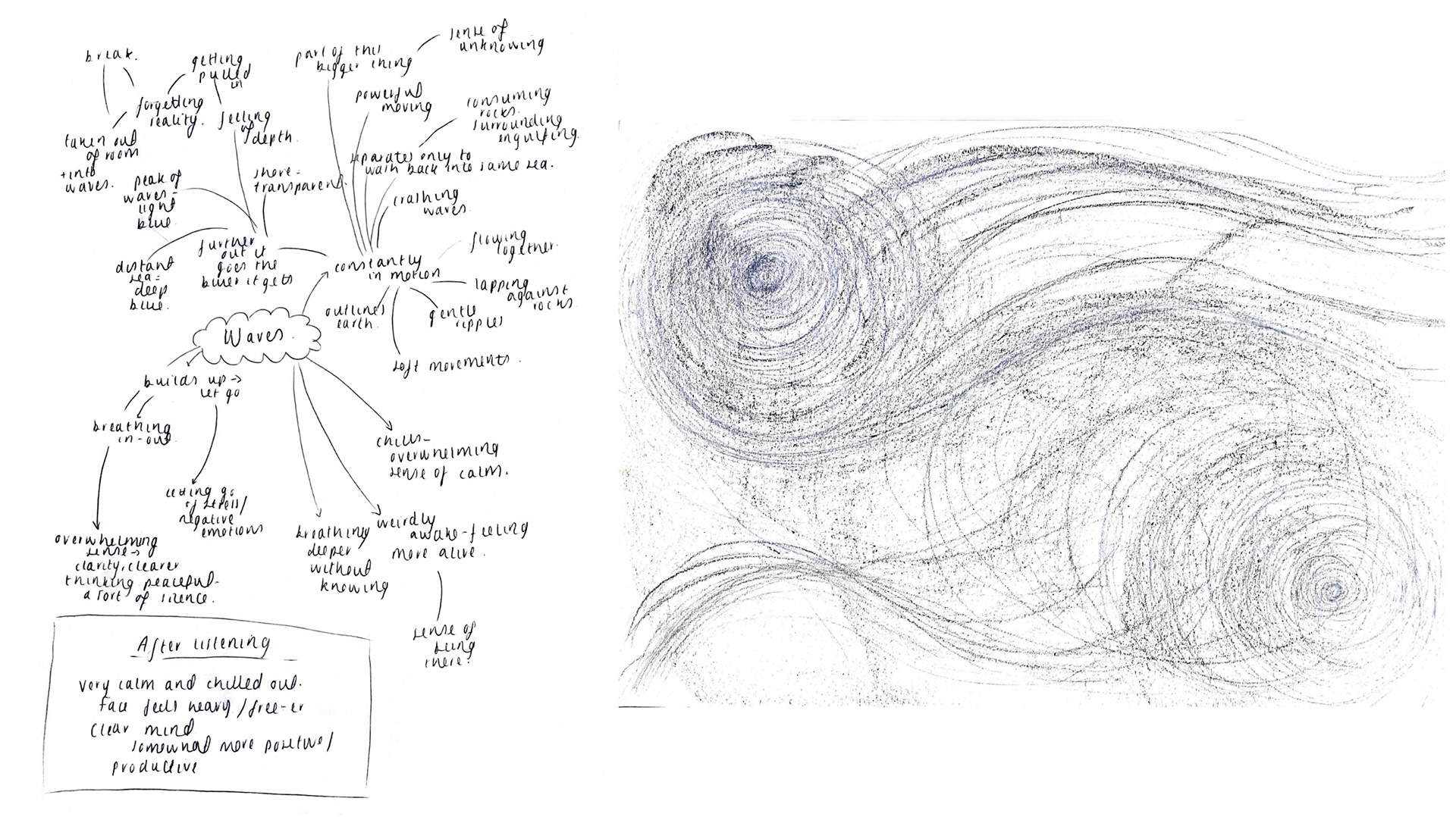
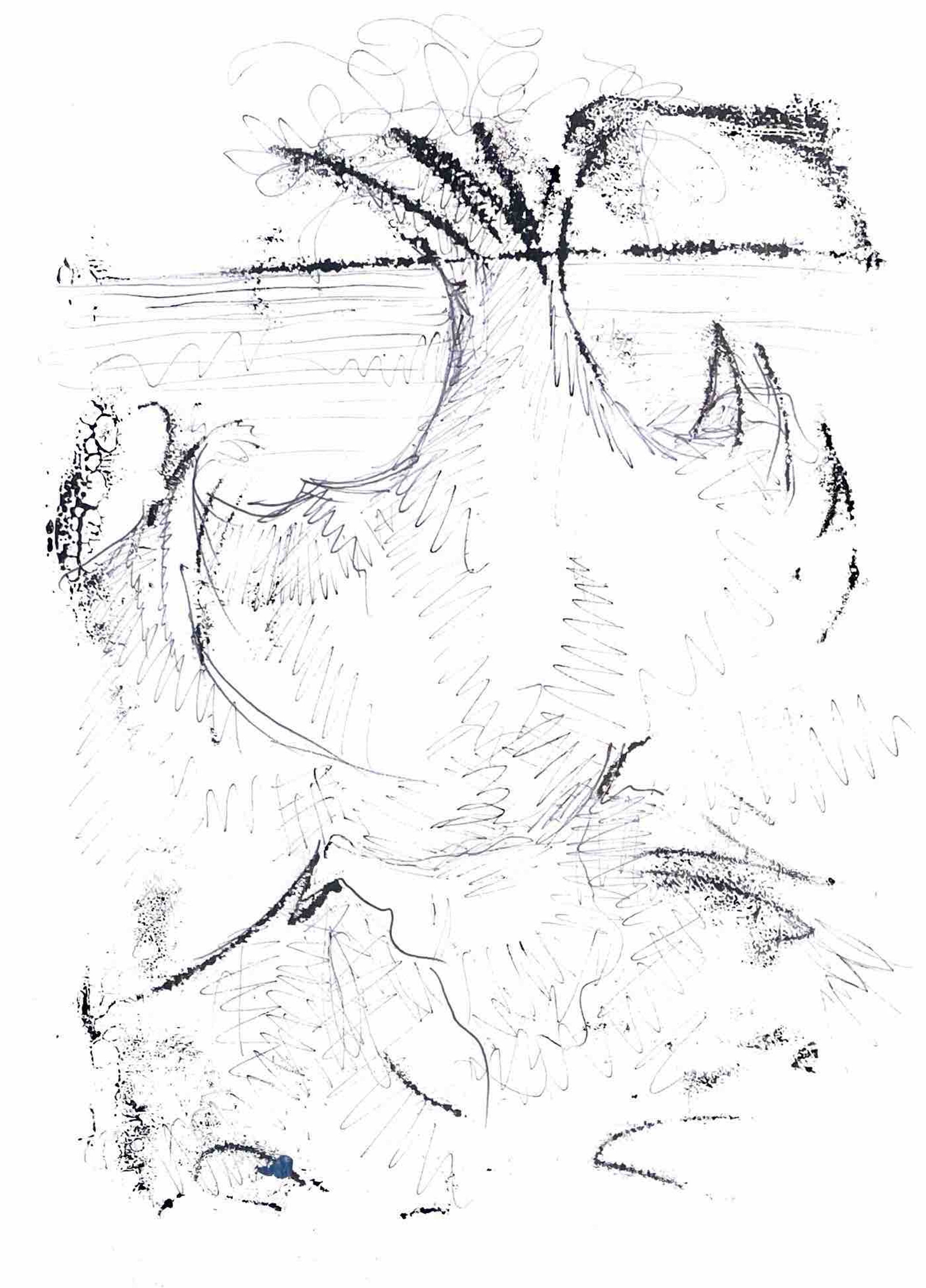
Instead of focusing on a specific memory or place, I wanted to change my direction to capture how being by the sea makes you feel. I sat with headphones for 30 minutes and watched a video of waves crashing- fully absorbed in watching, listening and blocking out the rest of the world. As I watched I drew big shapes using pencils of how I imagined the sound to be in simple lines as well as making notes of what I noticed.
From this I drew a simple mind map of what I wanted to achieve- the main takeaway being that I wanted it to be more of a sensory experience to take a break. When listening to the waves I felt so at peace, like I'd temporarily escaped the chaos, I want my visuals to be somewhere the viewer can escape to as well. I can do this by trying out more methods of layering in my work and the types of framing.
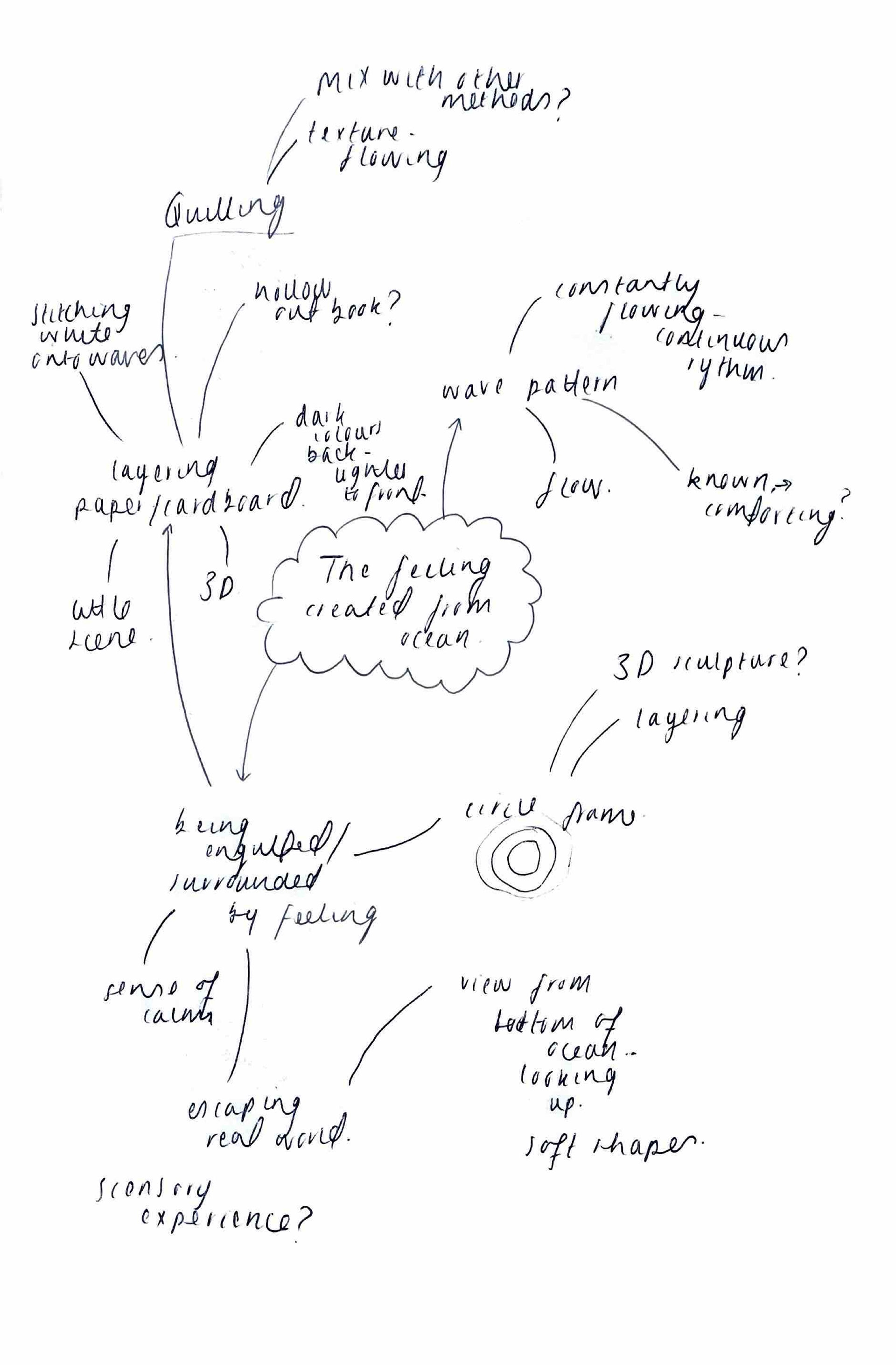
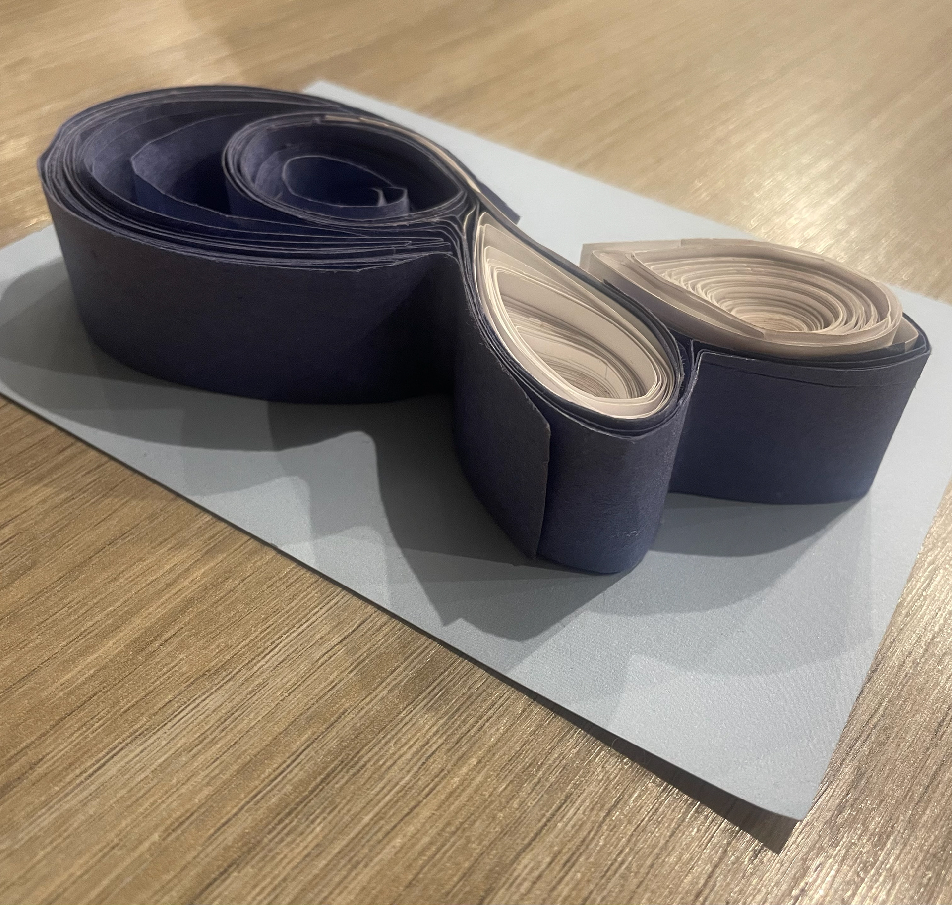
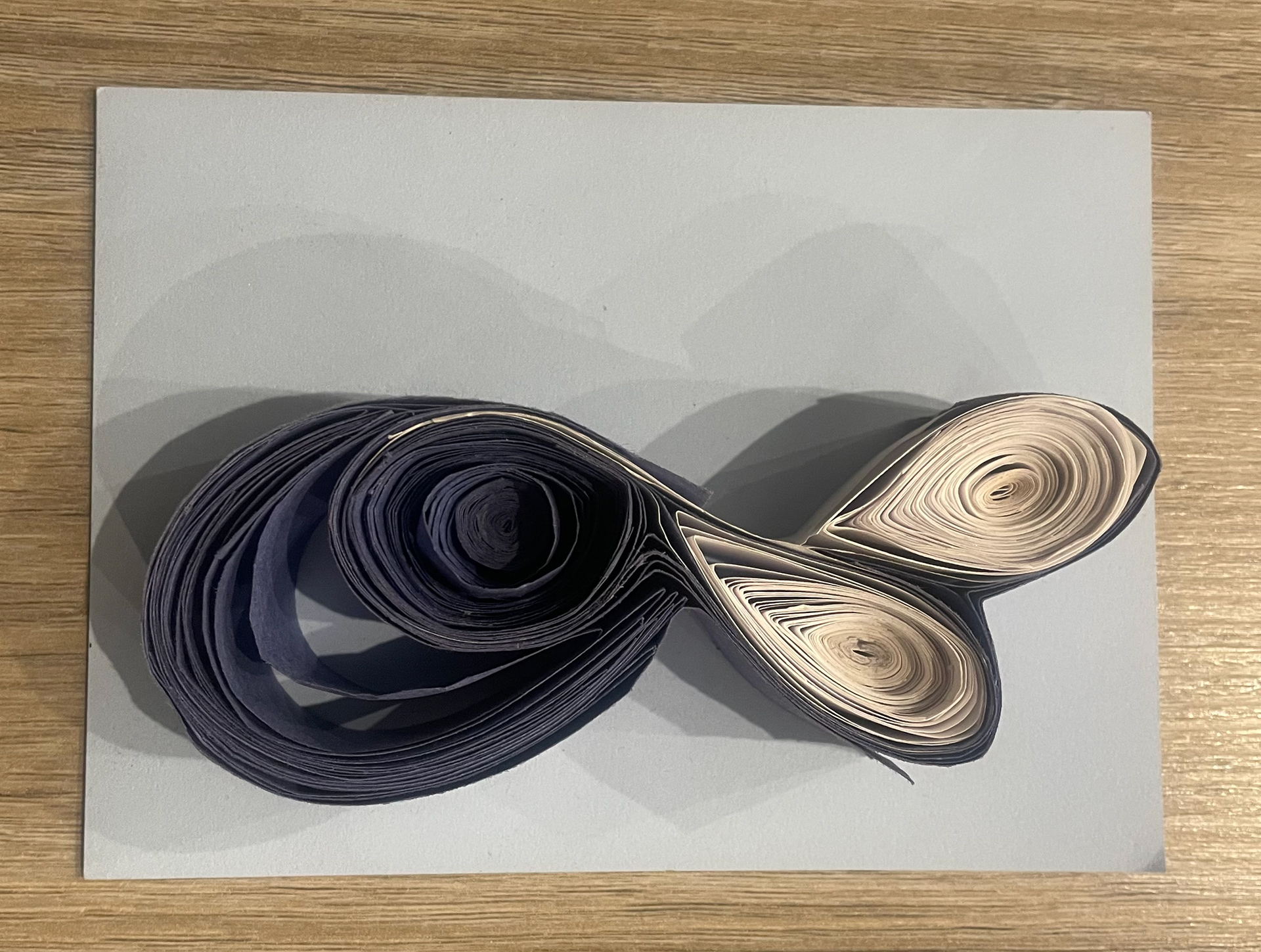
I tried quilling for some experimentation but quickly got attached. The continuous spirals of paper resembles the flow of water so well and I think the depth created from the different width of strips is really successful.
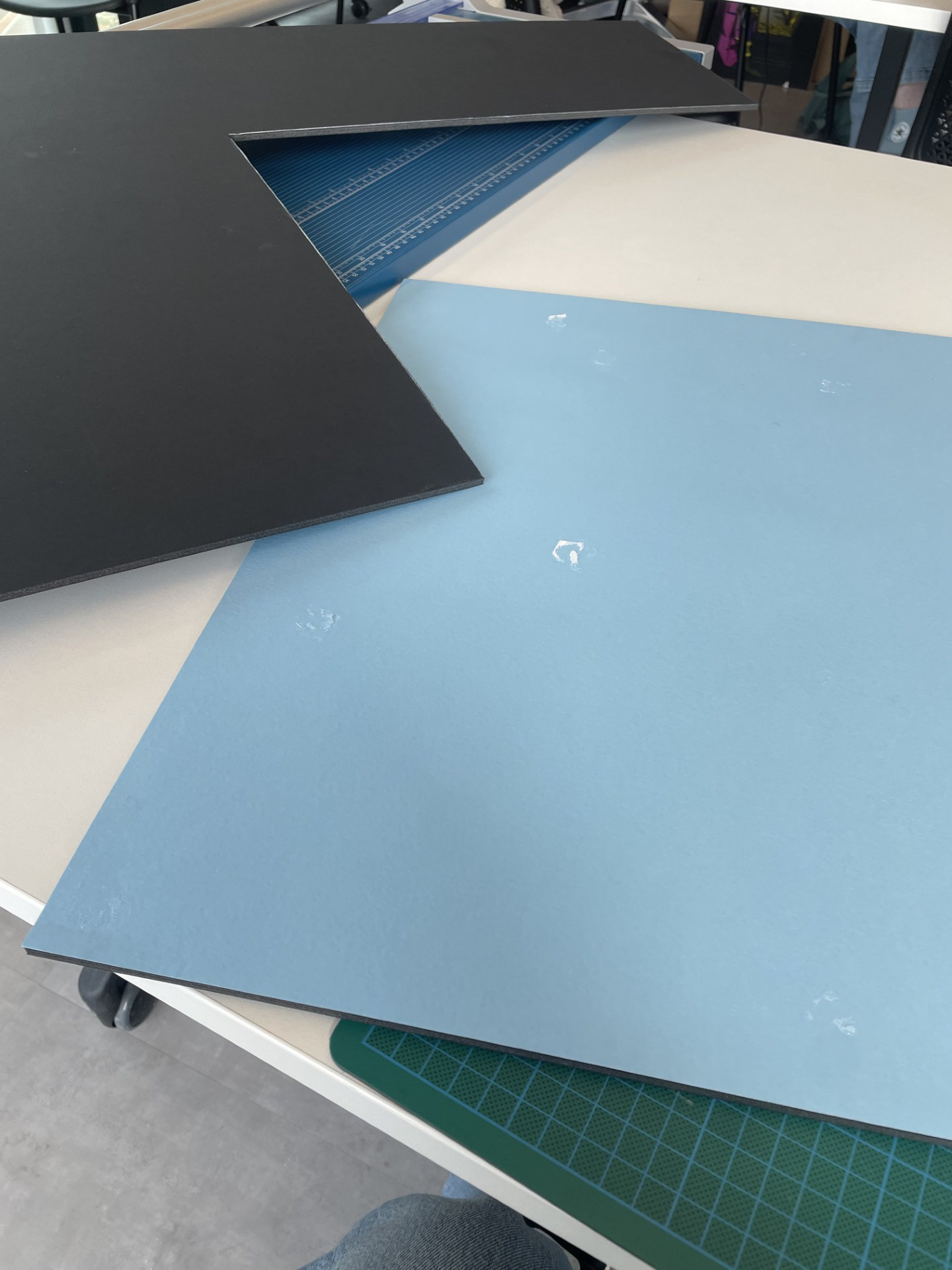
Following my tutorial we've decided that paper art would be a rewarding way to go as long as I use a more professional approach. I am going to do plenty of research into the art of paper and buy a better quality paper for a cleaner finish. A combination of paper cut and quilling would help achieve that depth and I could maybe even incorporate some painted features to tie in with the beginning of the project.
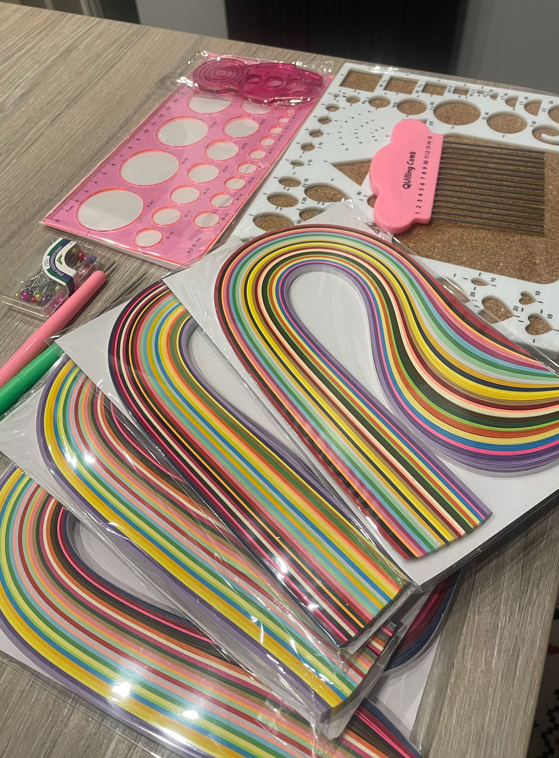
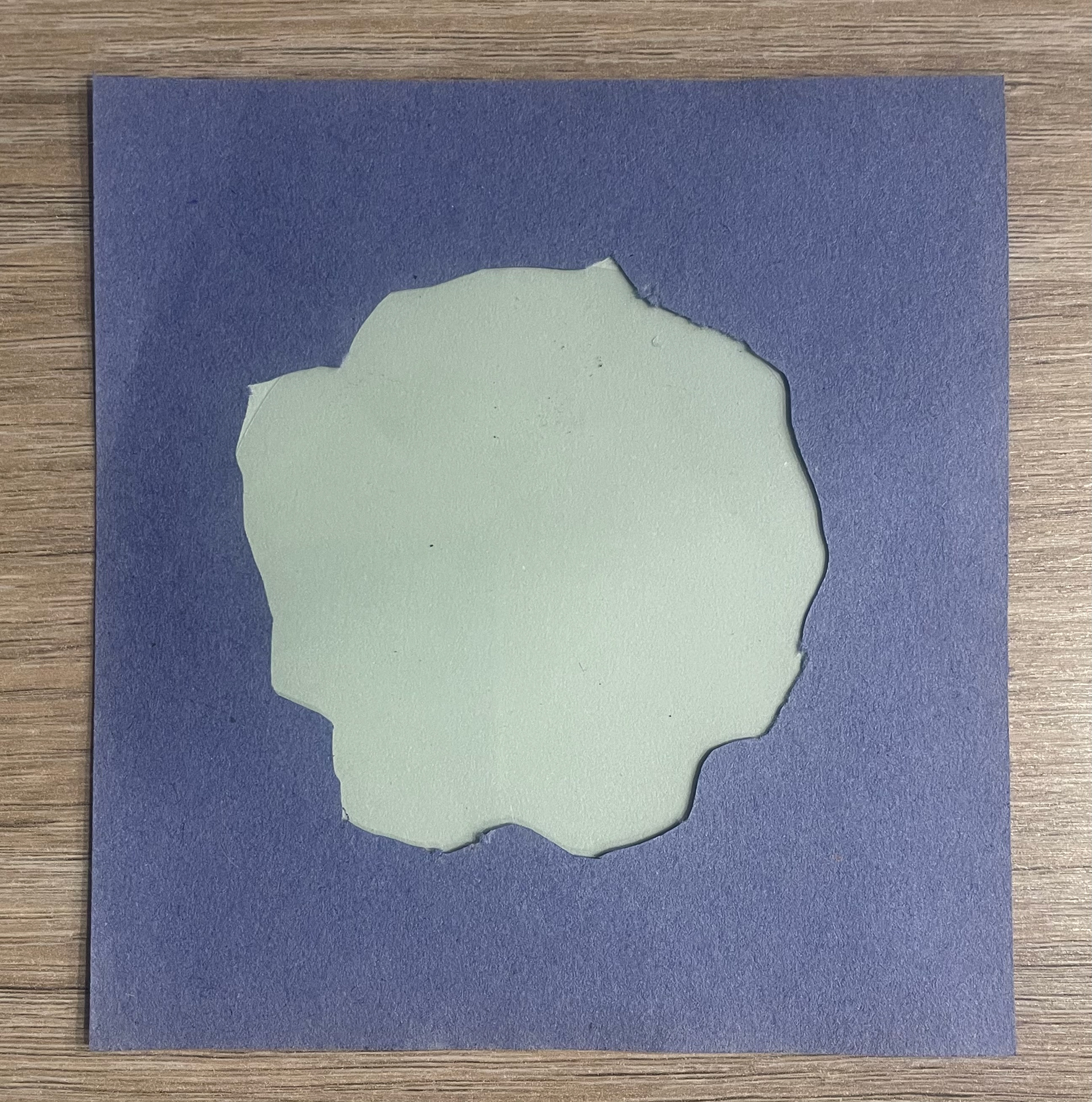
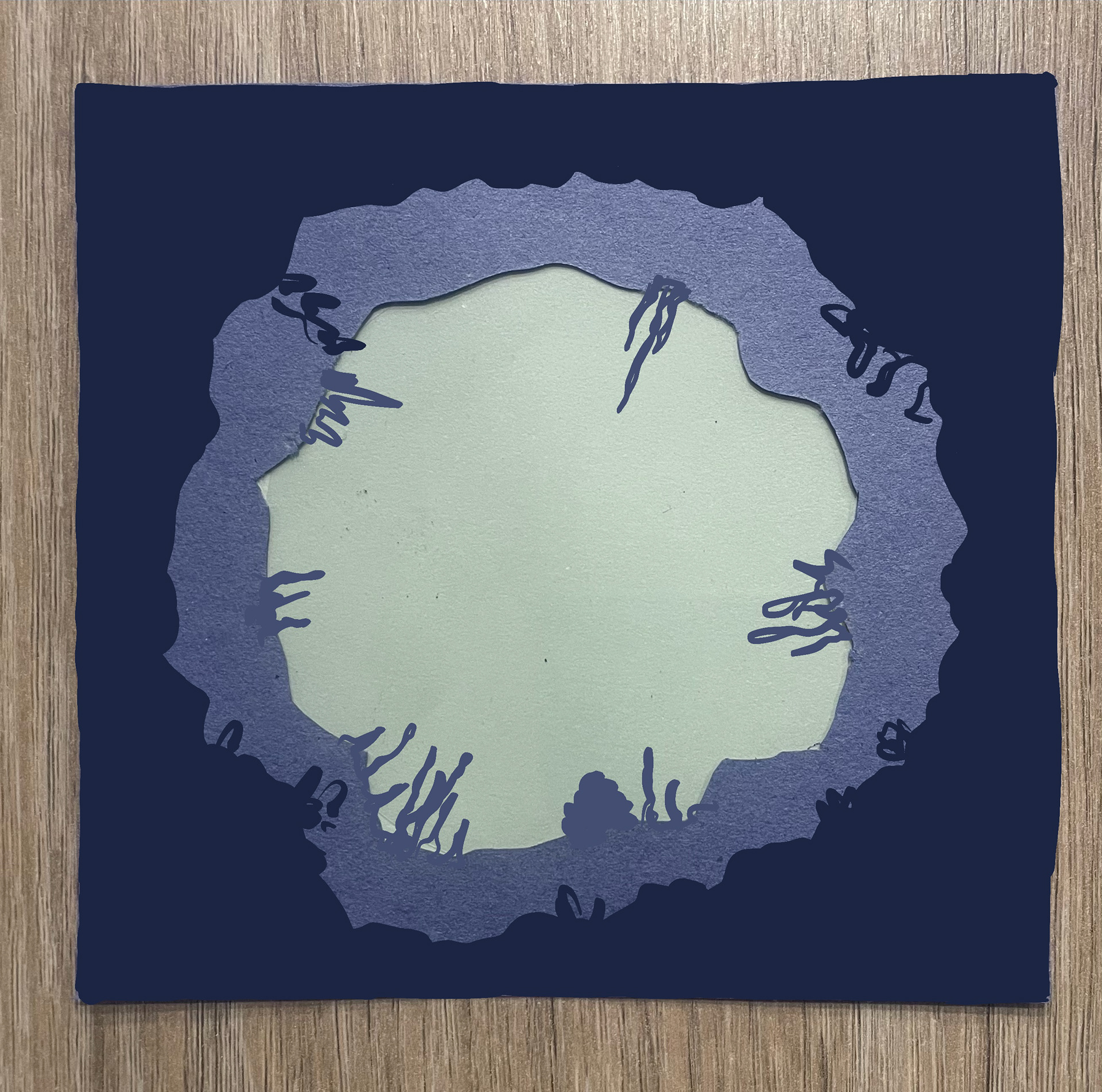
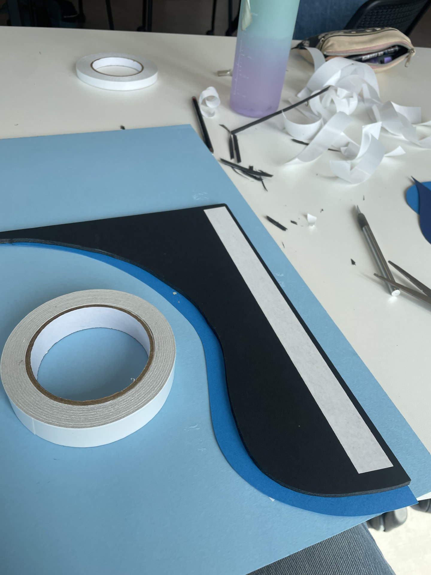
papercut testing
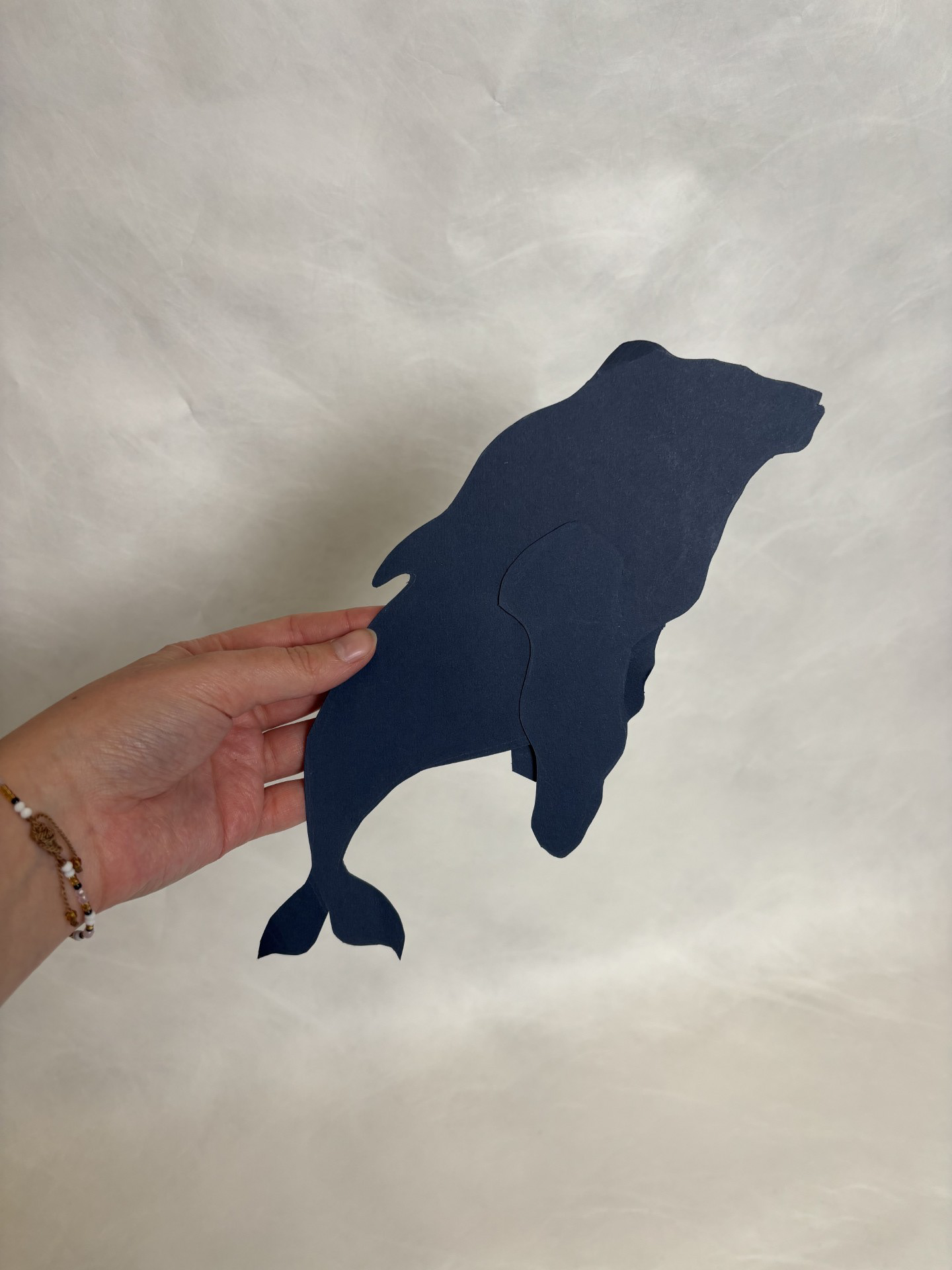
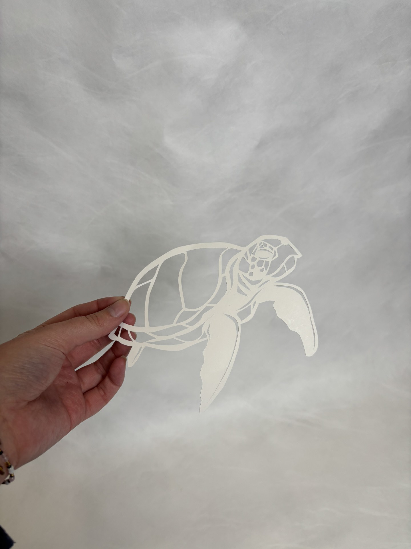
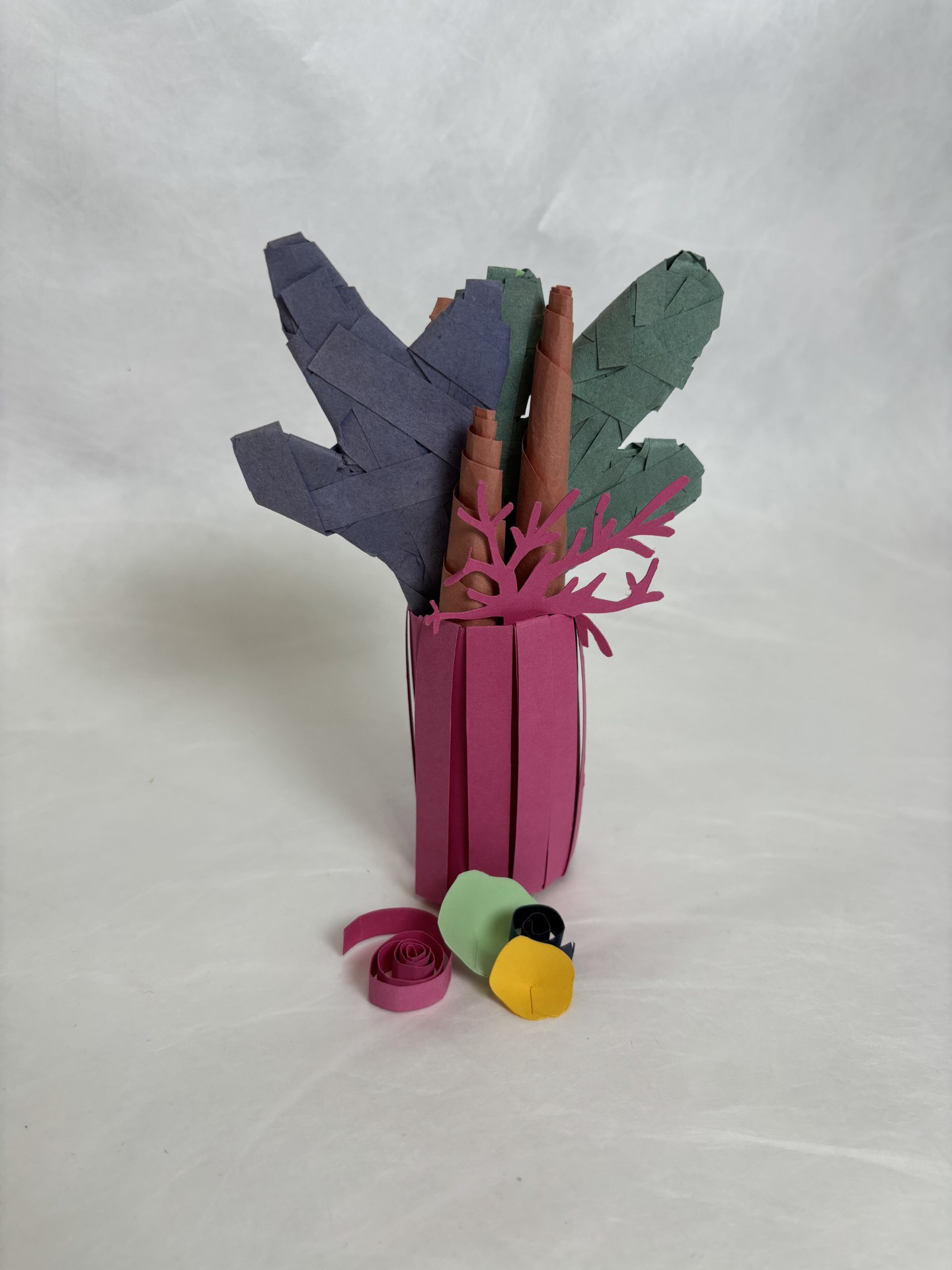
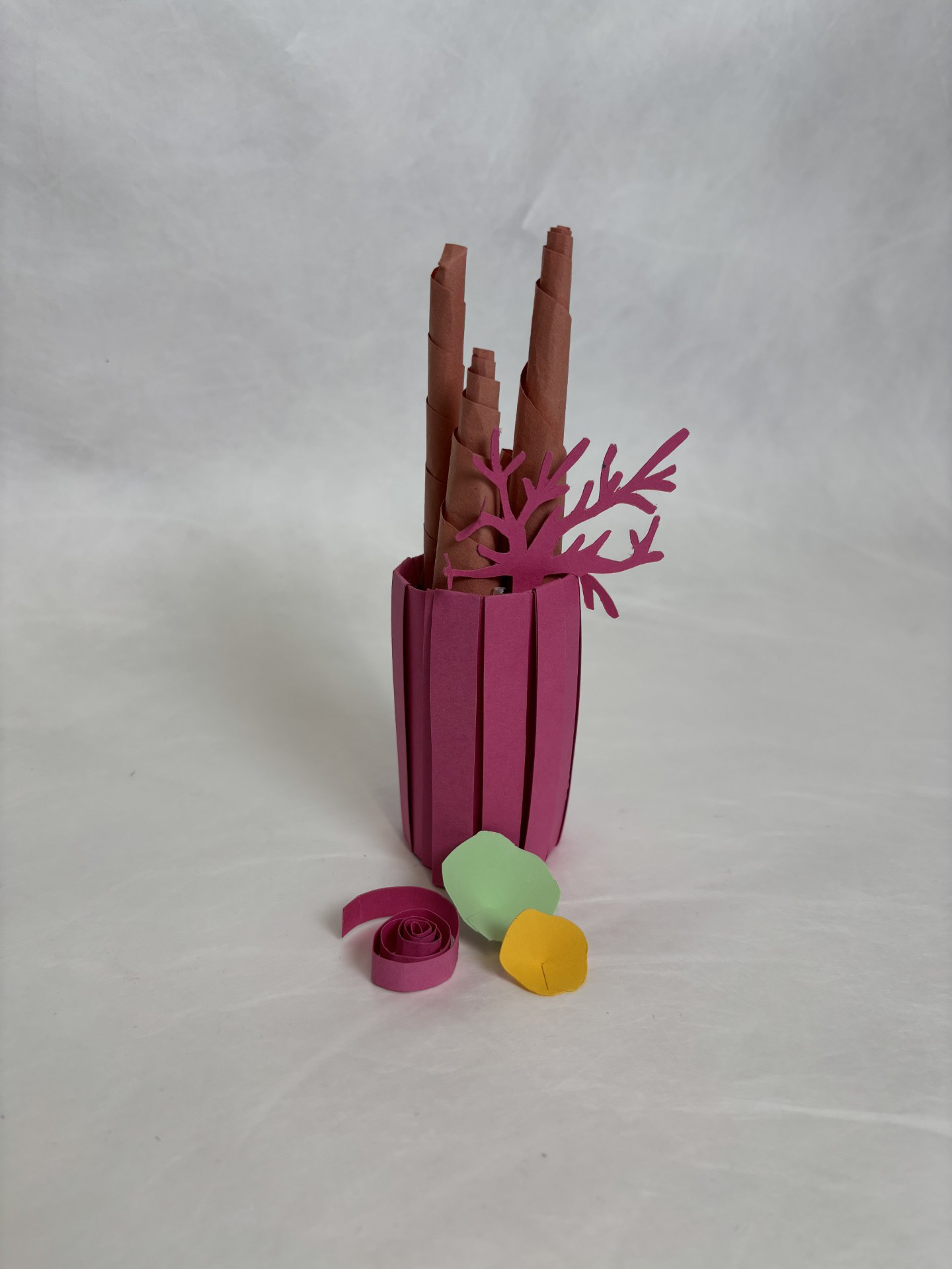
I found this part of the project so fun. I have never fully absorbed myself in creating art out of paper. Being able to actually create a 3-dimensional shape was incredible and I instantly could see myself becoming obsessed. I love that I could achieve something so realistic in such an experimental way. Although this was a successful trial, I need to learn how to make my work more professional.
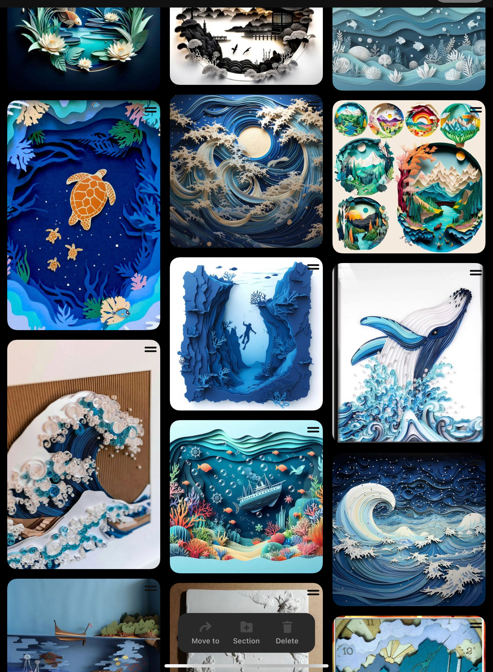
Maud Vantours
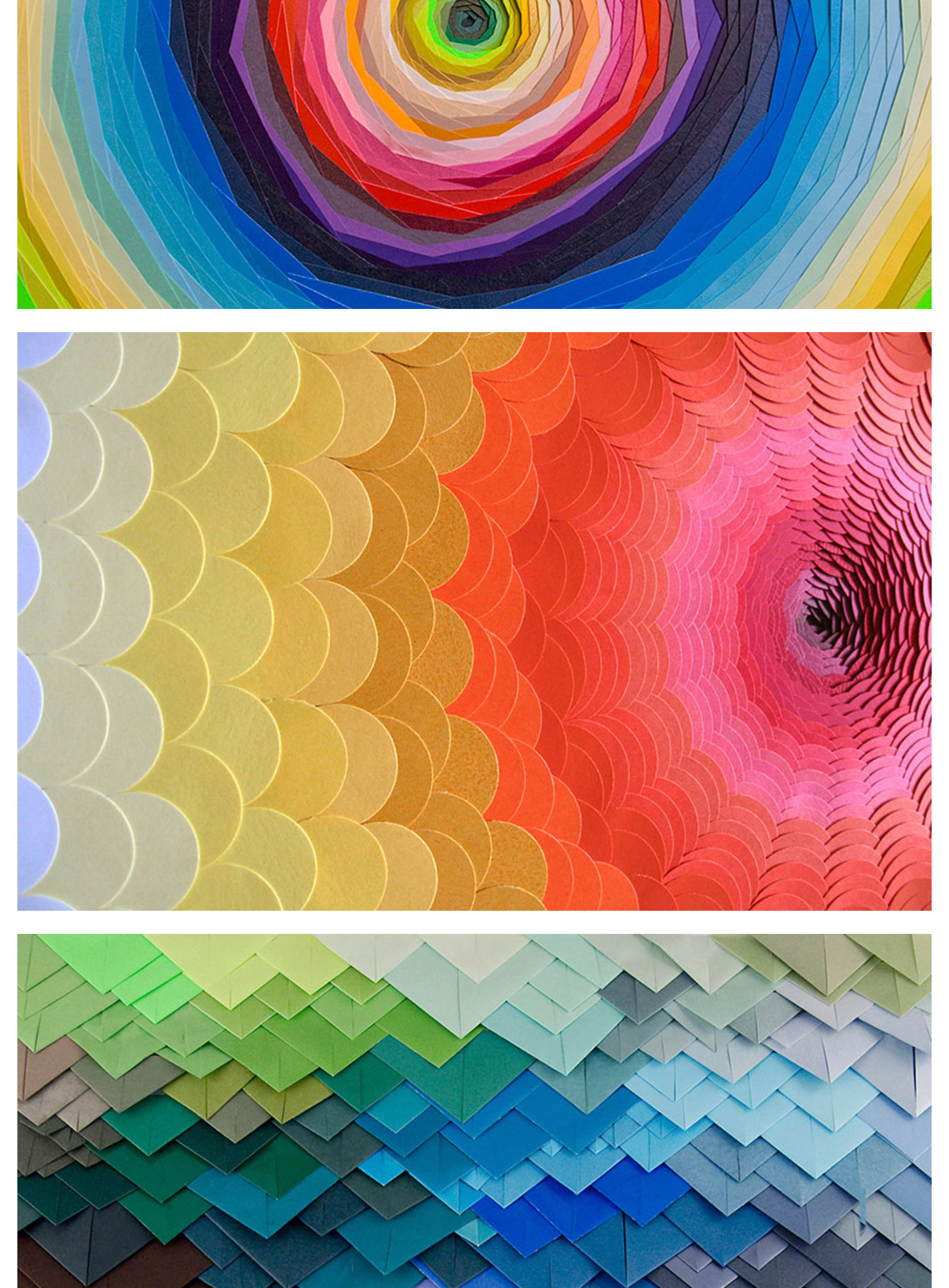
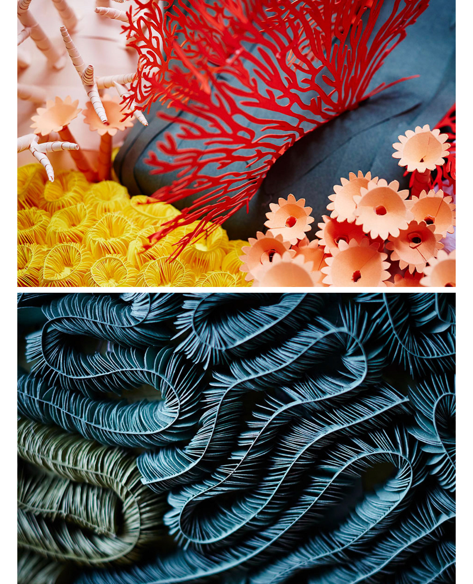
Maud's focus lies in the art of papercut, she says she 'loves to create original graphics with multicoloured and dreamlike landscapes'. Her colour scheme is vibrant and wild, which works perfectly in her work, but I think for my own project I need to keep it to a more restricted pallet. The thing I love most about her work is the vast amounts of shapes she uses as well as the depth. I love that she not only cuts into her piece, but also builds it out. I would love to use this combination for my project.
Raya Sader Bujana
Raya describes her own work as 'something between illustration and sculpture' where her background in architecture becomes evident. I think her sculptures are incredibly impressive- extremely precise and life like. She follows a very real to life colour pallet which I feel I will definitely take forward. Her focus is on specific objects but I think the direction I want to go in is more of a scene.
Fideli Sundqvist
Fideli is another paper artist and image maker who values animal rights and nature preservation. Her work is predominantly three-dimensional and again is very real to life. As much as her work is beautiful, I don't think my project would benefit from paper sculpture for what I am wanting to create.
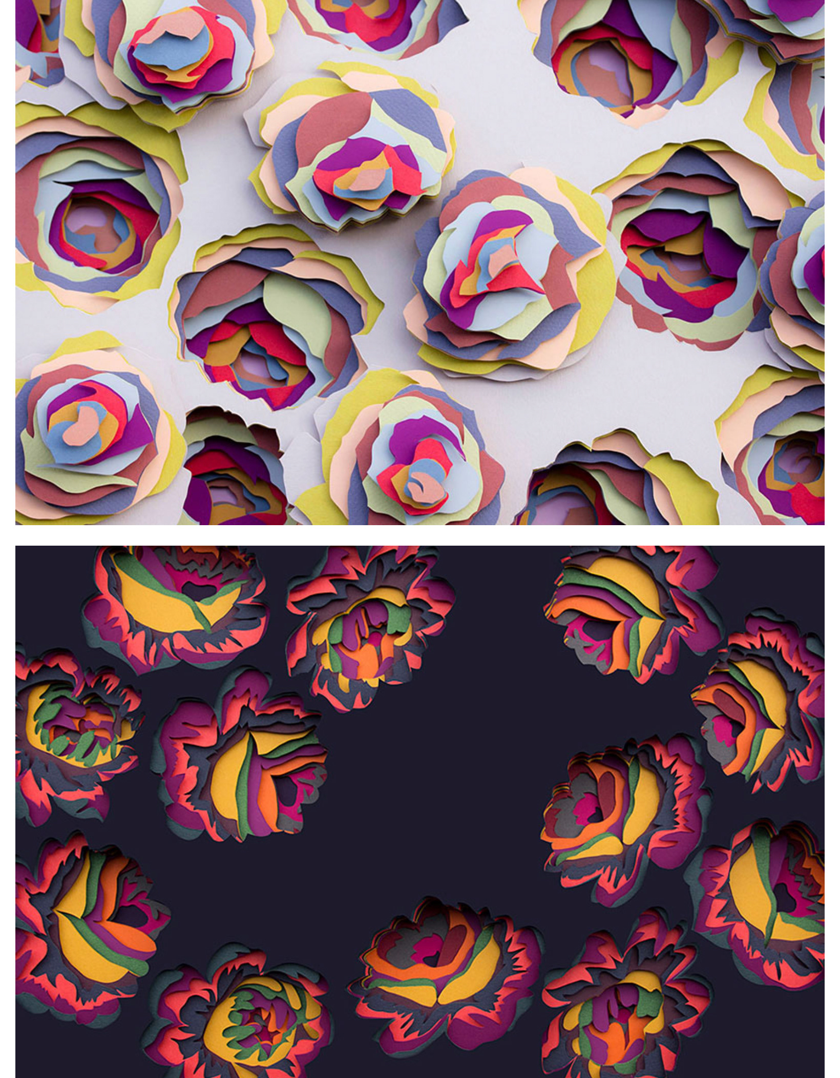
Mlle Hipolyte
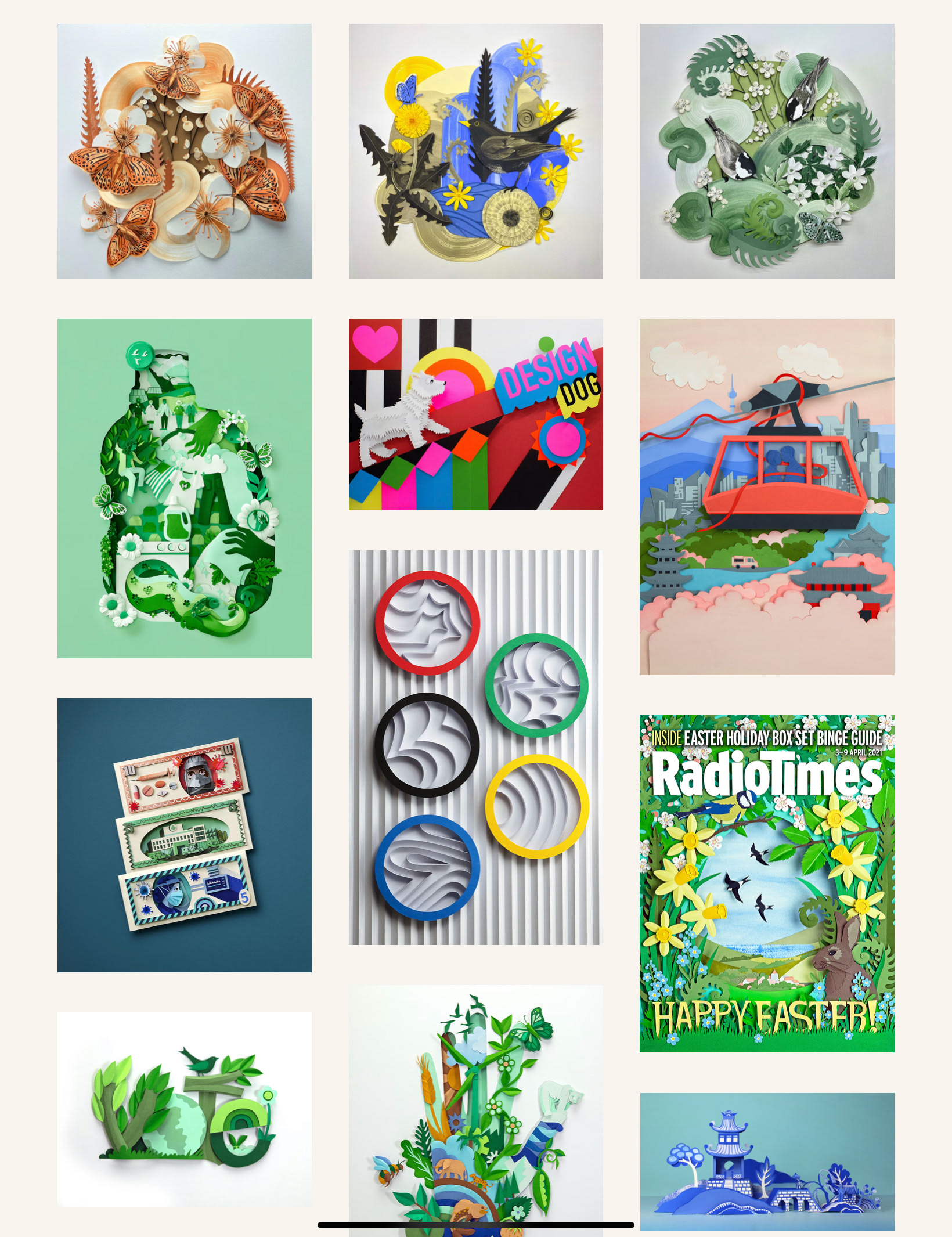
Mlle is an illustration artist that creates incredible work using intricately cut paper shapes, she is able to make such a variety of textures which completely admirable. I would love to be able to achieve textures as successful as these moving forward.
Helen Musselwhite
Helen says the more she works with paper, the more she finds she can do with it. I feel that her growing excitement for this is so evident in her pieces and it is truly inspiring. The thing I love most about Helen's work is how interactive it really is. She has so many different components to her work, having areas sunken in and others built out- literally growing out of the frame. I would love to try combining several areas of paper art and am excited to see where it it could take me. This is going to be extremely difficult as it's going to need extreme precision.
Fortunately Helen shares her process on the 'Handsome Frank' website. Having process pictures makes it even more impressive to see exactly where the idea initially came from and the development along the way. Having a direct plan of what I am doing would also allow me to achieve more of that precision.

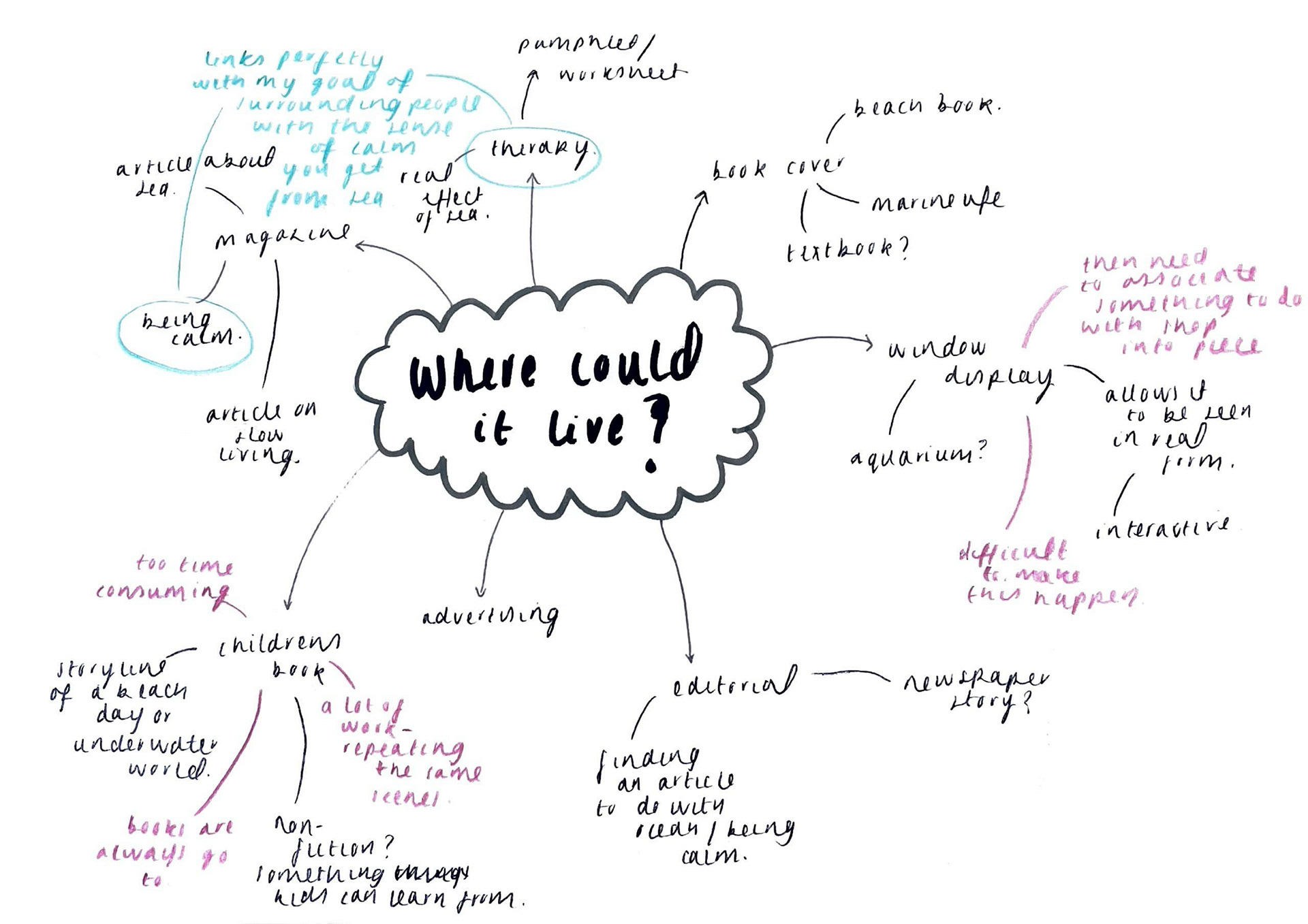
One of my aims for this week was to really focus on the research side of my project. Thinking about where my artwork should live is always one of the most challenging areas for me as I struggle to link purpose to place. Some areas were discussed but by far my favourite was finding a magazine to do with the feeling of being calm. Because of my history with forms of therapy I really connected with the idea of making something designed to help people. Even as simple as giving them somewhere they can can feel a sense of peace.
My tutor Ria helped me find this magazine called 'Breathe' which is a series designed to help people take a break from busy life. You can actually submit designs to this company that surround the topic of mindfulness and calm where it can be selected for the next issue. Therefore, this could also be a great opportunity for me if the piece turns out as successful as I hope.
Breathe magazine
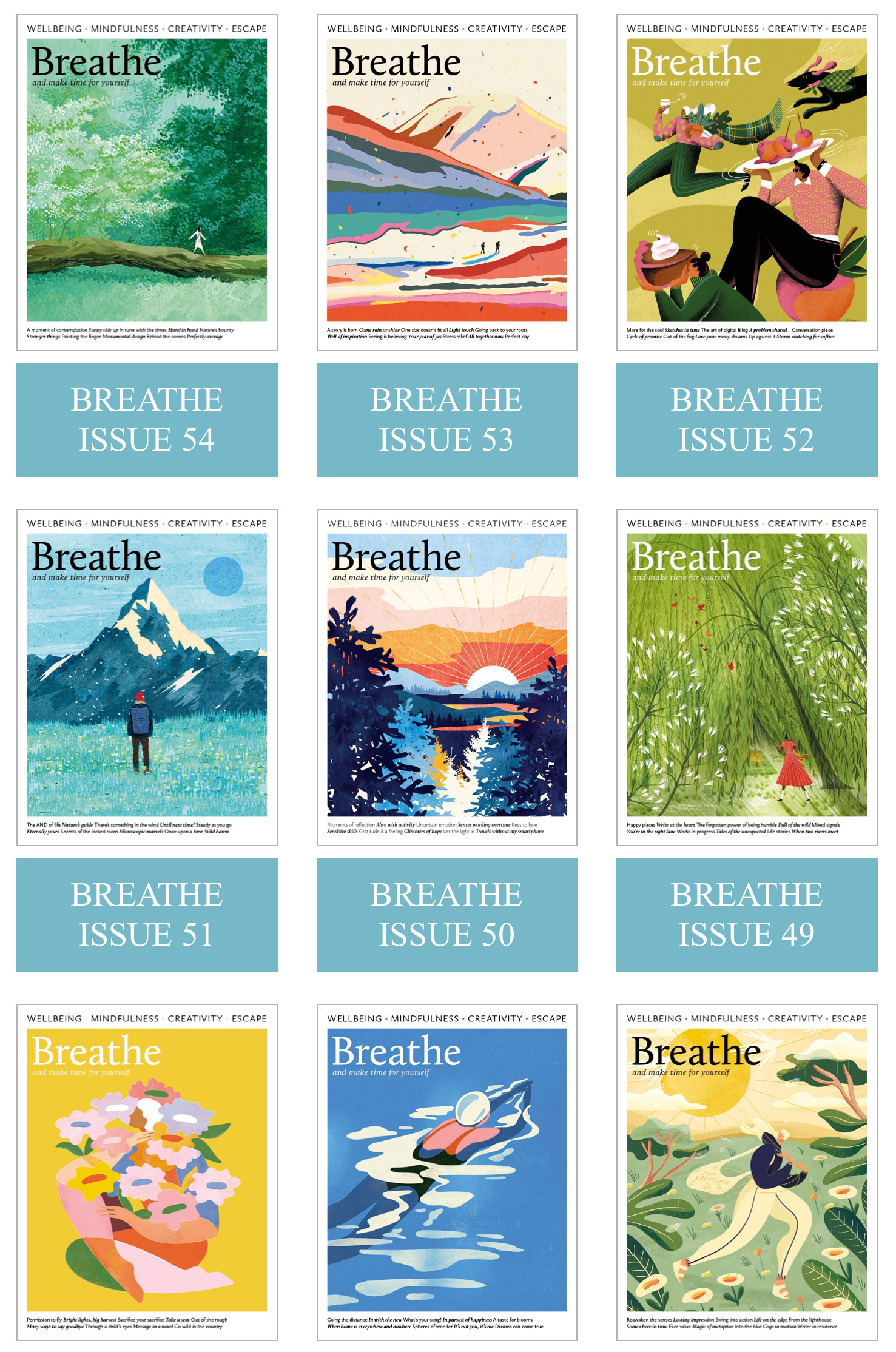
Favourites:
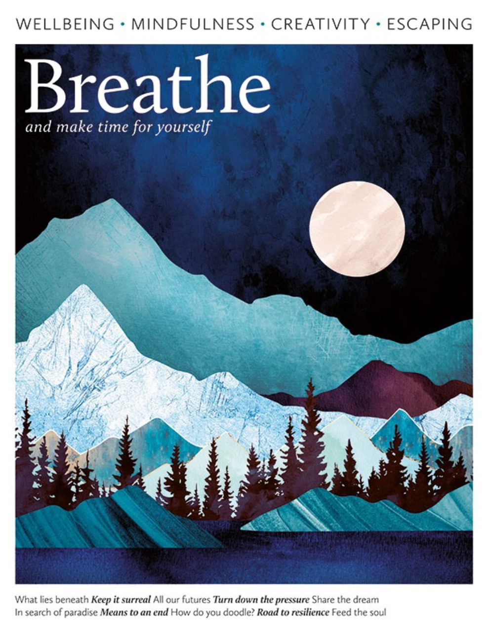
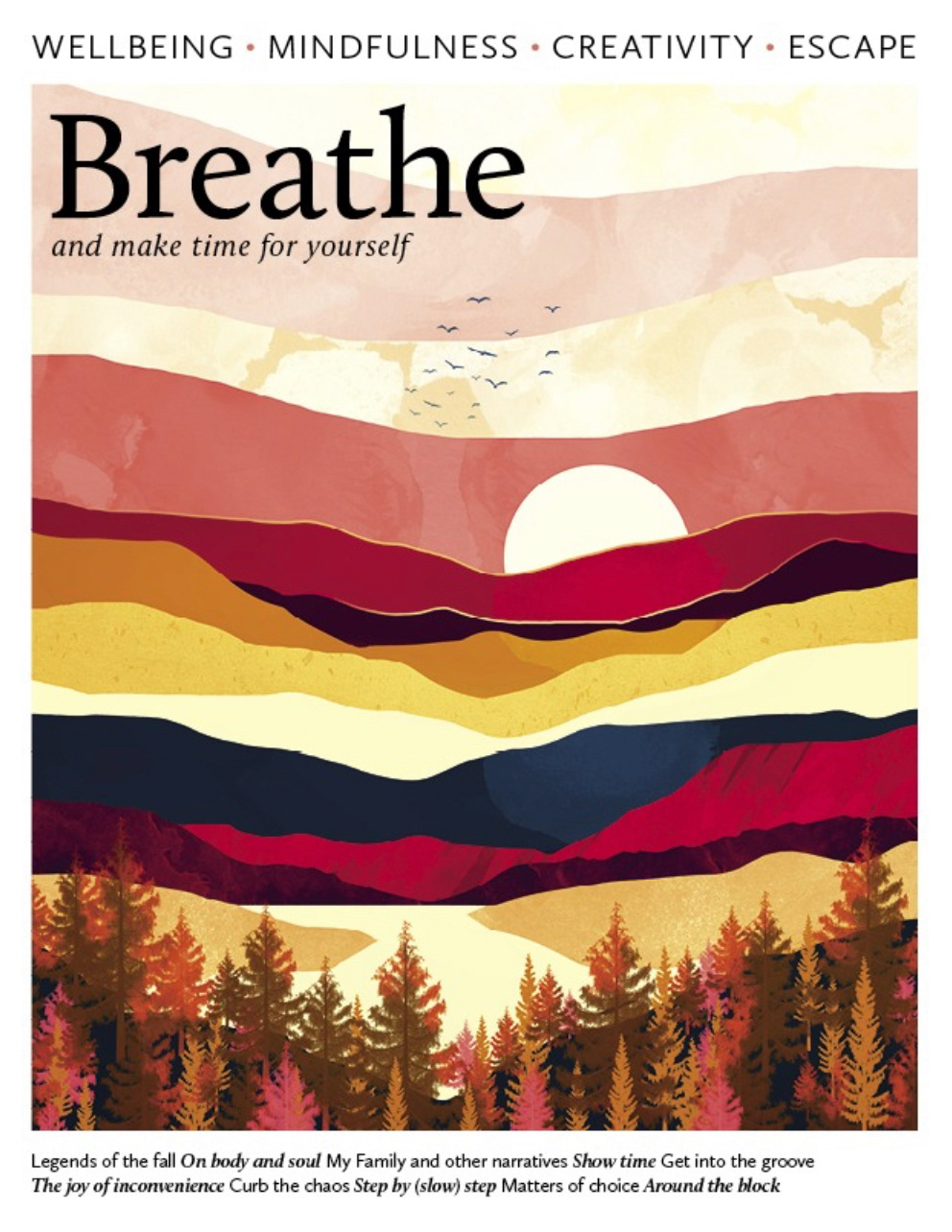
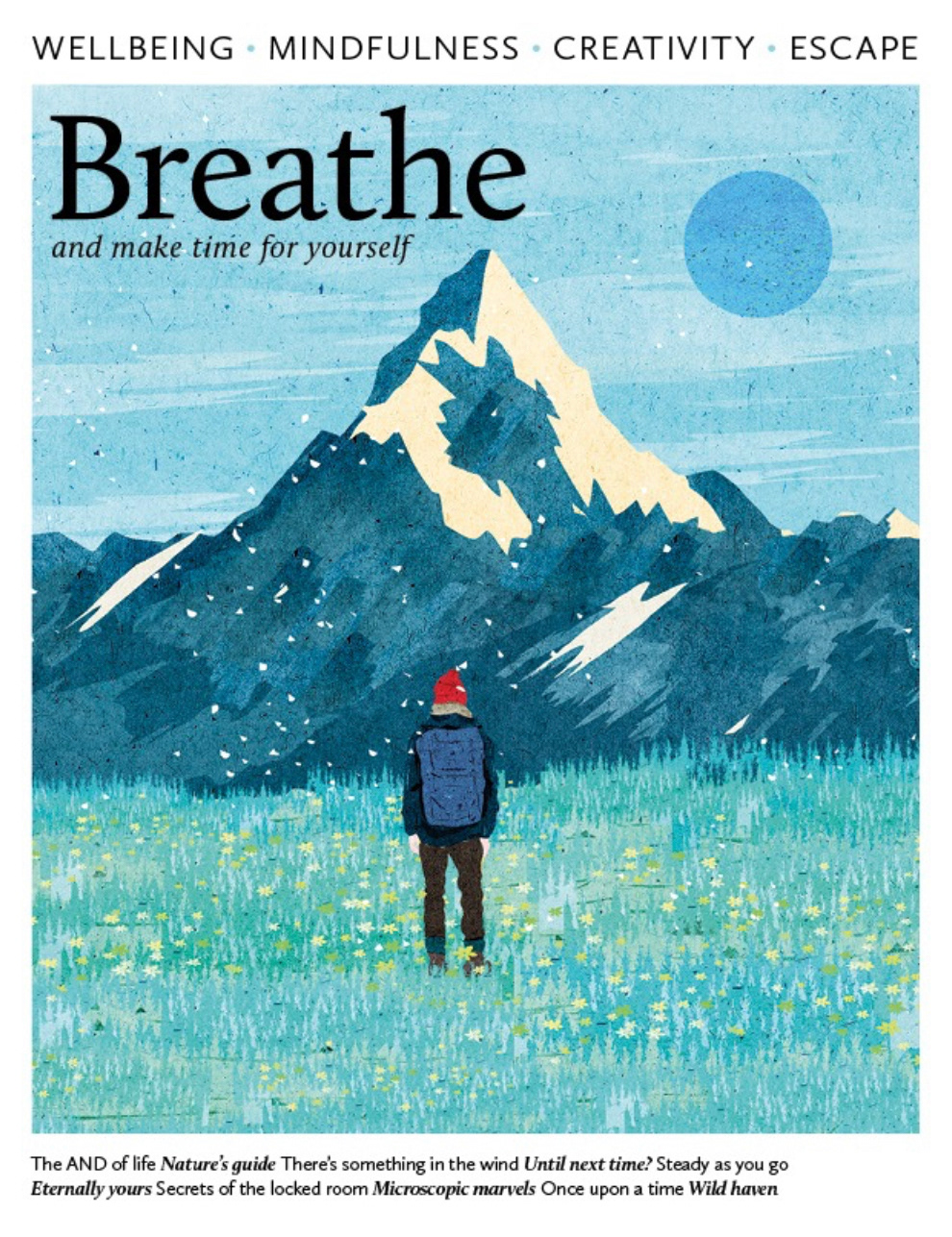
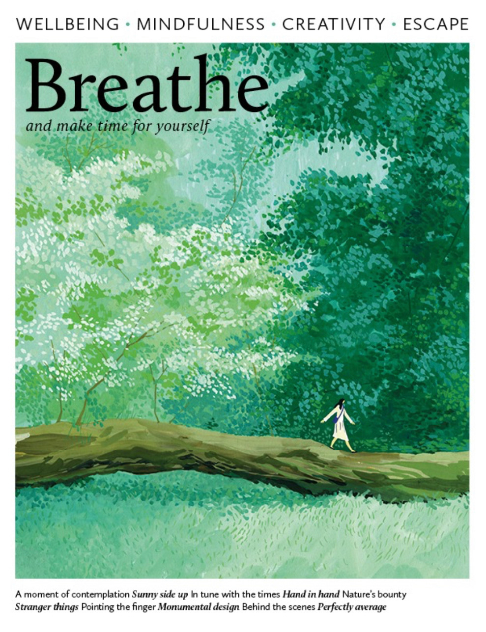
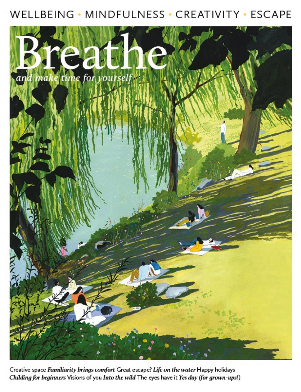
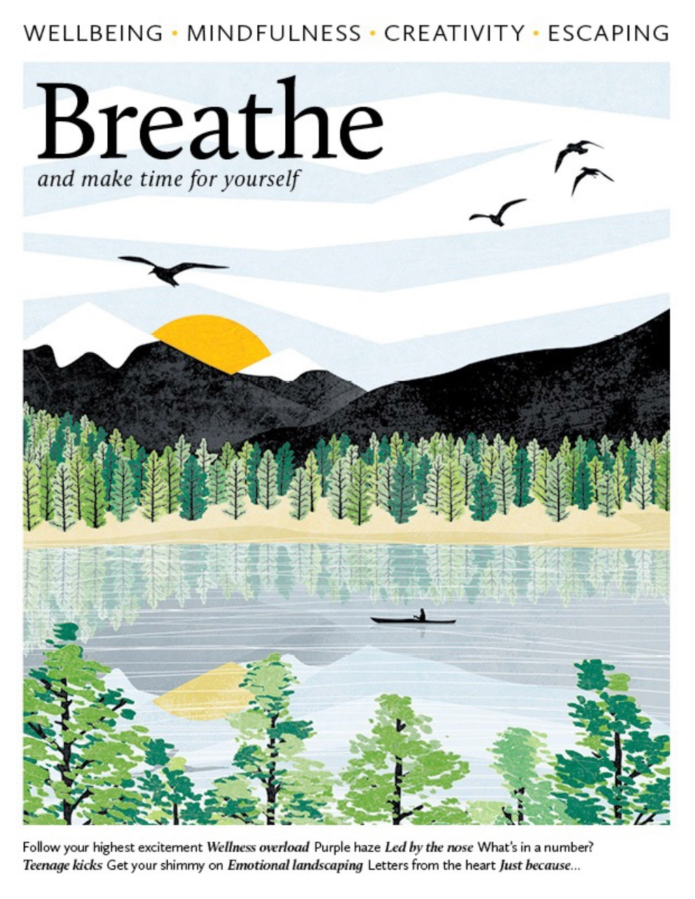
These covers are the ones that most stuck out to me when looking through, in particular the enlarged images. Each share a very restricted colour pallet, majority being cooler tones which are easy on the eye. No vibrant colours are used and I feel this really reflects the content of the magazine by not being too overwhelming. I also notice that the common focus of all these issues is the landscape rather than the components involved. I like this because it allows the viewer to take in the scene from afar and then as they look closer they are taken on a journey to the hidden storyline.
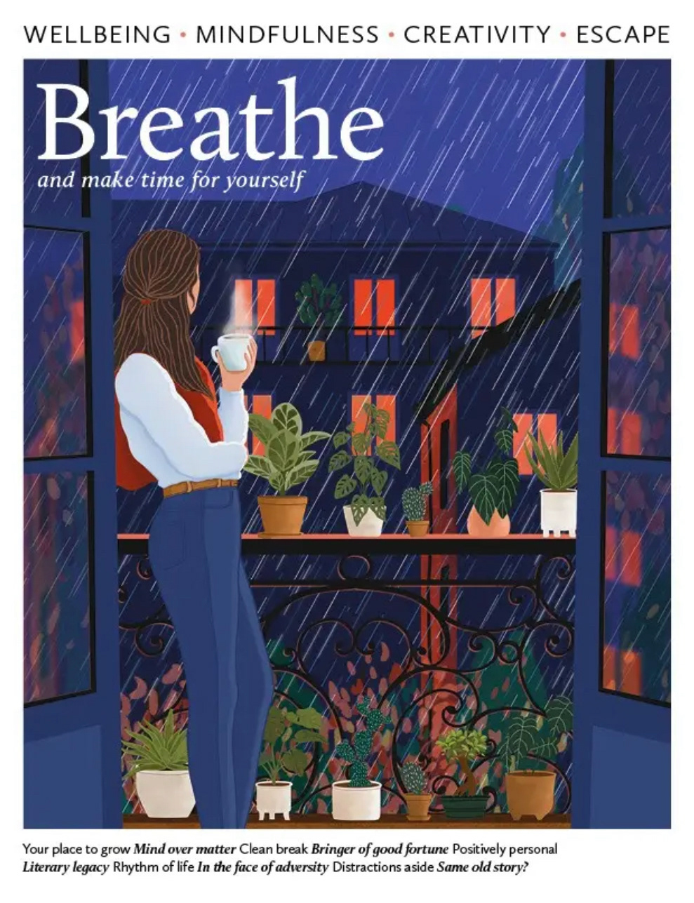
Issue 62 (left) was created by Ceyda Alasar who is a digital illustrator who's work often features whimsical and playful designs inspired by the beauty of nature and small daily pleasures. I love her piece because I can straight away feel the moment she has illustrated and it does indeed make me feel a deep sense of calm. The steam from the mug makes me feel warm and cosy with the added effect of looking out and listening to the rain. A truly soothing image that captures such a magical moment.
Issue 30 (right) was created by Ruth Thorp who is an illustrator that loves all things colour and print. She is inspired by the natural world, incredible landscapes and a sense of adventure which again is captured so well in her piece. Likewise with Ceyda's, I can feel the relief just from looking at her cover. The open lake with the mountains is breath-taking and when you spot the person in the boat you instantly feel the peace felt from being in that position. Another incredibly successful piece.
What I have realised looking into this is that I want to be able to create my own peaceful moment involving my imagery of the sea. This is what I will now focus on developing.
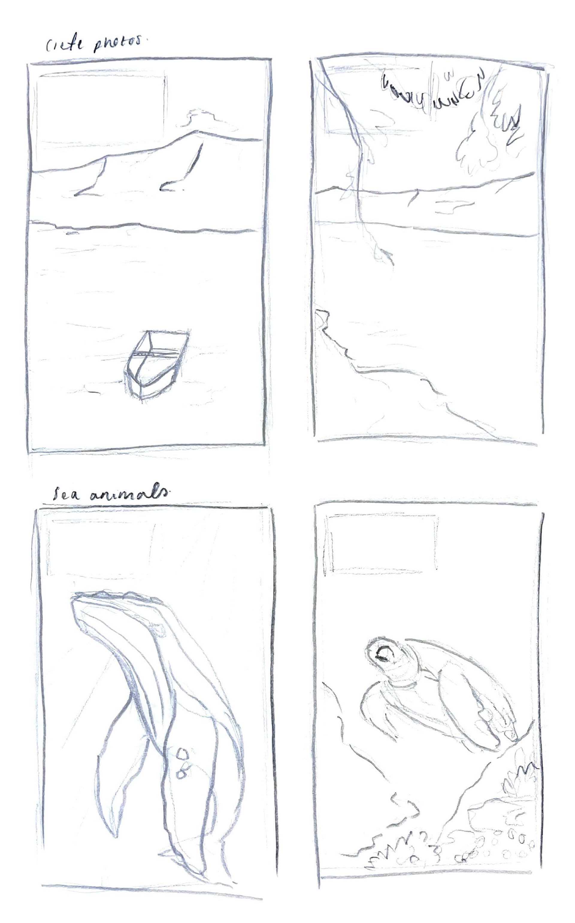
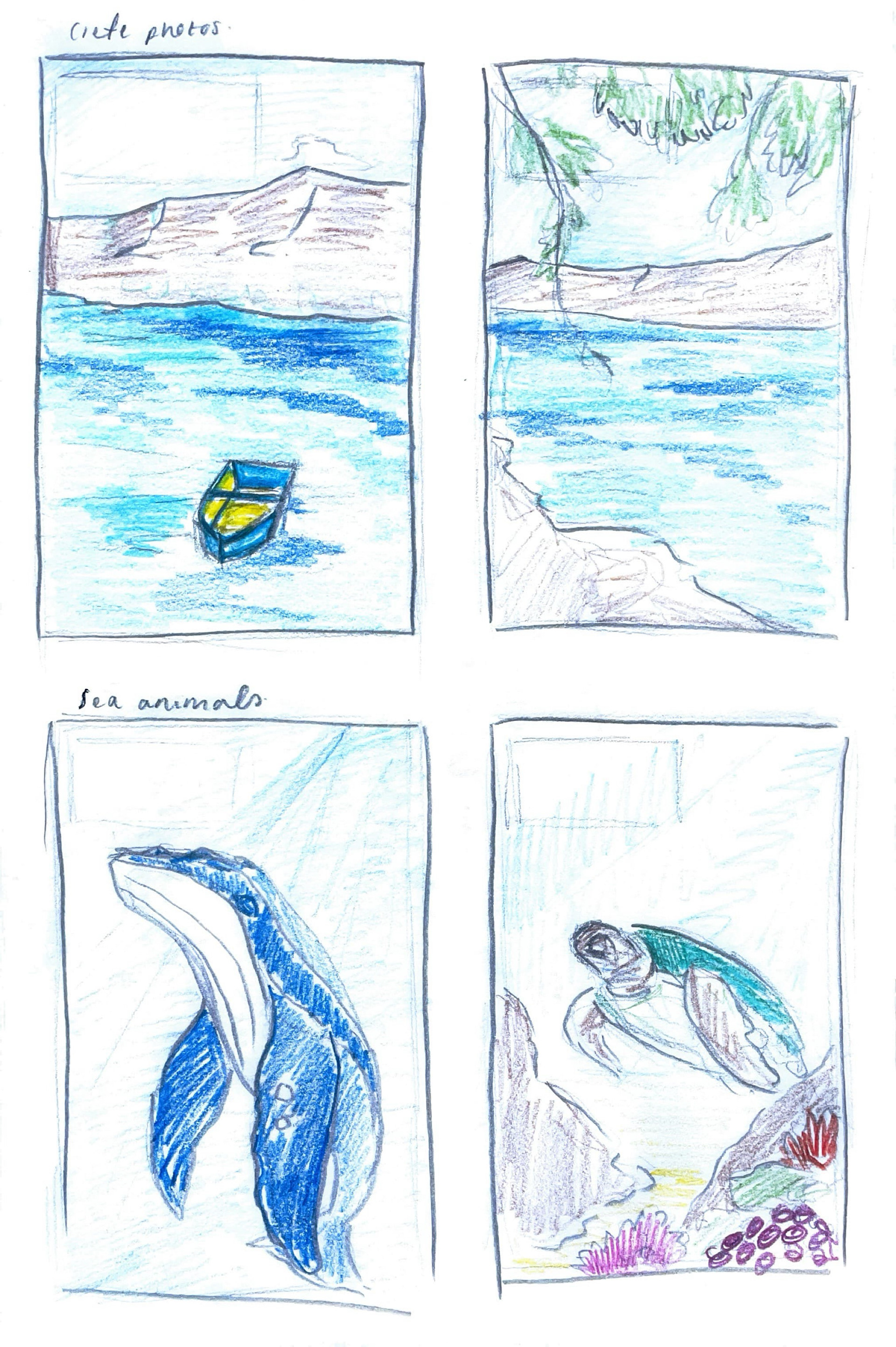
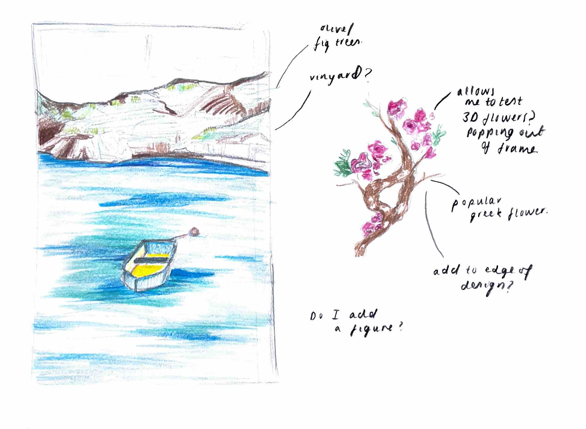
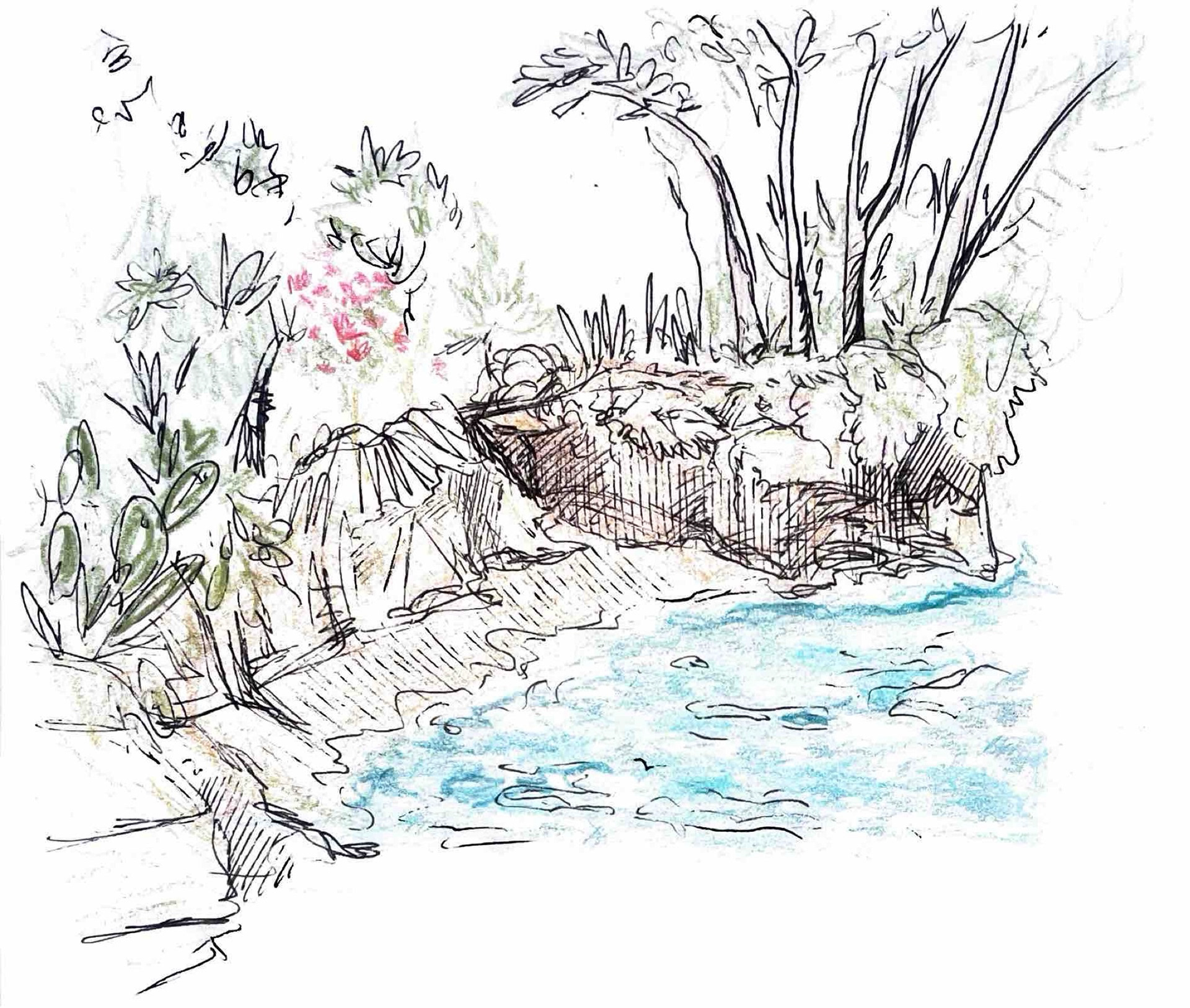
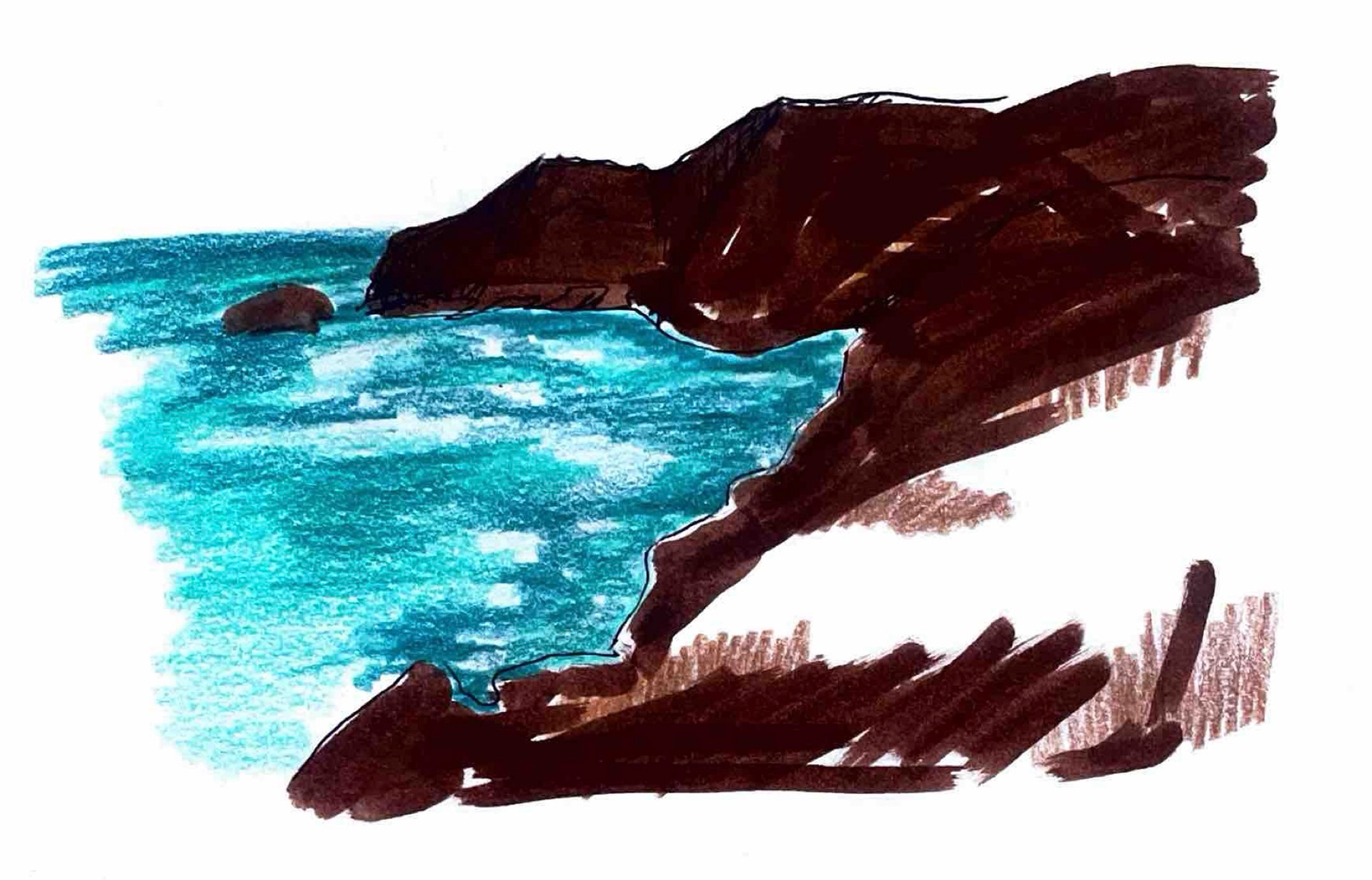
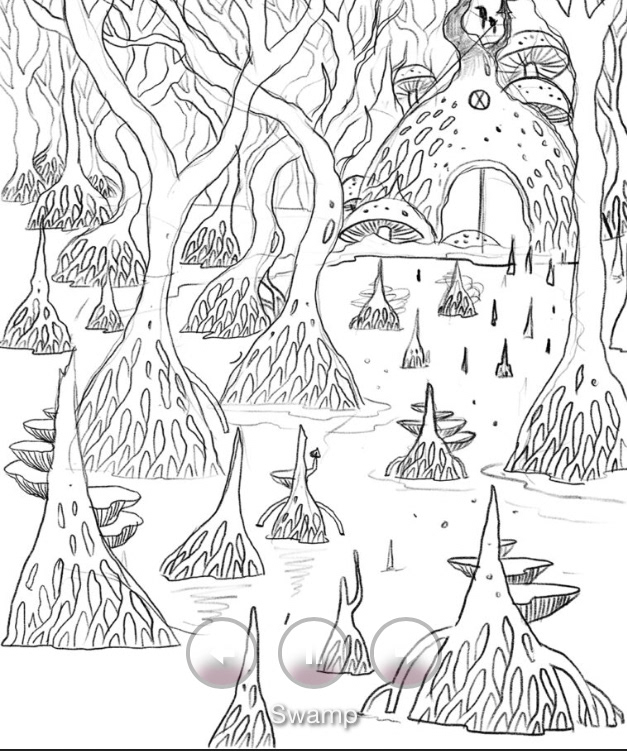
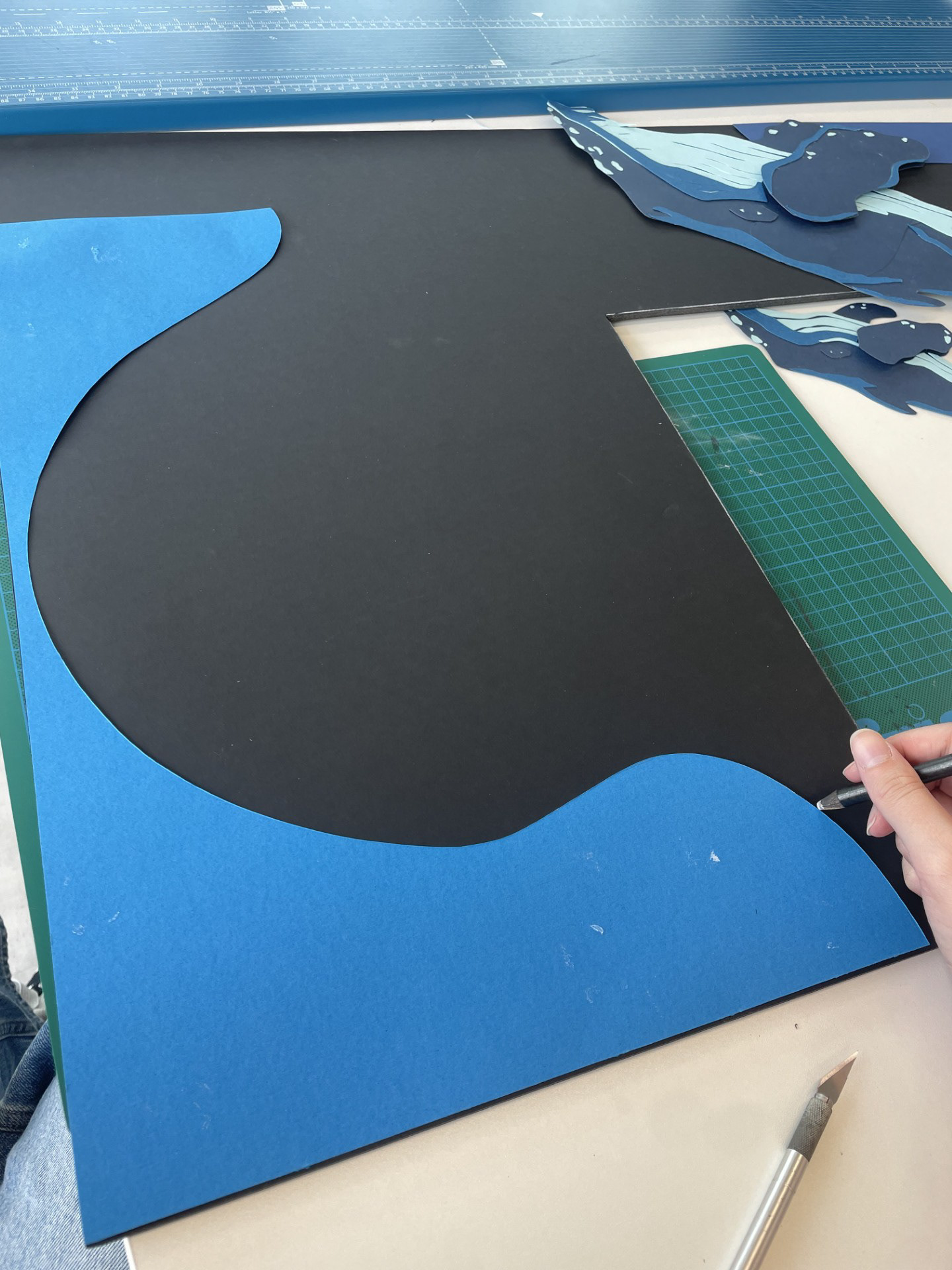
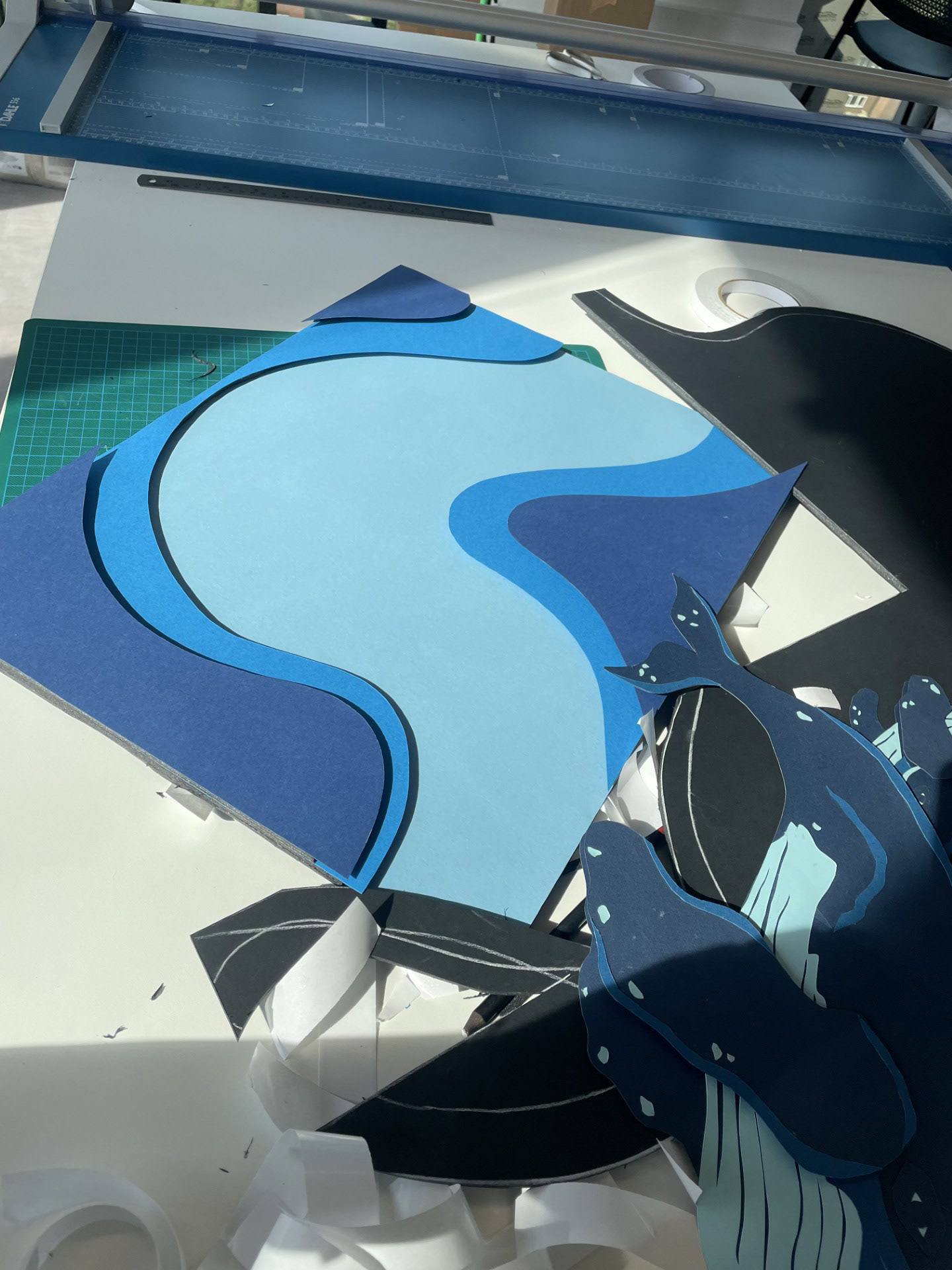
I have started drawing up some thumbnails of loose ideas. One part focuses on the ocean from a land POV and the other looking at a scene from within the water. I think moving forward I want to keep my designs broad until I know for sure which composition I prefer. I also think it could be successful having multiple finals to choose from.
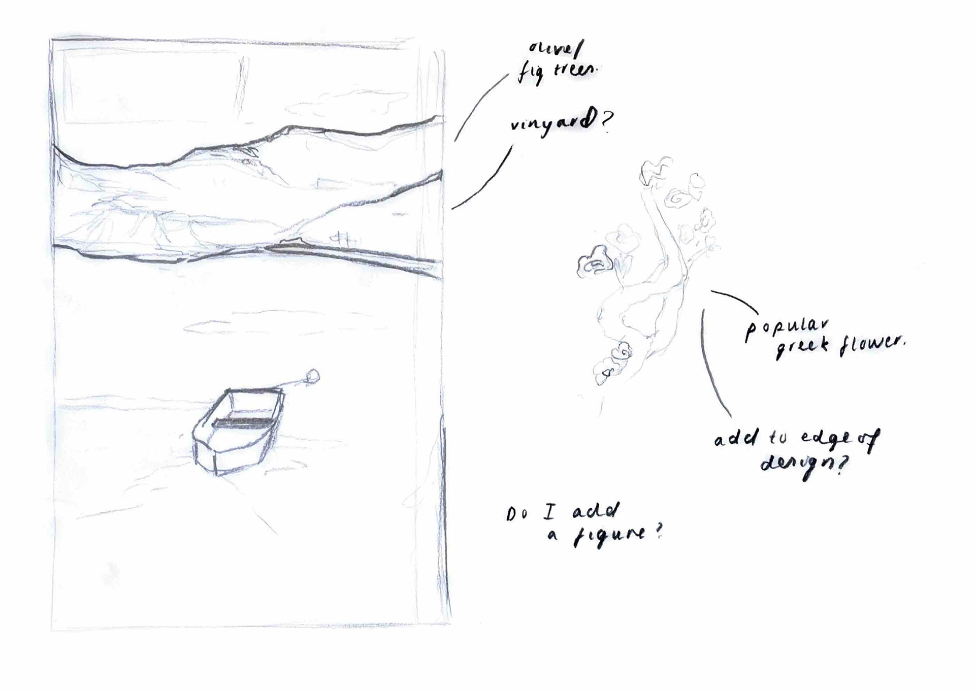
When using imagery from my Crete trip I have started to think about slightly altering/combining certain aspects. This will allow me to experiment with more textures and methods such as three dimensional flowers growing out of the frame.
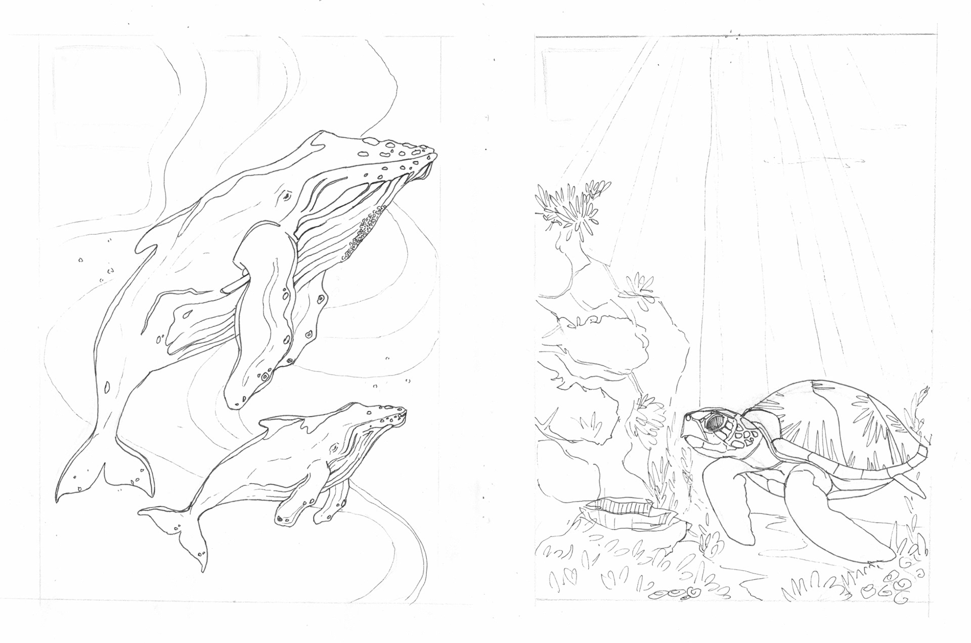
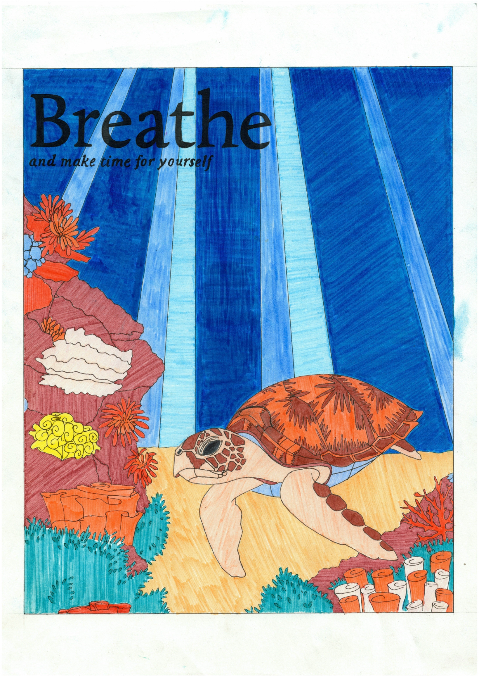
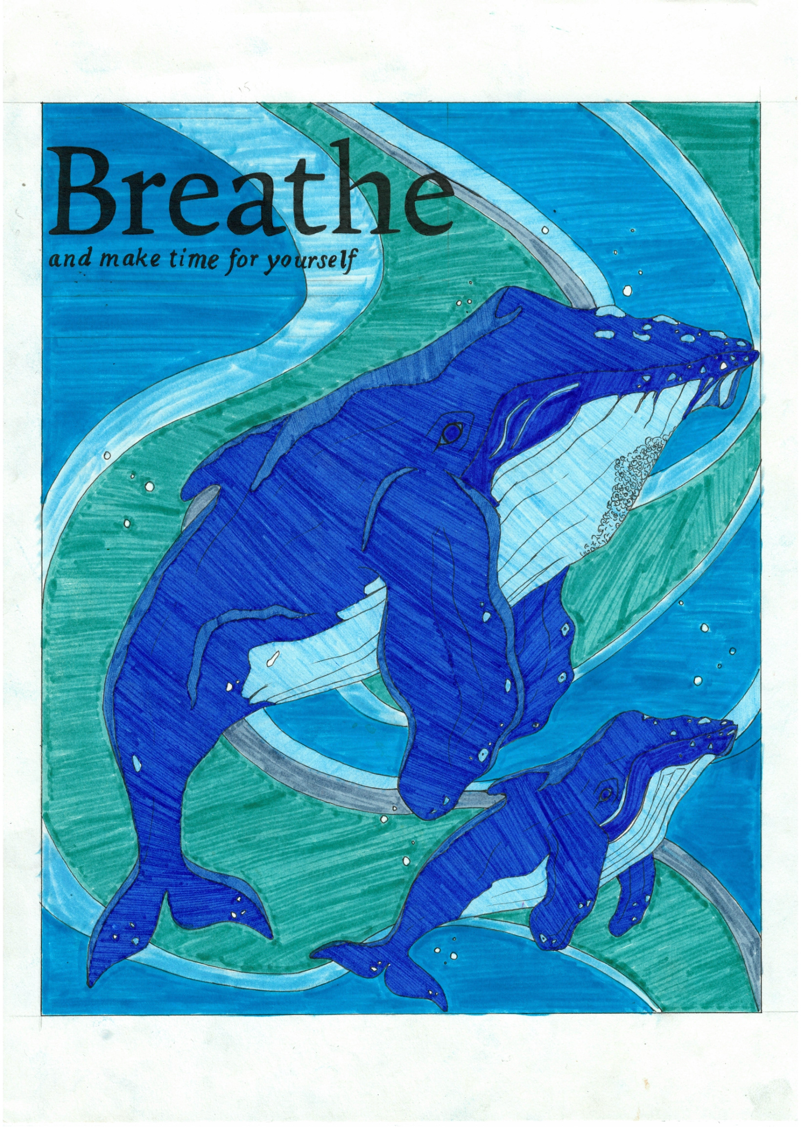
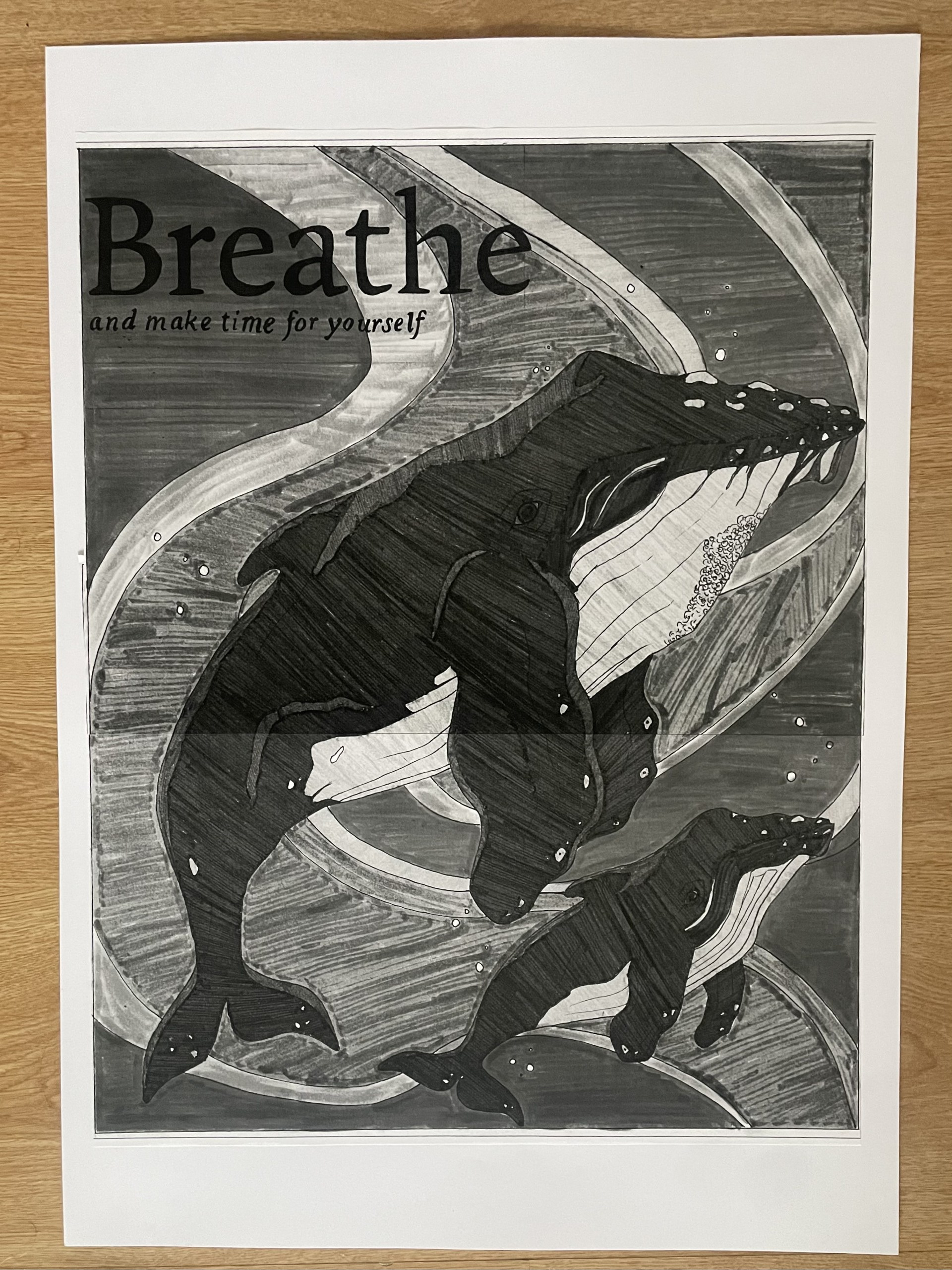
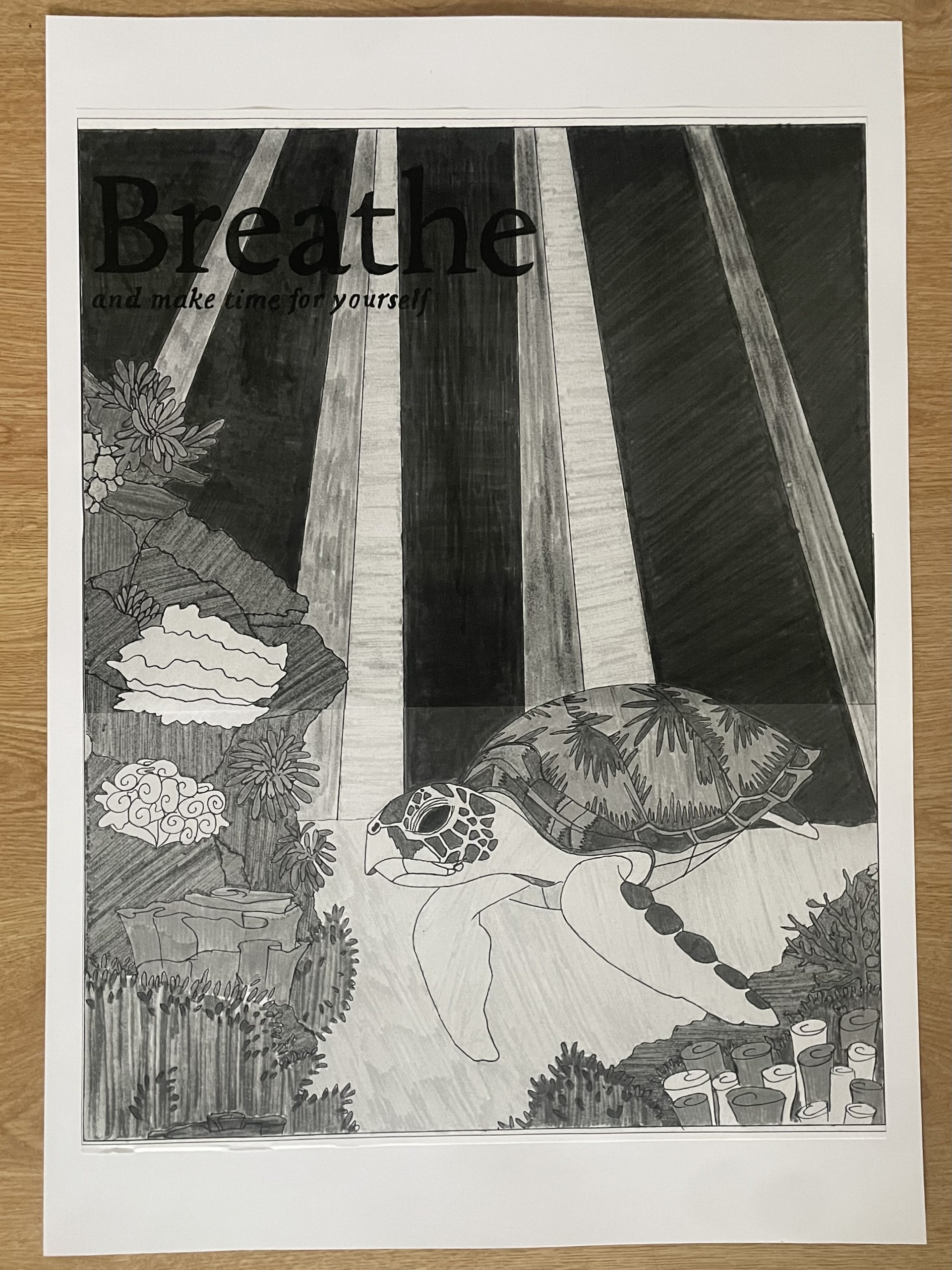
After a lot of thought I narrowed my designs down to the 2 above. I feel that the underwater scenes are more successful in creating that calming atmosphere because you are completely engulfed in the water. I was sure to only include animals that represented peace rather than creating any unwanted chaos. As well as this, I thought it was important to create the effect of light coming in from above the water. This is because the gentle light patterns push that sense of calm.
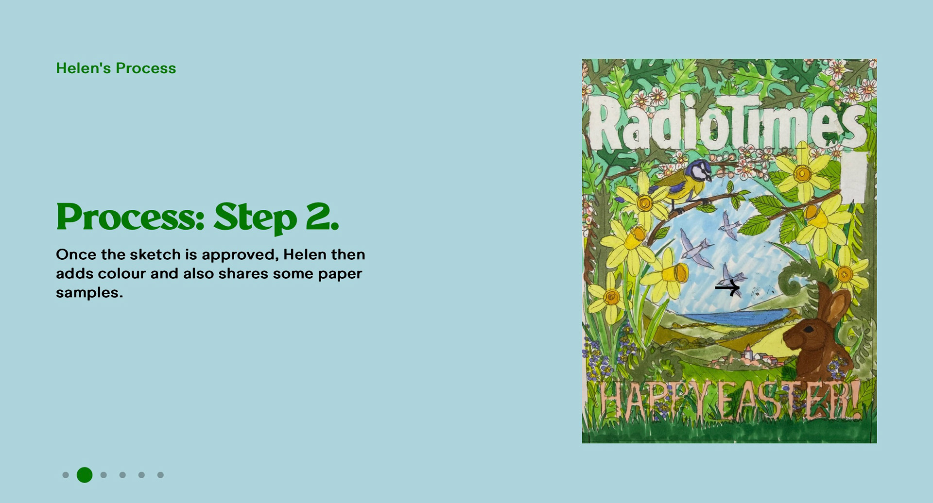
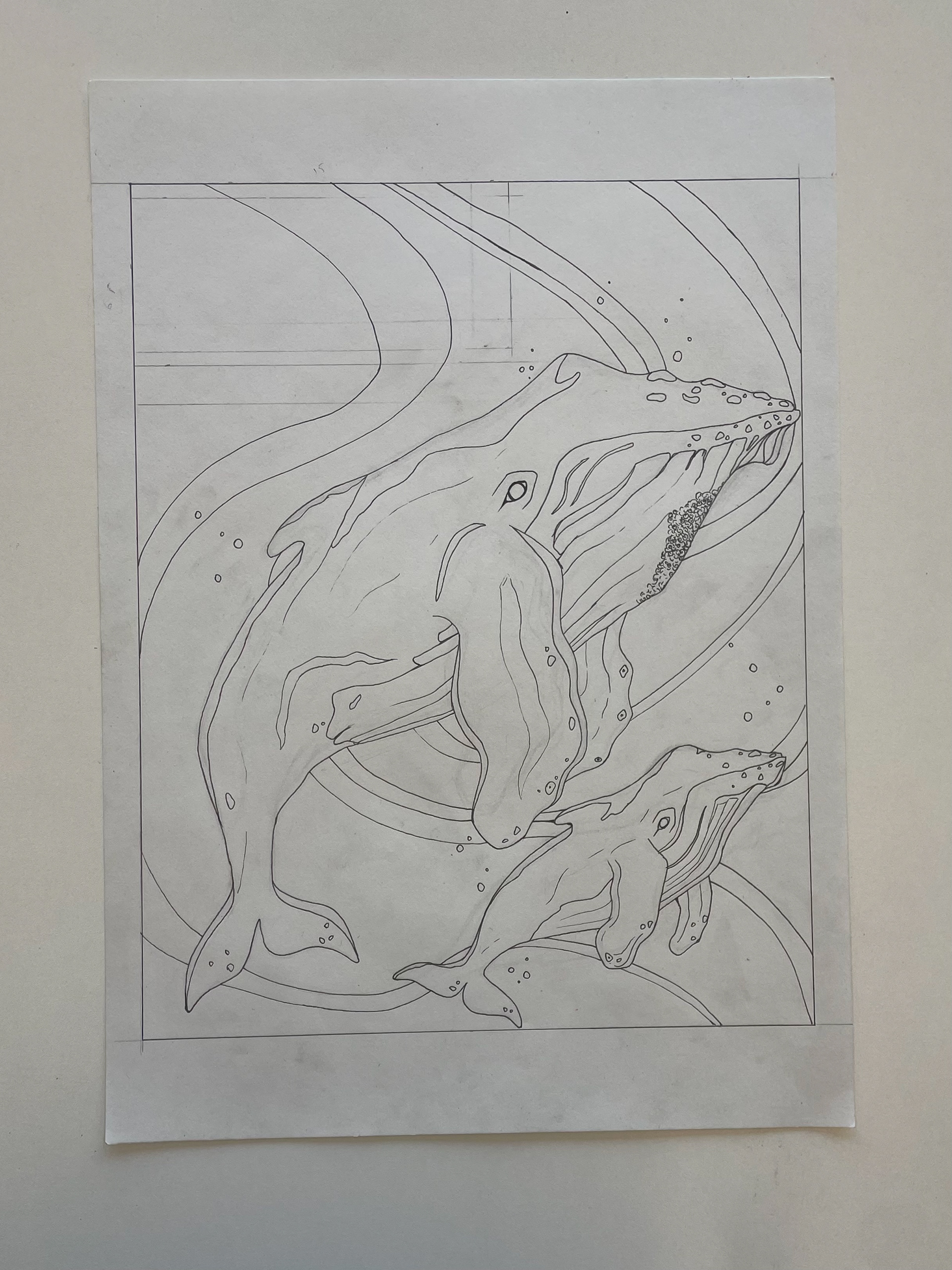
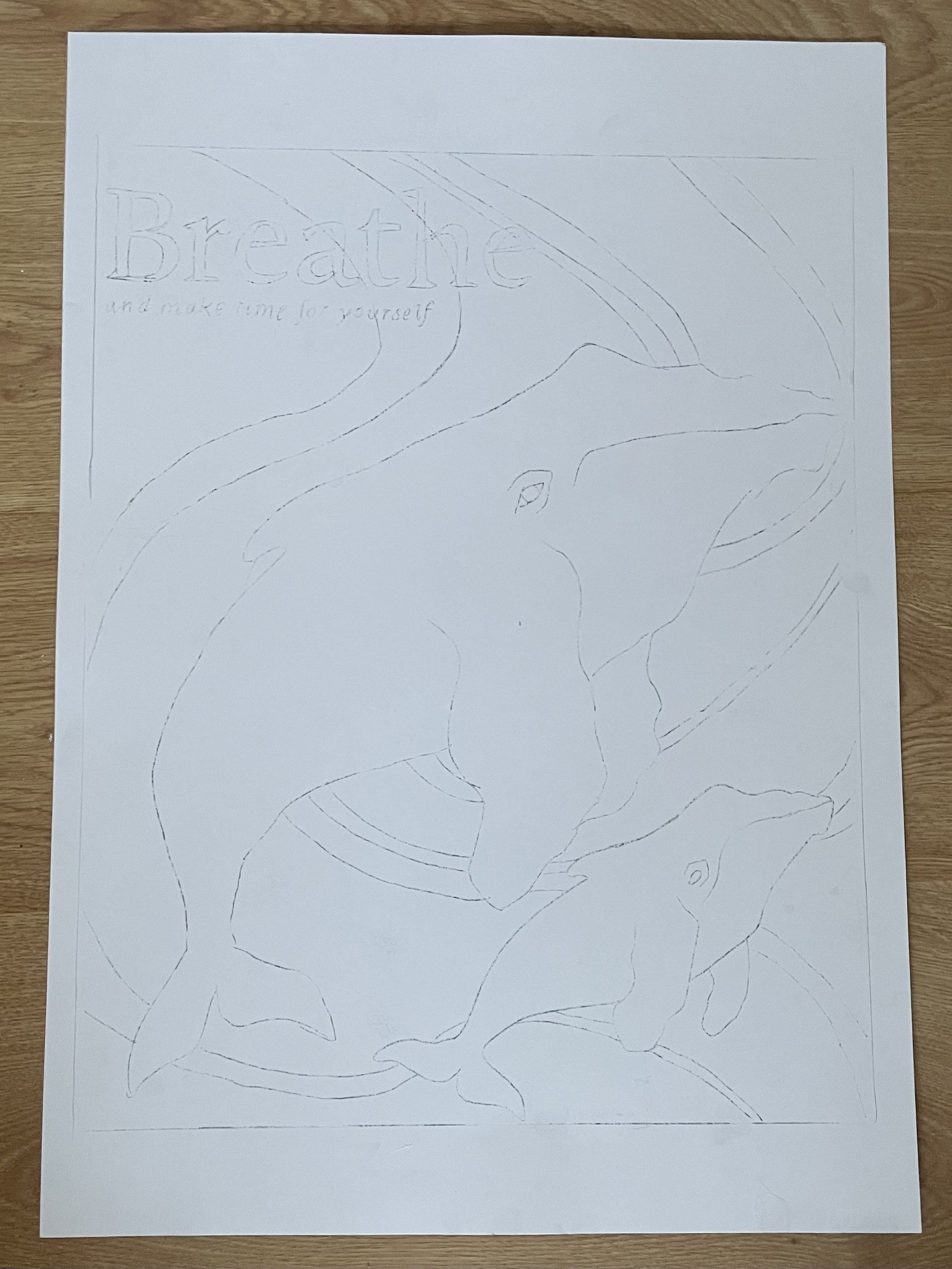
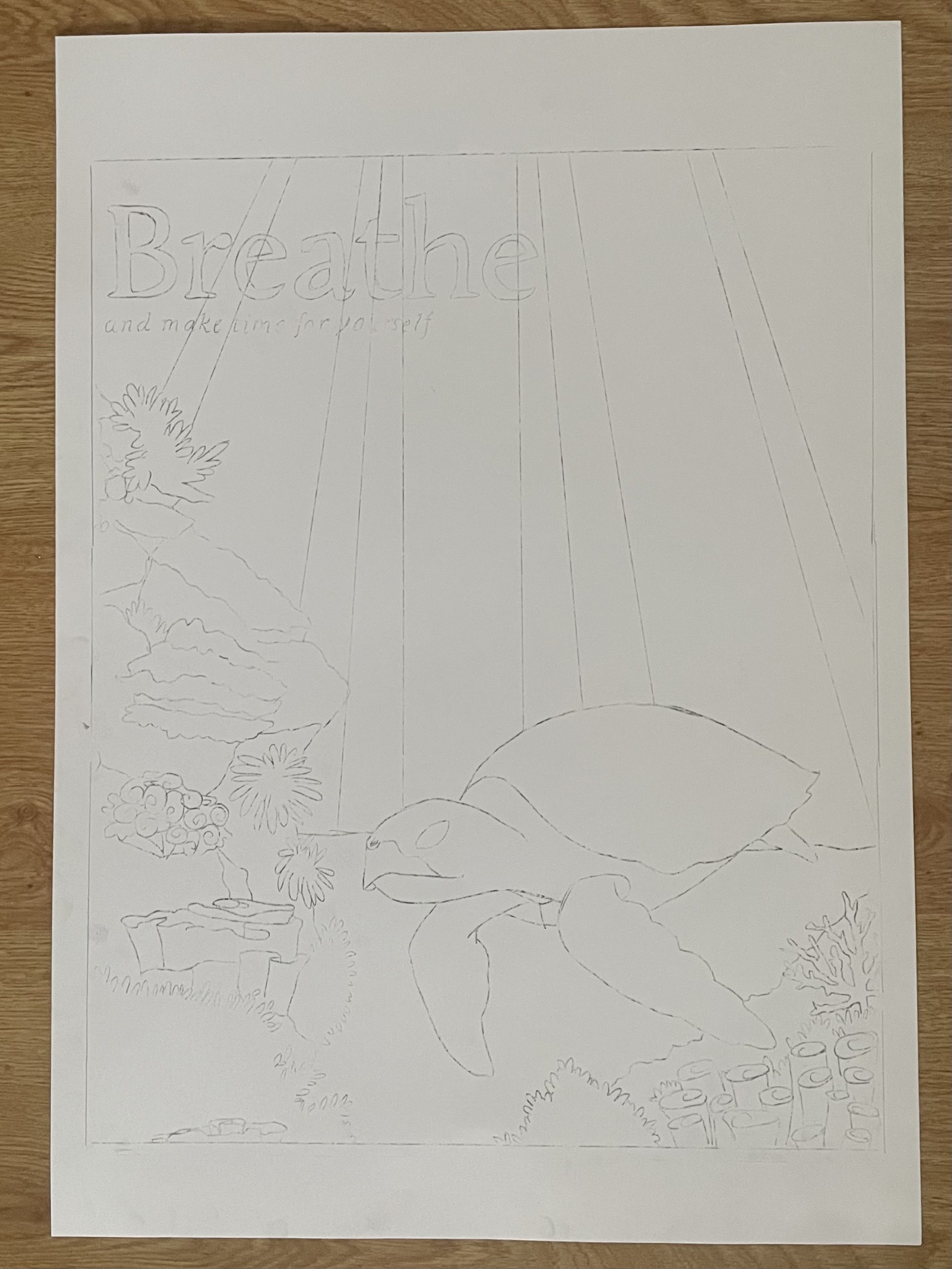
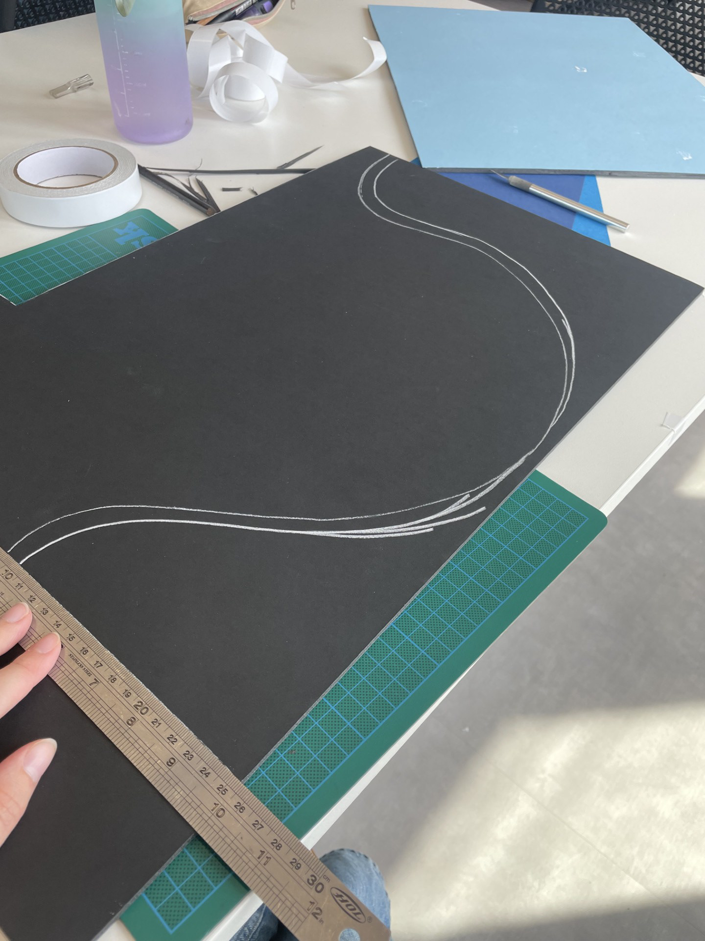
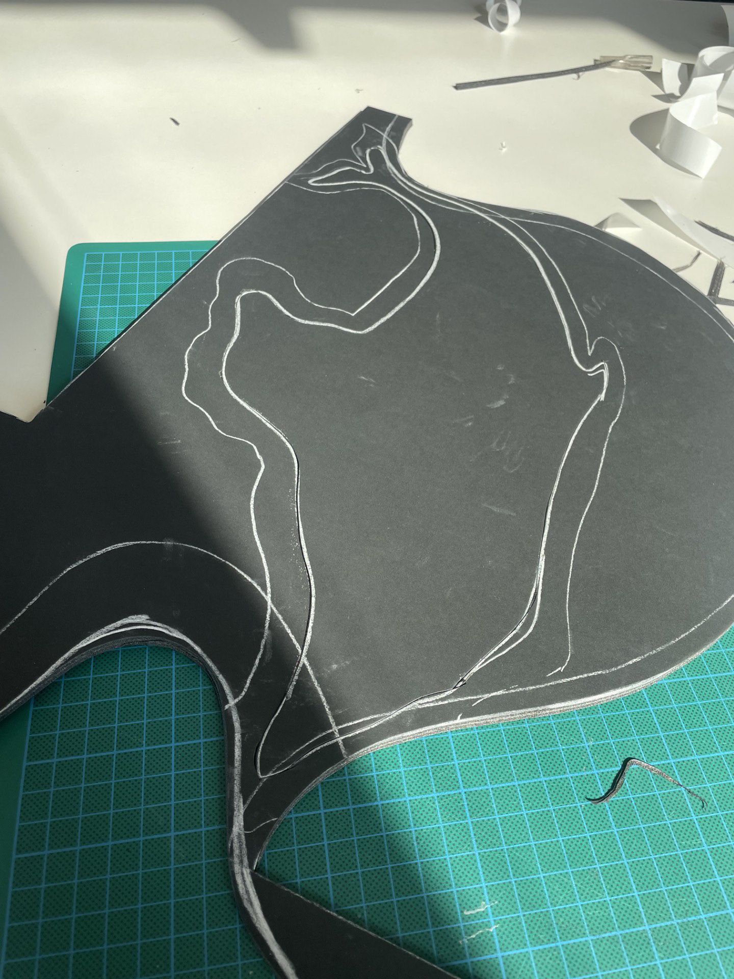
Step - THe sketch
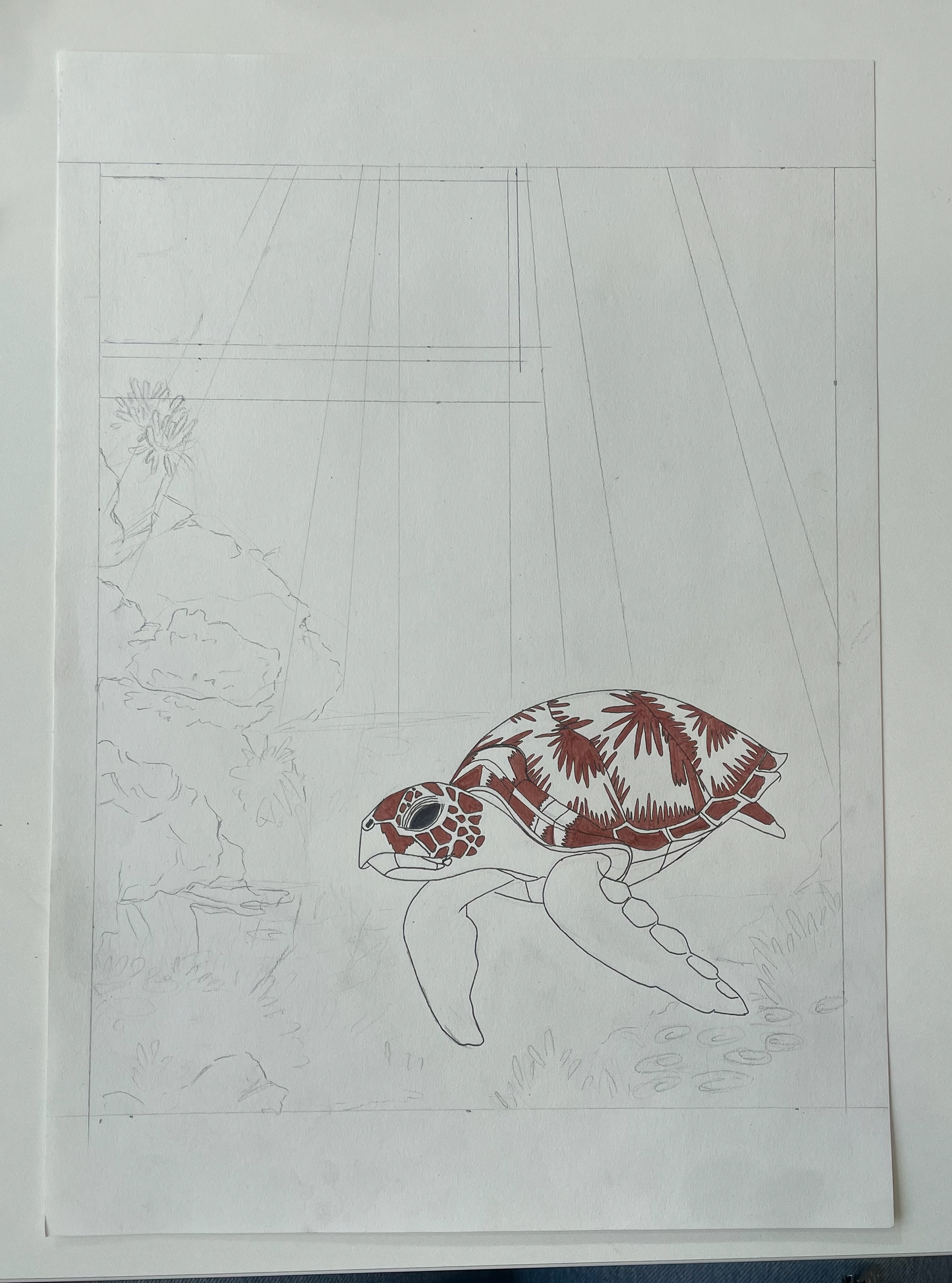
Step 2- adding colour
Exploring light
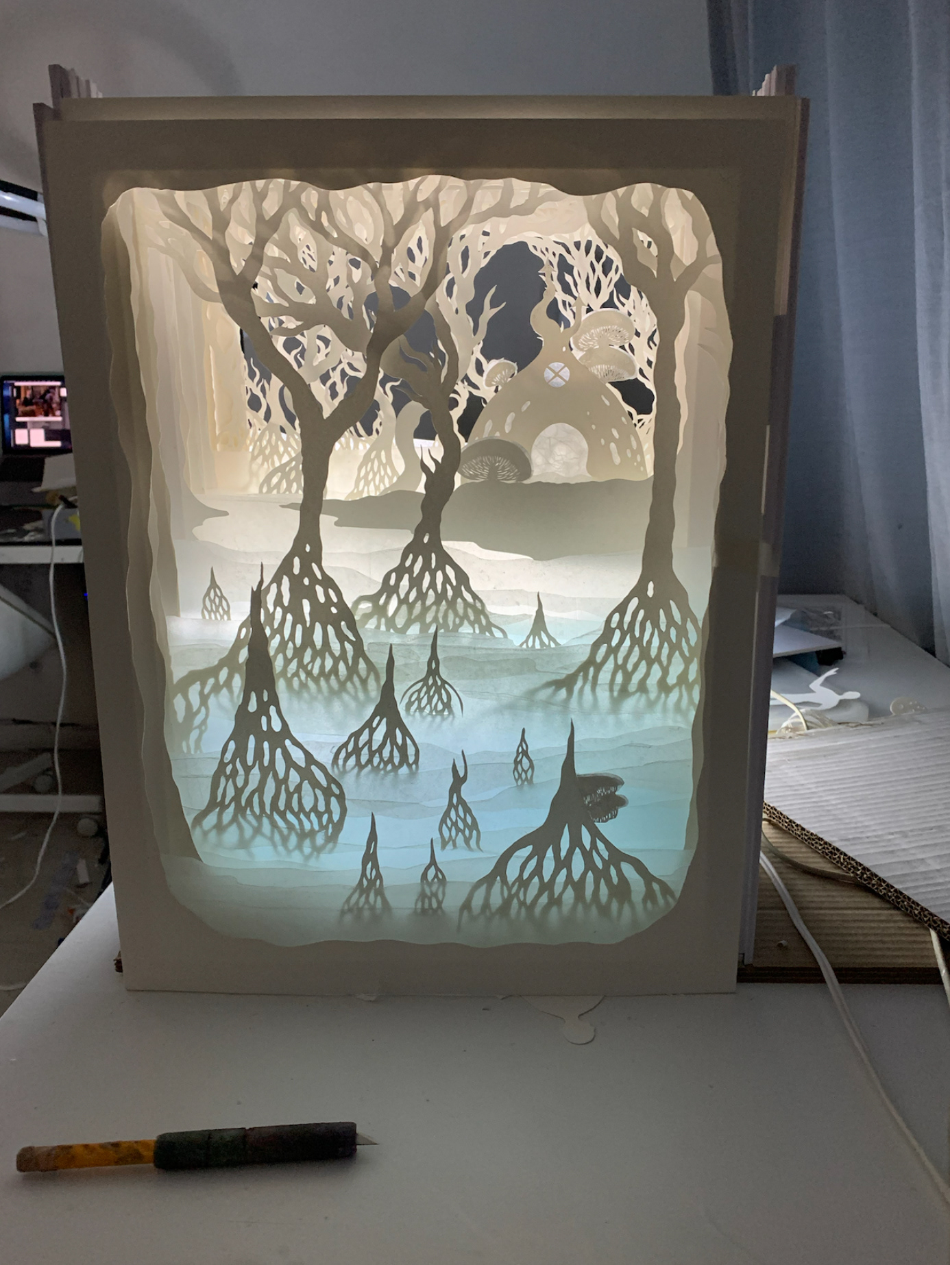
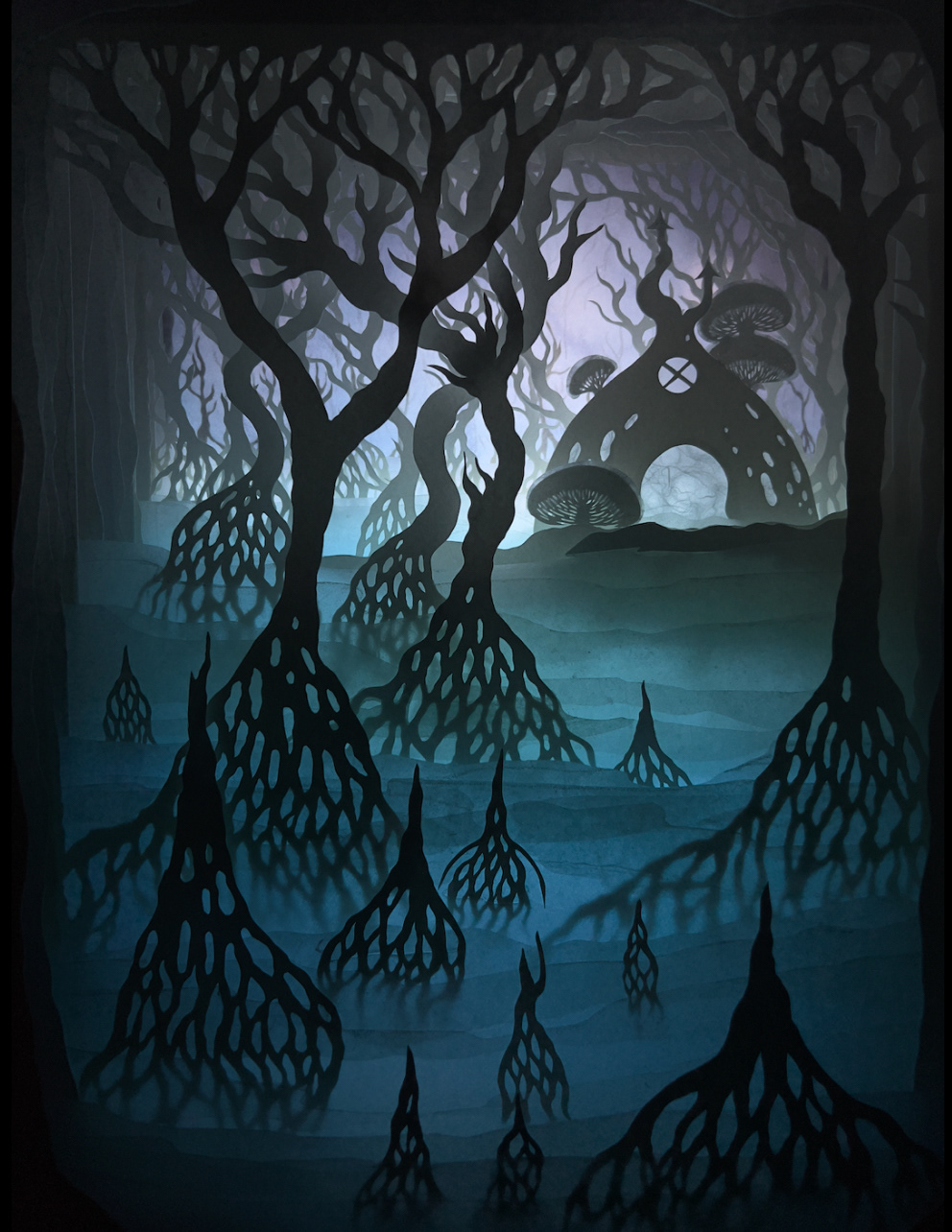
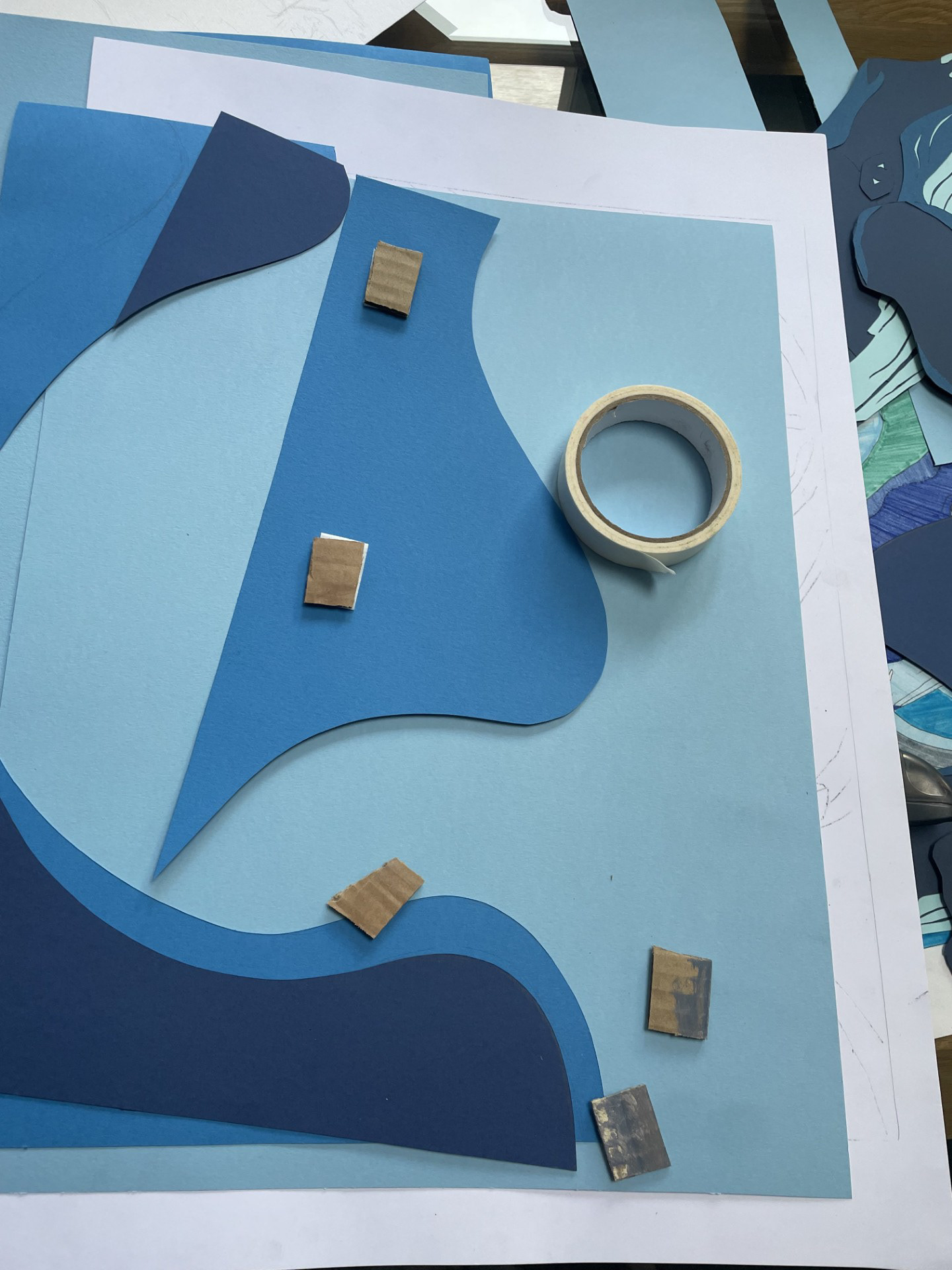
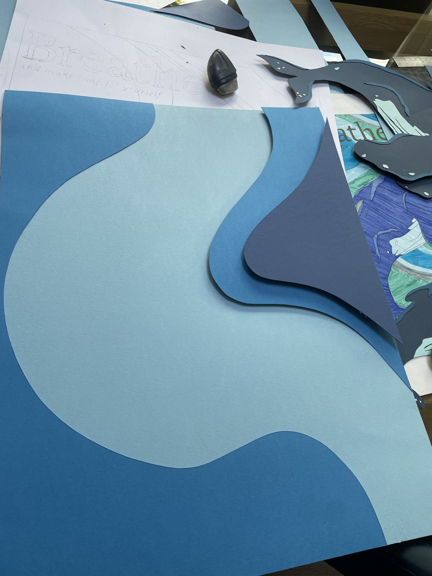
Having decided on my 2 designs to move forward with, I’ve started to think about how I could push this even further to make it more successful as a final piece. In both pieces a stream of light is evident, this is key to creating a calming atmosphere- having the gentle rays of light encircle the other components in some way. From this the question of ‘how could I incorporate real light into my work?’ arose. You do this by placing the paper cut between a light source and a viewing surface, typically using a light box with LED strips behind the paper layers- allowing the light to illuminate the intricate details of the cut.
Key points include: Layering- the varying layers of paper will create depth and dimension with the light. Paper- Thinner paper will allow the light to pass through more effectively and so for the areas that are meant to be the brightest areas should be made with the thinnest material.
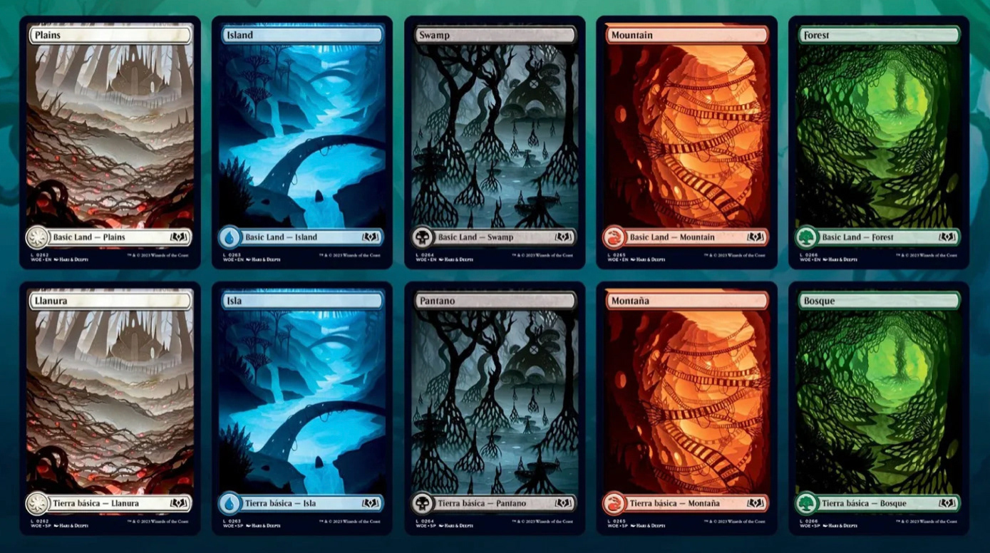
Hari & Deepti
Hari & Deepti are papercut artists creating their work with incredibly precisely painted and cut paper, expertly lit into shadow boxes, and then photographed for the cards. They start by drawing the scene and then dividing them into layers on a piece of translucent vellum and then hand cutting individual layers of paper. Sometimes they hand paint certain layers, especially the backgrounds. Their aim is to get a perfect balance where paper and light are ‘equal players’. Assembly takes a lot of time and it doesn’t fully come together until the light is added- sometimes it works, sometimes it doesn’t. This is where they may take out certain layers or re paint the background.
I found this entire process extremely fascinating to see broken down. As soon as the light was added it brought the entire scene to life, and even then it had the power to alter the feel of the piece by lighting it at night as well as during the day. This would be really fun to incorporate into my paper cuts.
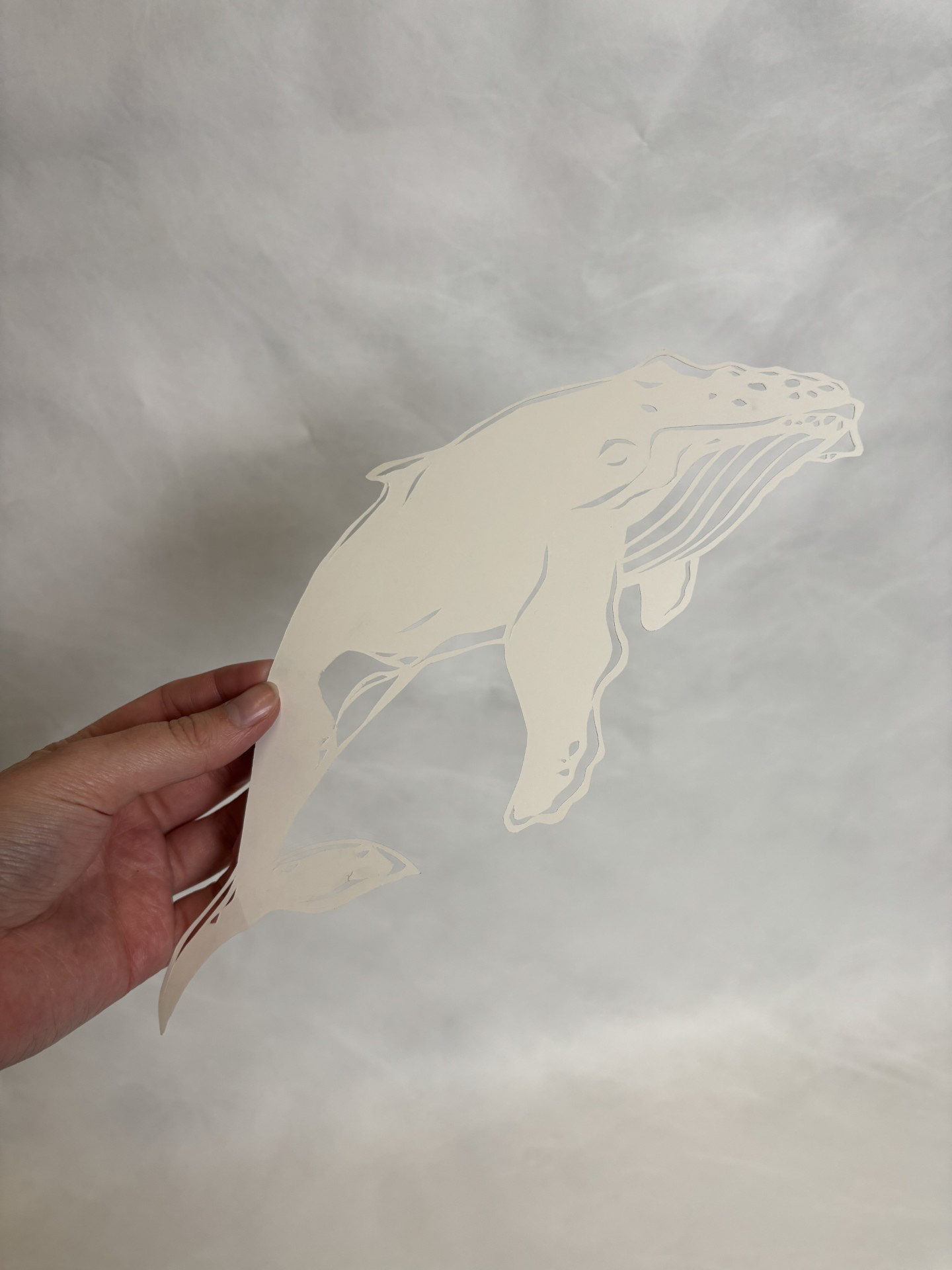
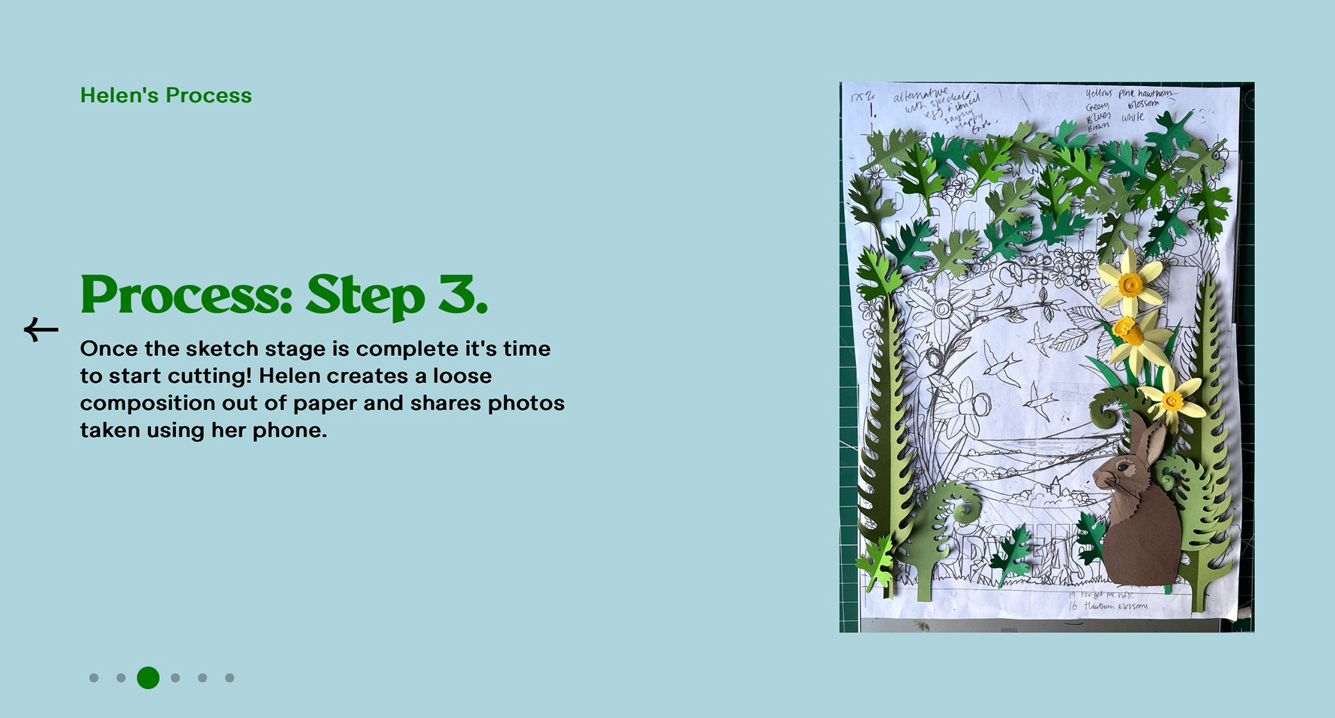
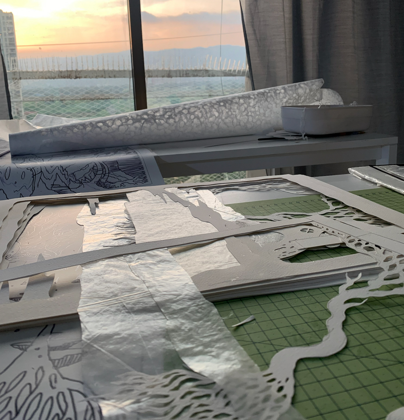
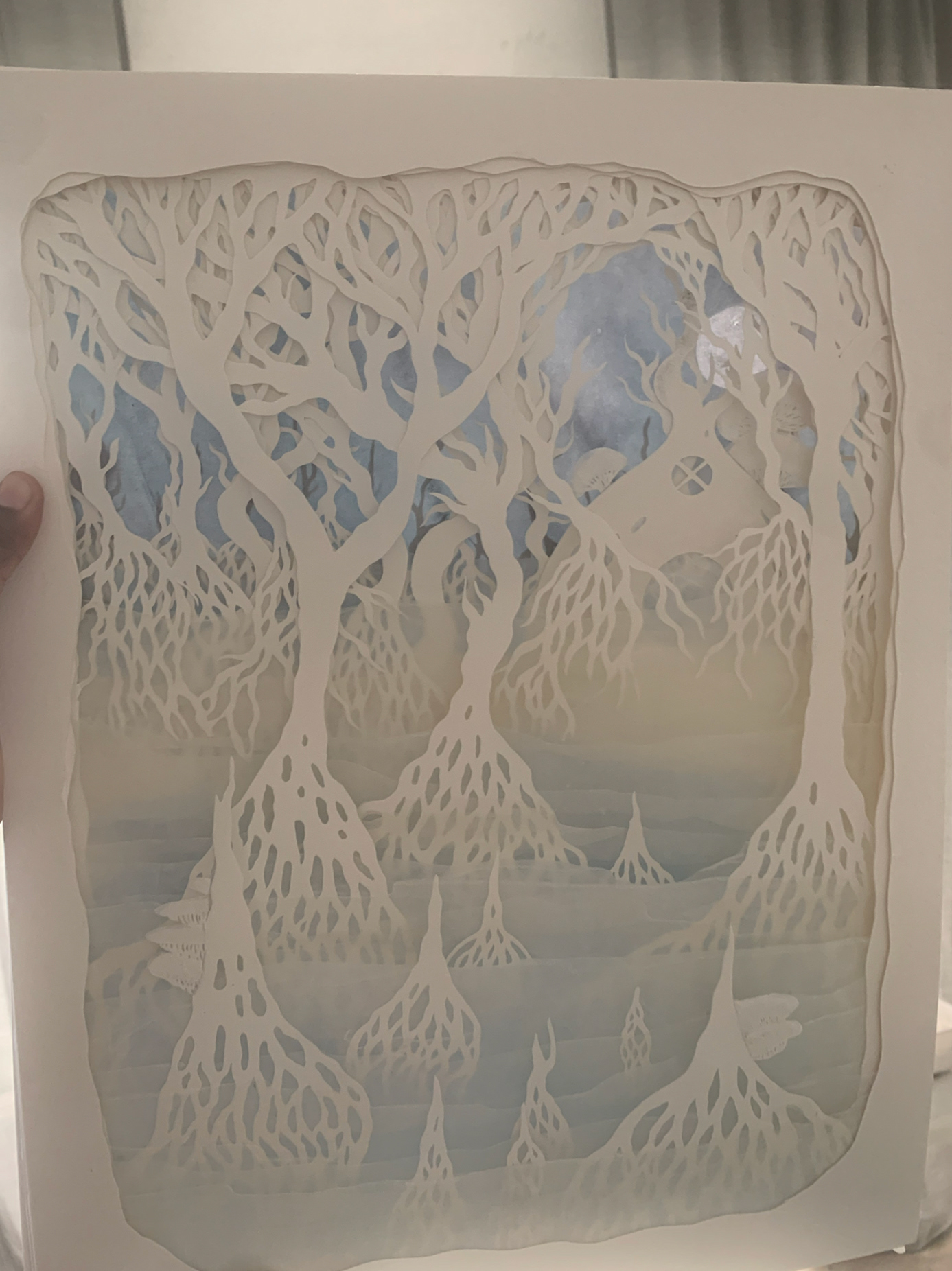
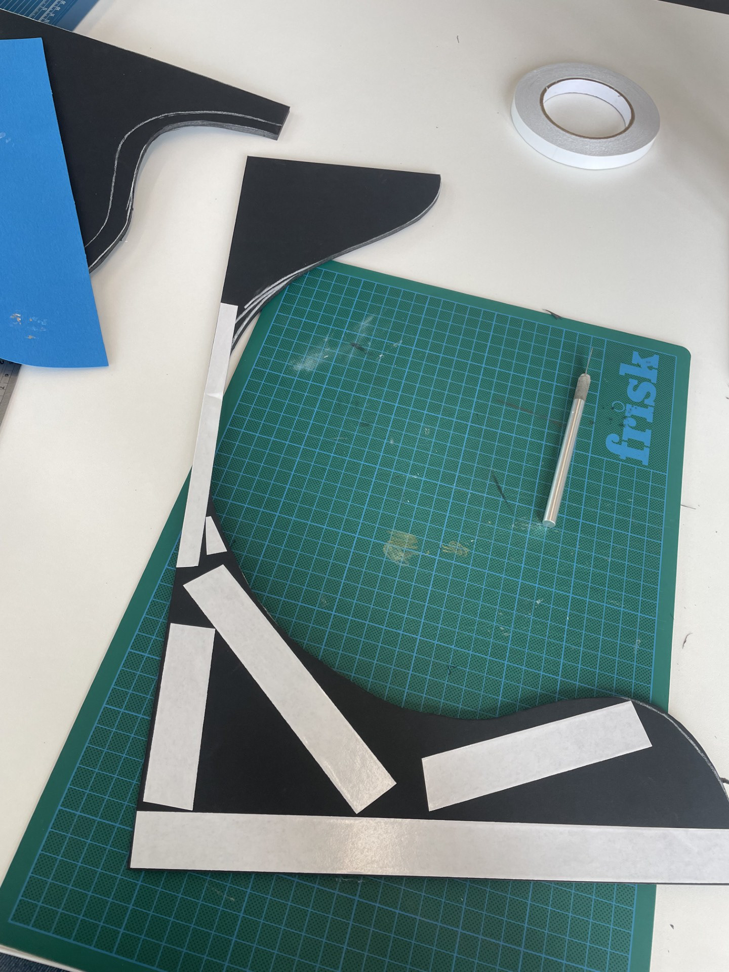
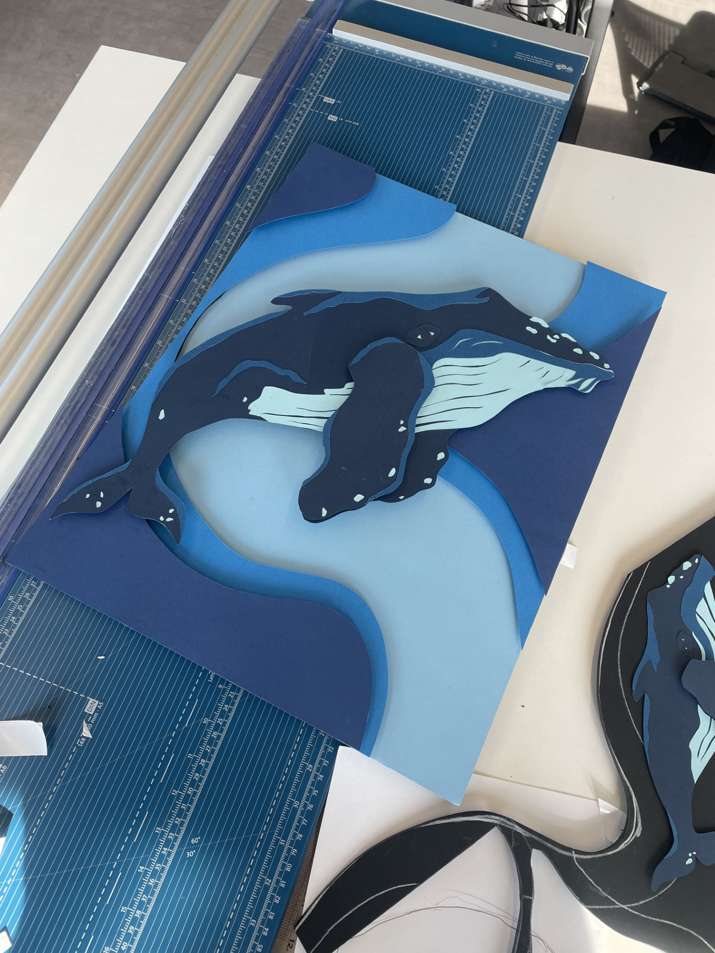
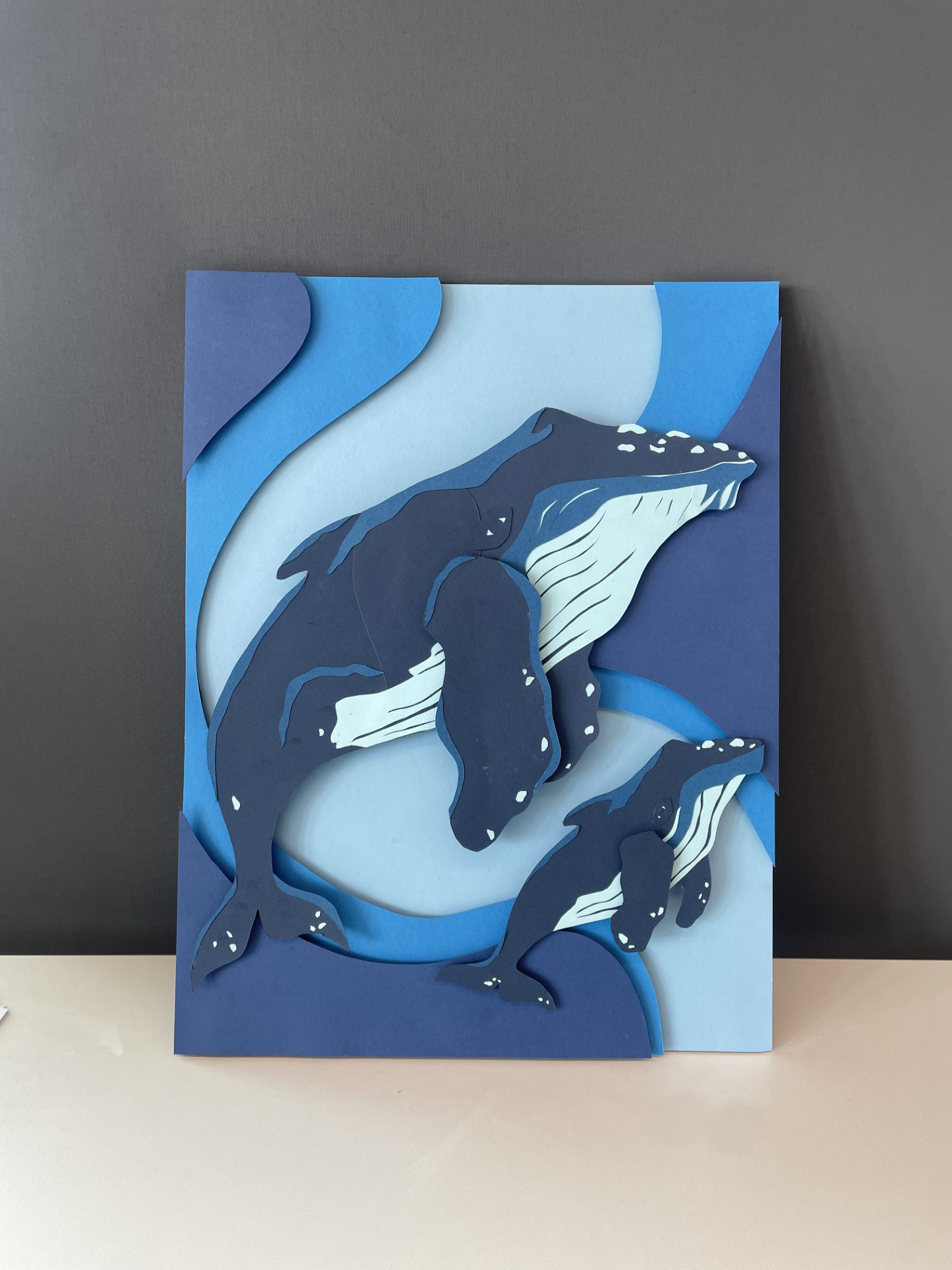
step 3- cutting the components
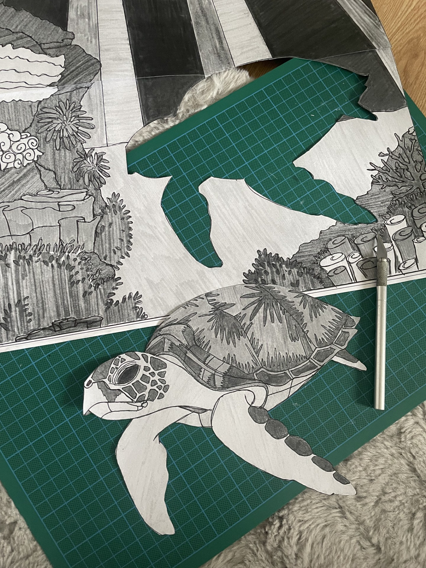
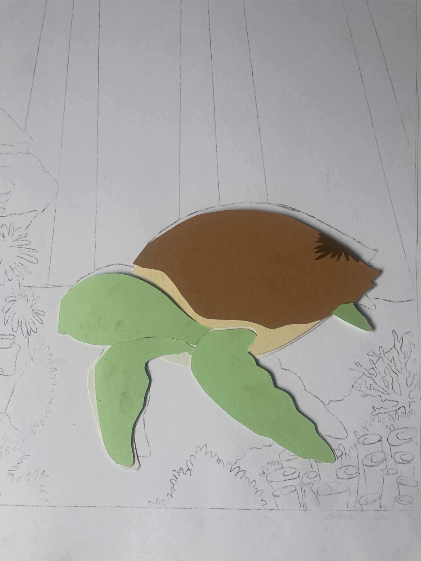
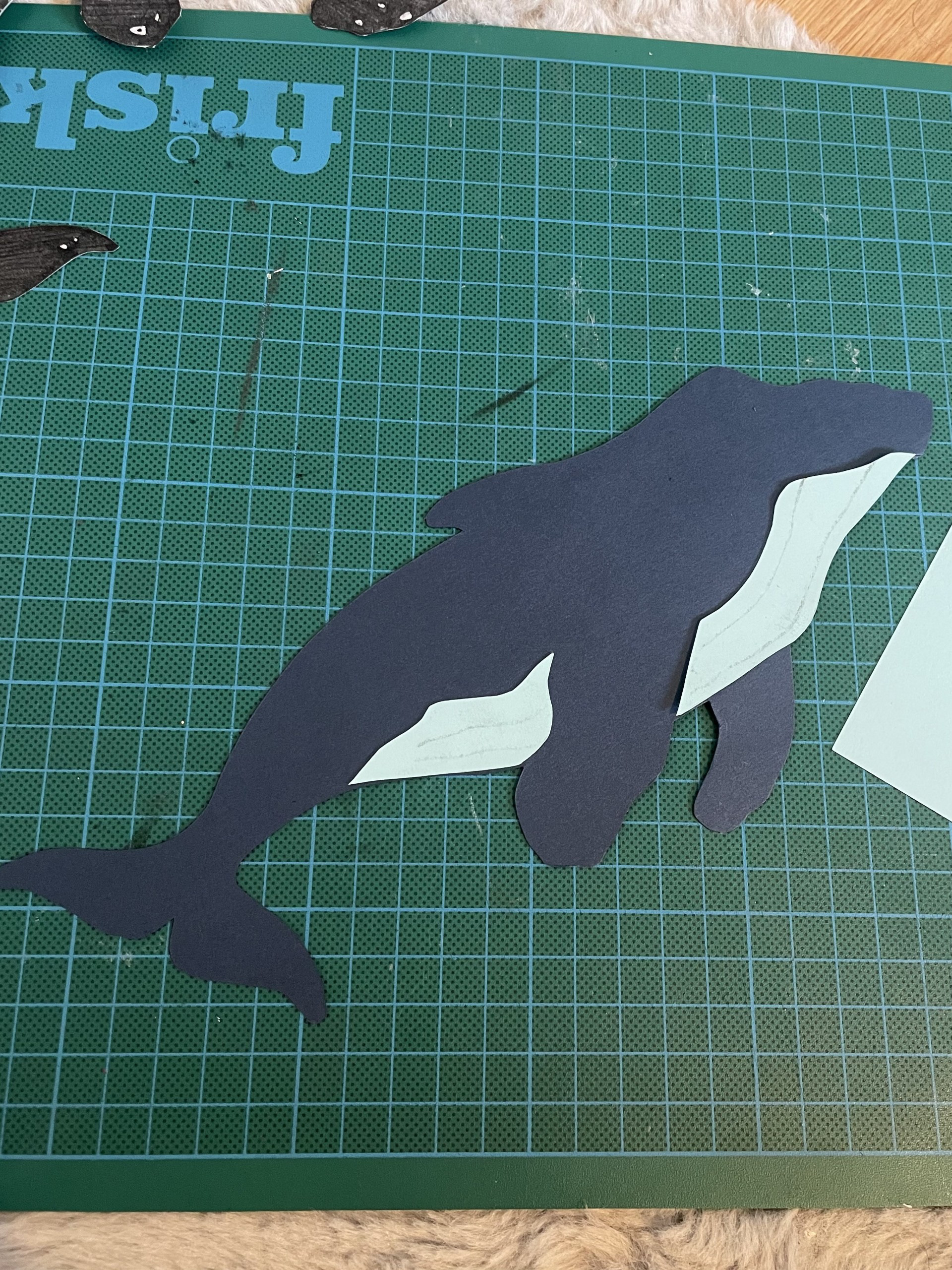
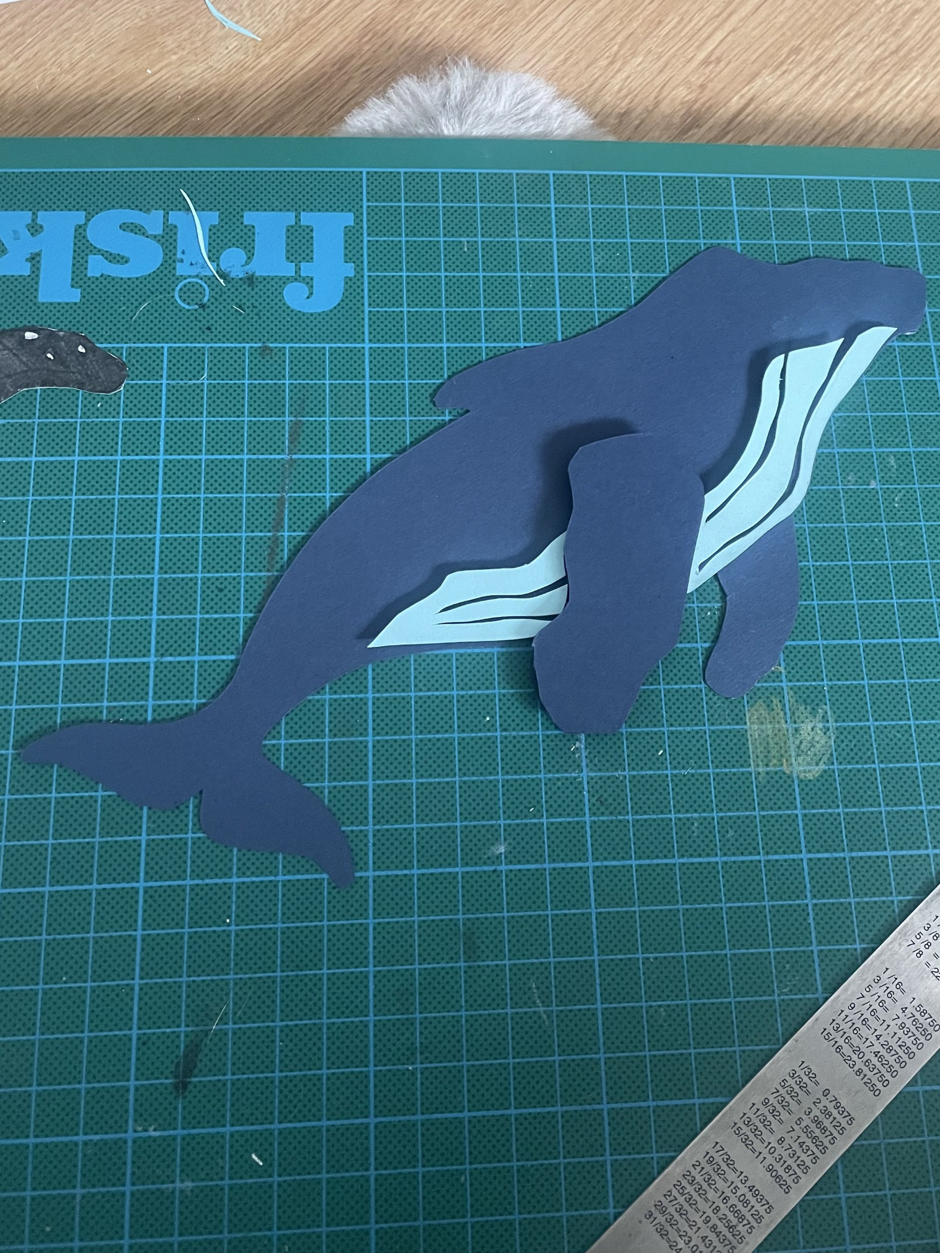
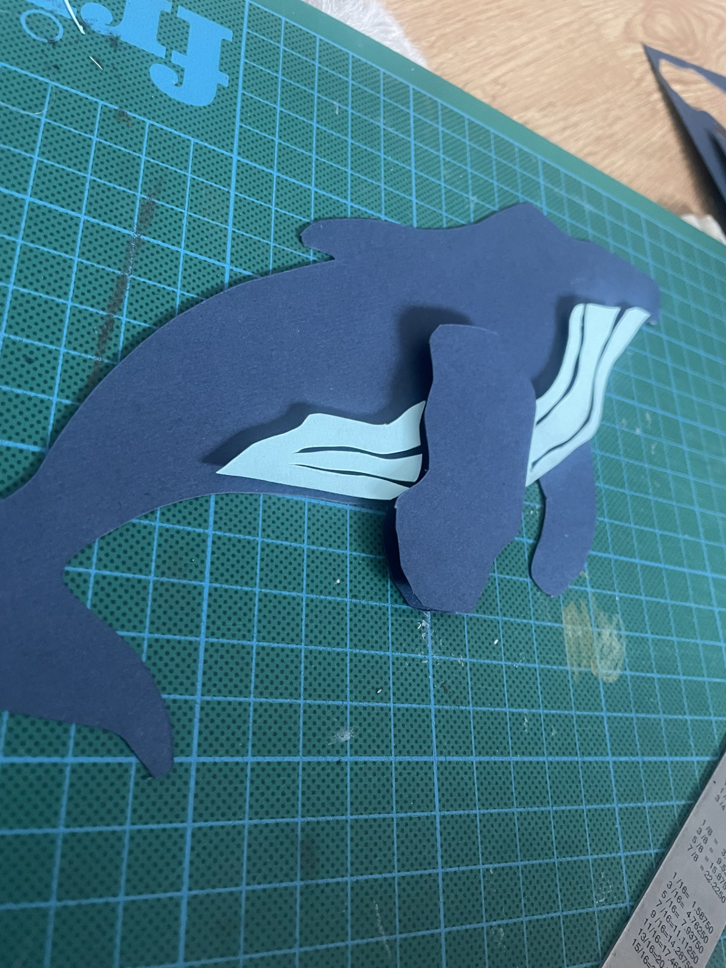

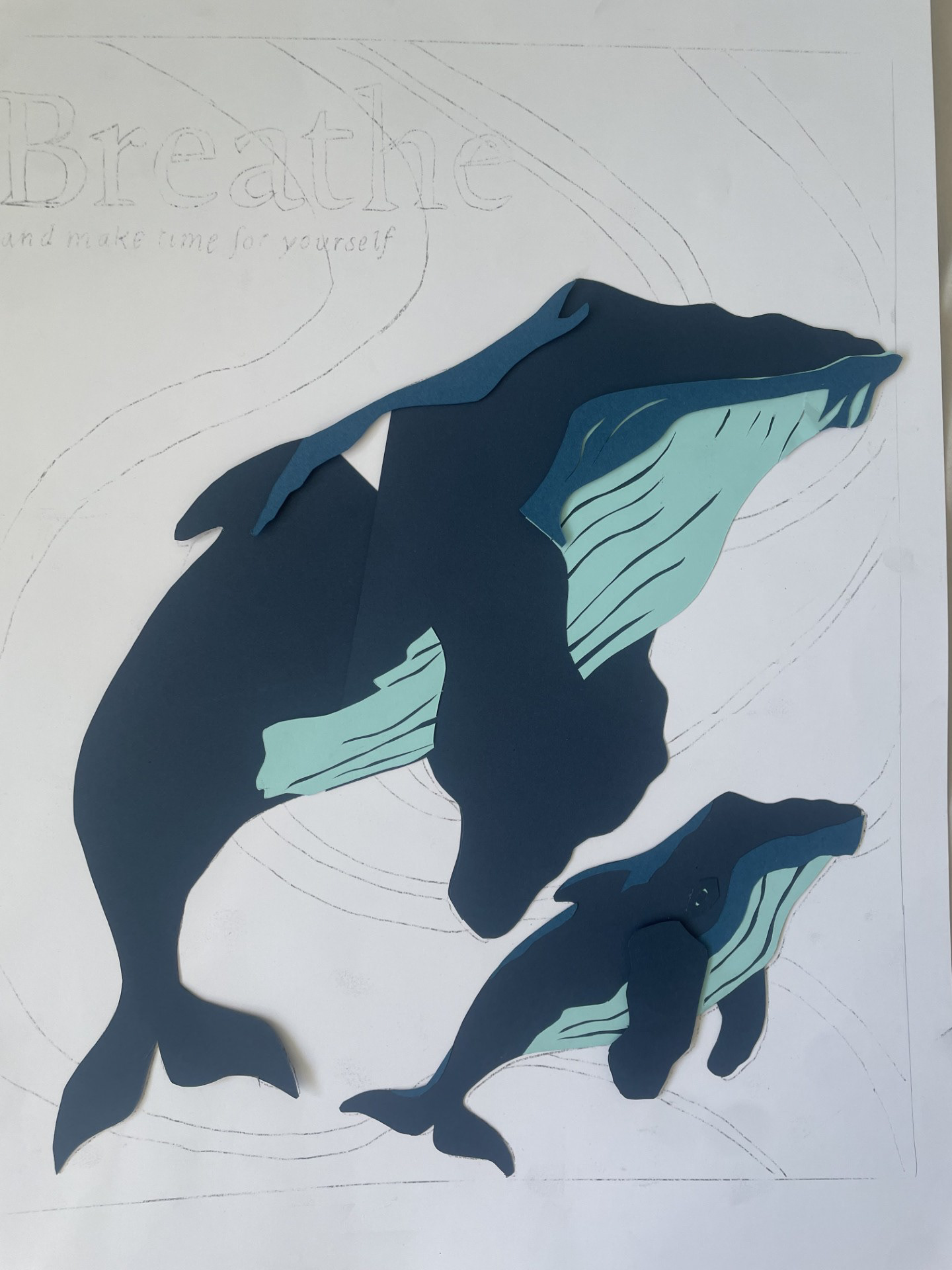
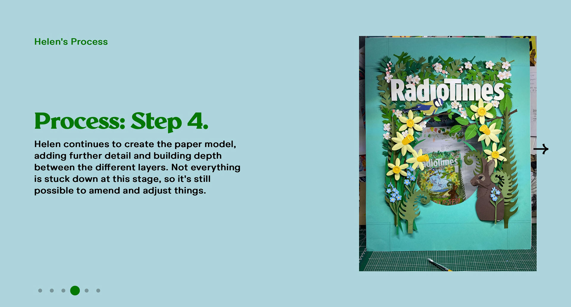
step 4- background and layout
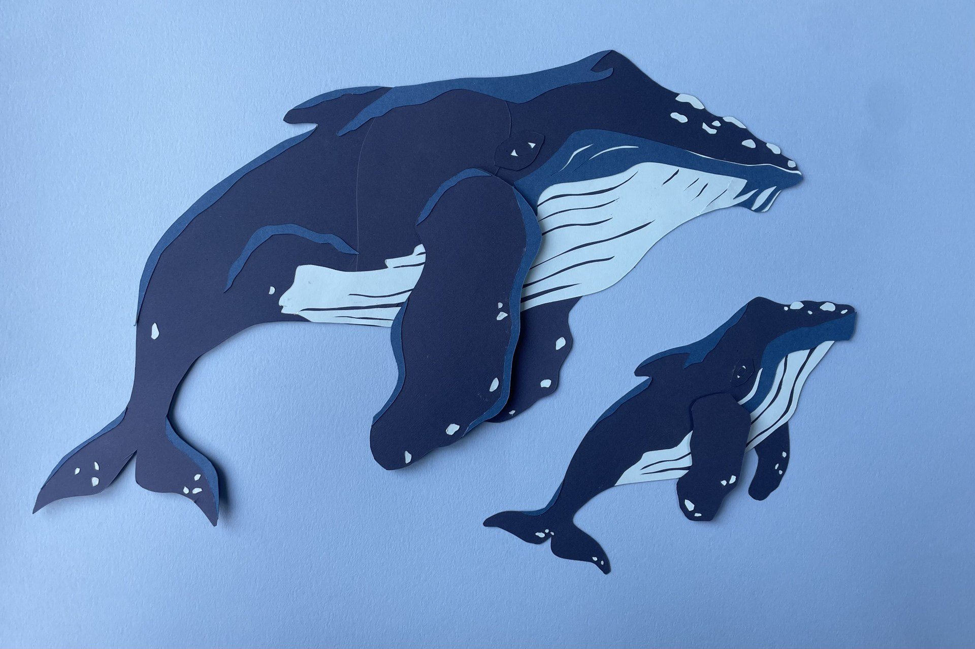
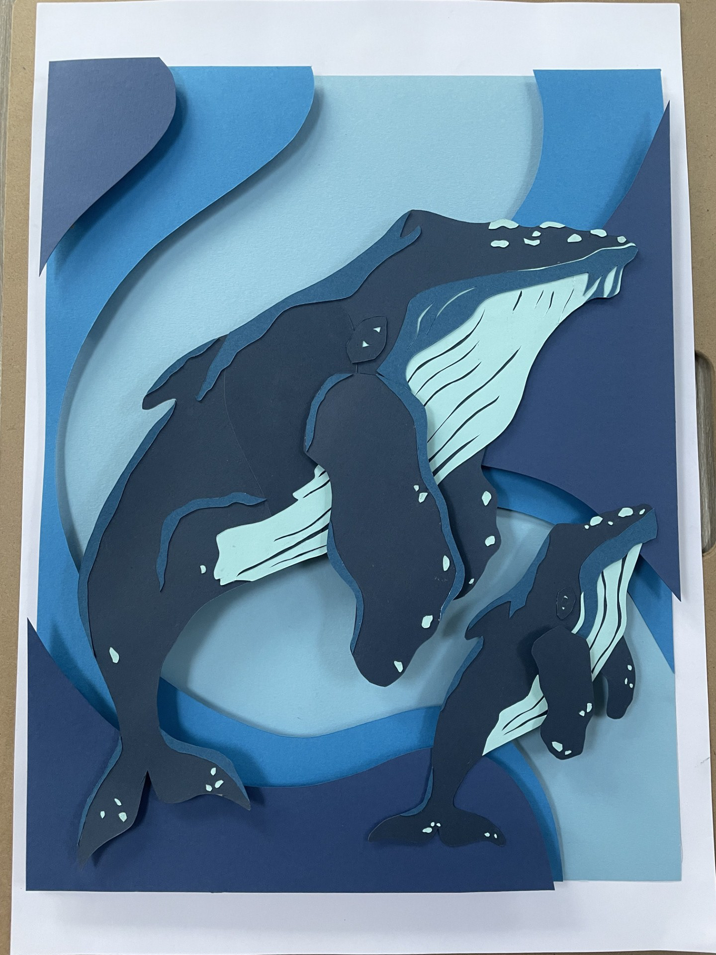
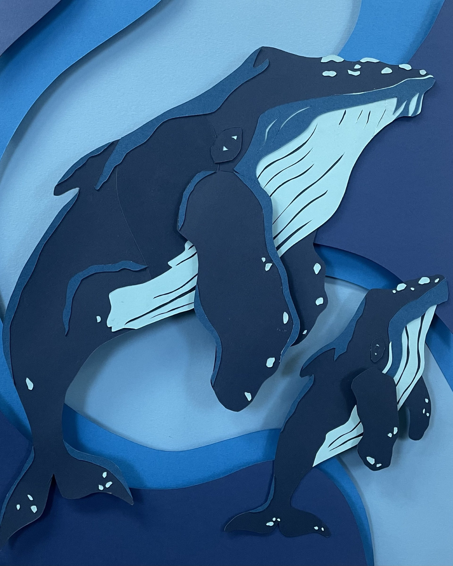
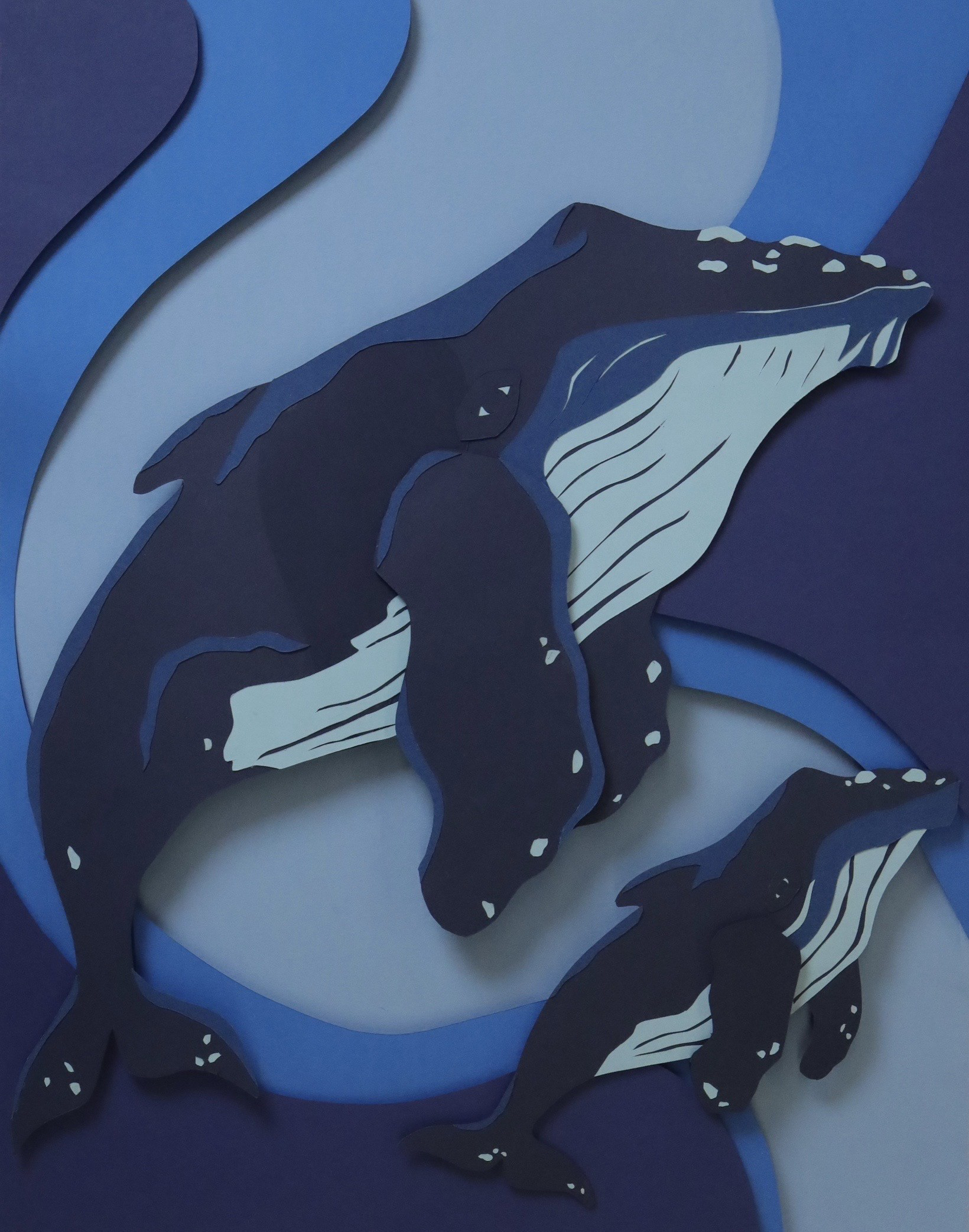
The feelings I had creating this may be the proudest I have ever felt about my art. The process of it all coming together actually made me emotional. Hours and hours of little cuts that turned into exactly what I wanted. I did have to forget the other design due to it being too big a task to undergo. I am so impressed with how professional this already looks and am so excited to photograph and place it into my magazine.
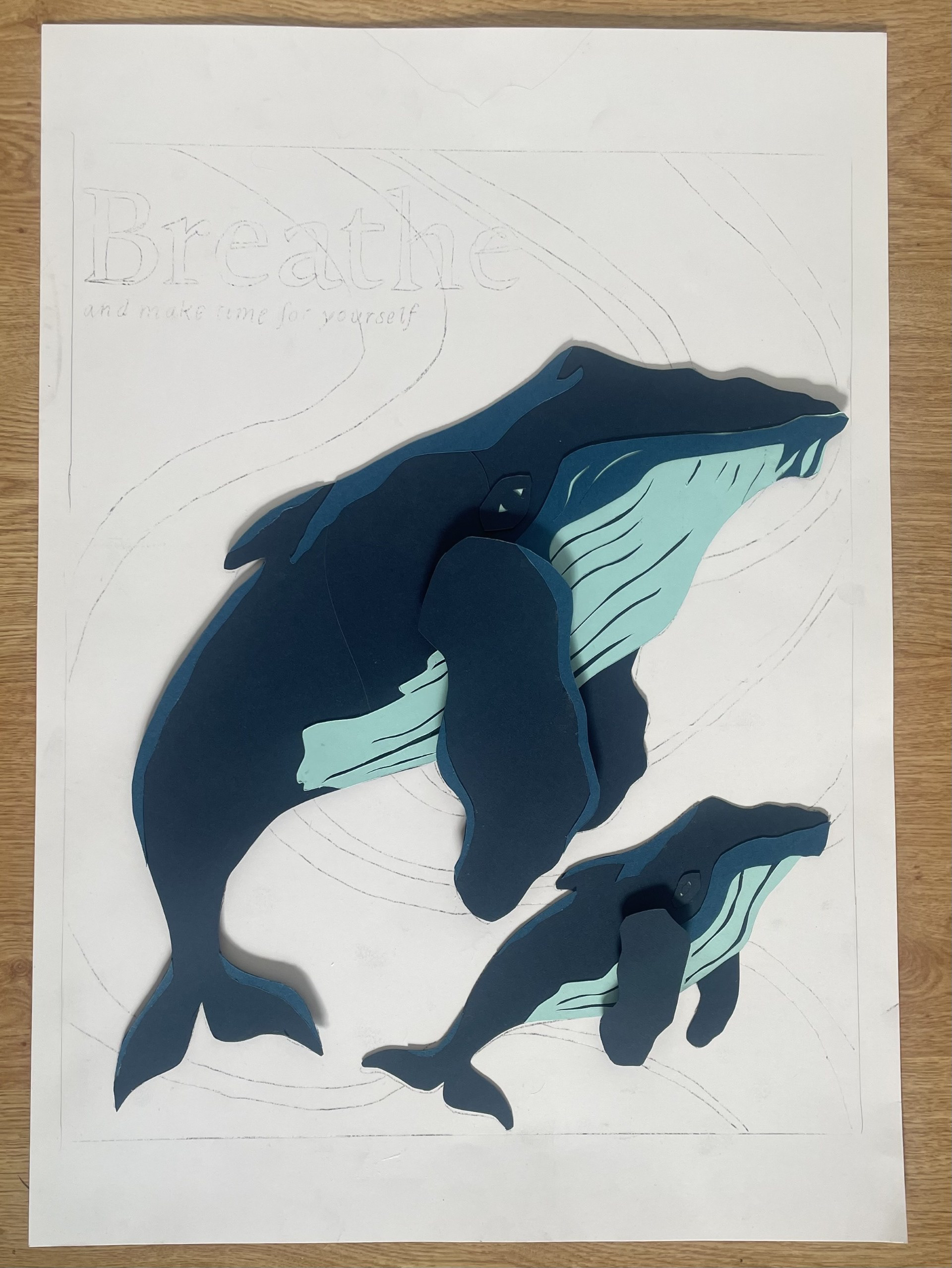
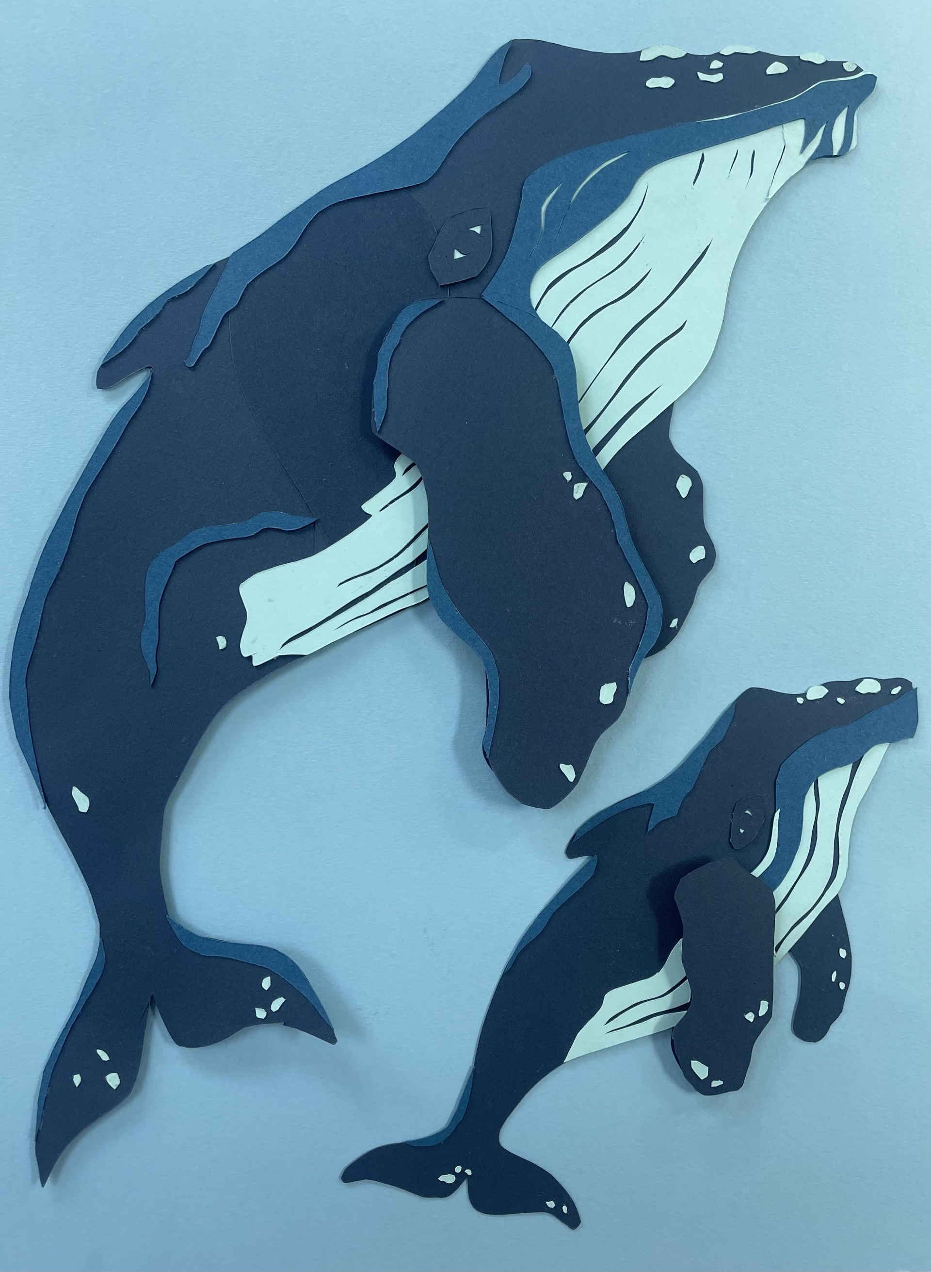
procreate touch-ups

Had to do some very minor touch-ups in Procreate to hide some bits of dried glue on the fin. I think this came out quite seamlessly.
first mock-up
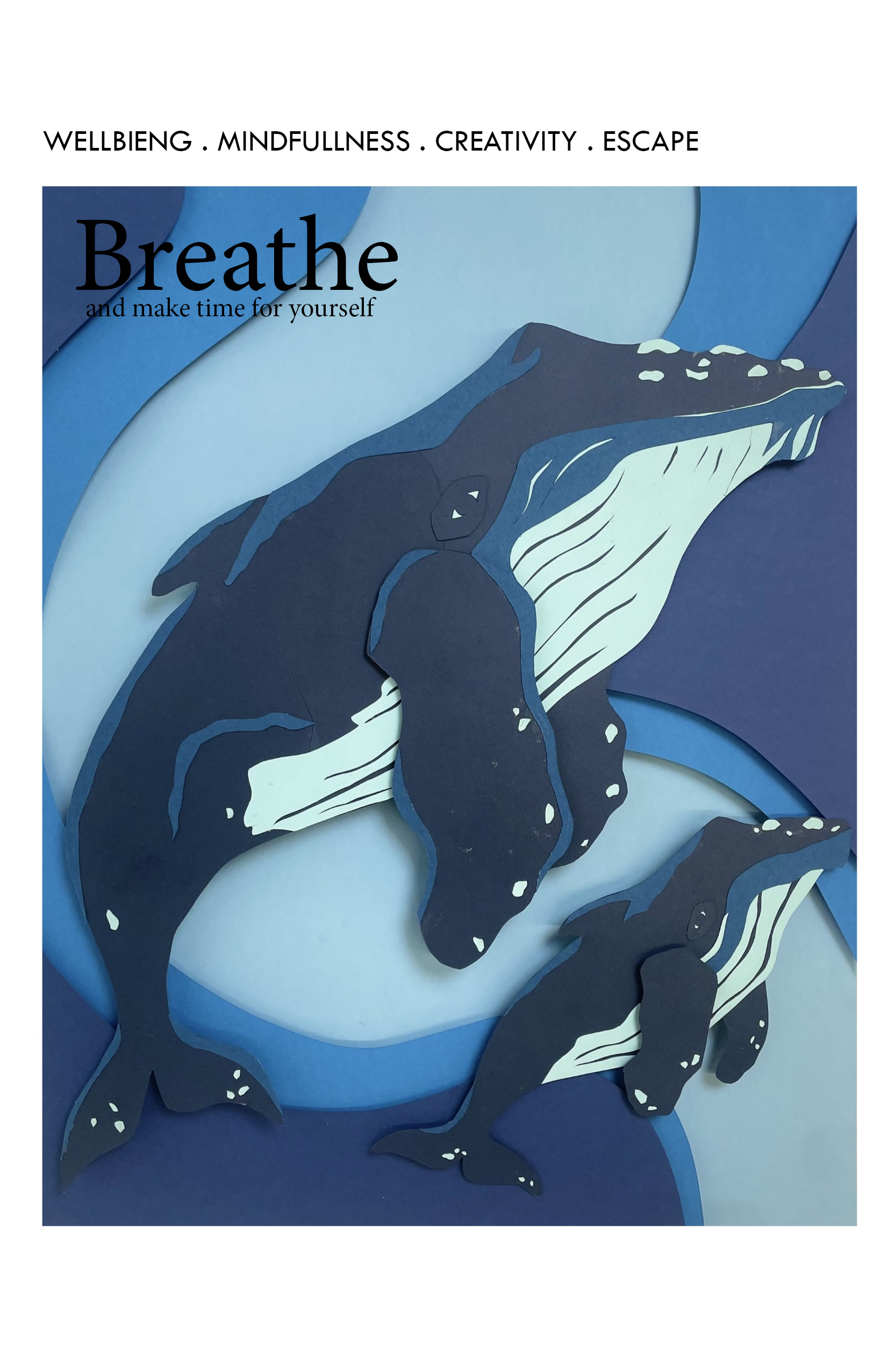
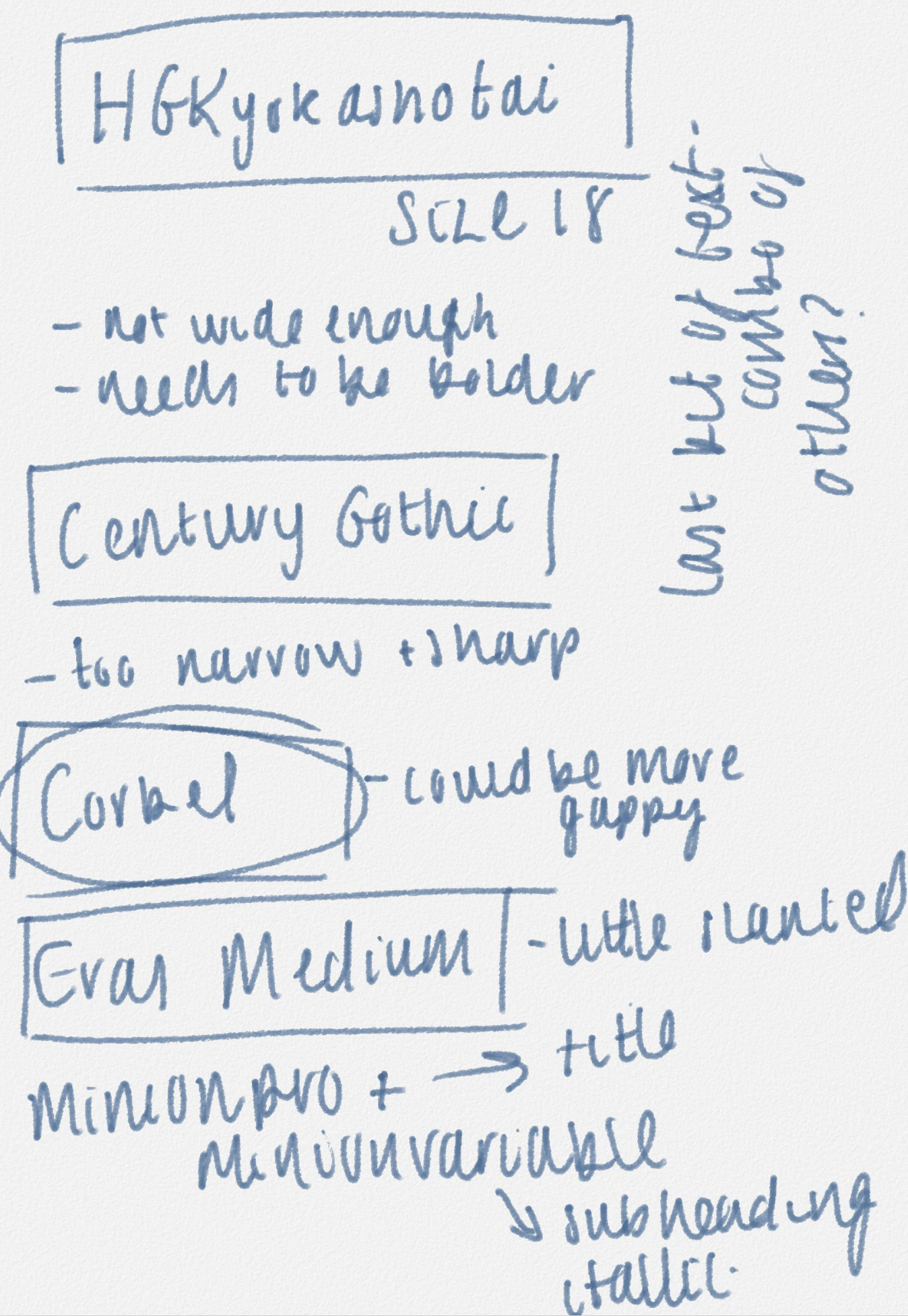
I started putting together the title of the magazine and got really excited about seeing the context being applied. In the overexcitement, I did make some errors in spelling so I had to go back and change this. I continued adding in the other details of the magazine. I trialled out a series of fonts and selected which was most true to the real copy. Lastly I made the decision to change the title to white. I think this really pulls together the lighter areas of the image and allows the title to better stand out. As well as this, I think the lighter vibe better represents the calm atmosphere I wanted my piece to portray.
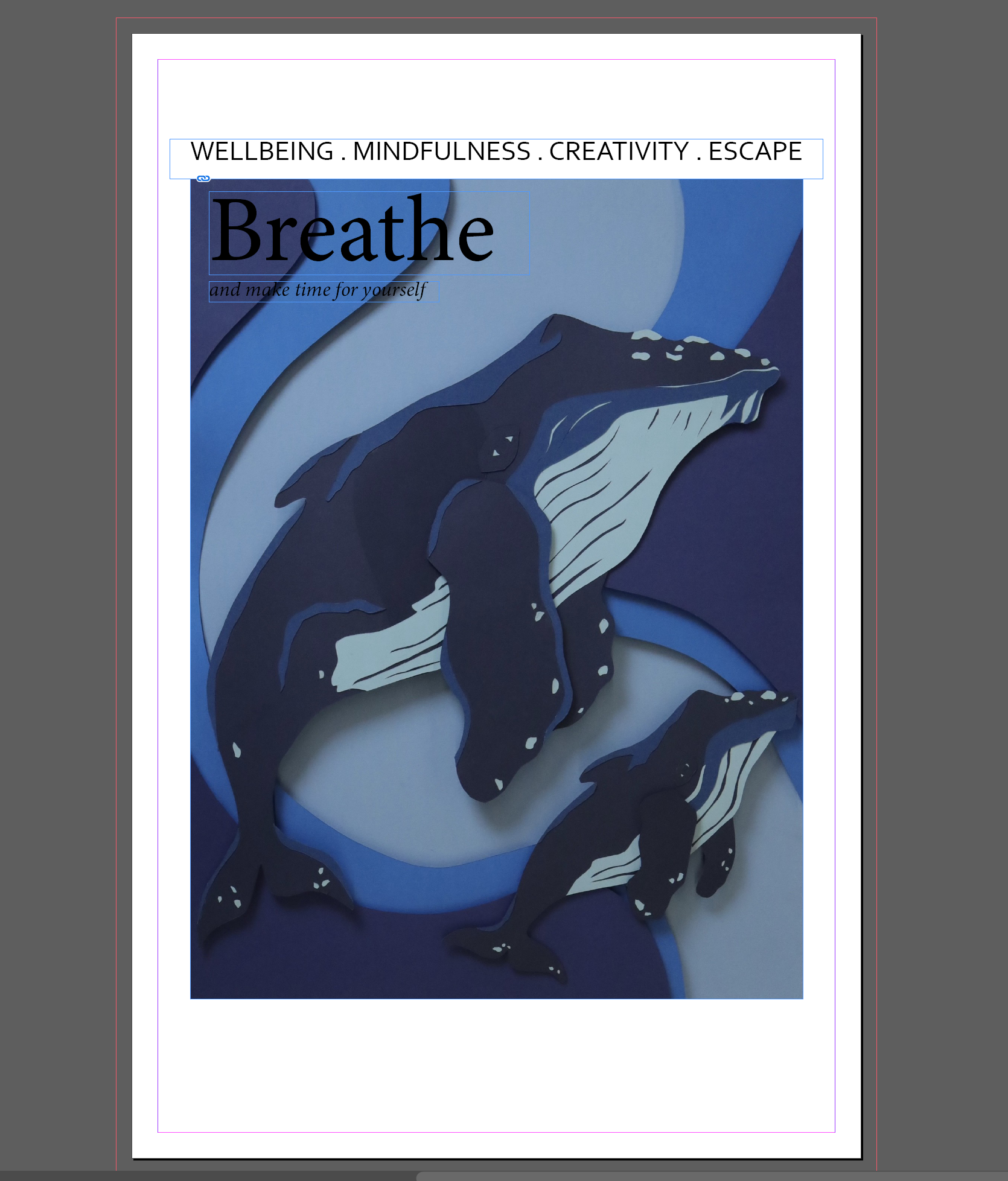
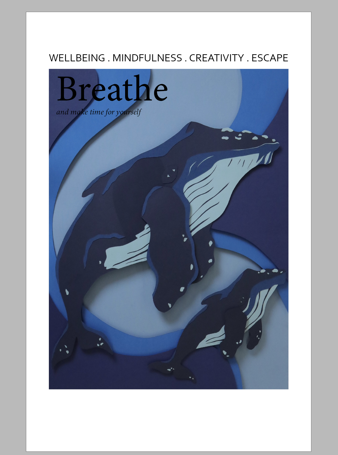
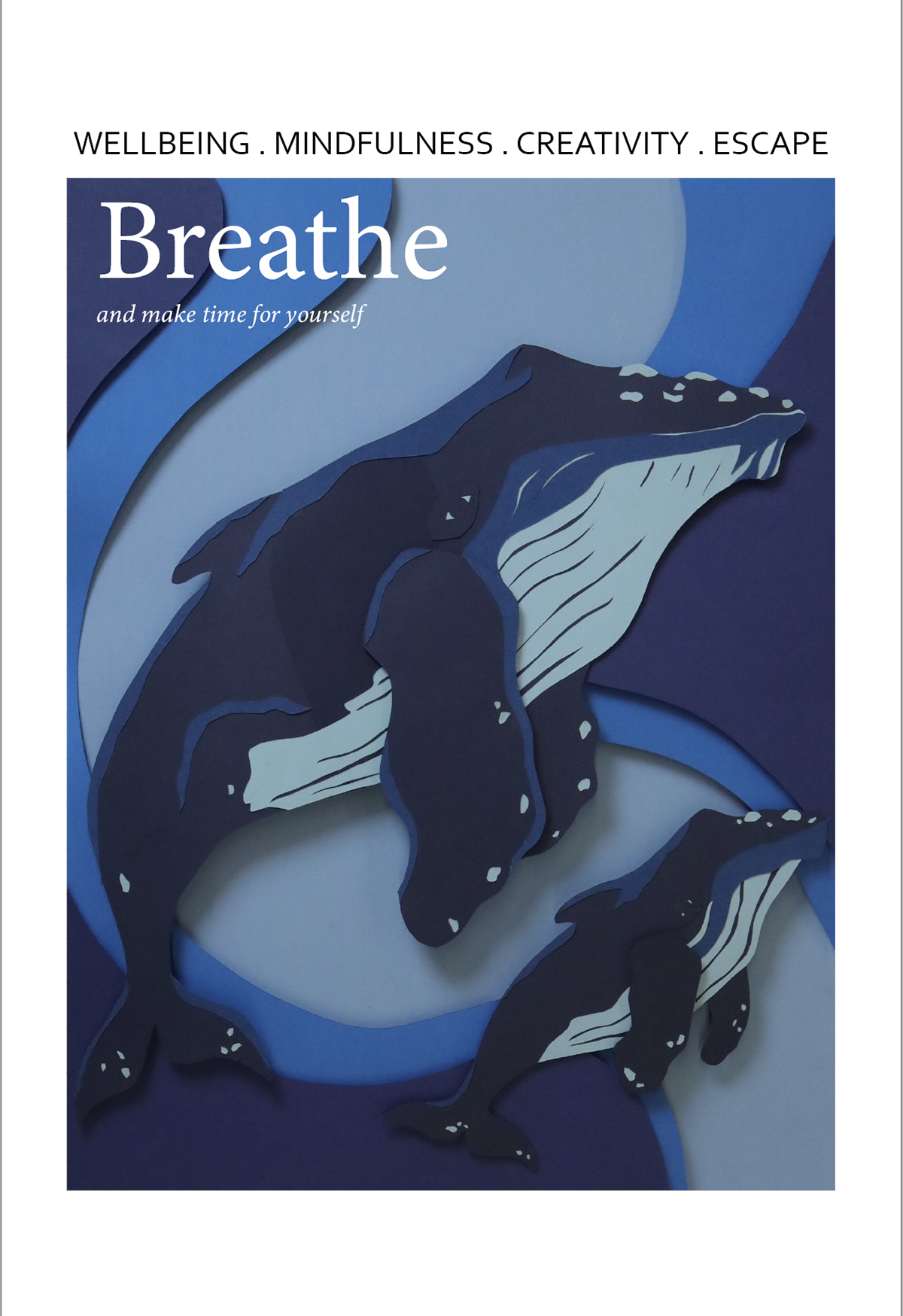
creating a caption
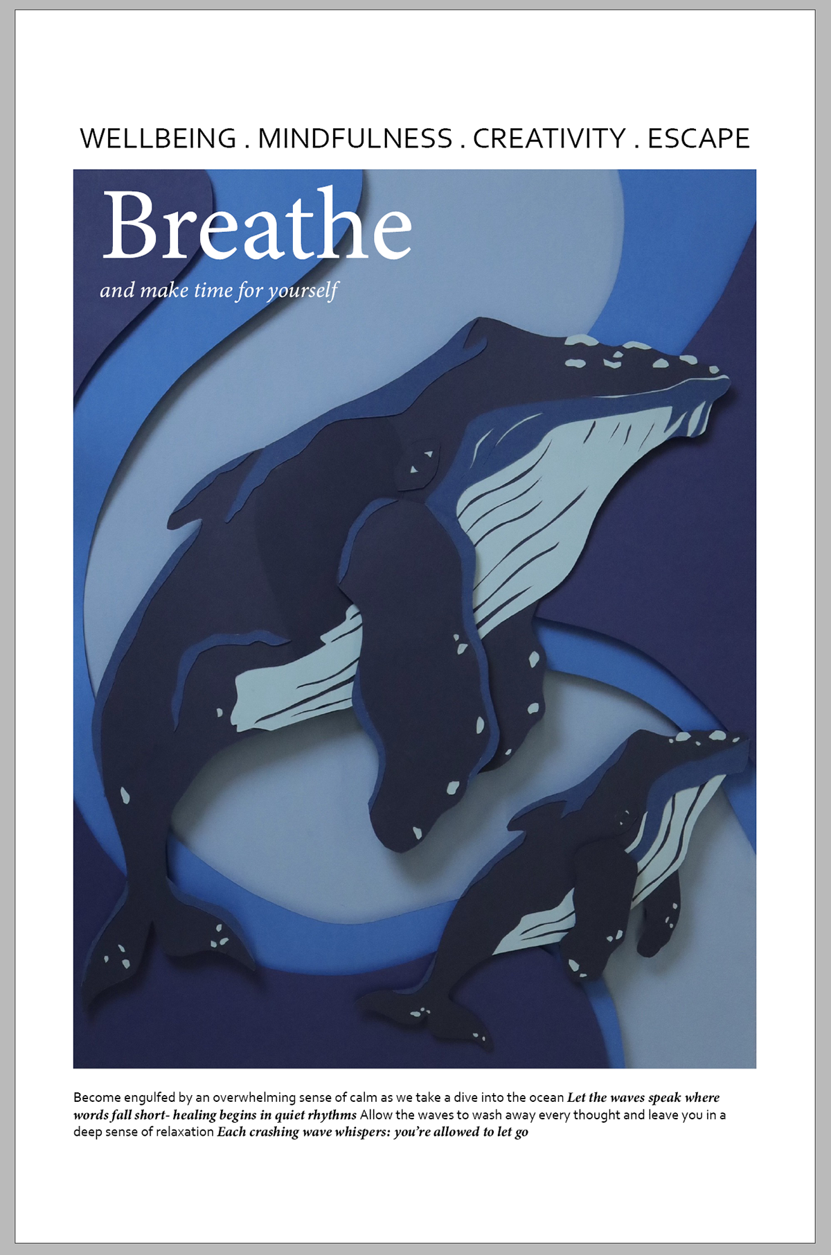
I collaborated with ChatGPT to create the caption for the bottom. On the real copies they have a mixture of normal and bold text that includes little references to what's inside. And so I used ChatGPT's prompts as the references in this case (bold) and made up the normal font myself.
photoshop and saturation
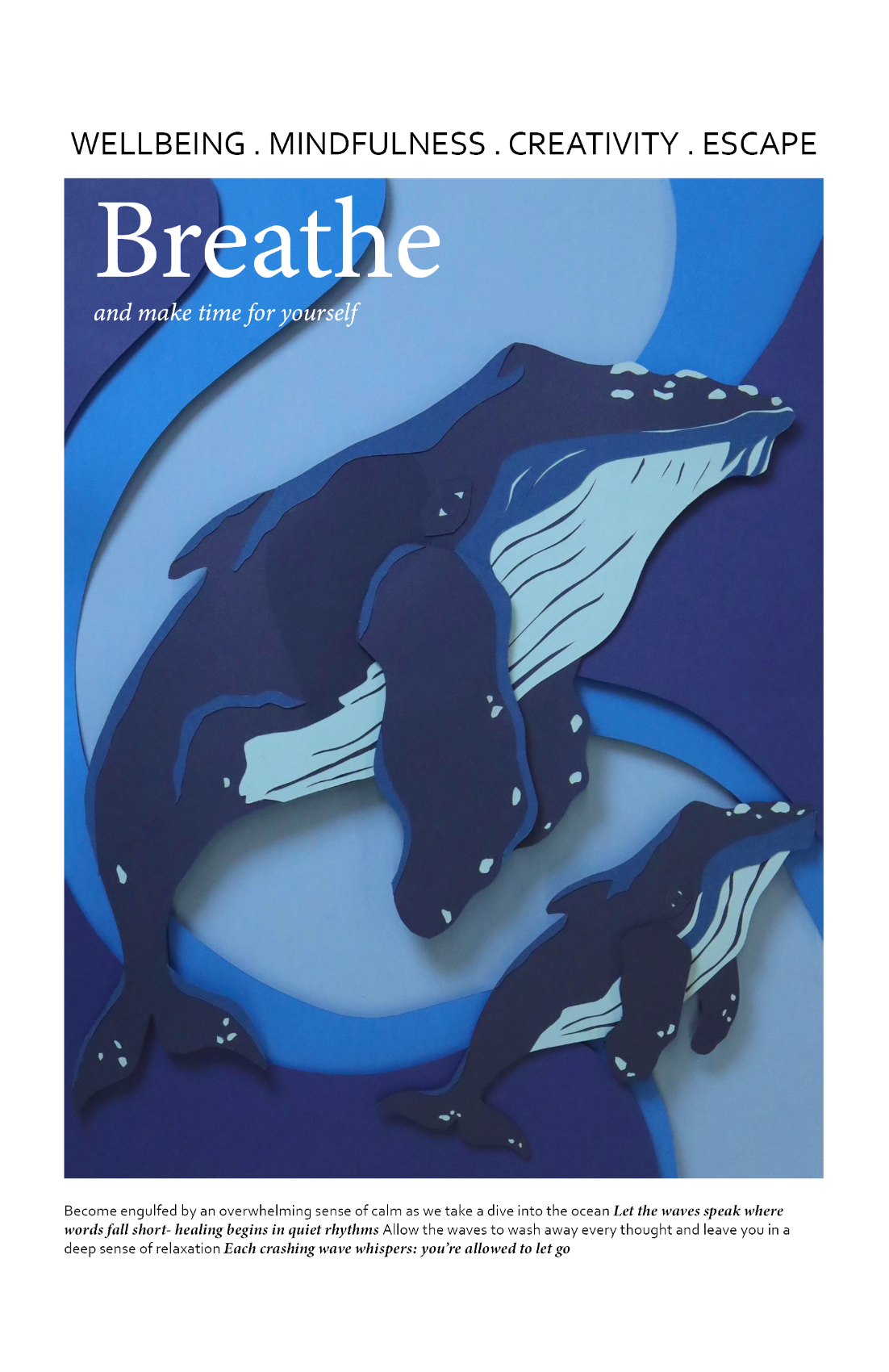
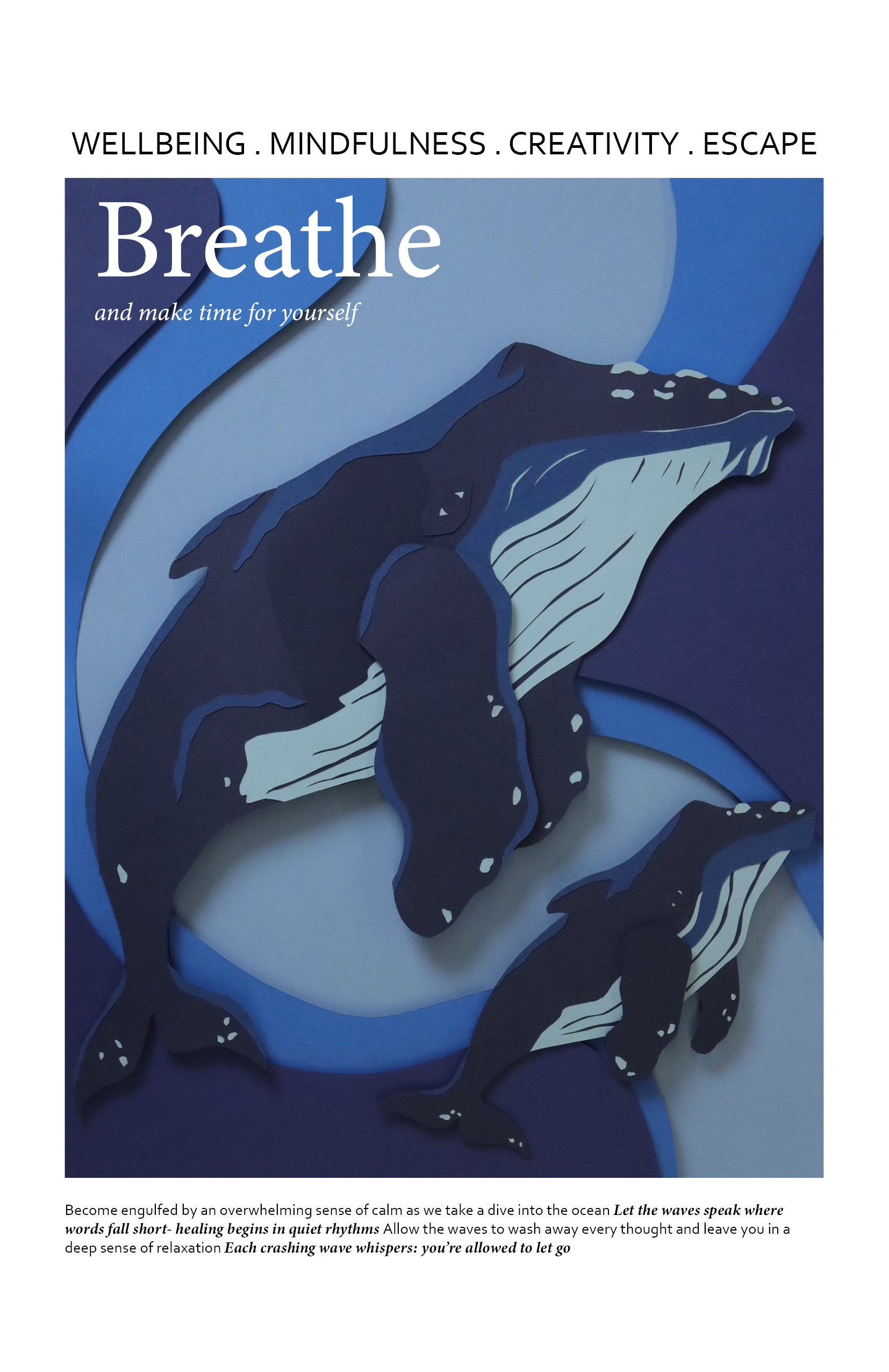
I played around in photoshop trying to brighten up the image slightly. At first I tried out a 'colour pop' filter but didn't like this as it made it seem a little tacky. And so after this I went in and altered the saturation at different levels. The most successful in my opinion was at a saturation level of 25. This is because it only added a subtle pop of colour.
Final

Final reflection
The place project was all about capturing the emotions related to the ocean. Feeling the pull from any source of water ever since I was a child, I thought it was only right to base an entire project on how much I love the ocean. Both watching and listening to the waves has always filled me with a deep sense of peace, one that clears every thought from my mind and allows me to take a break from whatever craziness life is throwing my way. It provides moments of calm, moments of reflection and moments of clarity. It can dig up the most hidden emotions and force you to feel. I often find myself sometimes even getting emotional looking out, being overcome by it's powerful beauty and holding onto this gratefulness to be alive to see it.
The part I most wanted to focus on is the feeling of calm that spreads over you when listening or watching the waves. I chose to have layers to this piece to be able to truly be emersed in the feeling. Adding layers adds depth and that's something I wanted very evident. I cannot express just how happy this project made me and I couldn't be anymore pleased about how it turned out. I feel that the design nicely fits the context of the magazine and that the magazine links smoothly with the feelings of calm I wanted to present.
I think the only thing I can say about this project to improve is that I needed to mount the pieces in a more stable way. However, I went on to do this to submit it as my sculpture for the degree show. I wish I had mounted this onto foam board since the start because it had such a cleaner, more structured finish. The choice of black foam board also managed to further push the shadows created by the layers. I am extremely proud of this piece and it has unlocked a new passion in me for papercut that I would love to carry forward in the future. I feel that this may now be my most rewarding project because actually being able to hold the thing I have spent hours working into fills me with so much pride.
Preparing for the degree show
light experiment
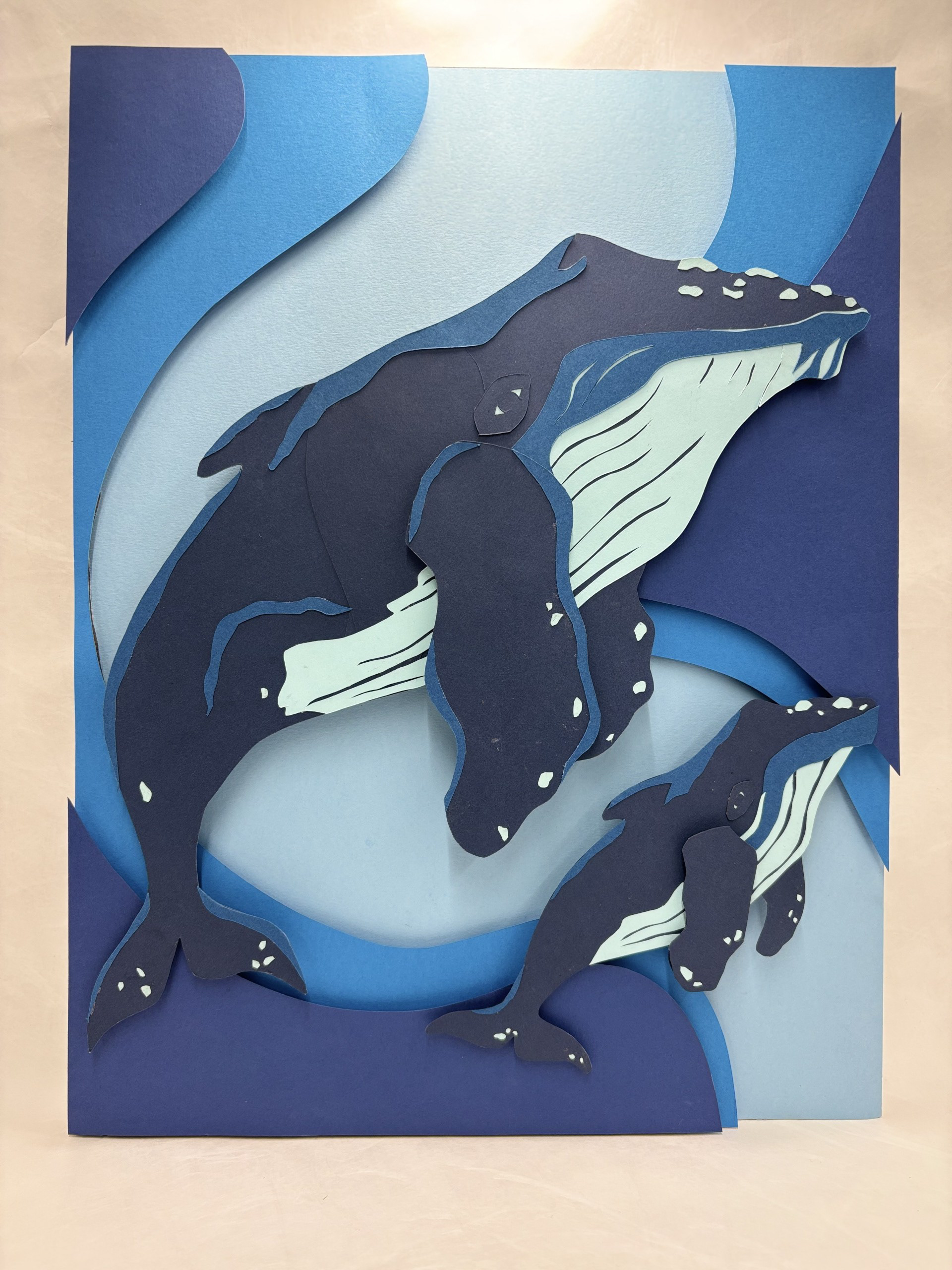
Adding a light source was so interesting to see. I feel that it really does create that idea of the light shining through the top of the waves, to create this almost cosy feel. I think if I wanted to push this effect further, I could experiment with varying thickness' of materials in order to make the light more intense.