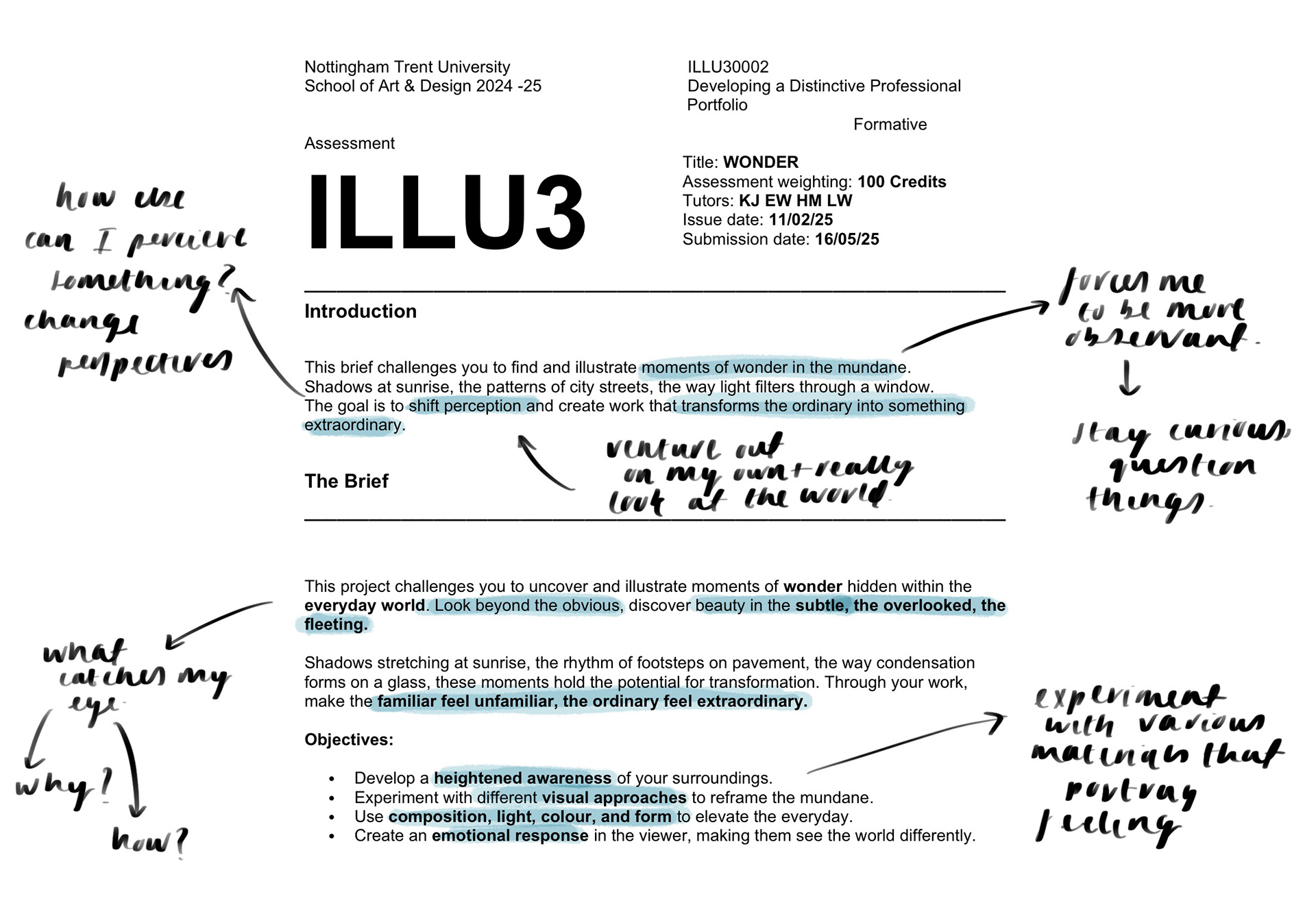
I instantly connected with this brief as I have come to realise just how important it is to find the beauty within the everyday. It's easy to get caught up in day to day life, getting lost in the work, education or mundane tasks. What we forget is that time is a gift and cannot be taken for granted. Often viewing something with an alternative perspective can make us more grateful for what we have allowing us to treasure the smaller things.
Due to this outlook, I am eager to explore the small beauties we may overlook in the mundane world and find a way to open people's eyes to this.
Edward hopper
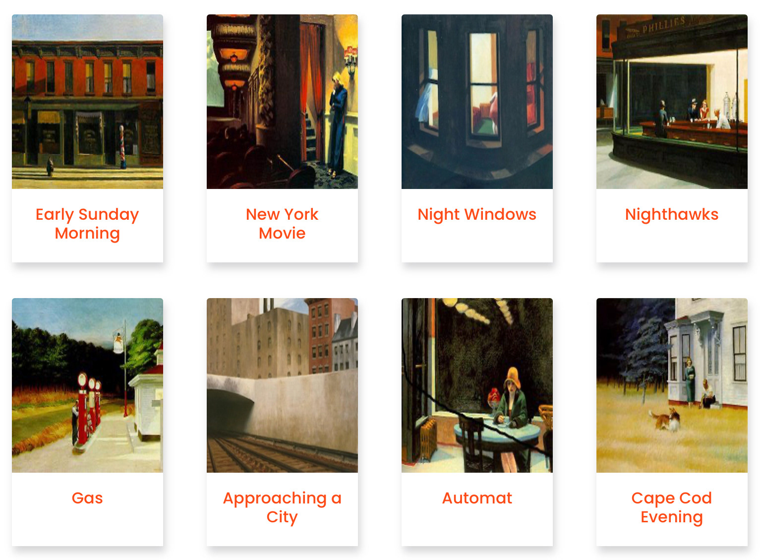
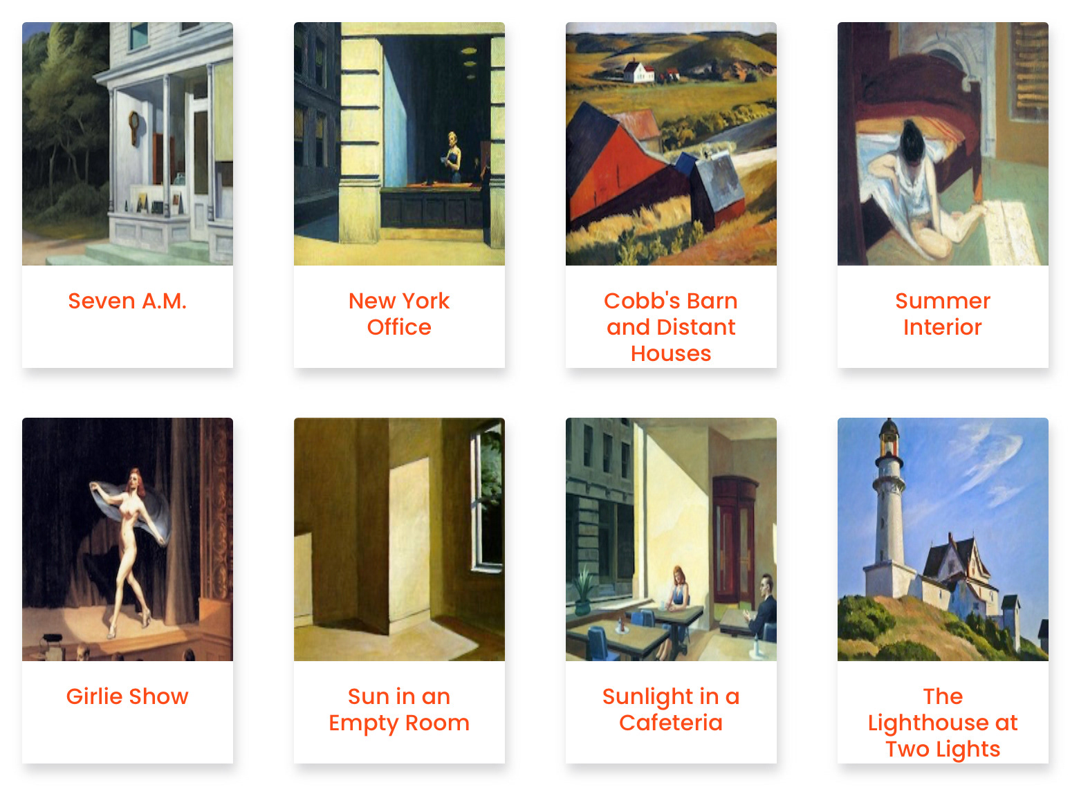
I feel that Edwards work is really successful at embodying the feelings linked with his subject. This is created through a combination of both the layout and colour scheme. I notice that there’s a lot of negative space created in the environments that gives a sense of solitude and peace which is key to understanding the situations. The colour scheme he uses allows for a great contrast between the light and dark areas of the piece. The light creating a deep sense of warmth and comfort. I wish to be able to use this going forward with this project as I think being able to really feel the emotion is vital for seeing the mundane beauty of the world.
Owen Rival
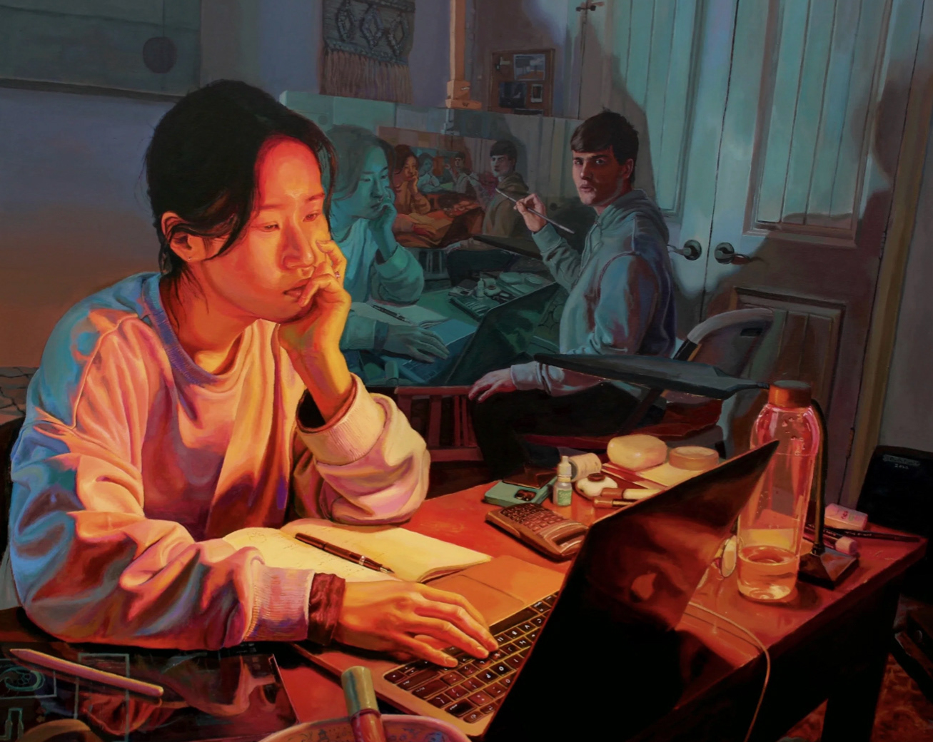
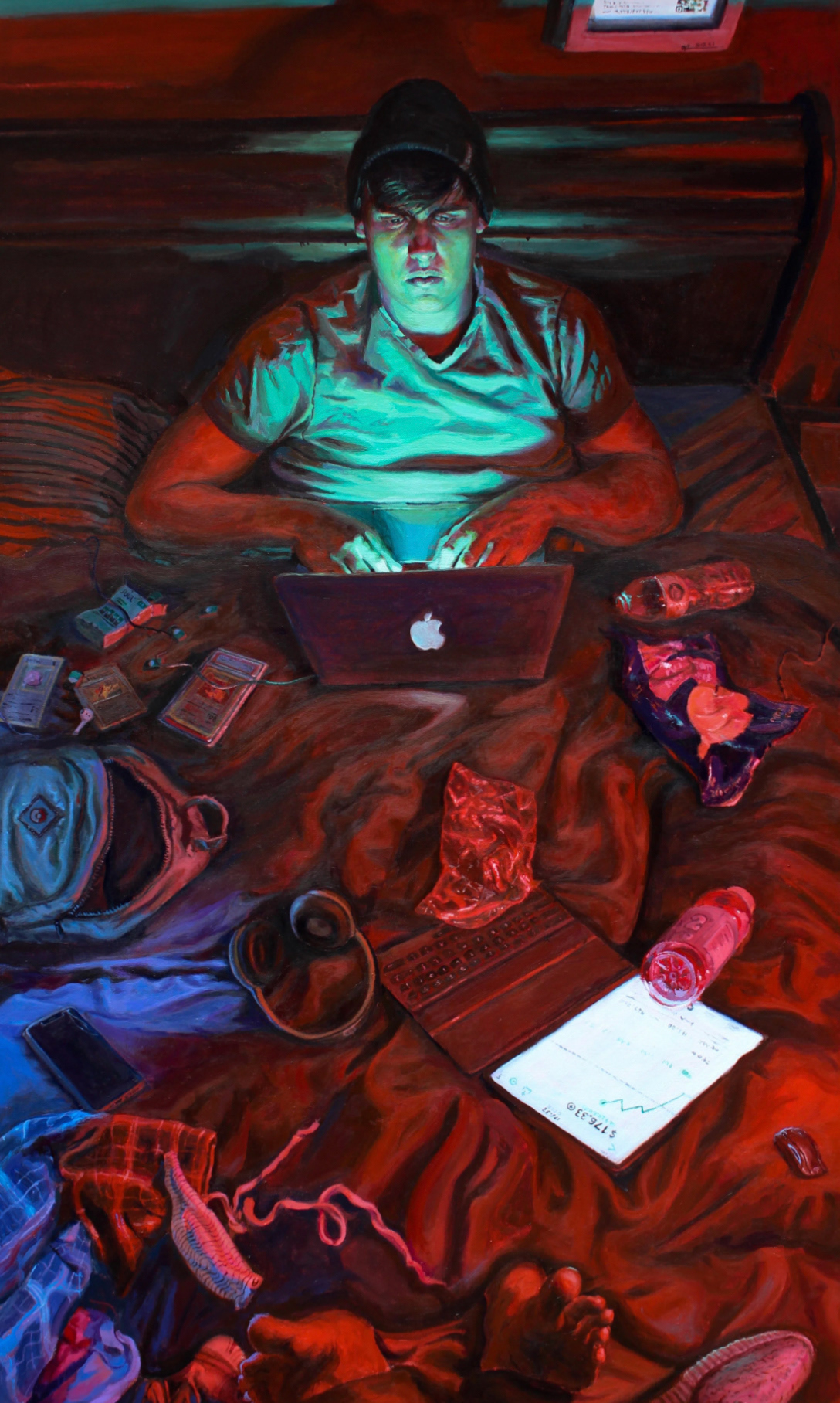
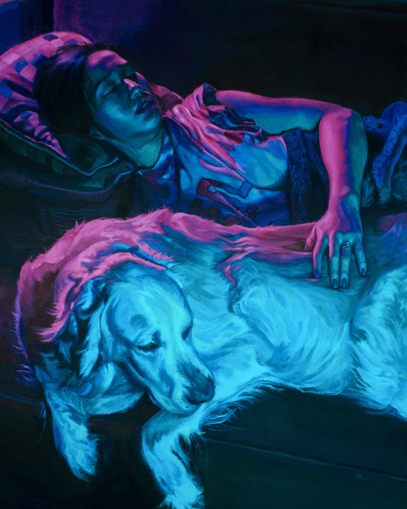
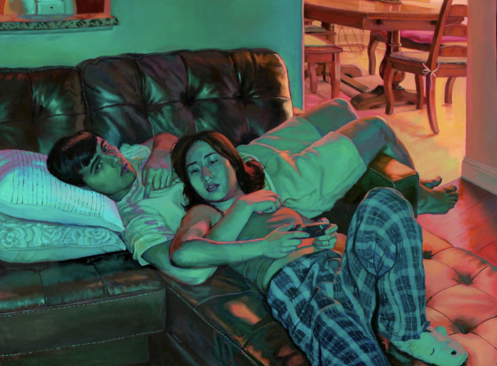
Owen uses his work to interact with life's high and low points, capturing the volatile nature of young adulthood. Although his paintings depict his day to day activities, his colour palette strays far from realistic and more towards vibrant and even 'supernatural' tones. He does this to draw the viewer in and amplify the mood- highlighting key components of his pieces. It's said that he loves how certain colours have the ability to imply a certain emotion, such as red making things seem more intense and blue bringing a sense of calm.
I really admire how Owen is able to create such a sense just by his colour palette and use of lighting alone. This brief is really pushing me to express these intense emotions linked with the small beauties in the everyday and so this is something I would love to be able to develop into this project.
Looking up
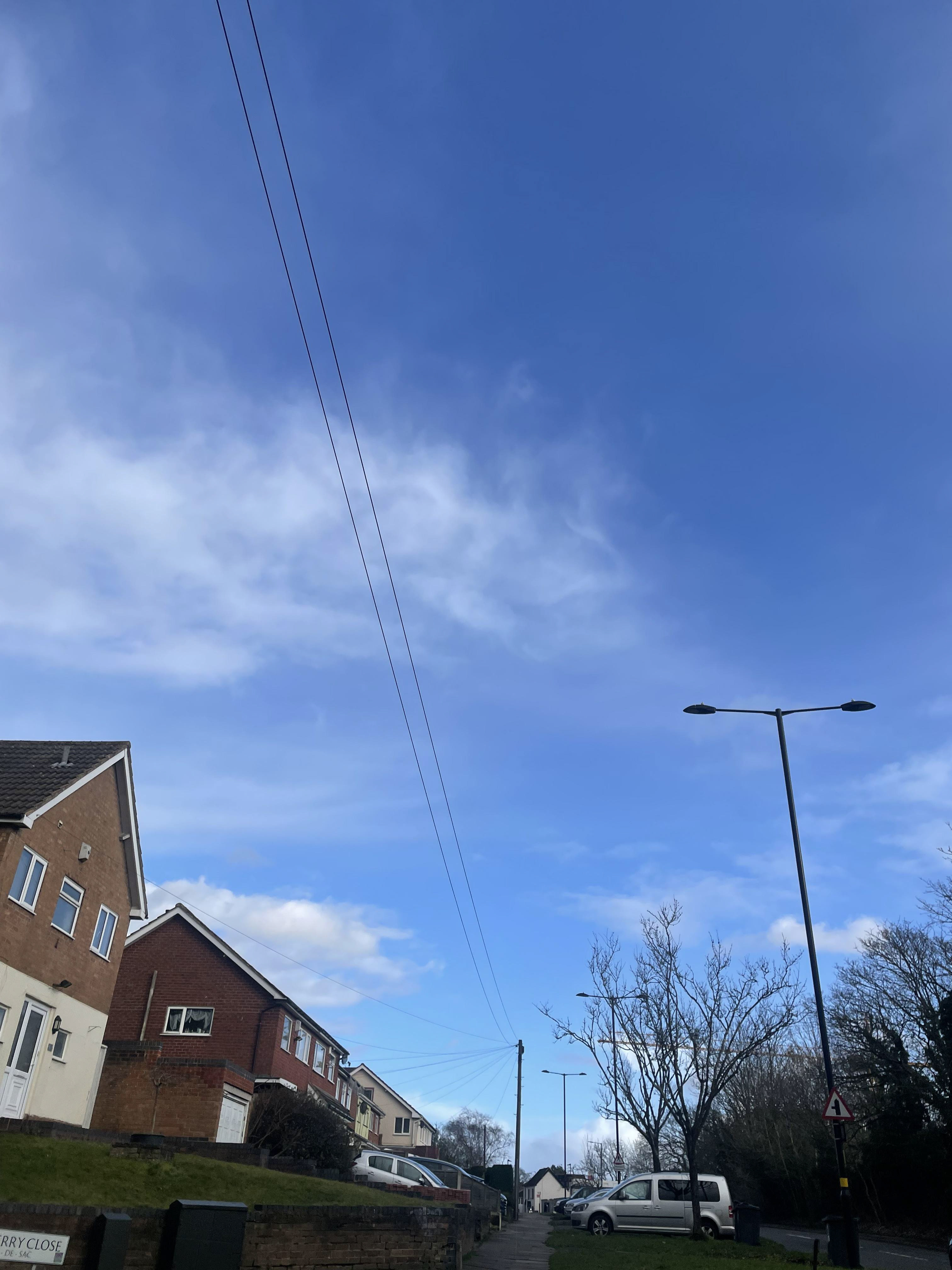
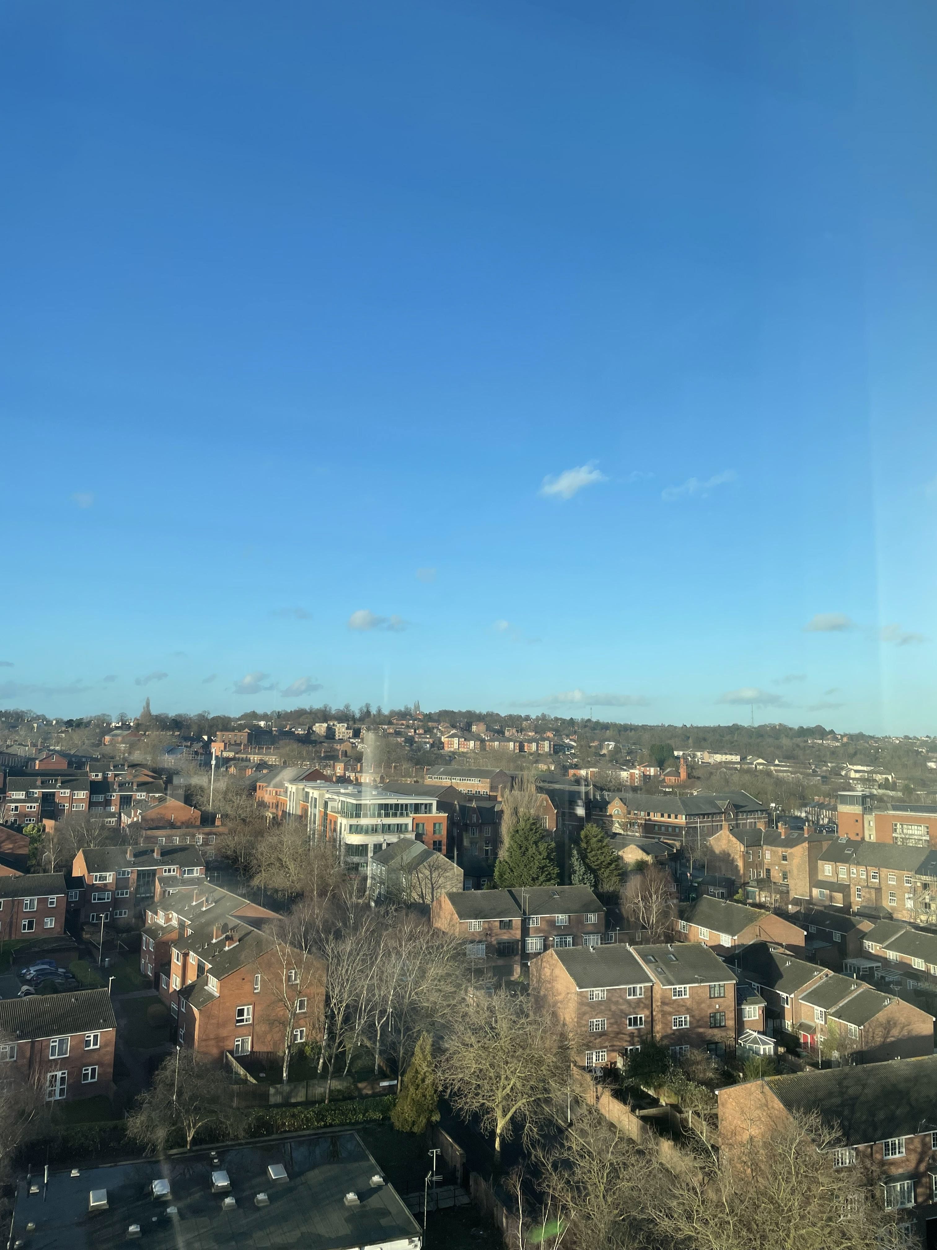
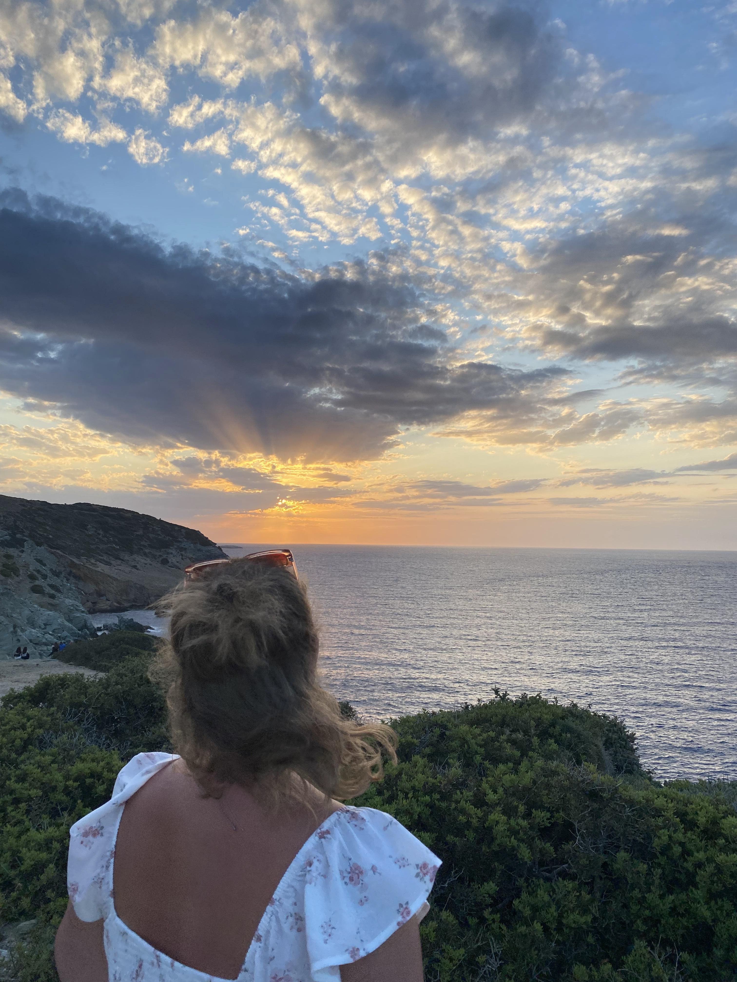
The sky is described to be a source of beauty, wonder and inspiration signifying vastness, freedom and ever changing life. Many find comfort and peace looking up at the sky, making them feel connected to something much larger than themselves. No matter how unpredictable and chaotic life may get, looking up is a constant that will never change. I find myself looking up a lot when I get overwhelmed, being able to break from the crazy and get lost in the world. As well as this, it allows me something to look to when I miss those that I have lost in life, telling myself that they're up there somewhere has always created a deep sense of comfort and a lot of the time making me feel less alone. The sky is aways around, a lot of the time we take it for granted- forgetting it's beauty. I would really like to explore ways to push this feeling and show just how wonderous and moving looking up can be.
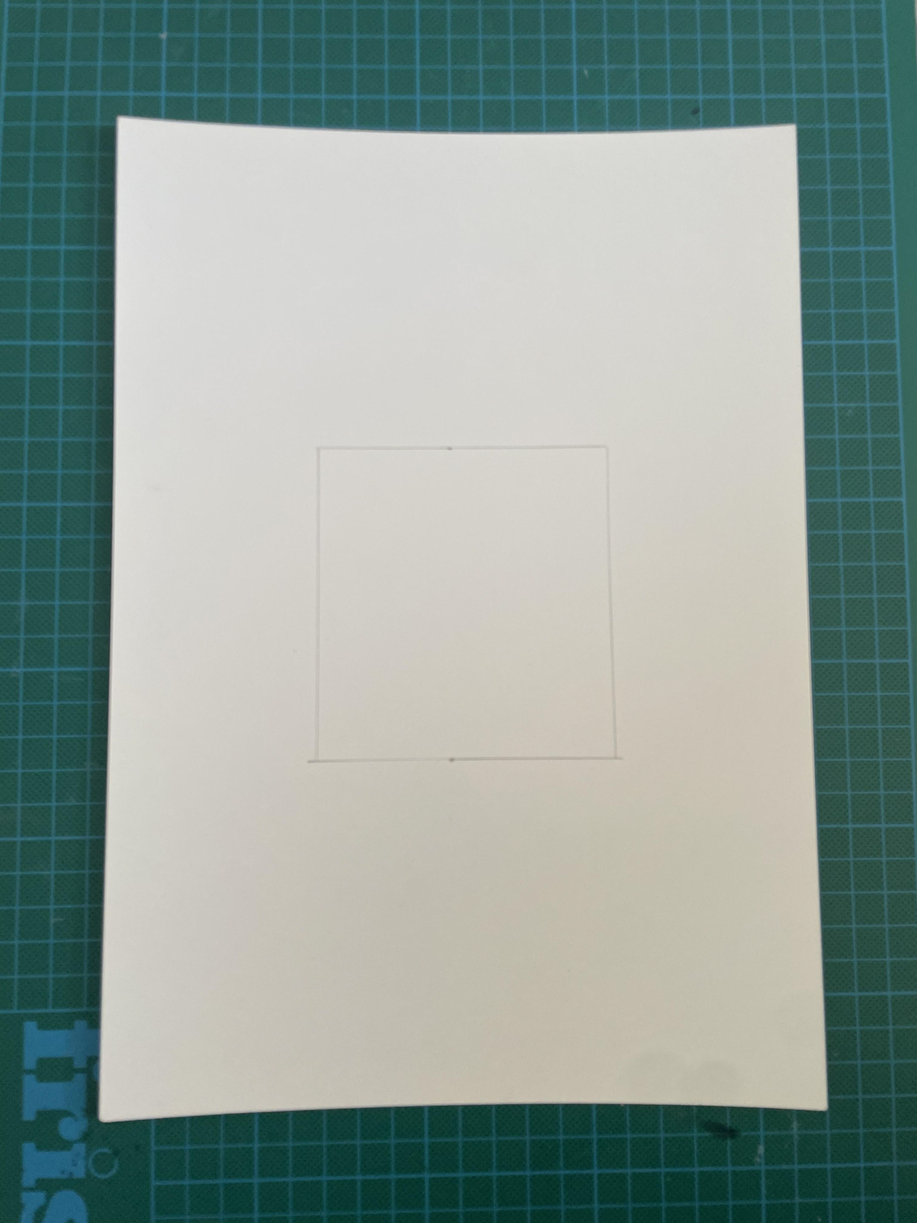
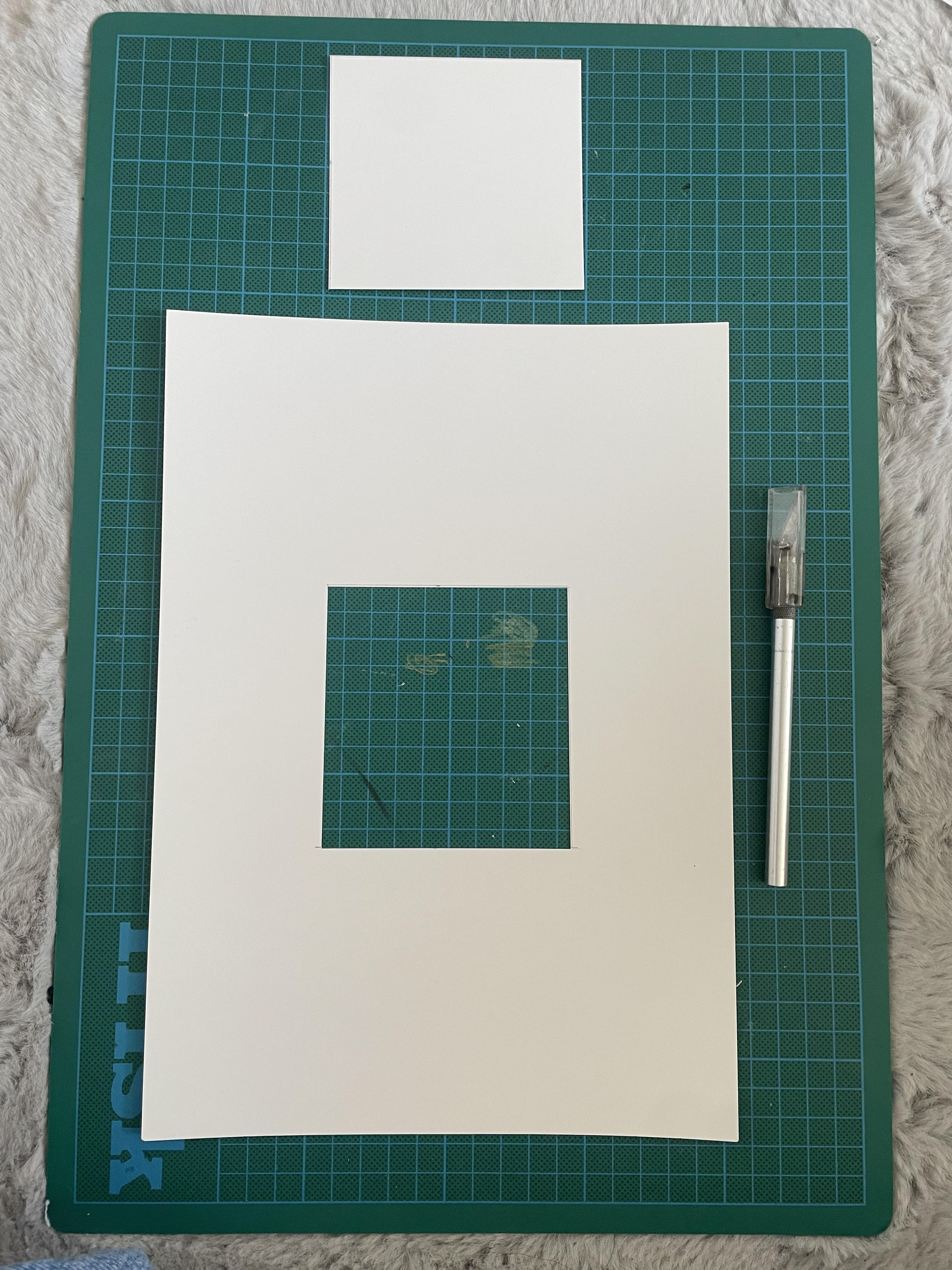
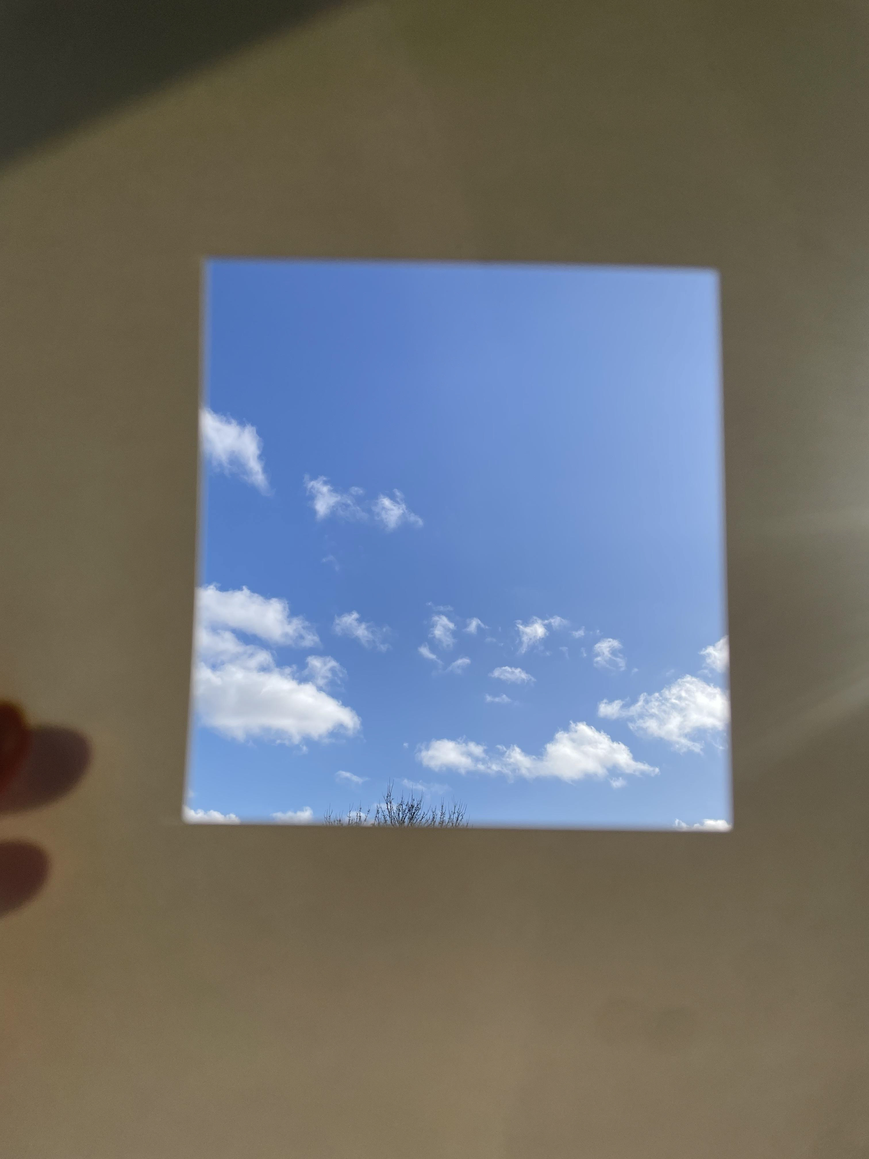
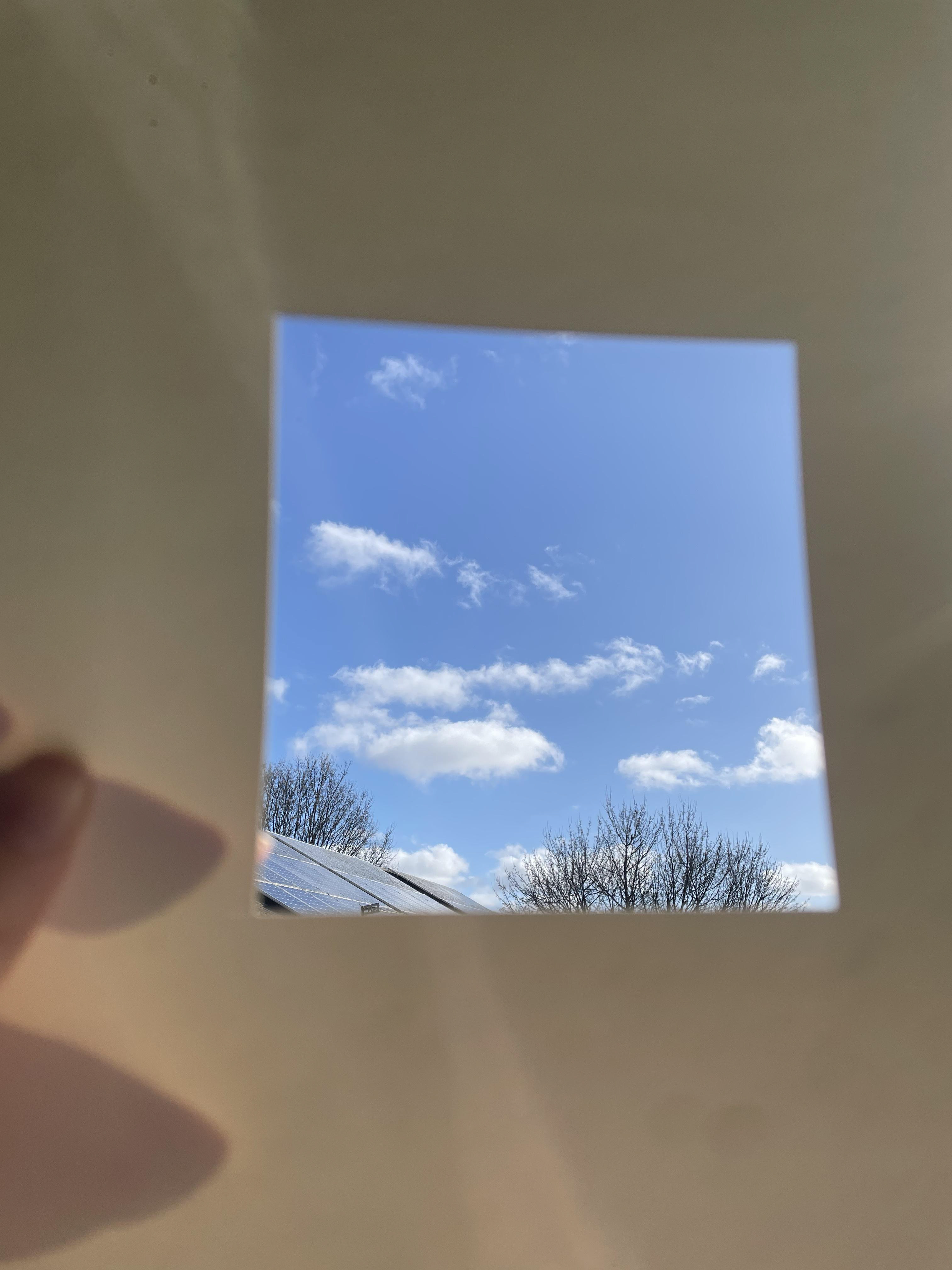
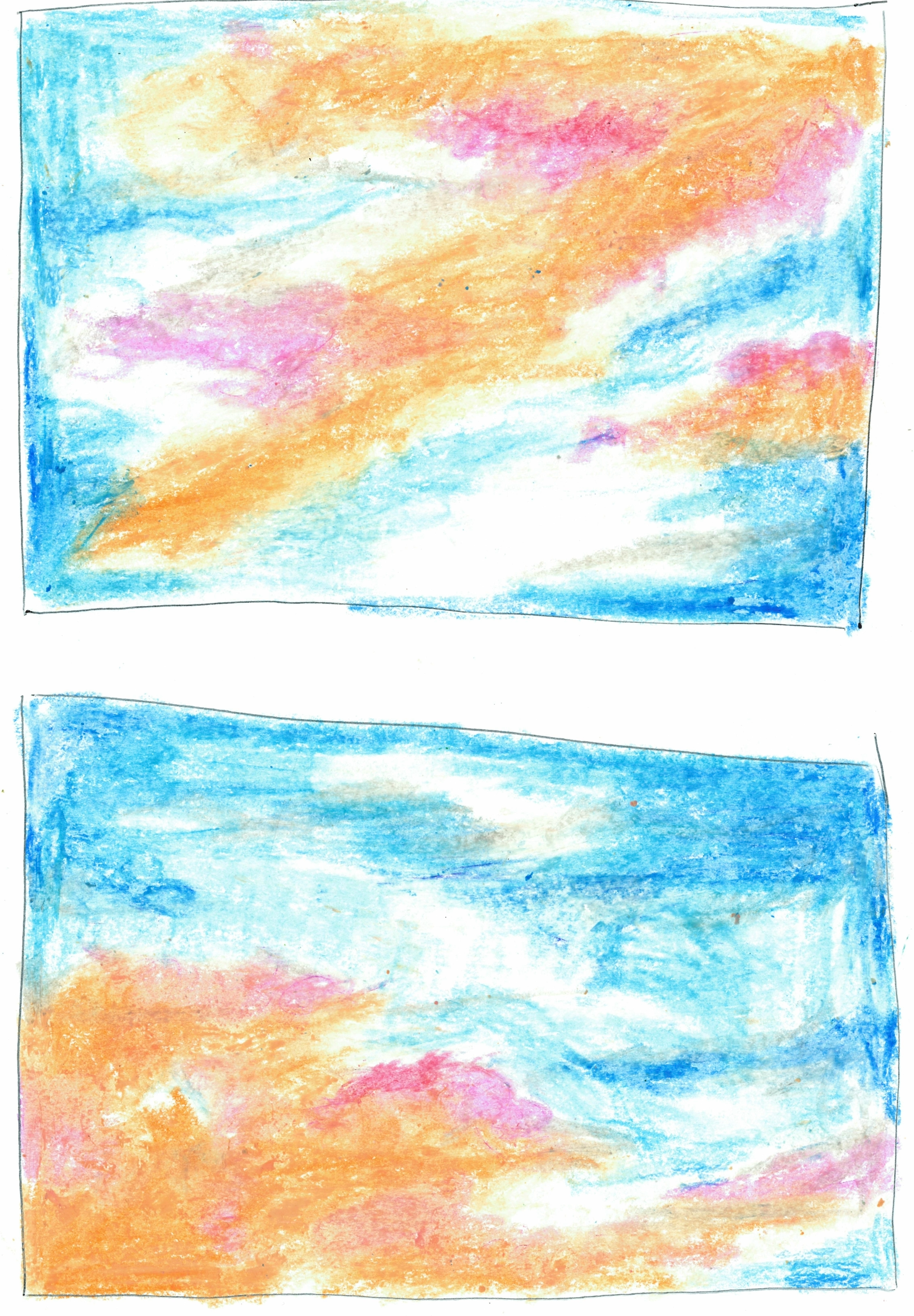
This was when I was experimenting with negative space. My idea was to block out everything except the sky to really be able to focus in on it and all its beauty. I really enjoyed how these turned out, however I do wish I had time to take the square to a series of places.
Kimball Geisler
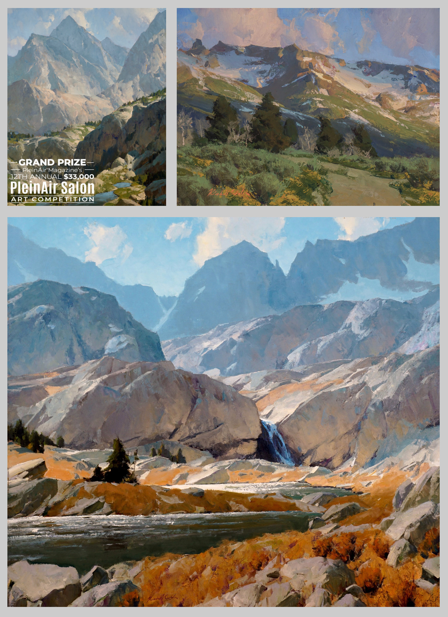
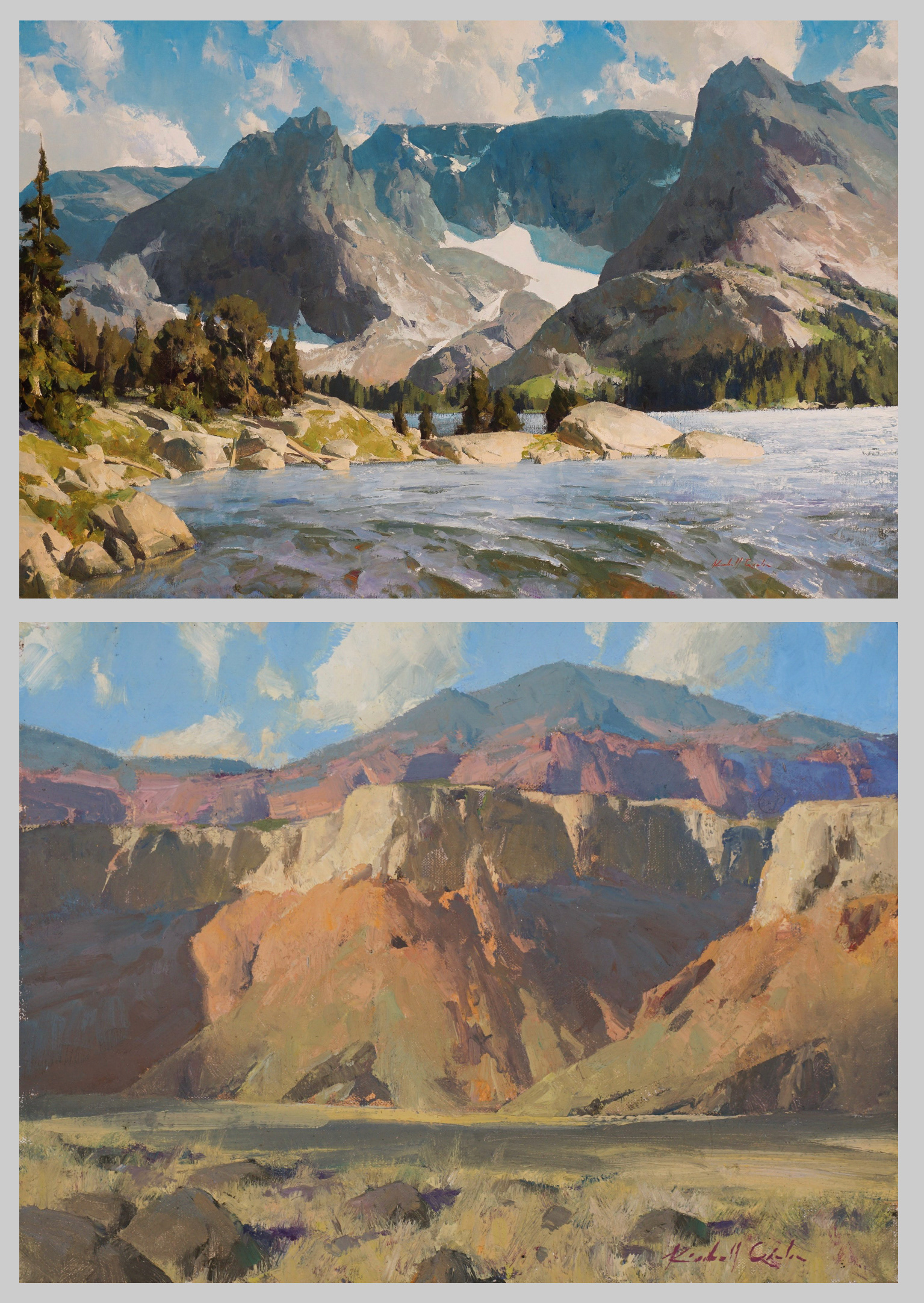
Kimball is a painter with a passion for landscapes, the longer he spends outdoors the more he wants landscape to be a part of his life. Because of this he devotes his career to the study of nature through his paintings. Instantly when I look at his pieces it takes my breath away. Knowing these places of such vast beauty and light actually exist was completely shocking. His colour palette is rather pastel toned, making the composition really soft on the eye and his variety of brush strokes create such lovely textures within the different components of the piece. This makes it easy for the viewer to be fully absorbed in his paintings, finding it difficult to look away.
I feel that Kimball is really successful in capturing the beauty of these scenes and I would love to be able to create the same feeling when moving forward with my work.
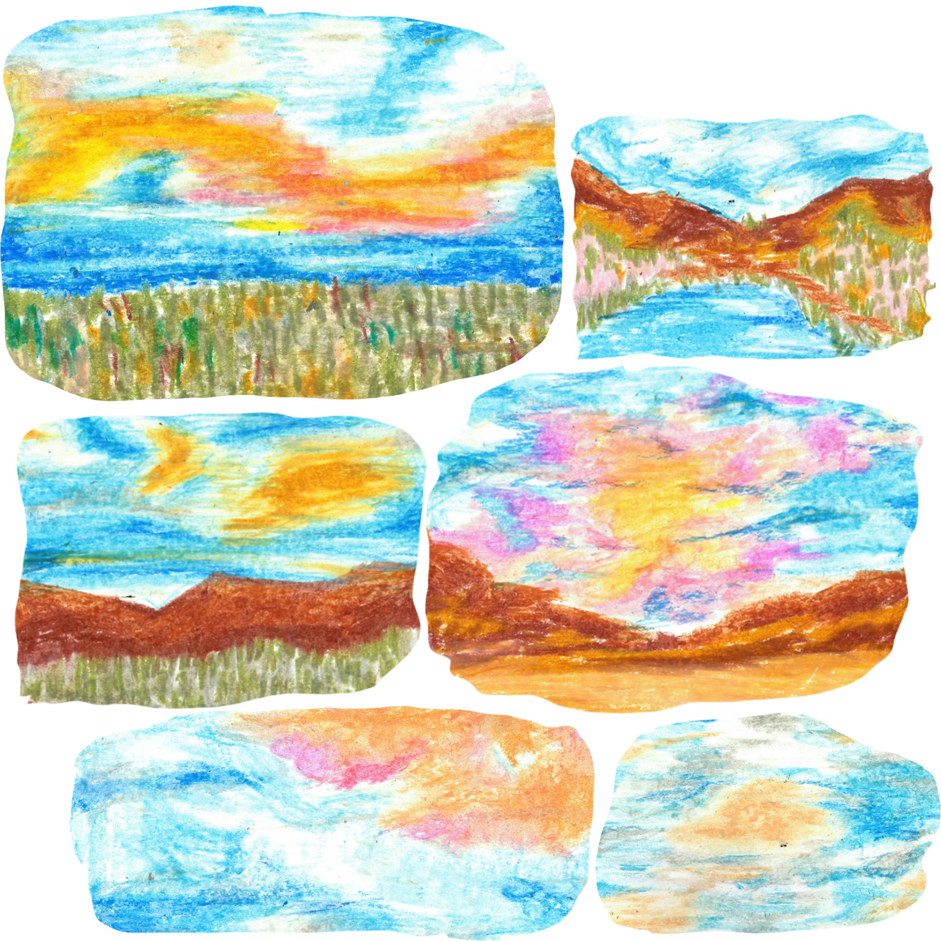
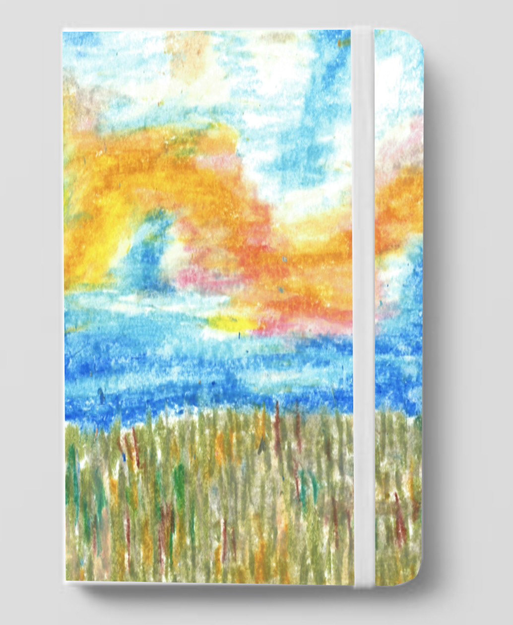
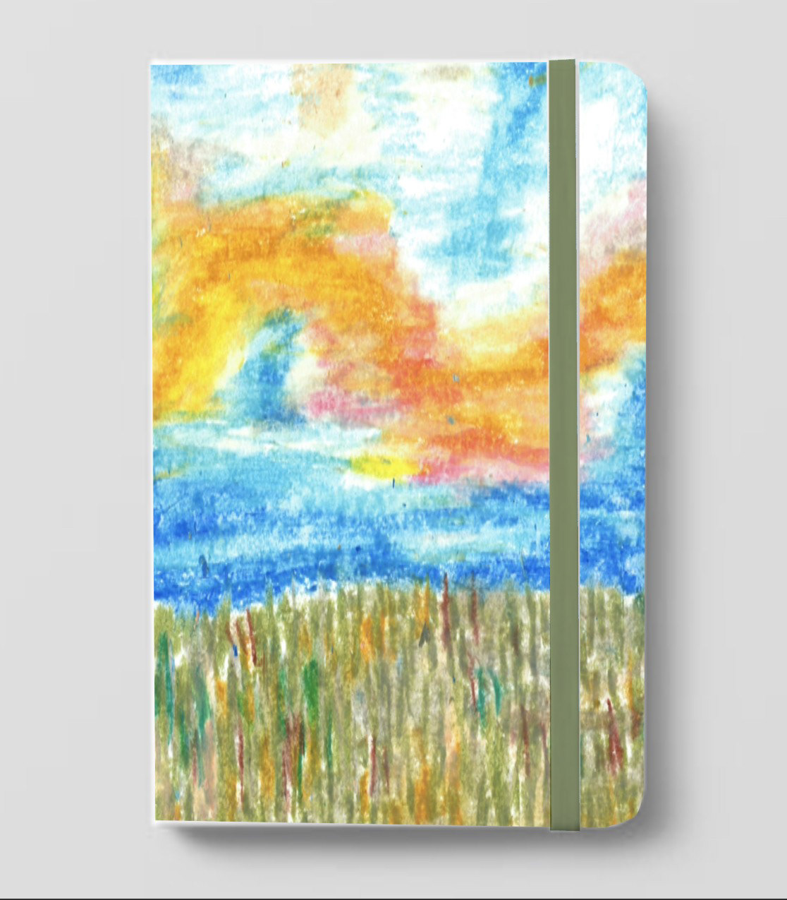
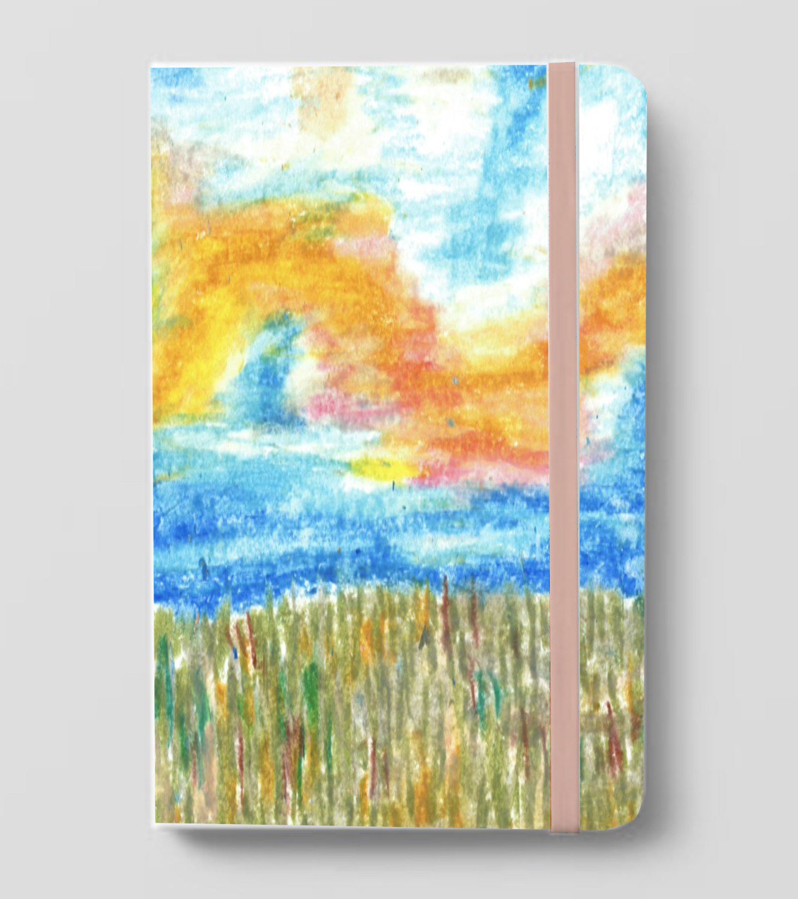
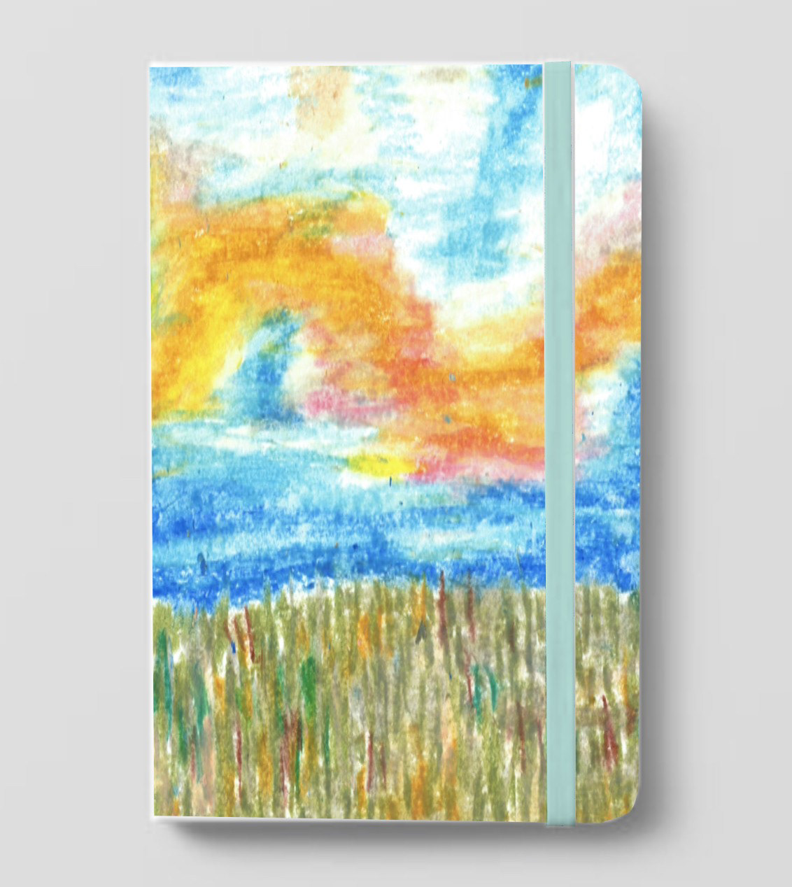
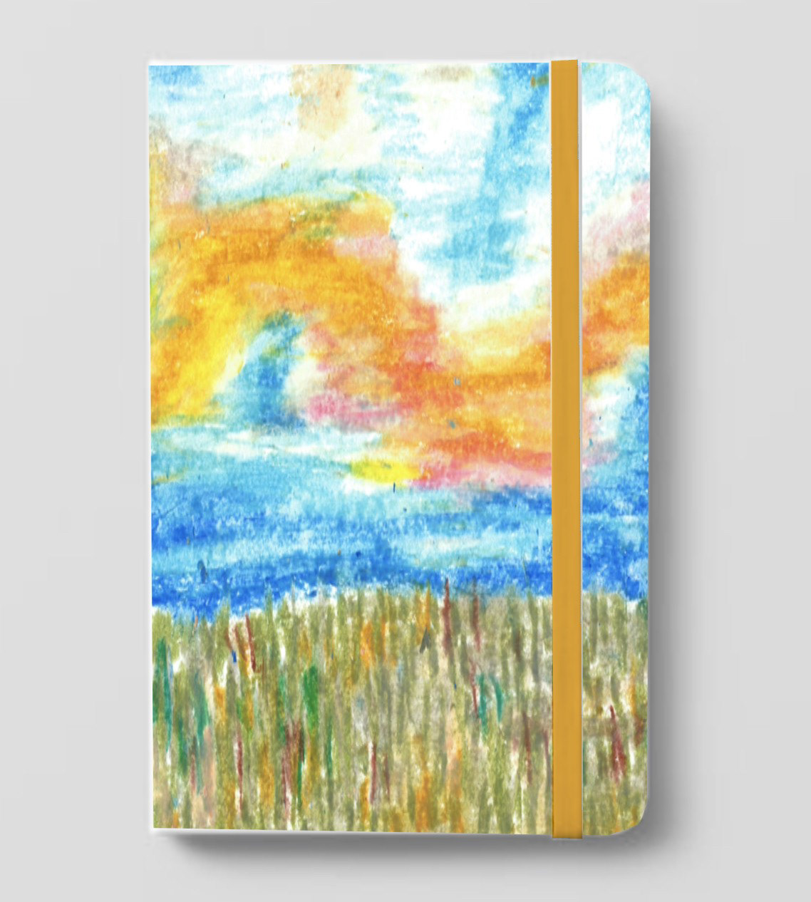
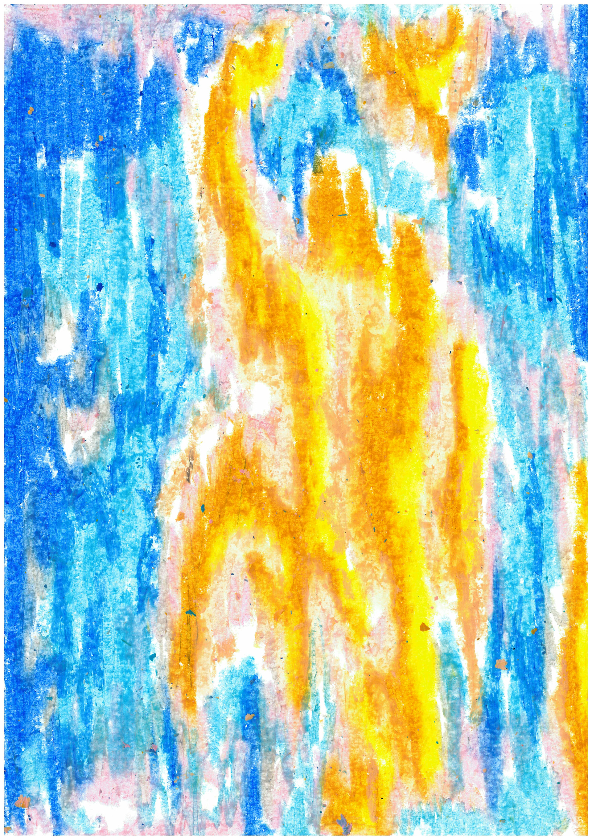
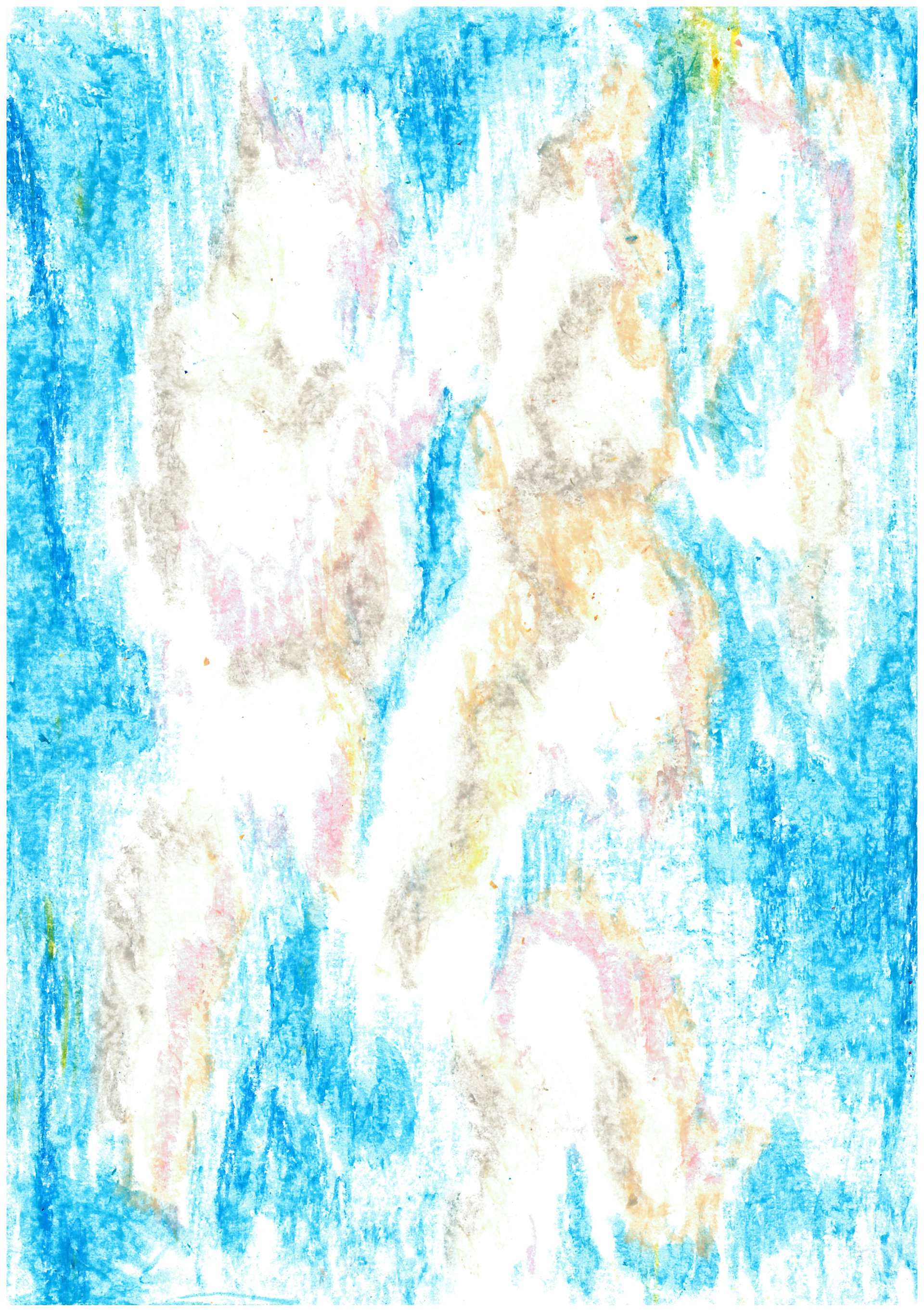
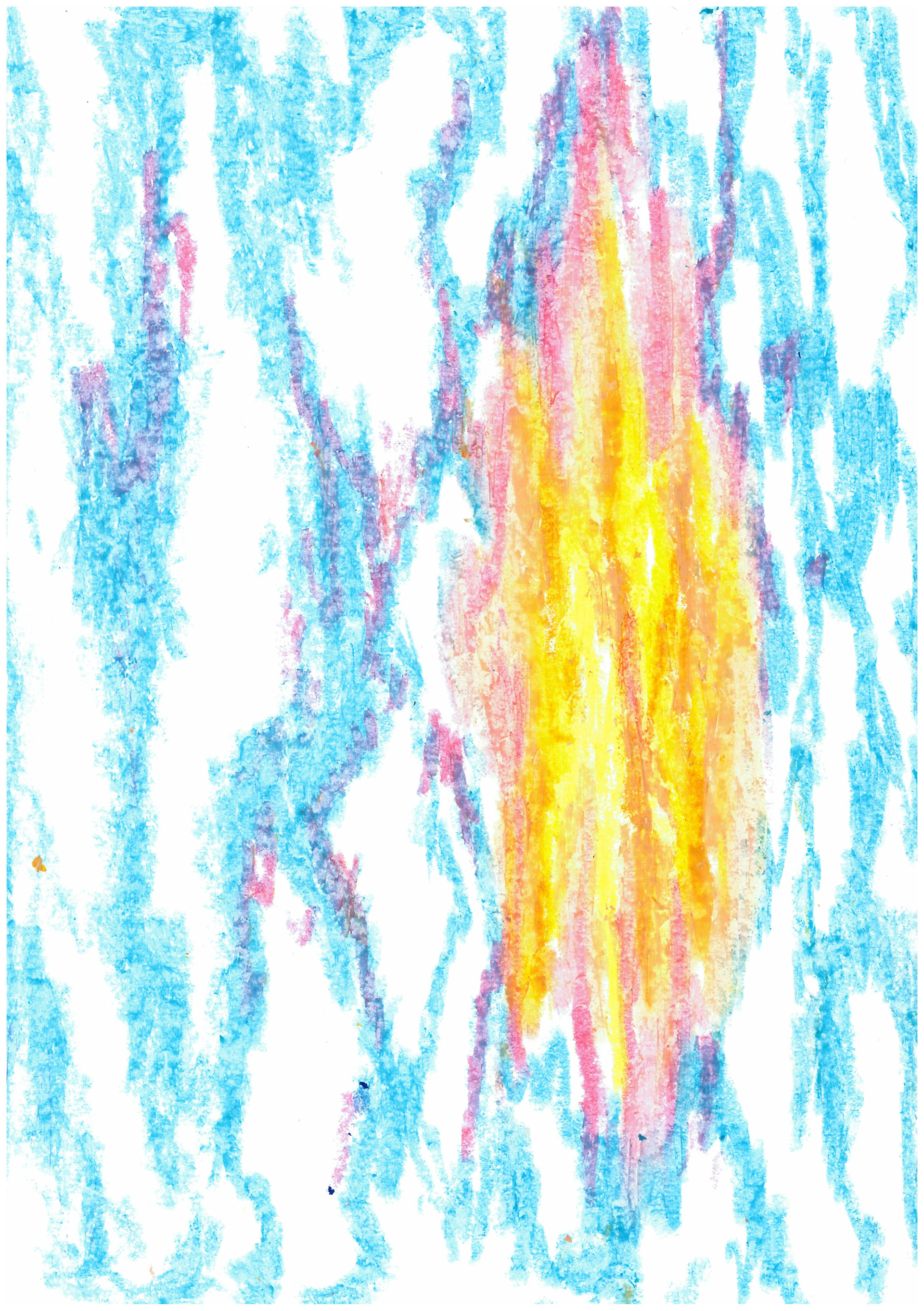
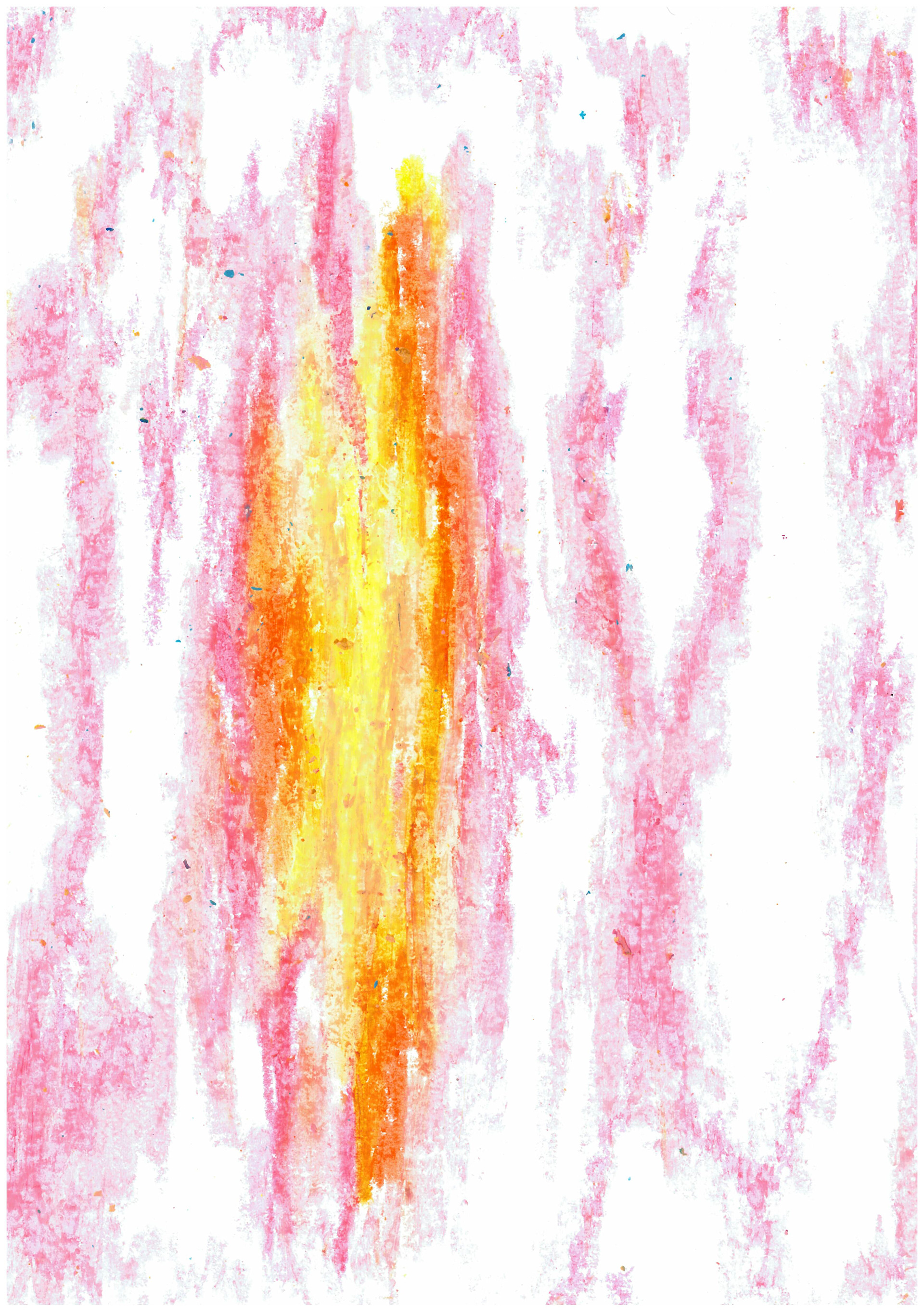
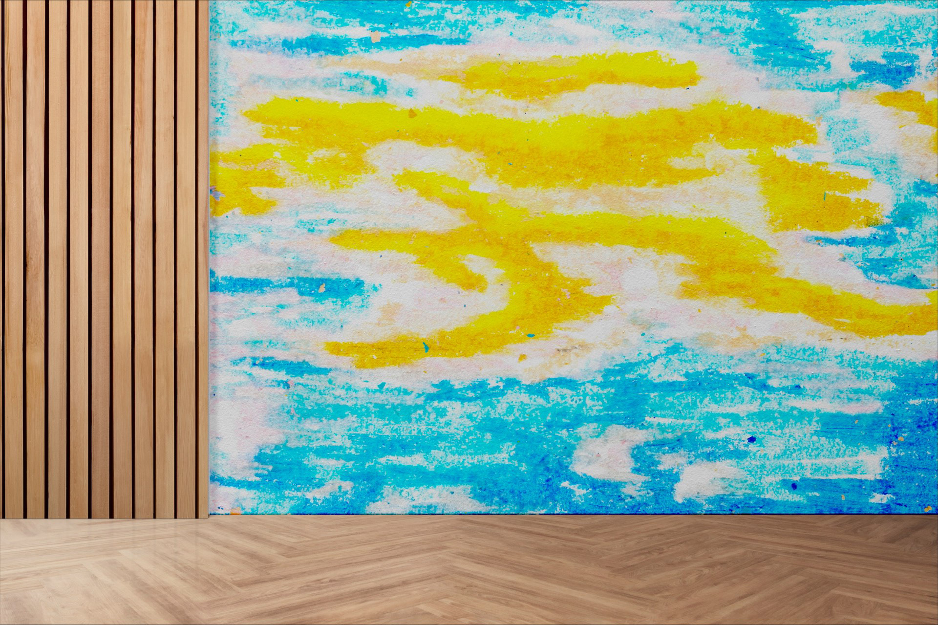
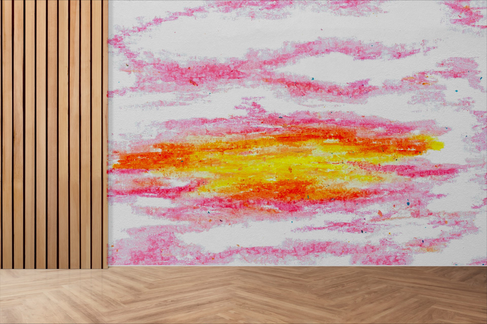
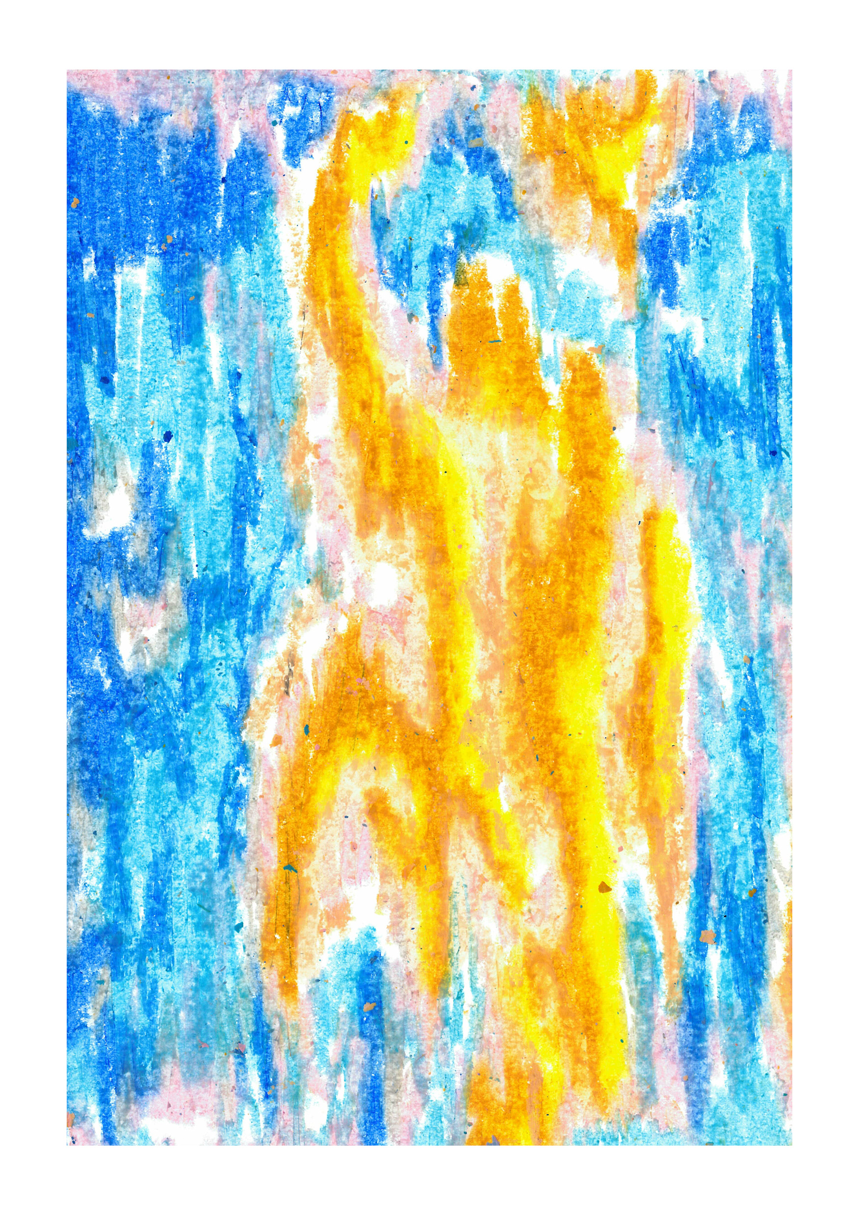
Oil pastel experiments
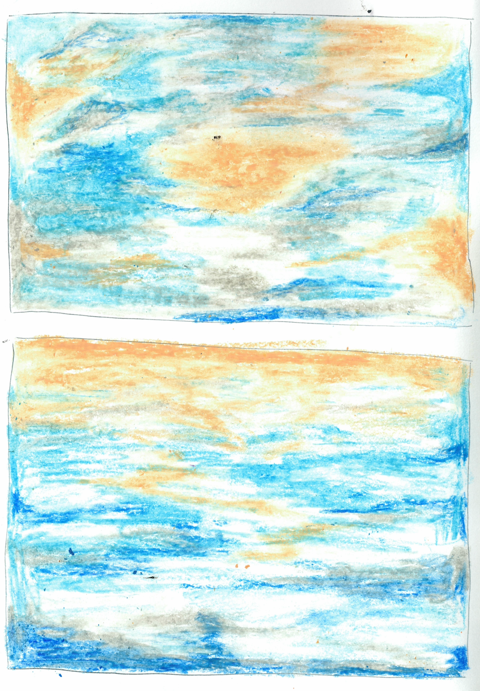
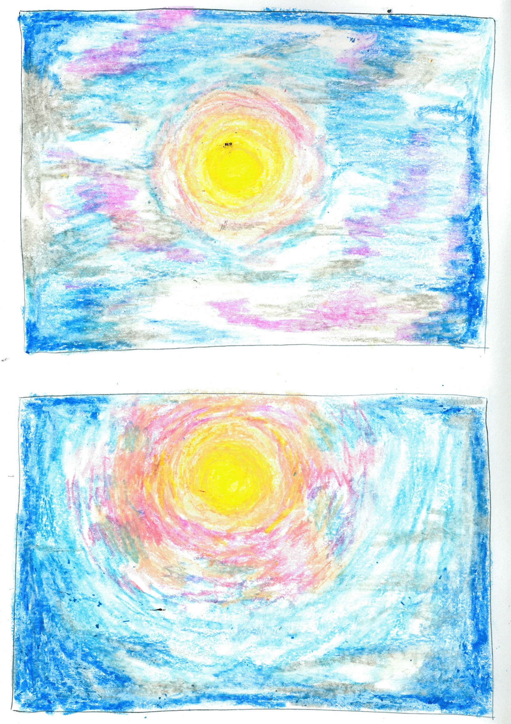
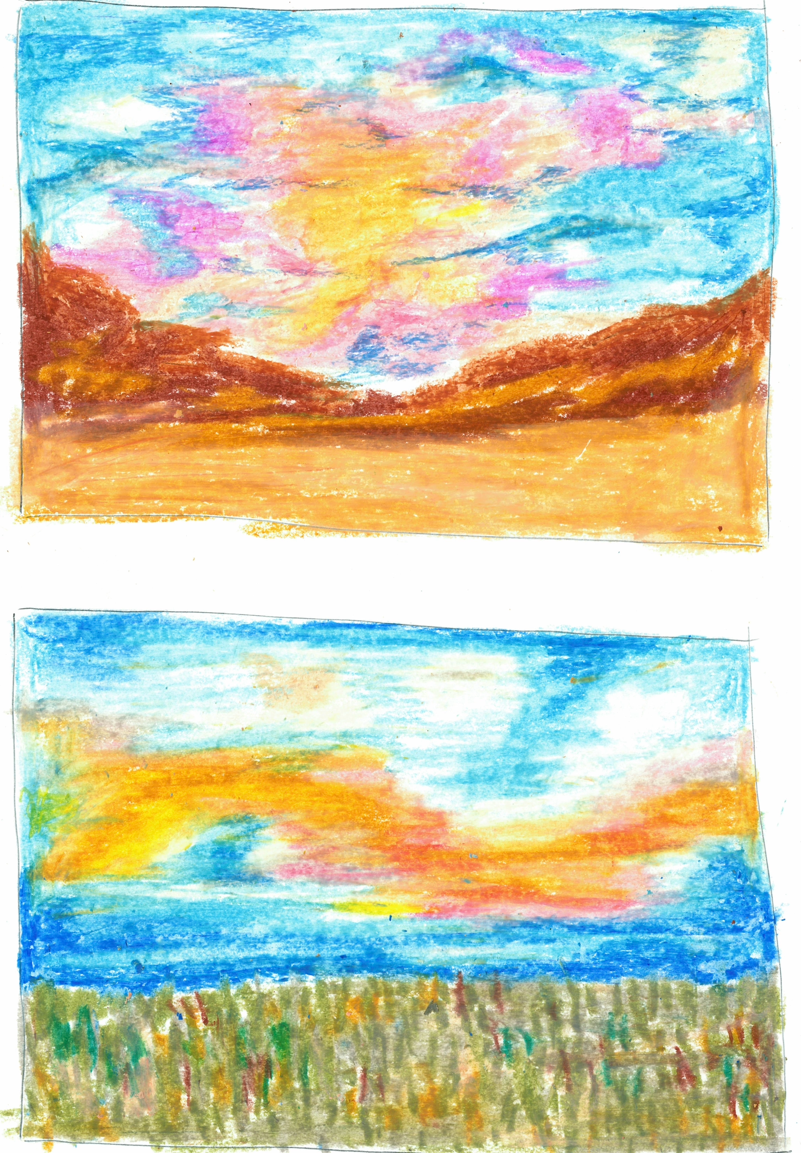
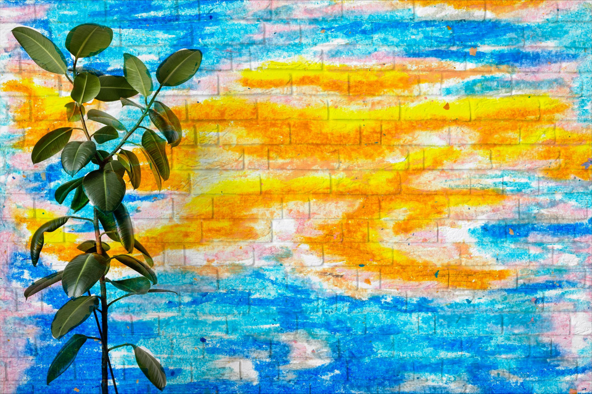
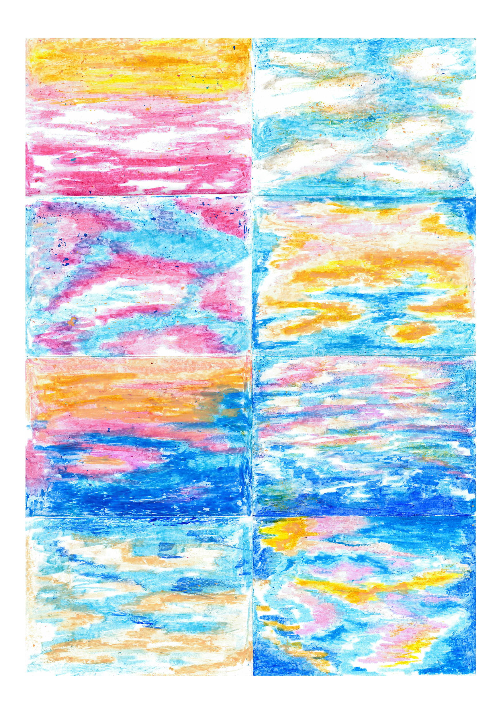
I carried out these oil pastel designs when I was feeling overwhelmed about how long we had until deadlines. It allowed me to zone out and forget all the stress-filled thoughts and phase into exactly what I wanted for this project. At first I was doing it from life, copying the patterns of the clouds from the window but then went off into my own little world seeing what colours could add more feeling.
I'm really happy with how these turned out, and even more so that it calmed me down in the process. I think the golden hints within the sky really emit a feeling of hope.
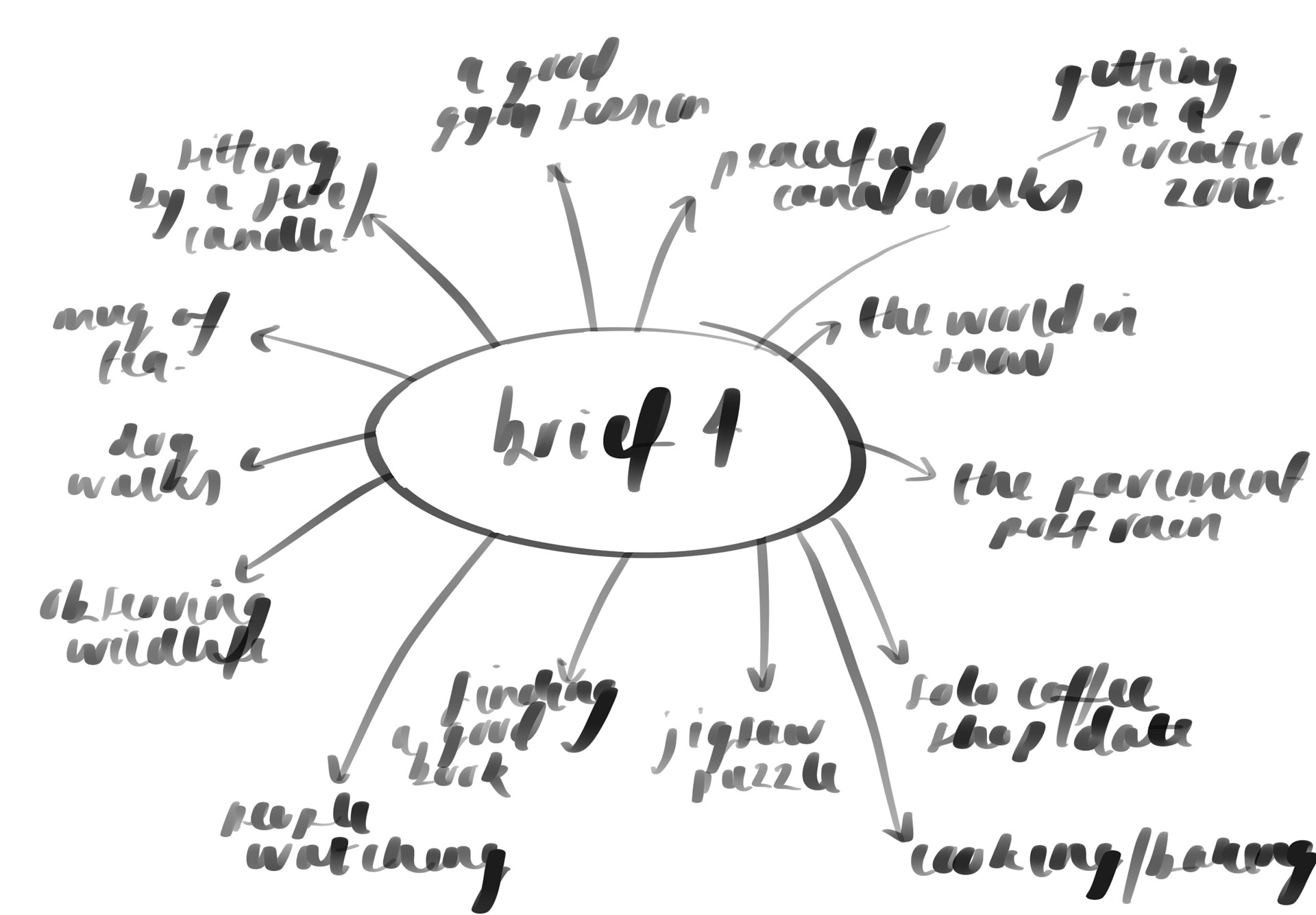
where would it live?
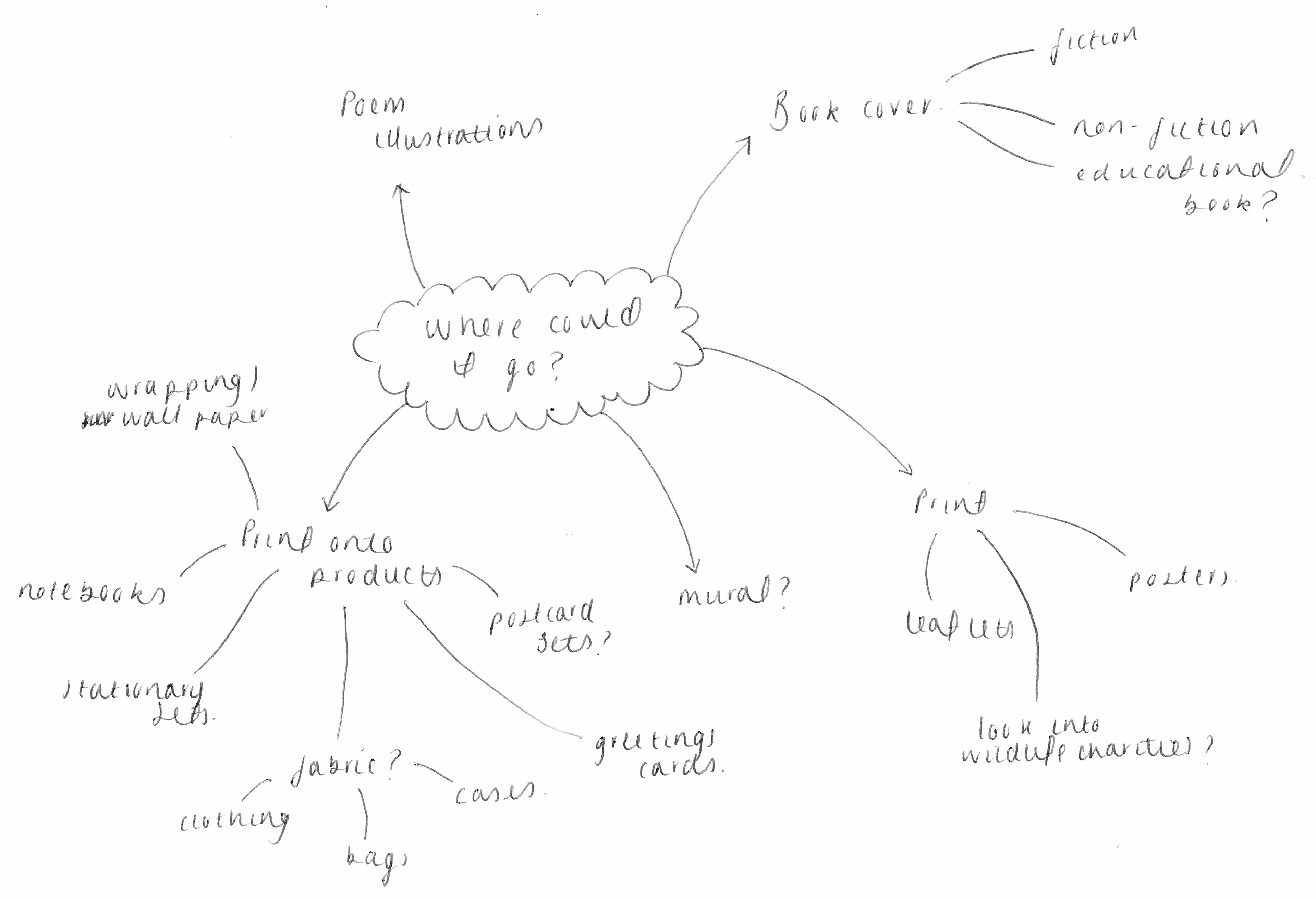
When thinking about where I want to see my designs, physical items came into mind. I find a deeper sense of achievement when being able to actually hold the things I create and so getting this printed onto a variety of products would be amazing. My idea of illustrating the sky and 'finding the beauty in the mundane' fits really well into this. I want my designs to appear on such everyday items and be able to remind people that they are constantly surrounded by this beautiful thing and that all they need to do is look up. That in itself is taking something mundane and making it beautiful.
A big question to ask myself is if I would want these designs turned into a repeat motif or if it works more effectively as a single image that wraps around or is confined to a certain frame.
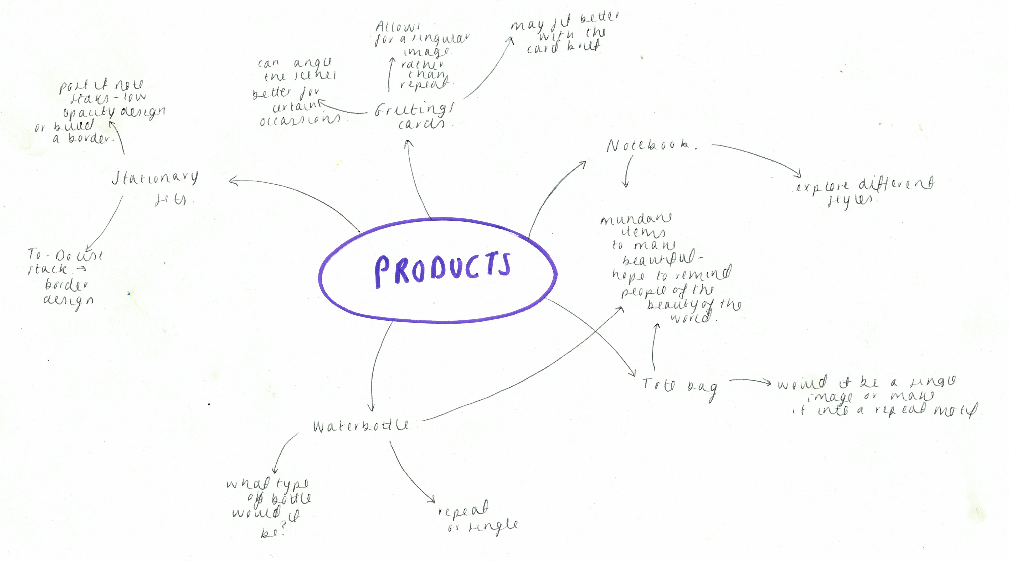
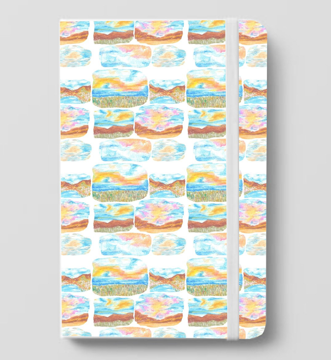
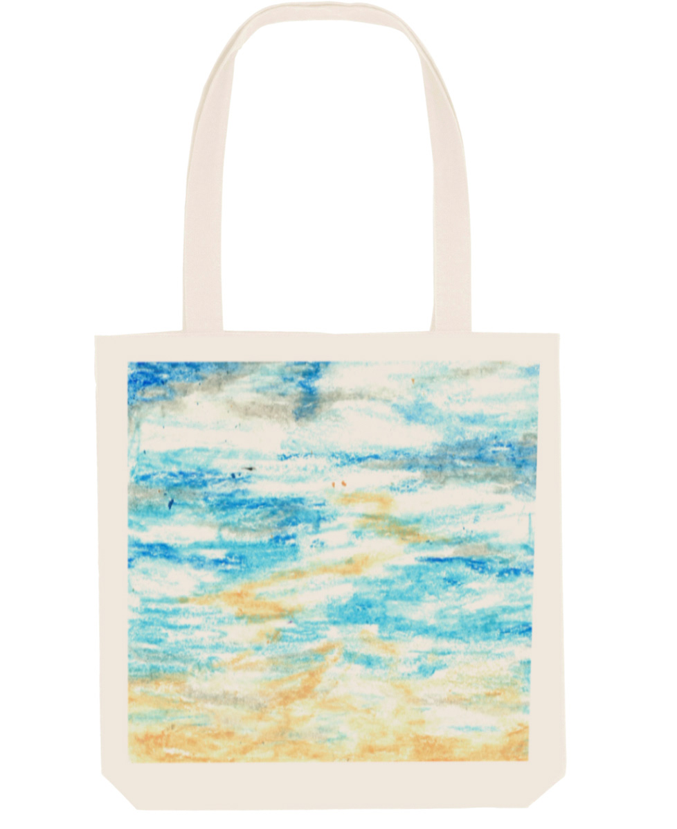
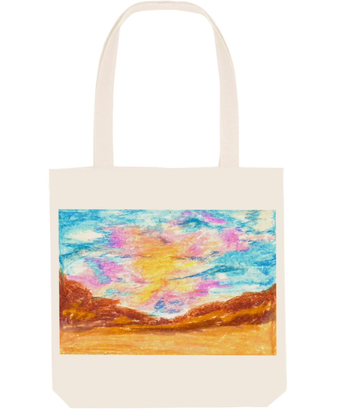
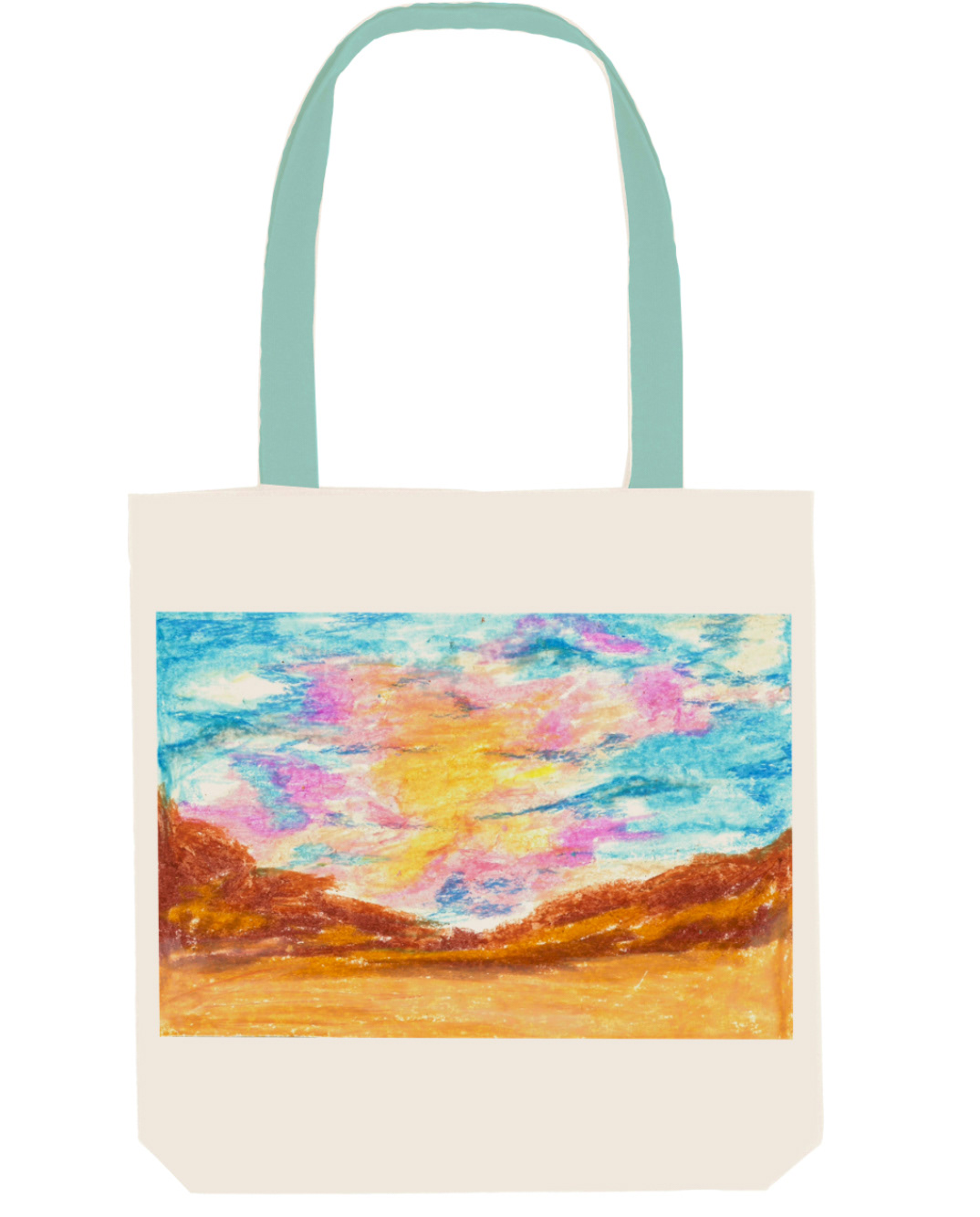
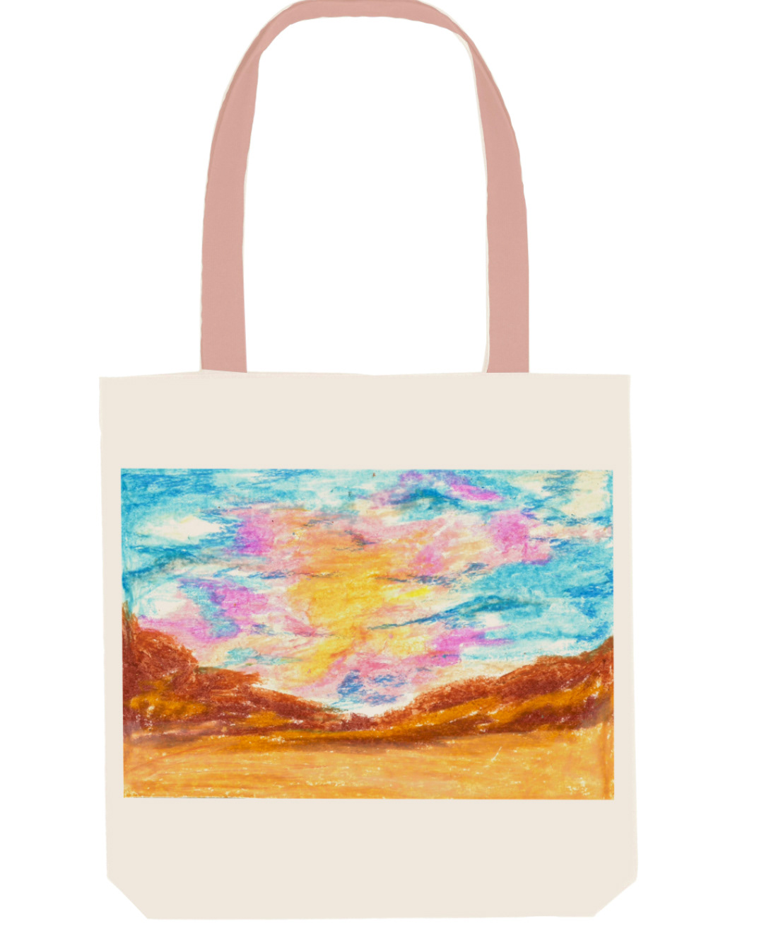
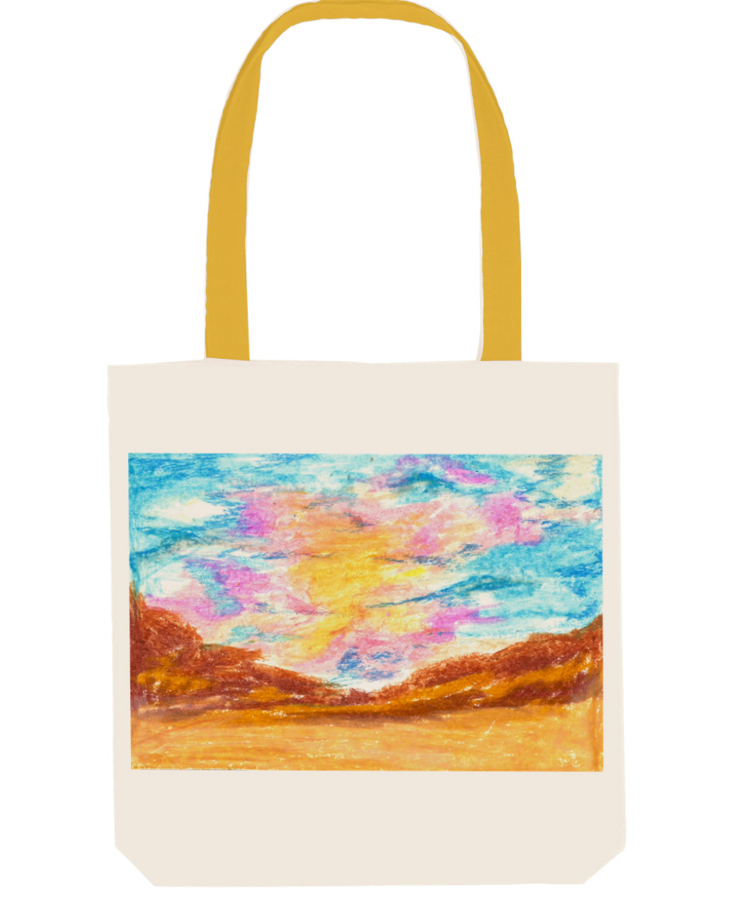
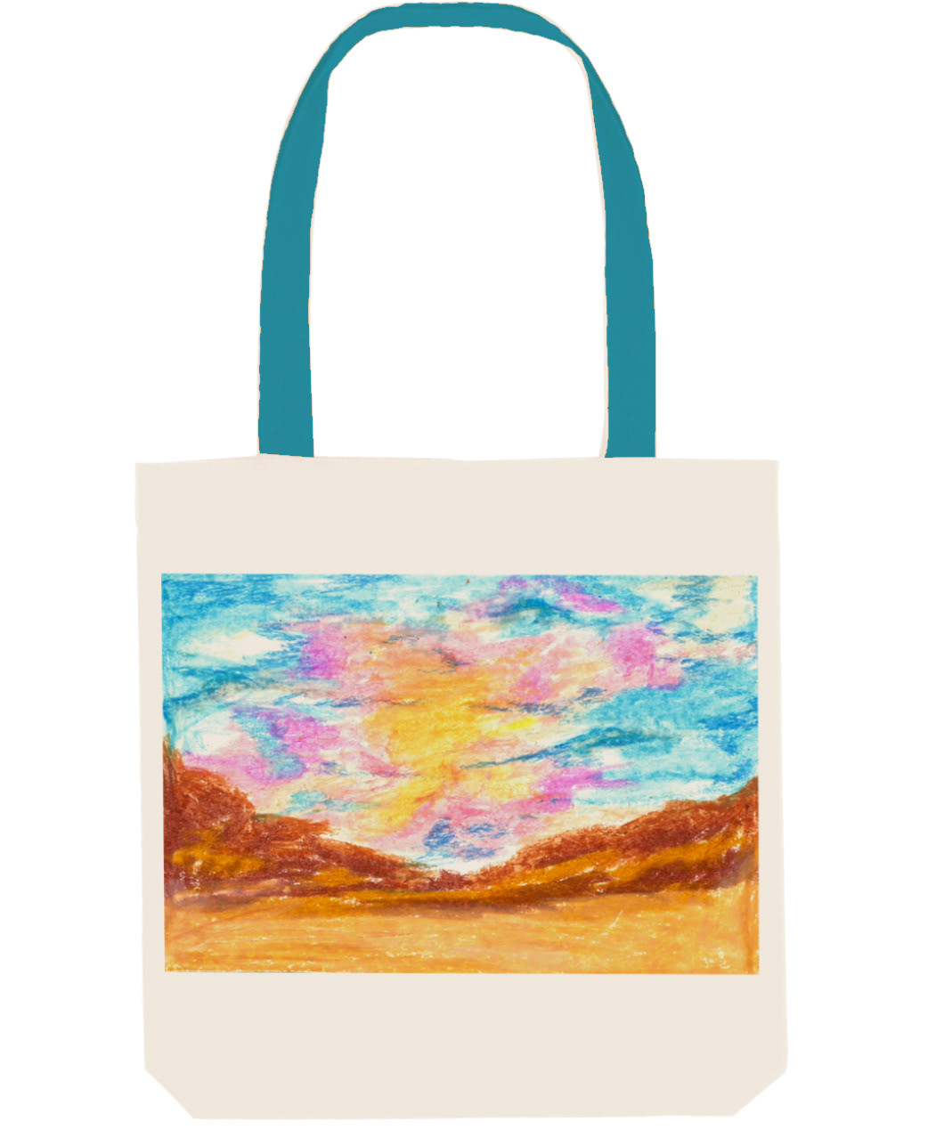
product exploration
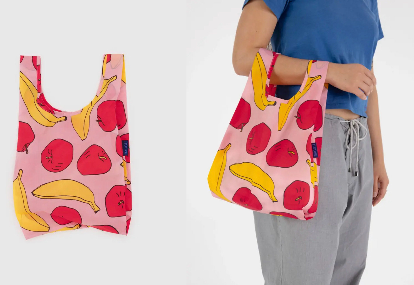
Initially I researched into a specific brand called 'Baggu'. Their tote bags are made from recycled nylon which gives it that plastic look. What I noticed when looking at these was that pretty much all the designs were in repeat and fit really well together. The colour schemes are extremely vibrant and bold, making something so simple stand out by a mile. These bags make a statement, fitting quite well with turning the 'boring mundane' into something more fun and beautiful.
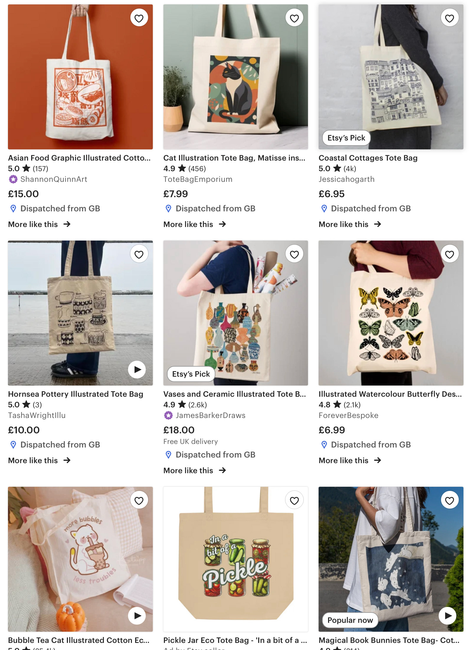
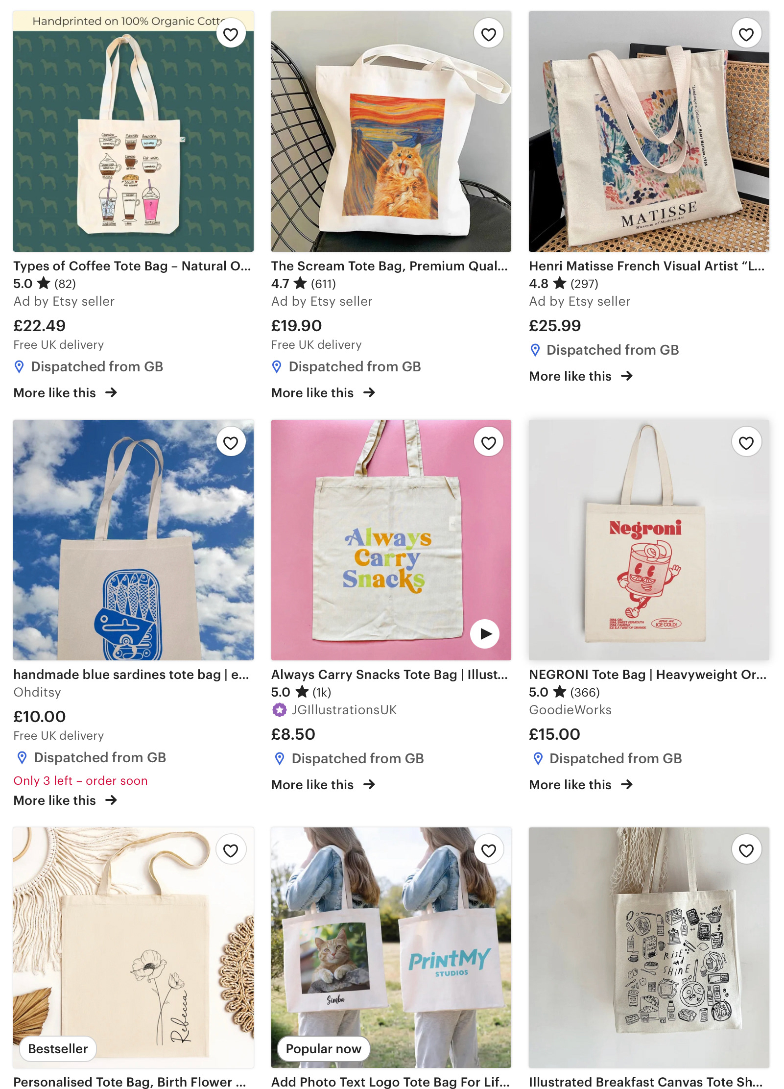
When looking into the more classic style of tote made from canvas, I notice the opposite with the type of patterns they hold. They generally only fill a specific square frame of the bag, whether that be a fully coloured image or something more simple. But they're rarely seen with a repeat motif. These tote bags are what jump out to me the most but moving forward I want to explore how far I can push my designs and whether they'd work in repeat.
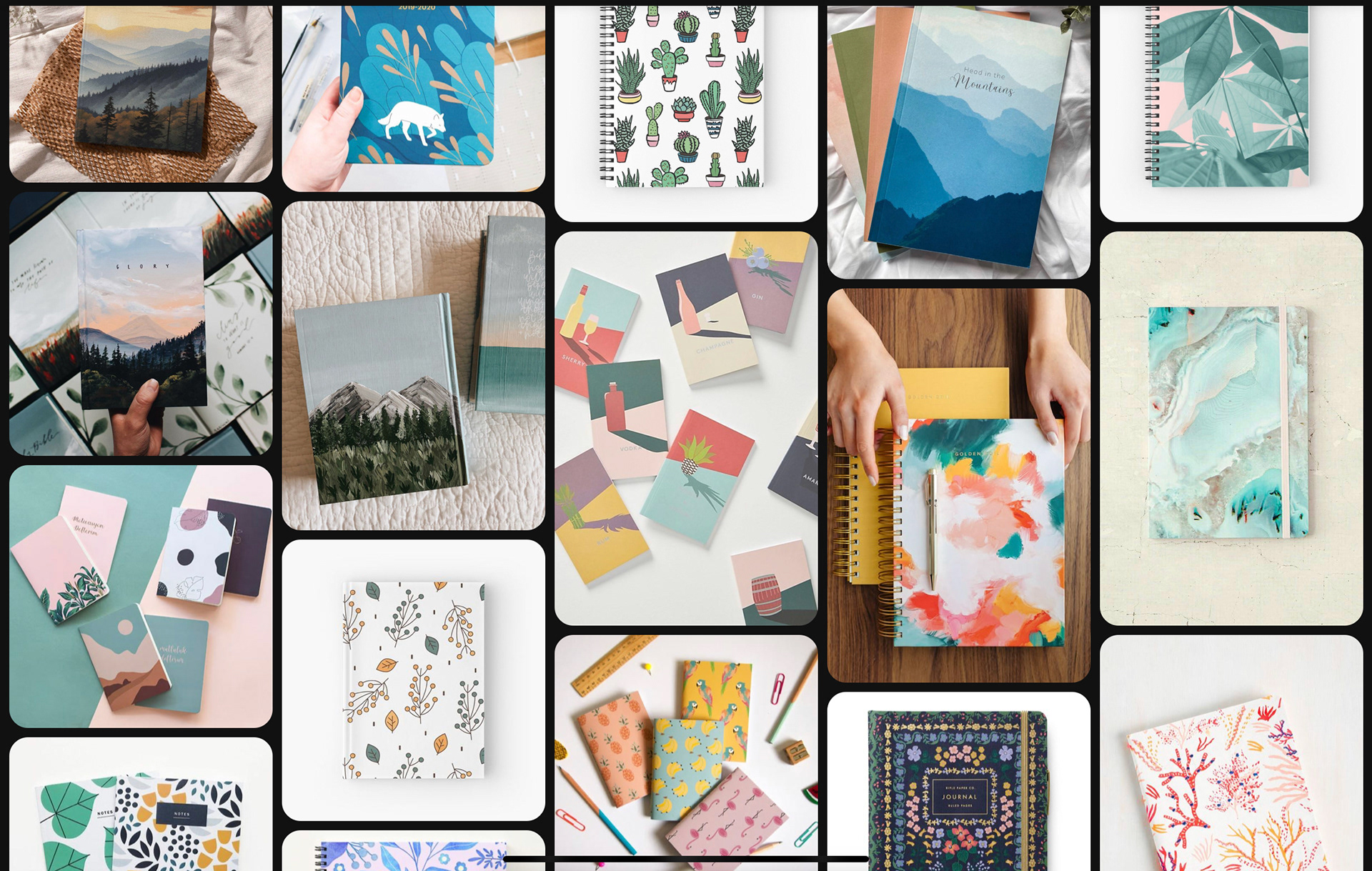
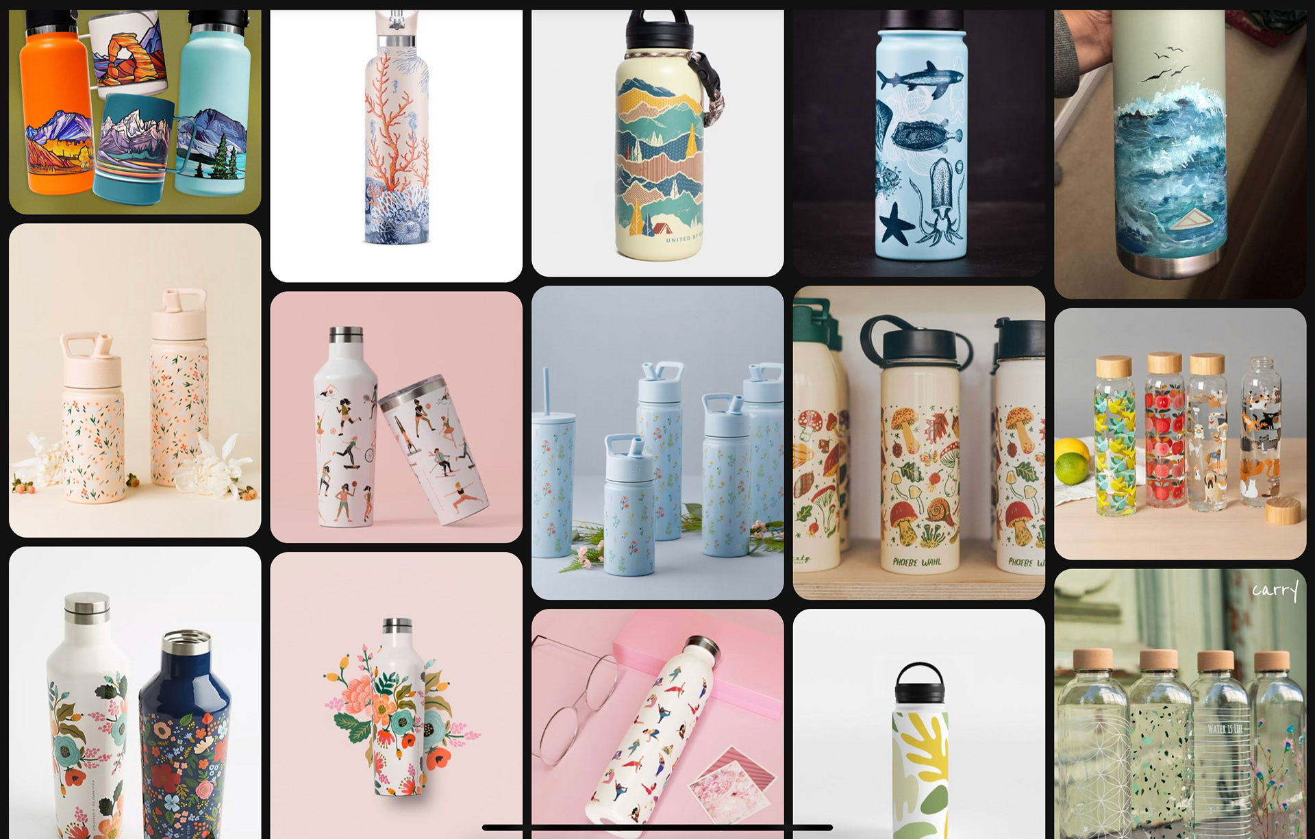
When looking into notebook and water bottle designs they tend to be more simplistic but there isn’t a more common appearance of either repeat motif or single. I feel that a single scene would be be really effective on the wrap of a notebook, this is because it doesn’t need to match up at the ends because there will be a page break. This would allow me to make a more impactful image rather than have it broken up into smaller components. Whereas on the water bottle because of its cylindrical structure it would only be successful if the pattern were matched up. This could be rather difficult to attain but could be good to explore.
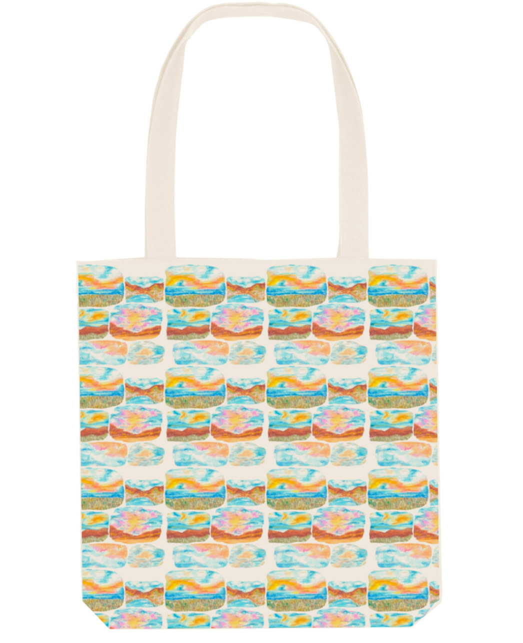
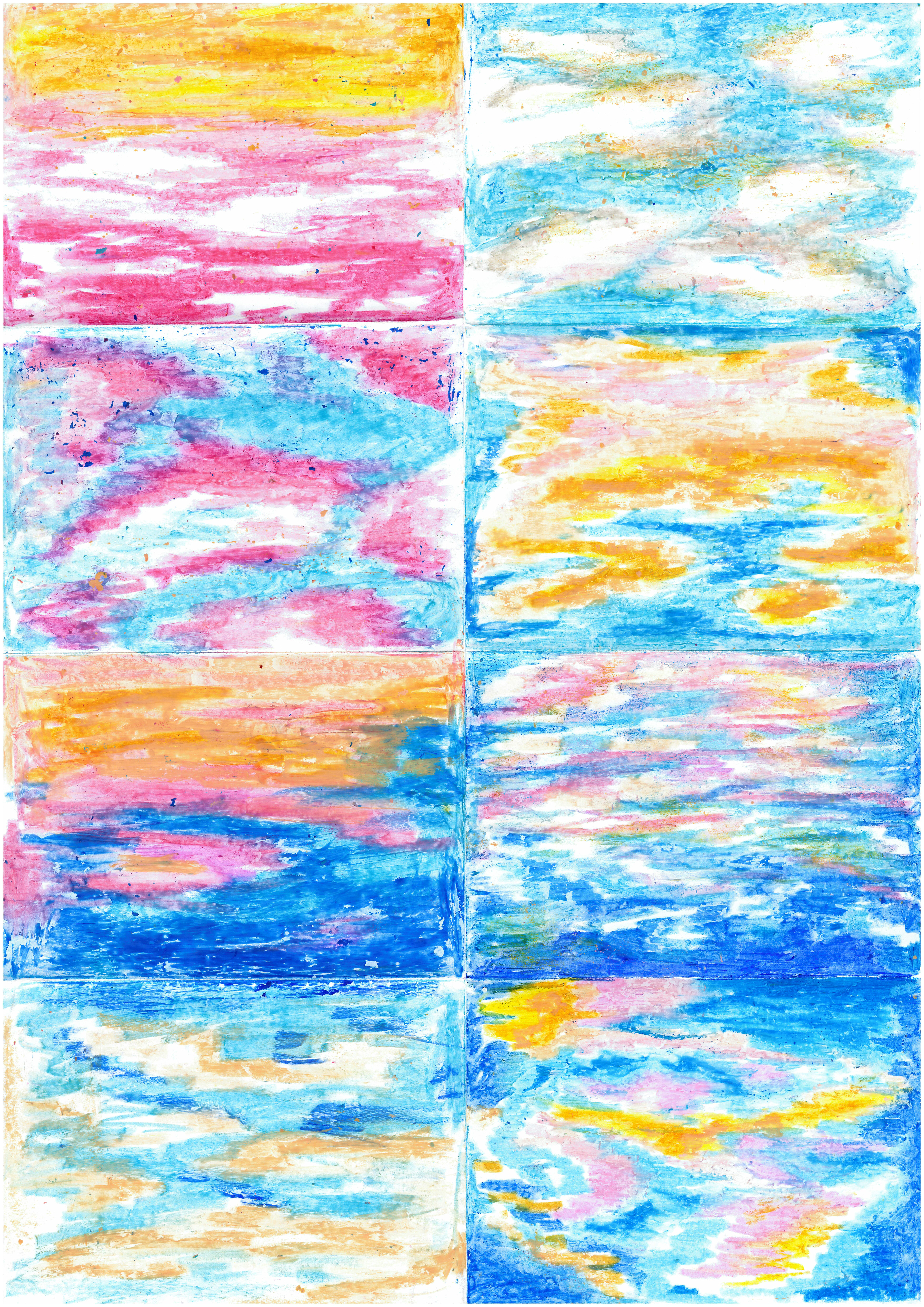
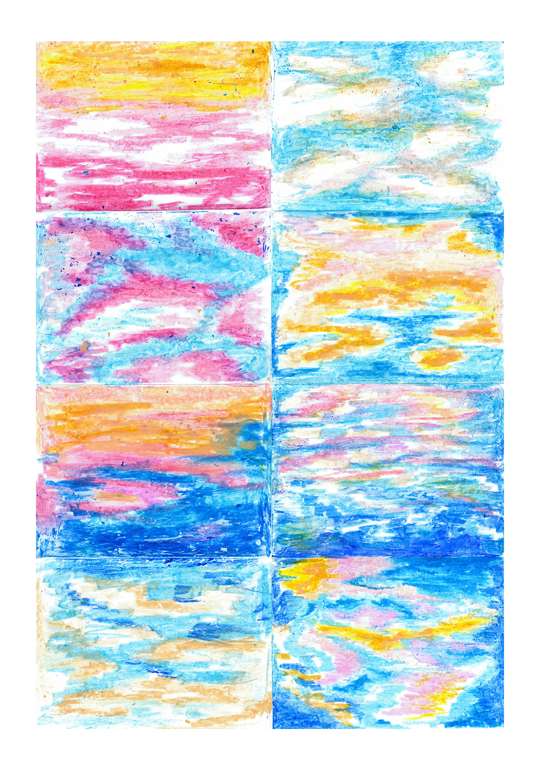
Pattern experiments
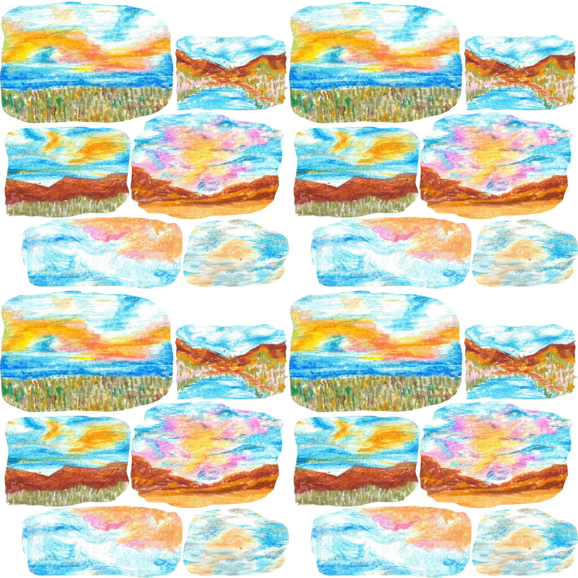
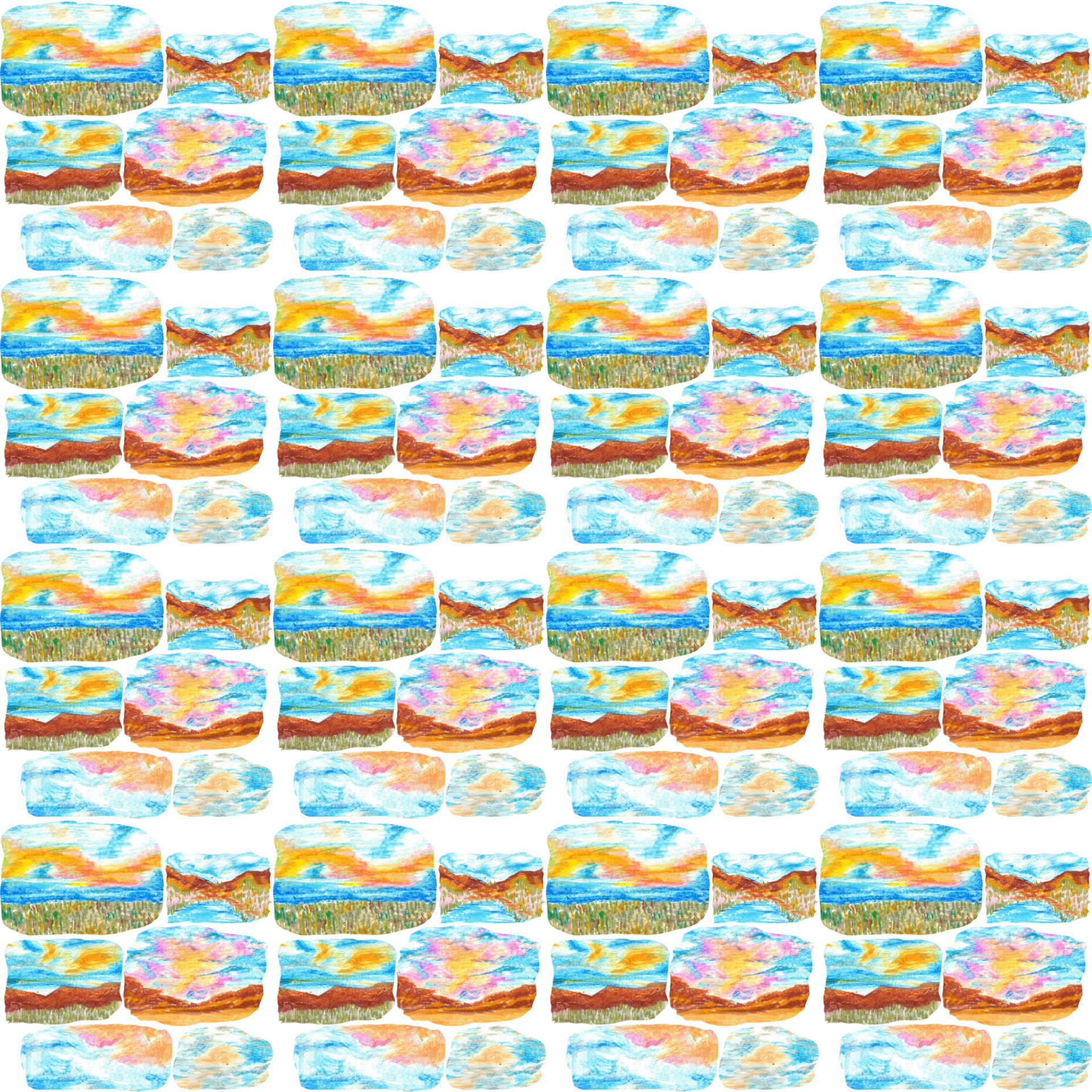
For my initial pattern experimentation I selected areas from 6 of the sky images I created and cut them out on procreate. I organised them into a patchwork kind of pattern and then put them into repeat. I think I could make this slightly more effective by splitting one off the images off the edge where you can see a gap in order to fill it. All in all though I think it turned out a lot better than I was originally expecting. Moving forward I could attempt creating these pieces in different shapes that fit more cohesively together.
Mockups
Thinking of a collection
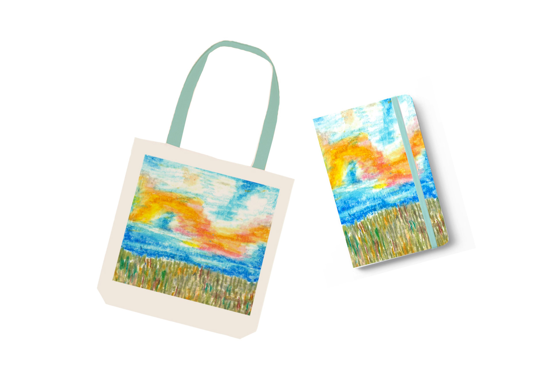
I think this could be really successful being made into a collection as long as a third component is added to complete it. Each product would have a corresponding strap colour that will be decided from the palette of the piece. This could also stretch to being a series of multiple different designs, each with the option of having a generic pattern used for the notebook. Continuing on I will try some mock ups of water bottles as I feel that would be a fitting third part to the collection. I will also try expanding on my designs to find a more cohesive theme for the pieces.
change of direction
Following up from the wonder presentations, I lost a bit of passion for this project. I felt like my ideas lost their original spark and I didn't have as much of a drive to make pattern. I still find it extremely rewarding being able to see my work printed onto products, and this would have been a lovely final piece. However, I realise that pattern work is an extensive act that takes a lot of time, trials and thought. This is something I was lacking at this point of the year due to the increase of stress. In the future I may still try developing a new pattern to get printed as I would love to be able to walk around with an item of my own design. But in this situation I was advised by my tutors to go on with something I enjoy and look at it from a different perspective.
From this the decision to create more oil pastel pieces came up. Making these was so relaxing and brought me so much joy that I went on to spend a few days creating a new series of them. My tutors told me to think about them in the context of an editorial piece so this is what I went on to do.
First trials
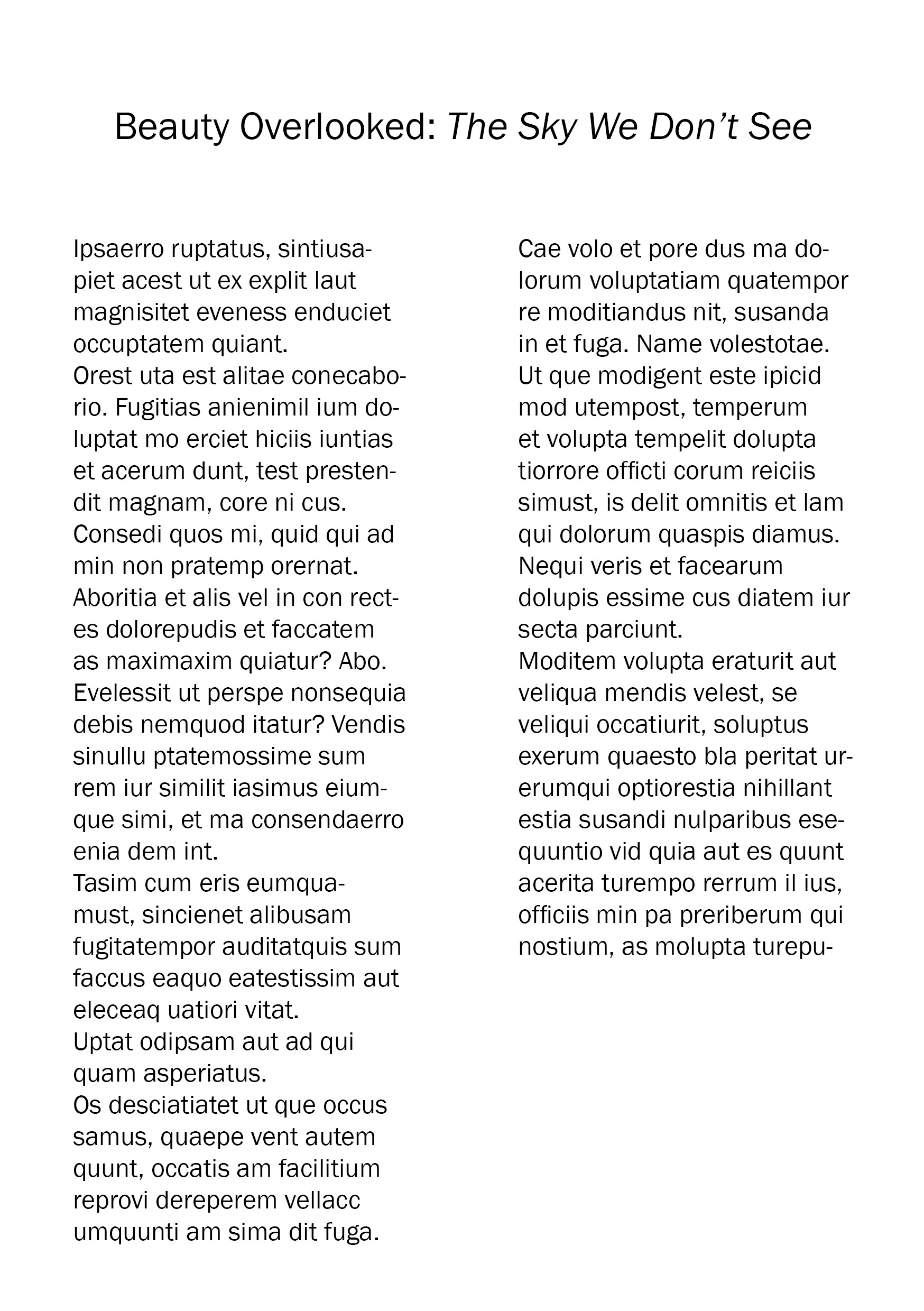


Seeing my work up next to text allowed me to see it in a more professional context. I've never really thought much into editorial illustration but if it allowed me to create a piece of art I loved to aid a certain context, it may be more enjoyable than I thought. In order to make this more successful, I need to adjust the type size and layout of the text. ChatGPT helped me come up with the title.
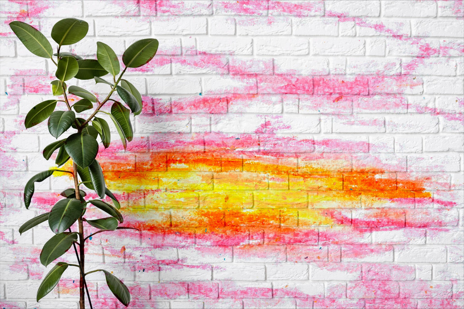
wallpaper mock-ups
When presenting my first attempt at an editorial piece, my friends were stating how much they thought it would look good as a wallpaper. Hearing this I decided to try it out and it did fit quite well. I knew that it was too late to delve into wallpaper design but it has sourced some form of future inspiration.
second trial

For this trial, I re-formatted the text to make it a more cohesive pattern that fit more with the image. I changed part of the title colour to blue in order to pull over a bit of the design and balance out the page. This is already looking a lot better however there are some other details such as author and page numbers that are missing. I need to add this in order to make it just that slight bit more professional.
Final trial
I quite like my final format, I think that it flows nicely together and is almost satisfying to the eye. I lengthened the paragraphs to make it match up with the length of the corresponding images, being careful not to leave any 'orphan' words to let down the layout. I also went in and filled the blank page with another piece that I did just so the second part of the article didn't feel so lonely. I added in page numbers, matching the colour to the one that I used in the title and made up an authors name. All in all, I think this has a very professional finish but next time I may swap around the page layouts just so it's not so heavily illustrated on the one side.
zine experiment
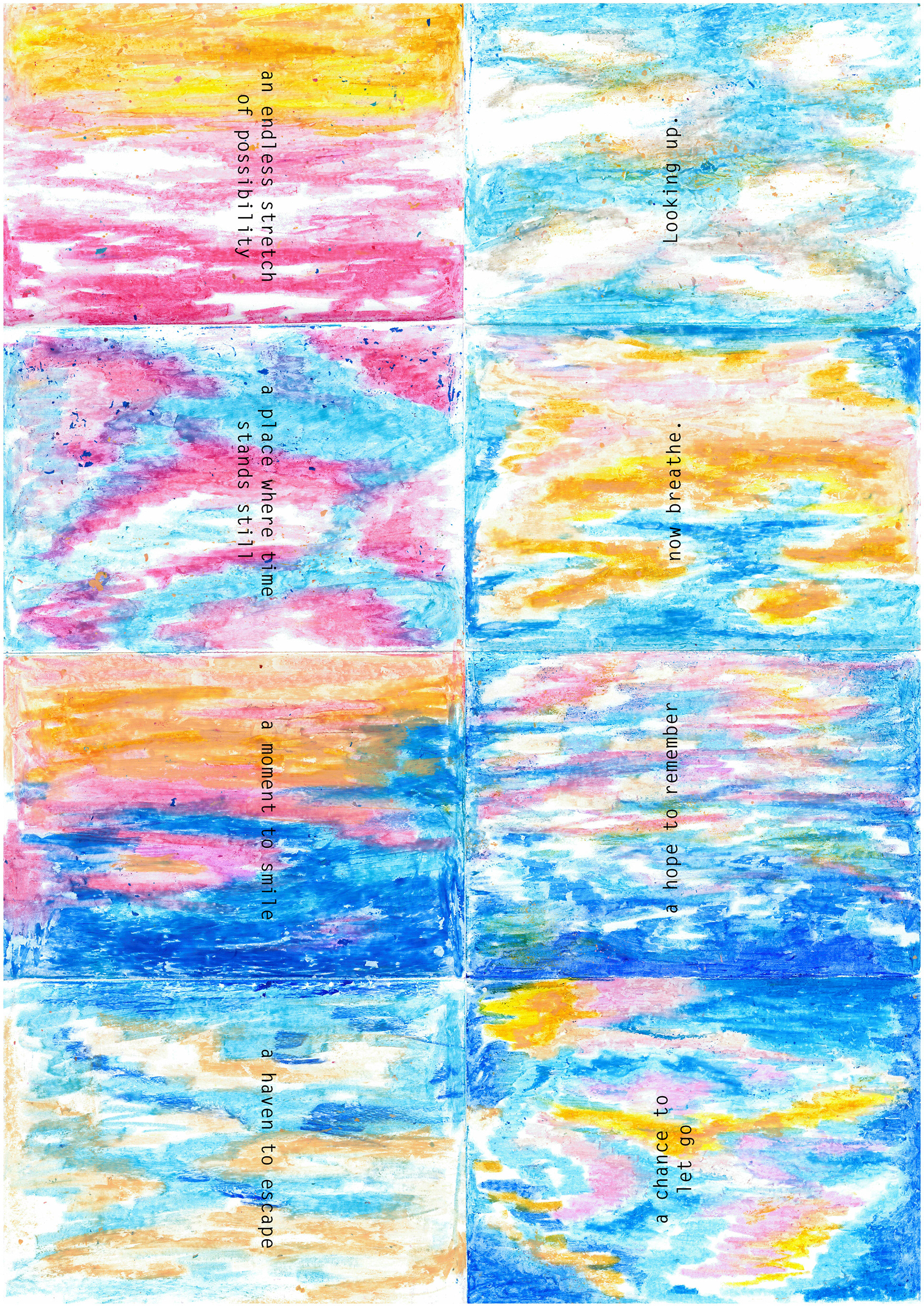
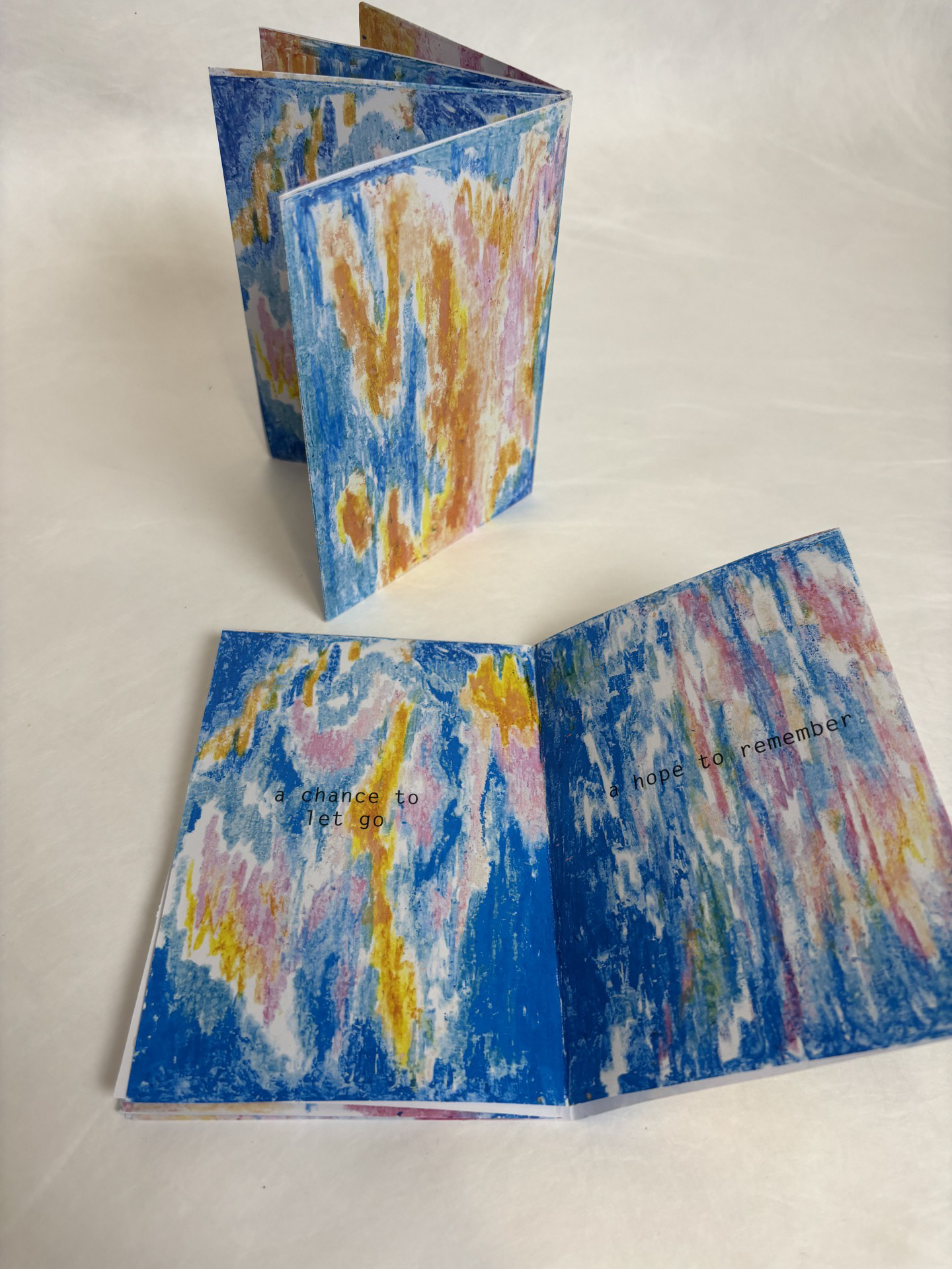
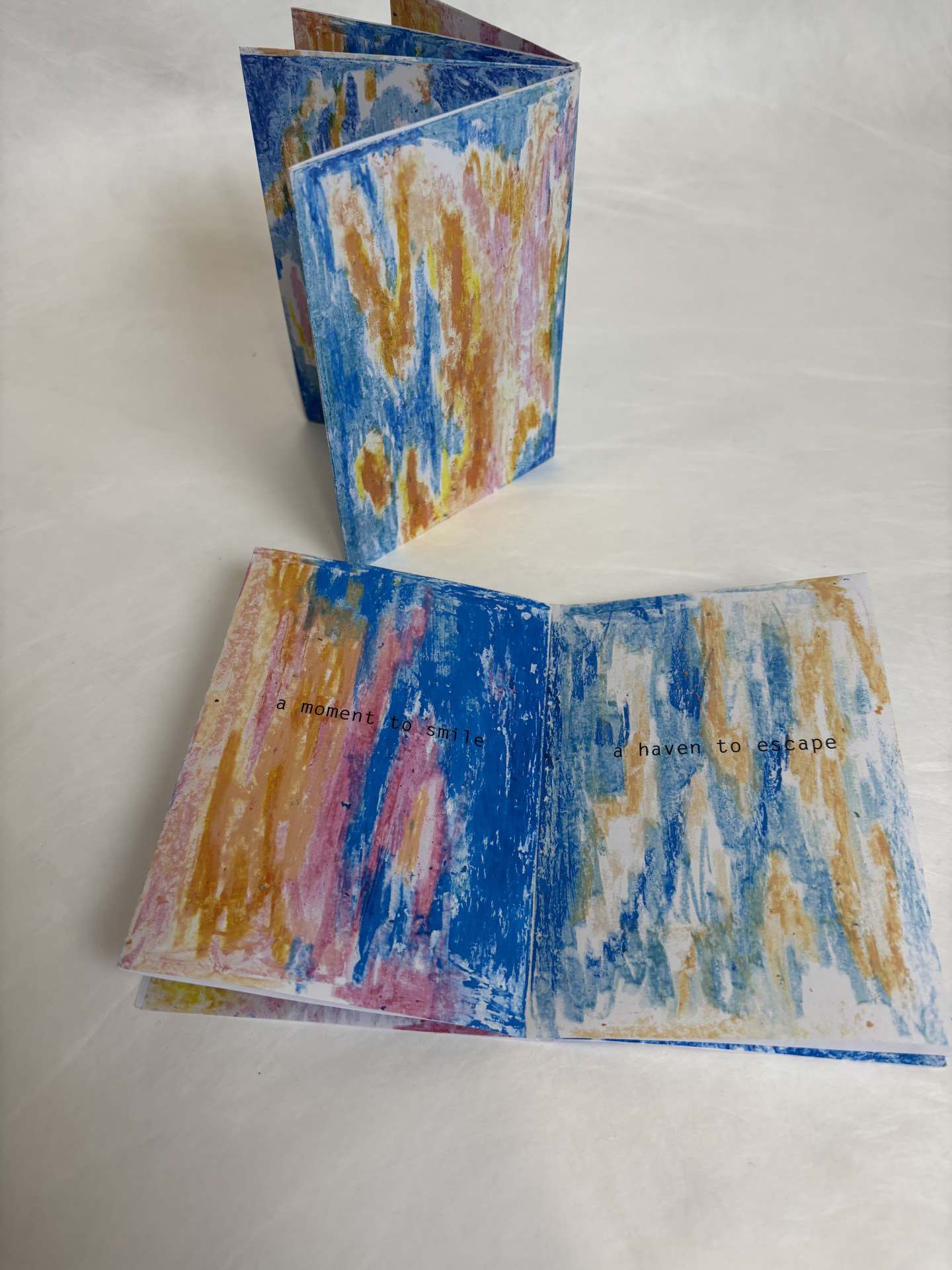
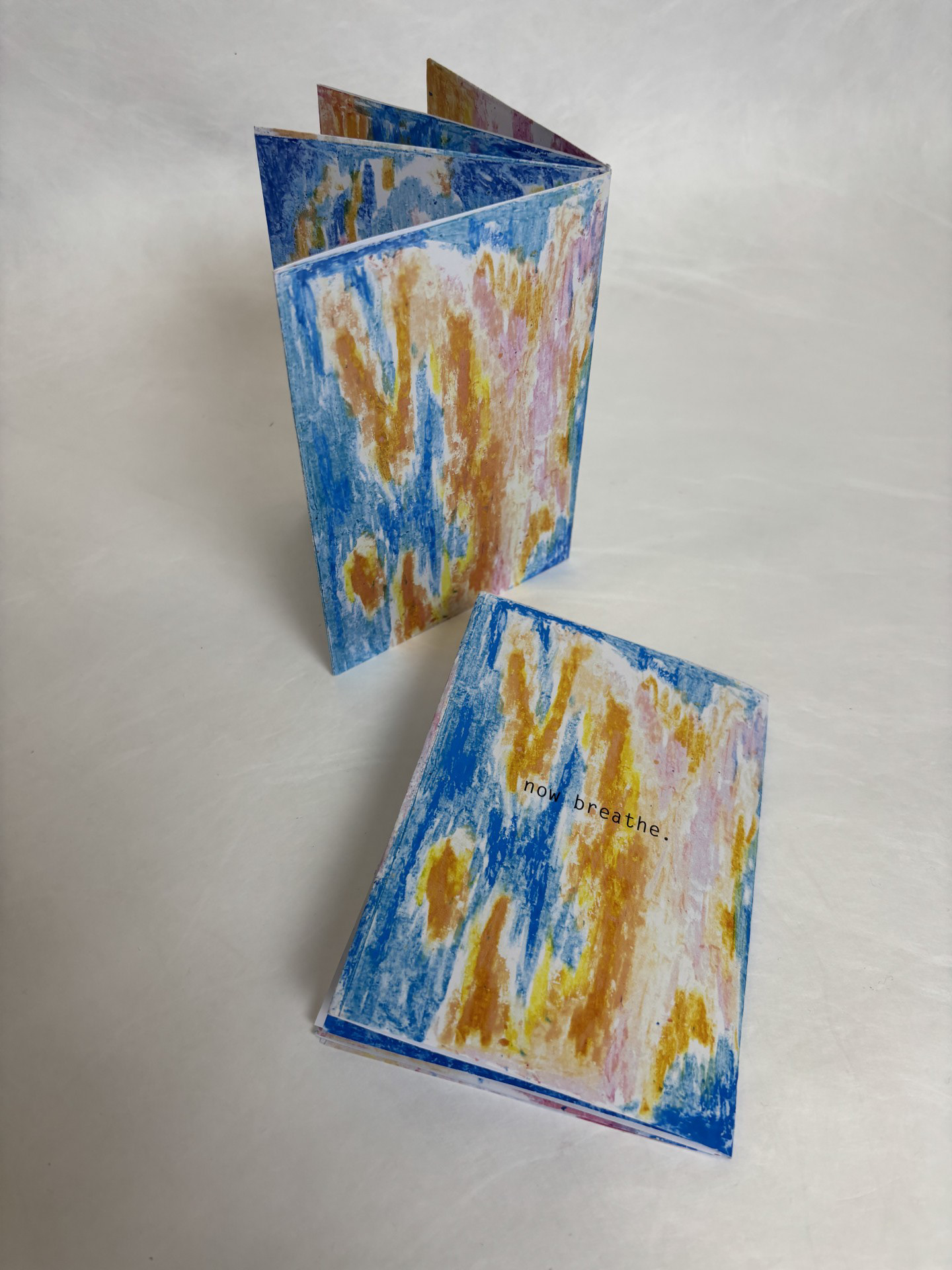
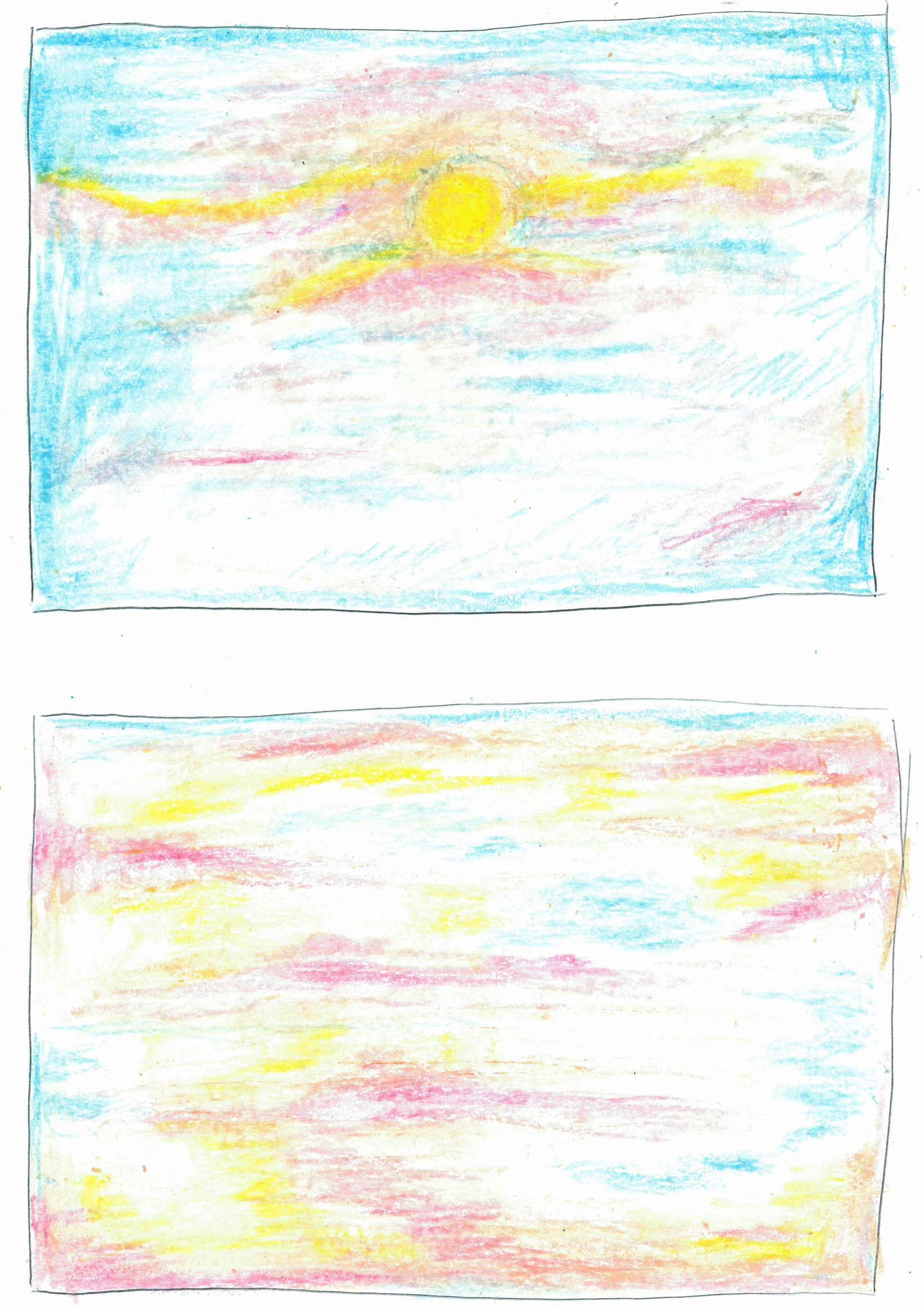
Moving forward I thought it would be nice to print my series of sky illustrations into a zine. I found it quite relaxing just flicking through them and being able to take in the sky. The pops of gold amongst the blue is really effective at creating a sense of hope. After this I went in and typed up some short sentences on each page that linked to different reasons to look up. I passed this around to my friends after printing and they said that it really helped them to relax. I think this could be pushed so much further and if I had more time I definitely would've explored.
final reflection
This project has been really strange for me. Coming from someone who always chooses detail, it has been a really freeing experience. I was always drawn to the beauty in the mundane as I tend to look for the beauty in the things that are overlooked. Looking up has always been so fascinating for me, always providing some form of surprise. I wanted to portray this in my work and allow people to remember that even on a bad day, the world still holds beauty that is accessible at all times. The sky provides that constant that we cannot let go of.
All in all, I don't feel very satisfied with how this project turned out. I think this is because I always love being able to actually hold my final pieces. Having something on a screen has never been as rewarding for me and so I view my finals in this as too simple. Saying this, the project has opened me up more to the world of InDesign- something that I've actually always been a bit nervous of. Being more of a traditional illustrator, I tend to avoid the addition of technology as I struggle to understand it and feels that it can take away from the natural texture. However, over the course of this I have grown a lot more comfortable and now see and appreciate it's benefits. From this new-found understanding, I know I will be able to be more adventurous in my print moving into the future. I do think my designs did create some form of wonder, the golden areas of the sky being key to forming that awe. However, next time I would like to challenge myself more and make something physical- possibly even print a series of these as a magazine. Something that I feel really let me down in this project was time keeping. As it was the final project to be announced, my mind was already too busy thinking about both the identity and place projects. Because I had connected so much with the other 2, knowing exactly what direction I wanted to go down, I almost left this one to the back of my head. Although I know I have worked hard, it just feels that this project was not as rewarding for me.